Reviewed: Follow-up: New Logo and Identity for Strandbags by Frost* Design
“You Can’t Handle the Truth”
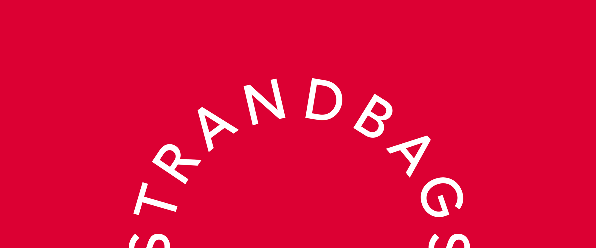
Established in 1927, Strandbags is a retailer of handbags, luggage, business bags, backpacks, and wallets with 300 stores across Australia and New Zealand. Privately owned, their selection includes a range of designer brands as well as Strandbag's own long-established and exclusive private label ranges. Recently, Strandbag introduced a new identity designed by Sydney, Australia-based Frost* Design.
Our strategy focused on transitioning perceptions from 'discounter' to 'value retailer' by injecting a sense of lifestyle and travel into the brand experience; from 'luggage' to 'travel', 'handbags' to 'fashion'.
"Taking People Places" is the brand idea that brings this to life. It's not about discounts and bargains, it's about life's journeys. No matter who you are or where you're going, Strandbags has the right bag for you.
The wordmark represents the connection between bag and person, always by your side, enhancing every journey and adventure. The handle is the symbol of this connection, creating the start of a journey, from A-B and beyond.
Frost* project page
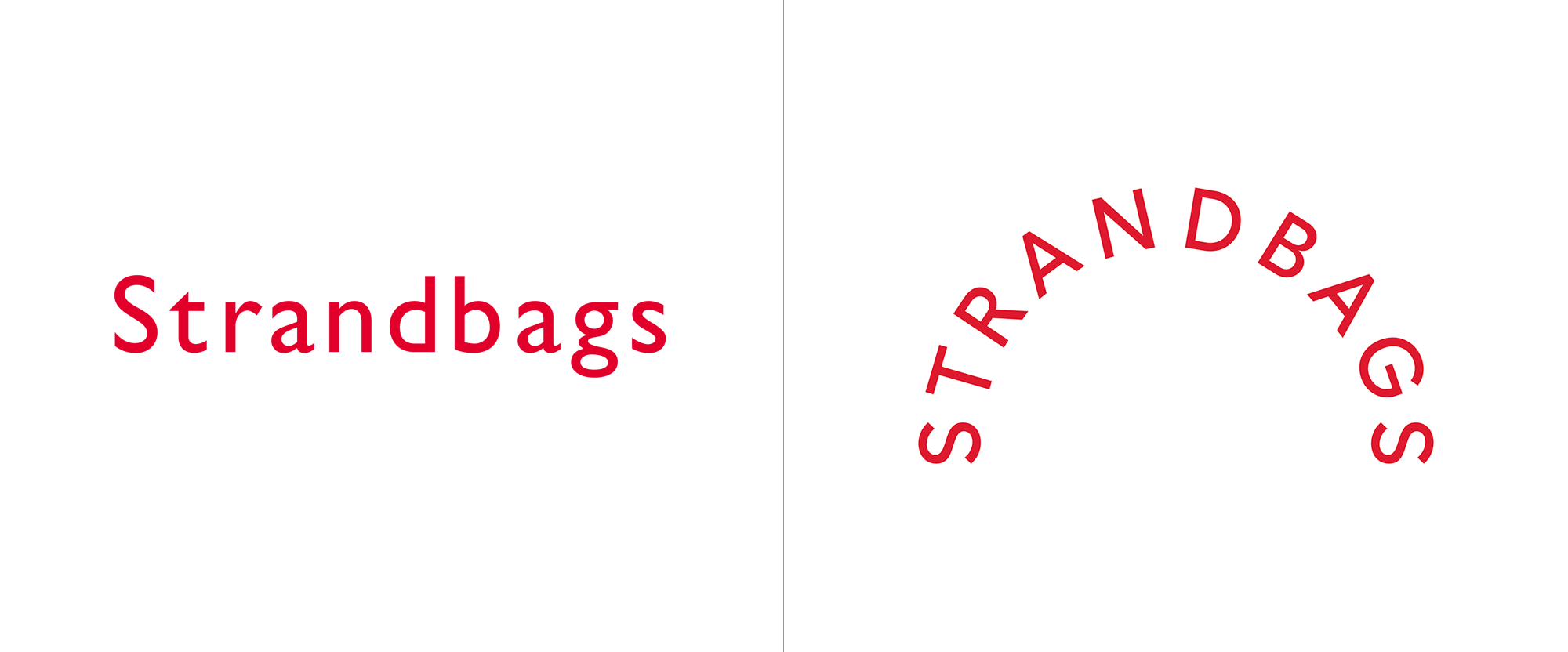
I first posted this in the Spotted section last month and while I usually don't add any thoughts to those posts I did have positive ones of them and imagined that this could be interesting in application, so here we are. The old logo, in out-of-the-box Gill Sans, was bland and showcased everything I dislike about Gill Sans -- that "db" pair, the toppling "a", the gangly "r", et al -- in a single wordmark. The new logo may seem like a Design 101 concept with type on a half circle meant to evoke the handle of a bag but as basic as it may seem it's highly efficient, relevant, and a satisfying, easy-to-solve visual puzzle for the rest of the population that isn't hard-to-please graphic designers. The deadpan sans serif, which is very much in line with the Burberrys and Balenciagas of the world, adds a degree of fashion-ness that elevates Strandbags from being seen as a utilitarian retail brand to more of a lifestyle brand. The half-circle logo starting and ending with an "S" on the baseline makes me happy and when they are slightly cropped provide a great opportunity for some circular treatments.

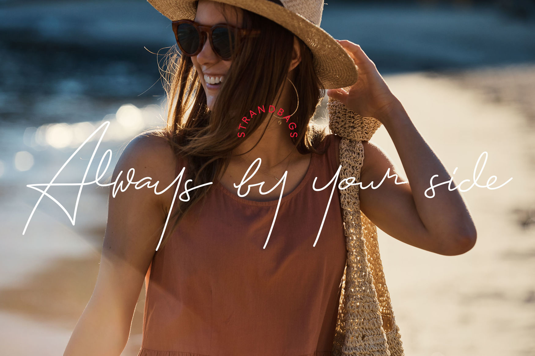
The script tagline is pretty nice and I like how it can be paired with the logo small above it or with the logo big behind it. They make for an unconventional but engaging pair.
Lifestyle photography captures the variety of scenarios, from having coffee to hailing a cab, leaving hotels to walking in parks - the bag catering to any human need. While the bag is in frame, the hero is the journey.
By using the brand's iconic red in a more premium way, establishing a clearer messaging hierarchy throughout and forming a strong narrative, a new Strandbags journey begins.
Frost* project page
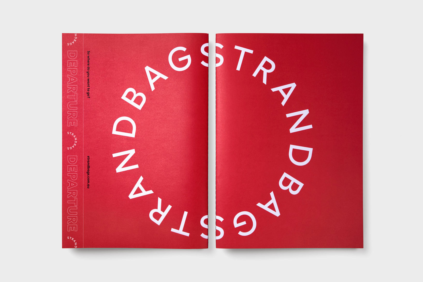
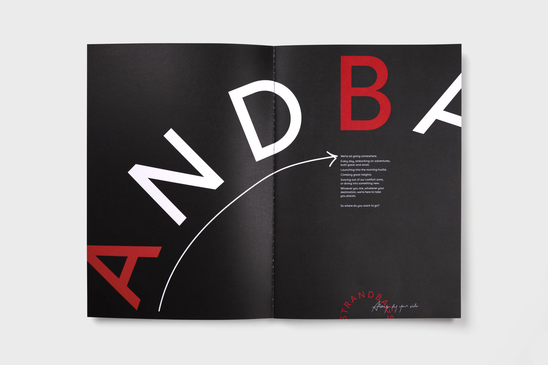
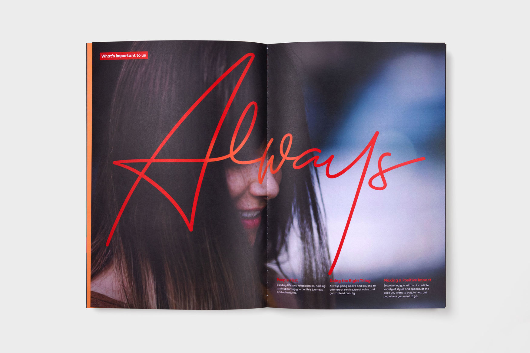
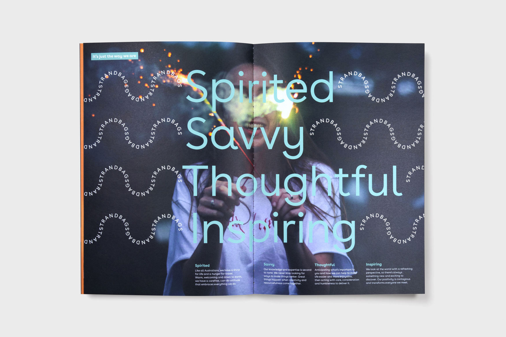
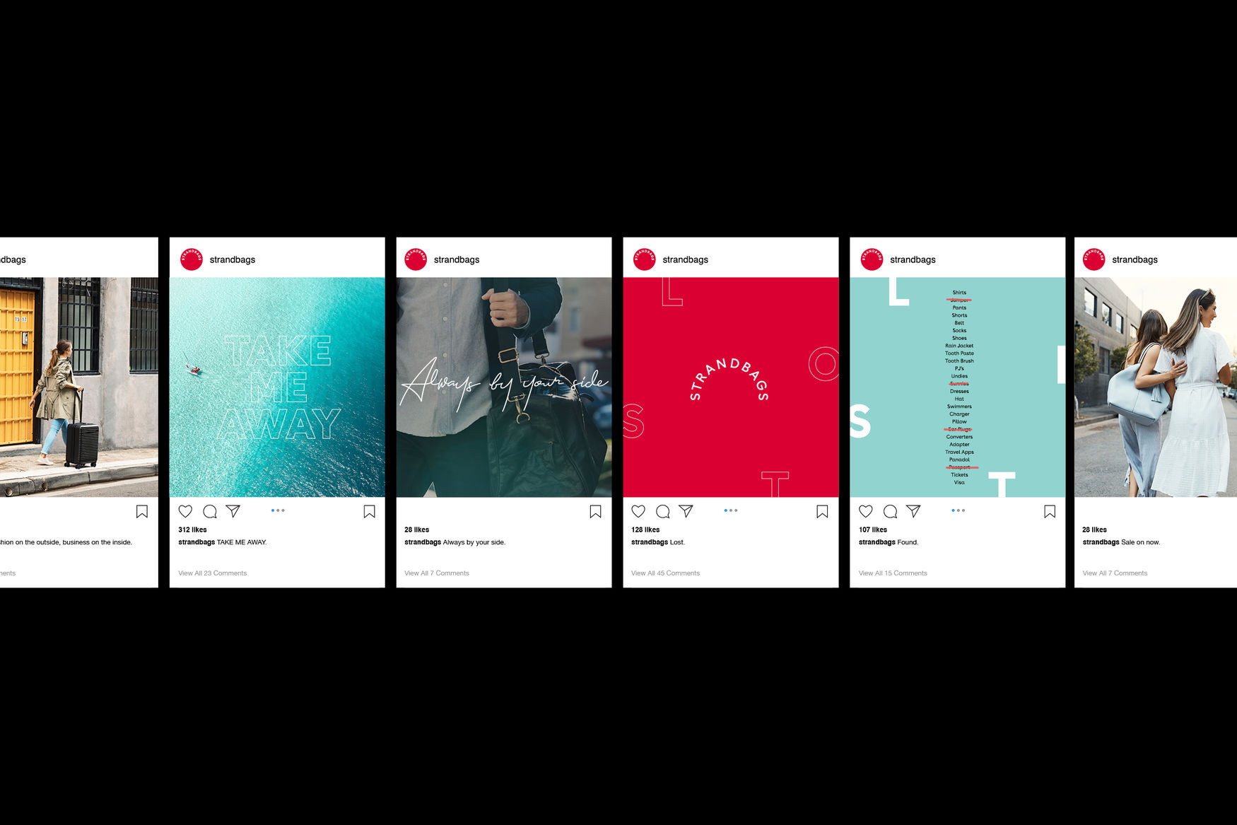
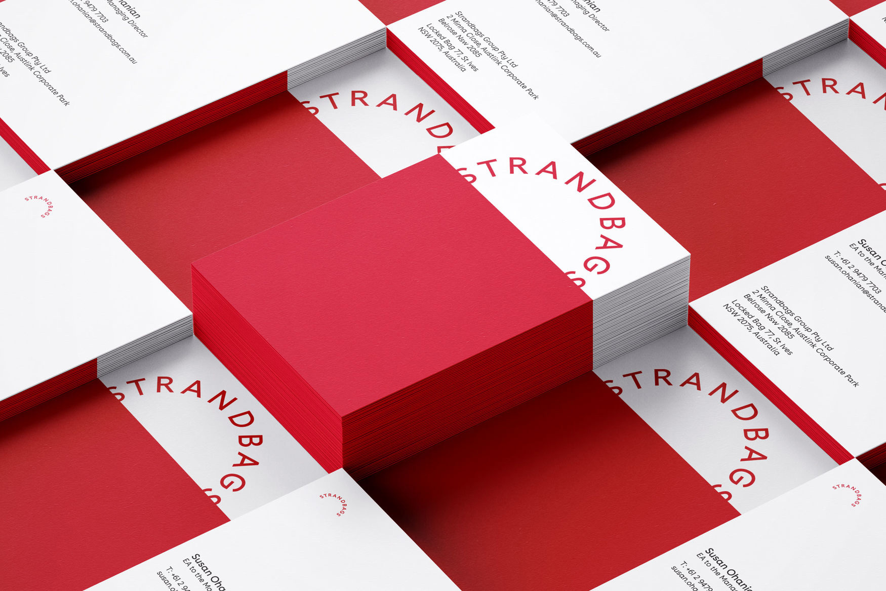
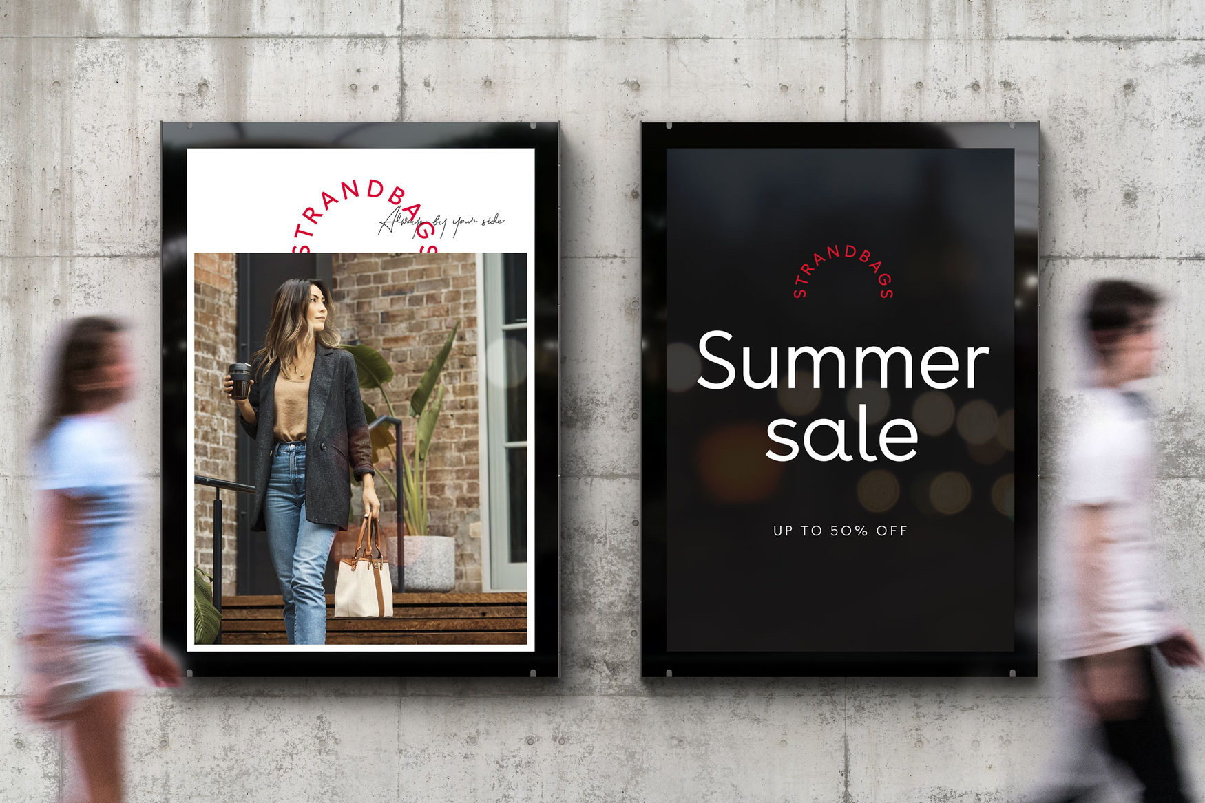
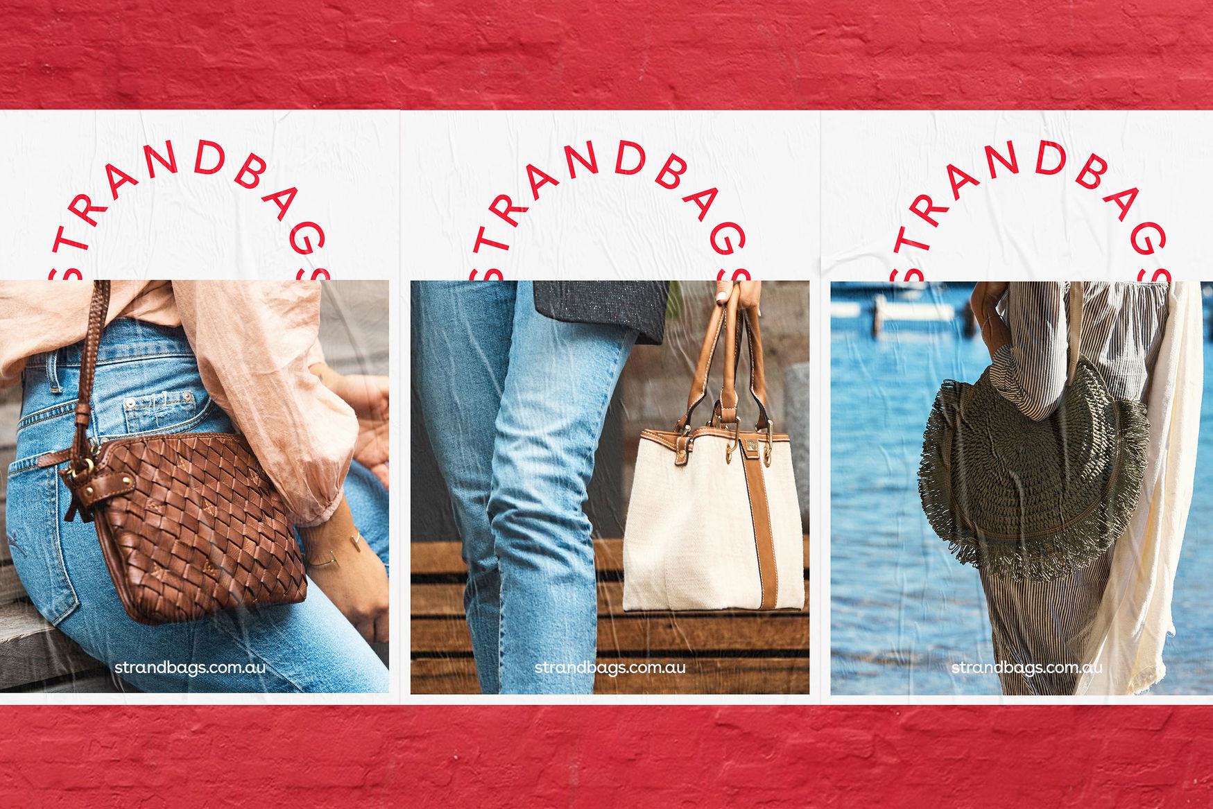
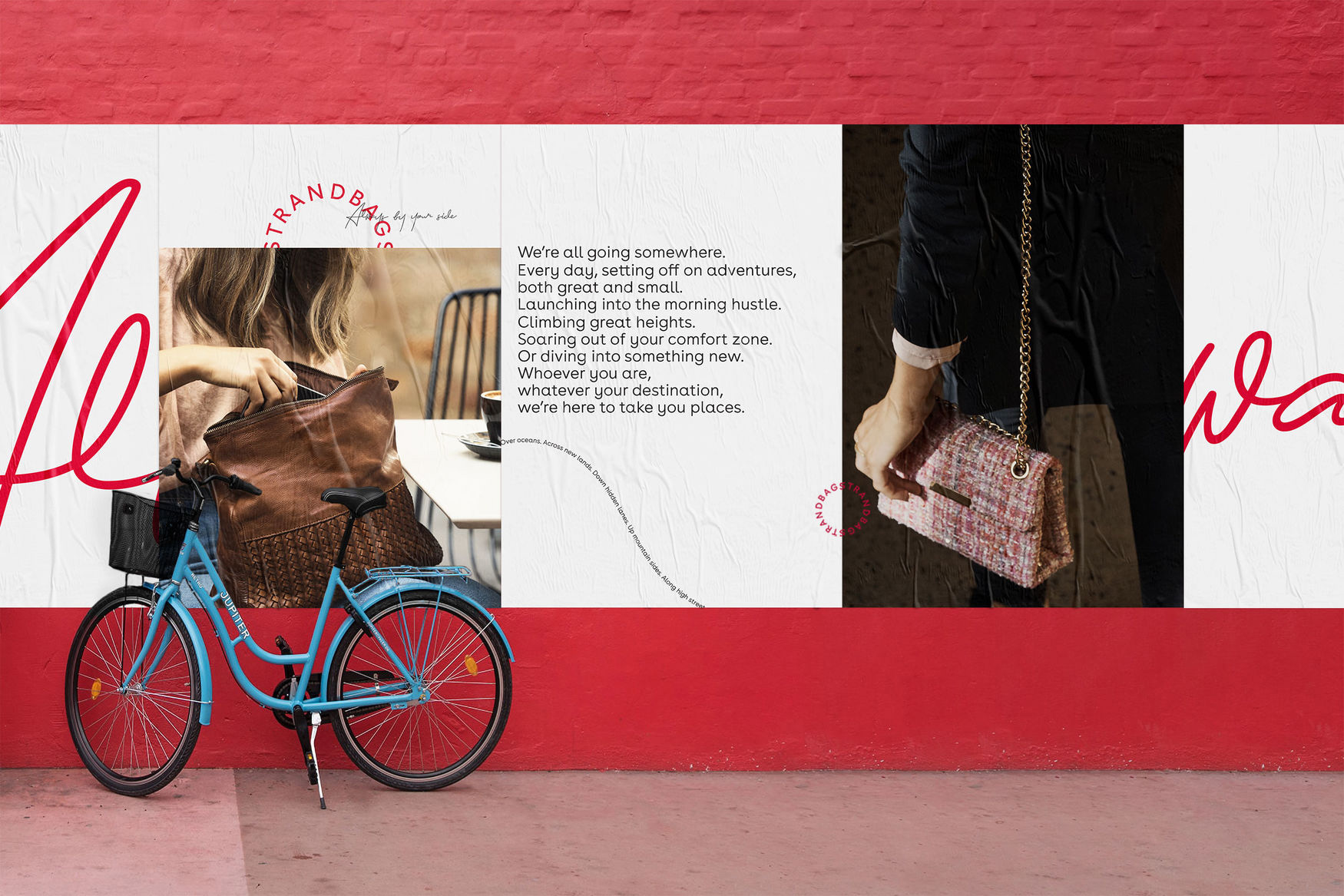
Some of the applications double down on the bag handle concept by placing the logo on top of a rectangular field of color or cropped photograph and, again, it may seem obvious but I think it's handled in a playful and sophisticated way that doesn't feel like a student exercise, which could easily be the case. The only element I would question is the secondary sans serif -- the one for "Summer Sale" or the long paragraph of text directly above -- where it starts to introduce a different aesthetic from what has nicely been established by the logo and tagline.
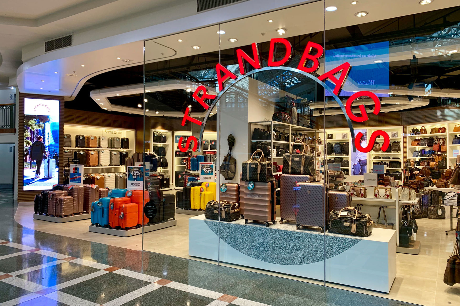
Other than the minor quibble about the type, this strikes a good balance of coming across as an accessible mainstream retailer but one that feels more premium and less like a discount-bargain store, especially with that slick new window sign.
In ấn Anpic In nhãn mác Anpic In brochure Anpic In card visit Anpic In catalogue Anpic In thiệp cưới Anpic In tờ rơi Anpic
In Ấn Anpic – Nổi Tiếng In Đẹp In Nhanh
Số 5 Ngõ 75 Nguyễn Xiển, Thanh Xuân, Hạ Đình, Hà Nội
0963223884
baogiainananh@gmail.com
https://anpic.vn
https://g.page/inananpic
In nhãn mác Anpic ✅ In brochure Anpic ✅ In card visit Anpic ✅ In catalogue Anpic ✅ In thiệp cưới Anpic ✅ In tờ rơi Anpic
https://anpic.vn/in-nhan-mac-dep
https://anpic.vn/in-brochure
https://anpic.vn/in-an
https://anpic.vn/in-voucher-in-phieu-giam-gia-khuyen-mai
#inananpic
Comments
Post a Comment