Noted: New Emblem for 2024 Summer Olympics
“Le Flaming Lips”

"The 2024 Summer Olympics (French: Jeux olympiques d'été de 2024), officially known as the Games of the XXXIII Olympiad (French: Jeux de la XXXIIIe Olympiade), and commonly known as Paris 2024, is a forthcoming international multi-sport event that is scheduled to take place from 26 July to 11 August 2024 in Paris, France. Having previously played host in 1900 and 1924, Paris will become the second city to host the Olympics three times, after London (1908, 1948 and 2012). 2024 will mark the centenary of the Paris Games of 1924. These will be the sixth Olympic Games hosted by France (three summer and three winter)." (Wikipedia)
Design by
N/A
Related links
IOC press release
Relevant quote
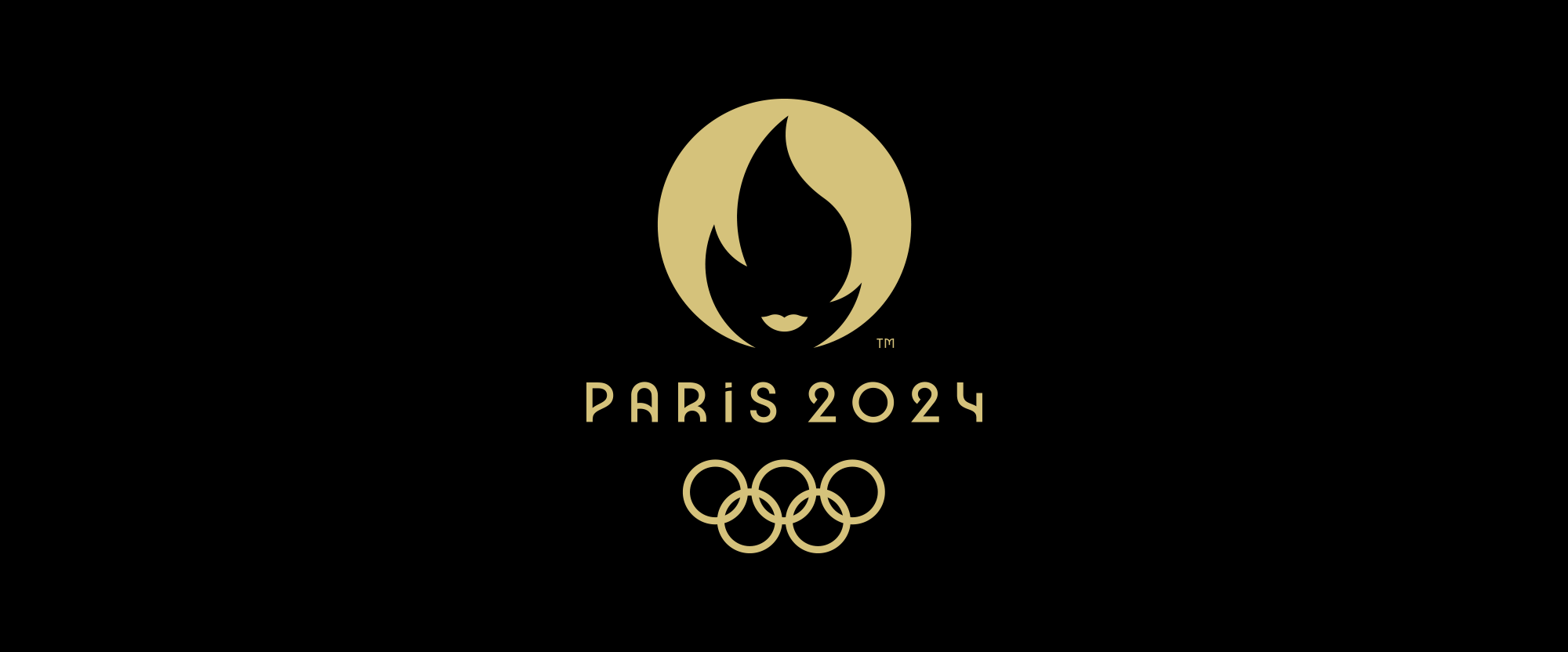
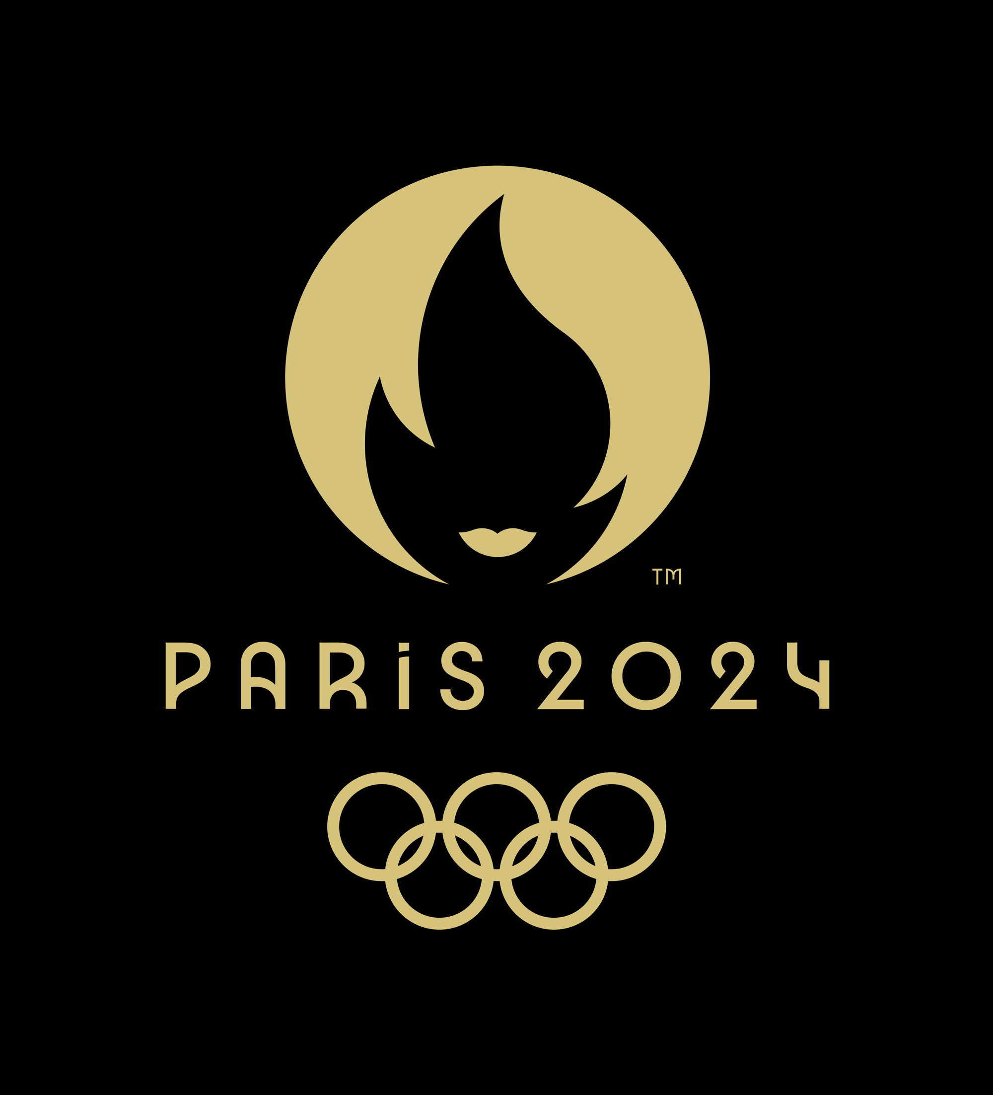
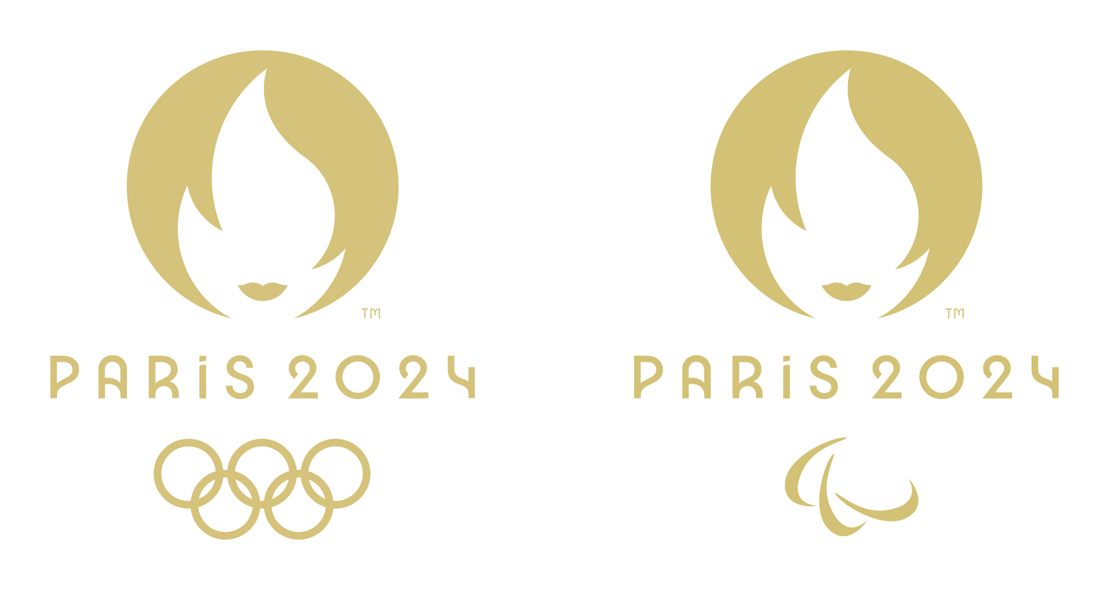
The new design brings together three iconic symbols connected to sport, the Games and France – the gold medal, the Olympic and Paralympic flames, and Marianne.
The emblem embraces the shape and colour of the most beautiful medal of all to express one of the core values of sport: striving for excellence. That same commitment also informs every step that Paris 2024 is taking in organising the Olympic and Paralympic Games Paris 2024, so that it can fulfil the pledges it has made to stage a different, grounded, sustainable and inclusive Games.
The Olympic and Paralympic flames always conjure up special memories. The flame invites us to dream, to engage and to come up with new ways of staging the Olmypic and Paralympic Games. It reflects the unique energy of the Games, which bring people together and drive solutions forward. The Games will help improve the lives of the inhabitants of the Seine-Saint-Denis area by bequeathing useful infrastructure to them: eco-neighbourhoods, through the conversion of the athlete and media villages into housing, and the creation of local sports facilities, such as the Olympic Aquatics Centre.
Finally, Marianne. With its feminine traits, the Paris 2024 emblem pays tribute to a woman who is a French national symbol known around the world. She embodies the revolutionary spirit that infuses the Paris Olympic and Paralympic Games. She encapsulates the desire to bring the competitions out of the stadium and into the heart of the city. A familiar figure who is everywhere in the everyday lives of French people, she is also a reminder that these Games will be Games for everyone, Games that will belong to the people. Her face is also a homage to female athletes and a nod to history, as it was in 1900 at the Olympic Games in Paris that women were first allowed to compete.
Images (opinion after)


Opinion
When I first saw the emblem it took me a couple of seconds to get what was going on and once things came into focus my first reaction was “Whoah” — having a woman be the emblem of the Summer Olympics is such a bold move. Heck, having a man be the emblem of the Olympics would have been bold too, given that most emblems have been abstract or genderless figures when depicting humans. But this is especially striking. My initial association, given the execution of the emblem, was “Fashion = Paris = Women”, which I felt was a little superfluous but I didn’t make the connection to Marianne since, no offense to the style of the 1780s, they didn’t have such chic haircuts back then. With that in mind, though, as well as the fact that the 1900 Paris games was the first time women were allowed to compete, add a great, relevant dimension to the emblem. Execution-wise I love the simplicity of it and the positive-negative relationship of the flame and hair. Being round will make it so easy and flexible to apply to everything too. The custom typeface… it’s funky. It doesn’t have the best rhythm when seen in a paragraph — mostly because of the letters with angles (w, v, y, et al) that create abrupt stops when reading. Nonetheless, it’s not a geometric or humanist sans so I’m all for it. Overall, this should be interesting when it comes time for the Look of the Games.
In ấn Anpic In nhãn mác Anpic In brochure Anpic In card visit Anpic In catalogue Anpic In thiệp cưới Anpic In tờ rơi Anpic
In Ấn Anpic – Nổi Tiếng In Đẹp In Nhanh
Số 5 Ngõ 75 Nguyễn Xiển, Thanh Xuân, Hạ Đình, Hà Nội
0963223884
baogiainananh@gmail.com
https://anpic.vn
https://g.page/inananpic
In nhãn mác Anpic ✅ In brochure Anpic ✅ In card visit Anpic ✅ In catalogue Anpic ✅ In thiệp cưới Anpic ✅ In tờ rơi Anpic
https://anpic.vn/in-nhan-mac-dep
https://anpic.vn/in-brochure
https://anpic.vn/in-an
https://anpic.vn/in-voucher-in-phieu-giam-gia-khuyen-mai
#inananpic
Comments
Post a Comment