Noted: New Logo and Identity for NESN by MOCEAN
“One-way Ticket”
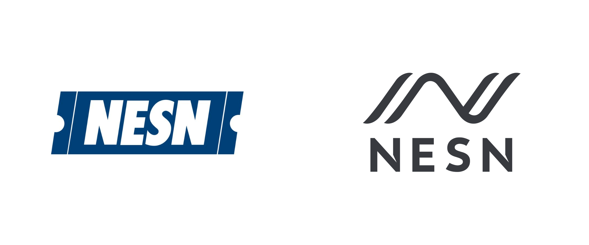
(Est. 1984) "New England Sports Network, popularly known as NESN, is an American regional sports cable and satellite television network that is owned by a joint venture of Fenway Sports Group (which owns a controlling 80% interest, and is the owner of Boston Red Sox and Liverpool Football Club) and Delaware North (which owns the remaining 20% interest in the network, and owns the TD Garden, home of the Boston Celtics and Boston Bruins). Headquartered in Watertown, Massachusetts, the network is primarily carried on cable providers throughout New England (except in Fairfield County, Connecticut, which is part of the greater New York City media market). NESN is also distributed nationally on satellite providers DirecTV and Dish Network and as NESN National via select cable providers. NESN is the primary broadcaster of the Boston Red Sox and the Boston Bruins - serving as the exclusive home for all games that are not televised by a national network. The network has become synonymous with local sports in New England, and is considered a local institution." (Wikipedia)
Design by
MOCEAN (Los Angeles, CA)
Related links
NESN press release
NESN PDF media kit
Relevant quote
The change is an outward signal to viewers that NESN is changing, distributed in more ways and offering more available touchpoints than ever before.
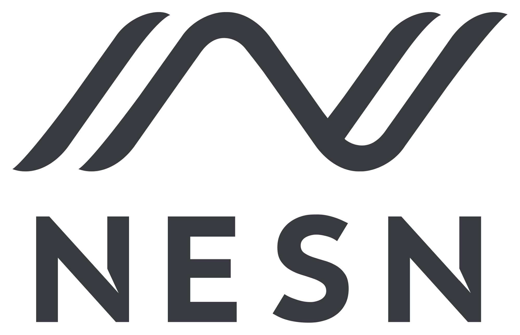
In tandem with one of the leading brand design firms in the country, NESN created a new logo that incorporates a contemporary typographic treatment with a unique icon.
Images (opinion after)
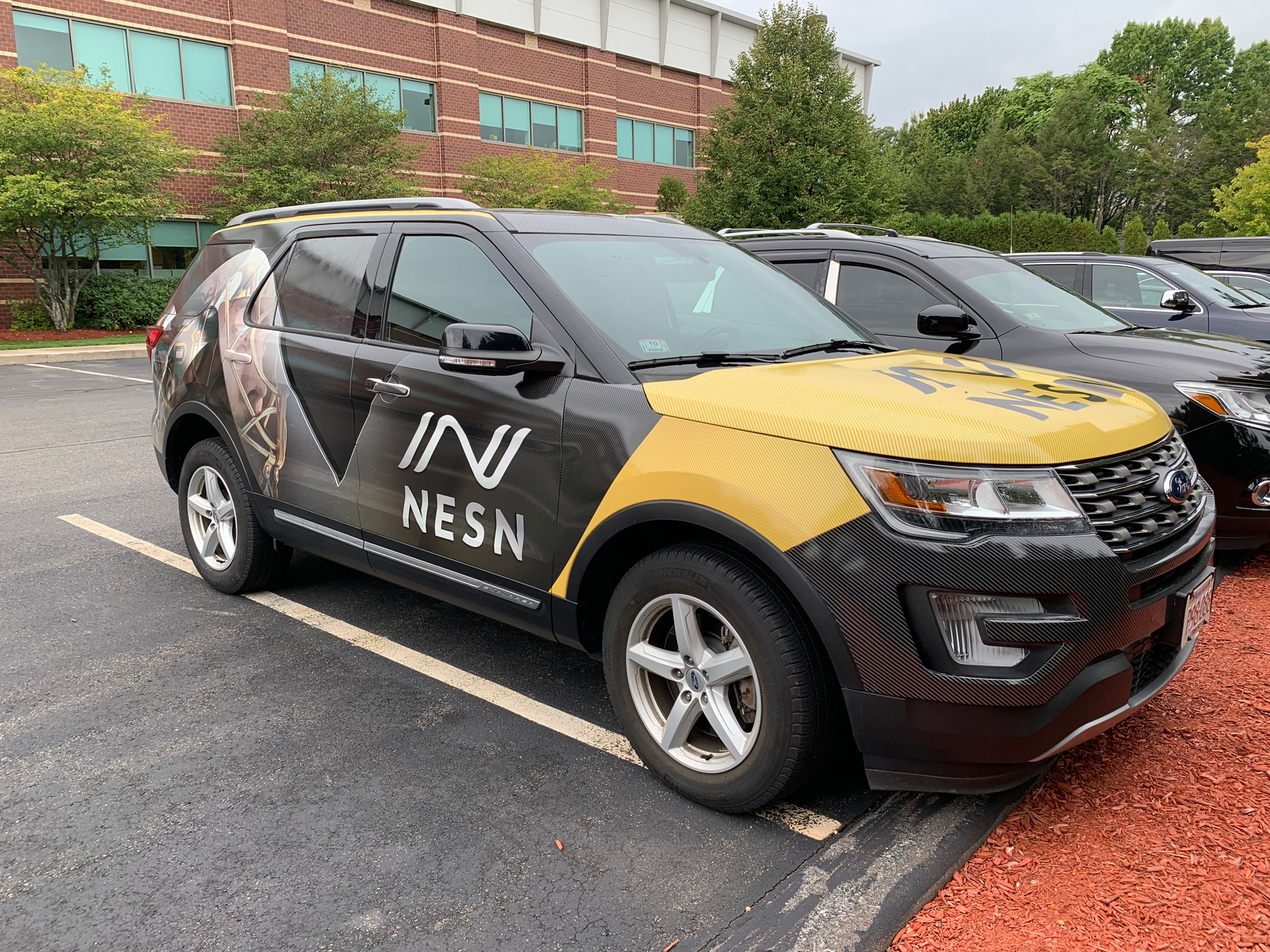
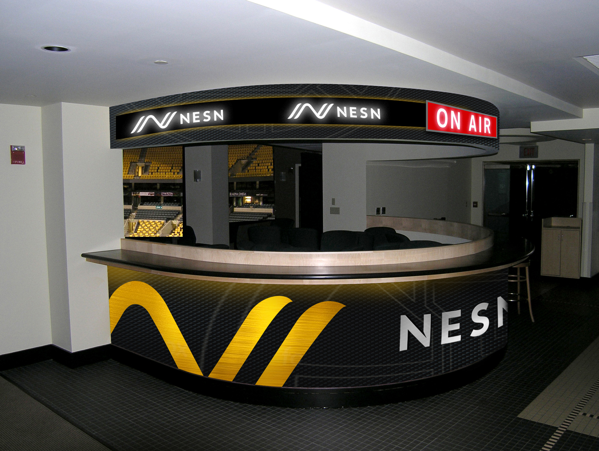
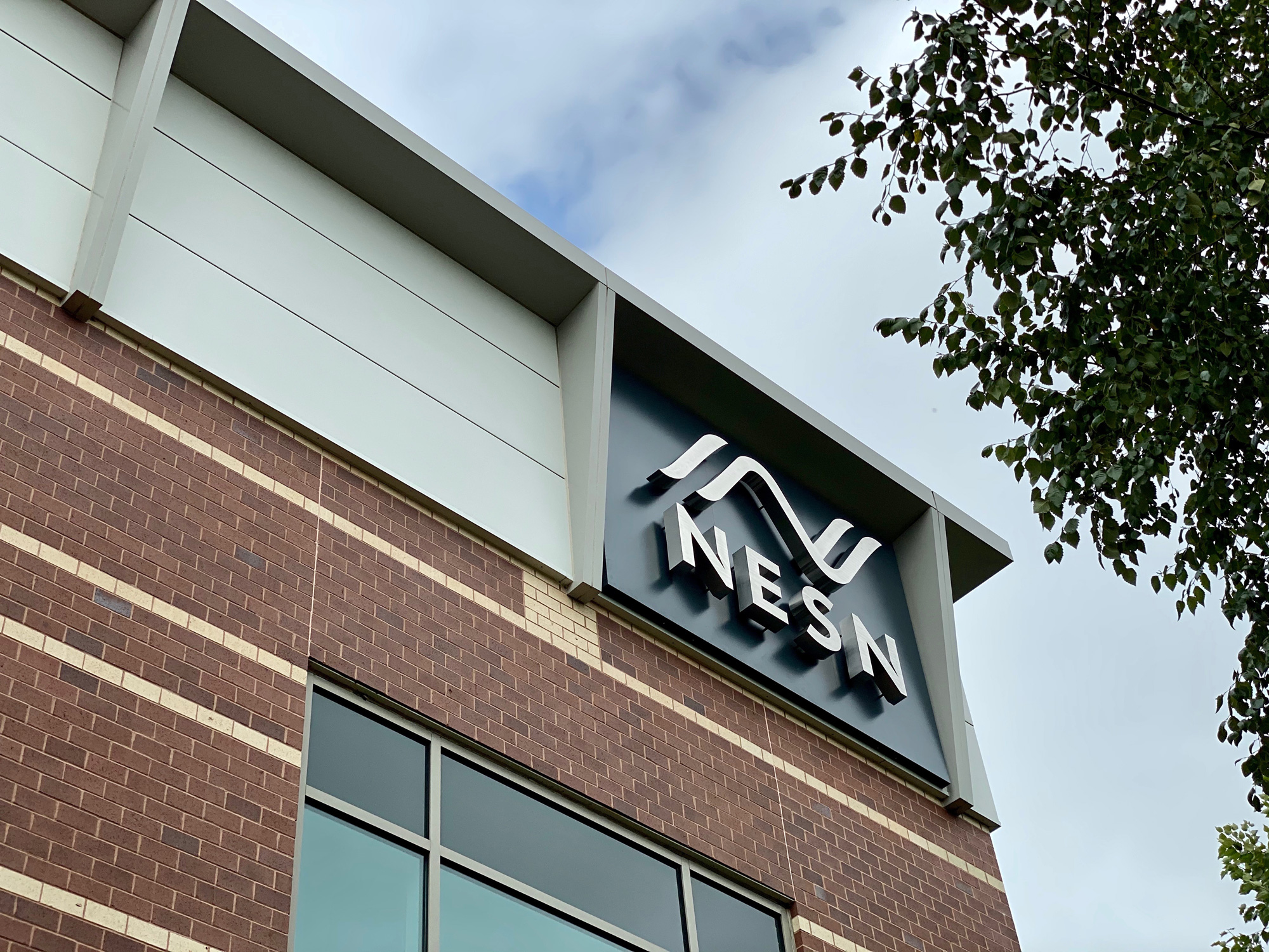
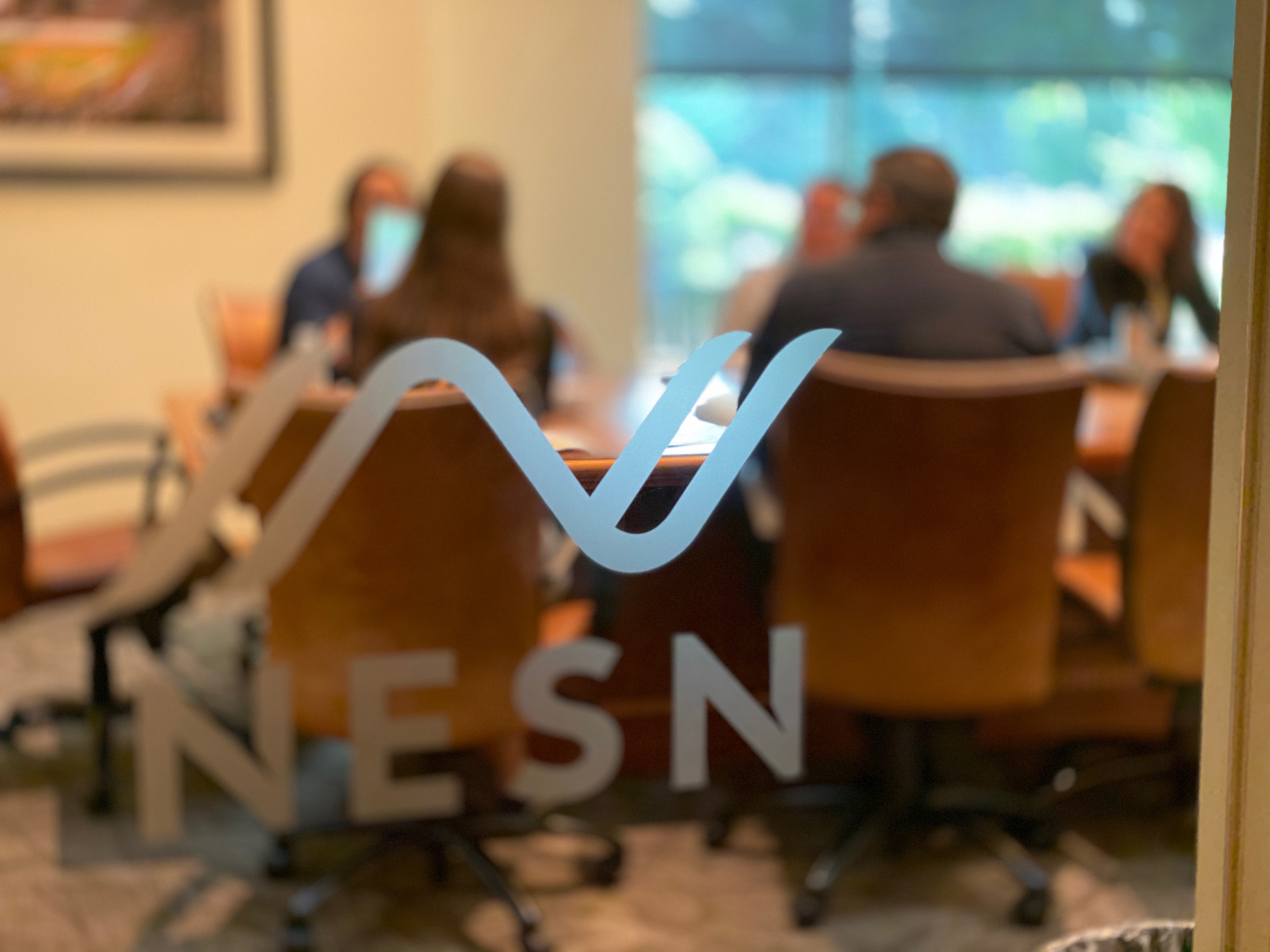
Opinion
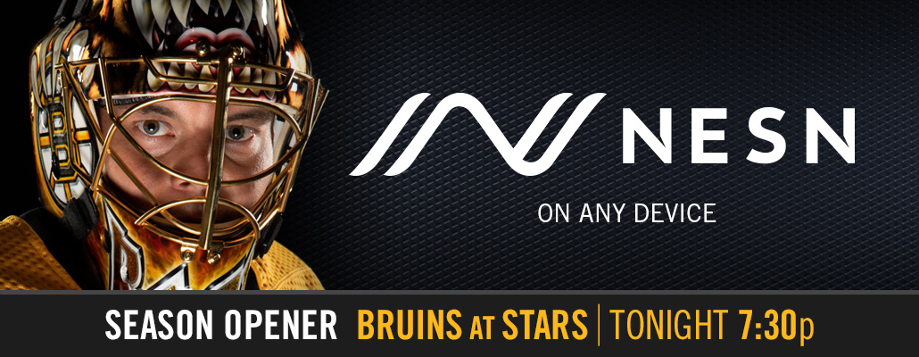
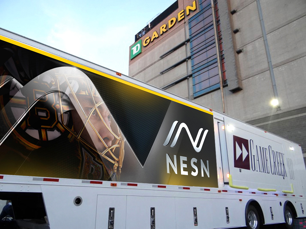
New England represent in the tip submissions for this one! At first I was going to post it as a Spotted but lots of demand, so here we go… The old logo, I get why it had to go… who uses tickets like that anymore? It was an outdated motif, sure, but along with the heavy italic typography it had cemented its place in the sports world in New England and I feel like both elements could have been evolved in a contemporary way to downplay the ticket but not completely chuck it. The new logo is so random, it could be for absolutely anything, from a healthcare organization to an outdoor equipment company. There is no explanation of what the “N” monogram is meant to be, convey, or represent and not that it needs an obligatory explanation but I feel that it is so peculiarly designed that there should be something to it. Maybe the local audience can shed light on what I’m missing, if anything? As an “N” graphic, I guess it’s fine; it has a somewhat interesting dimensionality and dynamism to it that’s decent, but as an “N” to serves as a shorthand for an acronym that represents a sports TV channel, it’s not fine. The wordmark is also weird with some aggressive notches in the “N”s that have zero visual relation to the monogram. It’s all very odd and sort of disconnected. The applications do not make things better, with some garish 1990s aesthetics. The nicest application is the frosted logo on the office window and that’s if I imagine this to be for something else. Overall, neither visually good nor thematically good.
In ấn Anpic In nhãn mác Anpic In brochure Anpic In card visit Anpic In catalogue Anpic In thiệp cưới Anpic In tờ rơi Anpic
In Ấn Anpic – Nổi Tiếng In Đẹp In Nhanh
Số 5 Ngõ 75 Nguyễn Xiển, Thanh Xuân, Hạ Đình, Hà Nội
0963223884
baogiainananh@gmail.com
https://anpic.vn
https://g.page/inananpic
In nhãn mác Anpic ✅ In brochure Anpic ✅ In card visit Anpic ✅ In catalogue Anpic ✅ In thiệp cưới Anpic ✅ In tờ rơi Anpic
https://anpic.vn/in-nhan-mac-dep
https://anpic.vn/in-brochure
https://anpic.vn/in-an
https://anpic.vn/in-voucher-in-phieu-giam-gia-khuyen-mai
#inananpic
Comments
Post a Comment