Noted: New Logo and Identity for Peace One Day by Interbrand
“A Million Little Peaces”
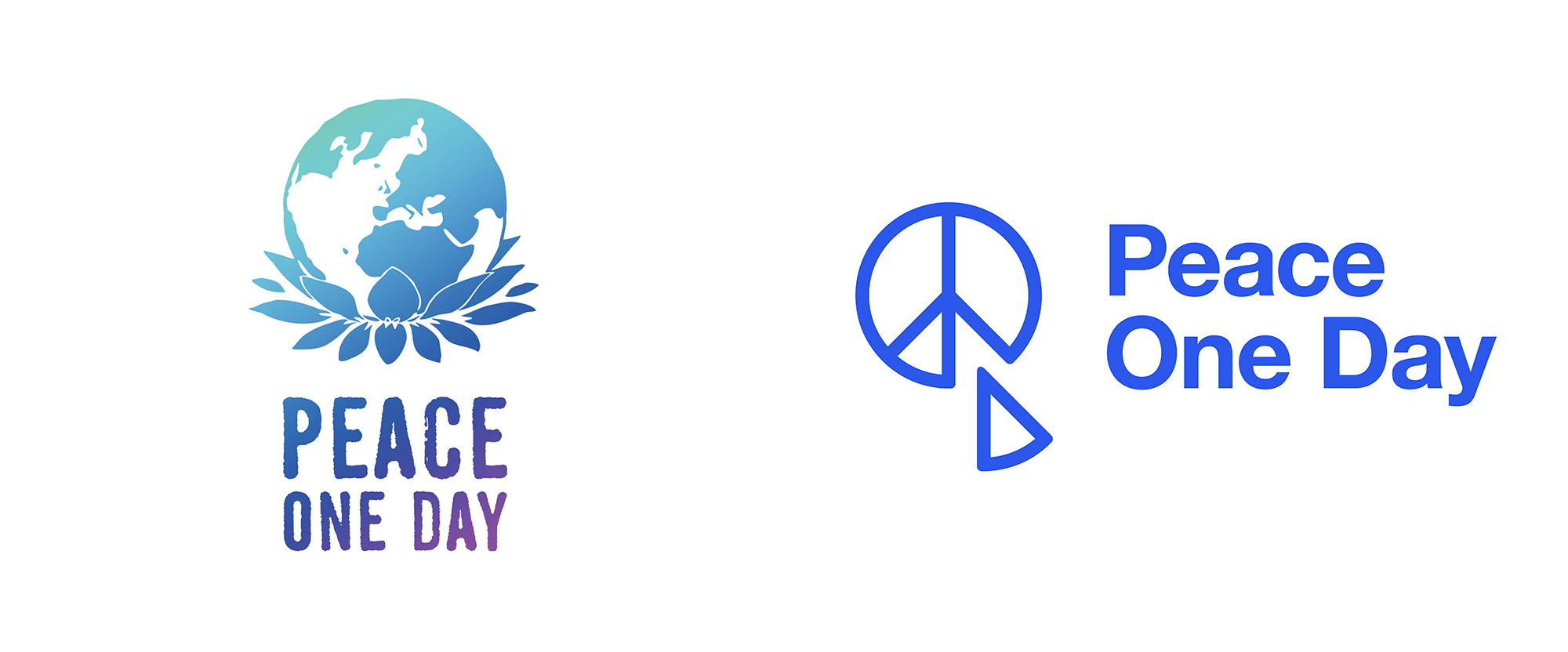
(Est. 1999) "In 1999, actor turned filmmaker Jeremy Gilley set out to document his efforts to create an annual Peace Day. To this end he founded the non-profit organisation Peace One Day. In 2001 the organisation's efforts were rewarded when the member states of the United Nations unanimously adopted the first ever annual day of global ceasefire and non-violence on 21 September - Peace Day. Since 2001, Peace One Day's objective has been to institutionalise Peace Day 21 September, making it a day that is self-sustaining, an annual day of global unity, a day of intercultural cooperation on an unprecedented scale."
Design by
Interbrand
Related links
Interbrand project page
Relevant quote
“Gerald Holtom purposely did not copyright his famous peace logo design in 1958. He wanted the logo to be used by all as a universal symbol of peace and open to be used by anyone that worked to achieve peace. We saw the same goals of Gerald’s ideas as with Jeremy’s. And the same potential for everyone to use the Peace One Day logo to help them do their peace,” said Michael Knaggs, Senior Creative Director of Interbrand New York.
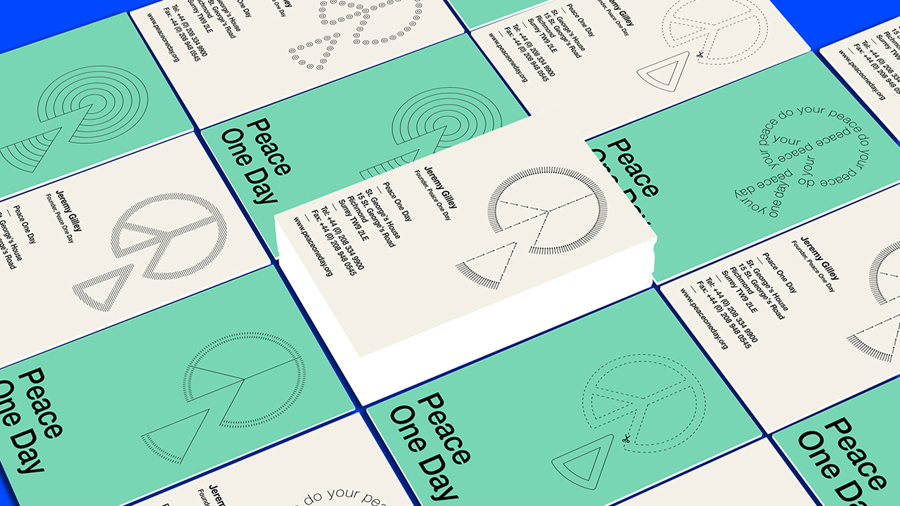
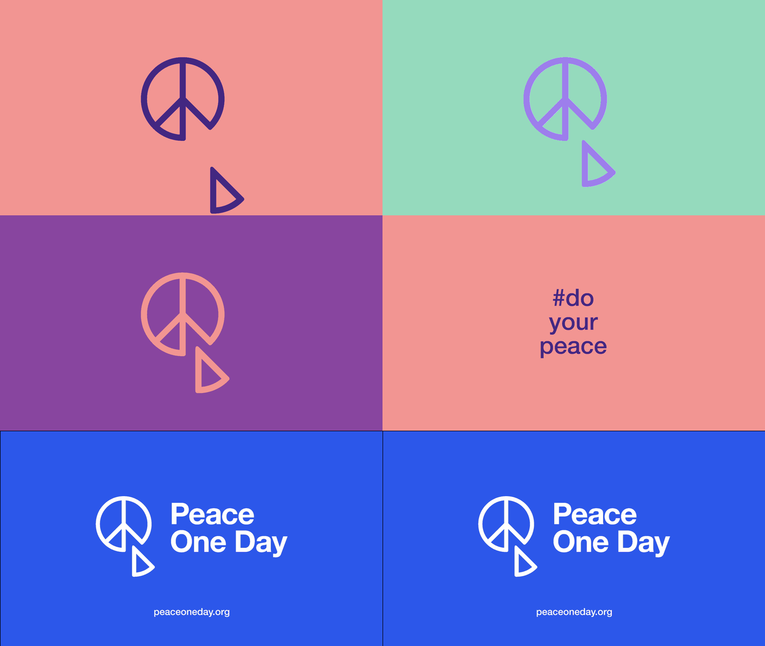
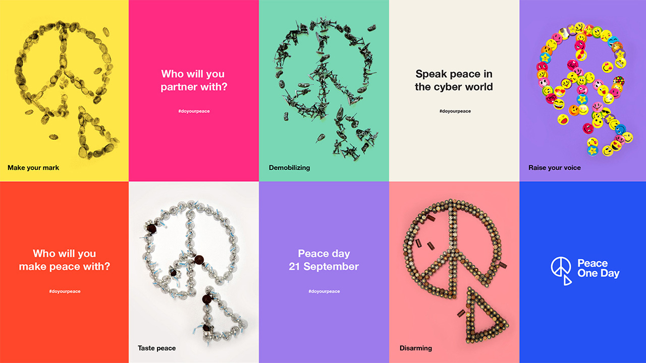
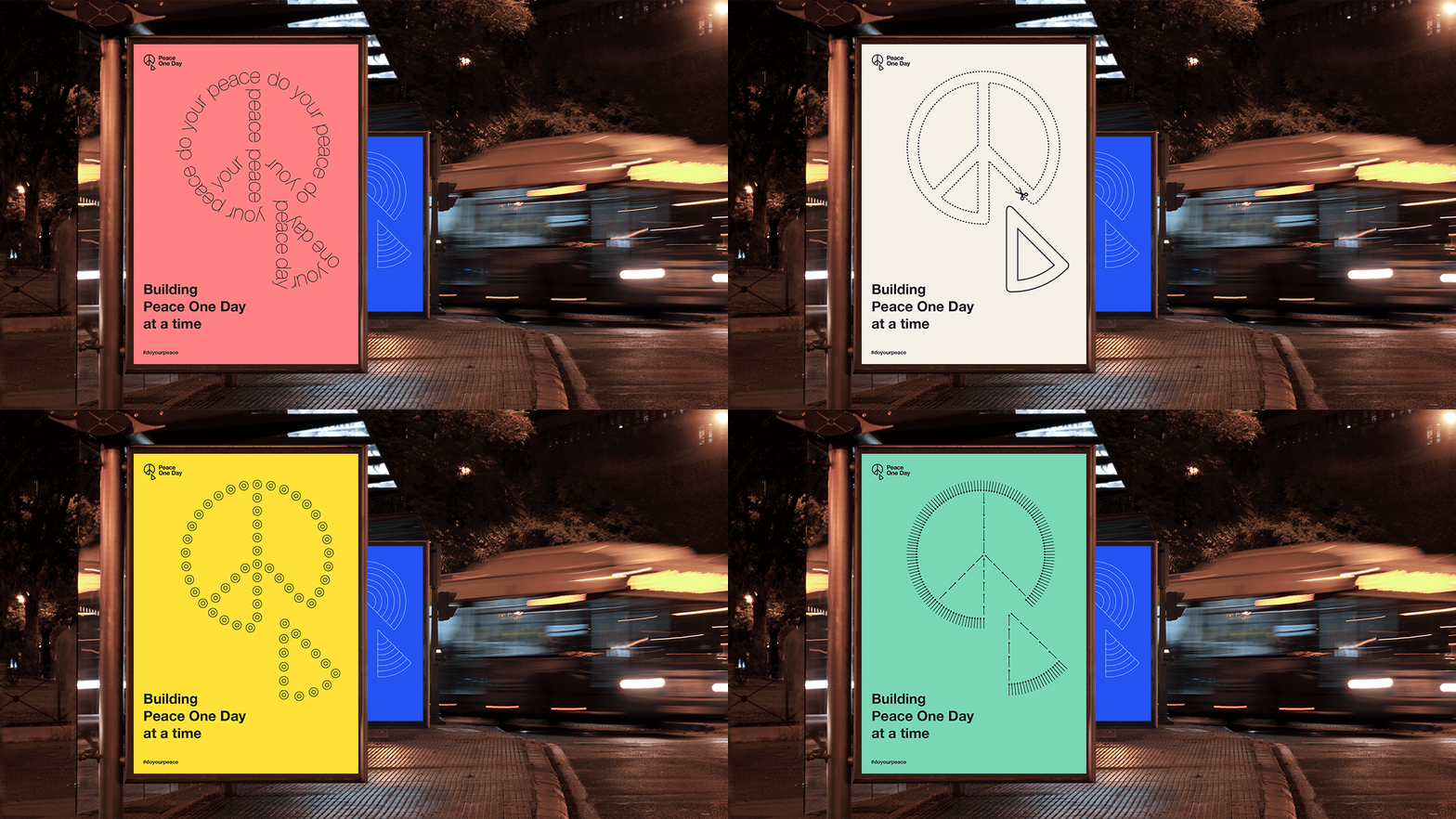
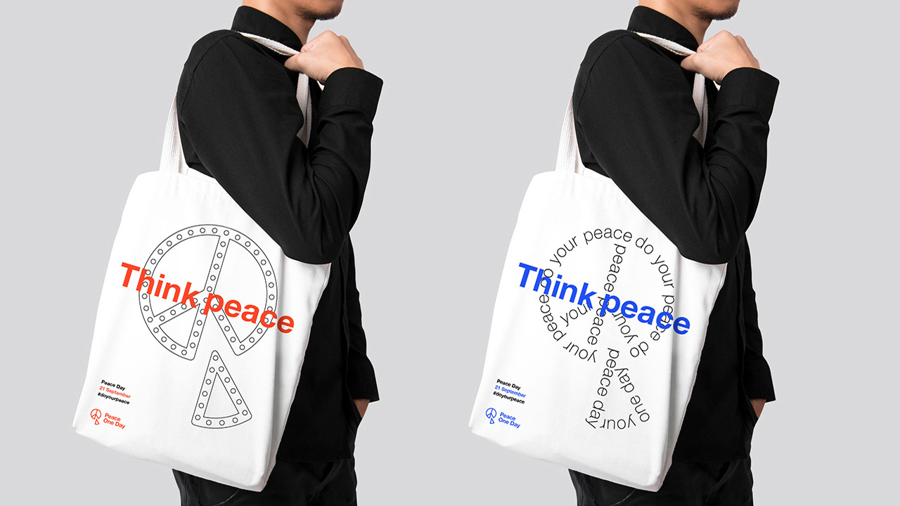
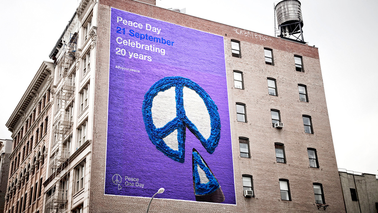
The new logo is a 21st century evolution of the globally recognized peace symbol, reworked to remove a slice of the original motif. The reimagination of a universal symbol matches Peace One Day’s aspirations, showing that change can start small, with us as individuals, one piece at a time. Designed to be infinitely customizable, it empowers people around the world to make Peace One Day their own.
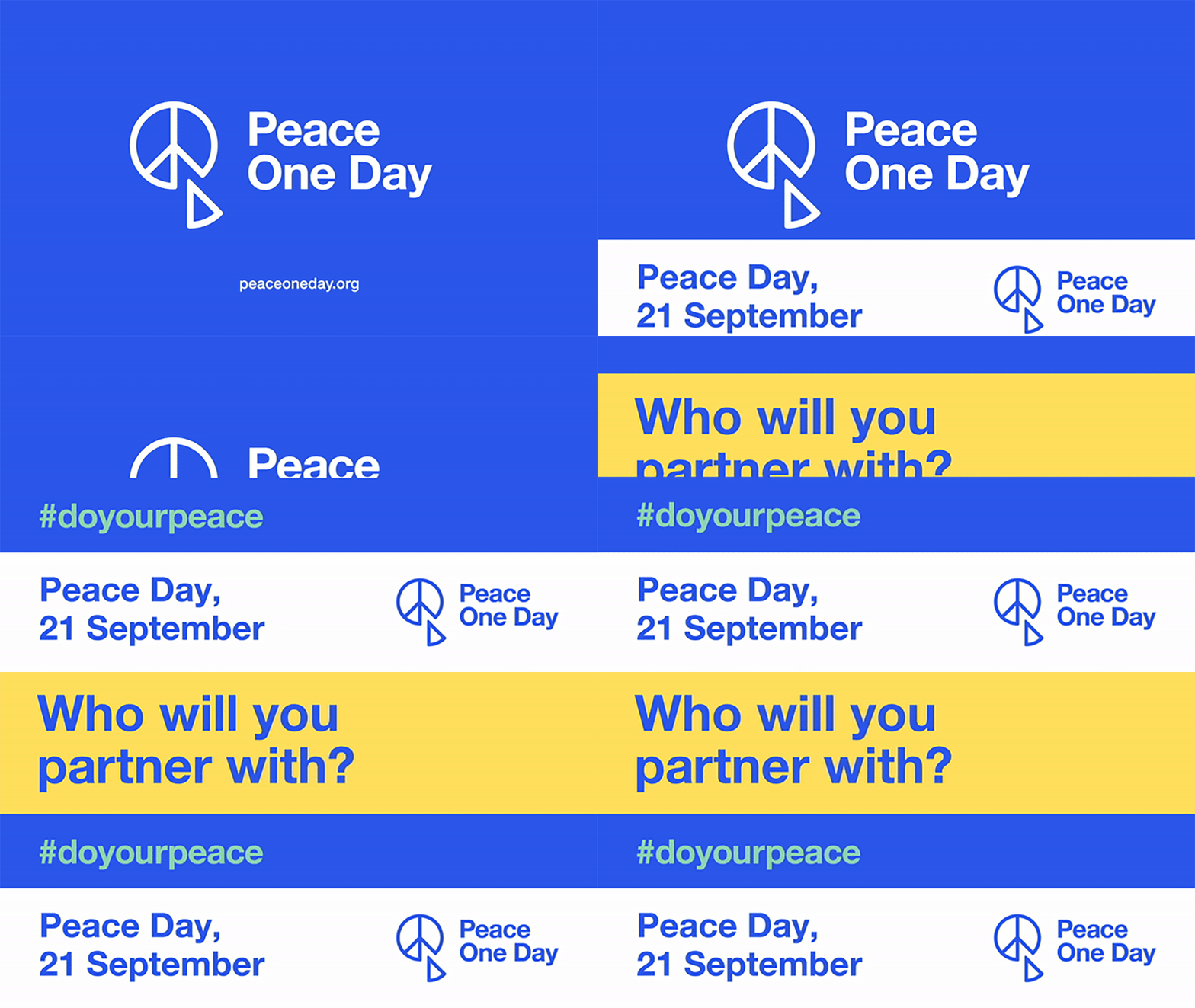
An energetic new color palette centers on blue (symbolizing serenity and trust) and is supported by a rainbow of pastels (representing openness and energy).
Images (opinion after)

Opinion
The old logo was… elaborate. A globe resting on a lotus flower on top of grunge typography, all dressed in a gradient from head to toe. Too much, too weird, too poorly made. The new logo is kind of clever, playing off of the name of the organization and taking a piece out of the peace symbol, for a visual/verbal pun. The problem is that, as a logo, it’s kind of strange for a number of reasons… I get that the peace symbol is free to use but adopting it as a logo for an organization doesn’t feel quite right, even if it’s a peace organization — I just don’t think anyone benefits from using an icon that is so prevalent. Removing the one piece could arguably be considered enough of a customization but I don’t think it is. Also, visually, and I usually try not to let my teenage brain get the better of me, but: pizza and/or Pac-man puking. Let’s assume that that’s just me and I should grow up… the logo can then be rendered in any number of styles and approaches but, at least what’s shown here, feels half-baked and not very interesting. A kind of lukewarm flexible identity that doesn’t quite ever blend into something poignant or exciting, event when the logo is made out of bullet casings. The identity isn’t sure either whether it wants to be edgy as in the totes looking like some Dutch design or if it wants to be cute as in the cake ad. It could be argued that it can be both and I agree but right now it’s neither. Overall, there is a decent idea in here but the execution of the logo and the application don’t quite sell it.
In ấn Anpic In nhãn mác Anpic In brochure Anpic In card visit Anpic In catalogue Anpic In thiệp cưới Anpic In tờ rơi Anpic
In Ấn Anpic – Nổi Tiếng In Đẹp In Nhanh
Số 5 Ngõ 75 Nguyễn Xiển, Thanh Xuân, Hạ Đình, Hà Nội
0963223884
baogiainananh@gmail.com
https://anpic.vn
https://g.page/inananpic
In nhãn mác Anpic ✅ In brochure Anpic ✅ In card visit Anpic ✅ In catalogue Anpic ✅ In thiệp cưới Anpic ✅ In tờ rơi Anpic
https://anpic.vn/in-nhan-mac-dep
https://anpic.vn/in-brochure
https://anpic.vn/in-an
https://anpic.vn/in-voucher-in-phieu-giam-gia-khuyen-mai
#inananpic
Comments
Post a Comment