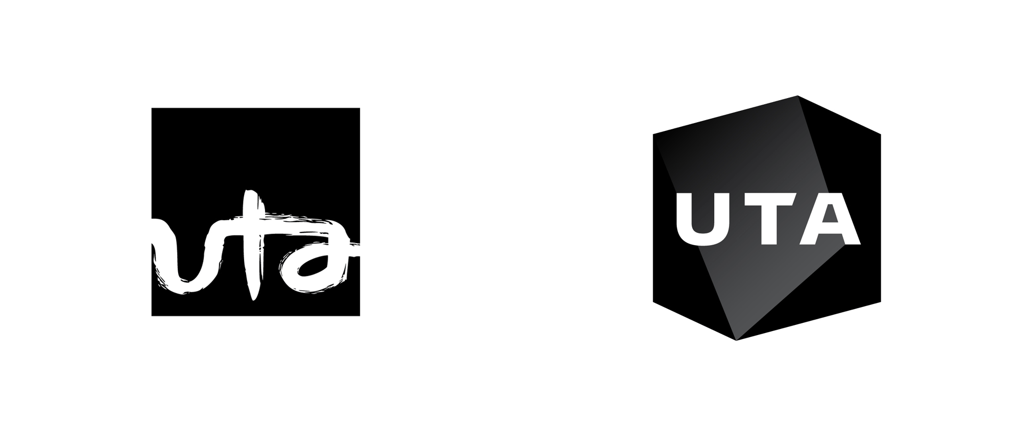
Noted: New Logo and Identity for UTA done In-house
“Hidden Talent”

(Est. 1991) "Leading global talent and entertainment company UTA represents many of the most acclaimed figures across film, television, news, music, sports, speakers, theater, fine art, literature, video games, podcasts and other social and digital content. A passionate advocate for artists, creators and innovators, the company also is recognized in the areas of film finance and packaging, branding, licensing and endorsements. UTA is known for its dedicated digital media group helping clients--from A-list talent to Fortune 500 companies--capitalize on a rapidly changing entertainment, media and business landscape. The company's worldwide presence includes its Los Angeles headquarters and offices in New York, London, Nashville, Miami and Malmö, Sweden."
Design by
In-house
Motion graphics: (Berlin, Germany)
Related links
UTA press release
2011 Brand New post
Relevant quote
The rebrand followed a repositioning of the company that focused on its signature ability to unite ideas, opportunities, and talent. Since the last rebrand in 2011, UTA has grown from a company of 300 employees to over 1,200 employees working in six offices around the world. It has also greatly expanded its areas of representation and it has diversified across many non-core verticals and business segments.
The new identity signals this shift by turning the flat canvas of the previous mark into a multidimensional, interactive space. As a company that operates deeply within media markets, the identity features an extensive motion graphics component developed in partnership with Berlin-based creative company, Colors And The Kids. Taken together, the visual identity system is better positioned to represent a global, multifaceted talent and entertainment company.
Images (opinion after)


Opinion
The old logo was fairly weird and not in a good way. The lowercase letters were oddly ligatured and then rendered in a non-convincing brush effect. The identity around it was sort of okay though. The new logo, regardless of what the “logo evolution” GIF is attempting to do, has no relation to the old logo and, on its own, is as weird-not-in-a-good-way as the old logo was. The holding shape, which looks like a deformed hexagon is strange and that’s mostly due because the 3D geometry shading isn’t clear at all. The typography inside looks like an airline logo and there is no clear (or even unclear) message about what the company is based on the type or even the shape — it’s just stuff. The logo can also lose the shading and instead use a thick stroke around the shape, which is even more ambiguous. Then there are the graphics and animations which are cool on their own but I have no idea what they are doing here other than decoration for decoration’s sake. The identity then sort of, maybe, starts to get interesting in the layouts with some decent typography but in the end it tries to be too cool without being able to really pull it off. Overall, this feels very confused as to what it is, who it’s representing, or what message it wants to convey.
In ấn Anpic In nhãn mác Anpic In brochure Anpic In card visit Anpic In catalogue Anpic In thiệp cưới Anpic In tờ rơi Anpic
In Ấn Anpic – Nổi Tiếng In Đẹp In Nhanh
Số 5 Ngõ 75 Nguyễn Xiển, Thanh Xuân, Hạ Đình, Hà Nội
0963223884
baogiainananh@gmail.com
https://anpic.vn
https://g.page/inananpic
In nhãn mác Anpic ✅ In brochure Anpic ✅ In card visit Anpic ✅ In catalogue Anpic ✅ In thiệp cưới Anpic ✅ In tờ rơi Anpic
https://anpic.vn/in-nhan-mac-dep
https://anpic.vn/in-brochure
https://anpic.vn/in-an
https://anpic.vn/in-voucher-in-phieu-giam-gia-khuyen-mai
#inananpic
Comments
Post a Comment