Noted: New Logo and Identity for Aerosoles by YummyColours
“Sole Sisters”
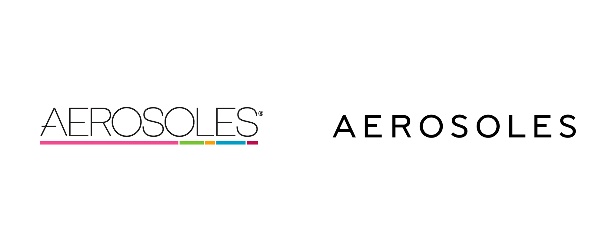
(Est. 1987) "Since 1987, Aerosoles has developed high quality, comfortable and fashion-right shoes at affordable prices. Aerosoles shoes offer a vast assortment to suit every occasion. From office wear to weekend gear and everything in between. You get the greatest footwear styles designed with a modern approach to improve the way you live, work, and play. Aerosoles mission is simple and clear: To be the number one product-driven footwear company in the world. The perfect blend of fashion and comfort makes the Aerosoles shoe - whether casual, dress, boot, sandal, or tailored - unique. Aerosoles careful use of quality materials with a clear emphasis on innovative constructions generates footwear that appeals to both the trend conscious consumer and those looking for classic style. With an uncompromising consideration to quality and craftsmanship, Aerosoles shoes are trend-right, fashionable yet with genuine comfort. In everything we do, its all about the shoes."
Design by
YummyColours (New York, NY)
Related links
YummyColours project page
Relevant quote
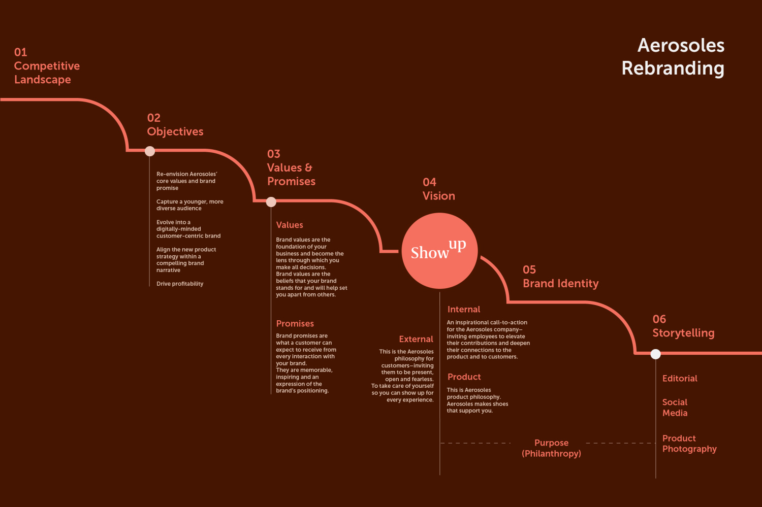
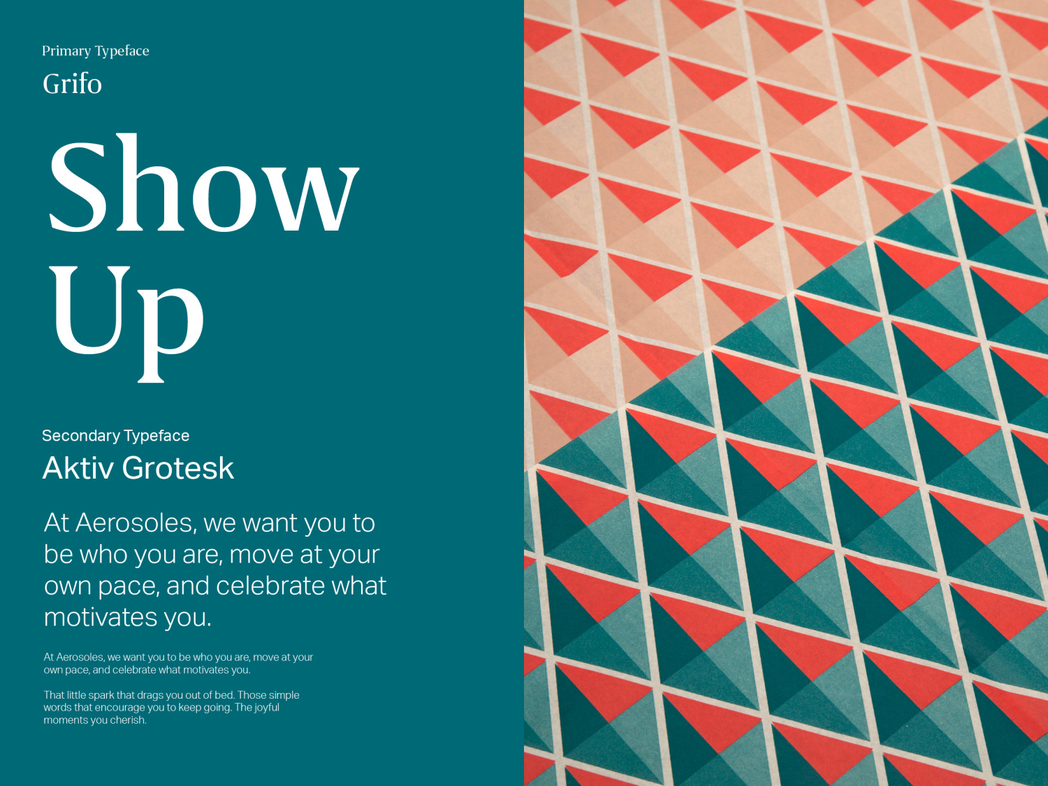
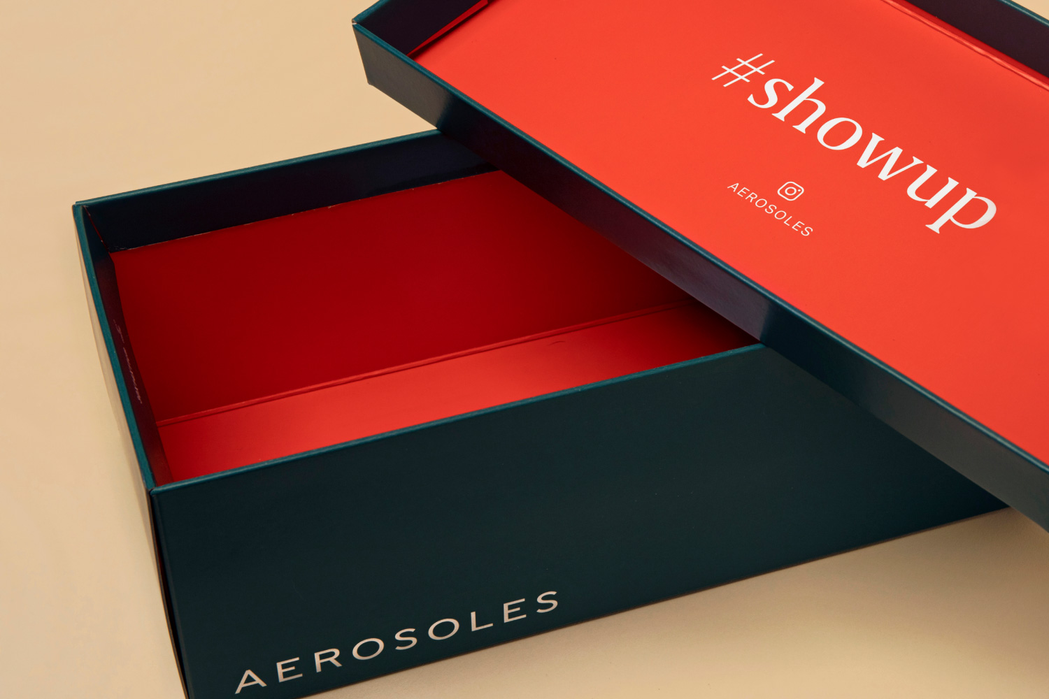
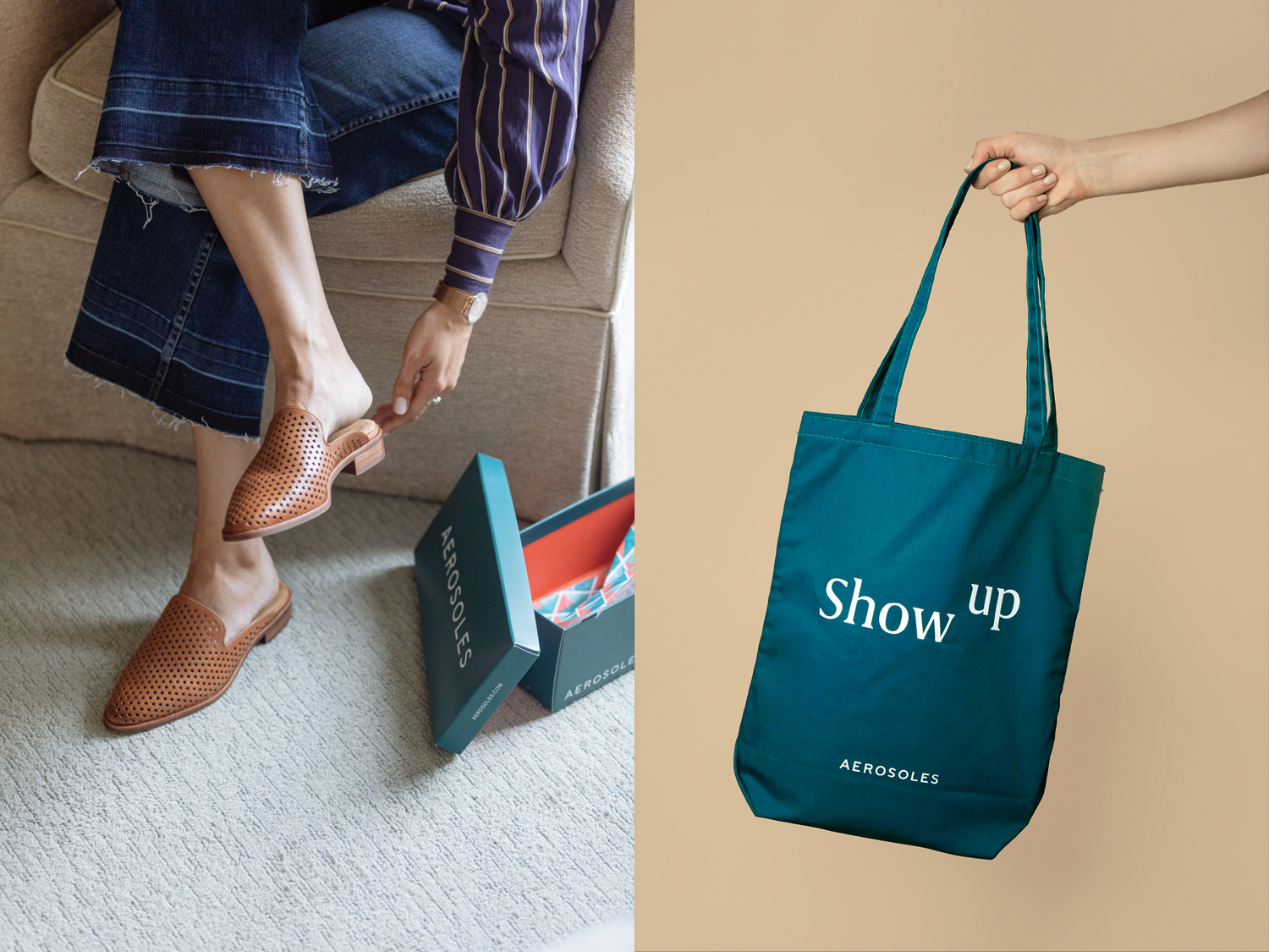
After embarking on a competitive analysis and identifying consumer segmentations, YummyColours created the action-forward tagline “Show Up.” The prompt reoriented the Aerosoles brand and company toward the consumer by responding to real-world customers and scenarios. The tag also extended to corporate relationships and product expectations. YummyColours implemented a new editorial direction around the “Show Up” concept, focusing on campaigns, user-generated content, and social media strategy.
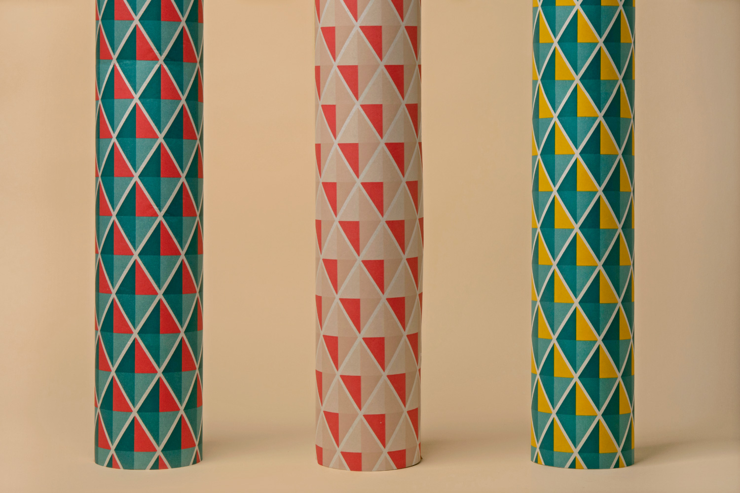
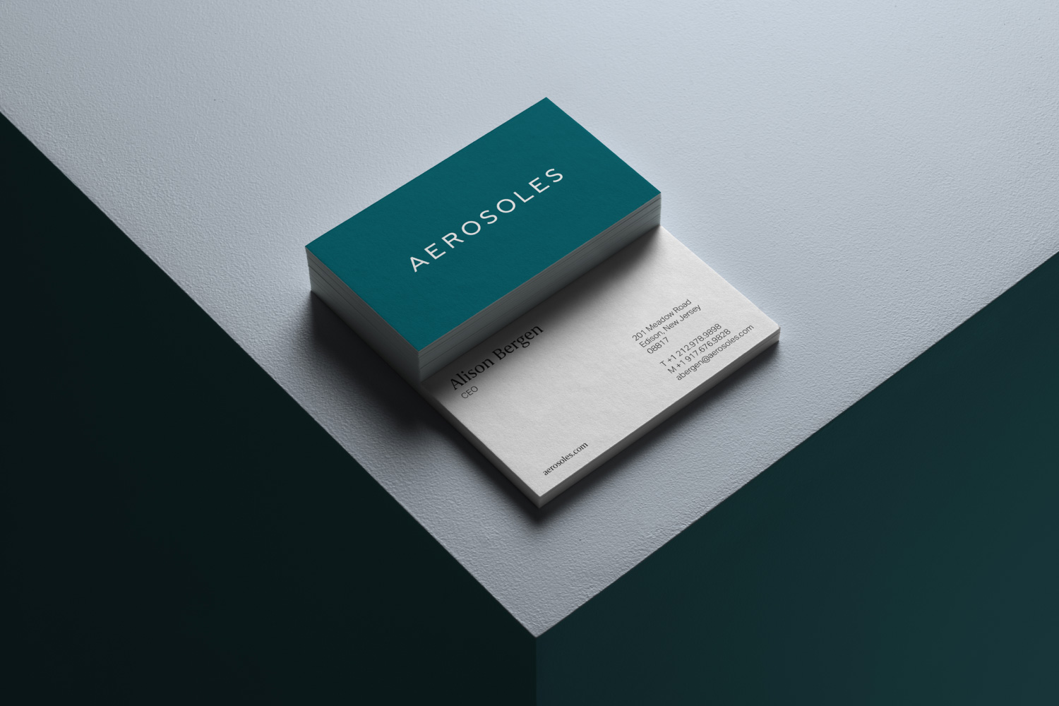
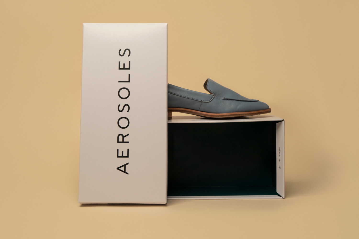
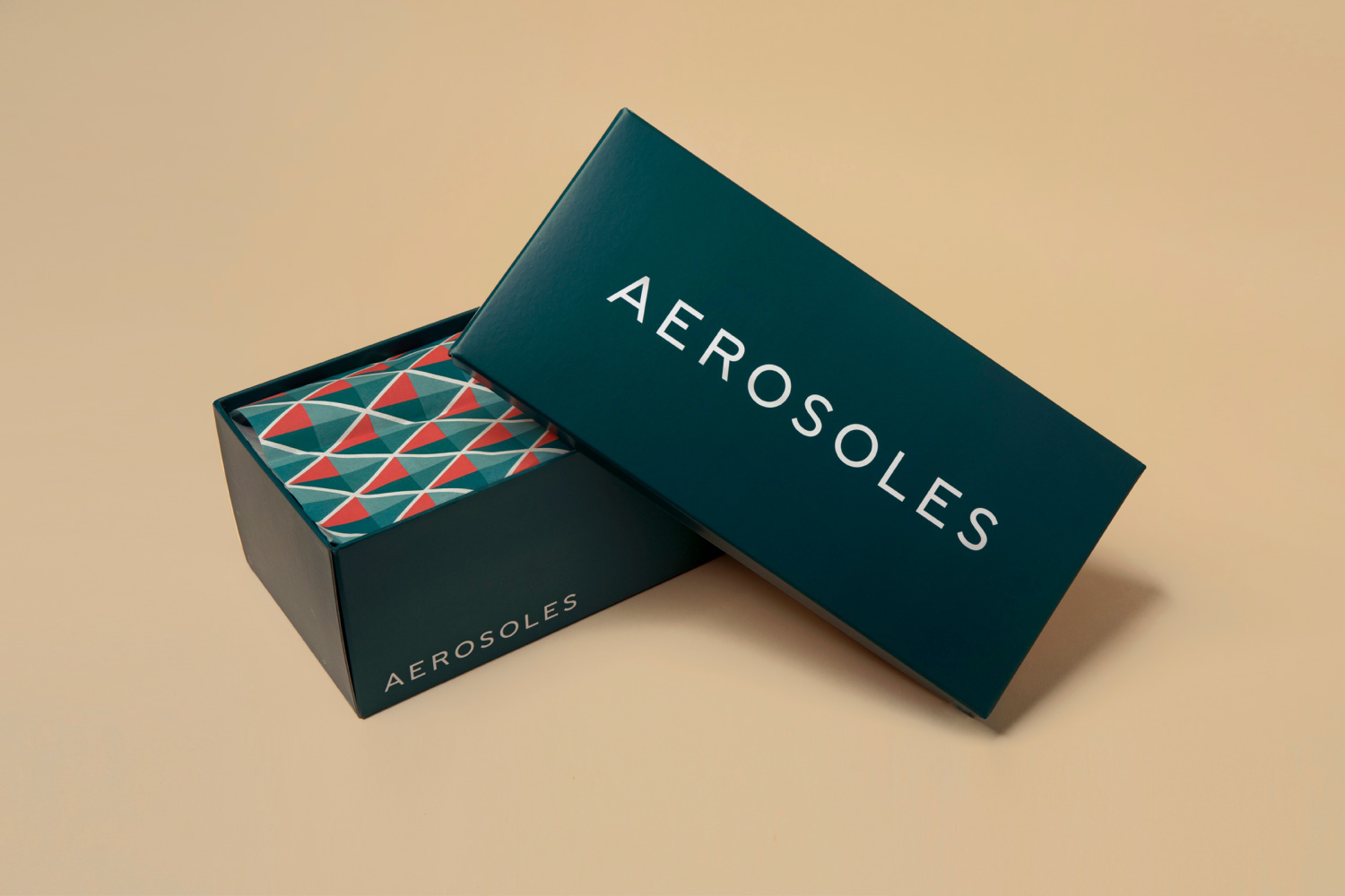
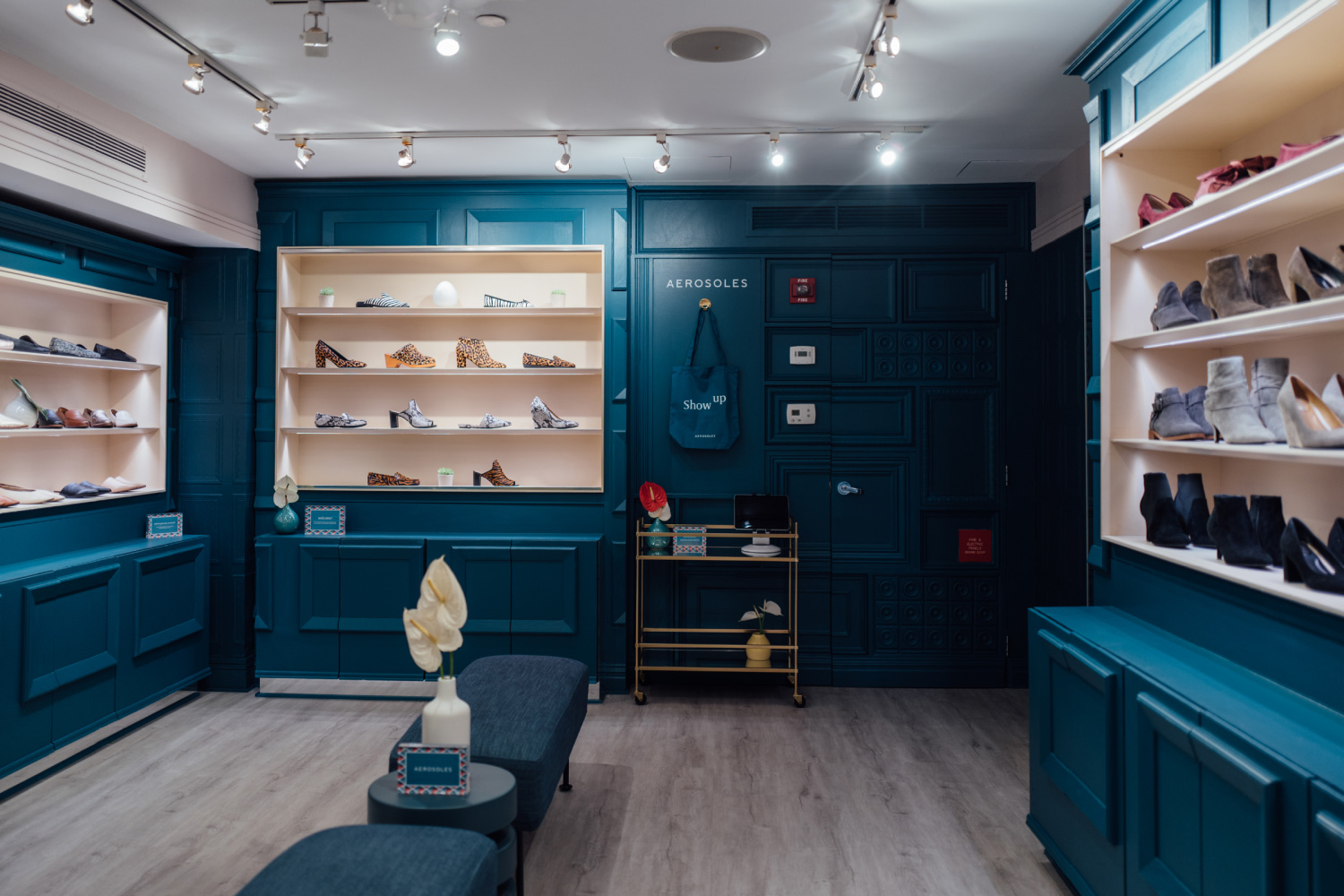
In addition to overall brand strategy and editorial direction, YummyColours created Aerosoles’ new visual identity. Tone of voice, logotype, colorways, and more help to support “Show Up” as a contemporary call-to-action that engages with young and diverse audiences without alienating existing ones. The project ultimately modernized the Aerosoles brand with an inclusive and inspiring angle, focused on real people, real stories and real engagement.
Images (opinion after)

Opinion
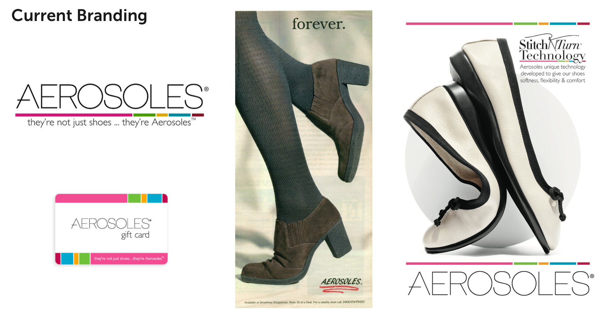
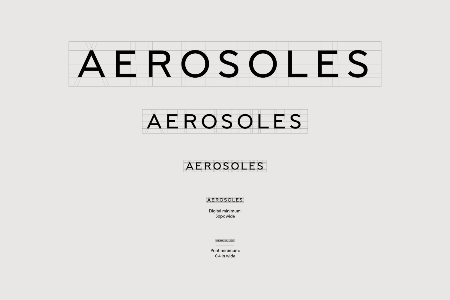
The old logo wasn’t necessarily great but it at least had a somewhat specific aesthetic with its extra light sans serif and open “A”. The colorful bar underneath was gratuitous and segmented at odd points but, eh, it was fine. The new logo looks like every other new logo in “elegant” sans serif, which is to say that it looks fine but is completely forgettable and indiscernible from the hordes of logos like it. The identity around the logo is a little more interesting, mostly thanks to the patterns which are quite nice and in a charming color palette that also works well in the packaging in flat colors. The “Show Up” tagline in serif is fine but feels like it’s part of the identity for something else — throw in the patterns and it’s almost like you have three separate things, all nice on their own, that never quite come together. Overall, though, there is an increased sense of sophistication, which the old logo and identity were definitely lacking.
In ấn Anpic In nhãn mác Anpic In brochure Anpic In card visit Anpic In catalogue Anpic In thiệp cưới Anpic In tờ rơi Anpic
In Ấn Anpic – Nổi Tiếng In Đẹp In Nhanh
Số 5 Ngõ 75 Nguyễn Xiển, Thanh Xuân, Hạ Đình, Hà Nội
0963223884
baogiainananh@gmail.com
https://anpic.vn
https://g.page/inananpic
In nhãn mác Anpic ✅ In brochure Anpic ✅ In card visit Anpic ✅ In catalogue Anpic ✅ In thiệp cưới Anpic ✅ In tờ rơi Anpic
https://anpic.vn/in-nhan-mac-dep
https://anpic.vn/in-brochure
https://anpic.vn/in-an
https://anpic.vn/in-voucher-in-phieu-giam-gia-khuyen-mai
#inananpic
Comments
Post a Comment