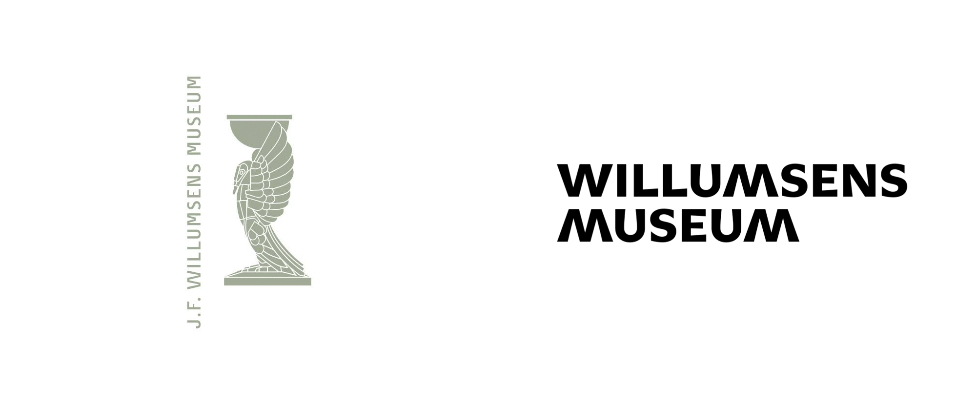
Noted: New Logo and Identity for Willumsens Museum by IDna Group
“Mirror Mirror on the Museum Wall”

(Est. 1973) "Willumsens Museum is a single artist museum created for the visual artist Jens Ferdinand Willumsen. JF Willumsen was a painter, sculptor, graphic artist, photographer, ceramicist and architect, and in all these areas he created significant works. The collection includes a wide spectrum of JF Willumsen's paintings, drawings, graphics, ceramics, sculpture, photographs and architecture. Thus, through a review in the museum, it is possible to follow the development of a single artist and to gain an insight into the many artistic issues he worked with. In addition, the museum displays a smaller selection of works from Willumsen's private art collection Old Collection."
Design by
IDna Group (Copenhagen, Denmark)
Related links
IDna Group project page
Relevant quote
One of the solutions that the museum suggested was to change the approach from primarily being about Willumsen’s own works, to allowing other artists to exist and interact side-by-side with Willumsen – presented in his spirit. In other words, all works, and all exhibitions, will now always be presented as a reflection of Willumsen’s thinking, approach and spirit.
This new approach to Willumsen’s works inspired us to create the underlying concept in the new visual identity; A reflection. The reflection is a metaphor of what role the museum has now, being introducing the spirit of Willumsen – not only to the visitors at the museum in Frederikssund, but also for the world. This reflection, or mirroring, is now seen in the logo, where the W for Willumsen Is shown in reflection as a M for Museum. This reflection is also used in the new imagery, for instance where Willumsen’s portrait or his art is “morphed” together with other artists’ works to make Willumsen present at all times.
The primary colours of the identity are black and white. However, in order to make J. F. Willumsen visibly present at all times at the museum, the secondary colours in the visual identity derive from his own works. We have carefully selected a number of his most important works and have extracted colours from there. Colours that can only be used in the same compositions as in these works, creating a wild and vivid palette for further communication.
Images (opinion after)


Opinion
The old logo featured a rendition of the Willumsen-designed sculptures that sit outside the museum, which are cool as sculptures but didn’t make for the best or most useful logo and the long name of the museum, in a single line, didn’t help. The new logo uses a great flared serif typeface with a lot of personality and the stacked layout allows for an effective mirroring of the “M” and “W” and I like that they chose to make the “M” like the “W” instead of the other way around where the legs/arms of each letter would have been straight. The logo works nicely in the full name or as a “WM” monogram that can then be split in the layouts to serve as framing elements. The posters and other layouts feel like they are missing one round of refinement and tightening as things feel like they are floating between the logo elements and the secondary typography, in Proto Grotesk, doesn’t quite gel with the logo. Nonetheless, the W / M structure works very well in establishing a solid system to build on.
In ấn Anpic In nhãn mác Anpic In brochure Anpic In card visit Anpic In catalogue Anpic In thiệp cưới Anpic In tờ rơi Anpic
In Ấn Anpic – Nổi Tiếng In Đẹp In Nhanh
Số 5 Ngõ 75 Nguyễn Xiển, Thanh Xuân, Hạ Đình, Hà Nội
0963223884
baogiainananh@gmail.com
https://anpic.vn
https://g.page/inananpic
In nhãn mác Anpic ✅ In brochure Anpic ✅ In card visit Anpic ✅ In catalogue Anpic ✅ In thiệp cưới Anpic ✅ In tờ rơi Anpic
https://anpic.vn/in-nhan-mac-dep
https://anpic.vn/in-brochure
https://anpic.vn/in-an
https://anpic.vn/in-voucher-in-phieu-giam-gia-khuyen-mai
#inananpic
Comments
Post a Comment