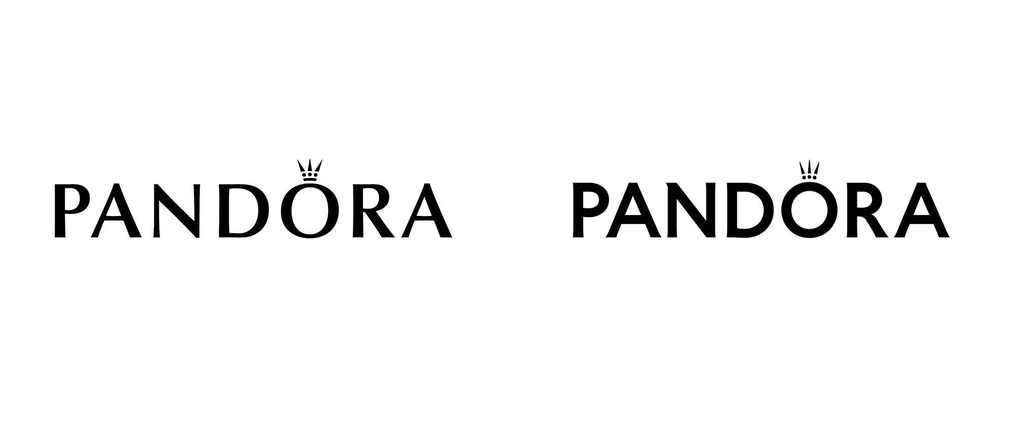
Noted: New Logo for Pandora
“Non-crowning Achievement”

(Est. 1982) "Pandora designs, manufactures and markets hand-finished and contemporary jewelry made from high-quality materials at affordable prices. Pandora jewelry is sold in more than 100 countries on six continents through more than 7,500 points of sale, including more than 2,700 concept stores. Founded in 1982 and headquartered in Copenhagen, Denmark, Pandora employs more than 26,000 people worldwide of whom more than 11,500 are located in Thailand, where the Company manufactures its jewelry. Pandora is publicly listed on the Nasdaq Copenhagen stock exchange in Denmark. In 2018, Pandora's total revenue was DKK 22.8 billion (approximately EUR 3.1 billion)."
Design by
N/A
Related links
Pandora press release
Relevant quote
Pandora introduced a new company purpose, “We give a voice to people’s loves – Passions, People & Places”, and an updated logo and monogram. The new visual identity will appear across all Pandora channels, as well as advertising campaigns together with Pandora’s updated nomenclature in a fresh, modern tone. The company has also adopted the colour pink as its new main marker and recognisable statement across all consumer touchpoints.
Images (opinion after)


Opinion
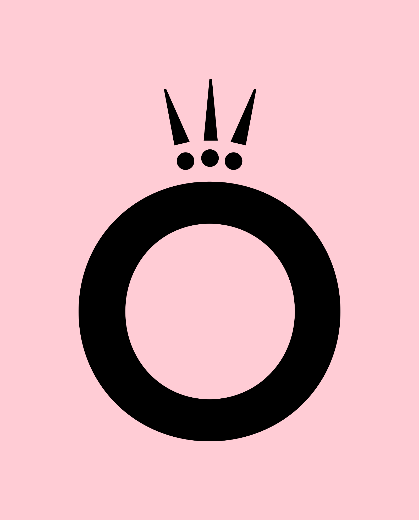
I wonder if this is one of the last large luxury good logos to abandon Optima in favor of a sans serif? The old logo was fine and with a few tweaks to the crown’s spacing I think it could have stayed as is for a long time. The new logo switches to a 99% sans serif with barely-there flared serifs that makes you wonder why did they even bother as they are almost impercetible, even at large sizes. There is also one serif that wants to be a hero, sticking out from the left of the “N”. I like flared serifs and I think the new logo could have been rather nice with more pronounced ones, given that the “P” and “R” have an interesting contour going. The crown evolution is not good as the bottom line it used to have really helped shape it as crown and now, along with its smaller size in relation to the letters, looks like a strange dingbat. When the “O” and crown are used on their own as the social media avatar or as big elements in the brand launch event, it starts to be interesting but the new crown feels small and flimsy and the “O” takes on too much prominence. The move to pink seems to be working in the brand launch events, creating fun, momentary bursts of pinkness. Overall, this is fine in terms of evolving the identity but the logo could have used a lot more love.
In ấn Anpic In nhãn mác Anpic In brochure Anpic In card visit Anpic In catalogue Anpic In thiệp cưới Anpic In tờ rơi Anpic
In Ấn Anpic – Nổi Tiếng In Đẹp In Nhanh
Số 5 Ngõ 75 Nguyễn Xiển, Thanh Xuân, Hạ Đình, Hà Nội
0963223884
baogiainananh@gmail.com
https://anpic.vn
https://g.page/inananpic
In nhãn mác Anpic ✅ In brochure Anpic ✅ In card visit Anpic ✅ In catalogue Anpic ✅ In thiệp cưới Anpic ✅ In tờ rơi Anpic
https://anpic.vn/in-nhan-mac-dep
https://anpic.vn/in-brochure
https://anpic.vn/in-an
https://anpic.vn/in-voucher-in-phieu-giam-gia-khuyen-mai
#inananpic
Comments
Post a Comment