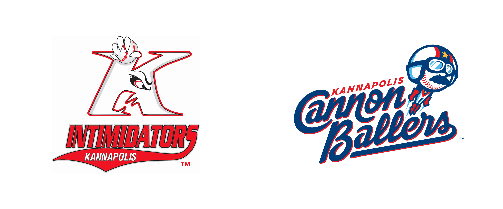
Noted: New Name and Logos for Kannapolis Cannon Ballers by Studio Simon
“This is Baller”

(Est. 1995) "The Kannapolis Cannon Ballers are a Minor League Baseball team of the South Atlantic League and the Class A affiliate of the Chicago White Sox. They are located in Kannapolis, North Carolina and beginning in 2020, will play their home games at New Kannapolis Ballpark. The team was established in 1995 as the Piedmont Phillies. From 1996 to 2000, they were known as the Piedmont Boll Weevils. From 2001 to 2019, they were known as the Kannapolis Intimidators, after NASCAR driver Dale Earnhardt, who was known as the "The Intimidator", purchased a share of the team before the 2001 season." (Wikipedia)
Design by
Studio Simon (Louisville, KY)
Related links
MILB press release
Relevant quote
“Cannon Ballers” represents both the history of Kannapolis and the carnival-like atmosphere the team plans to provide at its new ballpark, while the logo set offers subtle nods to Earnhardt and his outsized legacy. First and foremost, the moniker references the industrial age entrepreneurship that, quite literally, put Kannapolis on the map. The small North Carolina city, located approximately 25 miles northeast of Charlotte, is inextricably linked with James William Cannon and the textile company he founded, the Cannon Mills Company. (The city's name is a derivation of earlier, unofficial variants such as “Cannon-opolis.”) The Cannon Mills Company was founded in 1888 and ceased operations in 2003. At its peak, it was the world's largest textile producer.
“The Cannon family founded Kannapolis, so having a Cannon connection in our name is huge,”said Cannon Ballers general manager Matt Millward. “Cannons was the No. 1 suggestion we received [from the fans]. We really liked the name, but you can't do much with it. So we took it to the next level.”
The No. 3 is subtly embedded within the CB, a nod to Earnhardt's car number. The legendary NASCAR driver is also referenced, however obliquely, via the titular Cannon Ballers' jumpsuit and bushy mustache, key aspects of the primary logo. Simon said the Cannon Baller, like Earnhardt and all NASCAR racers, “lays it on the line every time he goes out there.”
Images (opinion after)


Opinion
The old logo was the manifestation of Pennywise in Minor League logo form. Who the hell thought that logo was a good idea? Such a crazy, wacky, thing. The new logo, on the other hand, is all kinds of awesome and good, clean graphic design fun. The baseball man thing mascot flying through the air after being shot out of a cannon is so delightful and cheerful with an immaculate mustache honoring the legacy of NASCAR driver Dale “The Intimidator” Earnhardt. The aviator glasses kill me too. So good. The script wordmark is not exactly my cup of tea but I like it and it’s really nicely done so that there are no empty spaces with the “C” nestling the first word, the “n” dipping into the second line to fill the space between the “B” and “l”s, and a good old-fashion Dodgers-style swash to bring it all together. The “B” even has a hidden “3”, which was Earnhardt’s number. From top to bottom, this is just great and the real-life mascot is the cherry on top. Boom.
In ấn Anpic In nhãn mác Anpic In brochure Anpic In card visit Anpic In catalogue Anpic In thiệp cưới Anpic In tờ rơi Anpic
In Ấn Anpic – Nổi Tiếng In Đẹp In Nhanh
Số 5 Ngõ 75 Nguyễn Xiển, Thanh Xuân, Hạ Đình, Hà Nội
0963223884
baogiainananh@gmail.com
https://anpic.vn
https://g.page/inananpic
In nhãn mác Anpic ✅ In brochure Anpic ✅ In card visit Anpic ✅ In catalogue Anpic ✅ In thiệp cưới Anpic ✅ In tờ rơi Anpic
https://anpic.vn/in-nhan-mac-dep
https://anpic.vn/in-brochure
https://anpic.vn/in-an
https://anpic.vn/in-voucher-in-phieu-giam-gia-khuyen-mai
#inananpic
Comments
Post a Comment