Reviewed: New Logo and Identity for ACS International Schools by Johnson Banks
“A Brave New Globe”
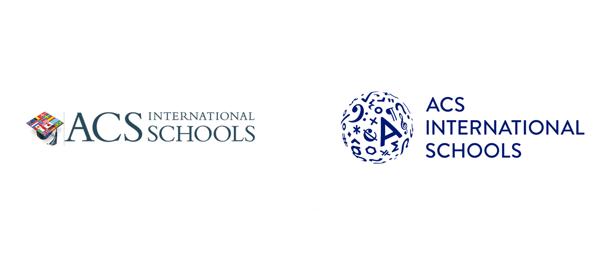
Established in 1967, ACS International Schools is a group of four non-sectarian and co-educational private schools -- three in Greater London and one in Doha, Qatar -- that serves over 3,700 students, aged 2 to 18, from more than 100 countries. Their U.S.-based curriculum covers the four International Baccalaureate programs as well as Advanced Placement (AP) courses and the new AP Capstone and International Diplomas. Notable alumni include actor Aaron Eckhart, fashion designer Misha Nonoo, and a number of football and rugby players. Recently, ACS introduced a new identity designed by London, UK-based Johnson Banks.
To help them appeal to [a] changing market, we were keen to show that they prepare a new and broader kind of citizen for the world, wherever in the world, whatever the language. This led to a core idea built around the concept of 'readiness'.
Ready to ask new questions and demand better answers. Ready to innovate and create. Ready for cultures that crossover, boundaries that blur, and ideas that interconnect. Ready for a world that demands a new kind of learning - and a new kind of citizen.
Johnson Banks project page

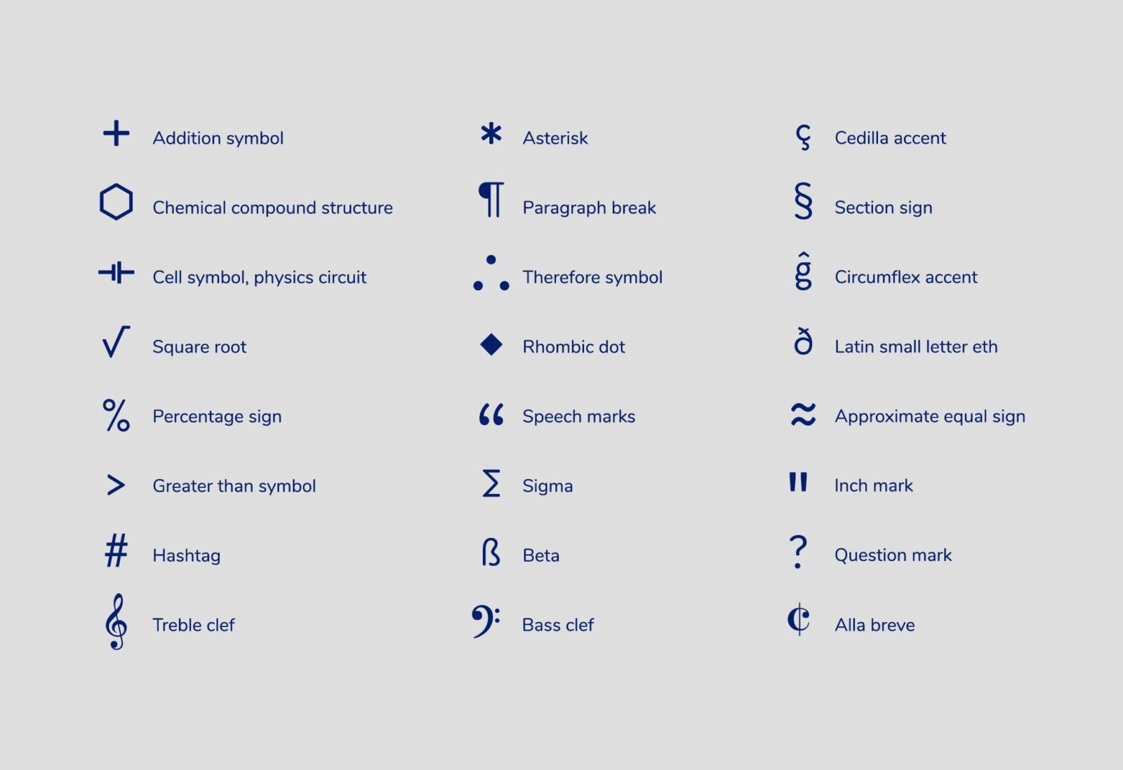
The new visual identity builds on this narrative by utilising 27 separate symbols that help communicate and connect student experiences and ideas. The new globe symbol is built from icons of language, music, art, science and sport - demonstrating worldliness and learning and representing the internationalism of their schools.
Johnson Banks project page
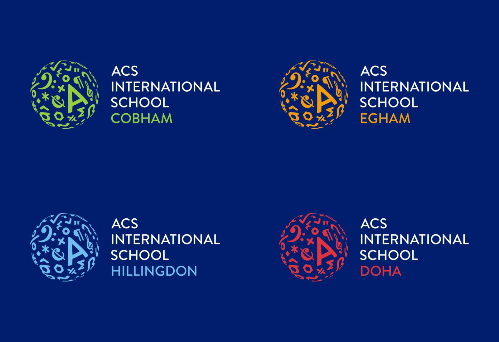
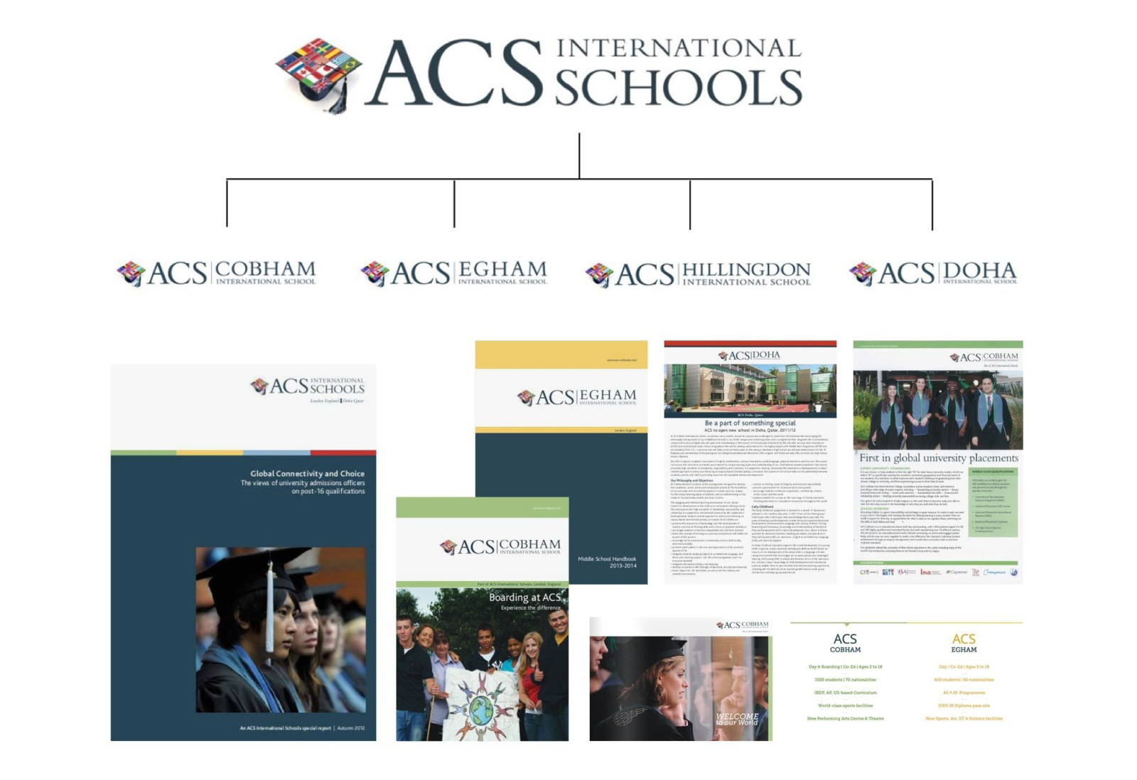
The old logo was very literal with a graduation cap adorned with different countries' flags and used a lot of different font sizes in its main logo as well as its school-specific logos. The typography was fine but the icon did not look very prestigious and even seemed like a scam school. The new logo goes to the opposite end of the spectrum with a more abstract idea by wrapping different symbols and glyphs around a globe and asking for more of an interpretation from the audience. The icon is very convincingly executed with the elements nicely warping as they near the edge of the globe and I particularly like that the globe is transparent so when placed on photography you can see through the icons. My only negative critique would be that the "A" is too large and I kept looking for the "C" and "S" of the organization's name, so perhaps that letter demands more attention than needed without an evident payoff. Nonetheless, I really like this. It's a shame that Wikipedia didn't hire Johnson Banks first because this would have been a wonderful evolution to their puzzle globe logo. The wordmark is fine and I like how all the words in it are the same size, creating a more fluid reading of the name than before.
The new design toolkit takes the new symbol, brand language and typographic style and combines them, in conjunction with a series of newly commissioned photographs by Fernando Manoso.
Johnson Banks project page

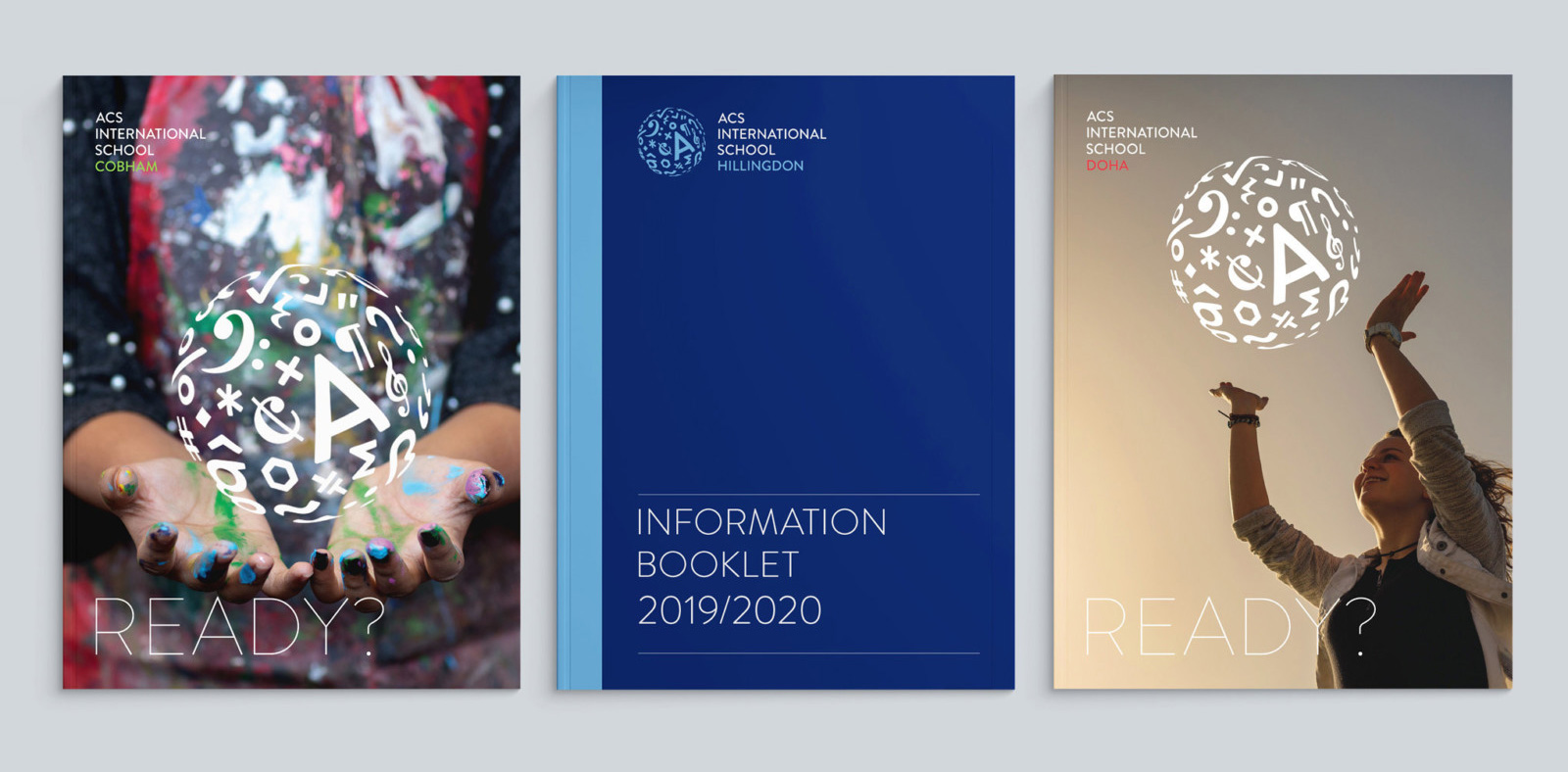
The identity is fairly straightforward but has some nice moments like the use of the globe to replace "O"s in different words, where it contrasts very nicely with the thin sans serif. It gets a little cheesy when the globe is made to interact with hands but I can understand how this is a very appealing image for the organization and the parents that see it. The color palette is mostly okay... there is something odd about it and it might be the light/bright hues that perhaps could have been more muted -- but that's just splitting hairs.
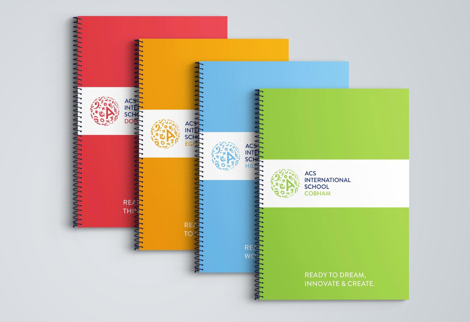
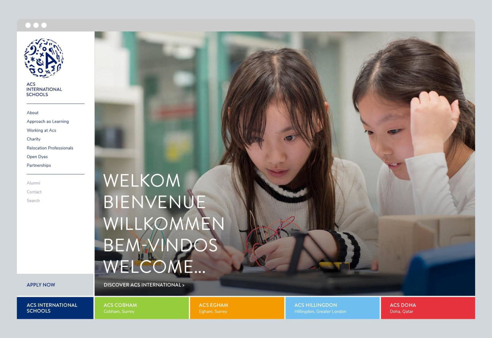

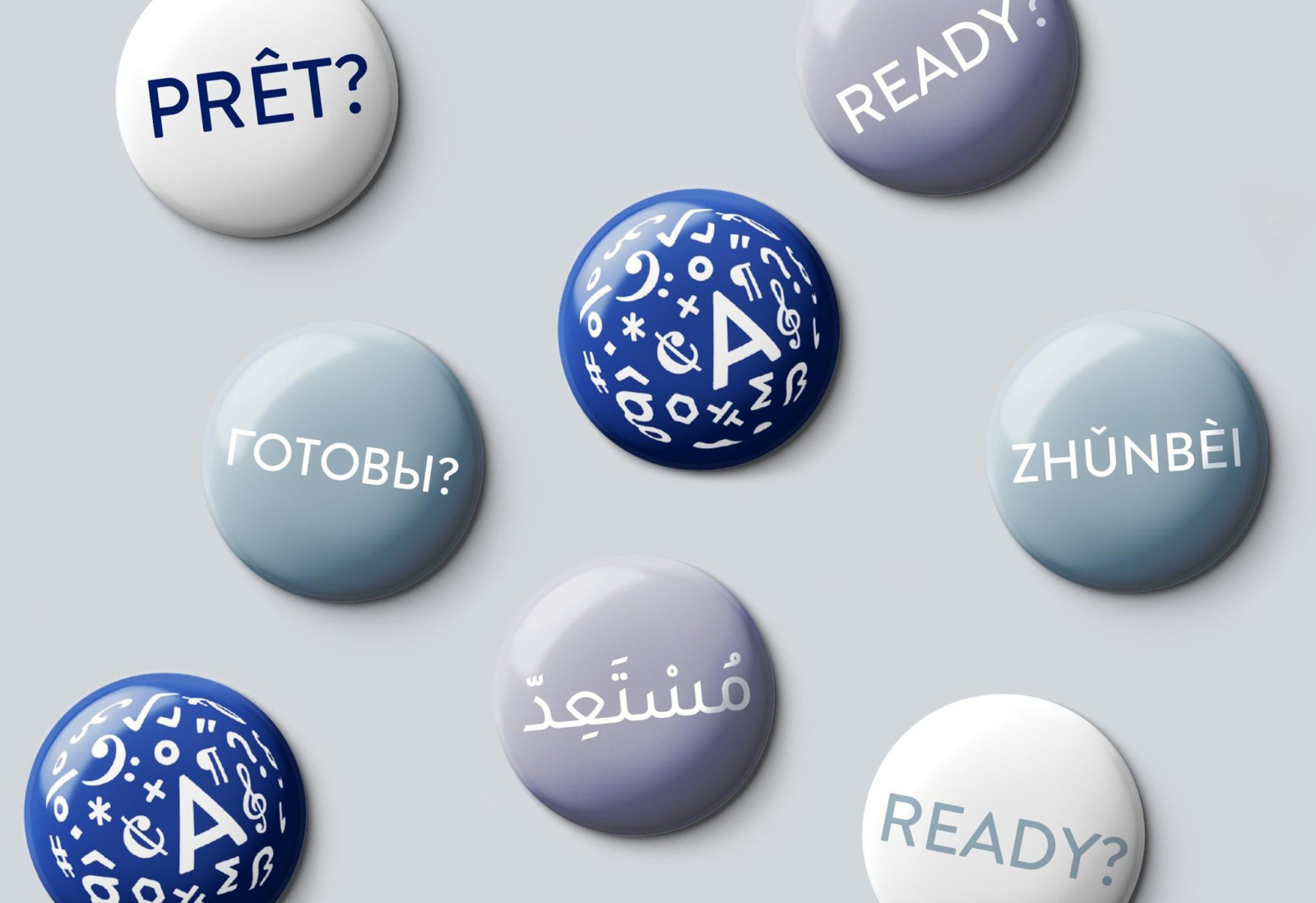
Overall, if I had the budget and (more importantly the) inclination to send my kids to a school like this, the identity alone would make it a top contender, whereas with the old logo I would have not even considered it -- yeah, I can be shallow like that when it comes to crappy logos -- so this is a clear, positive improvement for the schools.
In ấn Anpic In nhãn mác Anpic In brochure Anpic In card visit Anpic In catalogue Anpic In thiệp cưới Anpic In tờ rơi Anpic
In Ấn Anpic – Nổi Tiếng In Đẹp In Nhanh
Số 5 Ngõ 75 Nguyễn Xiển, Thanh Xuân, Hạ Đình, Hà Nội
0963223884
baogiainananh@gmail.com
https://anpic.vn
https://g.page/inananpic
In nhãn mác Anpic ✅ In brochure Anpic ✅ In card visit Anpic ✅ In catalogue Anpic ✅ In thiệp cưới Anpic ✅ In tờ rơi Anpic
https://anpic.vn/in-nhan-mac-dep
https://anpic.vn/in-brochure
https://anpic.vn/in-an
https://anpic.vn/in-voucher-in-phieu-giam-gia-khuyen-mai
#inananpic
Comments
Post a Comment