Reviewed: New Logo and Identity for Pet Plate by Sagmeister & Walsh and In-house
“Served on a Bluer Platter”
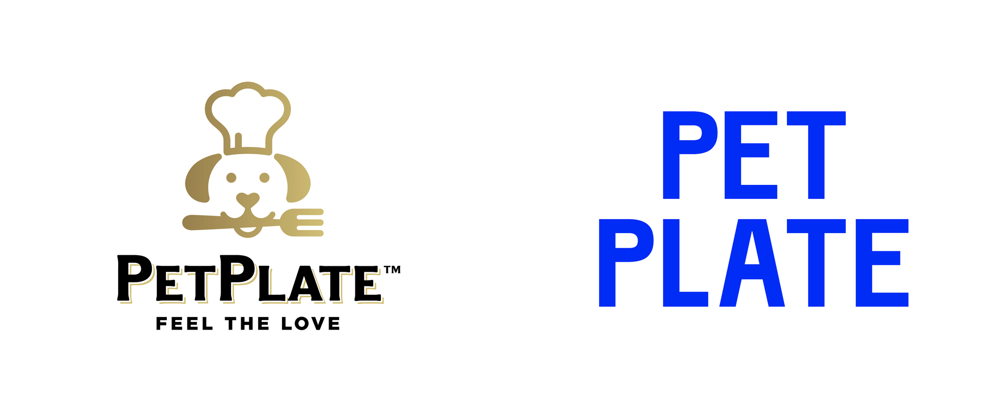
Established in 2016, New York, NY-based Pet Plate is an online, direct-to-consumer, healthy dog food subscription service. The food is made, tested, and delivered in the United States. Like a handful of modern history entrepreneurial success stories, Pet Plate founder Renaldo Webb appeared on Shark Tank in 2017 but received no deals. According to this update he went on to raise $4 million in seed money soon after followed by another undisclosed round -- how you like ’em apples with chicken liver now, Sharks? As its growth continues, Pet Plate introduced a new brand identity and packaging last year, designed by New York-based Sagmeister & Walsh (prior to the creation of &Walsh).
Side note: At this year's Brand New Conference we will hear from Ritesh Gupta who led the redesign as the Senior Director of Brand & UX at Pet Plate.
Contrary to the approach of many of our competitors, we wanted to create an identity that humanizes and celebrates dogs in a playful and approachable way and appeals to both humans and dogs.
We were inspired by how dog sees the world, blue and white porcelain plates, and by Winston (founder Renaldo's goofy dog).
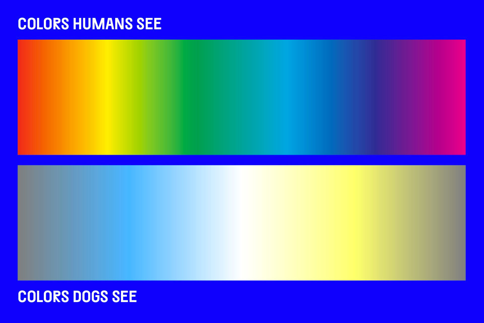
Humanizing and appealing to dogs manifested in using plates (not bowls), blue (one of the few colors dogs can see), and various applications below.
Nearly every asset shared below was created and utilized in the real world.
Ritesh Gupta provided text
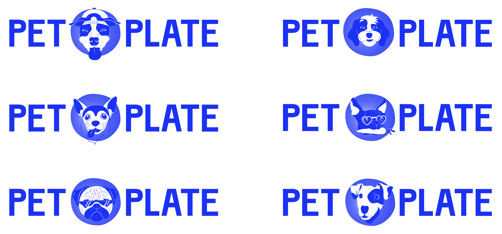
A customized Separat was utilized for the basis of the logo. Adjustments were made to ensure the stems of the Ps and the Ts aligned vertically.
Ritesh Gupta provided text

The old logo was pretty good with a charming and decently executed icon of a dog wearing a chef hat and holding a fork. A little too cute, but sure, it worked, and it had good typography to keep it company. If anything, perhaps it lacked excitement and maybe looked too conservative -- the latter being only evident in contrast to the direction they went in. The new logo avoids using a dog visual, which is probably smart given that there are so many different dogs that you don't want to have to pick just one to represent all dogs. Using Separat as a base, which is a super whack typeface, the new logo gets an instant contemporary vibe and edge from the relatively unconventional proportions of the letters and features great "P"s that look like tongues sticking out, which was my gut reaction before even seeing the animation above. Luckily, the name of the company doesn't have any "B"s or "R"s because there is nothing worse in the typographic universe than Separat's "B" and "R" -- which were smartly updated in the final customized version of the full typeface. The choice of "that blue" can perhaps be accepted by the rationalization that blue is one of the colors dogs can see but as the chart at the top shows, they certainly can't see "that blue" and they are probably better off for it. In combination with the typography and the funky illustrations, the blue can be overpowering at times but it certainly doesn't lack impact and a point of distinction for Pet Plate among other dog food services.
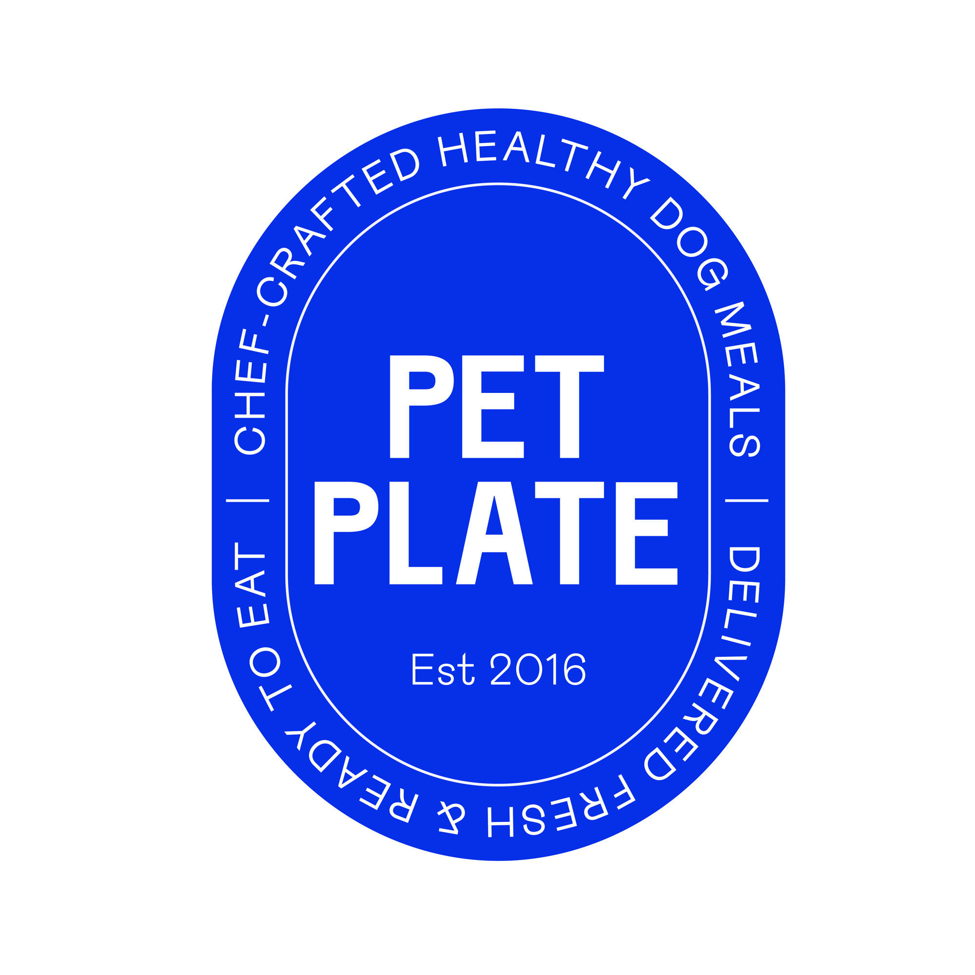
One of Pet Plate's main objectives was showing that they serve human-quality dog food. With this in mind, we took inspiration from the traditional blue and white style decorative plates that have roots in cultures all over the world. We balanced the fine line illustrations with bold, funky typefaces and humorous copywriting to establish a playful tone of voice.
&Walsh project page
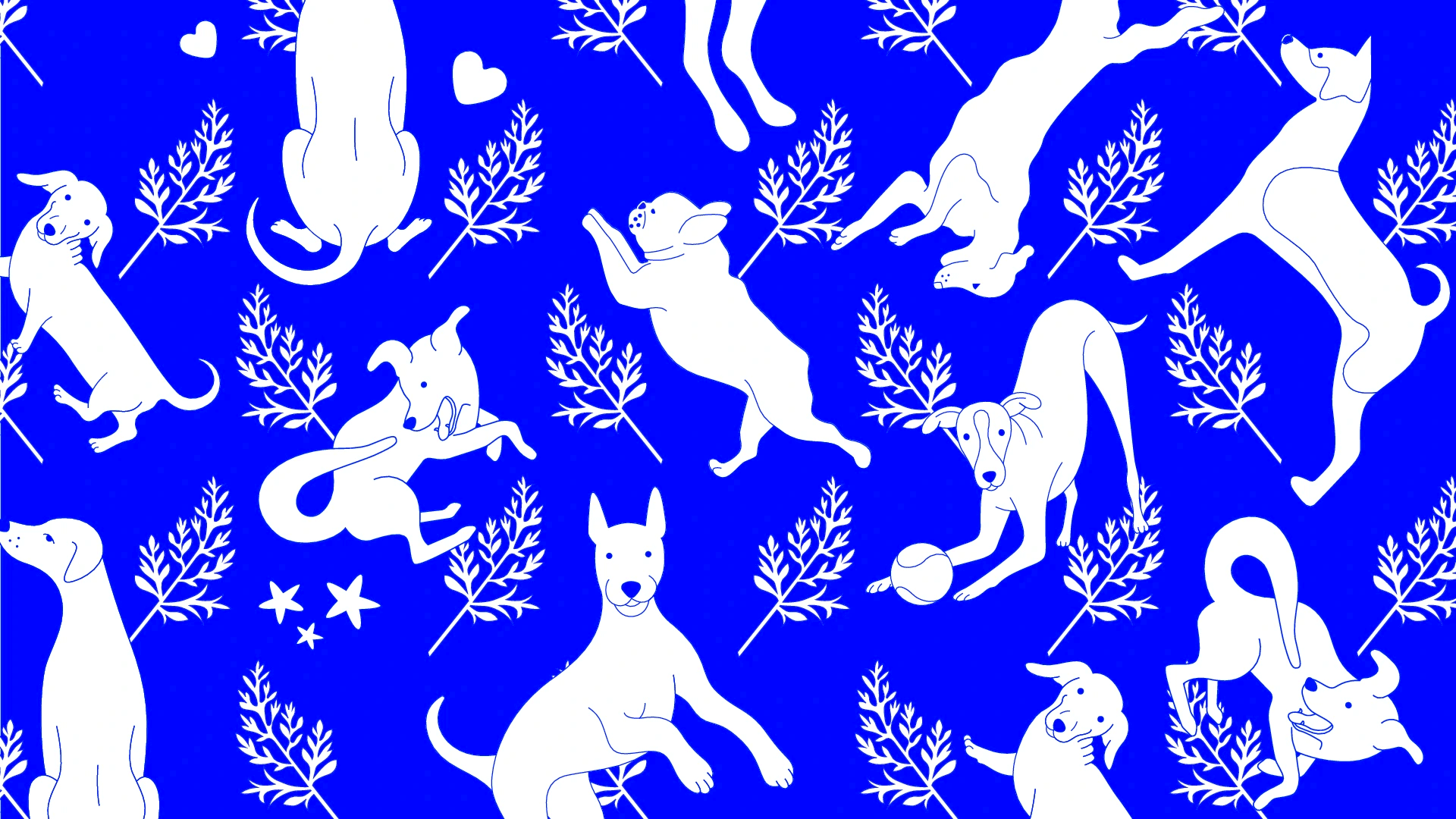
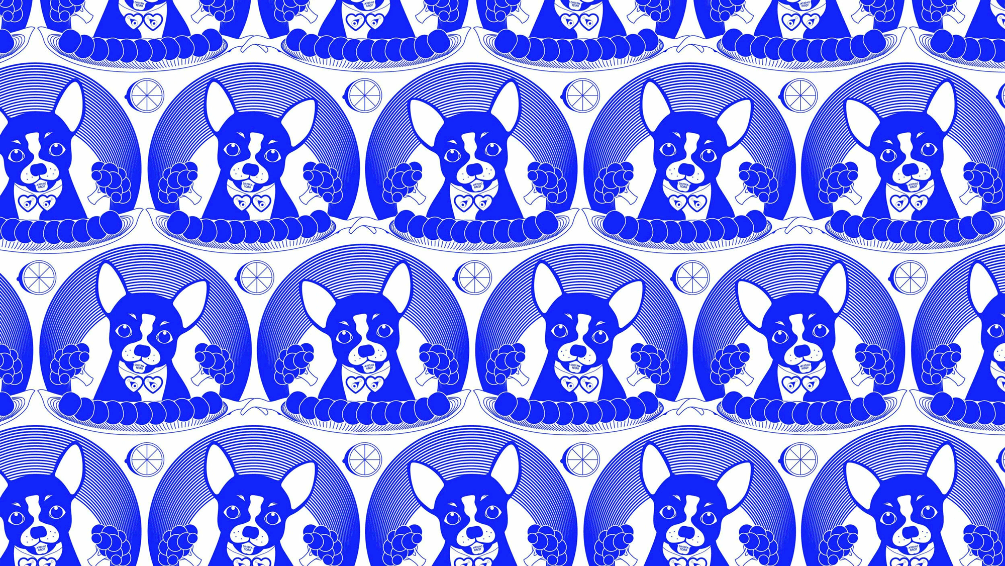
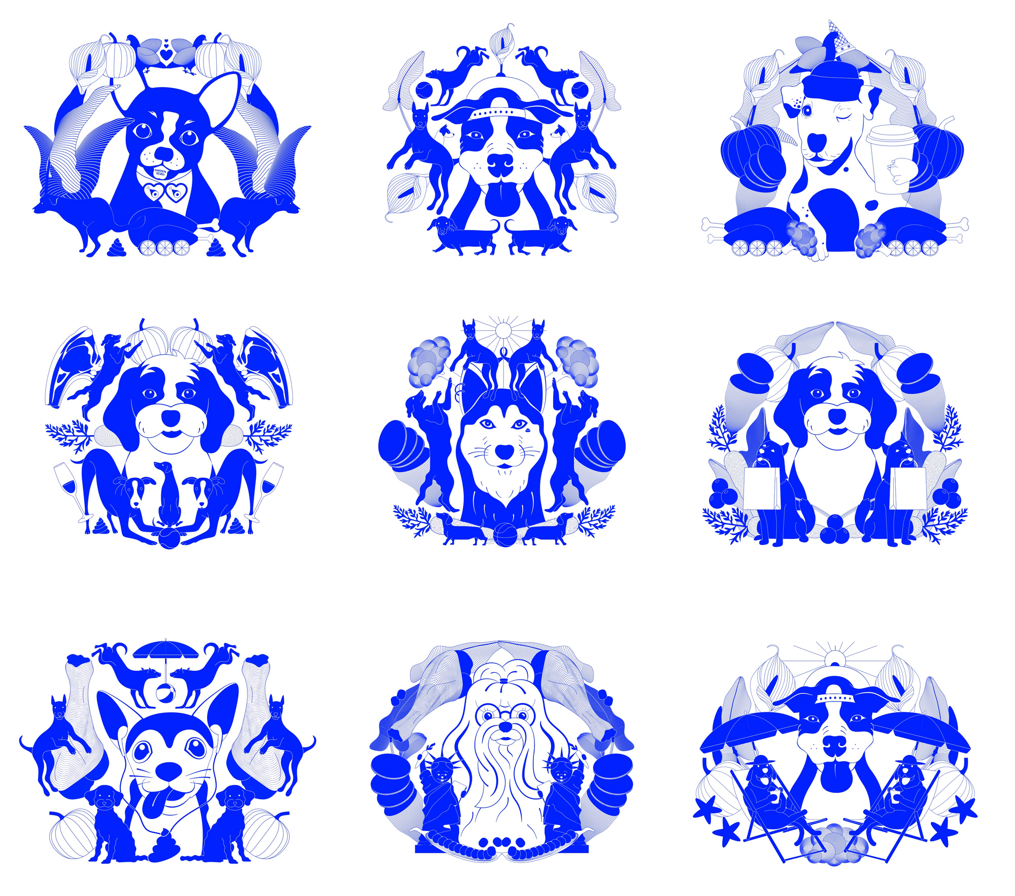
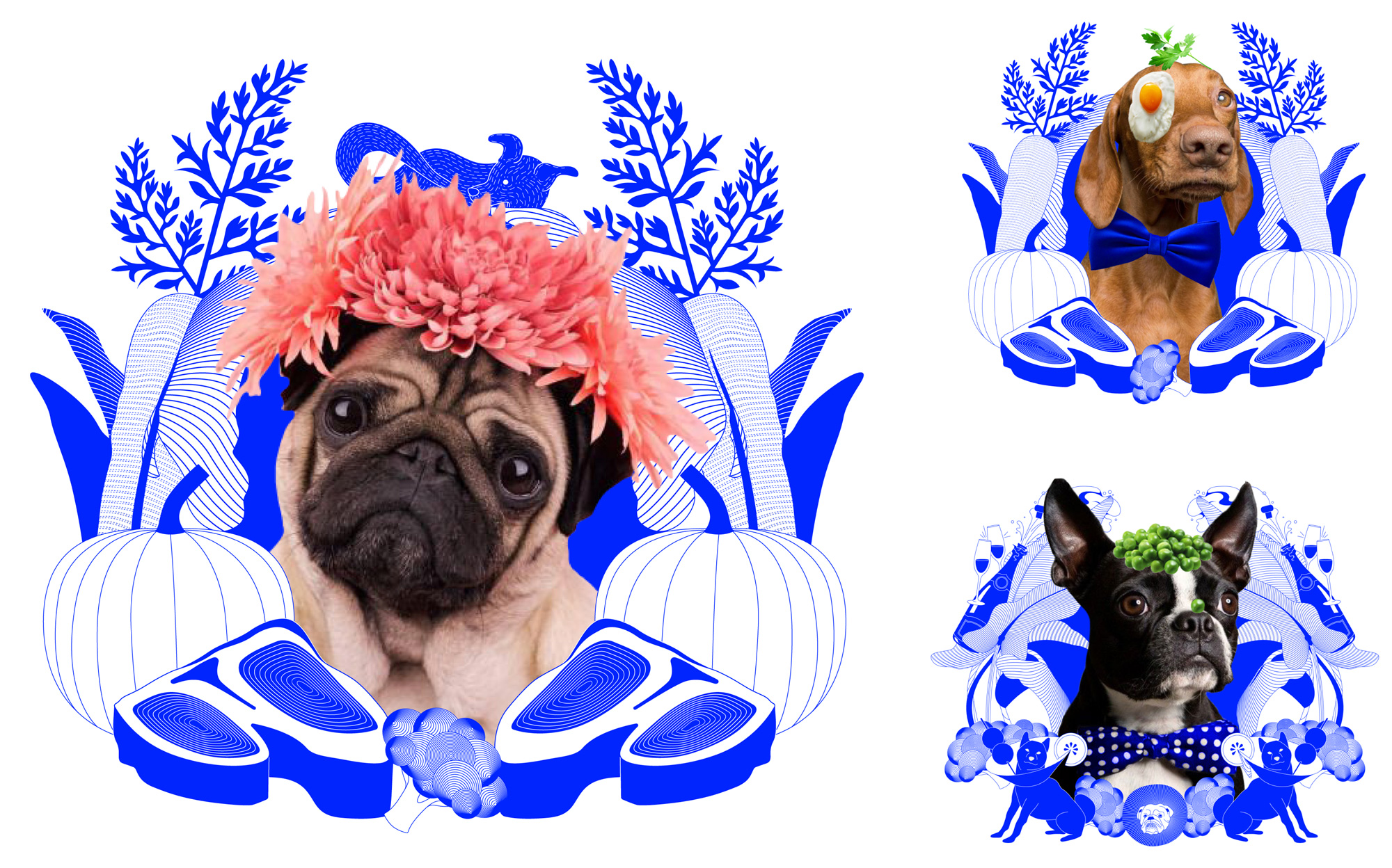
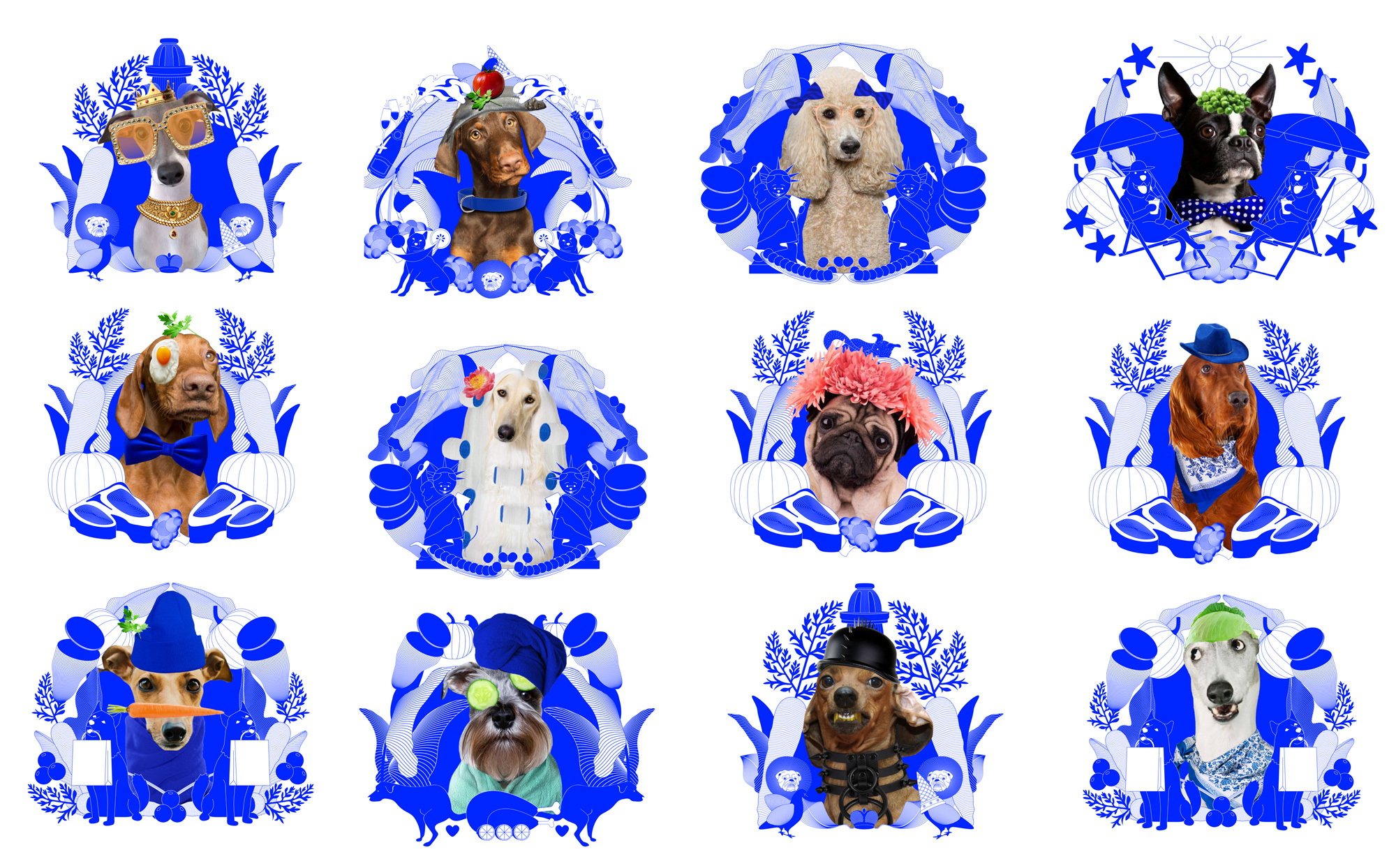
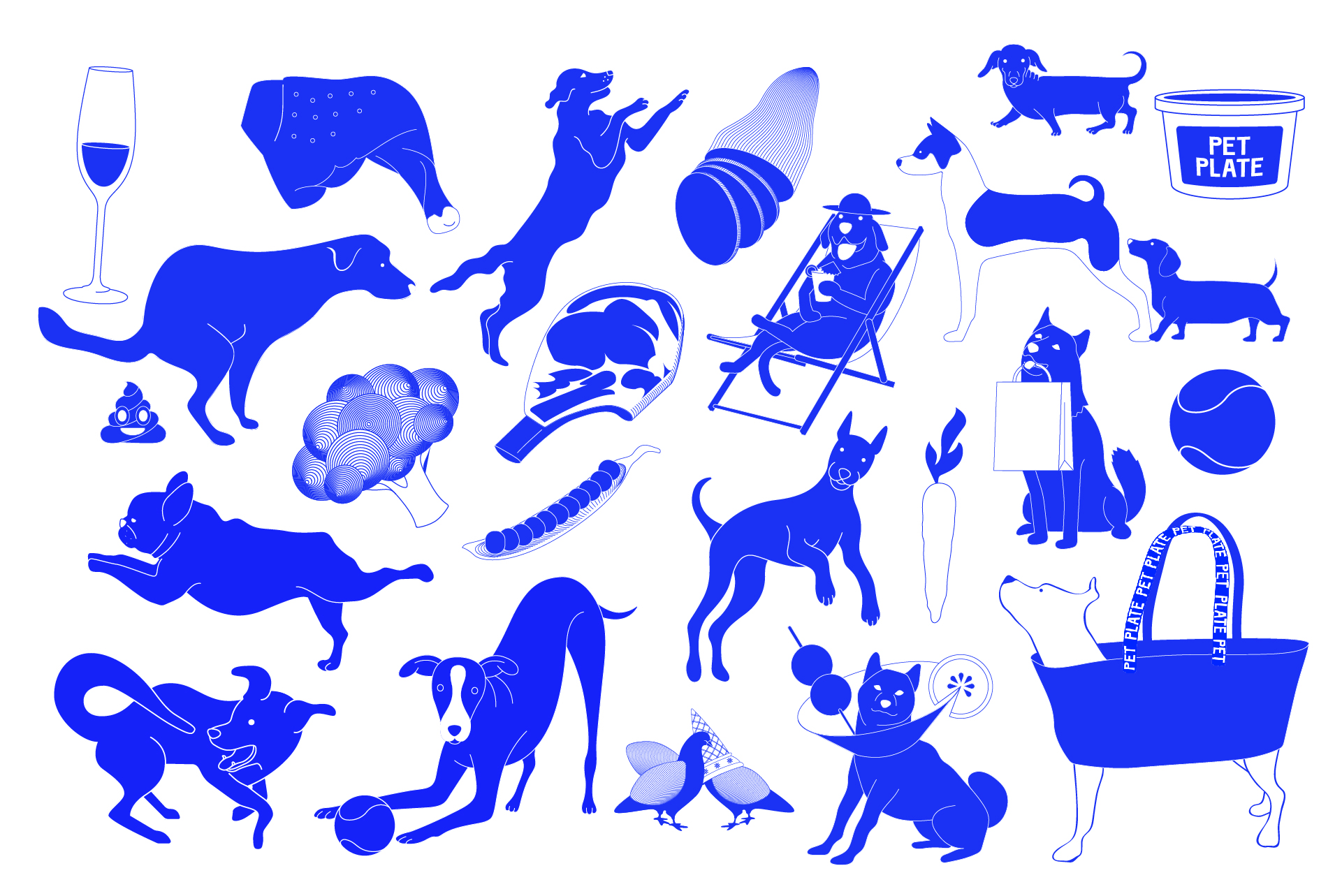
If the logo and electric blue weren't enough to set Pet Plate apart, things get wilder with the range of illustrations that are a kind of stream of dog consciousness from the minds of the (Sagmeister) & Walsh team, with dogs wearing hats, drinking wine, lounging on beach chairs, and flanked by things like seashells, statues of liberty, poop, and all kinds of vegetables. All in that blue. I don't like-them-like-them but they are highly enjoyable in an unhinged kind of way. When photos replace the illustrated dog faces it gets even more ludicrous and it's pretty amazing that Pet Plate went with something so out there.
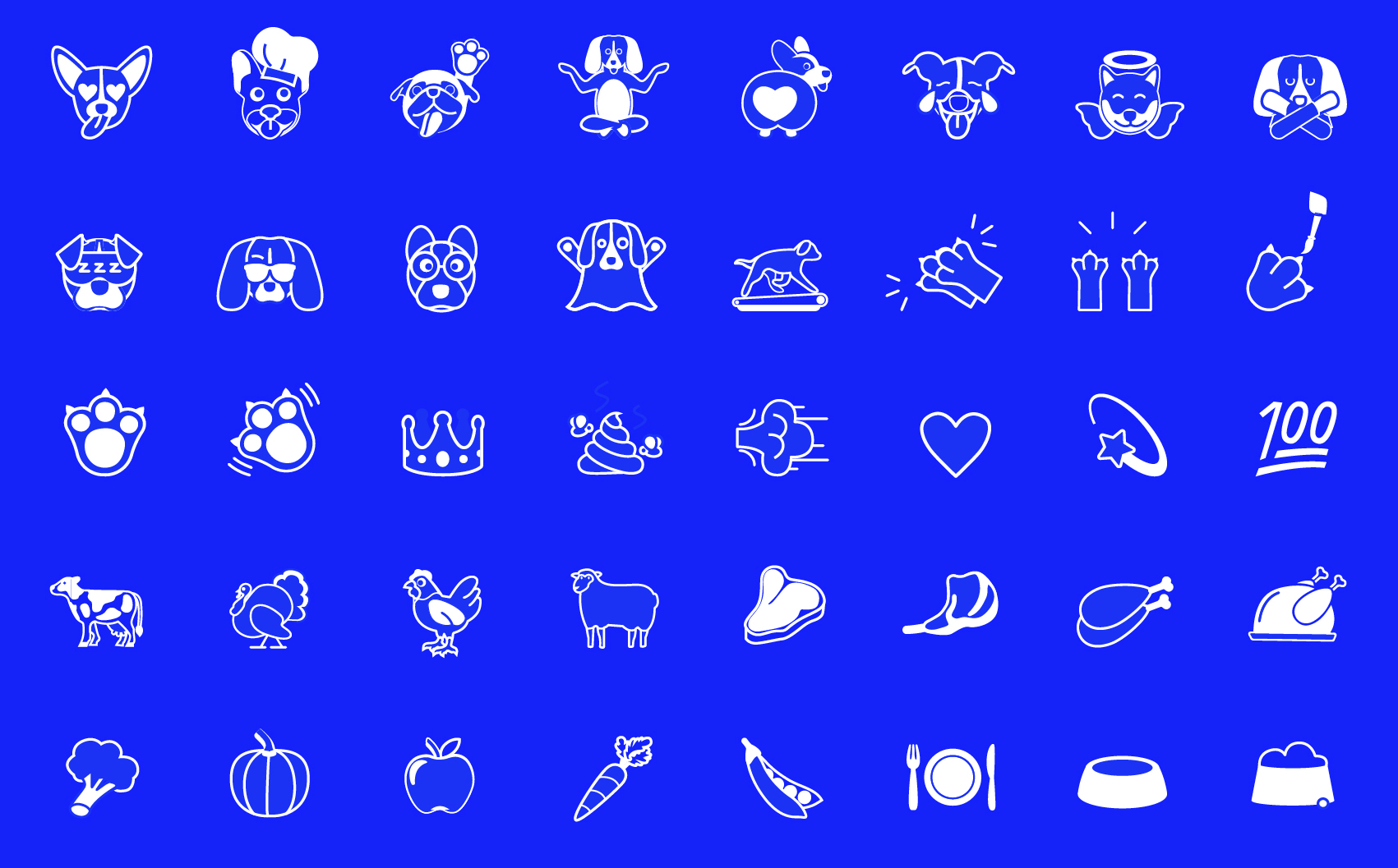
We also created a custom dog emoji set for Pet Plate because
1. Dogs absolutely deserve an entire custom emoji set.
2. They are actually quite useful for our client on social media and in newsletters for communicating in a warm, friendly way.
&Walsh project page
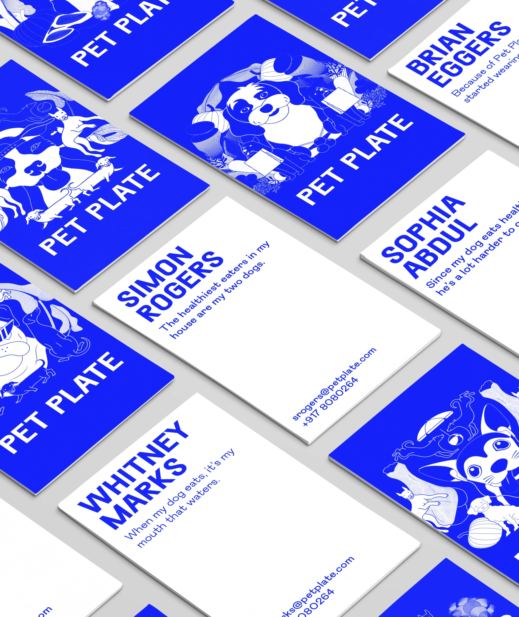
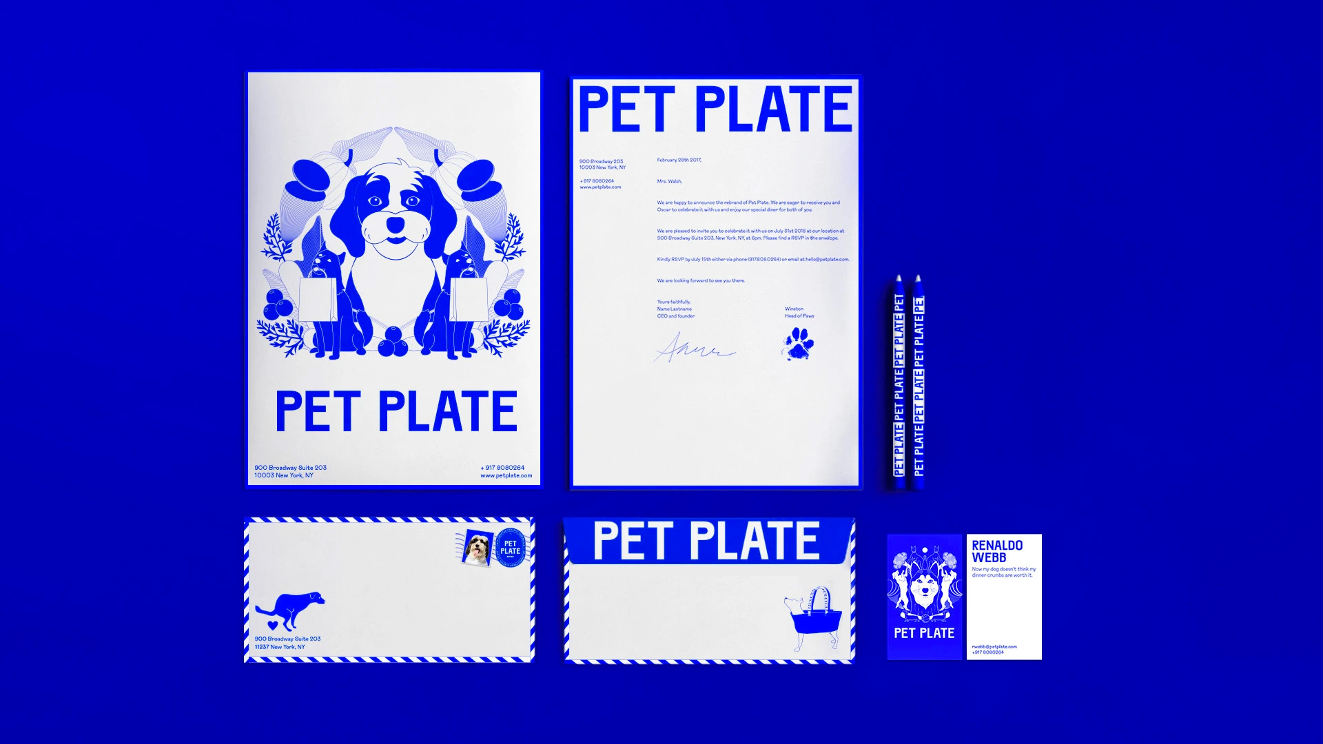
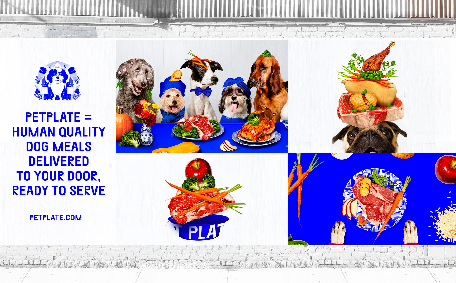
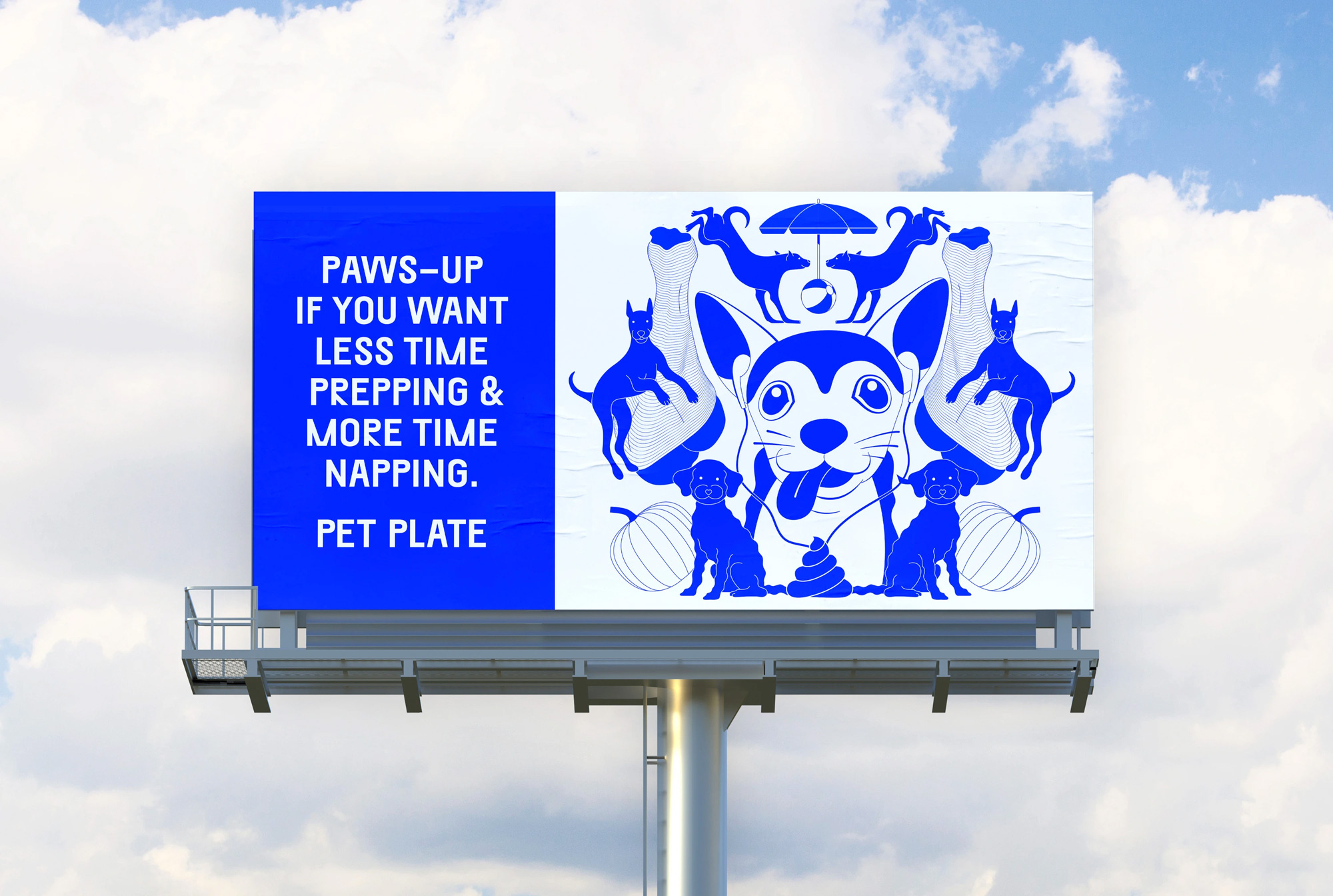
In application, the explosion of illustrations and blue continues and by this point you are either loving or hating it -- I am somewhere in the middle but deeply amused. When color photography is introduced, as in the billboard above, the blue becomes more interesting as an accent color that ties imagery together and I wonder if some of the other applications would have benefitted from secondary colors to soften the blue-ness.
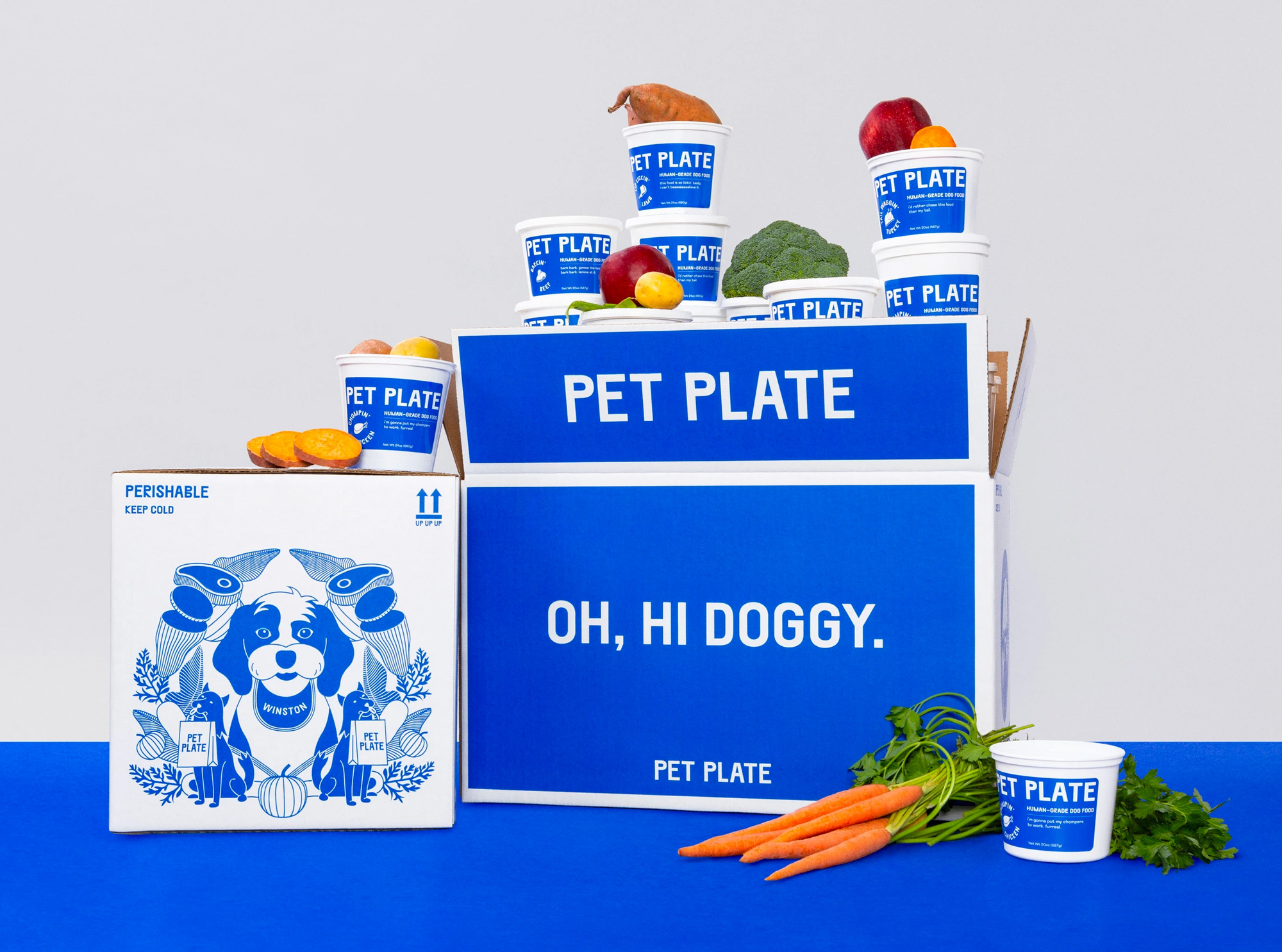
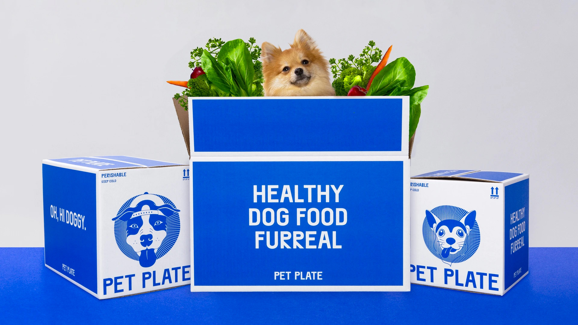
The packaging looks great and very much out of the ordinary. With this service being primarily in New York, the impact of these boxes waiting outside someone's apartment is a great, consistent advertisement. There is also something refreshingly unpretentious about the white tubs with the blue labels... like, it's not trying to turn the food into something you would find at Whole Foods with a super healthy vibe but is instead very matter-of-fact and makes it feel less "precious".
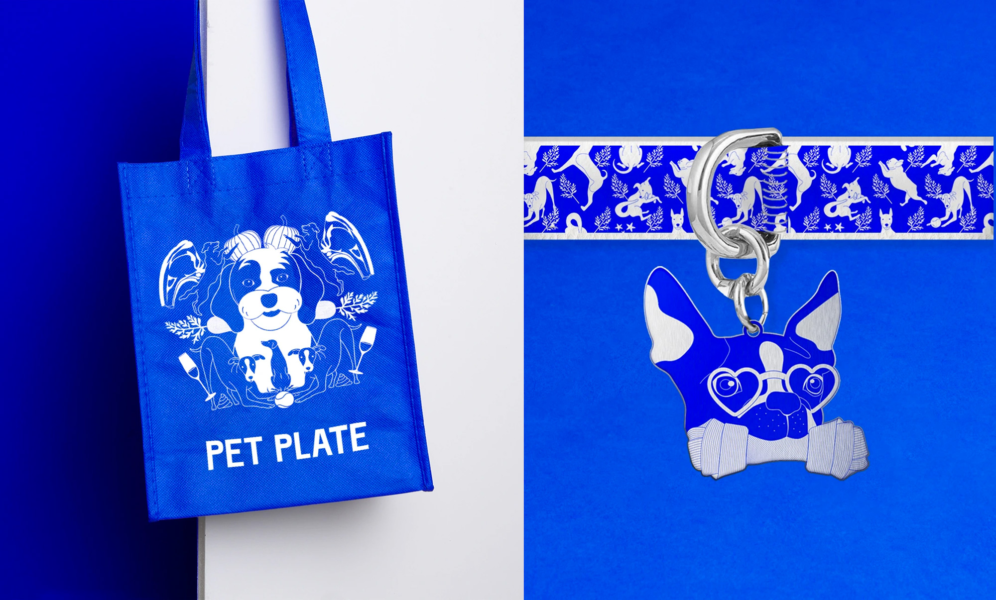
In collaboration with various parties, we created a range of photography of dogs doing human things, packaging, and swag.
Ritesh Gupta provided text
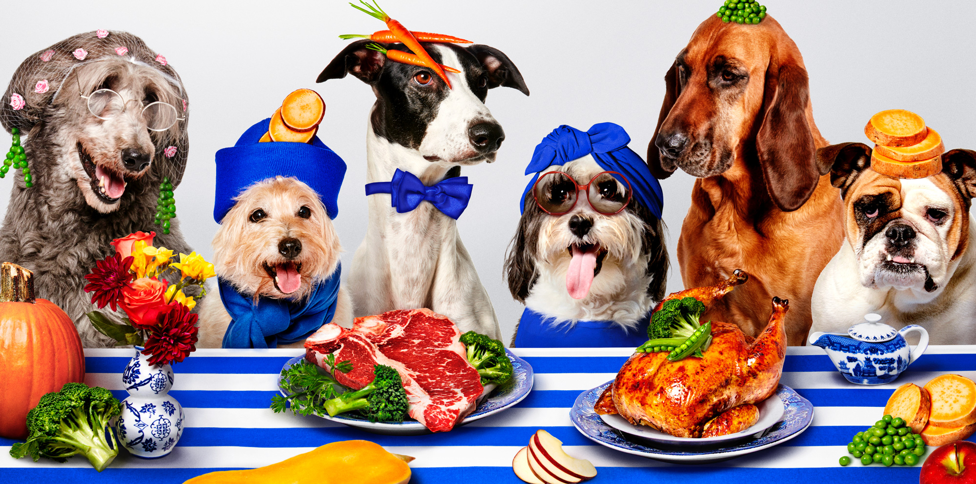

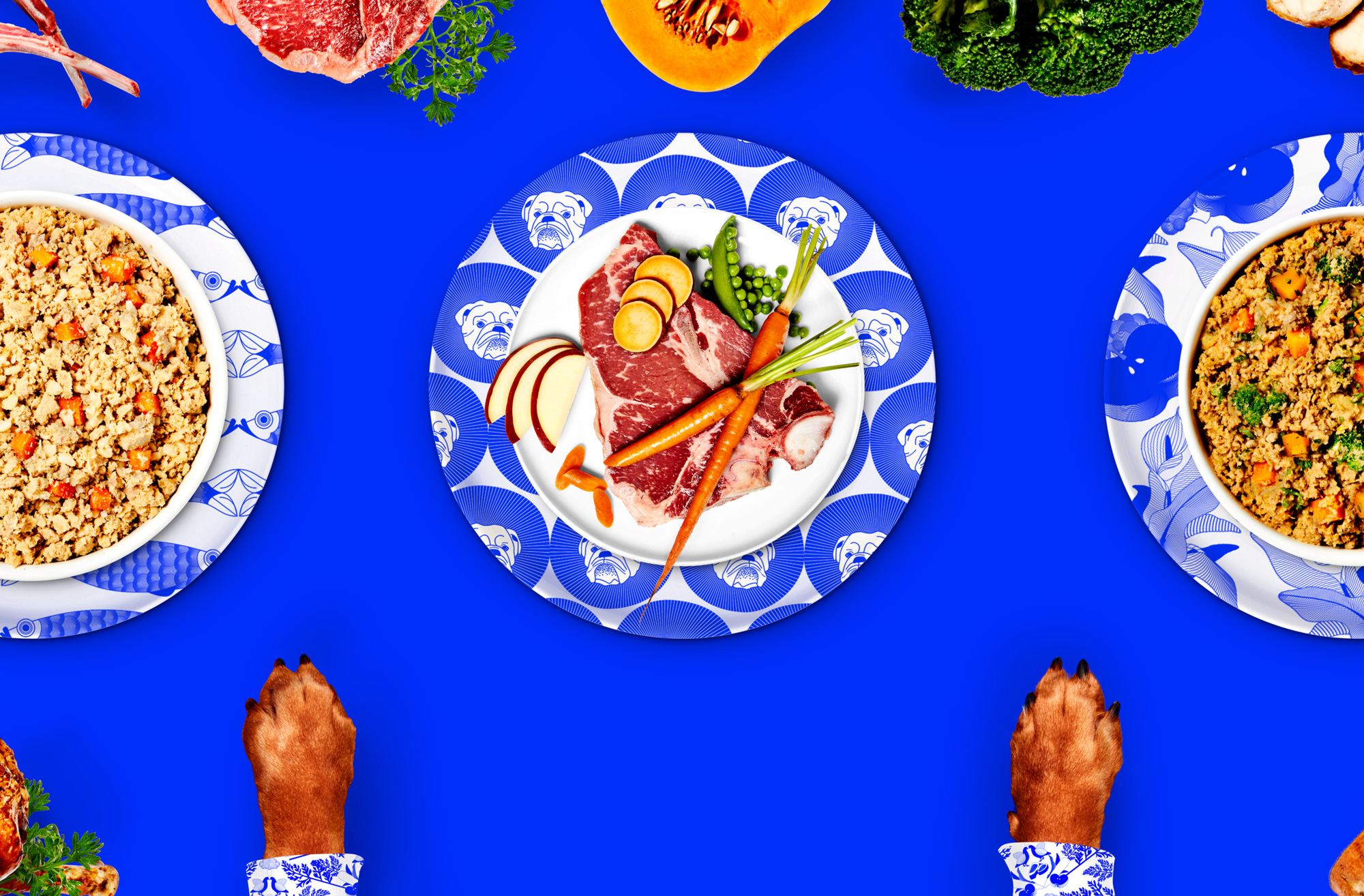
Overall, this is indeed very (Sagmeister) & Walsh-y, which can be a divisive thing to be and it's perfectly fine to love it or hate it but what's nearly undebatable is its ability to create a 100% distinct brand in the market of direct-to-consumer, healthy dog food subscription services. My only grievance would be the overabundance of that blue but I also can't imagine it working as well (or as bad, lol) if it were in another color or combination of colors. Overall, I think this is pretty entertaining and appropriate in a way that's unexpected.
In ấn Anpic In nhãn mác Anpic In brochure Anpic In card visit Anpic In catalogue Anpic In thiệp cưới Anpic In tờ rơi Anpic
In Ấn Anpic – Nổi Tiếng In Đẹp In Nhanh
Số 5 Ngõ 75 Nguyễn Xiển, Thanh Xuân, Hạ Đình, Hà Nội
0963223884
baogiainananh@gmail.com
https://anpic.vn
https://g.page/inananpic
In nhãn mác Anpic ✅ In brochure Anpic ✅ In card visit Anpic ✅ In catalogue Anpic ✅ In thiệp cưới Anpic ✅ In tờ rơi Anpic
https://anpic.vn/in-nhan-mac-dep
https://anpic.vn/in-brochure
https://anpic.vn/in-an
https://anpic.vn/in-voucher-in-phieu-giam-gia-khuyen-mai
#inananpic
Comments
Post a Comment