Reviewed: New Logo and Identity for Wixx by BR/BAUEN
“For Kicks”
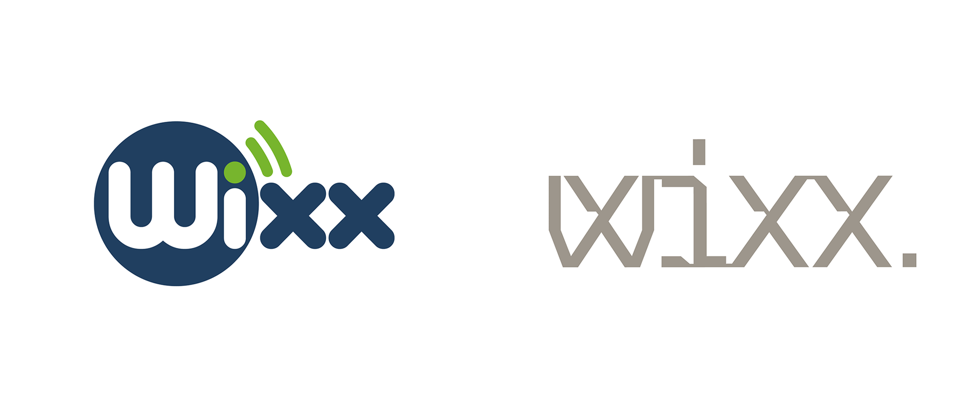
Established in 2009, Wixx is a telecommunications company in Brazil focusing on networking -- internet and IT -- for businesses, offering fixed solutions as well as, their specialty, temporary solutions for events. Headquartered in Brasília, Wixx's network is available in 45 cities across Brazil and they have recently started offering residential services as well. Earlier this year, Wixx introduced a new identity designed by São Paulo, Brazil-based BR/BAUEN.
[We] looked into understanding the verbal and visual language necessary to ensure that Wixx graduated from being a "small generic telecom" to a corporate service "specialist telecom". The first step was to define through brand archetypes, the persona whose personality would guide the process: The Governor, whom with technical mastery, expresses his expertise objectively through a direct tone of voice and total control.
BR/BAUEN project page
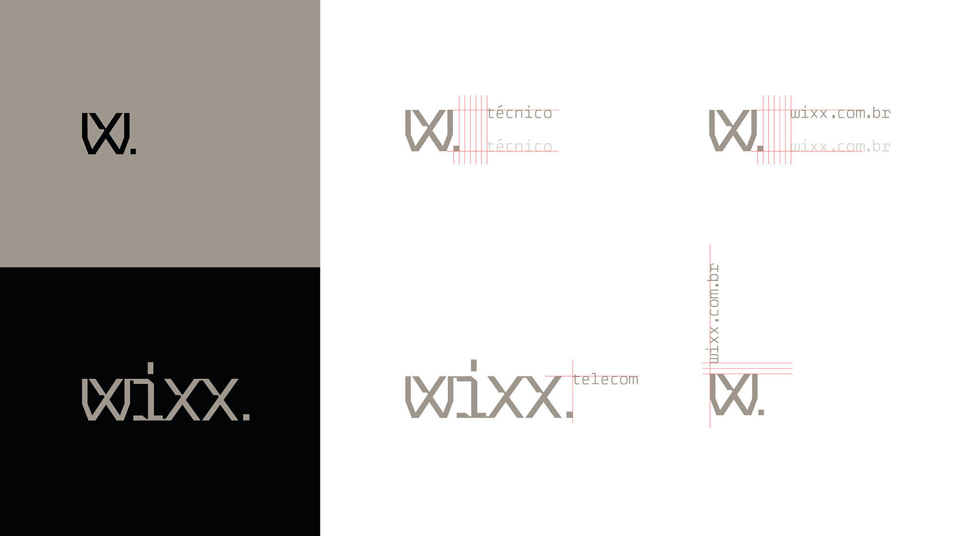
To support this discourse, we created the visual identity and its elements for maximum objectivity and identification: Wixx wordmark and short signature "W.", a graphic compositions language (inspired by transmission and responsiveness) which is extended to all printed material randomly. The chromatic palette was reduced to 3 colors, where black and copper predominate and with a tone of voice adjustment that establishes their perception at the desired balancing level: Wixx are experts, "for today or forever", where 'today' = events and 'forever' = fixed networks - which become the brand's tagline.
BR/BAUEN project page
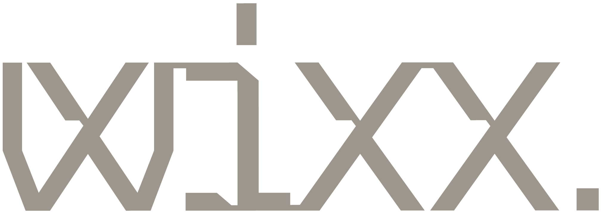
The old logo could have been passable without the big blue circle and some more convincing Wi-Fi signal graphics but, in the end, it looked like it belonged to an internet café more than a business-to-business organization. The new logo, to be perfectly honest, I have no idea why it looks the way it does but I kind of love it for that same reason. It's like grungy and Matrix-y but somehow manages to look corporate. I would have liked it more without the thin lines connecting each letter -- which I get that they convey connectivity -- so as to let the funky letterforms shine. I also don't think the period is necessary but if they wanted something at the end of the word, rotating the tittle of the "i" 90 degrees to create more of an underscore graphic could have been interesting... which they sort of do in the animation. I realize I have a lot of "but"s about the logo but I do really like it simply for being so weird and breaking with 2019 conventions (2019 the year; not 2,019 the quantity).
Considering the importance of the typographic voice for conveying corporate messages, we created a custom typographic family. An alphabet inspired by monospaced fonts, widely used in contexts perceived as technological, typography of code lines, a visual language that with coherent institutional brand messaging - enables us to develop all brand touchpoints necessary for the positioning shift.
BR/BAUEN project page
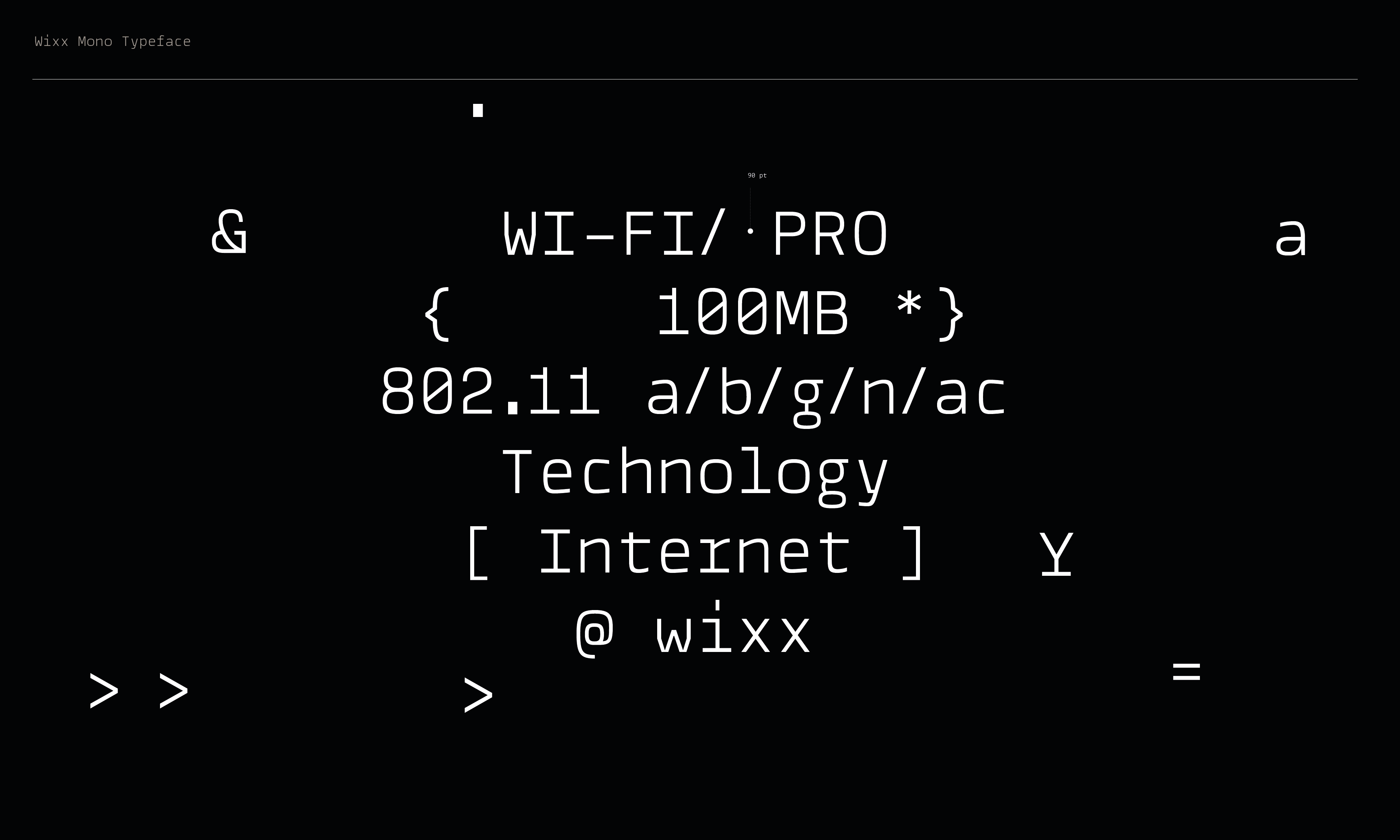
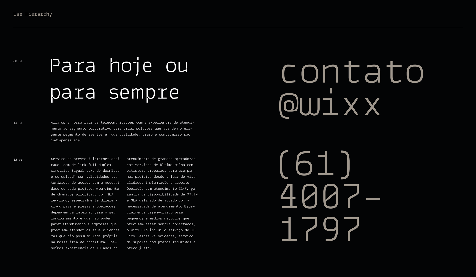
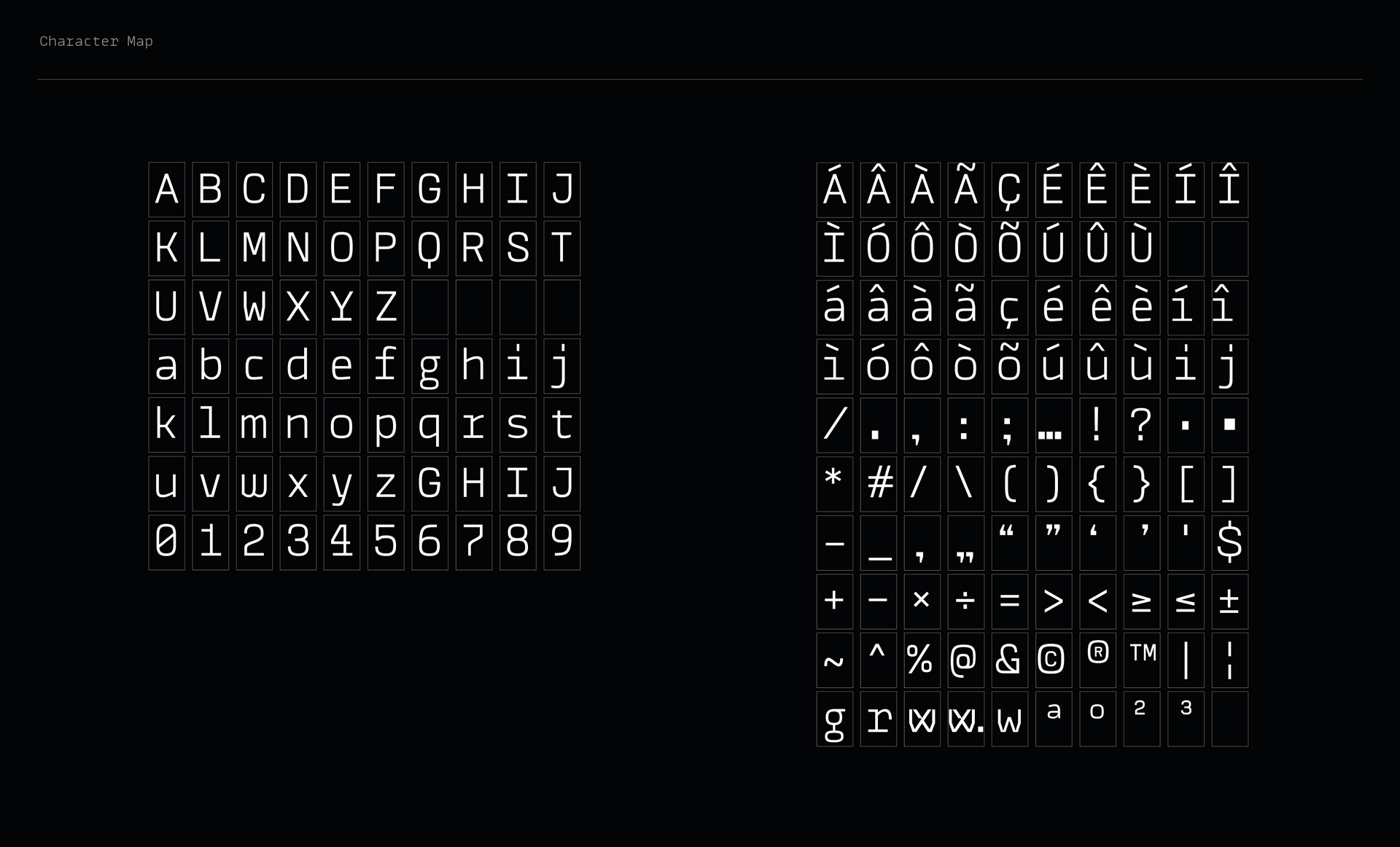
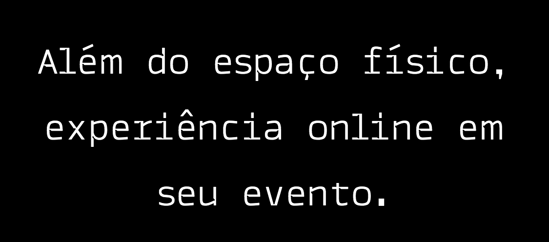
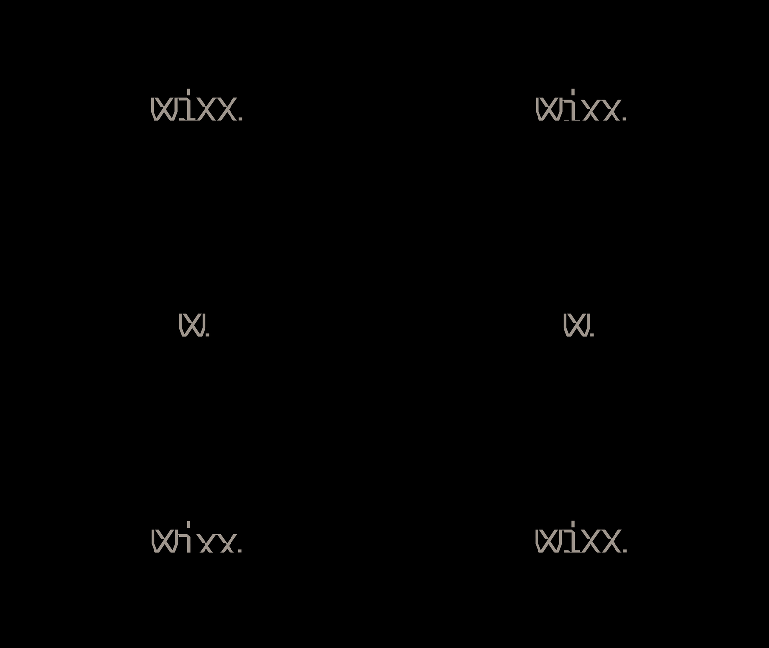
The custom typeface is pretty nice, offering a relatively fresh take on monospace fonts in a thin weight with some extreme ink trap-slash-notches. (For those of you that know, you know I love me some ink traps.) As I stare at the images above, though, I just realized there are at least two different styles, one with and one without notches. Inspecting their website does indeed confirm two different variations, one for small text and one for headlines. To conclude... still digging it.
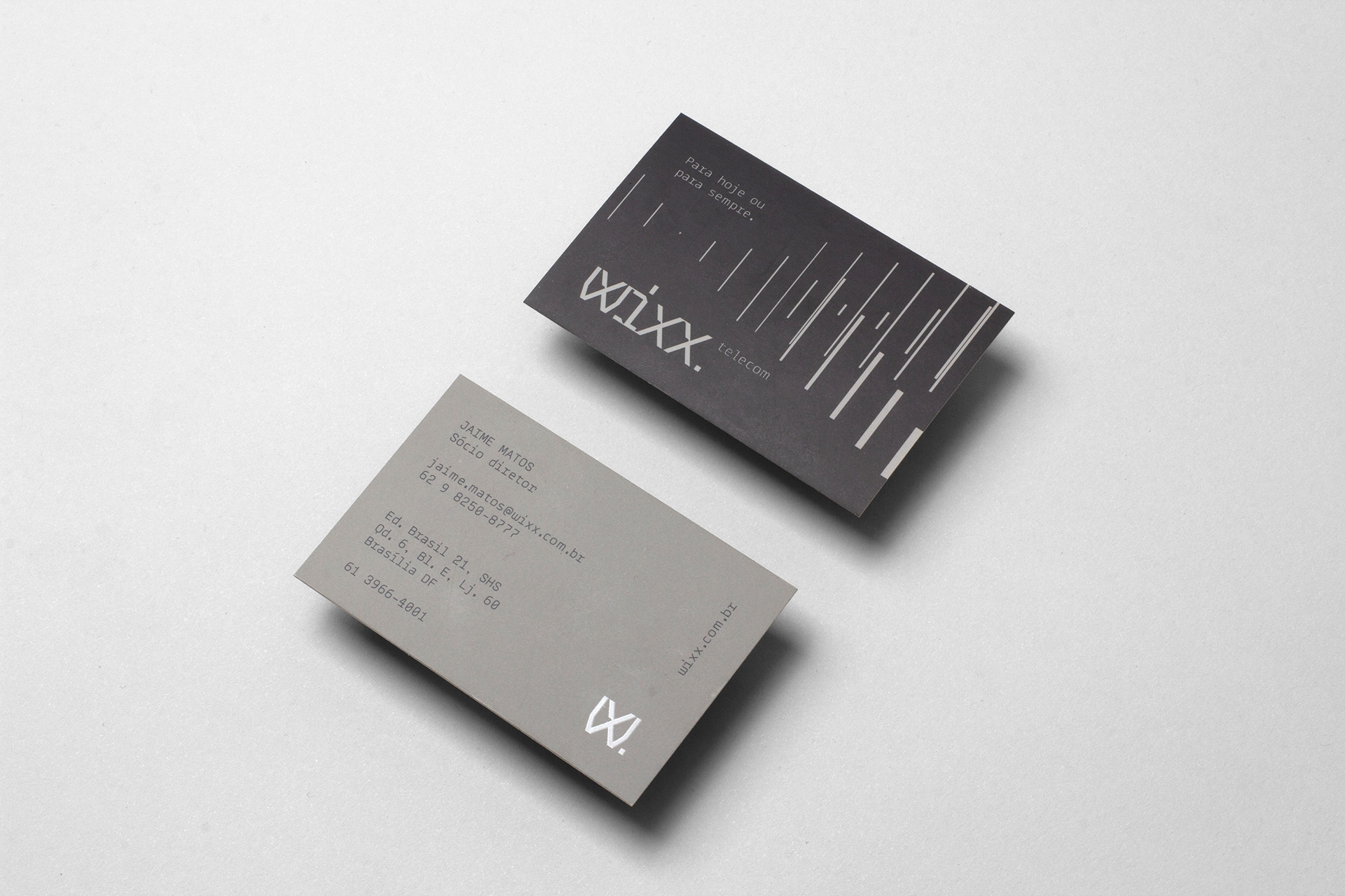
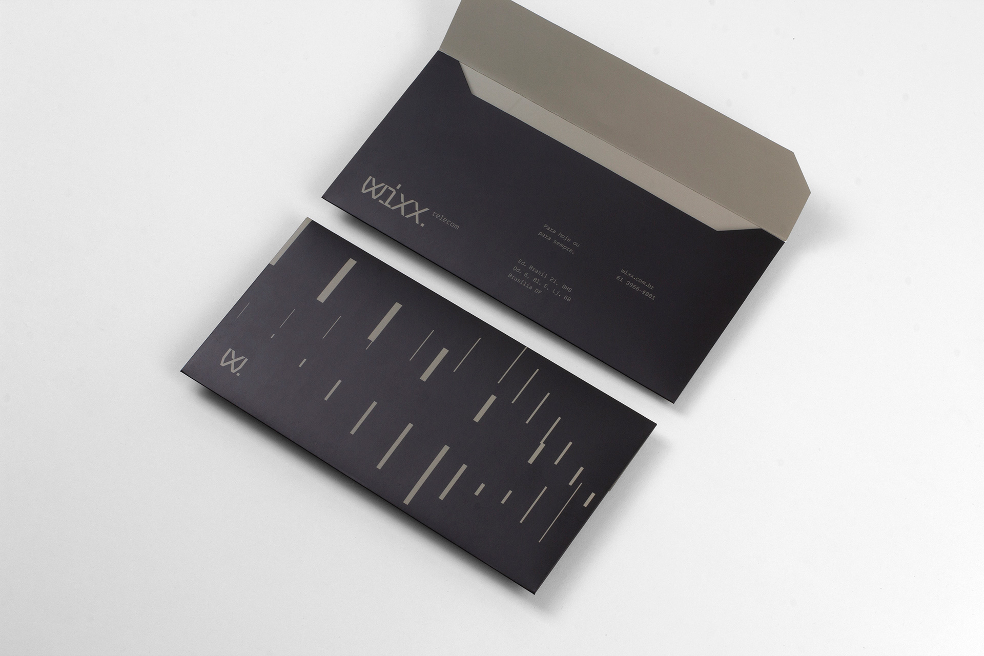
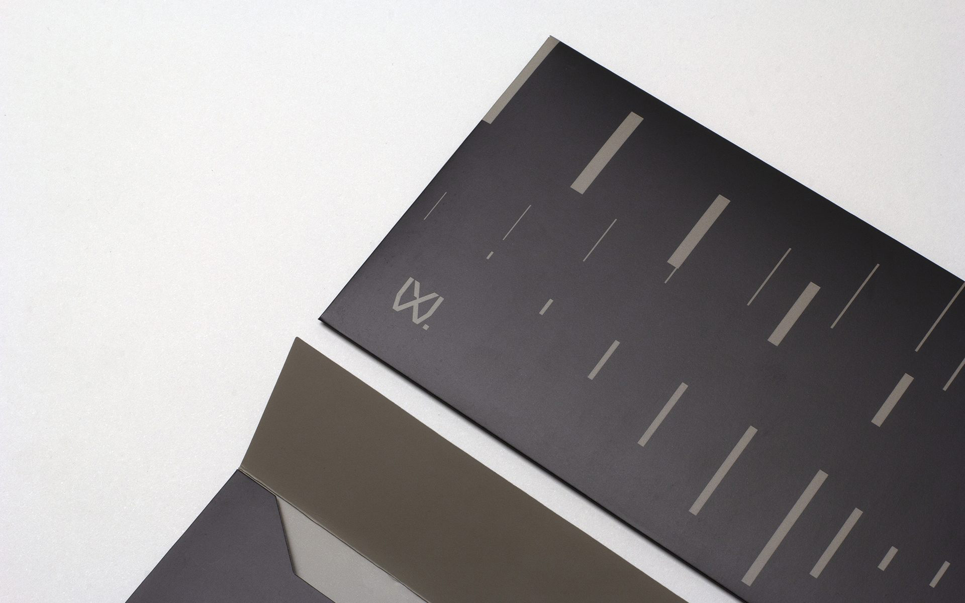
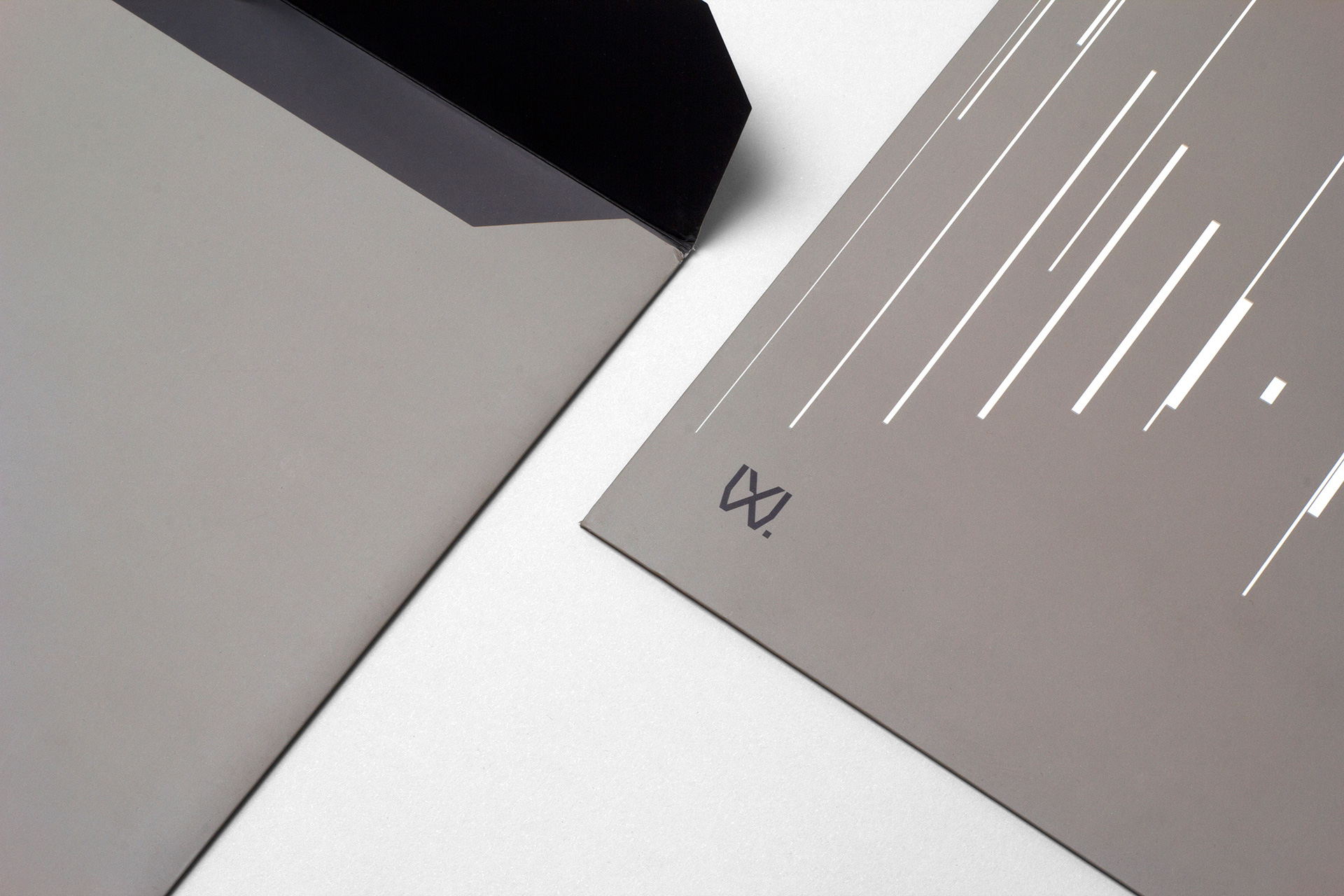
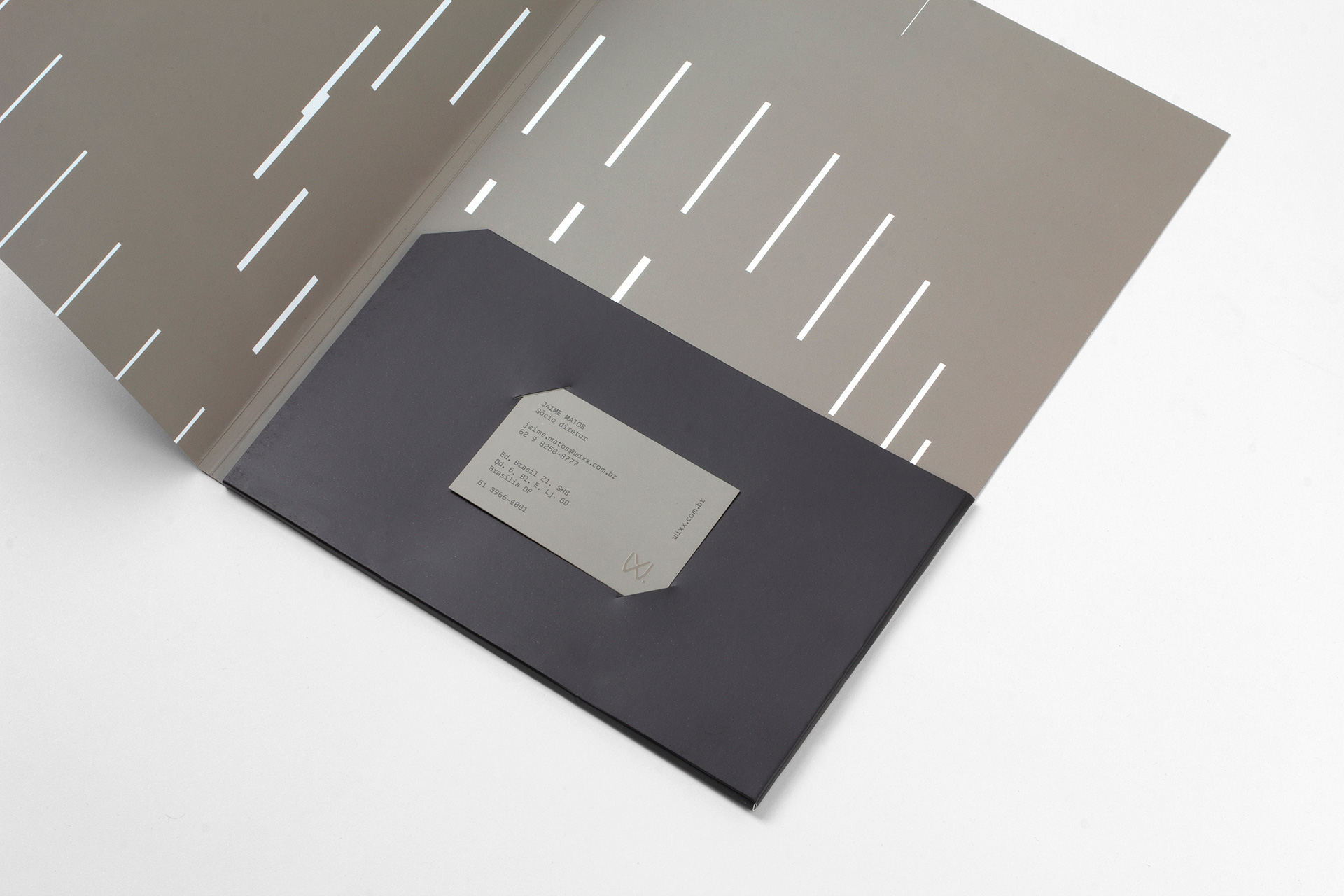
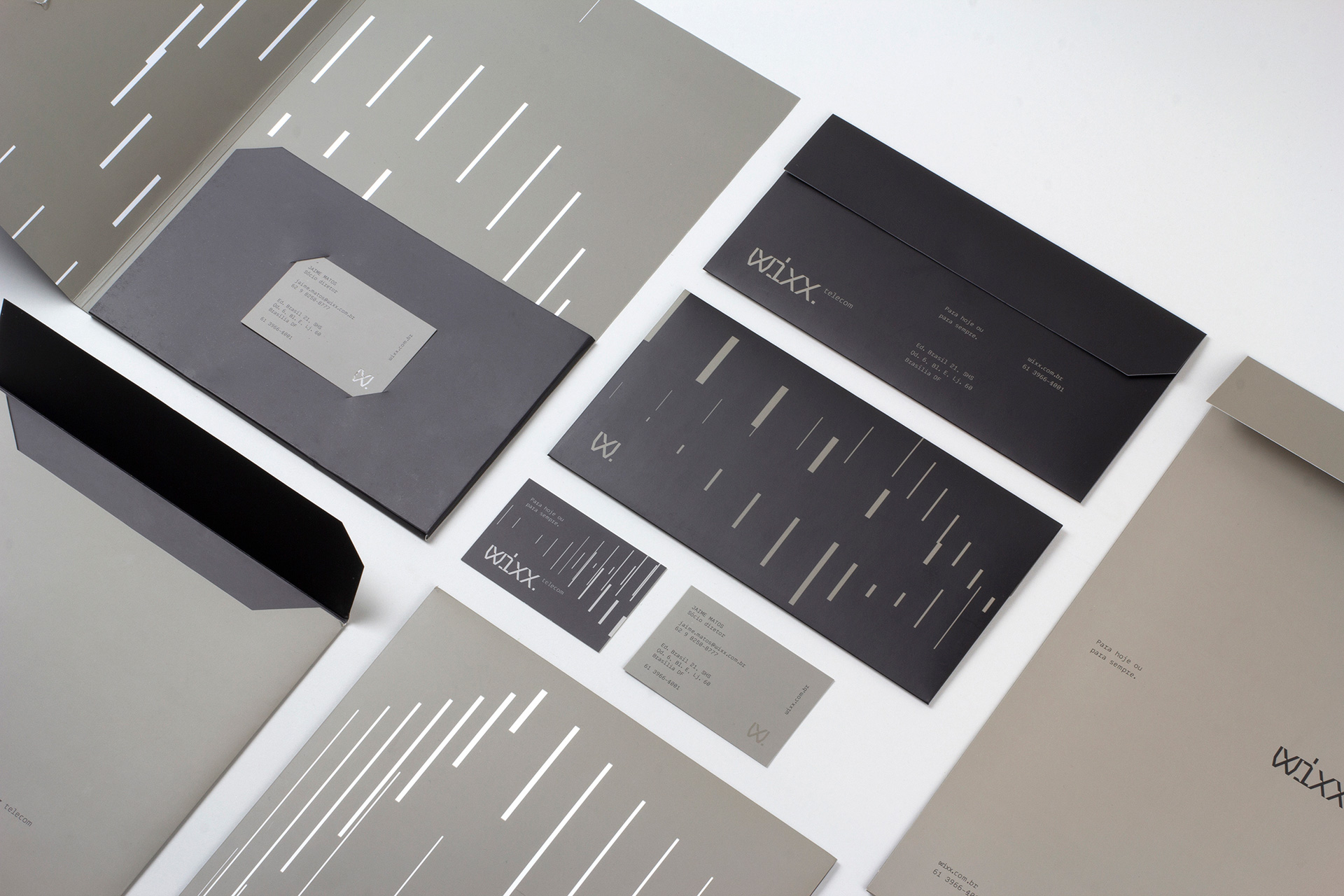
The print applications are actually designed too... not just the logo slapped on pieces of paper. They clearly spent time and energy on the business cards and letterhead and other materials. The vertical lines are a little random in meaning but I'm happy to interpret them as data going back and forth through cyberspace and they look kinda cool on the applications in the two-tone color palette.
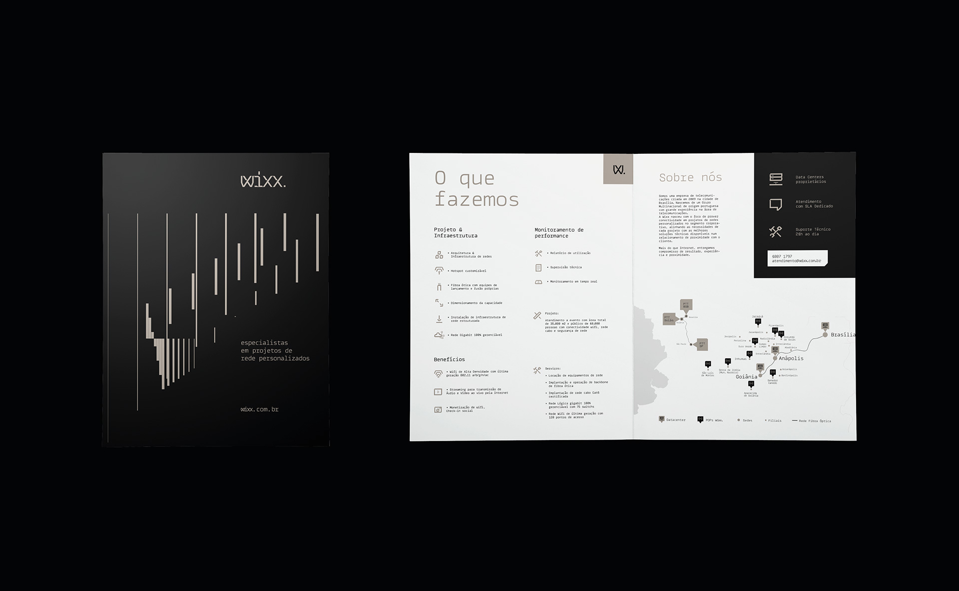
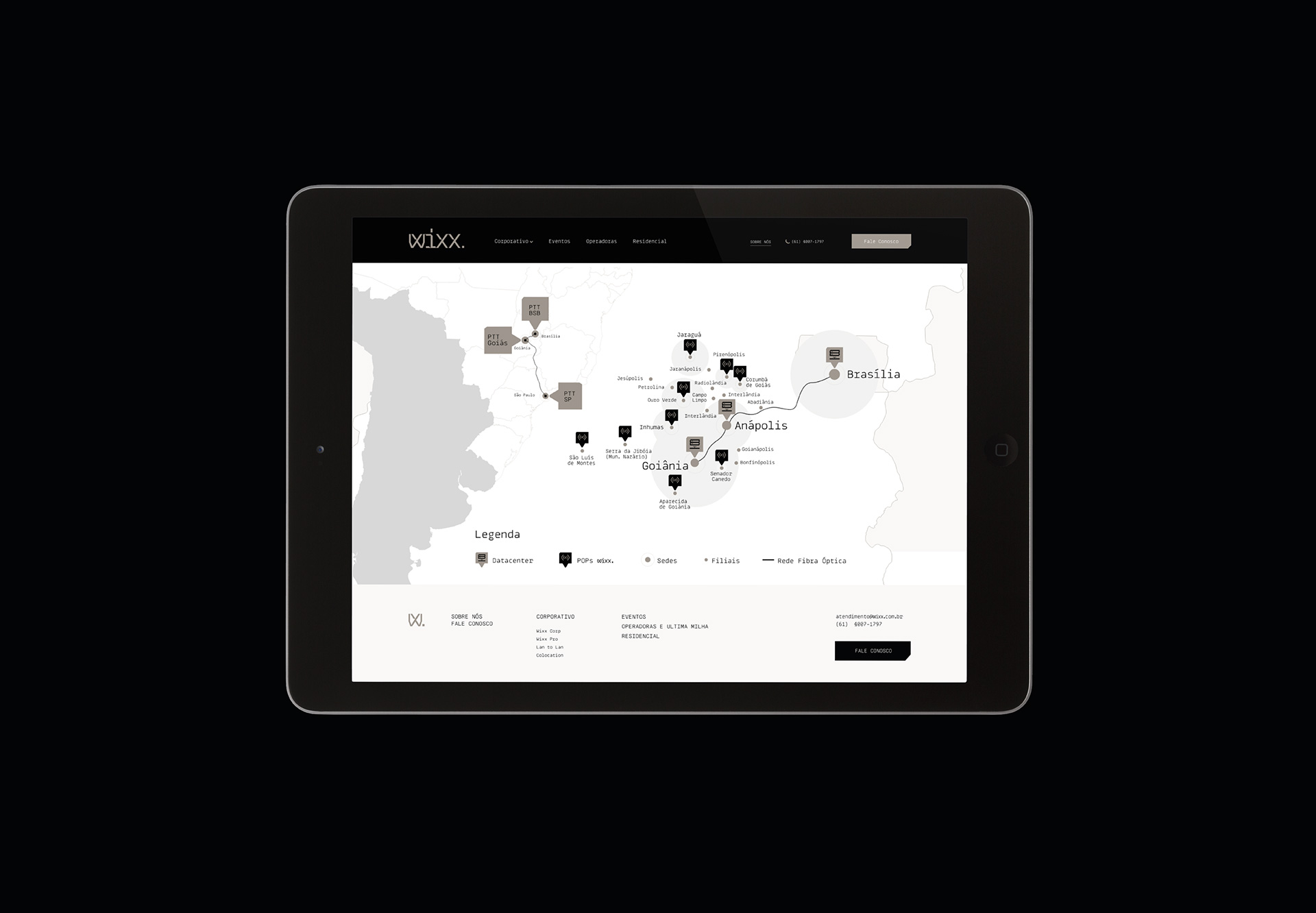
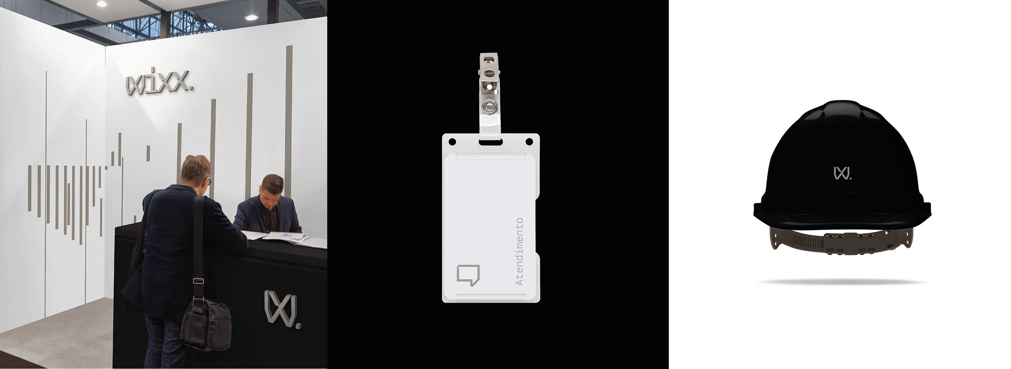
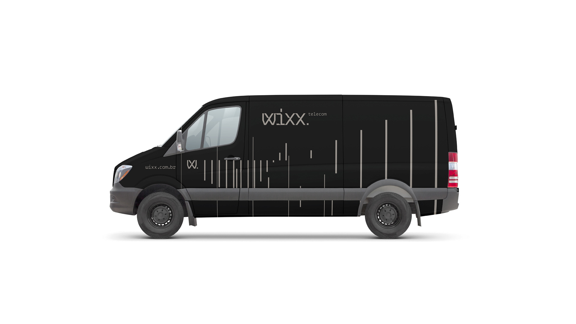
Most of us will probably never interact with this company and it's not even remotely a big telco in Brazil compared to Oi or Telefónica so its impact and visibility are not huge (which is, in part, what allows it to be more playful and weird) but it's definitely encouraging to see this kind of more expressive design in this sector in Brazil.
In ấn Anpic In nhãn mác Anpic In brochure Anpic In card visit Anpic In catalogue Anpic In thiệp cưới Anpic In tờ rơi Anpic
In Ấn Anpic – Nổi Tiếng In Đẹp In Nhanh
Số 5 Ngõ 75 Nguyễn Xiển, Thanh Xuân, Hạ Đình, Hà Nội
0963223884
baogiainananh@gmail.com
https://anpic.vn
https://g.page/inananpic
In nhãn mác Anpic ✅ In brochure Anpic ✅ In card visit Anpic ✅ In catalogue Anpic ✅ In thiệp cưới Anpic ✅ In tờ rơi Anpic
https://anpic.vn/in-nhan-mac-dep
https://anpic.vn/in-brochure
https://anpic.vn/in-an
https://anpic.vn/in-voucher-in-phieu-giam-gia-khuyen-mai
#inananpic
Comments
Post a Comment