Reviewed: New Logo and Identity for WarnerMedia by Wolff Olins
“Scene 1 Take 2”
Established in 2018, WarnerMedia is a multinational media an entertainment conglomerate that consists of a portfolio of iconic entertainment, news, and sports brands that include flagship properties like HBO, CNN, TNT, and Warner Brothers (movies). With film, television, cable, and publishing operations, WarnerMedia was born from the acquisition of Time Warner (est. 1990) by AT&T, first announced in 2016 and completed last year. Earlier this month, WarnerMedia introduced a new identity designed by Wolff Olins.
Since its inception, WarnerMedia had been utilizing a limited interim solution. In time, it became clear they needed something more substantive, a system to hold together an ecosystem of historic entities. They needed a concise strategy and compelling mission to help unify employees and stakeholders alike -- to understand why WarnerMedia existed and what they stand for moving forward.
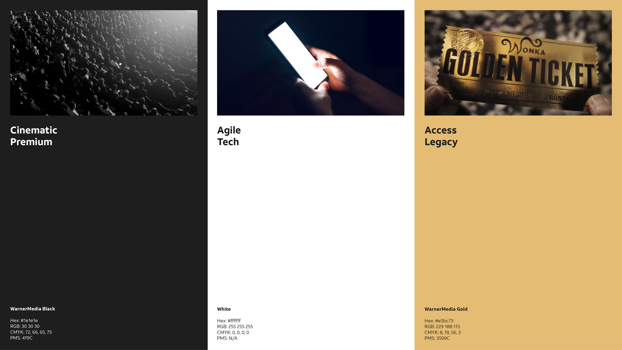
They needed a visual identity that felt as considered and crafted as all of the content their brands produced -- something that WarnerMedia employees could rally around and that partners could immediately recognize. With generous input from leaders across the portfolio, as well as a senior creative and executive team at WarnerMedia, Wolff Olins designed a set of flexible tools and gestures that would help them create meaningful and expressive communications, on every screen surface imaginable.
The kinetic motion is inspired by the action clapboard on set -- the one unifying aspect to all forms of media production, now and then.
Wolff Olins provided text

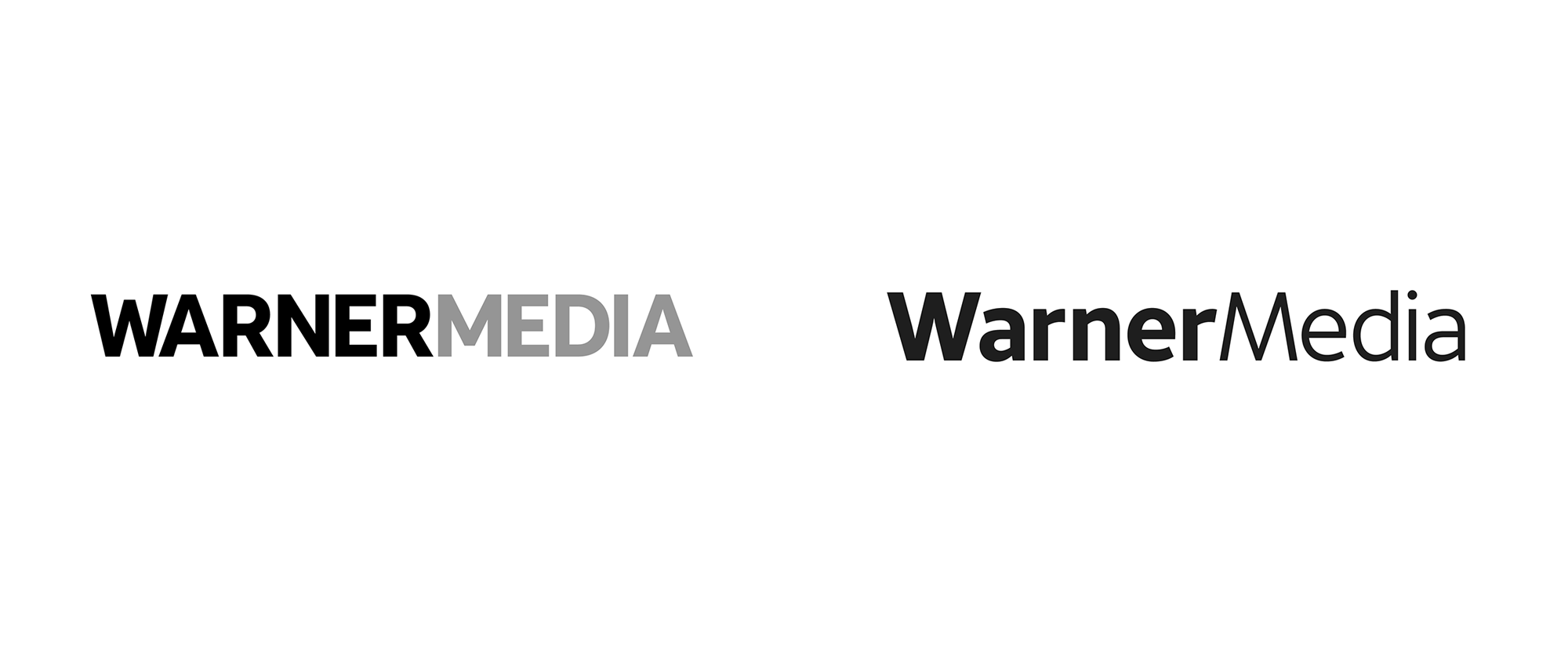
The old logo, which I covered last year, did not get the best welcome by me because it wasn't the most welcoming of logos -- even for an interim logo it was kind of devoid of soul -- in a dry, uppercase sans serif. The new logo isn't the most exciting but at least it's more nuanced, with a more interesting sans serif and a more considerate relationship between "Warner" and "Media", where the two initial letters share the same angles and where the bolder "Warner" plays up the recognizable part of the name and downplays "Media". The logo almost looks like that of a telecommunications company or maybe I just want to read that because it's owned by AT&T but there is a slightly tech-ie aspect to it, which is not all wrong but it's somehow not as entertainment-skewing as it could. Still, a relative improvement over what came before.
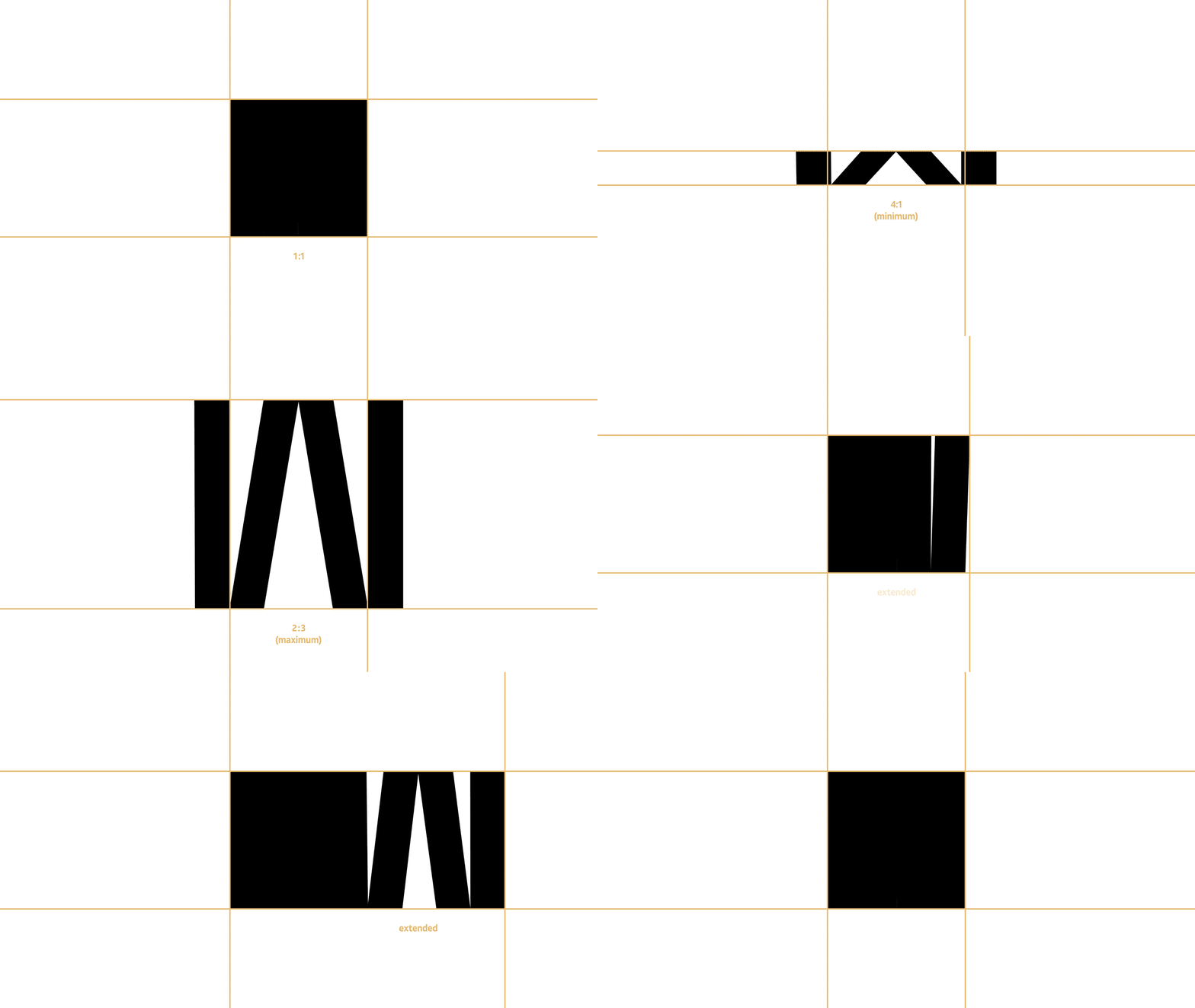
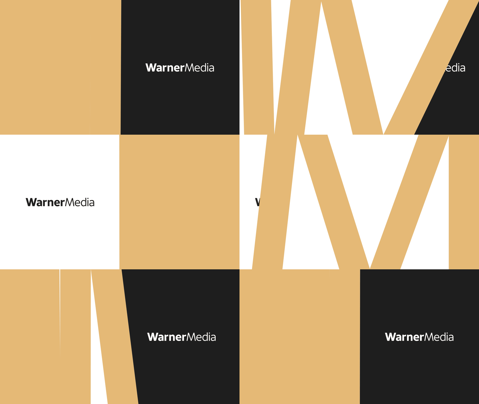
To make up for the lack of entertainment-ness in the logo, the identity includes a flexible "W" inspired by the clapboard's iconic motion of the "clapstick" closing down as each scene begins. I really like the concept behind this, being that the clapboard is used across movies and TV and remains in use since its invention in the 1920s. I also like how it is implemented not in a literal way for the "W" and is more of a digital interpretation applied to a shape with multiple clapsticks. In full animation and with the right motion speed, as with the animation directly above, the effect is so good that you can almost hear the clack as the "W" closes. The approach that each part of the "W" can hold a different image or clip is quite nice as well, alluding to the vast portfolio of stuff owned by WarnerMedia.
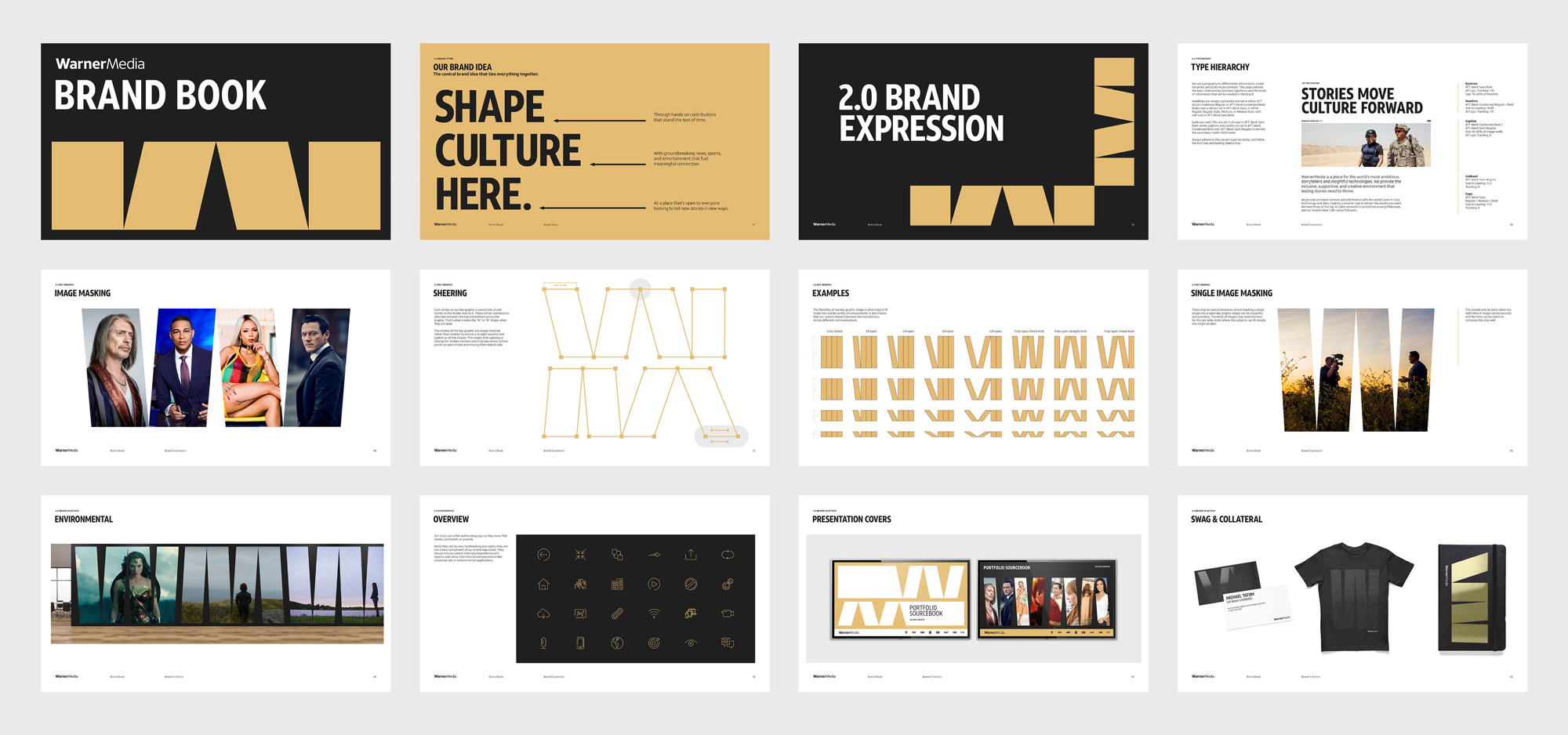
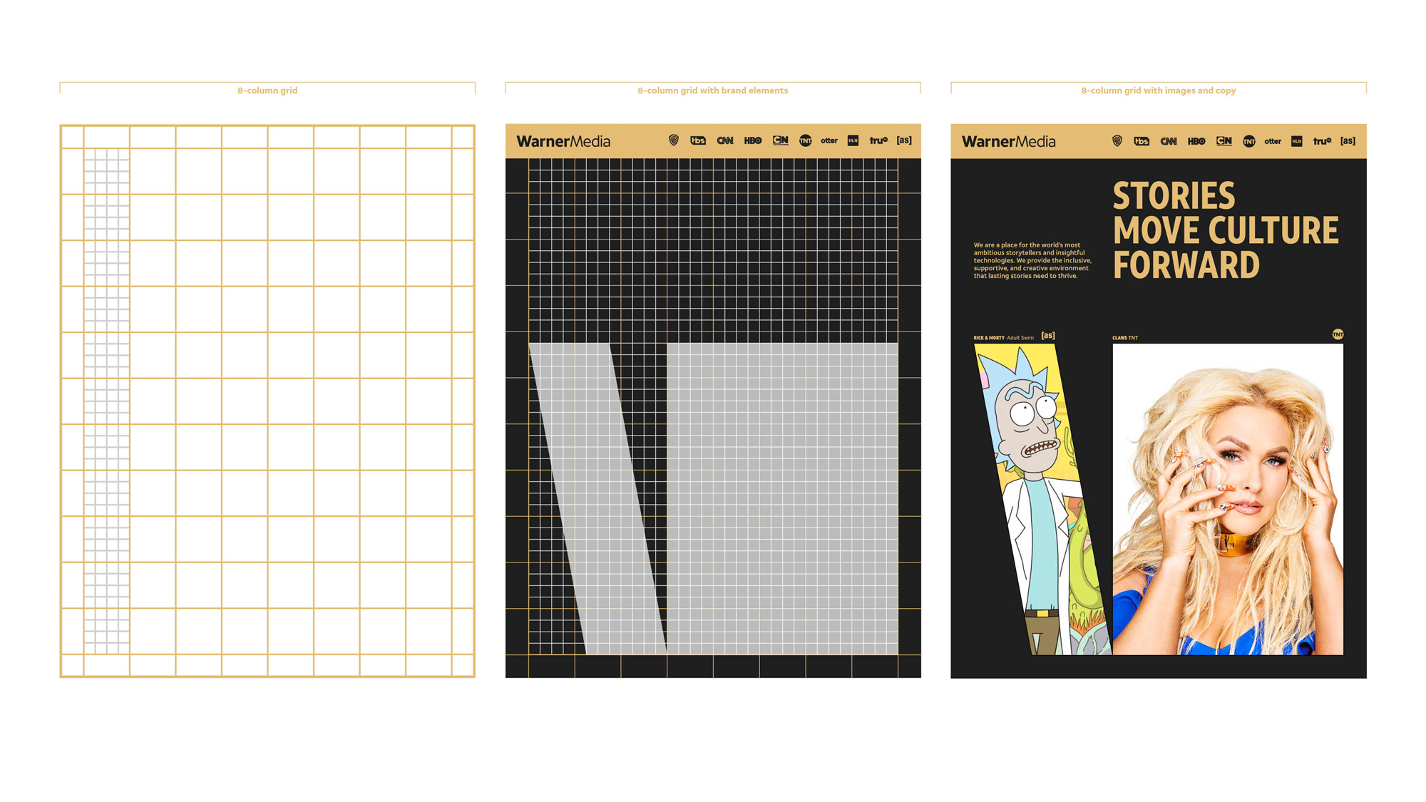
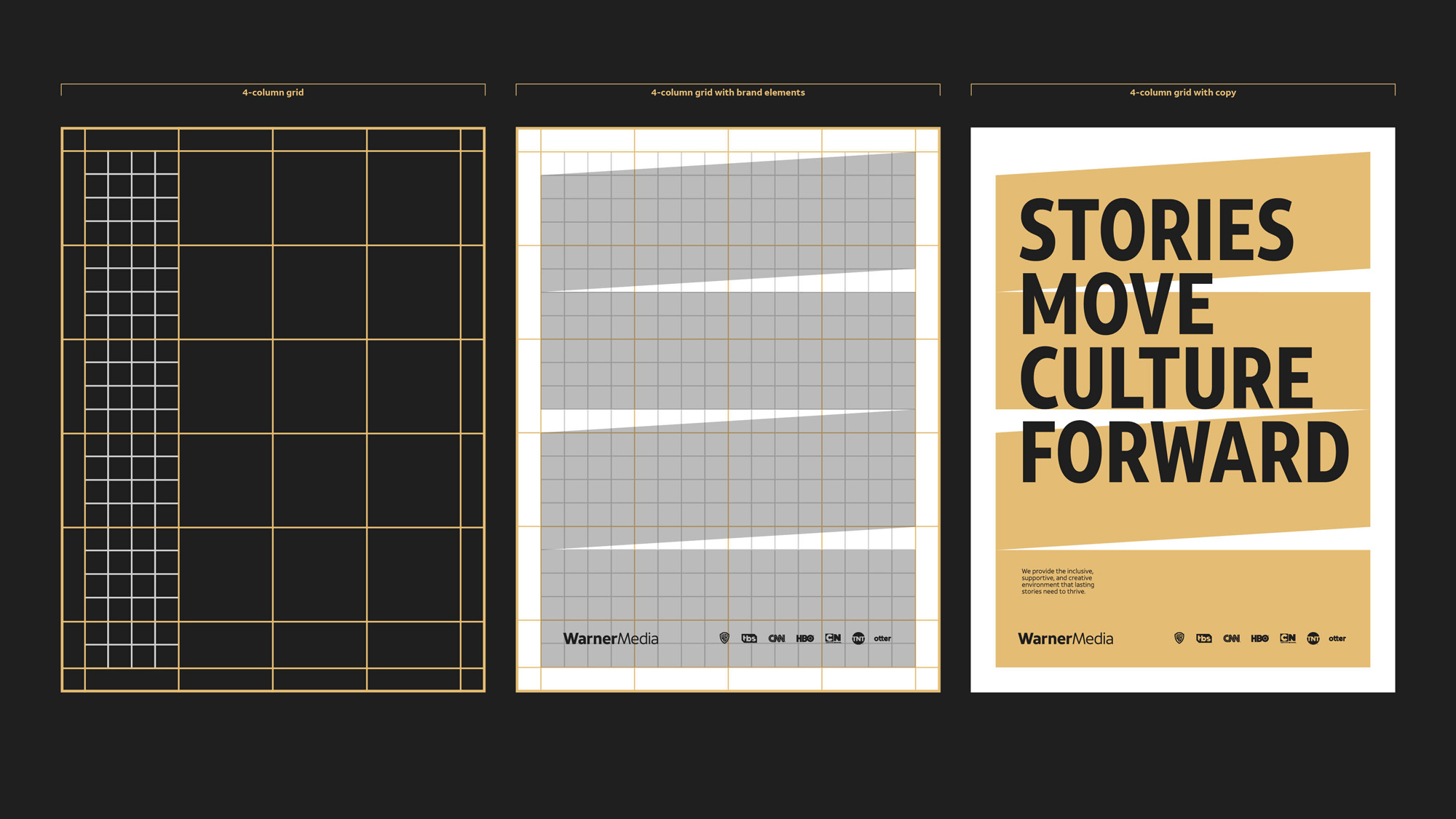
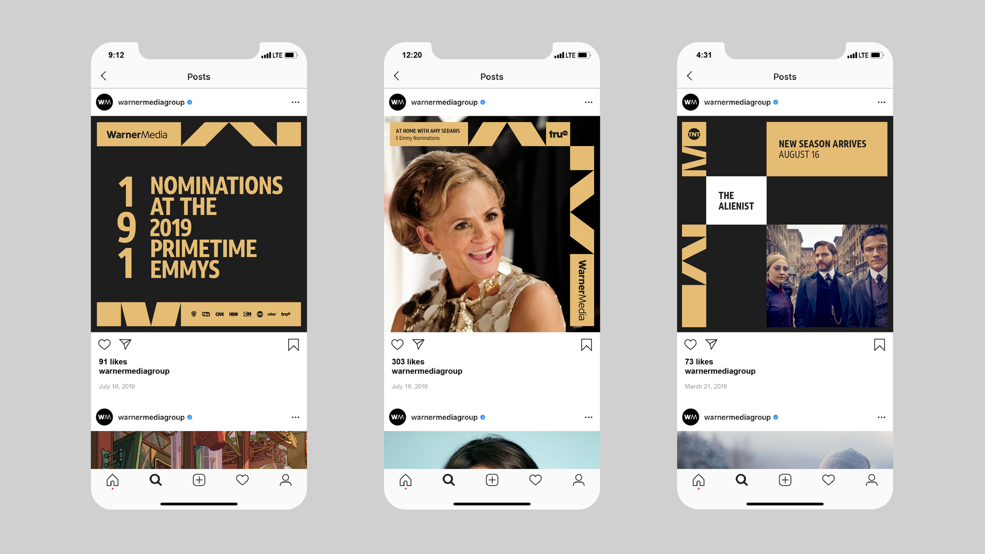
In static form, the clapboard effect is less obvious but it provides for an interesting layout system where the "W" can serve as background or it can accommodate content in the last segment of each "W". It's almost impossible to read them as "W"s unless you know that's what they are but that's not a huge problem as, on the surface, they provide nice design elements that create good tension.
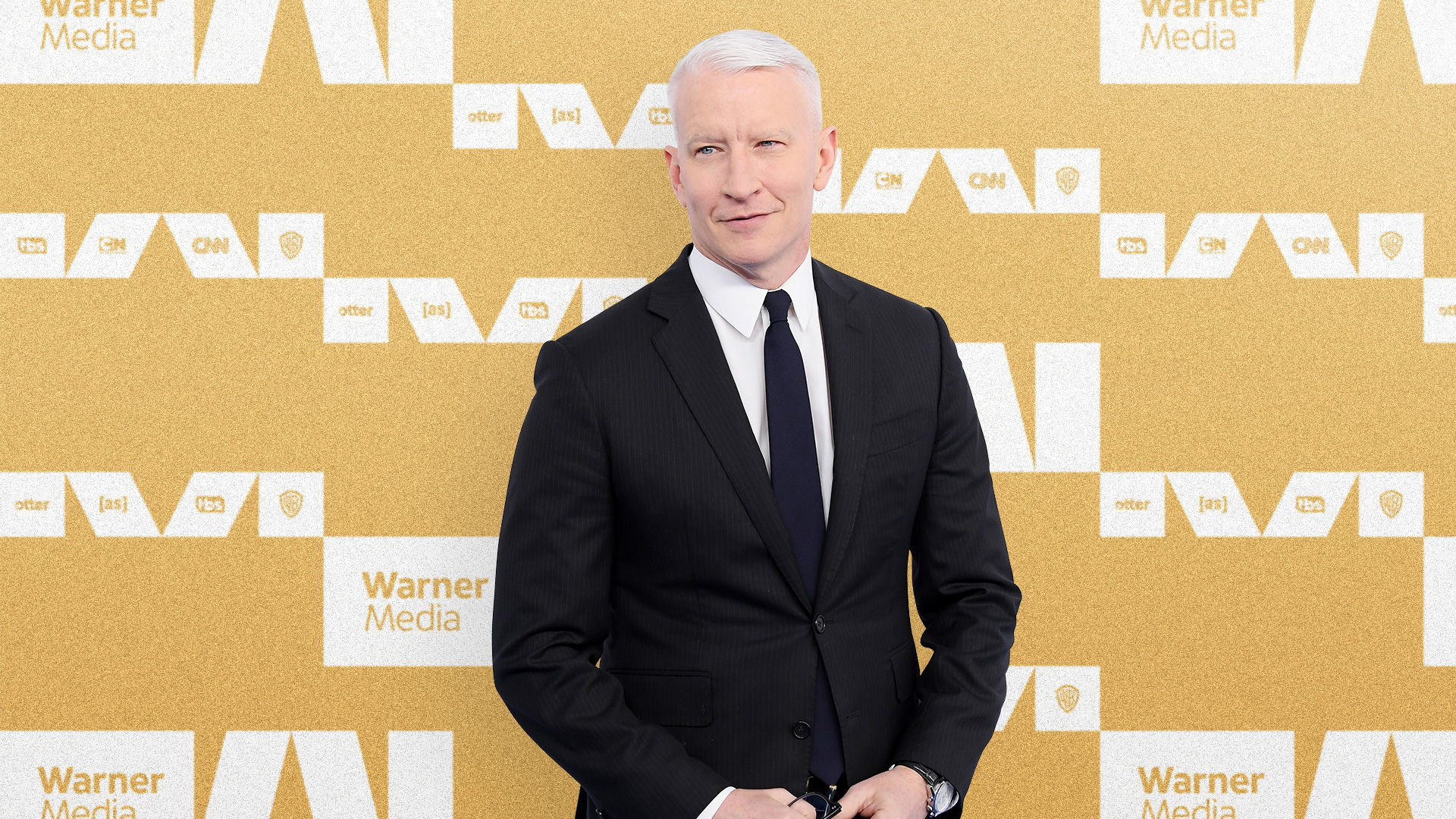
Overall, this makes WarnerMedia look far more interesting and relevant now as the supporting corporate brand behind so many well-loved consumer brands instead of the initial shock of the original logo where the whole name change and acquisition felt so sterile and business-oriented. And... scene.
In ấn Anpic In nhãn mác Anpic In brochure Anpic In card visit Anpic In catalogue Anpic In thiệp cưới Anpic In tờ rơi Anpic
In Ấn Anpic – Nổi Tiếng In Đẹp In Nhanh
Số 5 Ngõ 75 Nguyễn Xiển, Thanh Xuân, Hạ Đình, Hà Nội
0963223884
baogiainananh@gmail.com
https://anpic.vn
https://g.page/inananpic
In nhãn mác Anpic ✅ In brochure Anpic ✅ In card visit Anpic ✅ In catalogue Anpic ✅ In thiệp cưới Anpic ✅ In tờ rơi Anpic
https://anpic.vn/in-nhan-mac-dep
https://anpic.vn/in-brochure
https://anpic.vn/in-an
https://anpic.vn/in-voucher-in-phieu-giam-gia-khuyen-mai
#inananpic
Comments
Post a Comment