Reviewed: New Logo and Identity for Vonage by Wolff Olins
“Bon Vonage!”
Established in 2001, Vonage began as a consumer-facing, residential VoIP (voice over Internet Protocol) provider -- which seems like such a thing of the past now that home landlines are nearly inexistent -- that, if I remember correctly, was the primary choice at the time. After a botched IPO in 2006, some patent infringement lawsuits from Verizon, and a major marketplace shift, Vonage has been reinventing itself over recent years to evolve into a business-to-business, service as software company. Or B2B SaaS company if you prefer shorthand. Now, it offers other businesses services like an API platform to build business communications (e.g., notifying customers instantly), integration with Salesforce for customer contact centers, and cloud-hosted communications. As part of this shift, Vonage has introduced a new identity designed by Wolff Olins.
We worked closely with Vonage to create a unified identity that brought together the best of their heritage with the innovation they're known for today. By building on their purpose of leading through change, we created a visual language that could flex across the tech space and into the hearts and minds of developers. Approaching everything through a system of extrusion, the system shows how Vonage can be there when you need it, and fade away when you don't. Rich gradients challenge the more static colorspace of the industry, and the illustration style and verbal identity brings to life the quirk and irreverence that made Vonage memorable in the past. All of it works together to create an experience that's as delightful as it is helpful.
Wolff Olins project page
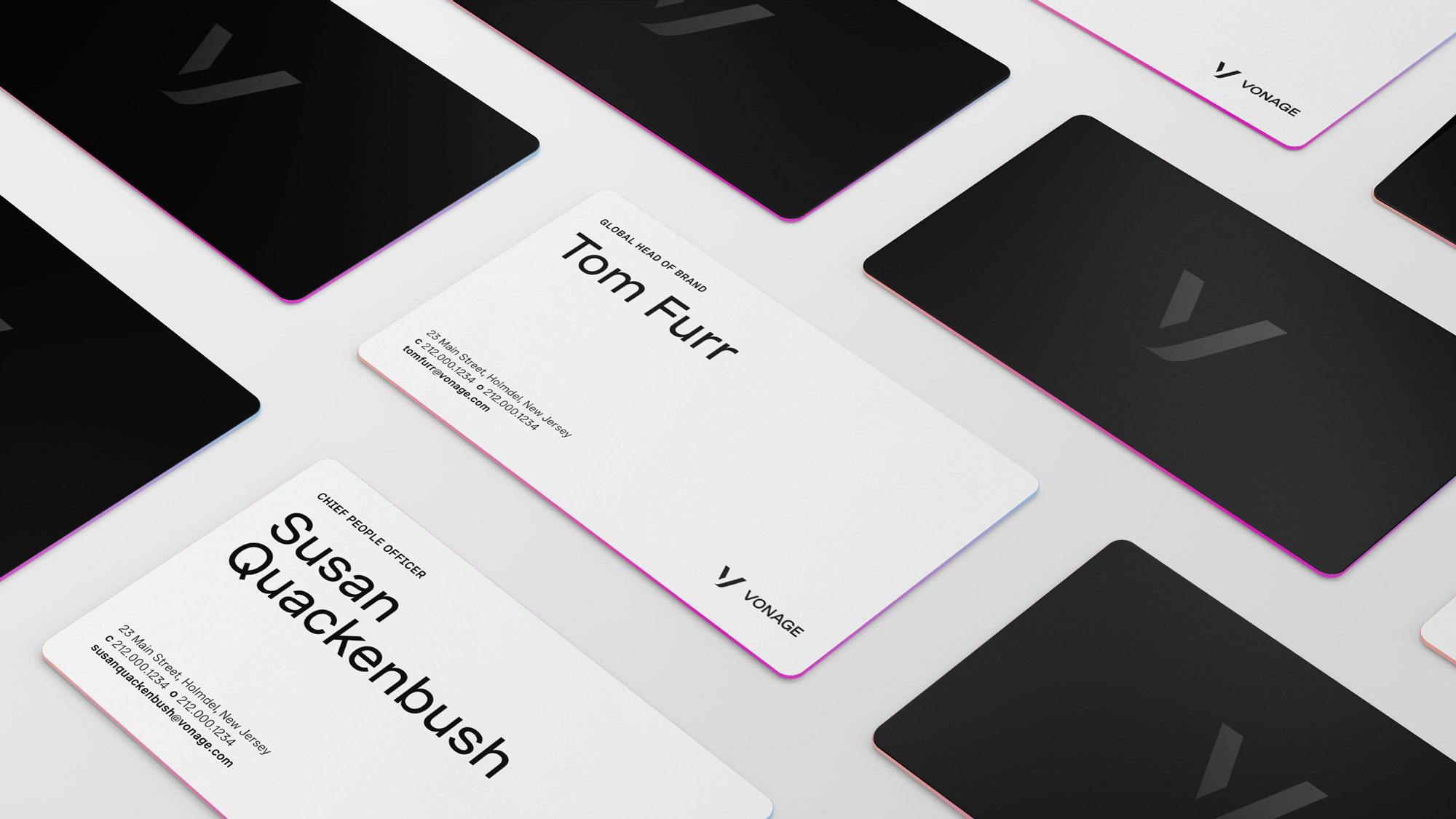
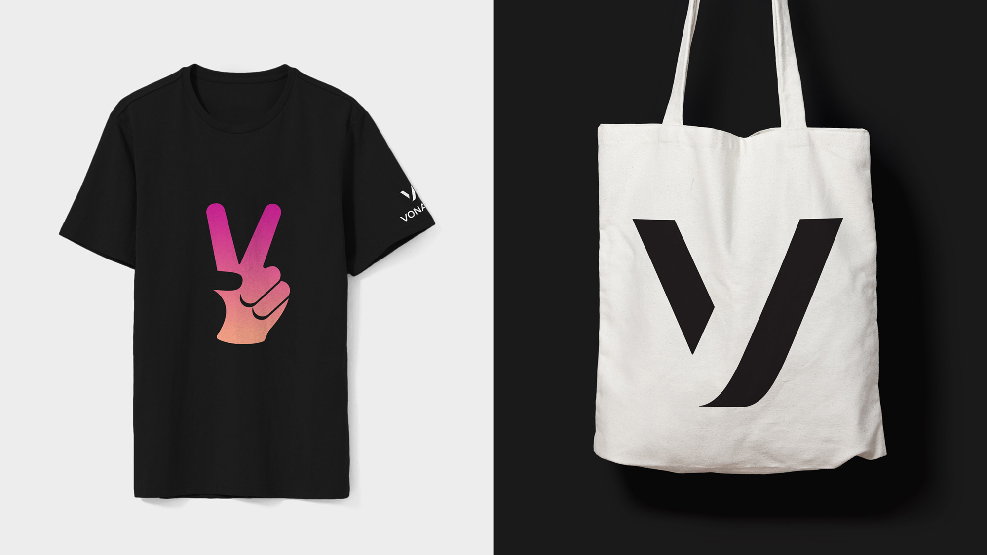
I never liked the old Vonage logo with its very ample letter-spacing and funky "V" with a blue dot. I don't think it was a bad logo -- on the contrary, it was distinct and recognizable -- I just didn't like it. With a shift in business it was definitely a no-brainer to shift the identity dramatically and leave behind most of the visual cues. Interestingly though, there is a little bit of the DNA of the old "V" in the new one, both in the size relationship with the wordmark and the rounded corner. The monogram is super simple and I think it's a treatment we all have toyed with at some point or another in our sketches but ultimately someone goes "Nah, too simple", but I really like this execution. The letter "V" in particular works very well with this hard shadow treatment creating a recognizable letter but also a slightly abstract mark. The wordmark is a good complement with the "V" and "A" following the cues of the monogram -- I would only question if the "G" would have benefitted from a rounded corner on the part that makes the arrow to match the "V" and the "A". As a B2B logo, this is pretty great, looking serious yet with a hint of mischief somehow.

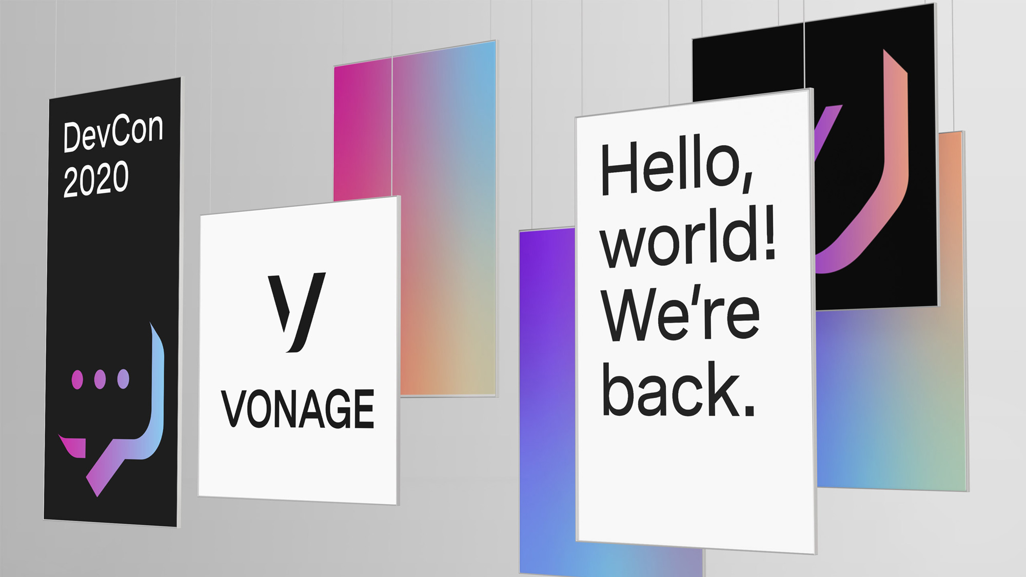
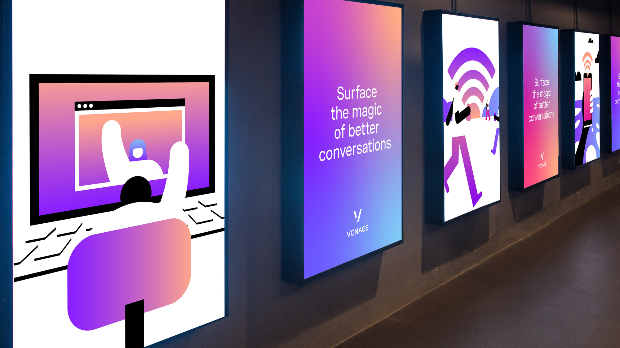
The identity elements play up the hard shadow effect and the concept that Vonage "can be there when you need it, and fade away when you don't" -- which I find quite interesting as a visual/conceptual simplification of what they do -- through some heavy extrusions on the graphics that yield a quirky and unique visual language. I'm torn on the heavy use of gradients, not just on the above but also on all the applications below... I like them visually but I don't know if the multi-color gradient approach has been played out too much and that, for better or worse, Instagram sort of won unofficial ownership of that look. Anyway, some interesting things here... the illustrations not so much, as they feel unfinished and rushed.
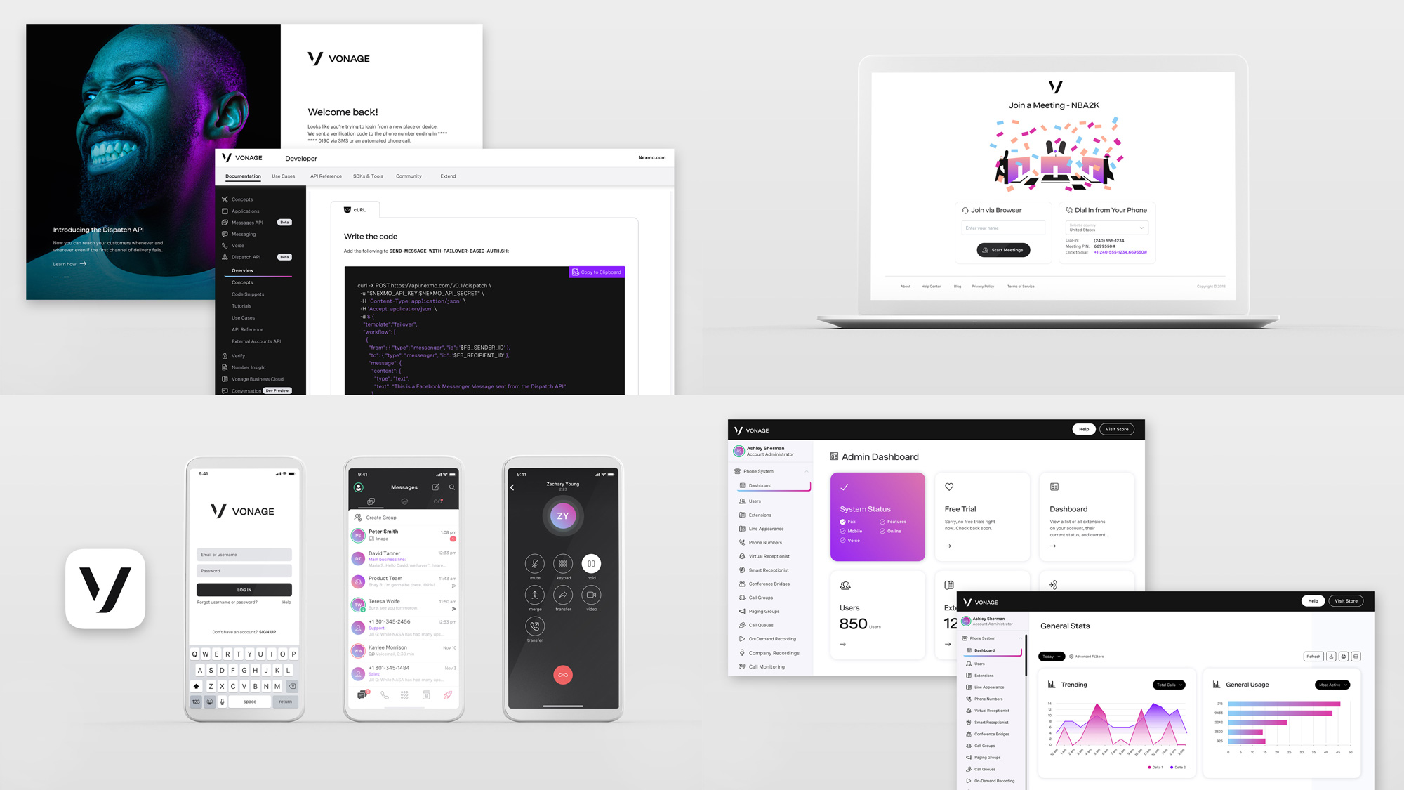
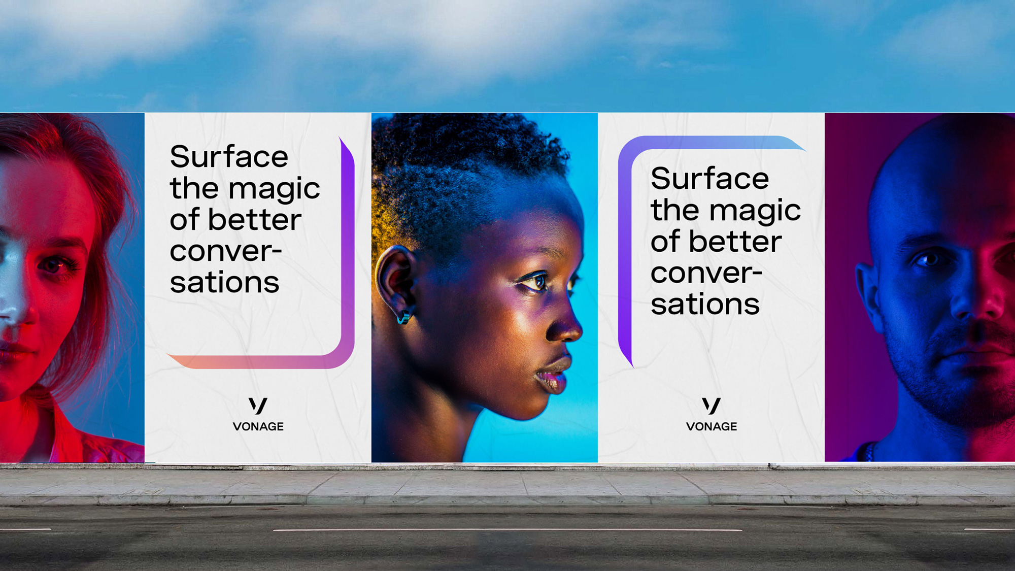
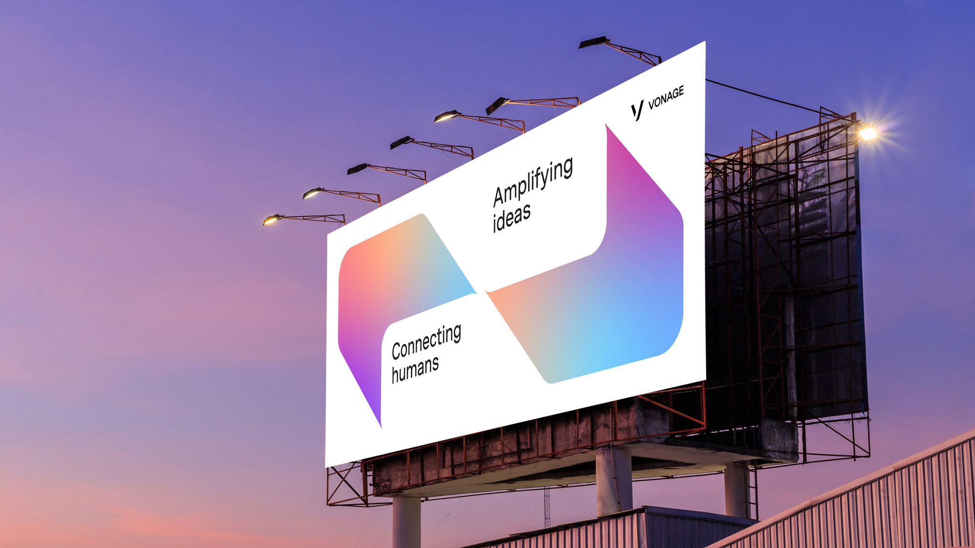
The applications are more or less okay... everything seems to be missing one round of execution to land the different layouts and a little more integration of whether things are centered, flush left, black backgrounds, white backgrounds, gradient backgrounds... I mean, it's good to have that much flexibility and it should work that way but there is something missing that ties all of these approaches together.
Even though I am not a big fan of the illustration approach I really like the video above and how they are playing with scale, light-and-dark, and abstraction to tell a boring story -- no offense! -- in an engaging way. Overall, this has a very a good start to build on and refine into a serious-yet-fun identity through the combination of black-and-white and the gradients and what it does almost unquestionably well is signal change at a point where it's most needed for the company.
In ấn Anpic In nhãn mác Anpic In brochure Anpic In card visit Anpic In catalogue Anpic In thiệp cưới Anpic In tờ rơi Anpic
In Ấn Anpic – Nổi Tiếng In Đẹp In Nhanh
Số 5 Ngõ 75 Nguyễn Xiển, Thanh Xuân, Hạ Đình, Hà Nội
0963223884
baogiainananh@gmail.com
https://anpic.vn
https://g.page/inananpic
In nhãn mác Anpic ✅ In brochure Anpic ✅ In card visit Anpic ✅ In catalogue Anpic ✅ In thiệp cưới Anpic ✅ In tờ rơi Anpic
https://anpic.vn/in-nhan-mac-dep
https://anpic.vn/in-brochure
https://anpic.vn/in-an
https://anpic.vn/in-voucher-in-phieu-giam-gia-khuyen-mai
#inananpic


Comments
Post a Comment