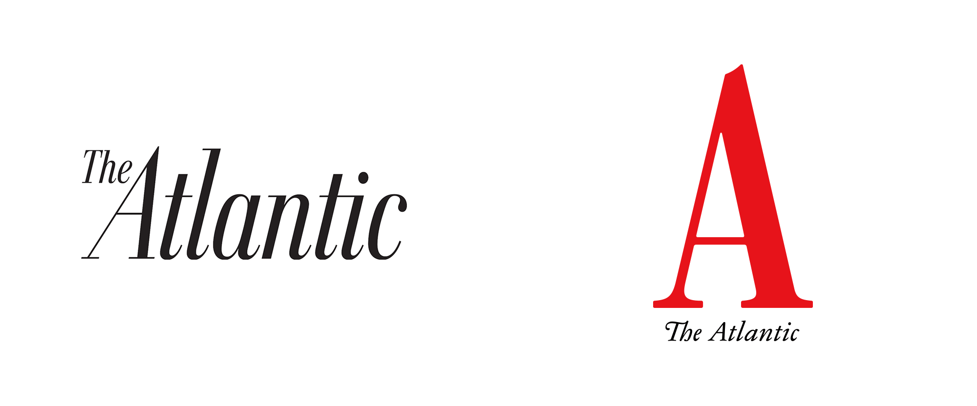
Noted: New Logo and Cover for The Atlantic done In-house
“Oceans Apart”

(Est. 1857) "The Atlantic is an American magazine and multi-platform publisher. It was founded in 1857 in Boston, Massachusetts, as The Atlantic Monthly, a literary and cultural commentary magazine. After experiencing financial hardship and undergoing several ownership changes in the late 20th century, the magazine was purchased by businessman David G. Bradley, who refashioned it as a general editorial magazine primarily aimed at a target audience of serious national readers and "thought leaders". In 2010, The Atlantic posted its first profit in a decade. In 2016 the periodical was named Magazine of the Year by the American Society of Magazine Editors. In July 2017, Bradley sold a majority interest in the publication to Laurene Powell Jobs's Emerson Collective. Its website, TheAtlantic.com, provides daily coverage and analysis of breaking news, politics and international affairs, education, technology, health, science, and culture." (Wikipedia)
Design by
In-house: creative director, Peter Mendelsund; senior art director, Oliver Munday
Related links
The Atlantic press release
Q&A with creative director, Peter Mendelsund
Relevant quote
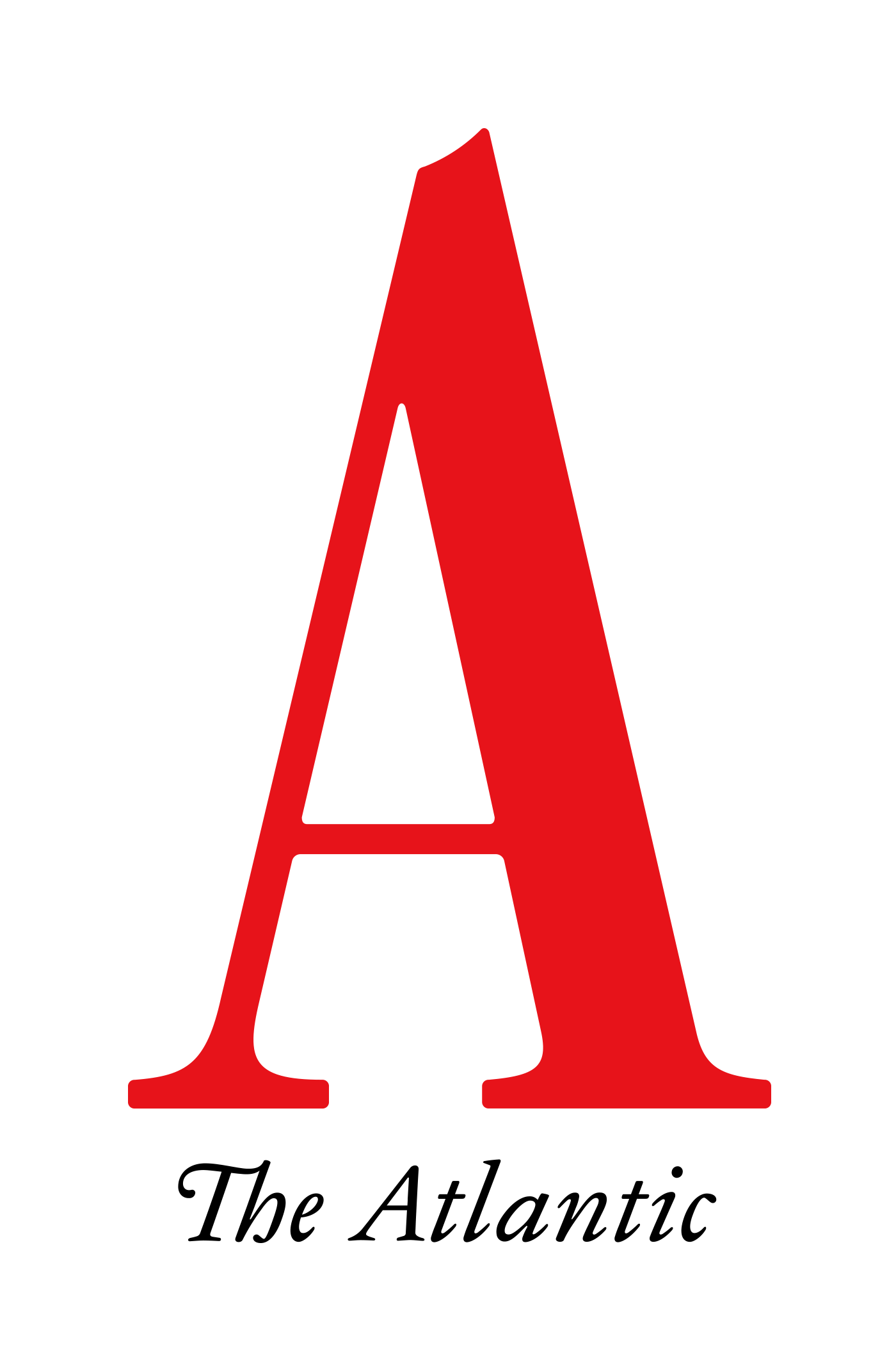
Among thousands of design changes, the most noteworthy is to the logo: The Atlantic nameplate that’s consistently topped the magazine (in different forms) for a century and a half has been updated to a simple and declarative A. The Atlantic also commissioned its first bespoke typeface, Atlantic Condensed, which was inspired by the original type chosen by the magazine’s founders in 1857. The new design also marks the start of a wholesale redesign of the website, beginning with a simplified and streamlined design and user experience.
Images (opinion after)


Opinion
I have always enjoyed the design of The Atlantic and in particular the logo and cover of the previous iteration. The old tall, italic wordmark was so crisply done and all the little curls on the bottom of each character created some beautiful rhythm. I don’t say this often but I will miss the old logo. Visually, the new logo is nice (which I’ll get to) but strategically, I don’t know how appropriate it actually is. Trying to own the “A” as an identifier when you already comfortably own “The Atlantic” seems like an unnecessary uphill battle and one that I’m not sure has a big payoff. I mean, sure, “A” is shorter than “The Atlantic” and it’s always cool to have a strong minimal device but when it comes to magazines, especially The Atlantic, I’m not sure it benefits from it. Still, it’s an interesting evolution in the decades-long history of the magazine, so we’ll see. Execution-wise, the “A” is lovely… I think maybe it could have been made more “display”-ish with more contrast in the thicks and thins and perhaps less bulgy serifs but I’m really not that passionate about that argument, as it’s a really nice “A”. The wordmark feels a lot less special than the old logo and looks more like typesetting that could change from issue to issue instead of being a formal wordmark for the long run. Regarding the cover… I love me a minimal cover but this might be extreme? Maybe this needs a couple of additional publications to settle in but right now it might be too spare and the elements floating too freely without a clearer structure in place. The inside spreads, though, those look fantastic (based on the video) and can’t wait to see more of those. Overall, brand-wise, it’s a fairly drastic change that I’m really not sure how well it will pan out — as considered as the design is, I have a feeling it might change/evolve sooner than later.
In ấn Anpic In nhãn mác Anpic In brochure Anpic In card visit Anpic In catalogue Anpic In thiệp cưới Anpic In tờ rơi Anpic
In Ấn Anpic – Nổi Tiếng In Đẹp In Nhanh
Số 5 Ngõ 75 Nguyễn Xiển, Thanh Xuân, Hạ Đình, Hà Nội
0963223884
baogiainananh@gmail.com
https://anpic.vn
https://g.page/inananpic
In nhãn mác Anpic ✅ In brochure Anpic ✅ In card visit Anpic ✅ In catalogue Anpic ✅ In thiệp cưới Anpic ✅ In tờ rơi Anpic
https://anpic.vn/in-nhan-mac-dep
https://anpic.vn/in-brochure
https://anpic.vn/in-an
https://anpic.vn/in-voucher-in-phieu-giam-gia-khuyen-mai
#inananpic
Comments
Post a Comment