Noted: New Logo and Identity for Danish Crown by Kontrapunkt
“Crown Jewel”
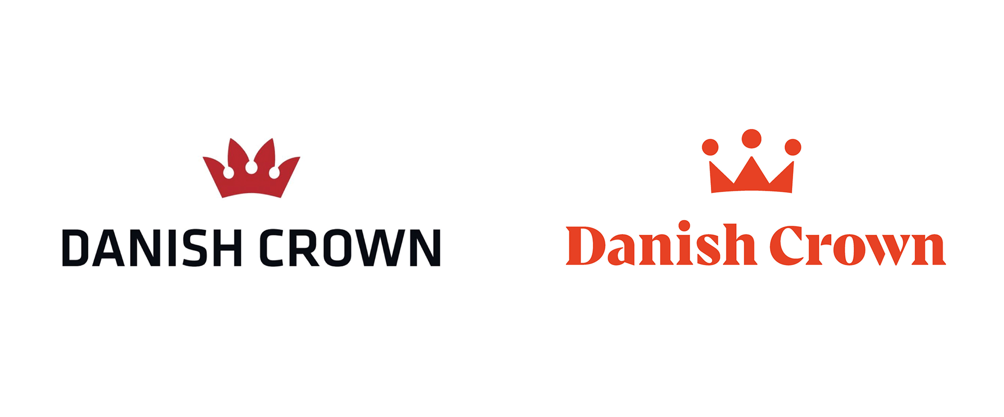
(Est. 1887) "The Danish Crown Group is a global food processing company and among the largest in its field. The Group is the world's largest pork exporter and Europe's largest pork processor. Furthermore, Danish Crown Beef is a significant player in the European beef market. As a global leader in sustainable meat production, we have big obligations; not just to deliver, but to explore new opportunities. We still have a long way to go and face many challenges. But we remain committed to improving how food is produced - with respect for animals, people and the environment. In this quest, we are prepared to challenge ourselves, the industry and the market."
Design by
Kontrapunkt (Copenhagen, Denmark)
Related links
Kontrapunkt project page
Danish Crown brand hub
Danish Crown press release
Relevant quote
Danish Crown’s new brand identity is a living vibrant interface, with vivid ways of expressing the brand in both look, sound and motion. It reflects a diverse and powerful company ready to act. Bold, optimistic and clear, the quality and attention to detail is as impressive as Danish Crown’s ambitions.
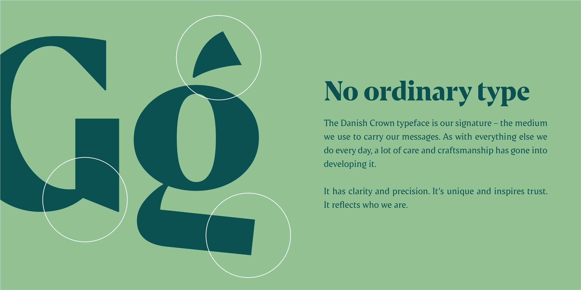
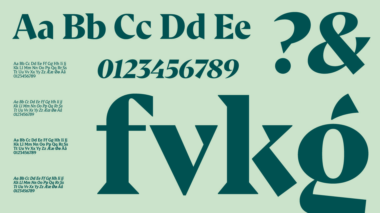
The typeface reflects Danish Crown's craftsmanship and their attention to detail. It takes on the role of a challenger and pushes towards new standards and a new future. It is a typeface that gathers all of Danish Crown - while securing instant brand recognition in all messages written. Even with its loud voice, it is fun, inviting and open to dialogue.
Images (opinion after)
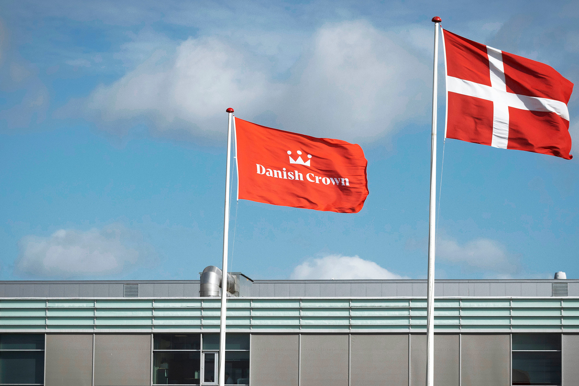
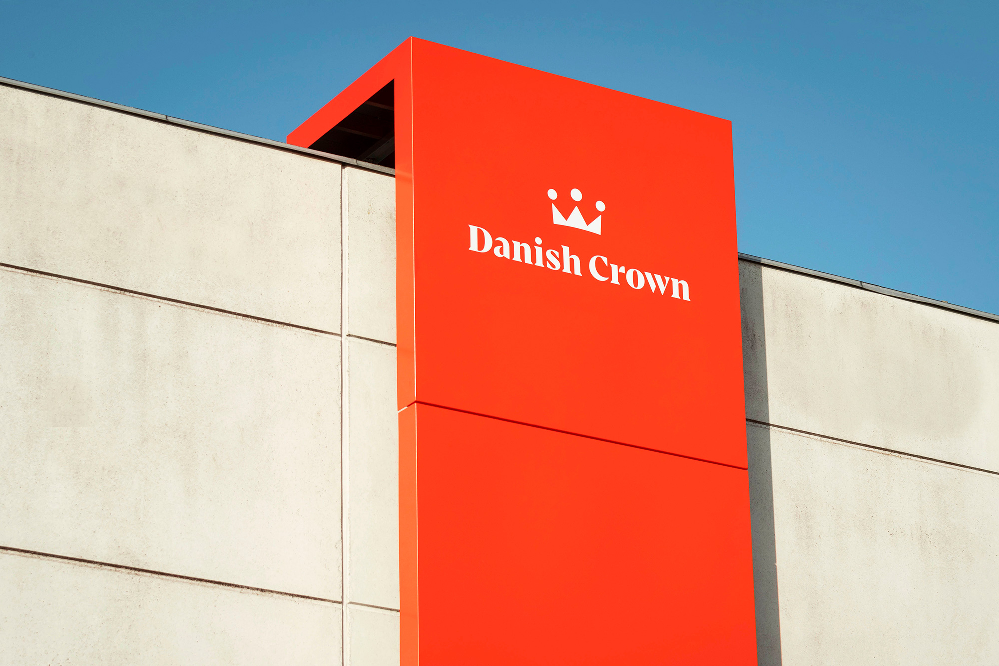
Opinion
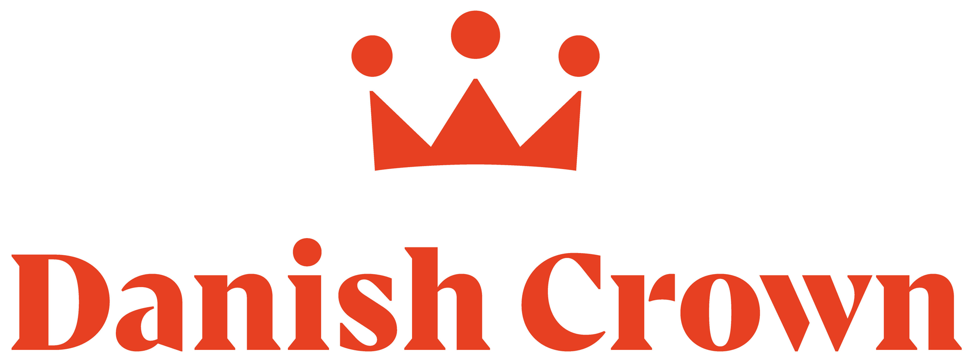
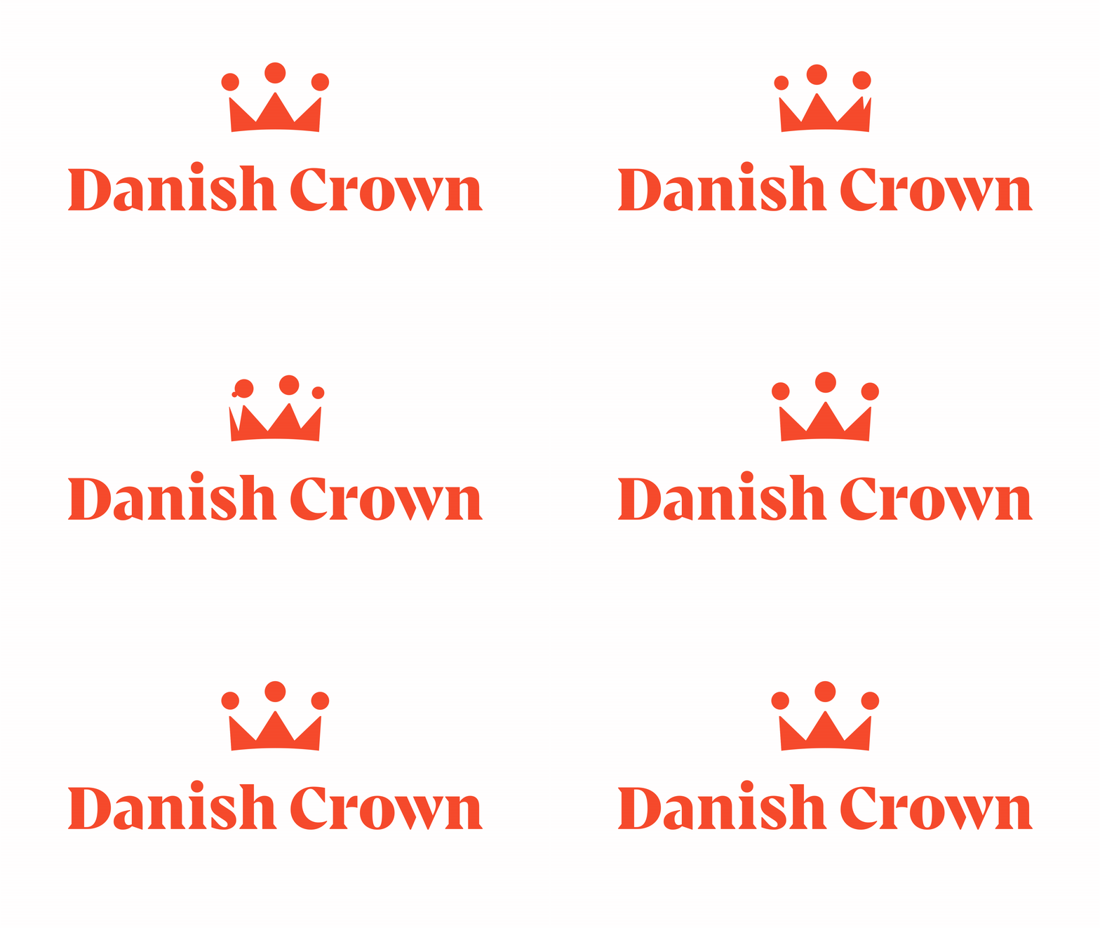
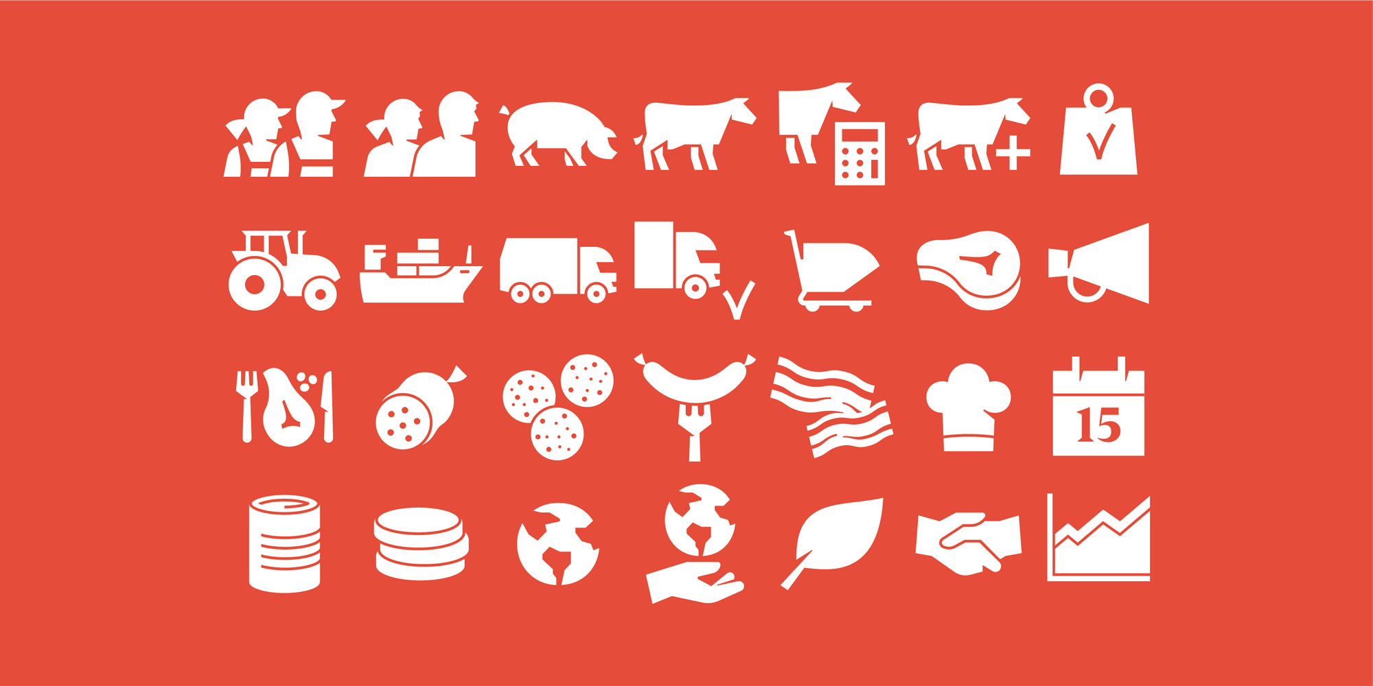
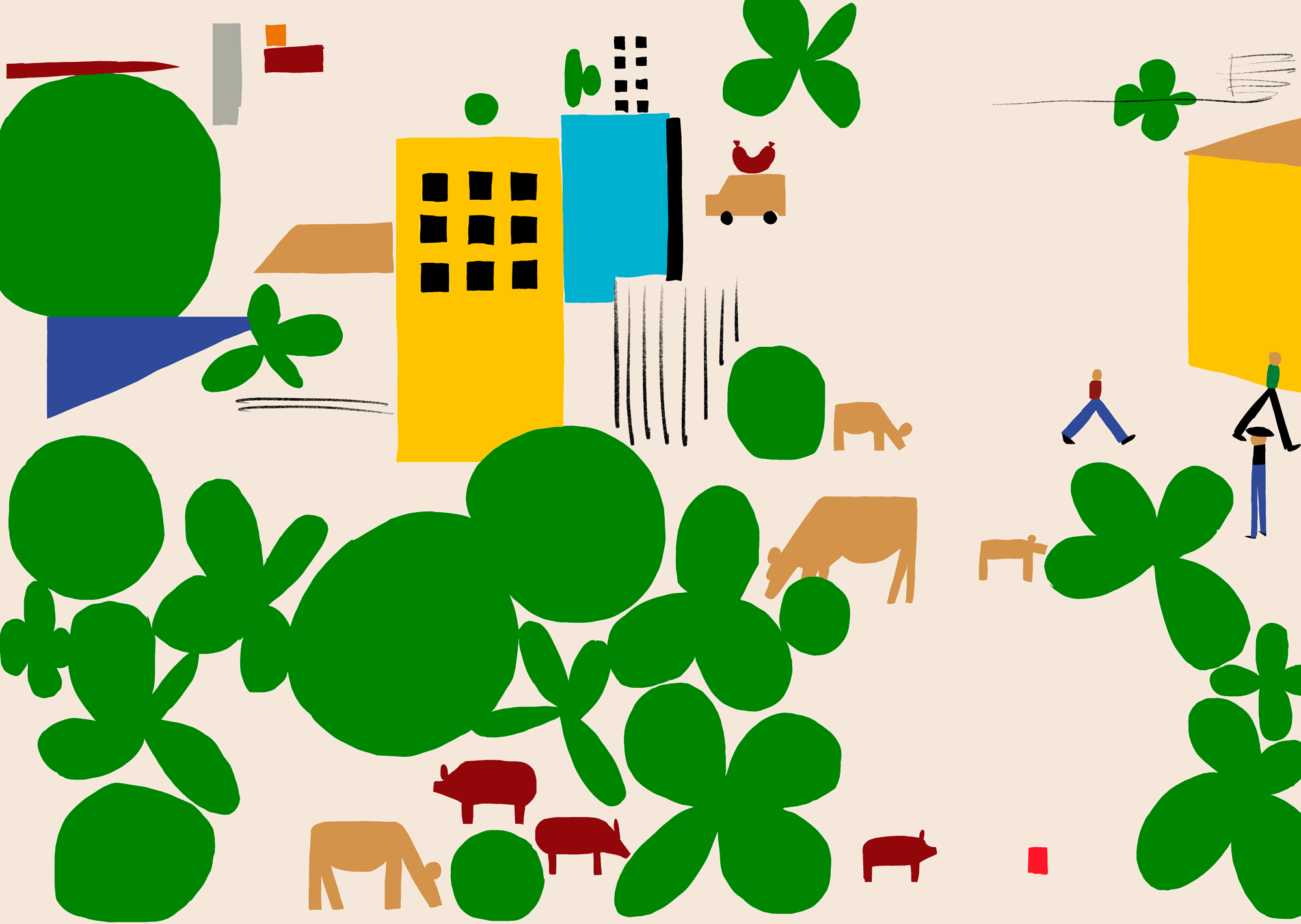
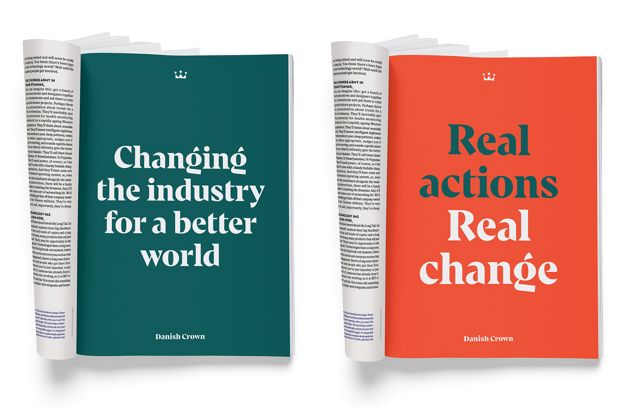
The old logo was relatively fine as a corporate logo with no high ambitions — both the icon and wordmark looked like they were randomly pulled from the internet and mashed together with no real purpose. The new logo is a beautiful evolution that exudes a high degree of craftsmanship, particularly in the serif wordmark but also in the minimalist crown. Both elements are very nicely done and well integrated through their use of sharp angles. The custom typeface is really nice and has some great details throughout — I would pay good money for it if it were retail. Icon set and illustrations are good too as is the color palette of dark and mint-ish green with pink and orange. The applications are all slick and professional with great use of the different elements. Overall, a solid and very well crafted evolution from identity to positioning. (Side note: apologies to all vegetarians/vegans who stand against the meat industry and any kind of celebration of their practices, even at the logo level).
In ấn Anpic In nhãn mác Anpic In brochure Anpic In card visit Anpic In catalogue Anpic In thiệp cưới Anpic In tờ rơi Anpic
In Ấn Anpic – Nổi Tiếng In Đẹp In Nhanh
Số 5 Ngõ 75 Nguyễn Xiển, Thanh Xuân, Hạ Đình, Hà Nội
0963223884
baogiainananh@gmail.com
https://anpic.vn
https://g.page/inananpic
In nhãn mác Anpic ✅ In brochure Anpic ✅ In card visit Anpic ✅ In catalogue Anpic ✅ In thiệp cưới Anpic ✅ In tờ rơi Anpic
https://anpic.vn/in-nhan-mac-dep
https://anpic.vn/in-brochure
https://anpic.vn/in-an
https://anpic.vn/in-voucher-in-phieu-giam-gia-khuyen-mai
#inananpic
Comments
Post a Comment