Noted: New Logo for Netherlands
“It Takes Two to Tulip”

"The Netherlands, informally Holland, is a country in Northwestern Europe with some overseas territories in the Caribbean. The official language is Dutch, but a secondary official language in the province of Friesland is West Frisian. In the northern parts of the country, Low Saxon is also spoken. The five largest cities in the Netherlands are Amsterdam, Rotterdam, The Hague, Utrecht, and Eindhoven. Amsterdam is the country's capital, while The Hague holds the seat of the States General, Cabinet and Supreme Court. The Port of Rotterdam is the largest port in Europe, and the largest in any country outside Asia. The country is a founding member of the EU, Eurozone, G10, NATO, OECD and WTO, as well as a part of the Schengen Area and the trilateral Benelux Union. It hosts several intergovernmental organisations and international courts, many of which are centered in The Hague, which is consequently dubbed 'the world's legal capital'. Its mixed-market advanced economy had the thirteenth-highest per capita income globally. The Netherlands ranks among the highest in international indexes of press freedom,[19] economic freedom,[20] human development, and quality of life, as well as happiness." (Wikipedia)
Design by
N/A
Related links
Government of Netherlands press release
Relevant quote
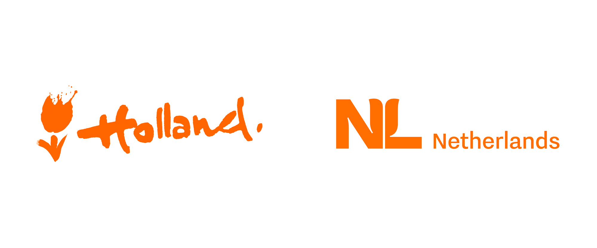
From now on the Netherlands and the Kingdom of the Netherlands can be recognised internationally by a new logo. The logo is characterised by two symbols: NL and a stylised orange tulip. The logo replaces the much used ‘Holland tulip’ of the Netherlands Board of Tourism & Conventions’ (NBTC).
The new style is the result of a strategy developed to more clearly show what the Netherlands has to offer to the world. Minister Kaag (Foreign Trade and Development Cooperation): ‘The new logo can be applied across a range of fields, from high tech to agrifood and from sport to culture. A clear cut international image is positive for our exports and the attraction of investment and talent.’
Images (opinion after)

Opinion
One thing worth mentioning upfront — if I am understanding the press release correctly — is that this logo replaces the Netherlands Board of Tourism & Conventions “Holland” with tulip logo AND becomes basically the country brand. (The other way this could be read is that the “Holland” logo will remain as the tourism logo but whatever use it had at the government level will be replaced by this new logo.) The old logo was very tourist-oriented with its “artistic” brush aesthetic and hand-lettered wordmark. Part of the problem was that the logo didn’t represent all of the country and further enhanced the confusion non-Dutch people have of whether the country is Holland or The Netherlands. The new logo clarifies that situation by switching to Netherlands and doubles down on the tulip with an “NL” monogram that slightly awkwardly but also slightly cleverly teams up to shape a tulip. I will disclaim that I do not know what the local sentiment is to tulips or if there is as much love and use for it as a symbol as Canadians have for the maple leaf but I’m digging this a lot, despite it being so weird. The concept of mixing the very recognizable “NL” shorthand with a tulip is forced for sure but the fact that they were able to even concoct something that reads as both things is quite commendable. I know I’m swimming against the current and that most people won’t like this but I’m okay with that. I like the weird look of the “L” and the asymmetry of the “N” — I wish the latter had a bigger counterspace in the notch to match that of the “L”. The wordmark is oddly small… perhaps eventually, in application, that will sort of correct itself because it makes the monogram feel heavier than it needs to be. In another likely unpopular statement, I’ll say this has the presence and instant association to become one of the most effective country logos in 5- to 10-years time.
In ấn Anpic In nhãn mác Anpic In brochure Anpic In card visit Anpic In catalogue Anpic In thiệp cưới Anpic In tờ rơi Anpic
In Ấn Anpic – Nổi Tiếng In Đẹp In Nhanh
Số 5 Ngõ 75 Nguyễn Xiển, Thanh Xuân, Hạ Đình, Hà Nội
0963223884
baogiainananh@gmail.com
https://anpic.vn
https://g.page/inananpic
In nhãn mác Anpic ✅ In brochure Anpic ✅ In card visit Anpic ✅ In catalogue Anpic ✅ In thiệp cưới Anpic ✅ In tờ rơi Anpic
https://anpic.vn/in-nhan-mac-dep
https://anpic.vn/in-brochure
https://anpic.vn/in-an
https://anpic.vn/in-voucher-in-phieu-giam-gia-khuyen-mai
#inananpic
Comments
Post a Comment