Noted: New Logo for PBS by Lippincott
“Future-facing”
(Est. 1969) "PBS, with more than 330 member stations, offers all Americans the opportunity to explore new ideas and new worlds through television and digital content. Each month, PBS reaches over 120 million people through television and 26 million people online, inviting them to experience the worlds of science, history, nature and public affairs; to hear diverse viewpoints; and to take front row seats to world-class drama and performances. PBS's broad array of programs has been consistently honored by the industry's most coveted award competitions. Teachers of children from pre-K through 12th grade turn to PBS for digital content and services that help bring classroom lessons to life. Decades of research confirms that PBS's premier children's media service, PBS KIDS, helps children build critical literacy, math and social-emotional skills, enabling them to find success in school and life. Delivered through member stations, PBS KIDS offers high-quality educational content on TV-- including a 24/7 channel, online at pbskids.org, via an array of mobile apps and in communities across America."
Design by
Lippincott
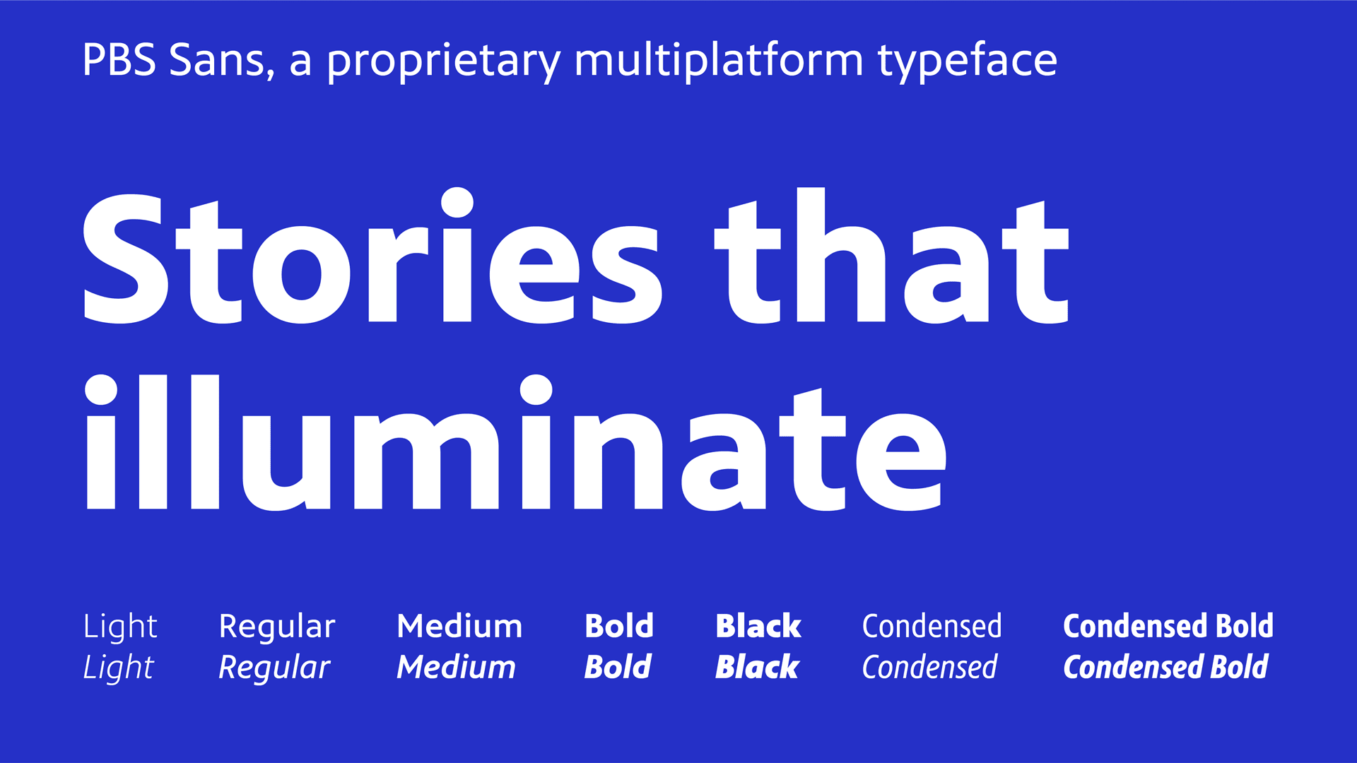
Custom type family: Monotype
Related links
Lippincott project page
PBS press release
Relevant quote
While the previous identity had incredibly strong equity with audiences, refinements would amplify its existing heritage and connect with viewers of all generations. The new logo boasts a vibrant blue and a more modern, clear, and relatable logotype. We softened the sharp geometric features of the original symbol, with a subtle upward gaze that feels more engaging. PBS Sans—the brand’s new proprietary typeface—is human, engaging, and highly legible across all platforms. Supporting visual elements like a distinct illustration style evoke the logo’s human characteristics, and circular cues and movements across the identity system bring warmth, sophistication, and energy to the rigor and reason of PBS. The entire visual identity is bolder and projects a sense of trust and dependability to better showcase PBS as a curator and provider of content. Combined, these visual elements highlight PBS programming and unify local and national communities across member stations.
Images (opinion after)


Opinion
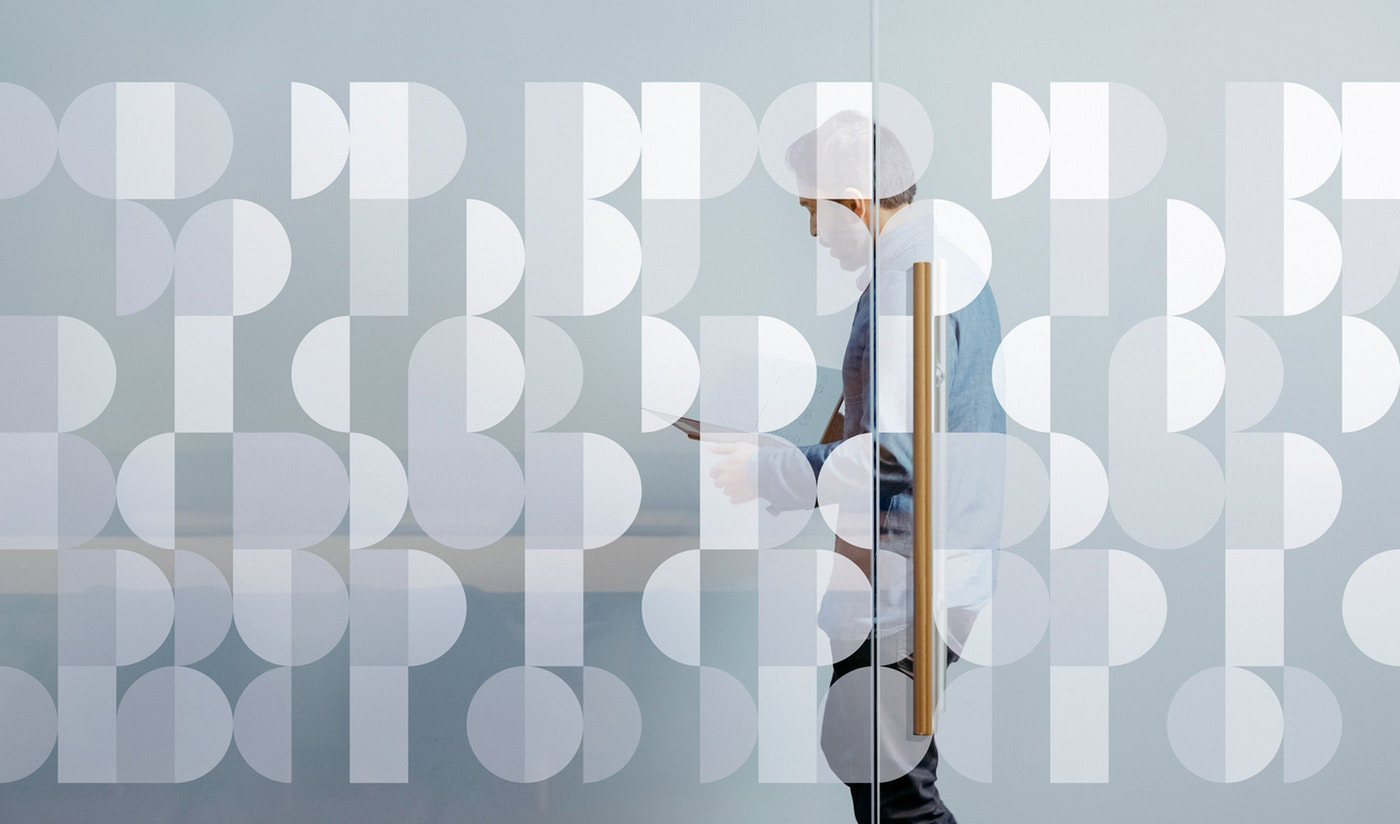
First, the good news: the triple face icon remains after a few tweaks that make it softer. I don’t think it’s better or worse than before as the basic structure is still intact. I think I do like the new version better with the noses being less harsh than before. Second, the not-bad, not-good news: The “PBS” slab wordmark has been replaced with a more corporate sans serif wordmark. I kind of liked the old version but perhaps just because of inertia as it’s been that way for a long time. The new one is an improvement in the size relationship with the icon, now being the same size as the heads, but it’s very dry, almost like a library logo… so I guess it’s not bad. The color has shifted to a slightly muted version of the “that blue”, which is kind of odd to see for PBS but as a quick way of adding some visual stimulus, it works. The custom typeface is really nice but I feel like it’s a little out of place for PBS — I get very heavy Southwest Airlines vibes since it’s somewhat similar to that custom type that was also the one-two punch work of Lippincott and Monotype. I’m not really sure what’s going on in the applications… it’s all fine I guess but there is no there, there. The UI renders are generic, the illustration is random, and that door mock-up is a head-scratcher. Overall, I think this is all fine… PBS could have probably done without it but it also equally probable benefits from it. One thing that’s crazy is that each member station can CHOOSE to adopt or not adopt the new identity, so there is going to be a lot more confusion before there is more clarity to the PBS brand.
In ấn Anpic In nhãn mác Anpic In brochure Anpic In card visit Anpic In catalogue Anpic In thiệp cưới Anpic In tờ rơi Anpic
In Ấn Anpic – Nổi Tiếng In Đẹp In Nhanh
Số 5 Ngõ 75 Nguyễn Xiển, Thanh Xuân, Hạ Đình, Hà Nội
0963223884
baogiainananh@gmail.com
https://anpic.vn
https://g.page/inananpic
In nhãn mác Anpic ✅ In brochure Anpic ✅ In card visit Anpic ✅ In catalogue Anpic ✅ In thiệp cưới Anpic ✅ In tờ rơi Anpic
https://anpic.vn/in-nhan-mac-dep
https://anpic.vn/in-brochure
https://anpic.vn/in-an
https://anpic.vn/in-voucher-in-phieu-giam-gia-khuyen-mai
#inananpic


Comments
Post a Comment