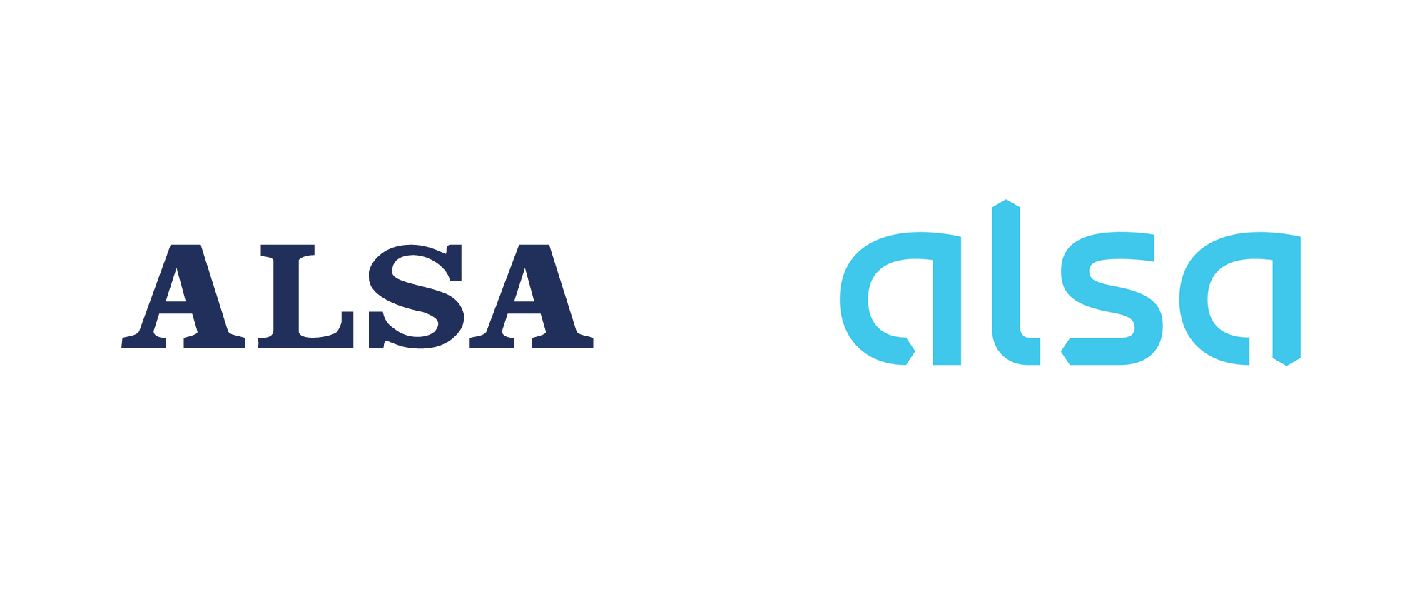
Noted: New Logo and Identity for Alsa by Interbrand
“Where the Wind Blows”

(Est. 1923) "ALSA is the leading operator in the Spanish sector of passenger transport by road. As an integral operator, it is able to meet the different transportation needs of citizens providing a wide range of regional, national, international, urban, discretionary (coach hire), and tourist services. Additionally, ALSA specializes in the management of bus stations, service areas, and vehicle maintenance areas. Currently, ALSA possesses a modern fleet including 3,465 buses, which transport more than 358 million passengers per year who are served by a competent team of over 9,719 professionals. Alongside its development in Spain, ALSA has carried out an intense process of internationalization, contributing to its presence in most EU countries as well as in the Kingdom of Morocco and, recently, in Puerto Rico."
Design by
Interbrand (Madrid, Spain, office)
Related links
Interbrand project page
Relevant quote
Alsa's new strategy is based on a clear promise: to bring people closer and connect the world in a safe and sustainable way with the best integrated mobility solutions. As a result, it positions itself as an operator that guarantees its consumers simple door-to-door mobility.
Using simple geometric symbols that are integrated and combined in different ways, a simple language was developed that conveys the future of Alsa: providing sustainable, multimodal and integrated mobility services. Playing with these geometric shapes inspired the new logo. Each of the arrows incorporated in the letters points to one of the cardinal points, thus associating the brand with an explorer component that invites movement. The option of abandoning capital letters responds to the brand's desire to connect in a more friendly and emotional way with its audiences.
The combination of the basic figures also gives rise to the "connectors", the key visual that provides Alsa with visual resources to communicate in all the necessary points of contact, both physical and digital. The visual identity also has an illustrative system and its own typography, thanks to which the brand will be able to communicate with its own voice and in a differentiated way compared to other competitors.
Images (opinion after)


Opinion
The old logo was forgettable, generic, and way too default-looking to even be considered a logo — nonetheless, it was on the sides of buses all over the place. The new logo is more clearly a logo with a custom wordmark in a corporate-y, tech-y, airline-y aesthetic that is mostly okay. I’m not a big fan of the logo but I also don’t think it’s bad-bad. I really like the concept that the arrowheads in each of the letters is each pointing to the four cardinal points — East, North, West, and South respectively. The lighter blue choice is perhaps way too light… something in between this and the old blue maybe would have been a better place to land. In application there is a lot going on and going in as many directions as the logo is pointing to. There is the custom type family that’s fine but I’m not sure if it fits “bus travel”, like, it’s trying too hard to be contemporary. There are some geometric-y, graphic shapes that are cool in the video that shows them but then that niceness is nowhere to be found in application. There are some illustrations of cities in a flat style that looks very… unfinished. And then there is some really cheesy photography… that man jumping while reading the newspaper in the posters image? Just, no. Overall, this definitely has a new-car-smell to it that’s better than whatever the old identity was but I think it needs to be reigned in in a number of places to work better and in a more simple, efficient way without expanding so much energy on so much stuff.
In ấn Anpic In nhãn mác Anpic In brochure Anpic In card visit Anpic In catalogue Anpic In thiệp cưới Anpic In tờ rơi Anpic
In Ấn Anpic – Nổi Tiếng In Đẹp In Nhanh
Số 5 Ngõ 75 Nguyễn Xiển, Thanh Xuân, Hạ Đình, Hà Nội
0963223884
baogiainananh@gmail.com
https://anpic.vn
https://g.page/inananpic
In nhãn mác Anpic ✅ In brochure Anpic ✅ In card visit Anpic ✅ In catalogue Anpic ✅ In thiệp cưới Anpic ✅ In tờ rơi Anpic
https://anpic.vn/in-nhan-mac-dep
https://anpic.vn/in-brochure
https://anpic.vn/in-an
https://anpic.vn/in-voucher-in-phieu-giam-gia-khuyen-mai
#inananpic
Comments
Post a Comment