Noted: New Logo and Identity for MAAM by Moth Design
“Just the Facts, Ma’am”
(Est. 2019, opening 2020) "The MassArt Art Museum (MAAM) is Boston's newest museum, a space to experience works by visionary artists at the forefront of contemporary art. As MassArt's teaching museum, we are committed to educating and empowering the next generation of artists--both on our campus and throughout the world. As a kunsthalle, a non-collecting museum with no permanent collection, our exhibitions will perpetually change to feature contemporary art across a wide array of disciplines--a true reflection of the diversity of majors at MassArt, the first publicly funded freestanding art school in the United States."
Design by
Moth Design (Boston, MA)
Related links
Moth Design project page
Relevant quote
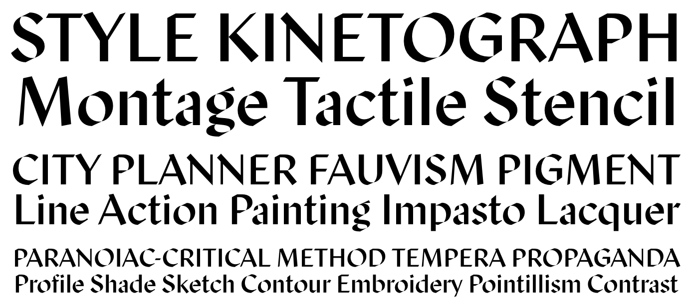
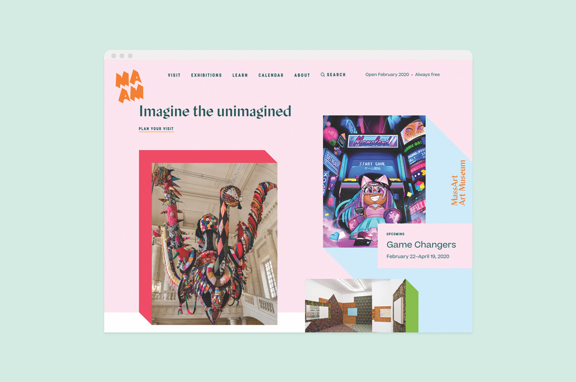
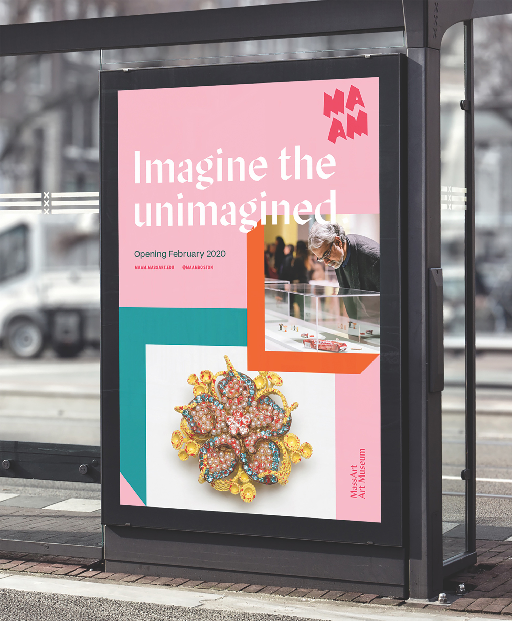
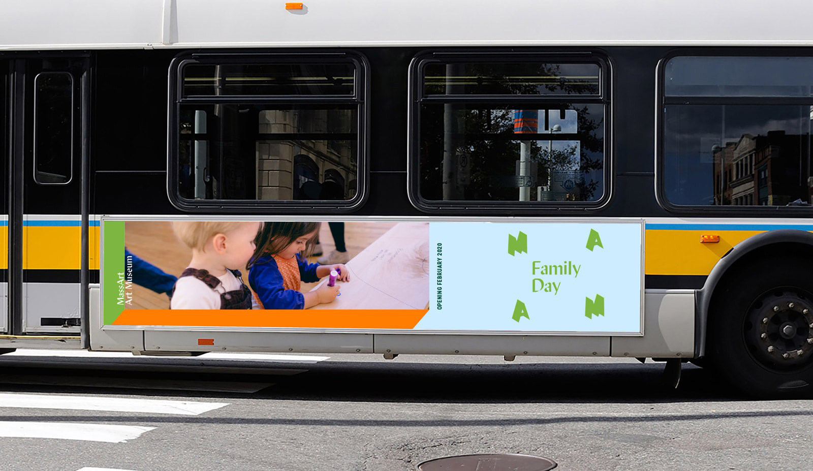
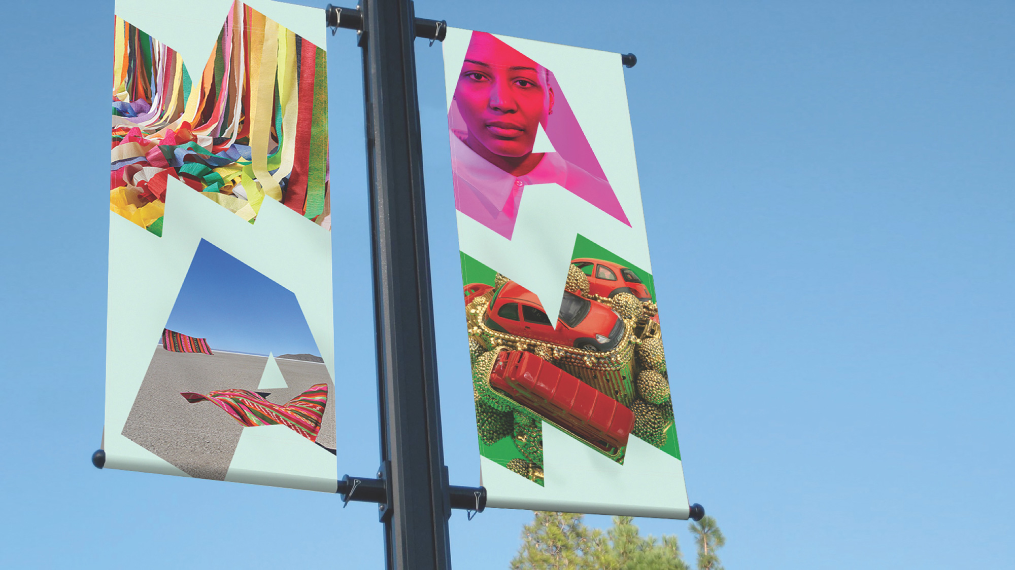
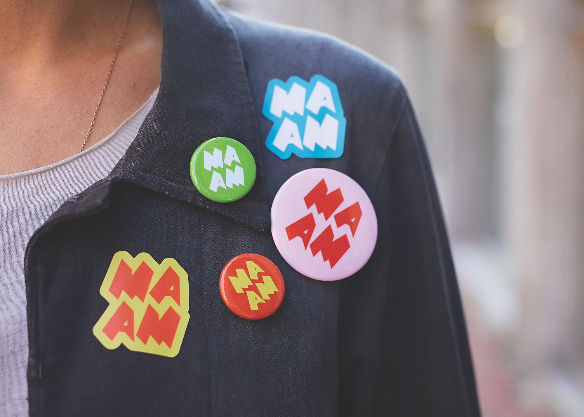
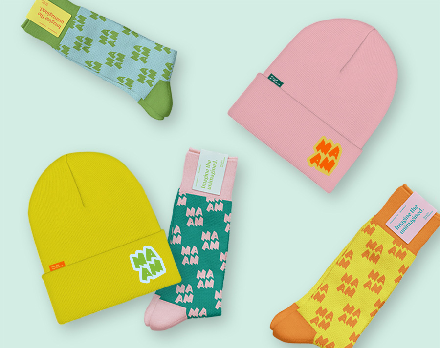
MAAM sought a bold brand that breaks the mold of the stark black-and-white motifs at other contemporary art institutions. During a visual workshop, the MAAM team reached consensus on what they desired in a logotype: “No serif, no sans serif.” No problem, right? We delivered with a logomark that has custom letter forms that are moving forward in space. And we partnered with Nick Sherman to craft a bespoke font that is used as the display face in the system.
Images (opinion after)

Opinion
The new logo is interesting and serves as another piece of evidence that both designers and clients may be getting tired of the same old approaches to art institution identity design. Coincidentally — because there is no reason to believe there is any foul play — this looks a lot like the recent Museum of the Home identity with the use of the orange color and the hard shadow casting. Again, in no way am I trying to say that MAAM is a derivative of Museum of the Home — they were both released at about the same time. On separate continents. Anyway… I don’t love the new MAAM logo but I think it does a good job of treating the mirror-y MA|AM combination of letters in an unexpected way by splitting them into two lines and extruding them quite generously. For a small-ish art museum it works. I could have done without the logo-as-window treatment which feels way too clichéd now for a museum and it doesn’t really work inside those shapes. The custom typeface is also interesting but it’s somewhat harsh and not exactly inviting. While the applications avoid the typical black, the colors chosen are a little too… happy. It almost starts to look like a high-end kids clothing store more than a museum. The hard shadows to frame photos in application go in all directions and it starts to get a little noisy with the different colors and the logo and the custom type — it’s as if each element in the layout is pulling you in a different direction. Overall, the approach is right — somewhere between playful and experimental — but it doesn’t quite come together in the end.
In ấn Anpic In nhãn mác Anpic In brochure Anpic In card visit Anpic In catalogue Anpic In thiệp cưới Anpic In tờ rơi Anpic
In Ấn Anpic – Nổi Tiếng In Đẹp In Nhanh
Số 5 Ngõ 75 Nguyễn Xiển, Thanh Xuân, Hạ Đình, Hà Nội
0963223884
baogiainananh@gmail.com
https://anpic.vn
https://g.page/inananpic
In nhãn mác Anpic ✅ In brochure Anpic ✅ In card visit Anpic ✅ In catalogue Anpic ✅ In thiệp cưới Anpic ✅ In tờ rơi Anpic
https://anpic.vn/in-nhan-mac-dep
https://anpic.vn/in-brochure
https://anpic.vn/in-an
https://anpic.vn/in-voucher-in-phieu-giam-gia-khuyen-mai
#inananpic


Comments
Post a Comment