Noted: New Logo and Identity for Offftlv by Firma
“All Eyes on Deck”
(Est. 2019) "Offftlv is a visual design festival hosting the most innovative creative creators. We are a community inviting all those who are eager to learn to participate and get inspired in a two day conferences journey of talks, workshops and inspiration. Nineteen years ago, Offf was born in Barcelona, Spain. Today, it has become a popular innovation and creativity festival worldwide. The event, hosted at the Tel Aviv Museum of Art, will offer a series of conferences, workshops, performances, and activities but most of all- will serve as a meeting point for collaborators and cultural commotion. Creators, students and emerging talents are invited to get together, get inspired and share new interests at this vibrant two-day festival."
Design by
Firma (Tel Aviv, Israel)
Related links
Firma project page
Relevant quote
We wanted to capture that diversity in a way that also interfaces with where we are. Tel Aviv is a tiny power-city is a small country, and during its relatively short existence, is has done the absolute impossible by becoming a bustling hub of culture, art and creation. Tel Aviv is for everyone. It’s beautiful and showy, aesthetic and scribbled, pioneering and traditional. We decided to create a visual event that captures minds, hearts and first and foremost: eyes.
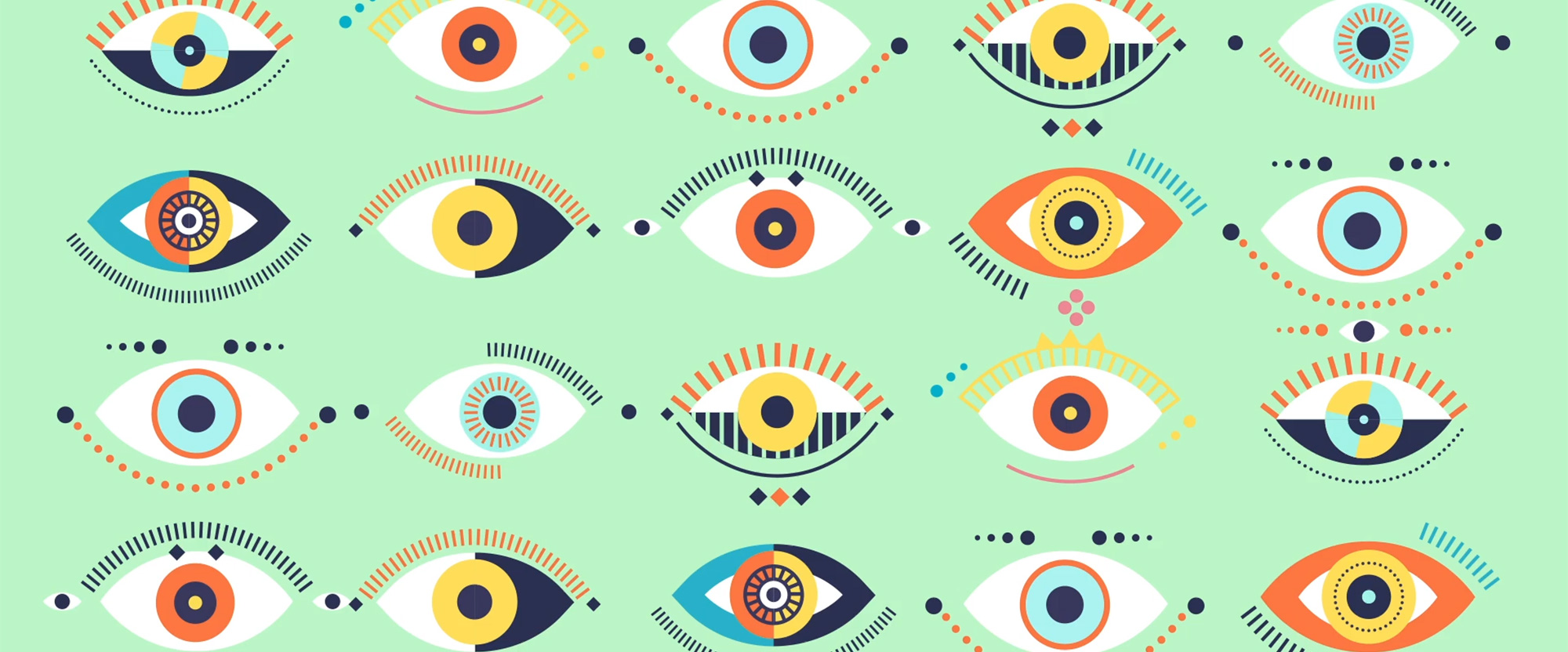
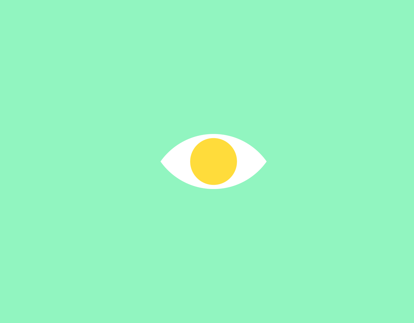
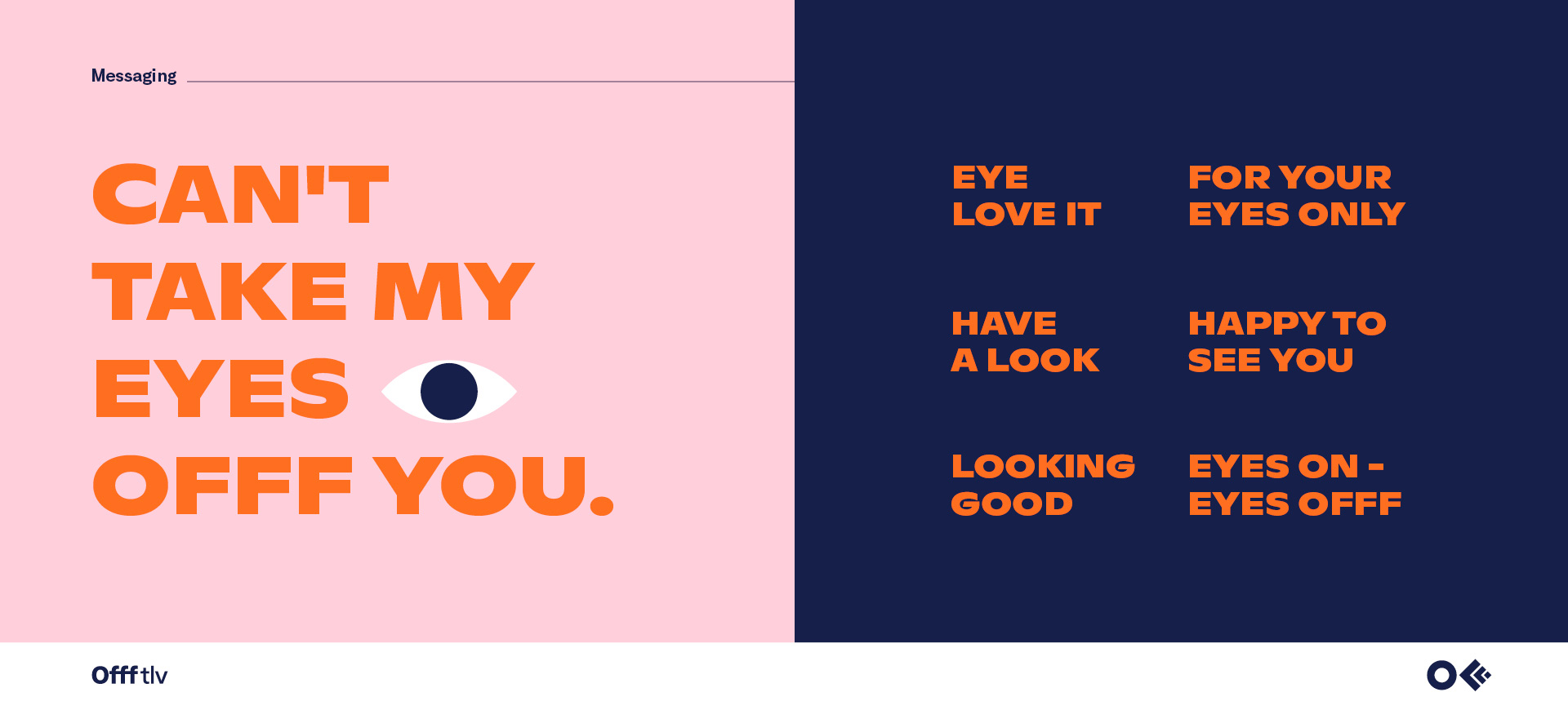
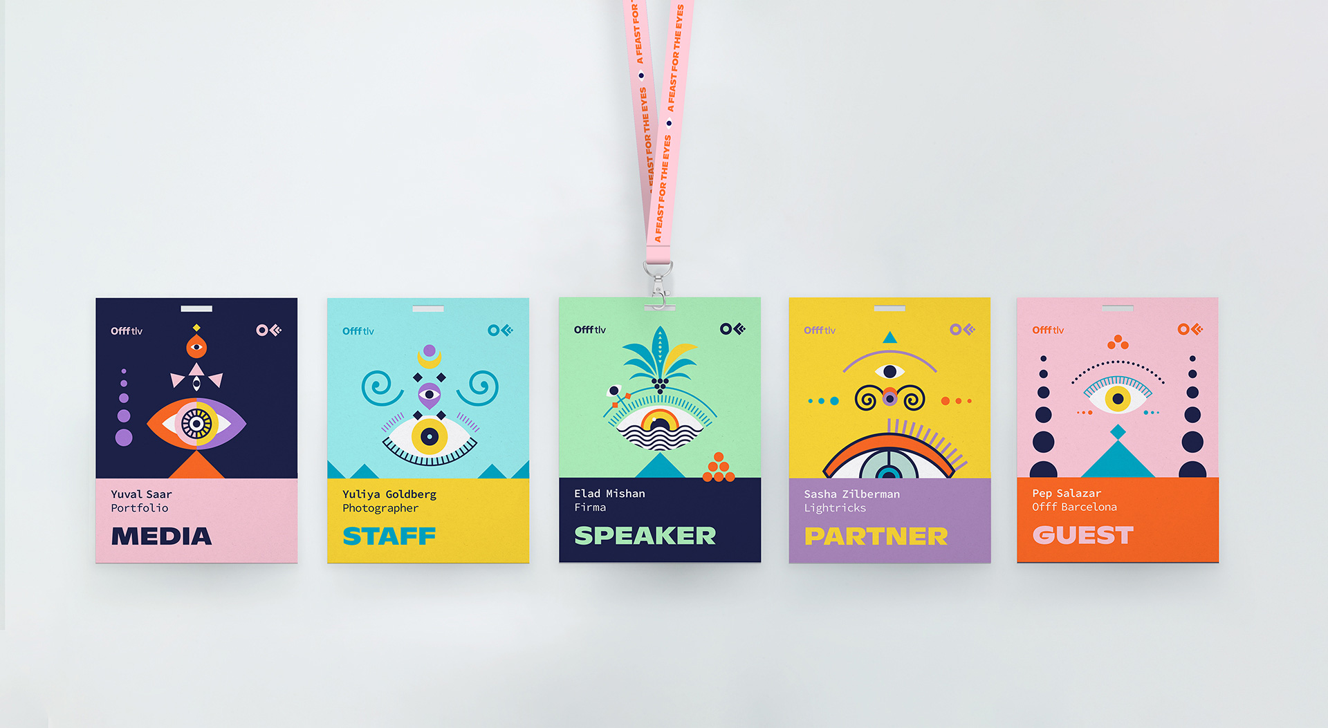
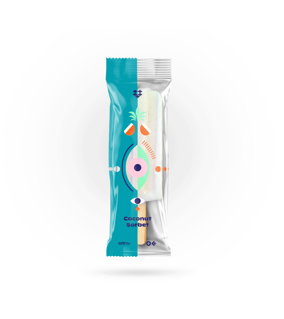
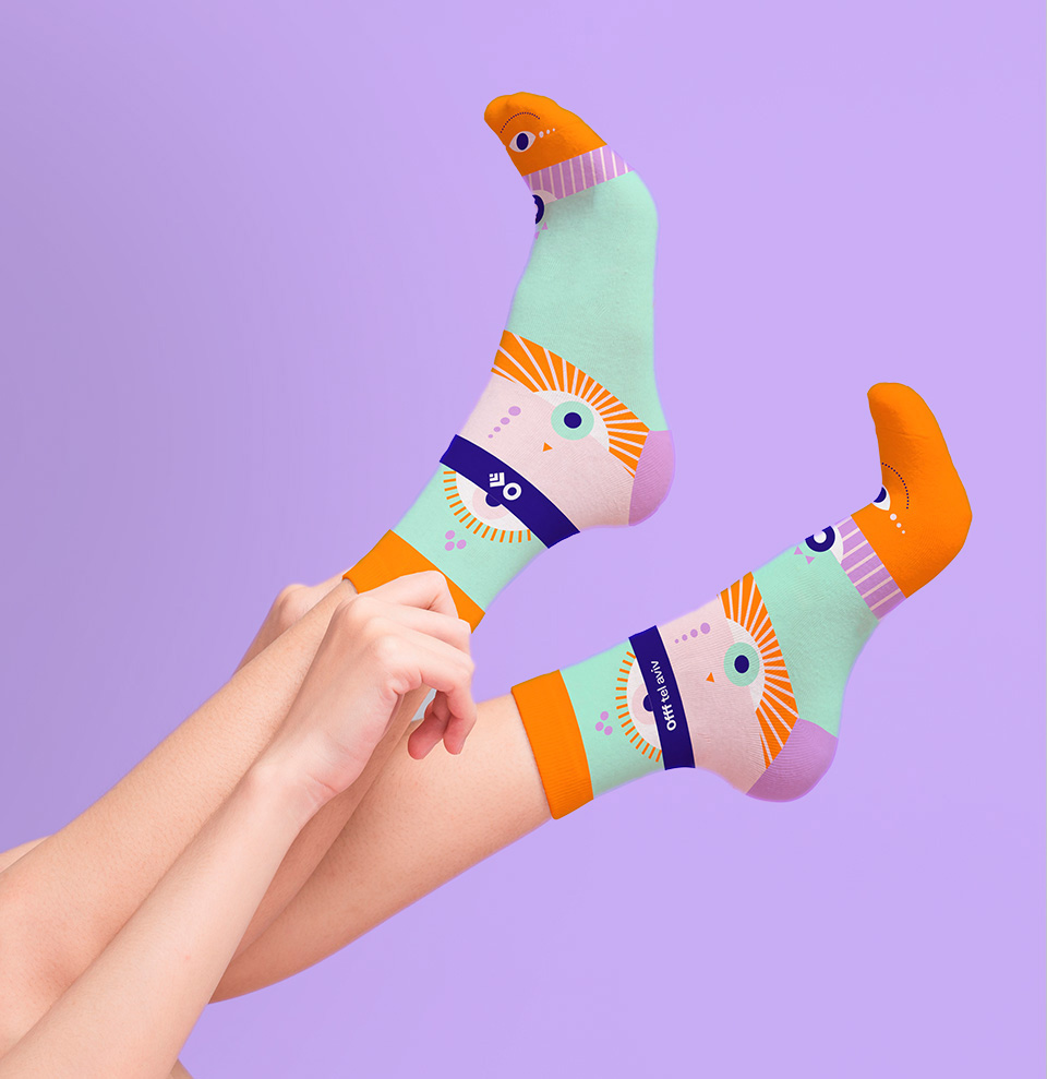
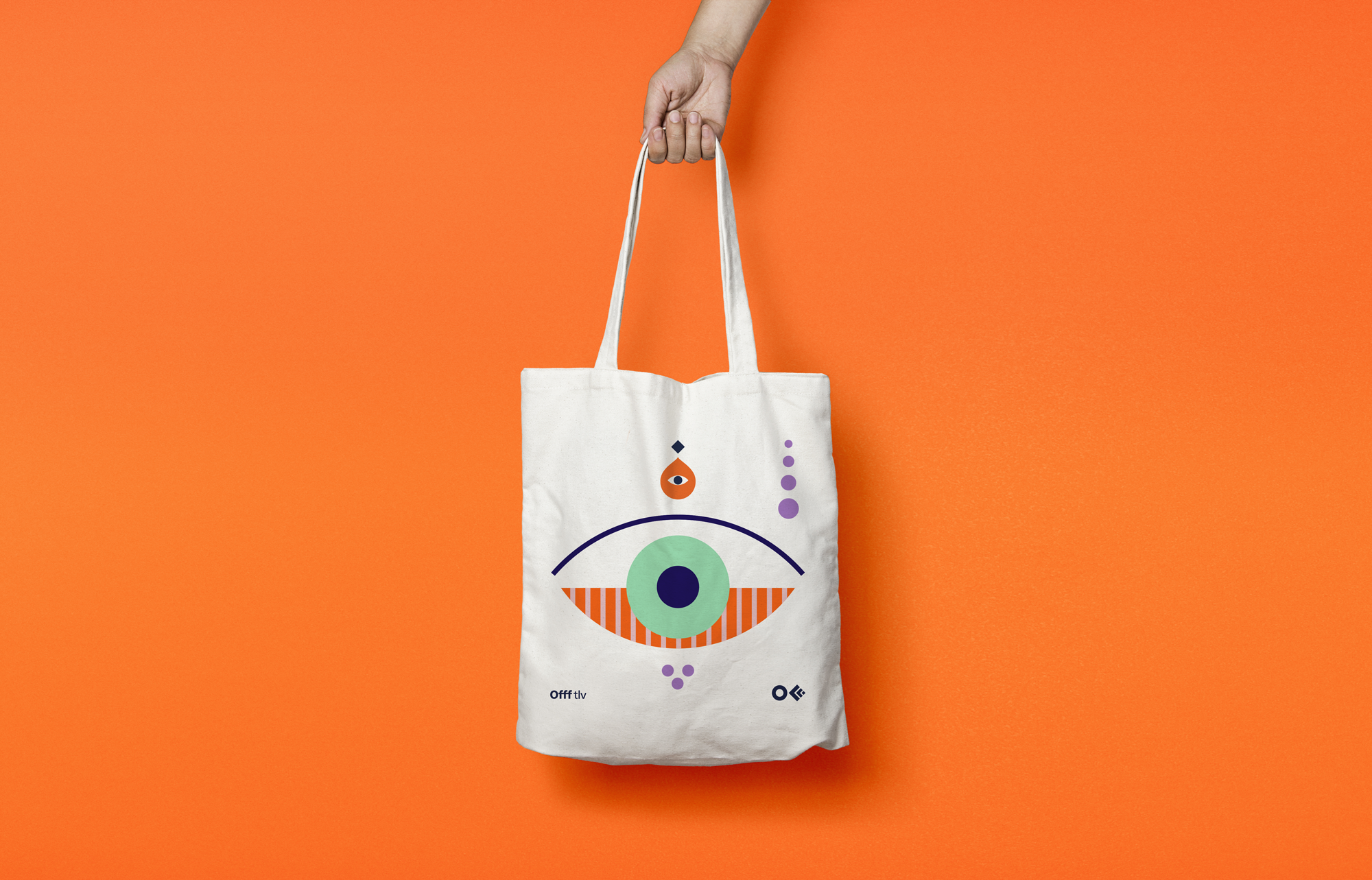
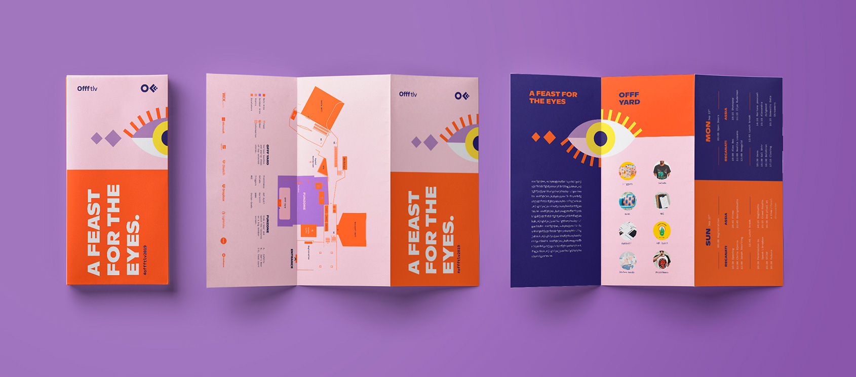
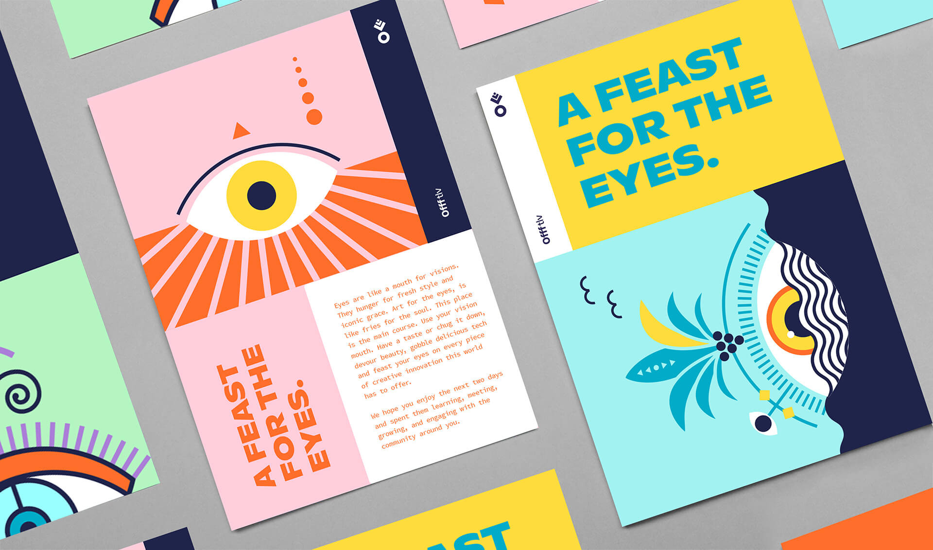
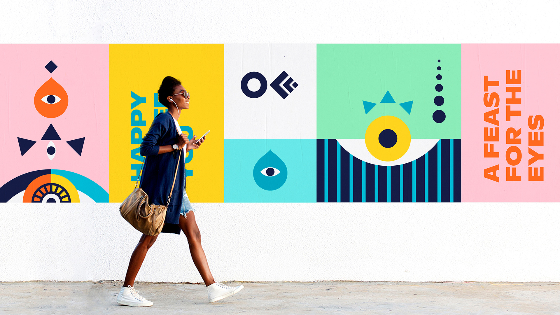
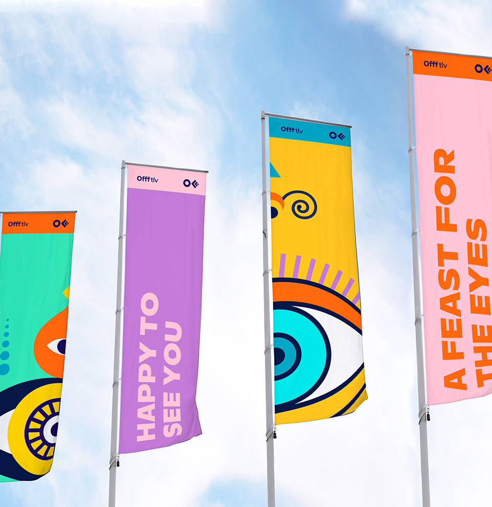
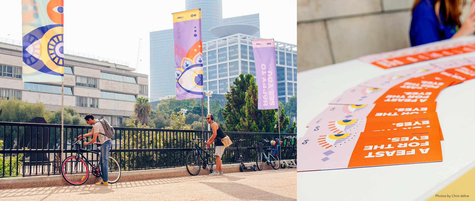
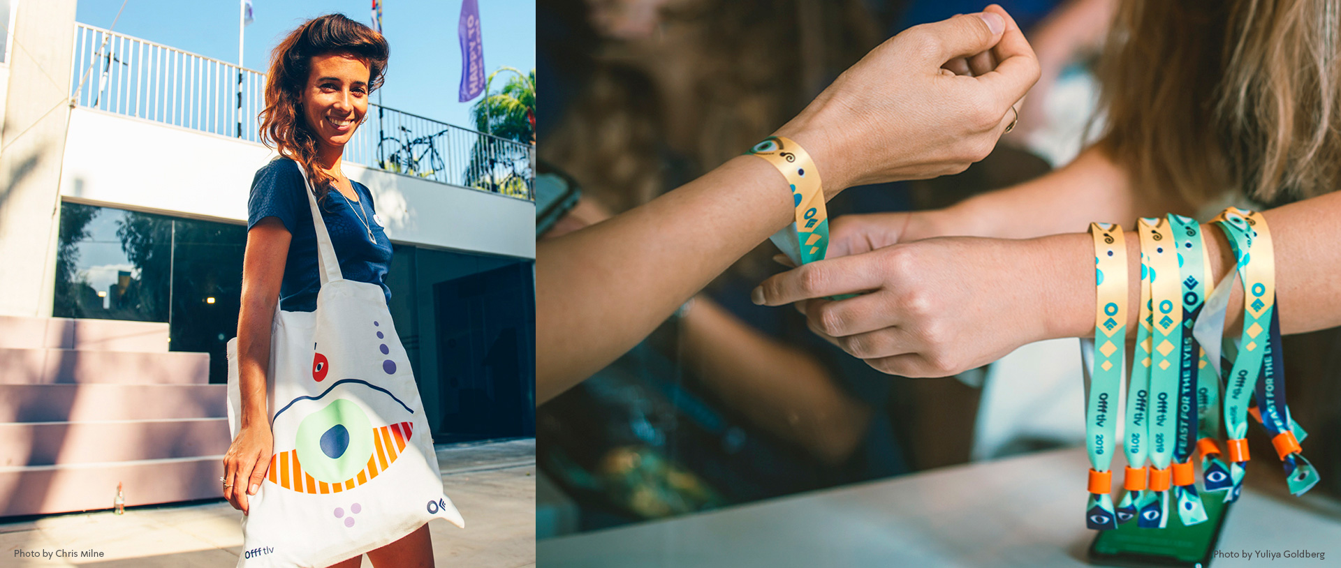
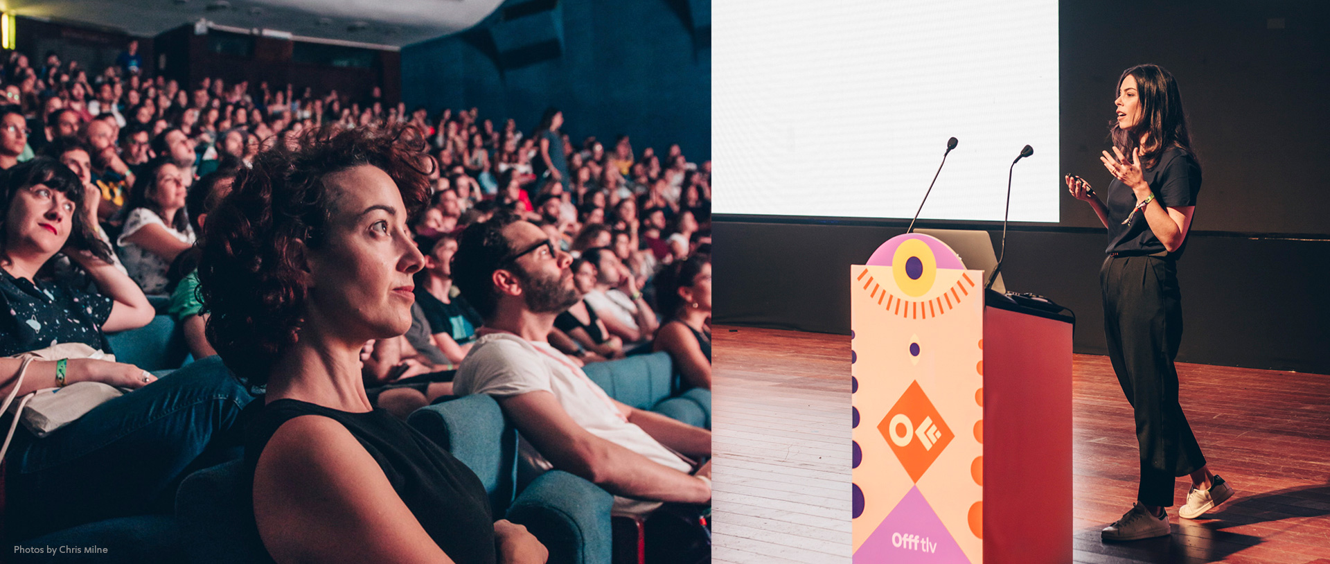
Eyes are mirrors to the soul and a window to emotions. They’re the first thing we lay on anything, the basic condition for love at first sight. Research shows that eye movement is a key element in decoding data and processing experiences. You can eat with your eyes and definitely shop with your eyes – cheers to our bank accounts. You can make eye contact and convey so much without saying a thing. Eyes are pure and raw instinct, and so the concept that we came up with is A FEAST FOR THE EYES. The graphic language is colorful, upbeat and playful. It presents eyes in different sizes, colors and textures, marrying its main element of local Levantine culture, with a modern, fresh design. Upon fruition, we carried on creating an entire world featuring the eyes, including socks, tote bags, signs, icicle wrappers and screened effects. One of the main visual events was a wall full of motion graphic eyes, looking around, to which we’ve added sound that were designed especially for OFFF.
This is how we described the idea: “Eyes are like a mouth for visions. They hunger for fresh style and iconic grace. Art for the eyes, is like fries for the soul. This place is the main course. Use your vision mouth. Have a taste or chug it down, devour beauty, gobble delicious tech and feast your eyes on every piece of creative innovation this world has to offer. But also, get fries :)”.
Images (opinion after)
Opinion
Without a logo per se, the identity revolves around a unifying eye structure, adorned a myriad of eclectic ways. The concept is not super deep — although the explanation makes it seem so (while also providing some moments of deep confusion) — and it’s an easy leap to make from a “visual festival” to an identity full of eyes. Although colorful and generally attractive I feel like this is somewhat safe given that not only is this OFFF but it’s OFFF in Israel — meaning, there is an assumed edginess to it — and the aesthetic could have probably been pushed more. Nonetheless, it’s a pleasing, dynamic identity with some good motion elements, strong typography, and vibrant colors.
In ấn Anpic In nhãn mác Anpic In brochure Anpic In card visit Anpic In catalogue Anpic In thiệp cưới Anpic In tờ rơi Anpic
In Ấn Anpic – Nổi Tiếng In Đẹp In Nhanh
Số 5 Ngõ 75 Nguyễn Xiển, Thanh Xuân, Hạ Đình, Hà Nội
0963223884
baogiainananh@gmail.com
https://anpic.vn
https://g.page/inananpic
In nhãn mác Anpic ✅ In brochure Anpic ✅ In card visit Anpic ✅ In catalogue Anpic ✅ In thiệp cưới Anpic ✅ In tờ rơi Anpic
https://anpic.vn/in-nhan-mac-dep
https://anpic.vn/in-brochure
https://anpic.vn/in-an
https://anpic.vn/in-voucher-in-phieu-giam-gia-khuyen-mai
#inananpic


Comments
Post a Comment