Reviewed: New Logo and Identity for Hudson by Siegel+Gale
“Hidden Figures”
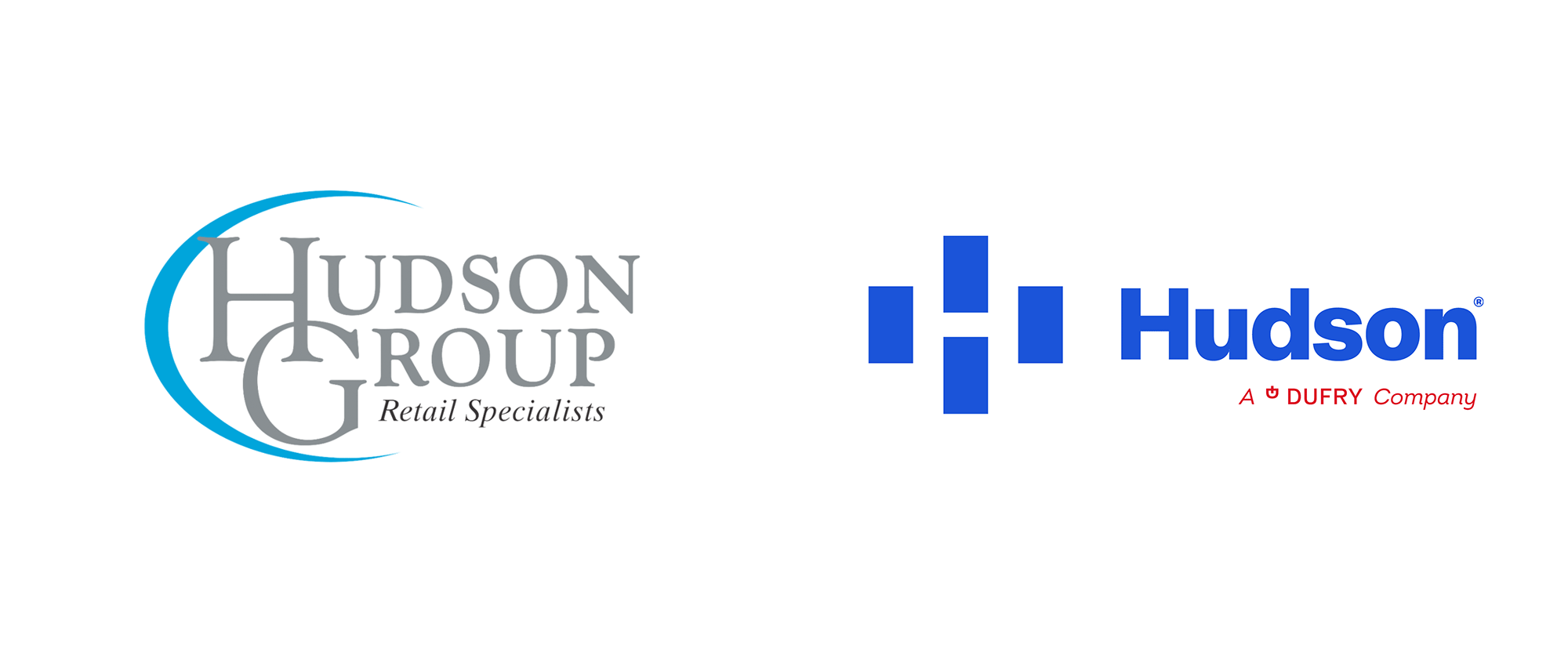
Established in 1987, Hudson (previously Hudson Group) is one of the largest travel retailers in North America with more than 1,000 stores in airports, commuter hubs, landmarks, and tourist locations. Most travelers will recognize them for the Hudson and Hudson News stores, their flagship brand, but they are also responsible for the retail airport experiences of brands like Dunkin, Coach, Pinkberry, FAO Schwartz, and more. From a few newsstands in New York's LaGuardia Airport when it first opened, Hudson is now present in over 80 airports and employs more than 10,000 people. The company has been owned by Dufry -- the Basel, Switzerland-based leading travel retailer that operates many of the ubiquitous duty-free shops -- since 2008 and has been a publicly-traded company since 2018. Last week, Hudson introduced a new identity designed by Siegel+Gale.
"While Hudson's original logo reflected the times in which it was created, and has served the company well, it's time to introduce travelers to Hudson's new look, feel and identity that reinforces our foundation and showcases where our brand is going," said Hope Remoundos, EVP and Chief Marketing Officer at Hudson. "Our new identity is sophisticated and confident, with a welcoming visual representation of the company's DNA that perfectly spotlights our people, brands, locations and, most importantly, our customers, and strengthens Hudson's authentic connection to travelers."
The design of the new logo represents the four cornerstones -- [ travel convenience, specialty retail, Duty Free and the most-recent addition, food and beverage] -- of the business as windows, which, together, form an iconic letter "H."
Hudson press release

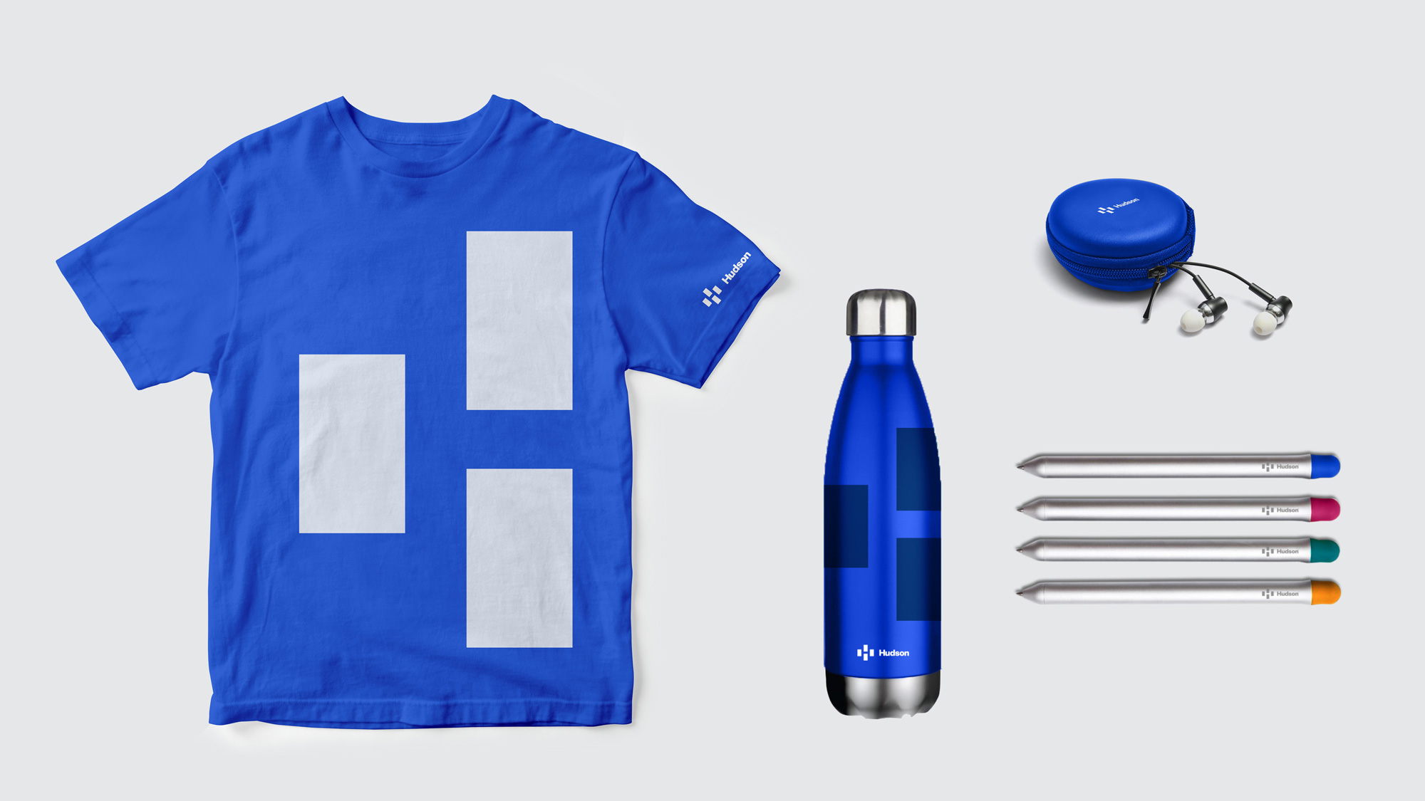
The old logo was mostly bad... the "H" and "G" interlocking could have been decent with better handling but the overall typography was lame and the giant swoosh was a perfect example of why swooshes need to be avoided in logos. The new logo smartly leaves everything from the old logo behind and introduces a more contemporary presence with an abstracted "H" hidden inside four rectangle shapes. I don't love it but I do like it well enough. Once you see the "H" it's then a little hard to find a visual connection for the four objects because let's face it, no one is going to go "Of course, those are the four cornerstones of Hudson" so I feel like they are a little ambiguous but I do like how they convert them into products in some of the applications (shown further down). The wordmark is fine... a little old school, but it can perhaps tie back to the company's newsstand roots. The blue is a lighter shade of that blue and it's neither good or bad, it just is.

What might be a problem down the road is having three "Hudson" brands out in the marketplace: there is Hudson, Hudson News, and now another Hudson which is not like the first Hudson because the latter Hudson doesn't have a retail presence as the former Hudson does yet you might still see the latter's branded items in the former as well as in Hudson News. See? It could be a problem. Unless Hudson and Hudson News change their logo to match the new Hudson, which I don't believe is the case.
The visual identity works as a fluid, modular asset, ideal for showcasing the brands that Hudson shares with travelers--the delightful surprises they have in store--in new and unexpected ways. The color palette helps Hudson stand out from its competitors. The team chose vastly more diverse and colorful expressions for Hudson's brand communications: just enough options to keep things feeling fresh, yet coherent. Using the logo as a supergraphic helps support the idea of how integral Hudson is to the traveler's experience, by appearing as a window framing the most memorable moments in travelers' journeys, and their end destinations. The new brand signals Hudson's immense expertise, illuminates its vast portfolio, celebrates team members and displays its understanding of travelers.
Siegel+Gale blog post
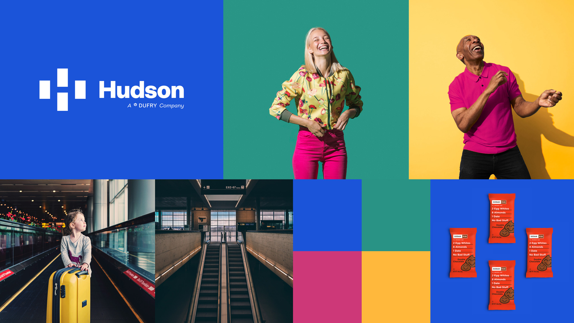
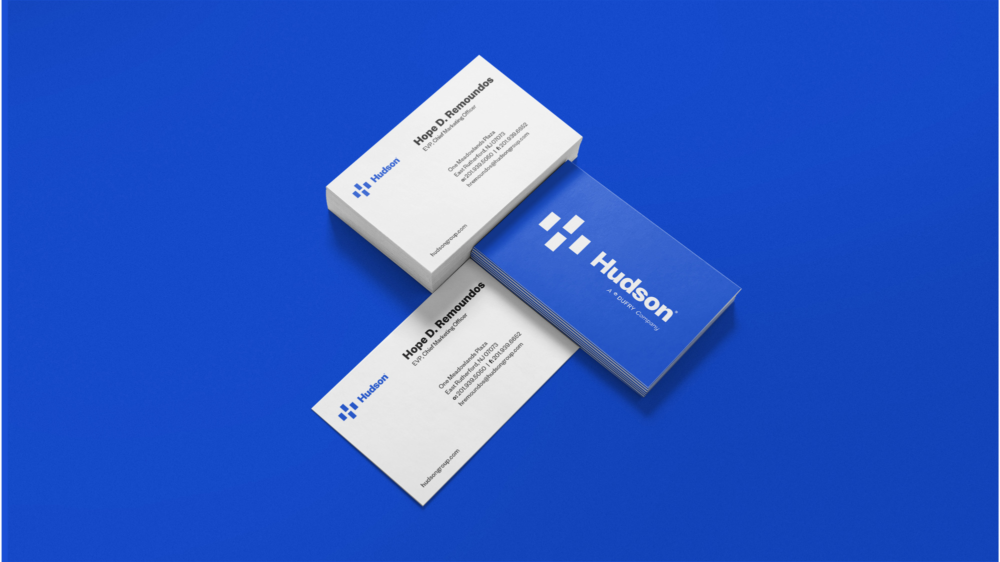
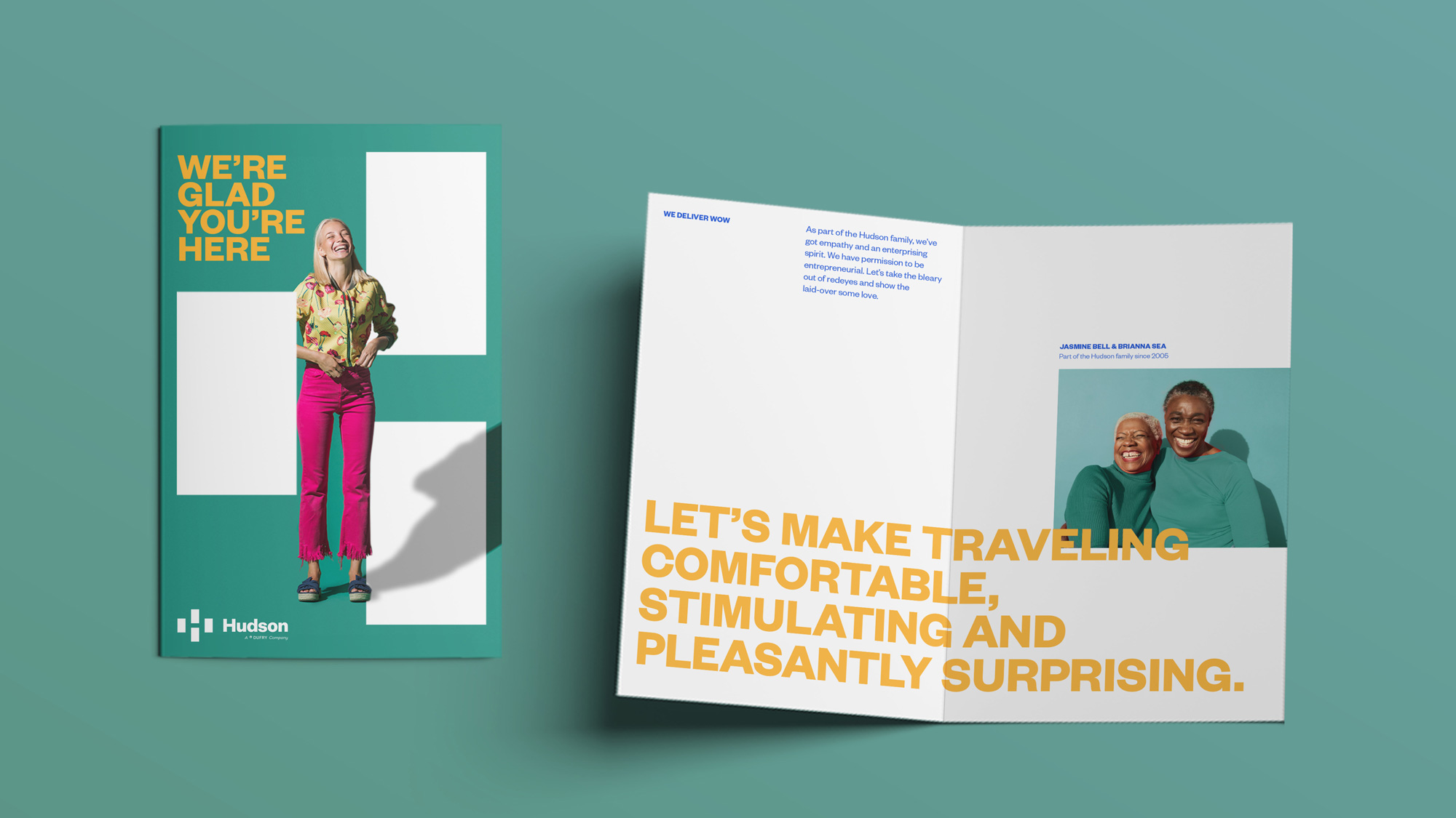
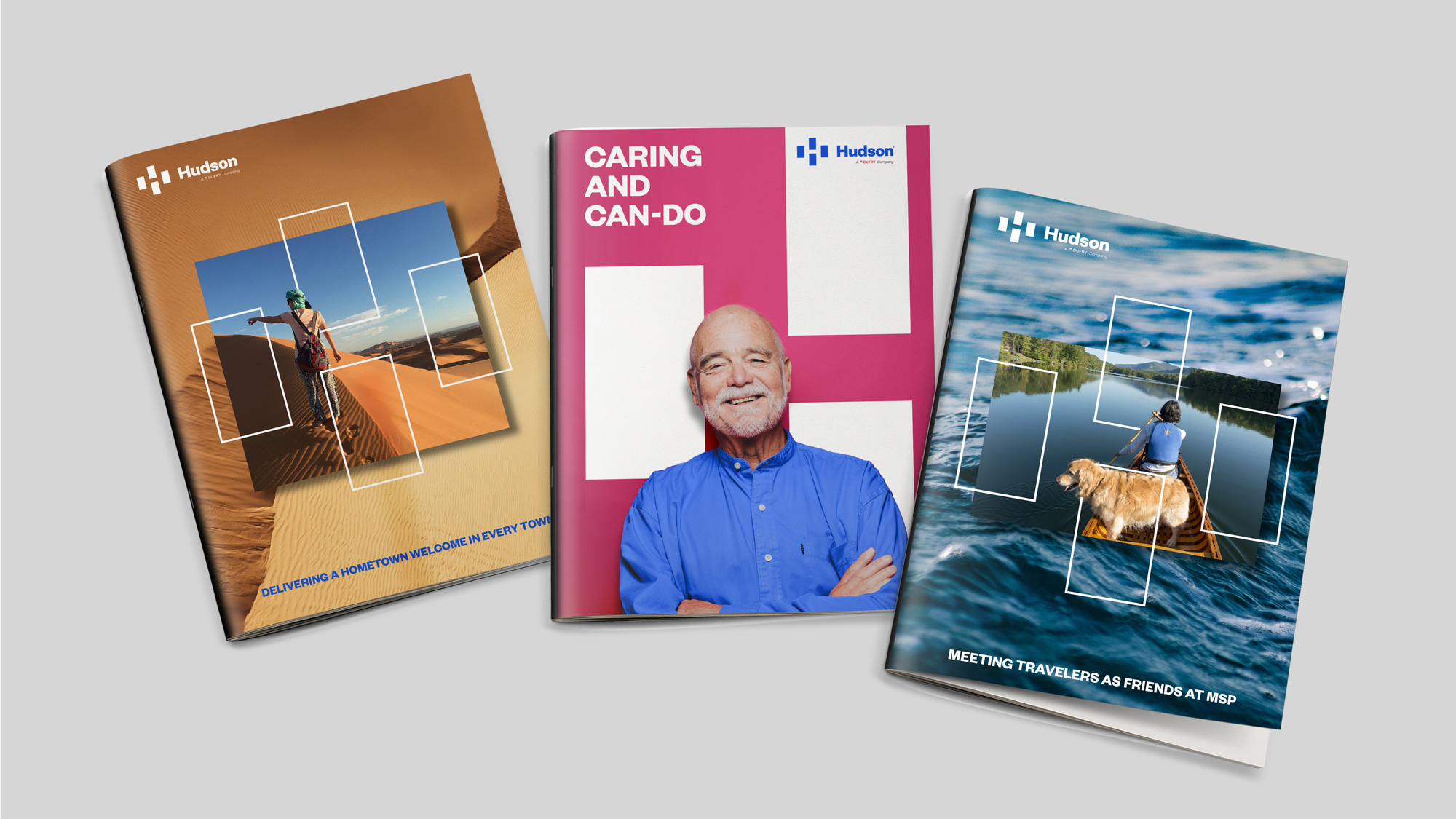
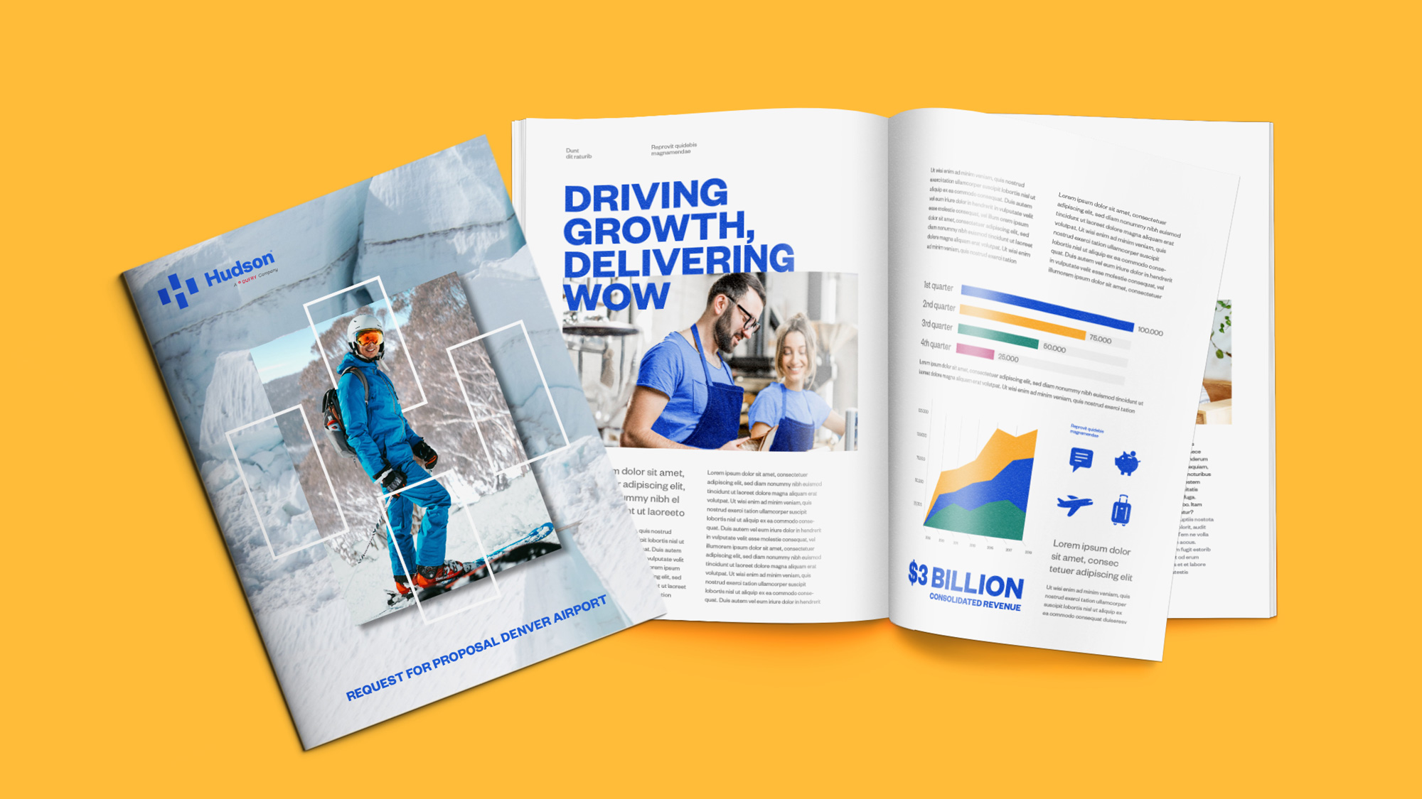
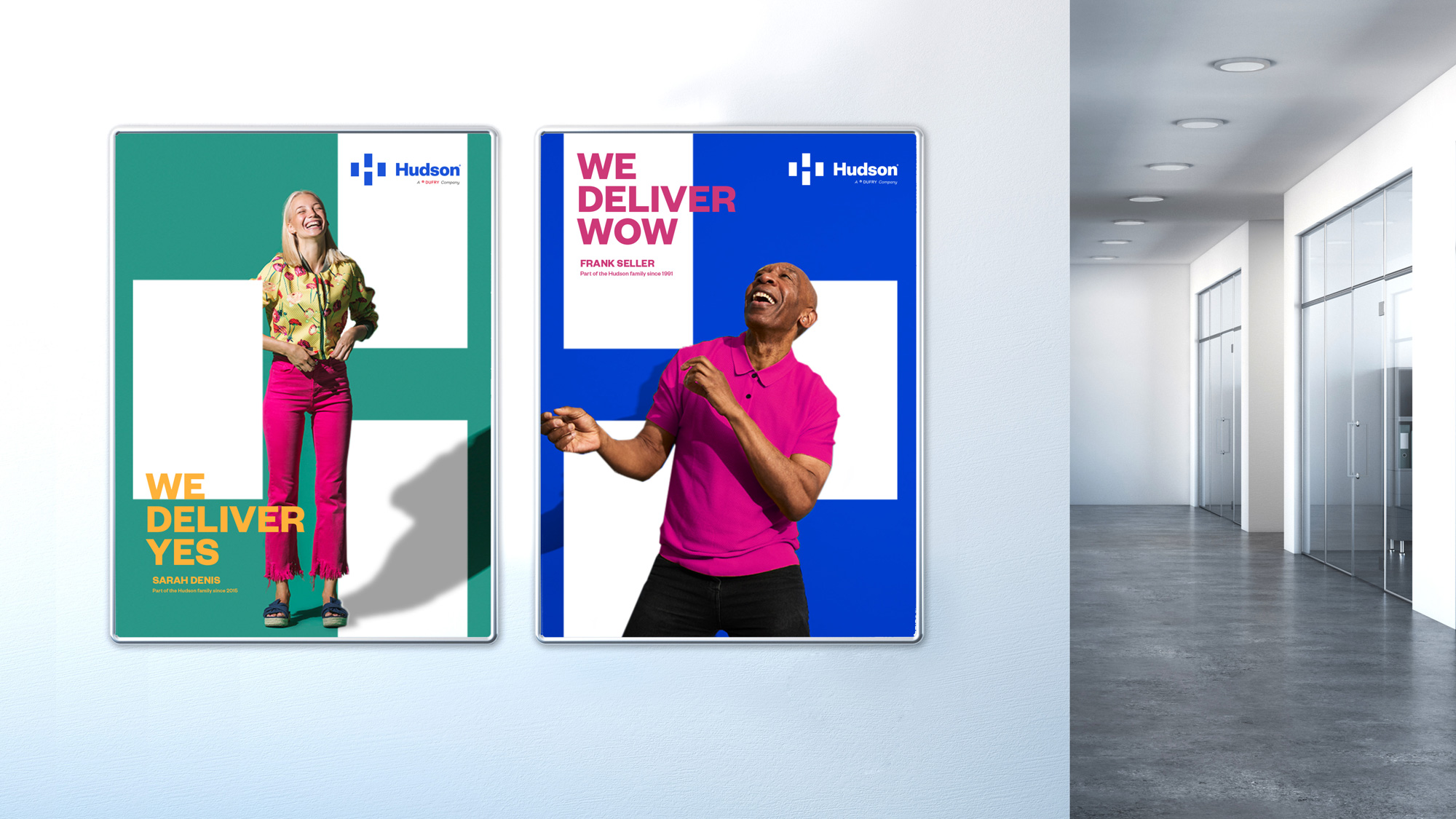

The applications are fine in terms of layout and design -- I like how they use the "H" icon as a framing/background device and the typography is passable -- but the photography is way too corny and the copywriting too contrived. As I mentioned earlier, the one solid idea in the applications is replacing the rectangles in the icon with products, as it hints at the delivery of myriad goods by Hudson.
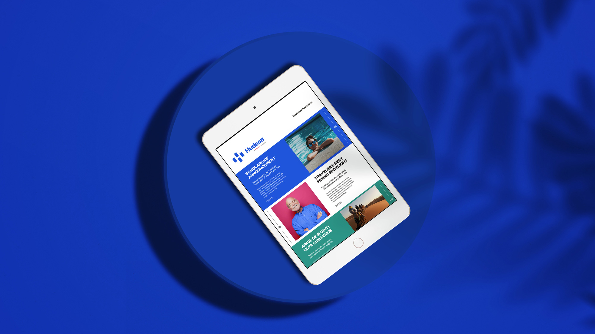
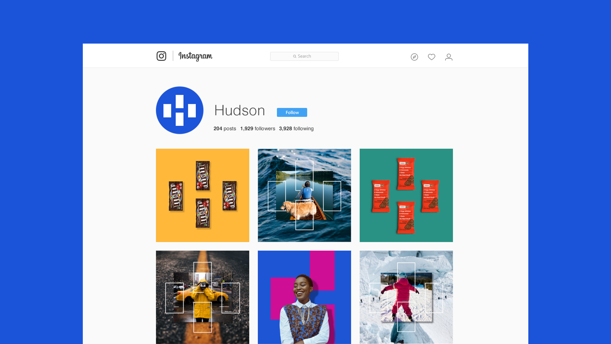
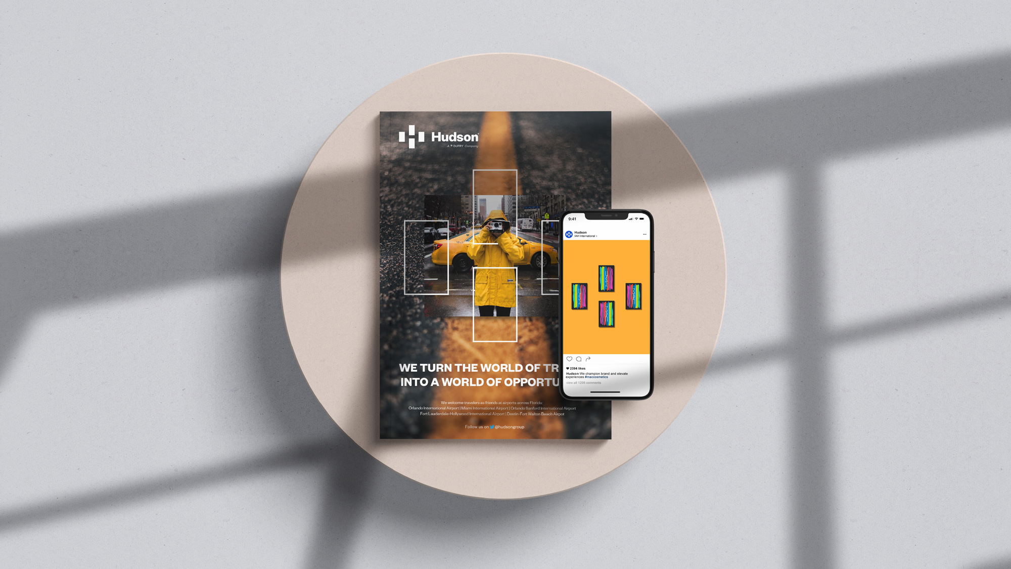
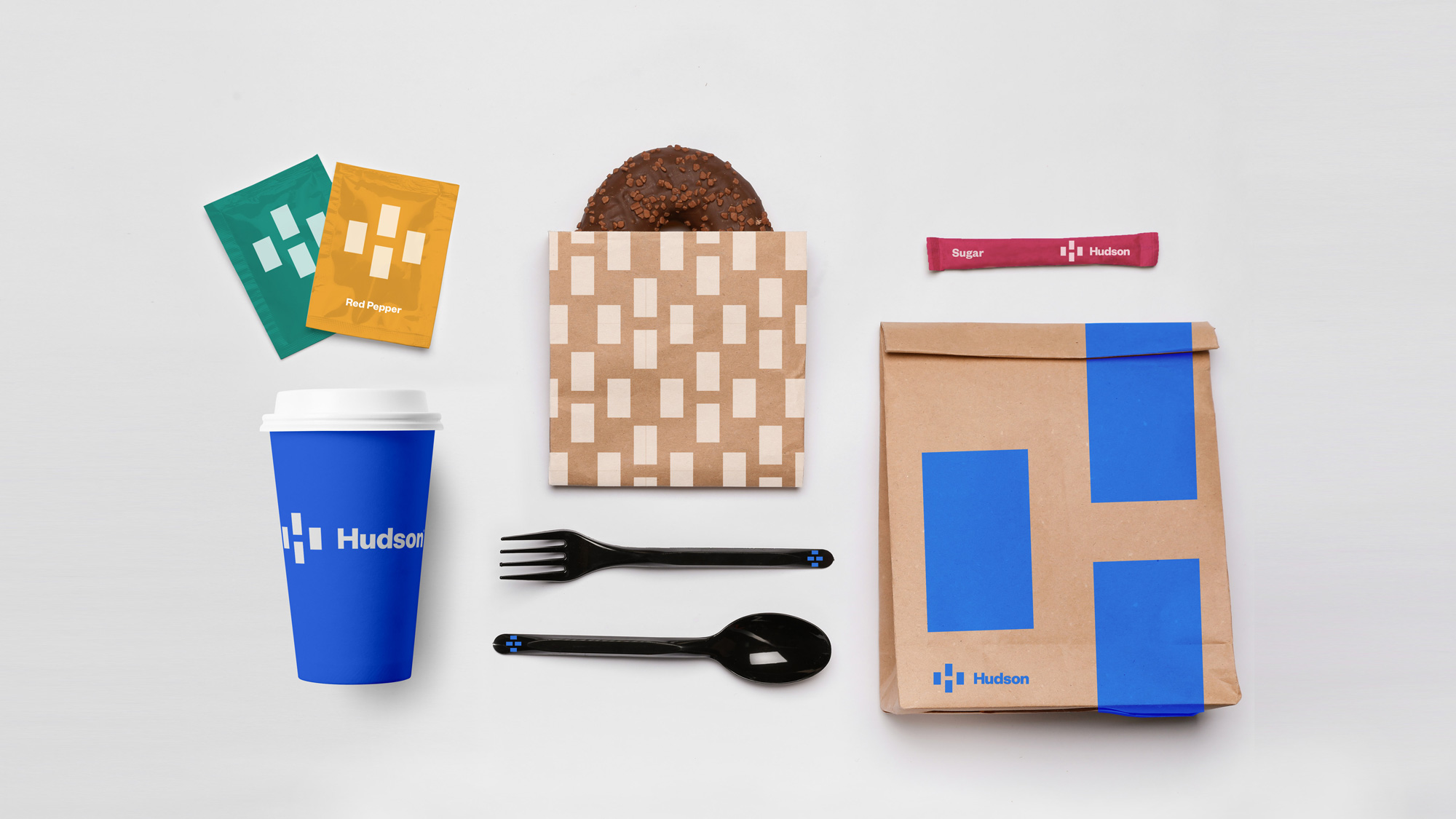
The image above shows some promise about what this brand could be in the retail environment and it has potential but it's not quite there yet.
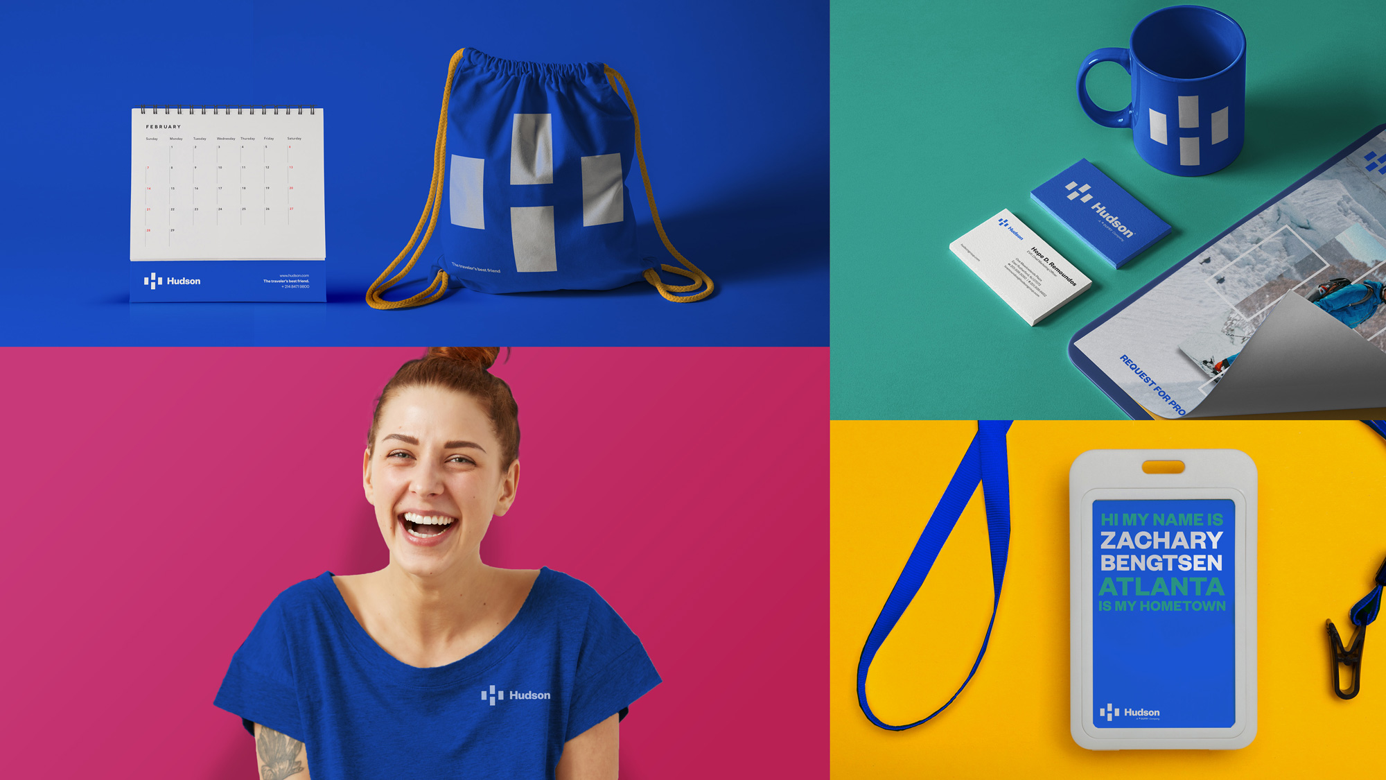
Overall, this is certainly an improvement over the old and even though I have no examples of the old identity in application, based on the old logo I can't imagine them being very exciting and although this doesn't fall in the exciting spectrum either, it's a serviceable identity with some untapped potential.
In ấn Anpic In nhãn mác Anpic In brochure Anpic In card visit Anpic In catalogue Anpic In thiệp cưới Anpic In tờ rơi Anpic
In Ấn Anpic – Nổi Tiếng In Đẹp In Nhanh
Số 5 Ngõ 75 Nguyễn Xiển, Thanh Xuân, Hạ Đình, Hà Nội
0963223884
baogiainananh@gmail.com
https://anpic.vn
https://g.page/inananpic
In nhãn mác Anpic ✅ In brochure Anpic ✅ In card visit Anpic ✅ In catalogue Anpic ✅ In thiệp cưới Anpic ✅ In tờ rơi Anpic
https://anpic.vn/in-nhan-mac-dep
https://anpic.vn/in-brochure
https://anpic.vn/in-an
https://anpic.vn/in-voucher-in-phieu-giam-gia-khuyen-mai
#inananpic
Comments
Post a Comment