Reviewed: New Logo and Identity for Media Design School by SomeOne
“Spark Side of the Moon”
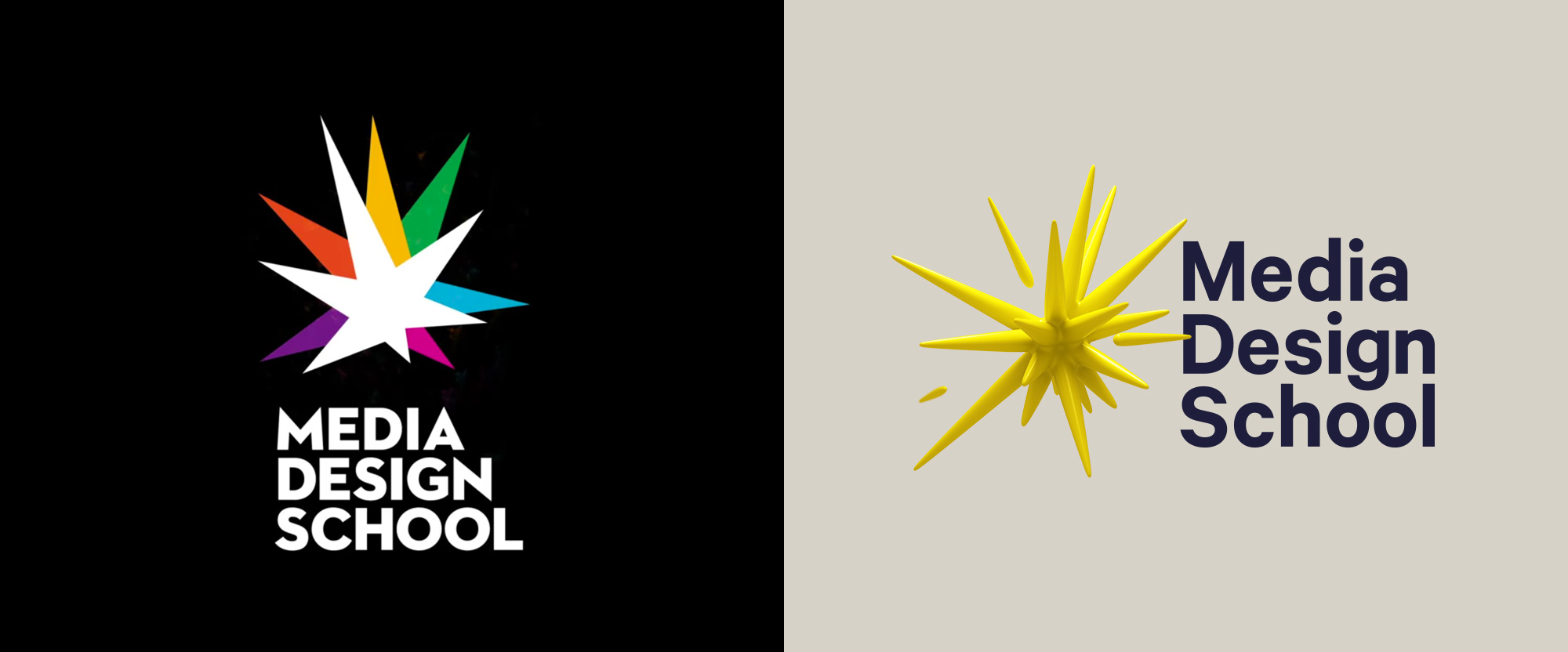
Established in 1998, Media Design School is a private tertiary institution in New Zealand offering diplomas, certificates, and bachelor and masters degrees for the digital and creative technology industries, including 3D Animation and VFX, Game Development, AI and Cloud Computing, Graphic Design, Interactive Design, Motion Design, and Advertising. A member of Laureate Education, Inc., the largest international network of degree-granting higher education institutions, Media Design School hosts a small but effective student population of over 800. Recently, Media Design School introduced a new identity designed by the Sydney, Australia office of SomeOne.
A progressive design school deserves a progressive attitude, in look and in personality. The time had come for the 'creative spark' to break free of its previous two dimensional straight jacket and burst into a hyper-real world.
SomeOne provided text
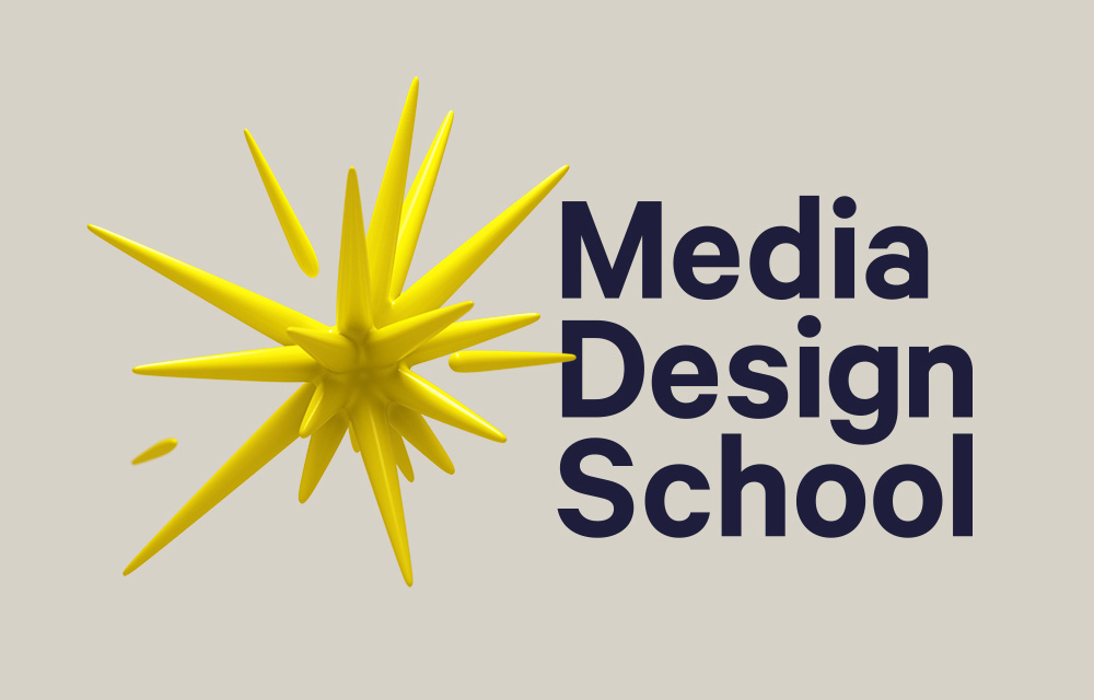
The old logo was more or less okay with a decent colorful burst icon but a so-so type choice that made it look dated and almost more like an advertising-focused school than new media. The new logo (and the whole identity) is a lot more overt in its technology-ness with a new interpretation of the spark in a 3D rendering that, as you might expect, works best as a digital-first mark with an animation that brings it to life in a cool and unexpected way. I really like how the spark, um, sparks continually and how its thick rounded-point spikes emanate and dissipate in all directions. But even in static form, there is a good deal of energy captured there and I like how it interacts with the wordmark by ever so slightly being in front of it. If you ever wondered what ferrofluid would look like as a logo, here you go. The wordmark, in Klim Type's Calibre, is alright although I'm not a fan of that "a".
We've developed a series of sparks to represent each of the courses offered by the school. Five key disciplines inform the design system and provide a base for endless iterations. With a variety of patterns, angles, colours, textures and lighting set ups, our sparks are ever evolving -- shifting and changing with every new communication.
SomeOne provided text
Deciding on what best represents each course was an iterative process -- the 'Game Art' sparks, for example, went through rounds of development. Starting in a more basic form, reminiscent of a building block game style (ala Minecraft), to more complete 'worlds' -- one even featured a little hero character -- before eventually settling on the futuristic, minutely detailed, space station style.
We leaned into popular culture to guide the spark styling -- giving each iteration a relatable and distinctive look. Drawing inspiration from the likes of Keith Haring, sci-fi movies such as Tron and StarWars and even technology focused brands like IBM, who have had a significant impact on how technology is used in design today.
SomeOne provided text
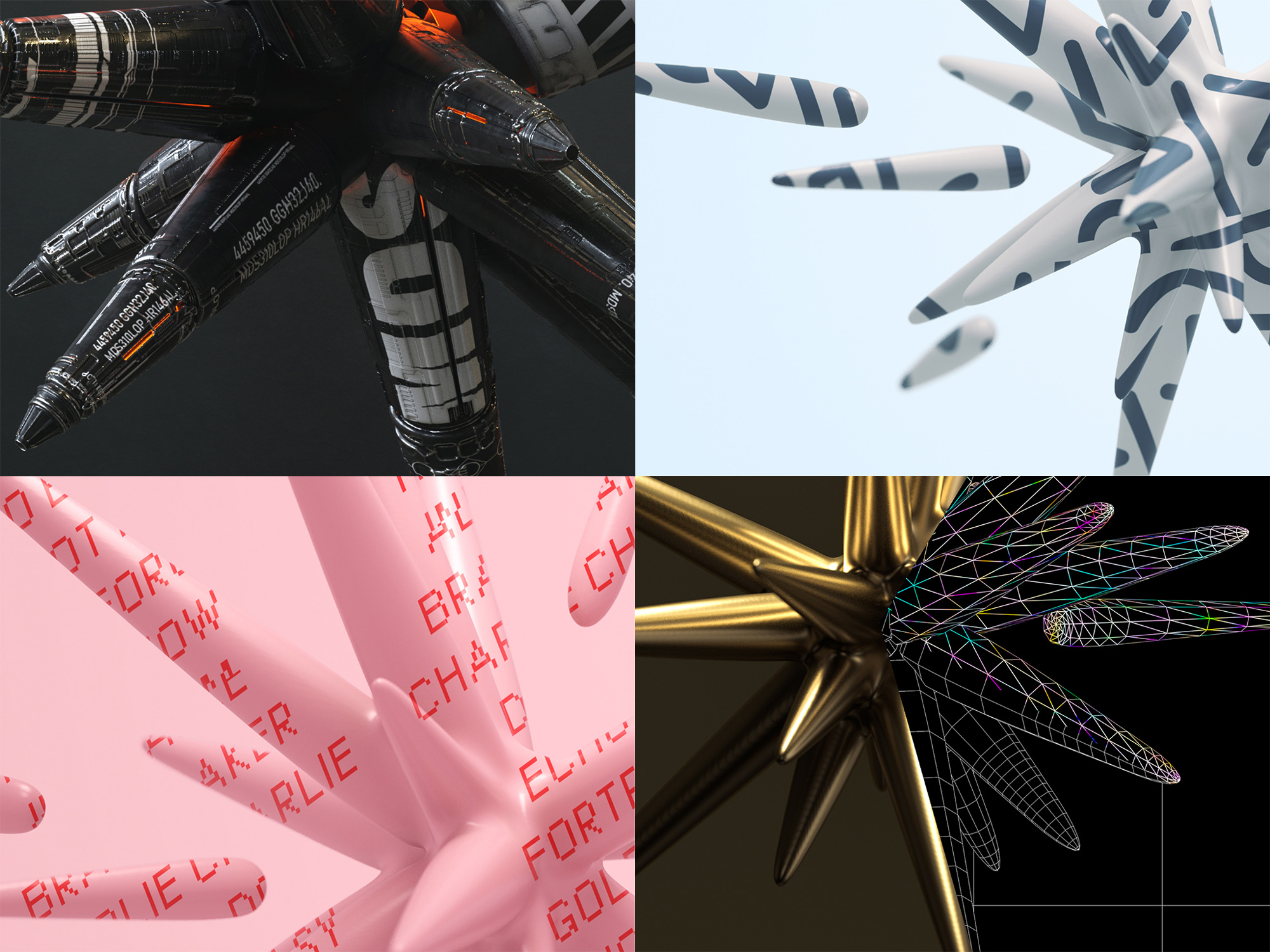


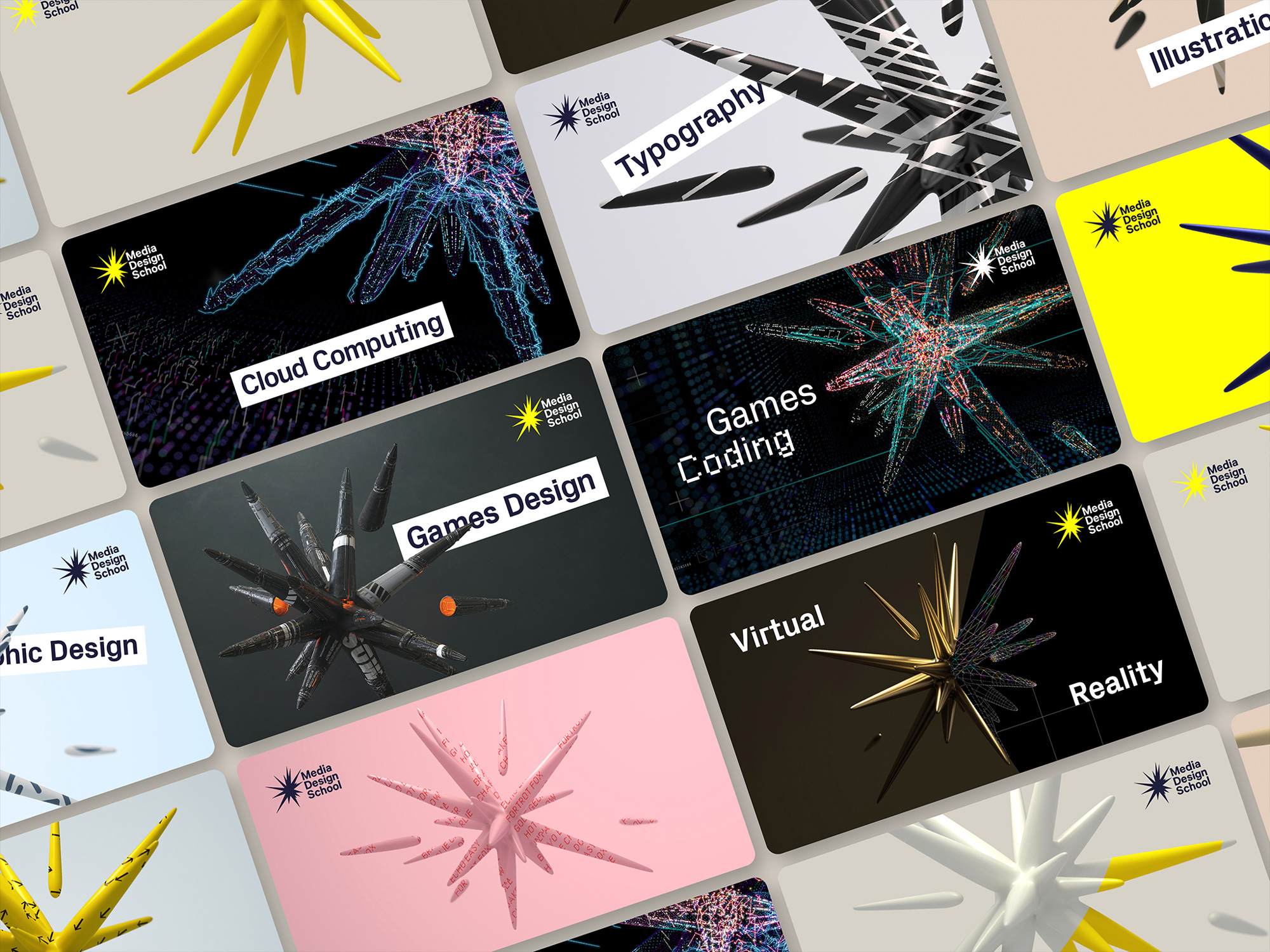
The main attraction of the logo is that it can take on a number of skins and adapt to the different courses the school offers. I'm torn between liking them and being turned-off by them. Like, the Games Design skin (featured in the close-ups one image above) is cool to look at but then it stops looking like the logo and just appears to be some whackadoodle spaceship. The skins where it's just type, like the pink one, look too much like a first-time attempt at skinning in 3D. And the hollow one for Games Coding and Cloud Computing look like covers for a PC magazine or something. I do think there is something potentially cool here and it's almost there but I think they got carried away with the many possibilities afforded by 3D rendering and the spark that was so well captured in the single-color rendering gets lost in special effects.
Px Grotesk from Swiss foundry, Optimo was chosen for its obscure balance between it's rounded human construction and its contrasting, hard edged angular personality in characters such as the lower case, a, f and y. It straddles the line between classic and cutting edge, just like the school itself.
SomeOne provided text
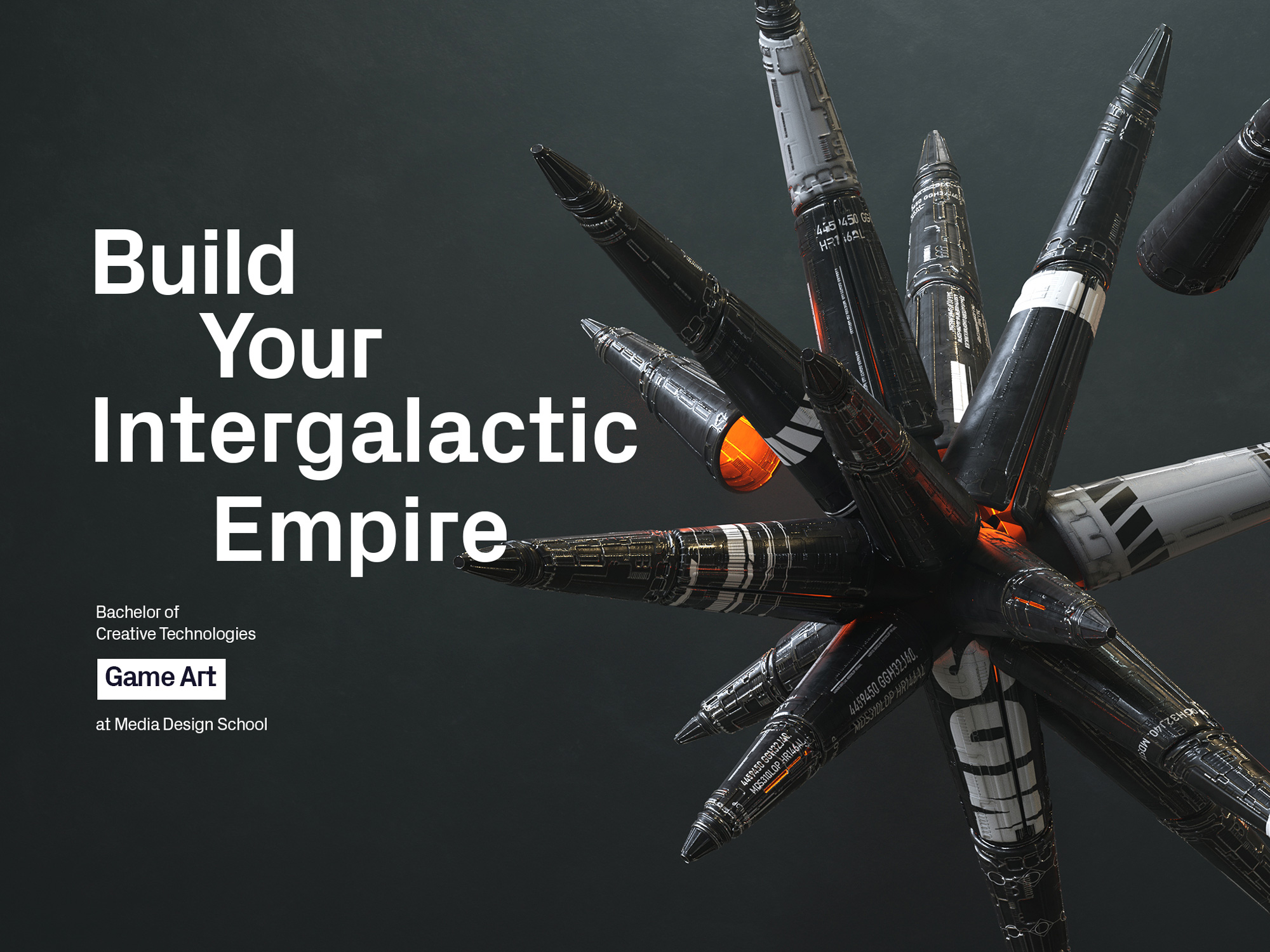

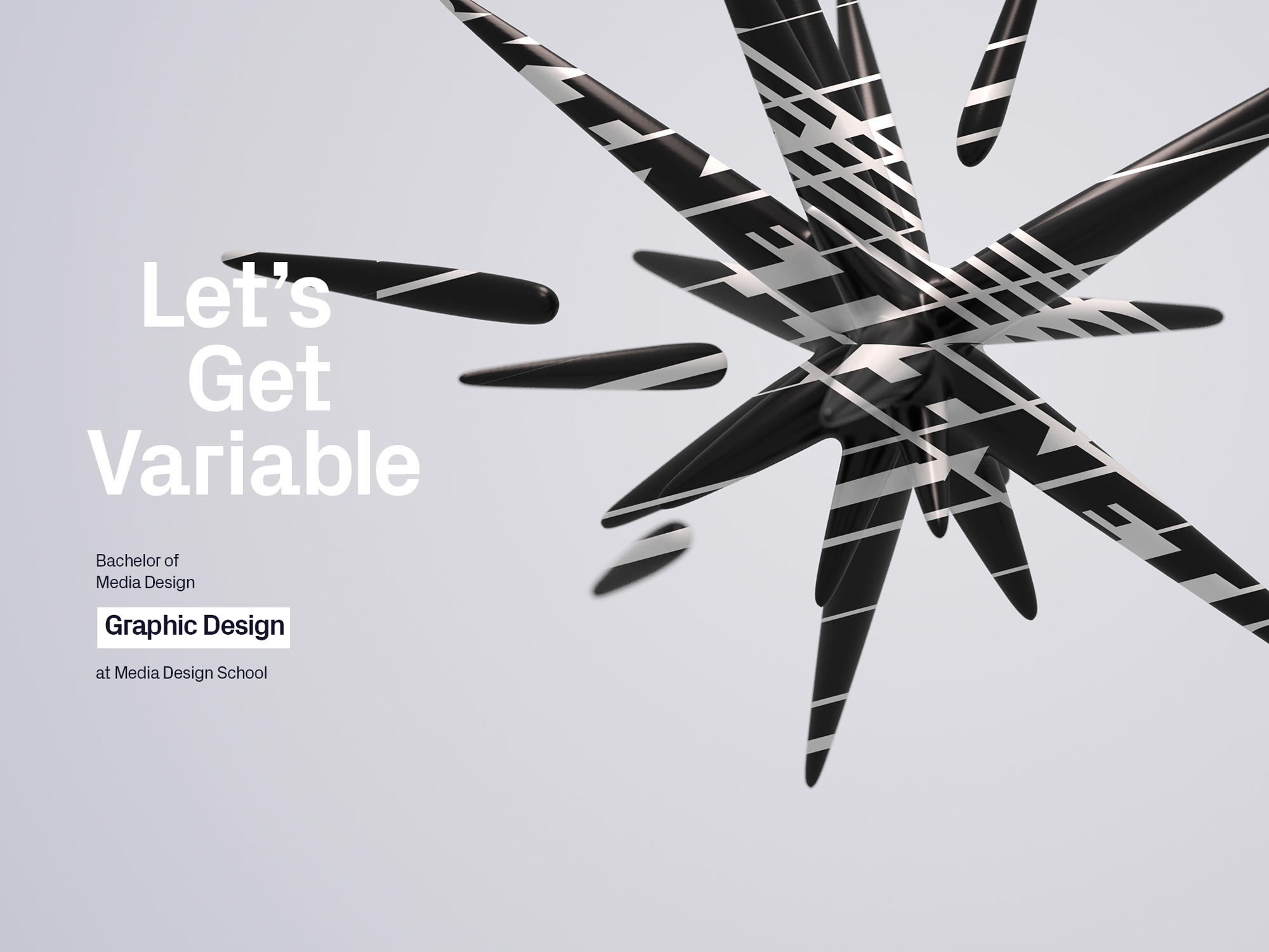
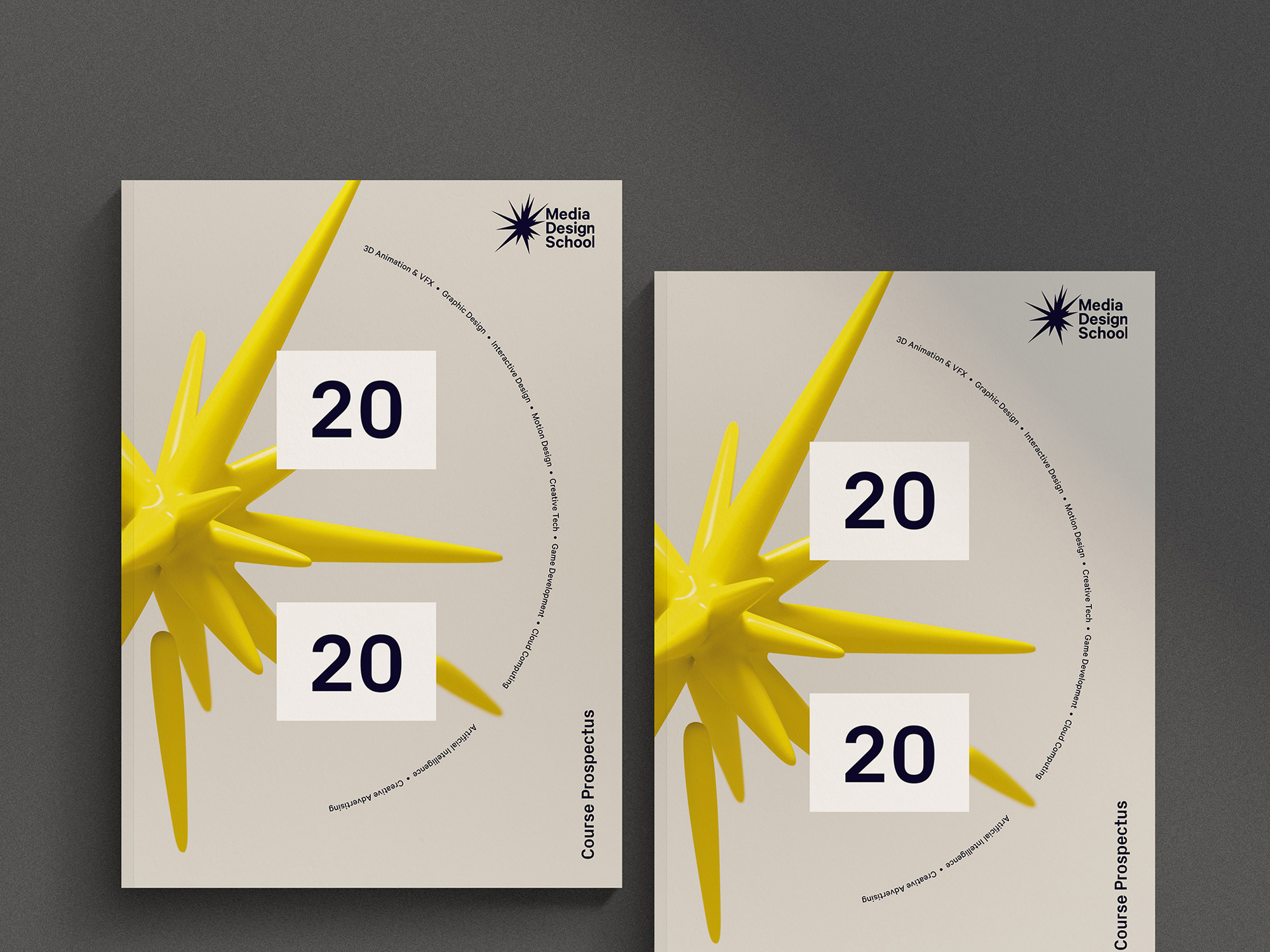
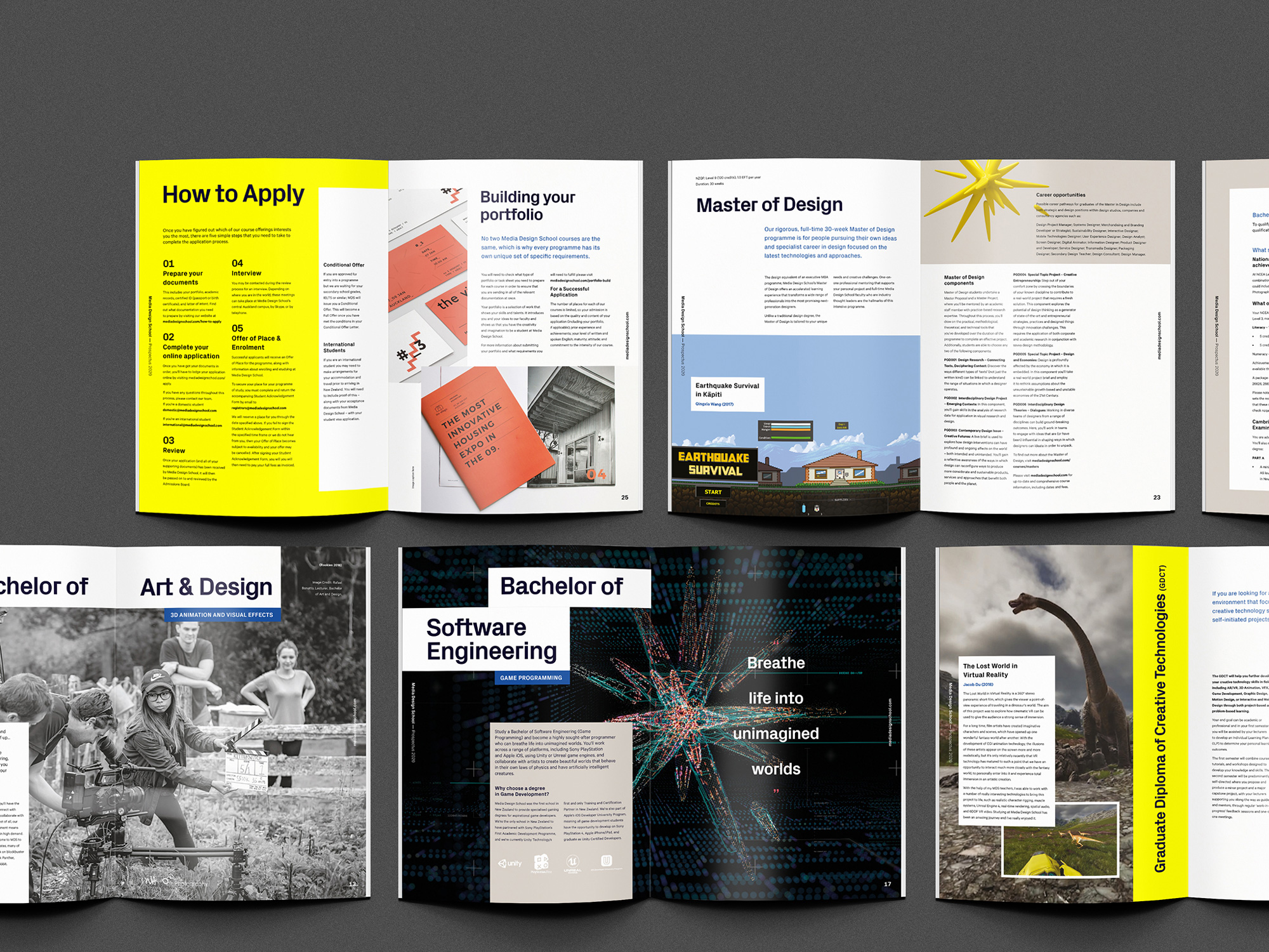
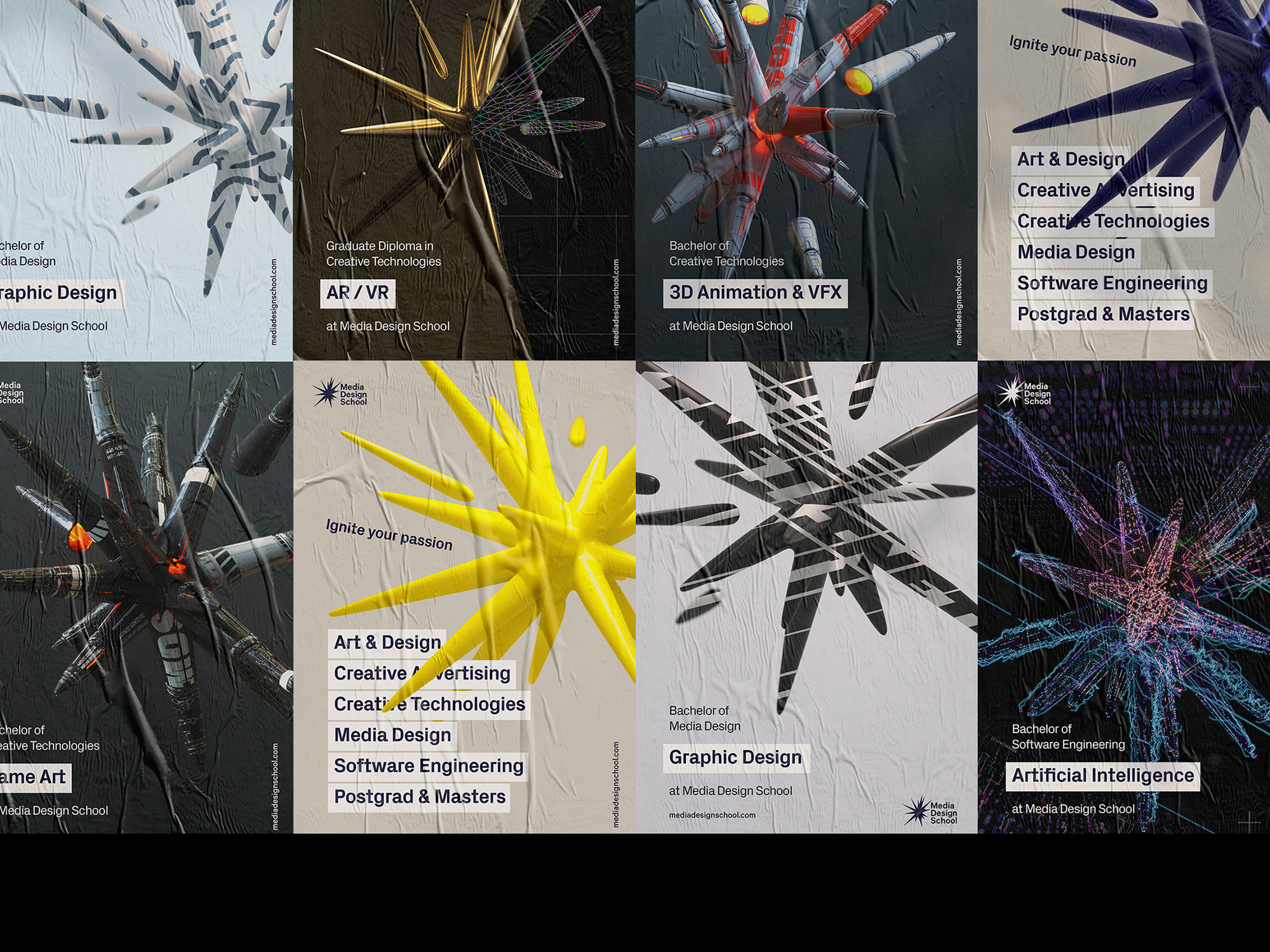
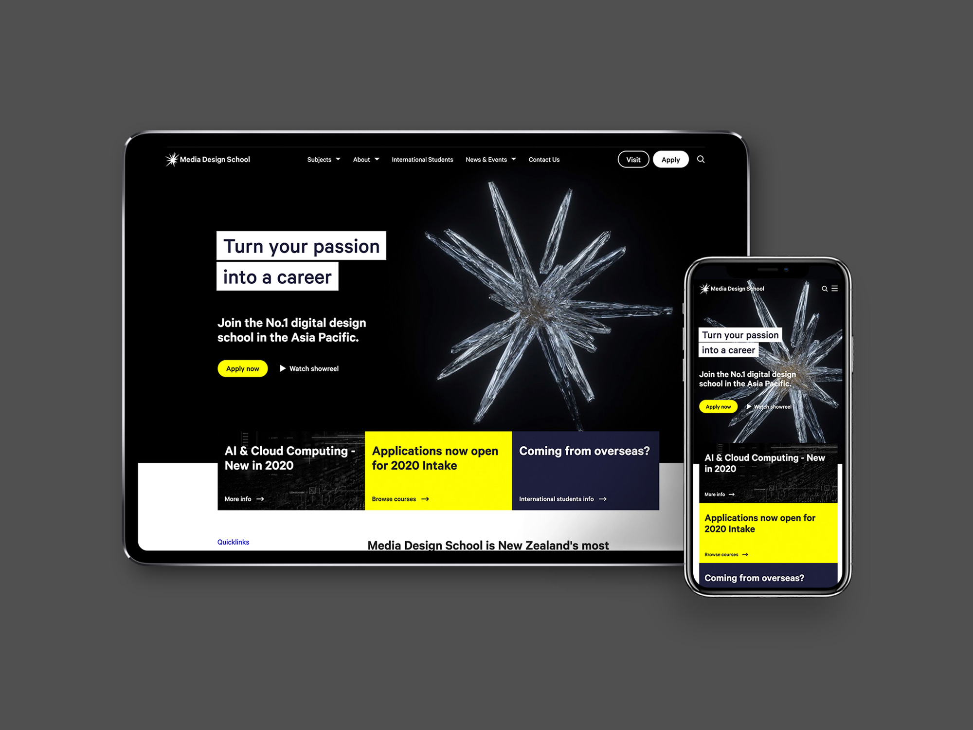
The applications make good use of the sparks, appearing large and bold in most layouts and paired with the always good-looking (but perhaps now over-used) Px Grotesk from Optima -- together they certainly achieve digital-ness. In the applications (and on their website) you can also see a single-color version of the spark for the logo and... it's questionable. I feel like it takes on a much sharper aesthetic and loses that nice soft contrast it has in the large 3D renderings. When I first checked out the website, after seeing the big version of the logo, my first impression was that they were still using the old logo.
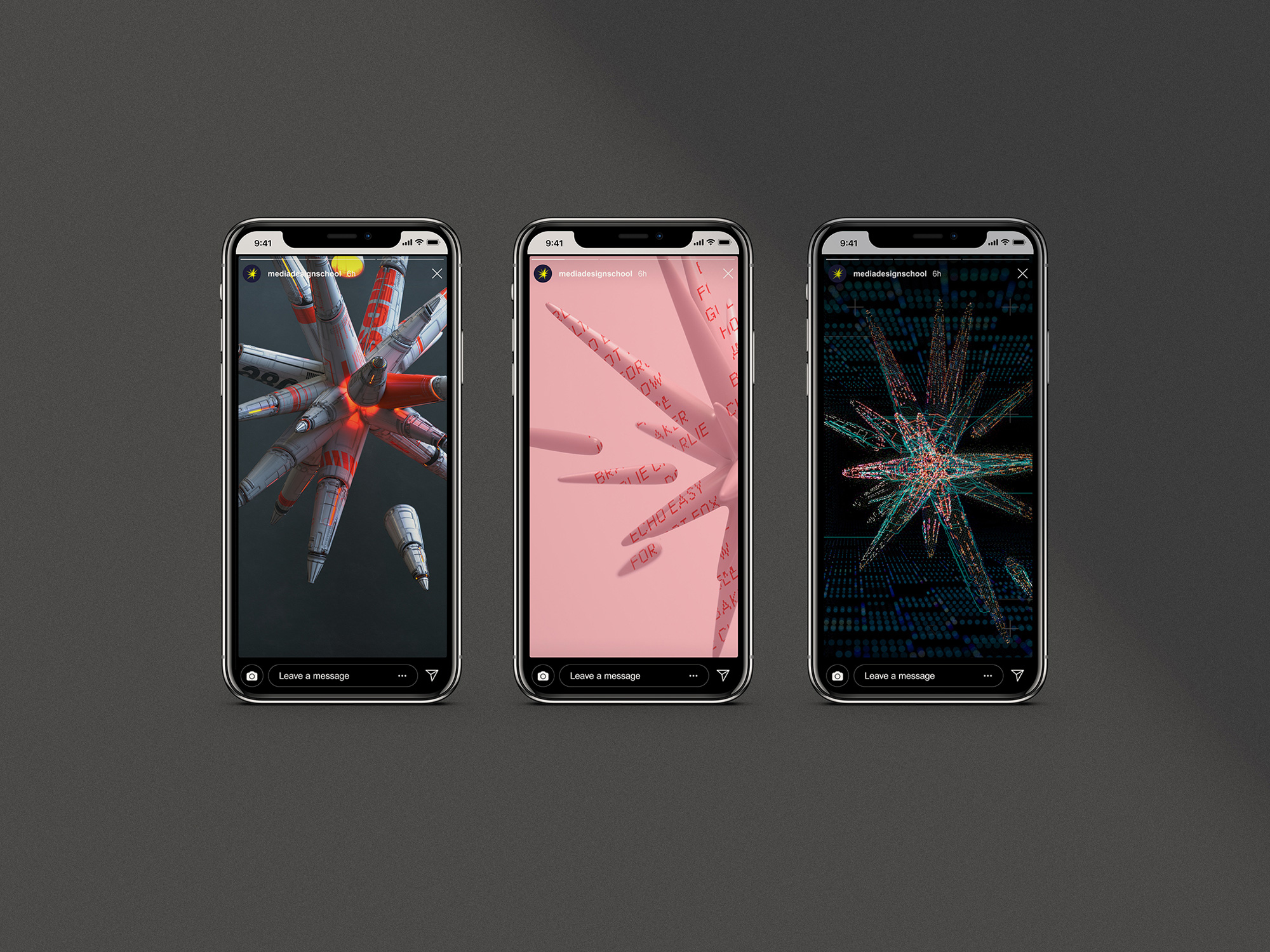
Overall, if I were a student looking to get into one of these areas, I do think this identity would make me pay extra special attention to this school as it does convey a clear and immediate sense of new-ness and digital-ness in a bold, enticing way.
In ấn Anpic In nhãn mác Anpic In brochure Anpic In card visit Anpic In catalogue Anpic In thiệp cưới Anpic In tờ rơi Anpic
In Ấn Anpic – Nổi Tiếng In Đẹp In Nhanh
Số 5 Ngõ 75 Nguyễn Xiển, Thanh Xuân, Hạ Đình, Hà Nội
0963223884
baogiainananh@gmail.com
https://anpic.vn
https://g.page/inananpic
In nhãn mác Anpic ✅ In brochure Anpic ✅ In card visit Anpic ✅ In catalogue Anpic ✅ In thiệp cưới Anpic ✅ In tờ rơi Anpic
https://anpic.vn/in-nhan-mac-dep
https://anpic.vn/in-brochure
https://anpic.vn/in-an
https://anpic.vn/in-voucher-in-phieu-giam-gia-khuyen-mai
#inananpic
Comments
Post a Comment