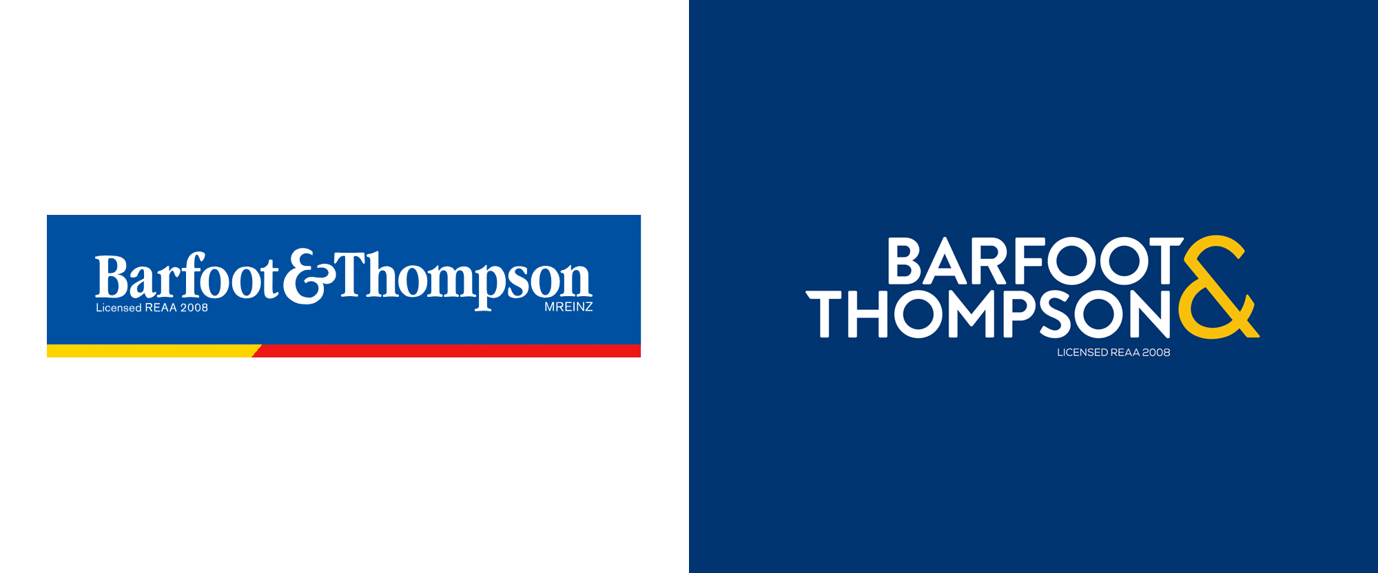
Noted: New Logo and Identity for Barfoot & Thompson
“Not the Best Foot Forward”

(Est. 1923) "Barfoot & Thompson is New Zealand's largest privately owned real estate company, still run by the Barfoot and Thompson families after 95 years. Our more than 1,700 salespeople in over 75 branches sell Residential, Lifestyle/Rural and Commercial real estate throughout Auckland and Northland. Residential Property Managers operate from over 70 of our branches."
Design by
BIG Communications and Simon Byers Design (Auckland, New Zealand)
Related links
Barfoot & Thompson press release
BIG Communications project page
Relevant quote
“The logo has progressed into a cleaner, geometric font, with a more vibrant colour palette, and we’ve shed the ‘blue box’ that once contained the main elements. Key to the new look is also the ampersand, which is given pride of place and prominence to the right of the lockup. “The ‘and’ is at the heart of the Barfoot & Thompson story, highlighting the two founding families which still own and manage the company today. “It is also a signal of the culture of the business, which values people, family, diversity and community at its core.” Flowing from the base design, there are also distinctive sub-logos and accent-colours to represent the company’s many other business divisions, giving each their own visual identity.
Images (opinion after)


Opinion
Imma be honest: I am mostly posting this because of the introduction video, which is a genuinely ambitious way of announcing a redesign but that, because of its execution, turned out genuinely cheesy. From the sound effects to the music score to the visual effects, they are all actually well done but also endearingly naive. I’m honestly impressed by the effort and concept but really wish it had turned out not so much like a parody. Since we are here, though, let’s talk logos. The old one was more or less fine but looked more like a law firm and had a fairly thick ampersand, most likely the result of it simply being scaled to be that size. The new logo switches to a meh-ish sans that’s caught somewhere between wanting to be Art Deco and techie with its angled “T”s — it’s not exactly pleasant but it’s not terrible, I guess. The ampersand, though, is kind of terrible, with a rather aggressive and pointy look that’s exacerbated by being so big, especially in the stacked configuration. To its credit, its thickness is correct and well proportioned to the letters. The applications are fairly dull and generic but at least have a decent idea in the cropped images following the angle of the ampersand. Overall, this still feels too cold and lawyer-y for a real estate company and the execution on all fronts leaves a lot to be desired.
In ấn Anpic In nhãn mác Anpic In brochure Anpic In card visit Anpic In catalogue Anpic In thiệp cưới Anpic In tờ rơi Anpic
In Ấn Anpic – Nổi Tiếng In Đẹp In Nhanh
Số 5 Ngõ 75 Nguyễn Xiển, Thanh Xuân, Hạ Đình, Hà Nội
0963223884
baogiainananh@gmail.com
https://anpic.vn
https://g.page/inananpic
In nhãn mác Anpic ✅ In brochure Anpic ✅ In card visit Anpic ✅ In catalogue Anpic ✅ In thiệp cưới Anpic ✅ In tờ rơi Anpic
https://anpic.vn/in-nhan-mac-dep
https://anpic.vn/in-brochure
https://anpic.vn/in-an
https://anpic.vn/in-voucher-in-phieu-giam-gia-khuyen-mai
#inananpic
Comments
Post a Comment