Noted: New Logo and Identity for Uswitch by venturethree
“Switching Gears”
(Est. 2000) "Uswitch is one of the UK's leading comparison and switching services. We help compare prices on gas and electricity, home phone, broadband, digital television, mobile phones, and personal finance products including mortgages, credit cards, current accounts and insurance. Our aim is to help customers take advantage of the best prices and services on offer from suppliers so they can get the deal that's right for them."
Design by
venturethree (London, UK)
Related links
venturethree project page
Relevant quote
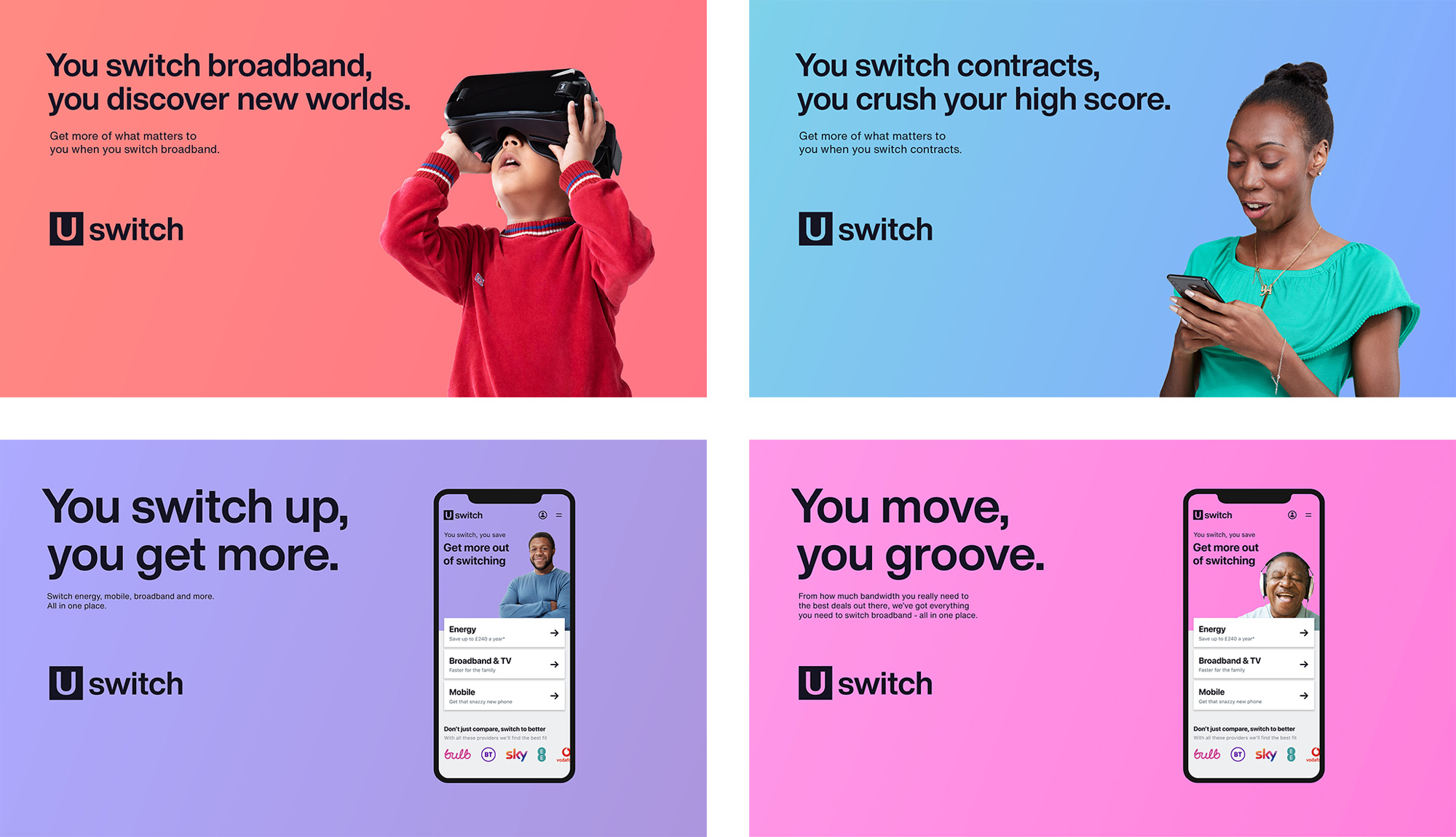
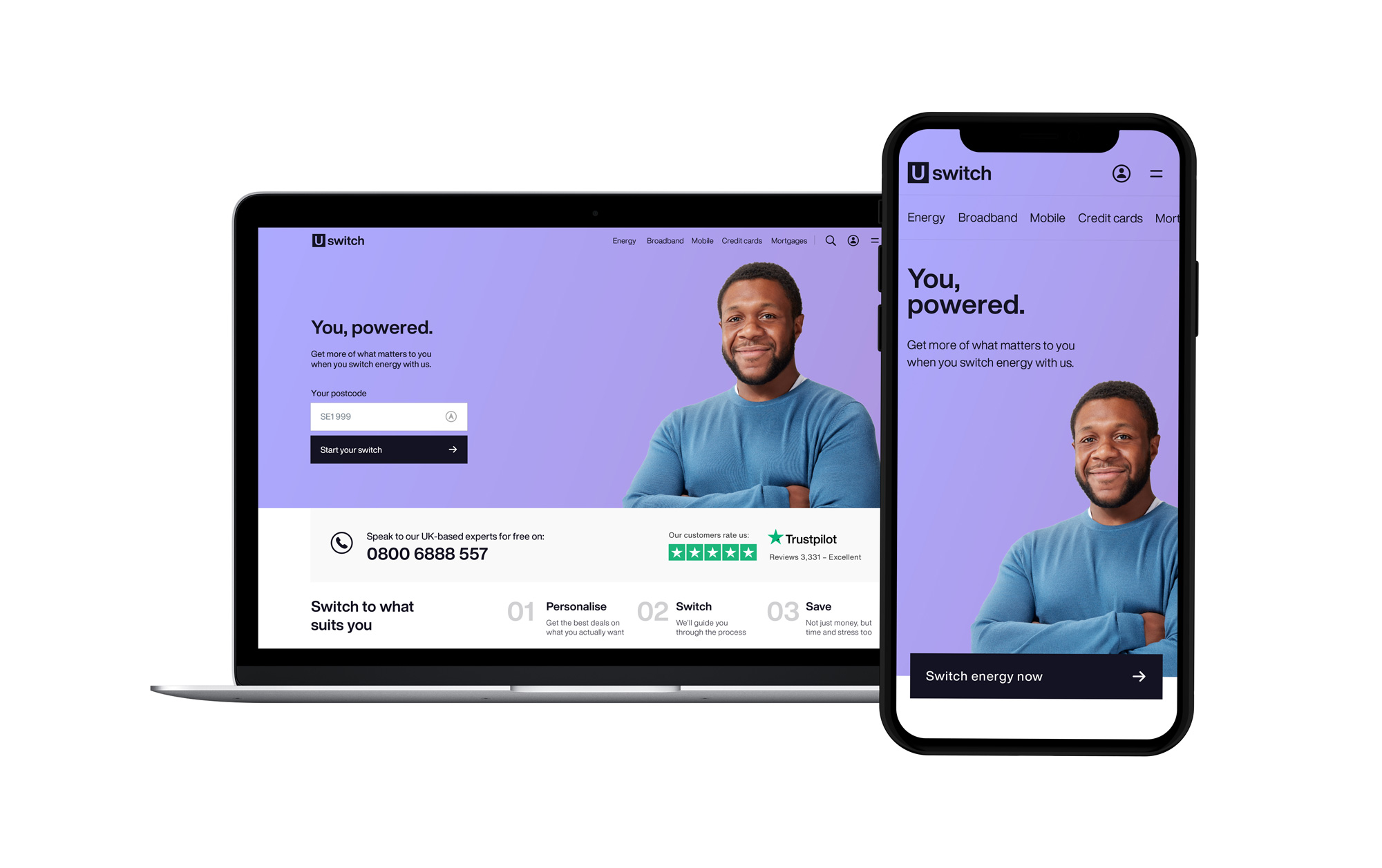
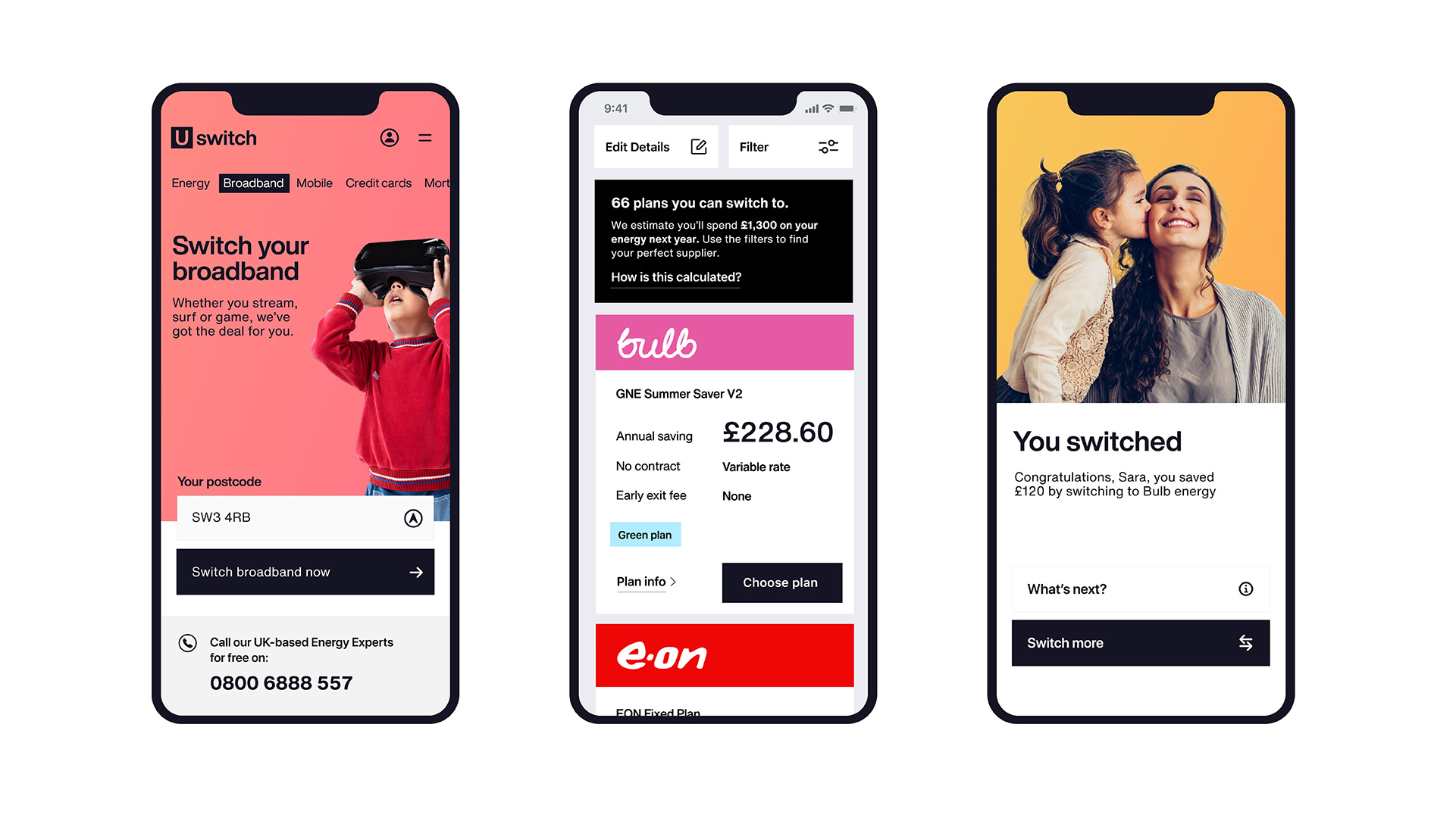
The idea of one place to switch everything has the power to change Uswitch’s entire business model. Instead of 2D caricatures, fluffy characters and brand gimmicks of competitors, we encouraged Uswitch to move out of their space entirely. To say goodbye to the ‘comparison site’ label and become a switching experience. ‘You, powered’, our brand idea, becomes a promise to Uswitch customers to get more of what actually matters – all in one place. Simple and empowering.
There’s an inherent gift in the Uswitch name. ‘U’ is the most important word in our headlines and the core of our new logo. Both showing that the brand is about customers first and foremost. Our brand symbol is authoritative – nodding to the expertise of a business that has been consistently chosen as number one in energy, broadband and mobile switches for years. But it’s also versatile, allowing the individuality of every ‘you’ to shine through.
Images (opinion after)
Opinion
The old logo was fine, although there was something unresolved about the arrow that started strong with the twist of the “U” but then had a weak finish. Wordmark was bland but also fine. With the goal of of the service being to lower payments perhaps the upwards arrow sent the wrong message. The new logo is also fine and even drier than the before logo, which at first I was turned off by but as I understood the service, which allows you to compare prices across other consumer brands, I found the extreme neutrality of the logo to be quite appropriate. It doesn’t impose anything on the user and serves almost as a brand palate cleanser as the user changes from one brand to another. I’m not gonna lie though, I do wish there was something extra to both the logo and the applications that are even more pared down than nutrition fact charts. Overall, and to continue my own contradictions, there is something satisfying about the lack of design for this particular service.
In ấn Anpic In nhãn mác Anpic In brochure Anpic In card visit Anpic In catalogue Anpic In thiệp cưới Anpic In tờ rơi Anpic
In Ấn Anpic – Nổi Tiếng In Đẹp In Nhanh
Số 5 Ngõ 75 Nguyễn Xiển, Thanh Xuân, Hạ Đình, Hà Nội
0963223884
baogiainananh@gmail.com
https://anpic.vn
https://g.page/inananpic
In nhãn mác Anpic ✅ In brochure Anpic ✅ In card visit Anpic ✅ In catalogue Anpic ✅ In thiệp cưới Anpic ✅ In tờ rơi Anpic
https://anpic.vn/in-nhan-mac-dep
https://anpic.vn/in-brochure
https://anpic.vn/in-an
https://anpic.vn/in-voucher-in-phieu-giam-gia-khuyen-mai
#inananpic


Comments
Post a Comment