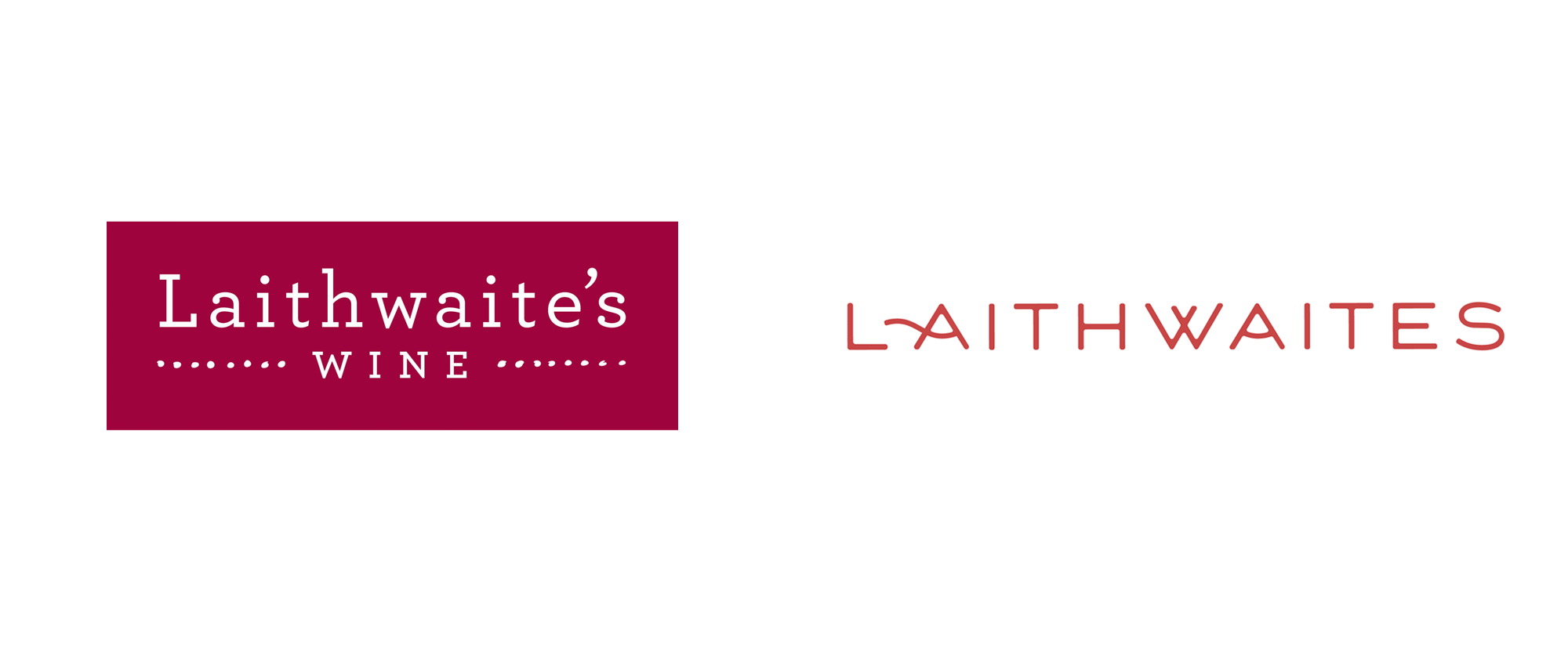
Noted: New Logo and Identity for Laithwaites by I&CO
“Hints of Watercolor with a Smooth Finish”

(Est. 1969) "Laithwaites started in 1969, when a young Tony Laithwaite drove a van filled with wine from Bordeaux to the UK hoping to share his excitement at tasting delicious, authentic locally-bottled wines (a man and a van, with help from his nan). 46 years later Laithwaite's Wine is still owned and run by Tony and his family and we still believe that great-tasting quality wines are made by passionate wine makers at a scale that is, mostly, too small to reach the biggest retailers. Our buying team taste around 40,000 wines each year to find just 800 that are good enough for our customers. So, 98% don't make the cut - either for quality or for value. Our wines have been awarded over 300 medals at the major London shows this year (2013). We offer new customers a £50 discount to give us a try, because we are confident about the great taste and quality of our wine. Laithwaites is a well-established brand in America, the United Kingdom, Australia, and New Zealand that sends an exclusively selected range of small-batch wines to over 700,000 people internationally."
Design by
I&CO (Brooklyn, NY)
Related links
N/A
Relevant quote
Laithwaites is not just in the wine business, they are in the entertaining business.The new brand celebrates the sense of adventure, fun, and passion that has and continues to be part of Laithwaites’ DNA. Visually, the brand embraces a vintage, yet modern approach to bringing “entertainment” to life, with illustrations becoming a core component to express the brand’s charm.
Humanity is also at the center of Laithwaites. The new logo was designed with the inspiration and curvature of a handwritten note. Dropping ‘wine’ from the logo was strategically done because this is a brand with a 50-year legacy in wine that has the legacy to stand on its own.
Images (opinion after)


Opinion
The old logo managed to make Hoefler&Co.’s Archer look lame. I mean, it was fine, nothing wrong at all with the logo but its ample letterspacing on a lowercase slab serif was not a good look. The new logo is a custom wordmark in a friendly, slightly aged aesthetic that’s much more unique and interesting. The reverse ink traps give it a nice vintage look. This is a hard word to kern and the result shows it, with plenty of awkward counterspaces throughout the wordmark — some of it isn’t poor kern-manship (although some is as in the “ES” pair), it’s just a bad mix of letters. Even the “LA” that they cleverly filled in with a swash could have been tightened. Anyway, overall, it’s a fine logo, with a lovely monogram to match. I really like how they nestled the “W” and swashed the “L”. The illustrations are great, in a detailed style we don’t see often and a good balance of playfulness and warmth. The typography is alright and the main application, the website, is alright as well. Nothing to get too excited about but well done. The other applications are sort of halfway there, probably because they are only proof of concept but there is a good set of ingredients for someone to make some good work out of this. Overall, an evolution in a good direction that makes Laithwaites feel more authentic, storied, and established.
In ấn Anpic In nhãn mác Anpic In brochure Anpic In card visit Anpic In catalogue Anpic In thiệp cưới Anpic In tờ rơi Anpic
In Ấn Anpic – Nổi Tiếng In Đẹp In Nhanh
Số 5 Ngõ 75 Nguyễn Xiển, Thanh Xuân, Hạ Đình, Hà Nội
0963223884
baogiainananh@gmail.com
https://anpic.vn
https://g.page/inananpic
In nhãn mác Anpic ✅ In brochure Anpic ✅ In card visit Anpic ✅ In catalogue Anpic ✅ In thiệp cưới Anpic ✅ In tờ rơi Anpic
https://anpic.vn/in-nhan-mac-dep
https://anpic.vn/in-brochure
https://anpic.vn/in-an
https://anpic.vn/in-voucher-in-phieu-giam-gia-khuyen-mai
#inananpic
Comments
Post a Comment