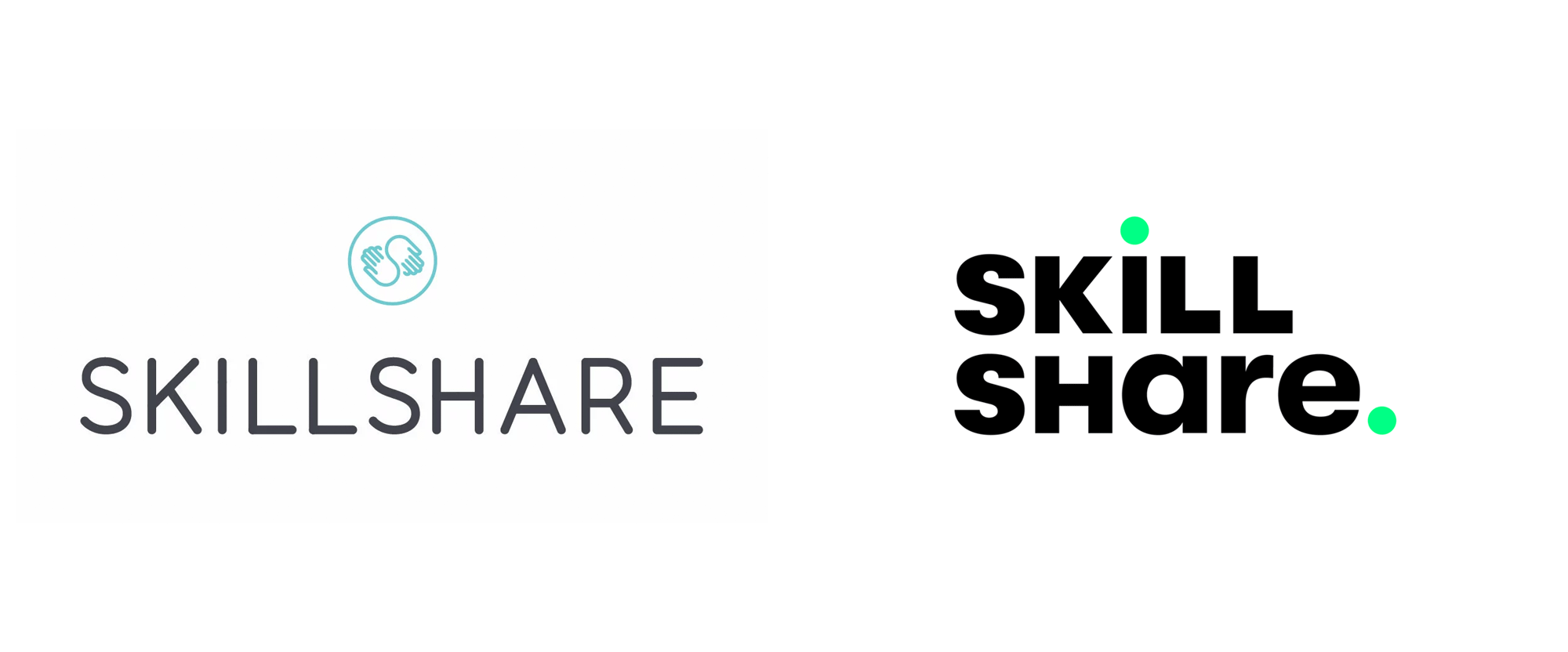
Noted: New Logo for Skillshare
“License to Skill”

(Est. 2010) "Skillshare is an online learning community with thousands of inspiring classes for creative and curious people, on topics including illustration, design, photography, video, freelancing, and more. On Skillshare, millions of members come together to find inspiration and take the next step in their creative journey."
Design by
N/A
Related links
Skillshare blog post
Relevant quote
Our new visual concept leans into our belief that exploration makes discovery and fulfillment possible — that the journey is the destination.
First and foremost, it’s legible. Our previous wordmark didn’t work in all digital spaces, so we’ve now built a flexible logo system that reads well at any size and orientation.
Second, the dots. They represent key points along a journey, highlighting important moments in a process and illustrating the idea that there’s no defined beginning or end. Plus, we love the pleasing repetition they create.
And third, in the spirit of strange, beautiful, and surprising creative acts, we’ve played with upper and lowercase letterforms as a tribute to experimentation and the desire to keep it weird. Geometric sans serif logos are hyper-legible but often indistinguishable from each other. Our odd little family of letterforms helps us be who we are.
We’ve emphasized lines and the use of meandering paths and bold colors to create a graphic and eloquent personality that represents what Skillshare is about: finding yourself. The lines don’t have a beginning or an end because your journey is endless and evergreen. And sometimes it will be animated, just as we all are when we feel enlightened and excited along the way.
Images (opinion after)


Opinion
The old logo had a decent wordmark and a relatively clever icon of an “S” embedded between the two, sharing hands — not amazing, but good. The new logo drops the hands icon — which I think could have been improved and kept as a secondary mark perhaps — and introduces a new sans serif wordmark in a unicase format that, as you may come to expect by now, I dislike. This doesn’t mean the logo is bad, I just personally find the unicase annoying to look at, with its tiny “r”, giant “a”, and awkward “L”s. The dots, without the green path animation, come across as gratuitous because why would you punctuate a single unicase word? With the animated green paths, where the dots are revealed in sequence as the path travels through the wordmark, the concept is a little more engaging but, still, not entirely convincing. The logo comes in two configurations: a single line version that works remarkably better, and the main split-line version that works remarkably not better by breaking the proper name of the company, “Skillshare”, into two words which I am sure is verboten in the written application of the name. The squiggles (or “paths”) are an okay graphic… not entirely unique or novel but it’s put to good use in the website and social media. The secondary serif — that complements GT Walsheim — Kumlien Pro feels like it’s weird for weird’s sake but, to its credit, it does at least feel different. Overall, it was probably indeed time for Skillshare to evolve and while this isn’t the most exciting or differentiating change, it does manage to signal a mature evolution.
In ấn Anpic In nhãn mác Anpic In brochure Anpic In card visit Anpic In catalogue Anpic In thiệp cưới Anpic In tờ rơi Anpic
In Ấn Anpic – Nổi Tiếng In Đẹp In Nhanh
Số 5 Ngõ 75 Nguyễn Xiển, Thanh Xuân, Hạ Đình, Hà Nội
0963223884
baogiainananh@gmail.com
https://anpic.vn
https://g.page/inananpic
In nhãn mác Anpic ✅ In brochure Anpic ✅ In card visit Anpic ✅ In catalogue Anpic ✅ In thiệp cưới Anpic ✅ In tờ rơi Anpic
https://anpic.vn/in-nhan-mac-dep
https://anpic.vn/in-brochure
https://anpic.vn/in-an
https://anpic.vn/in-voucher-in-phieu-giam-gia-khuyen-mai
#inananpic
Comments
Post a Comment