Noted: New Name and Logo for Truist by Interbrand
“I Want the Truist. You Can’t Handle the Truist.”

(Est. 2019) "Truist is a purpose-driven company dedicated to building a better future for its clients, teammates and communities. With 275 years of combined BB&T and SunTrust history, Truist is one of the nation's largest financial services holding companies offering a wide range of services including retail, small business and commercial banking; asset management; capital markets; commercial real estate; corporate and institutional banking; insurance; mortgage; payments; specialized lending and wealth management. Headquartered in Charlotte, North Carolina, Truist serves approximately 10 million households with leading market share in many high-growth markets in the country. Truist Bank, Member FDIC."
Design by
Interbrand
Related links
Interbrand press release
Relevant quote
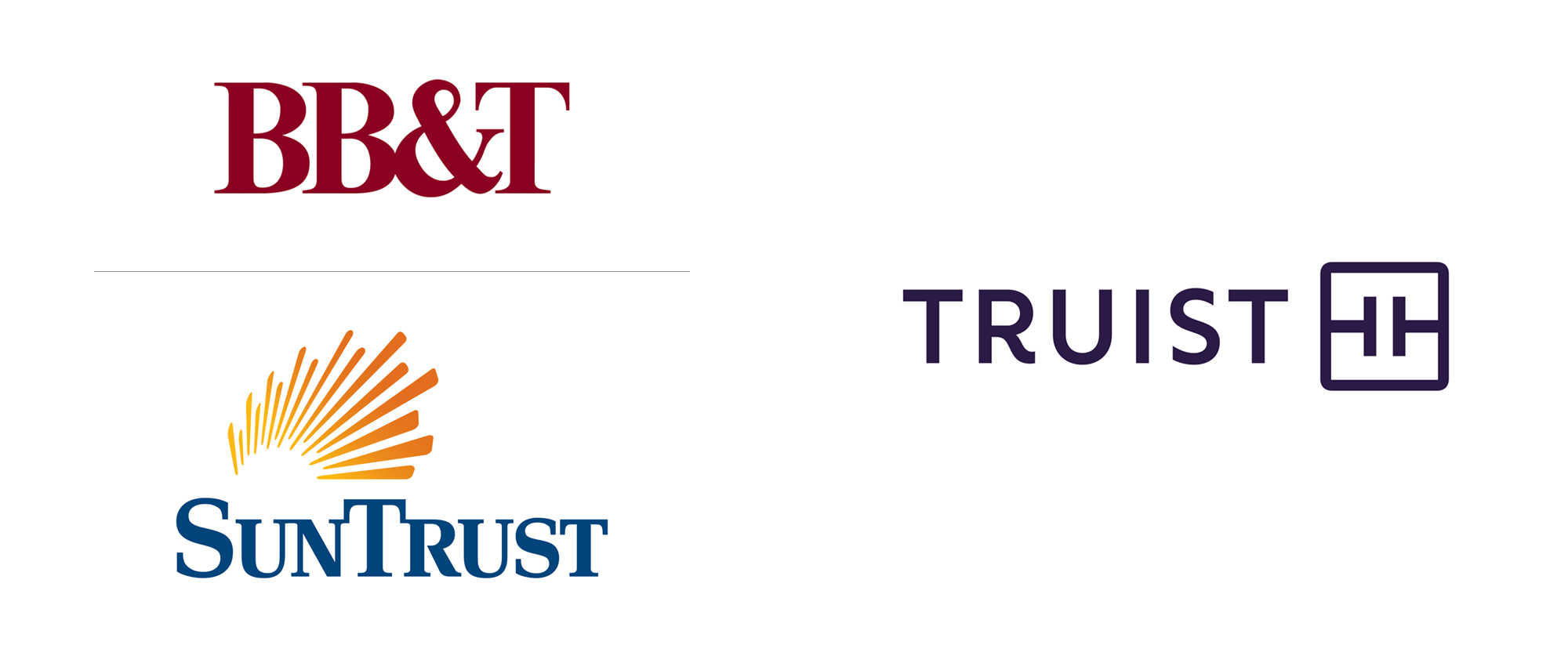
The new identity we created for Truist centers on Truist Purple, a color that represents the merger of equals by combining the burgundy of BB&T and the blue of SunTrust.
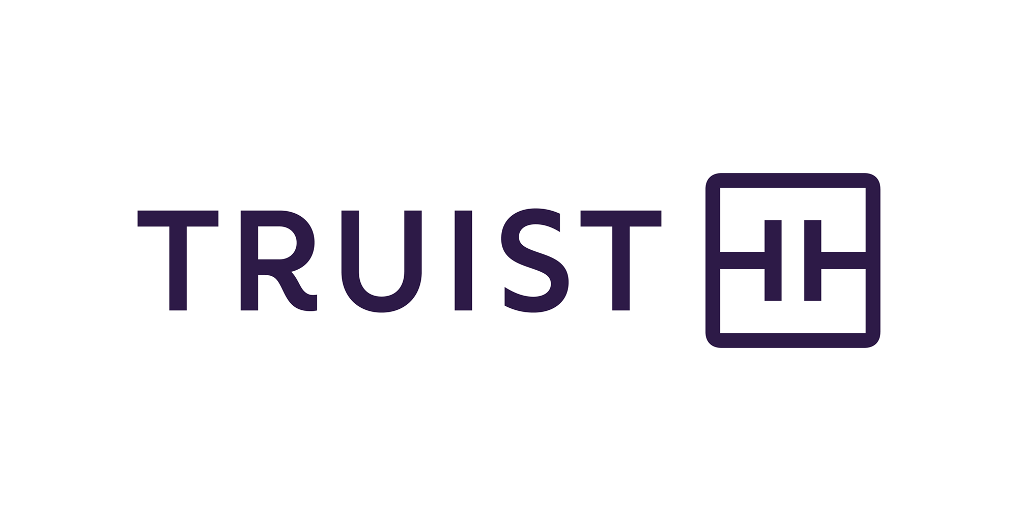
The powerful logo is comprised of a unique monogram made of two Ts that echo the Truist name and represent tech and touch, “which define the distinct experience Truist is creating,” says Chris Campbell, Executive Creative Director of Interbrand New York. The two Ts are enclosed in a square that represents trust and security, with rounded outer corners that make it approachable and distinct.
The wordmark puts the Truist name front and center in custom letters created by a master typographer. The generous letter-spacing conveys access and openness, while the unique curved leg of the “R” moves the eye from left to right, evoking a sense of momentum toward the future.
Images (opinion after)


Opinion
Neither of the previous names or logos were good or bad, they just were, in the way many regional banks are where they look and sound like banks. By contrast, the new name — introduced in the Summer of 2019 and not very well received — tries a little too hard to sound like something that’s meaningful and, for better or worse and after the 2008 recession and Wells Fargo being Wells Fargo, one of the last places we would turn to for truth is banks so the name is hard to digest without a modicum amount of apprehension. Nonetheless, as a protectable brand name that ties to the previous names, it’s a pretty commendable achievement. The new logo features a double “T” monogram that has an intriguing negative-positive interplay that’s fairly interesting: you can see two small, sans serif, light-weight “T”s on their side or you can see two large, slab serif, bold-weight “T”s upright. I like the optical illusion — whether intended or not — but as an icon, it’s a little flimsy, like, it’s too simple for its own good. The wordmark is really nice and that detail on the “R” is perfect — except for its rationalization about “momentum toward the future” but some things can’t be avoided in the corporate world, I guess. The color purple — the actual color not the novel — seems to be having a moment and this is a nice, royal shade. Overall, I do like this but I’m not sure if it’s quite right for a bank of this size, almost as if it’s missing some more boldness to equal authority.
In ấn Anpic In nhãn mác Anpic In brochure Anpic In card visit Anpic In catalogue Anpic In thiệp cưới Anpic In tờ rơi Anpic
In Ấn Anpic – Nổi Tiếng In Đẹp In Nhanh
Số 5 Ngõ 75 Nguyễn Xiển, Thanh Xuân, Hạ Đình, Hà Nội
0963223884
baogiainananh@gmail.com
https://anpic.vn
https://g.page/inananpic
In nhãn mác Anpic ✅ In brochure Anpic ✅ In card visit Anpic ✅ In catalogue Anpic ✅ In thiệp cưới Anpic ✅ In tờ rơi Anpic
https://anpic.vn/in-nhan-mac-dep
https://anpic.vn/in-brochure
https://anpic.vn/in-an
https://anpic.vn/in-voucher-in-phieu-giam-gia-khuyen-mai
#inananpic
Comments
Post a Comment