Noted: New Name, Logo, and Identity for Houst by Ragged Edge
“Houst of Representatives”
(Est. 2015, previously Airsorted) "Houst makes hosting on Airbnb -- across a full range of platforms, from Booking.com to Expedia -- Hassle-free. We are an Airbnb management company using technology to create an infrastructure for the fast-growing sharing community. We dramatically increase property yields and handle everything from cleaning to guest communication, laundry to key exchanges and reviews to pricing. We take care of everything - so you don't have to, all whilst helping you make the most from your property."
Design by
Ragged Edge (London, UK)
Related links
Ragged Edge project page
Relevant quote
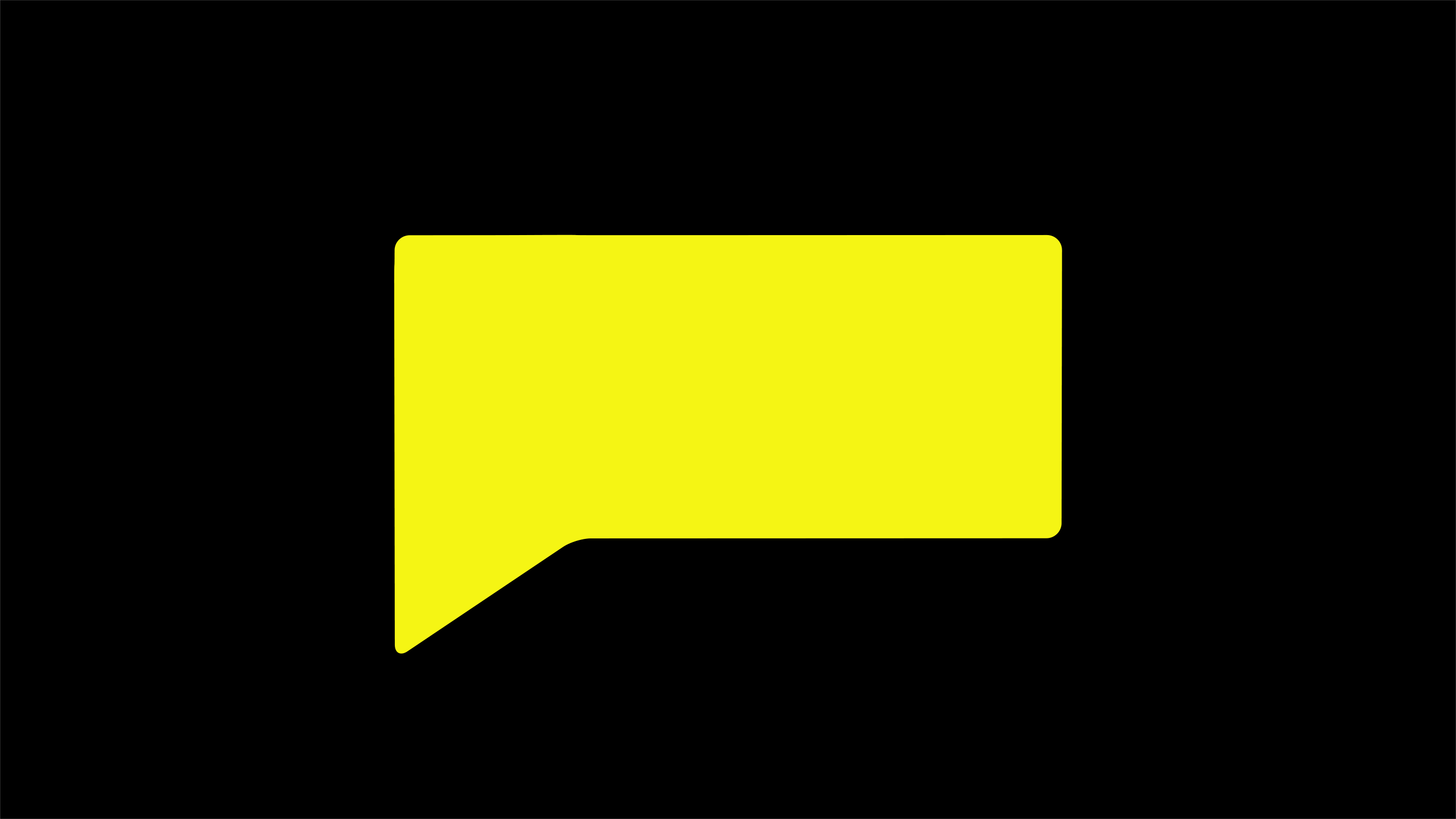
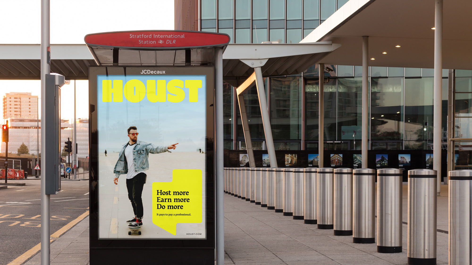
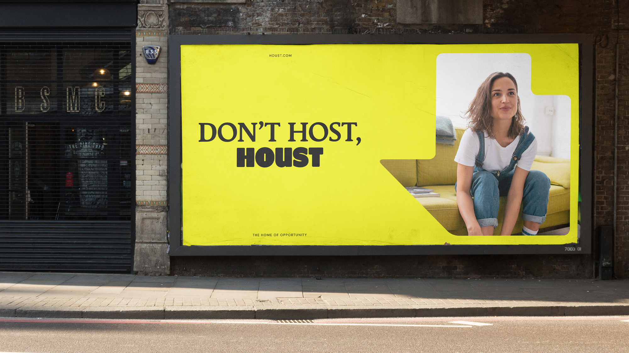
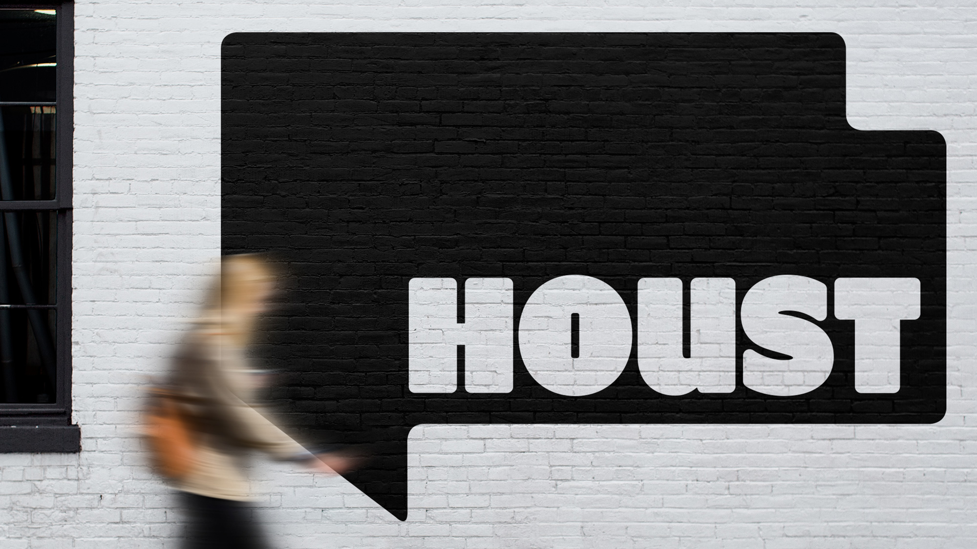
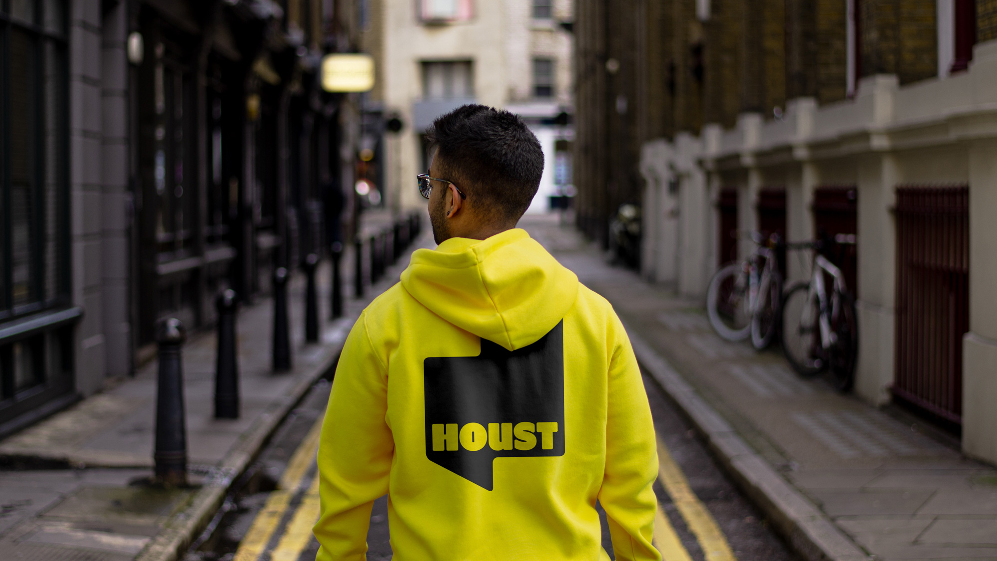
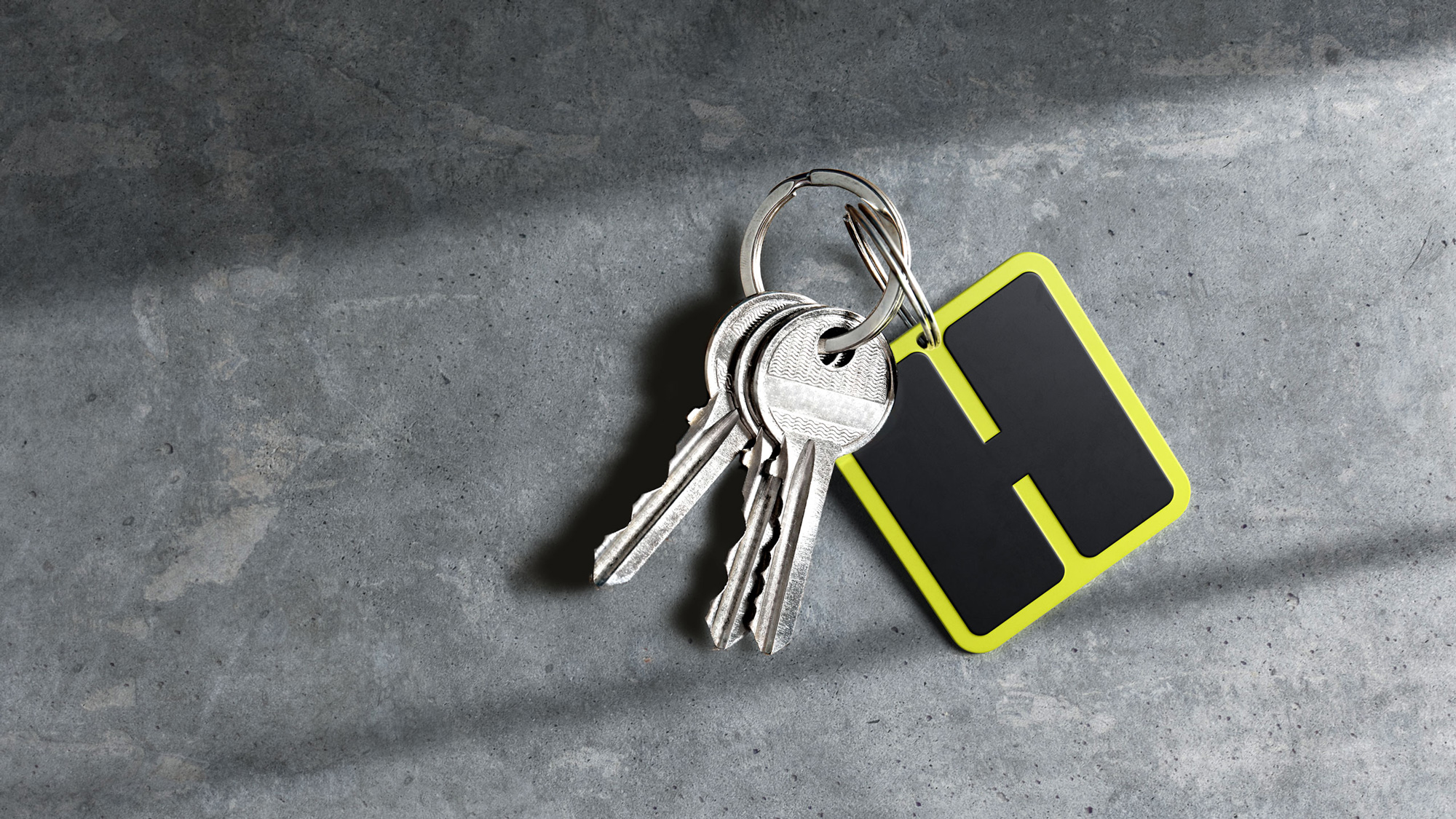
The business’s bold ambition is reflected across every part of the new identity. Airsorted became Houst, combining ‘house’ and ‘host’ for a name with the strength to redefine hosting. The visual identity is built around a bold, authoritative wordmark whose rounded edges and quirky letterforms imbue warmth and personality. And a striking yellow and black colour palette cuts through the conservative aesthetic of the rest of the category.
Other parts of the identity communicate the opportunity on offer. A graphic system uses shapes inspired by floorplans to house content that expresses what Houst makes possible – from imagery of the target audience enjoying their freedom to copy that encourages them to ‘do more’. Less hassle-free, more possibility.
Images (opinion after)
Opinion
The old name and logo were pretty bad, with the former playing too bluntly off of the Airbnb name and the latter demonstrating why you don’t letterspace lowercase with such abandon and a very odd peep-hole-like icon. The new name is short, fun to say, and can clear any legal requirements like a boss. The new logo is great, with an extra extra bold presence and some really tight letterspacing and counterspaces. The rounded corners are well executed and, indeed, add a bit of warmth as the quoted text says. The lowercase structure of the “u” works surprisingly well too. The floorplan shapes are interesting, except that they all remind me of the shape of the state of Texas, but, no, kidding aside, it’s an interesting design element although I am not sure it’s the most relevant for this company, since they are not really in real estate. The applications are good, almost with a magazine-like look, and the headline serif, Stuart, is a great complement and a welcome break from the bold spiky serif trend. Overall, this has a trustworthy presence with a dash of Airbnb-ness that should sit pretty well with the intended audience.
In ấn Anpic In nhãn mác Anpic In brochure Anpic In card visit Anpic In catalogue Anpic In thiệp cưới Anpic In tờ rơi Anpic
In Ấn Anpic – Nổi Tiếng In Đẹp In Nhanh
Số 5 Ngõ 75 Nguyễn Xiển, Thanh Xuân, Hạ Đình, Hà Nội
0963223884
baogiainananh@gmail.com
https://anpic.vn
https://g.page/inananpic
In nhãn mác Anpic ✅ In brochure Anpic ✅ In card visit Anpic ✅ In catalogue Anpic ✅ In thiệp cưới Anpic ✅ In tờ rơi Anpic
https://anpic.vn/in-nhan-mac-dep
https://anpic.vn/in-brochure
https://anpic.vn/in-an
https://anpic.vn/in-voucher-in-phieu-giam-gia-khuyen-mai
#inananpic


Comments
Post a Comment