Reviewed: New Logo and Identity for 305 Fitness by ēthos
“Dance Dance Revolution”
Established in 2012, 305 Fitness is a growing fitness club and movement that mixes dancing, a live DJ, and a light show into a 55-minute cardio workout. It was started by Sadie Kurzban, a Miami, FL, native -- "305" is Miami's area code -- and an economics student at Brown University, where she applied to their annual Entrepreneurship Pitch Competition and won $25,000 to get it going. Now, 305 Fitness has five studios in New York, one each in Washington DC and Boston, as well as pop-ups in Chicago, Los Angeles, and San Francisco, and has attracted the attention of celebrities like Amanda Seyfried and Ashley Olsen, investment from NBA player Kevin Durant, and plenty of positive attention for a business started by an early-twenties young woman and her emphasis on inclusivity and body-positivity. With plans to expand to 20 locations by 2021, 305 Fitness introduced a new identity last year designed by Montréal, Québec-based ēthos.
The new identity--loud, pop and in your face--is exemplified by a wildly diversified clientele, out-there instructors and classes (aka "dance parties") that are completely outrageous.
ēthos project page
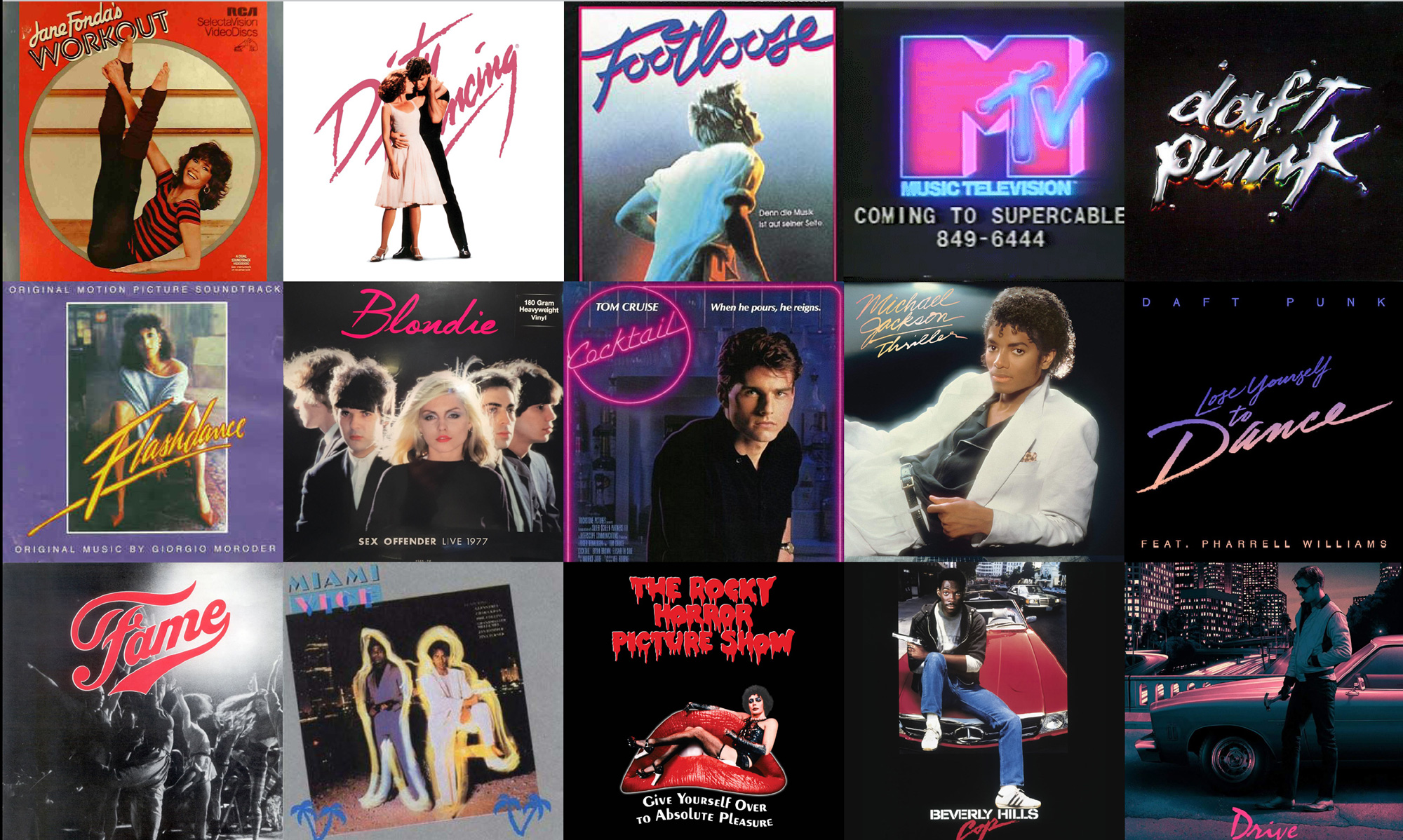
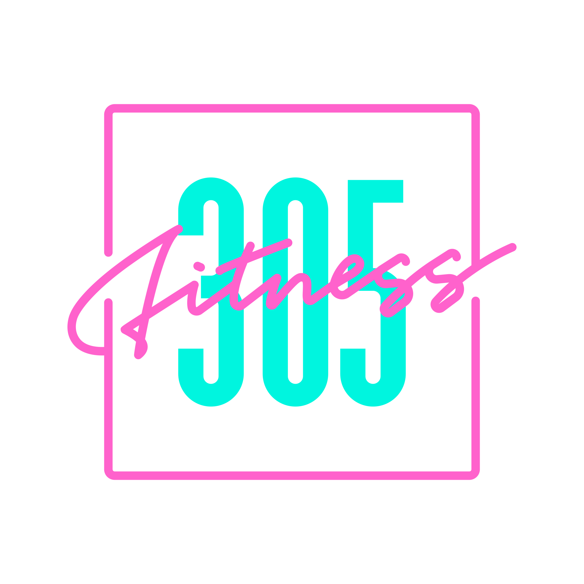
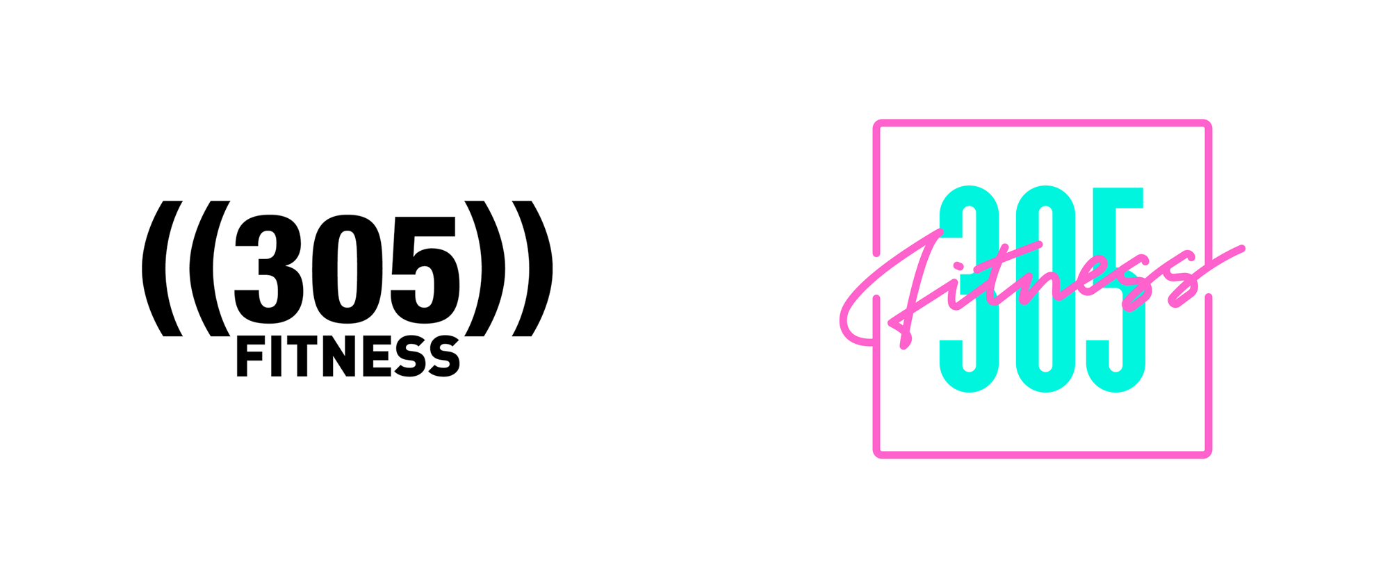
The old logo wasn't great or terrible but its biggest issue was that it looked more like a CrossFit gym than a fun, dance-led studio. The new logo corrects that and spryly establishes a Miami-esque, nightlife mood with a dash of 1980s nostalgia and I'm here for it. I have a very weak spot for 1980s neon and colors so this logo and identity had me at hello. More constructively though, I like the layered effect started in the logo that then drives the rest of the identity with a combination of a custom condensed sans serif and a fun script that contrasts really well. The one thing that bothers me about the logo is how the frame interacts with "Fitness", with the rounded endings of where the frame is cut -- I think that should have been handled less default-y. And, yeah, the color combination is questionable for its readability but, sorry, it's bitchin'.
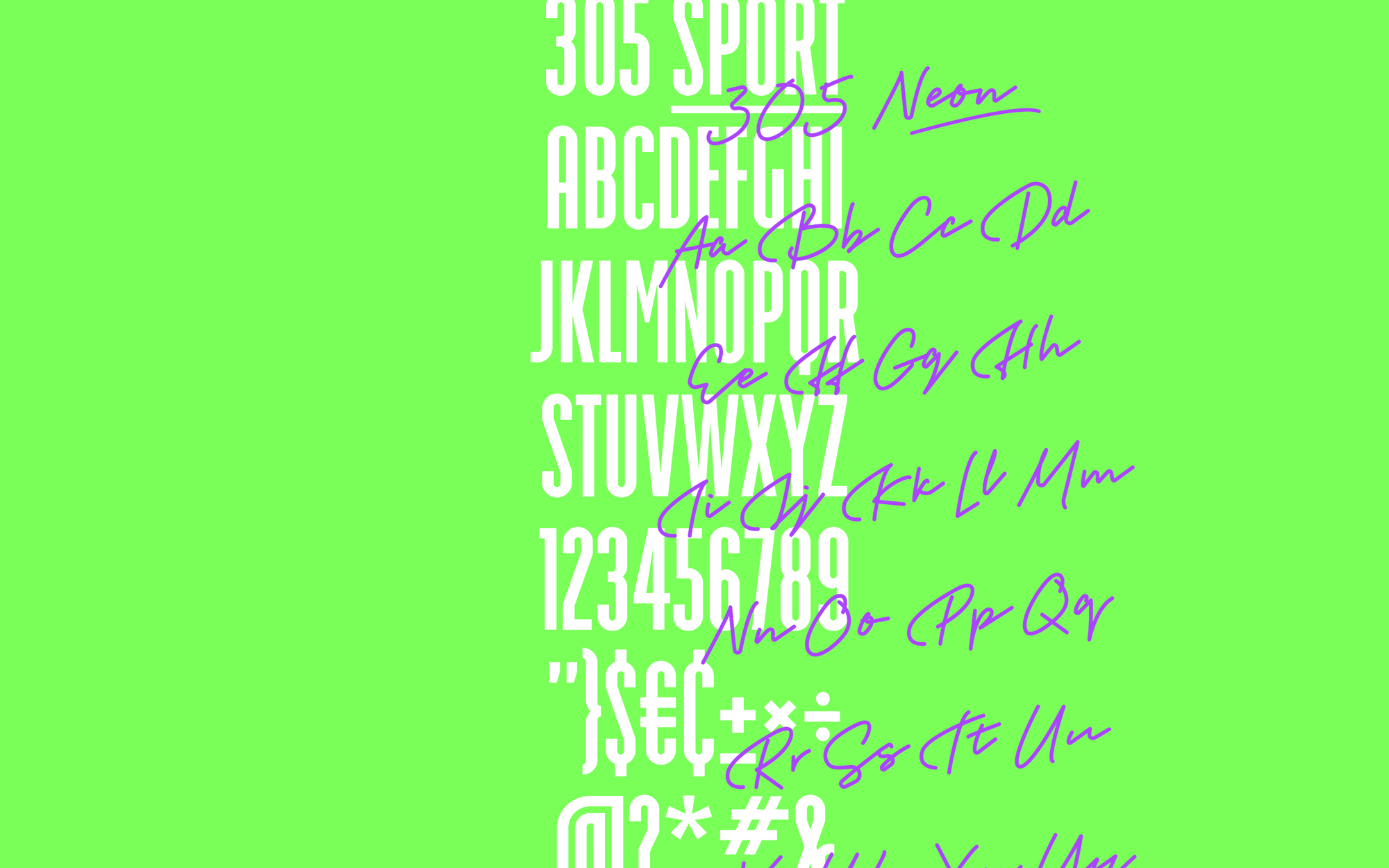

The two custom typefaces are really good and without a lot of pretense, both having a fun and loose aesthetic. The color palette... the rainbow approach... I'm not a big fan and would have liked to see a more focused range of colors.
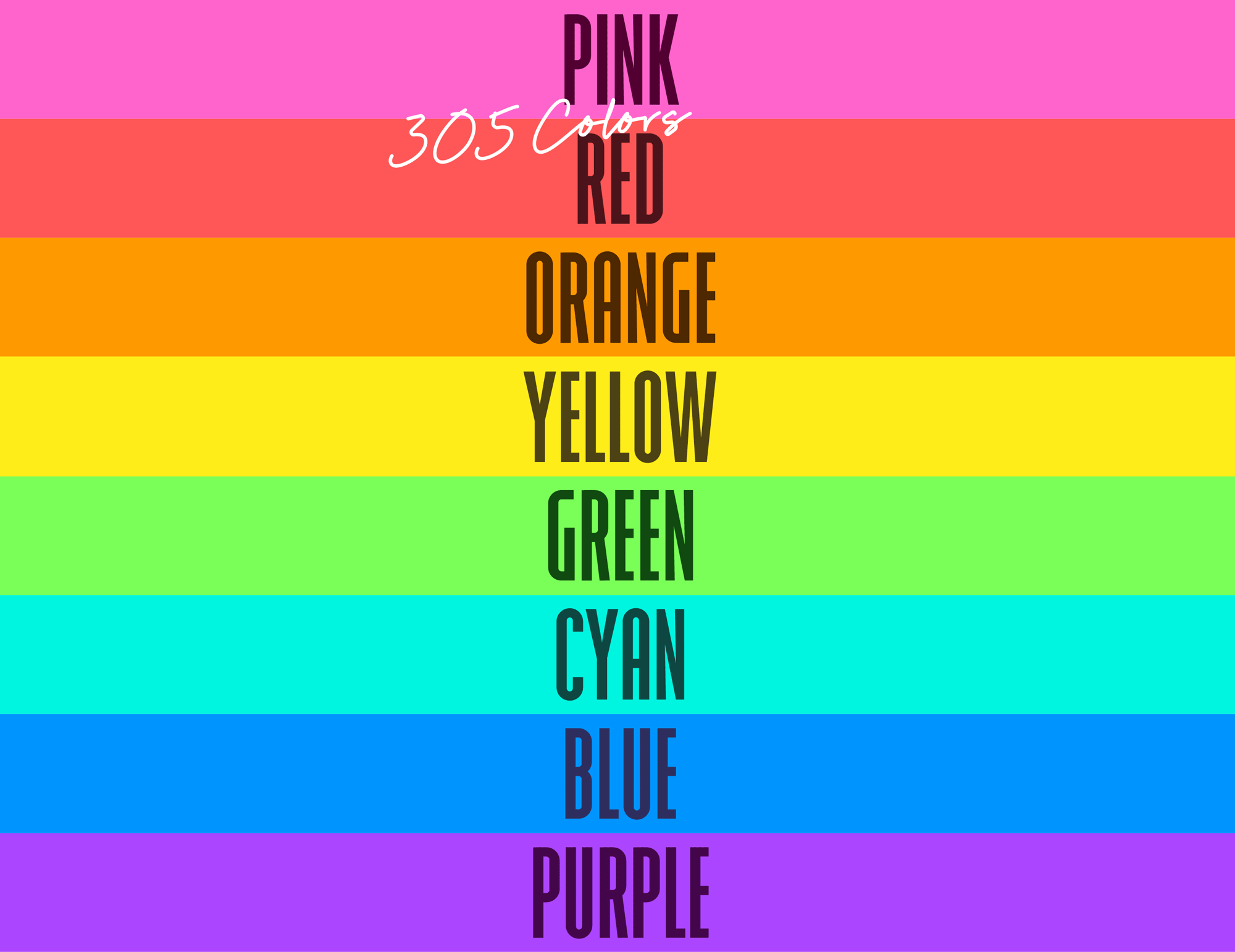
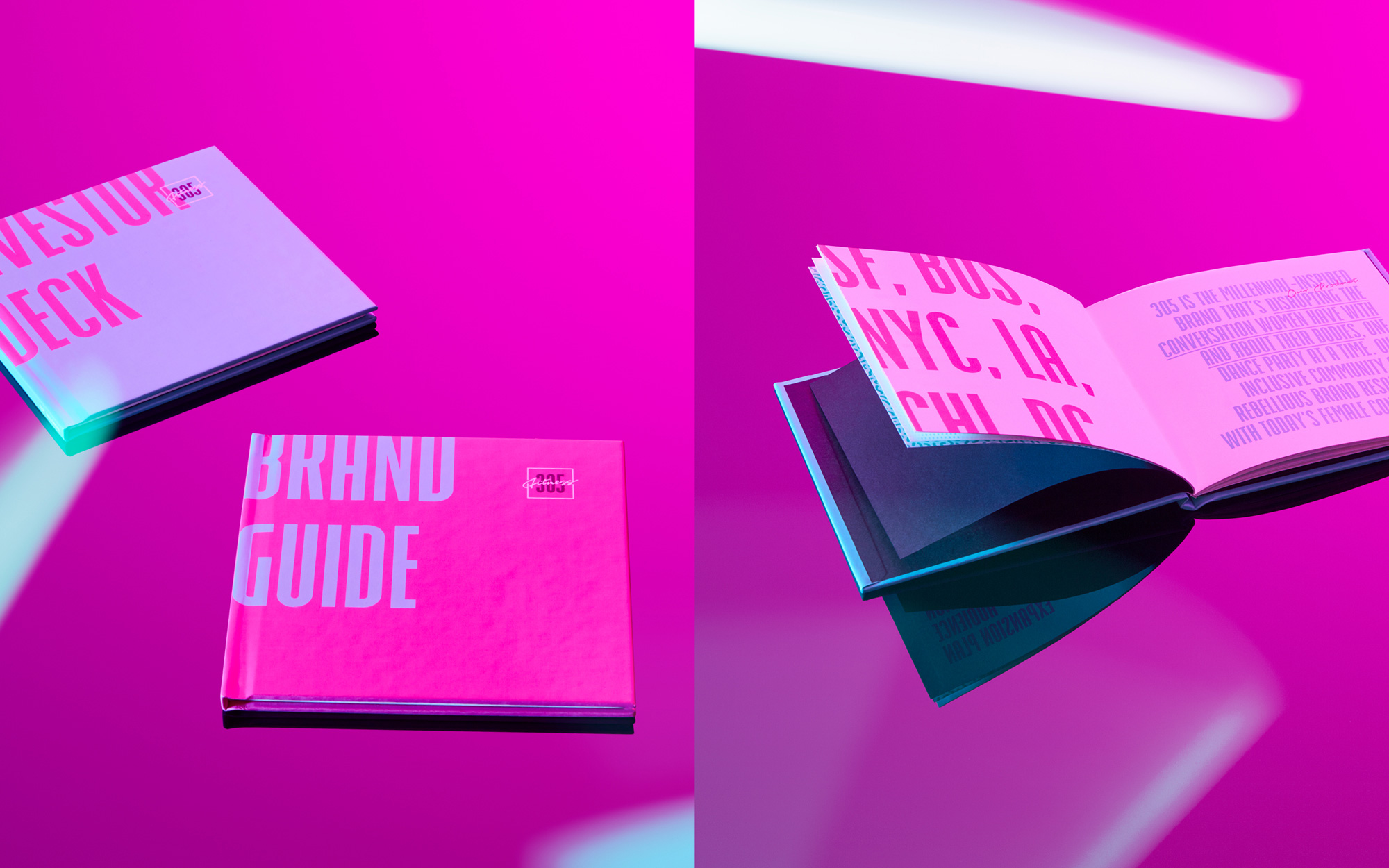
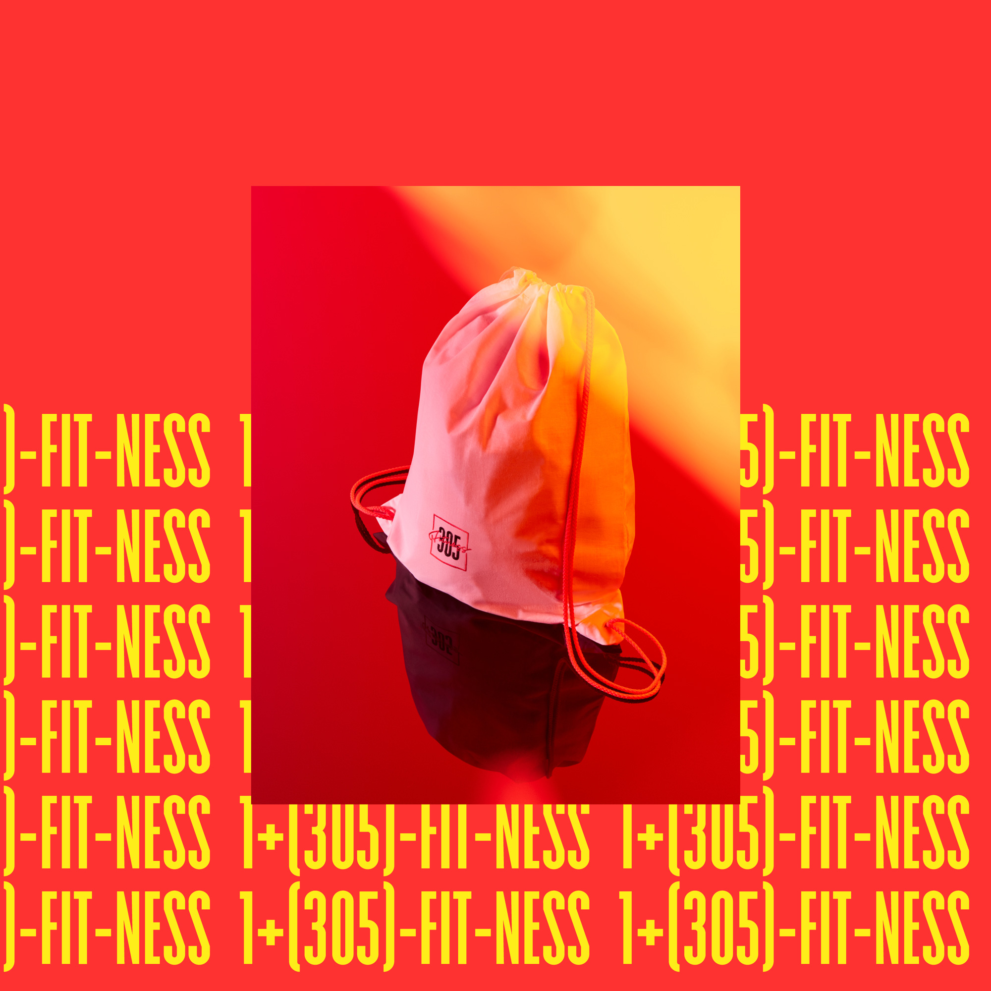

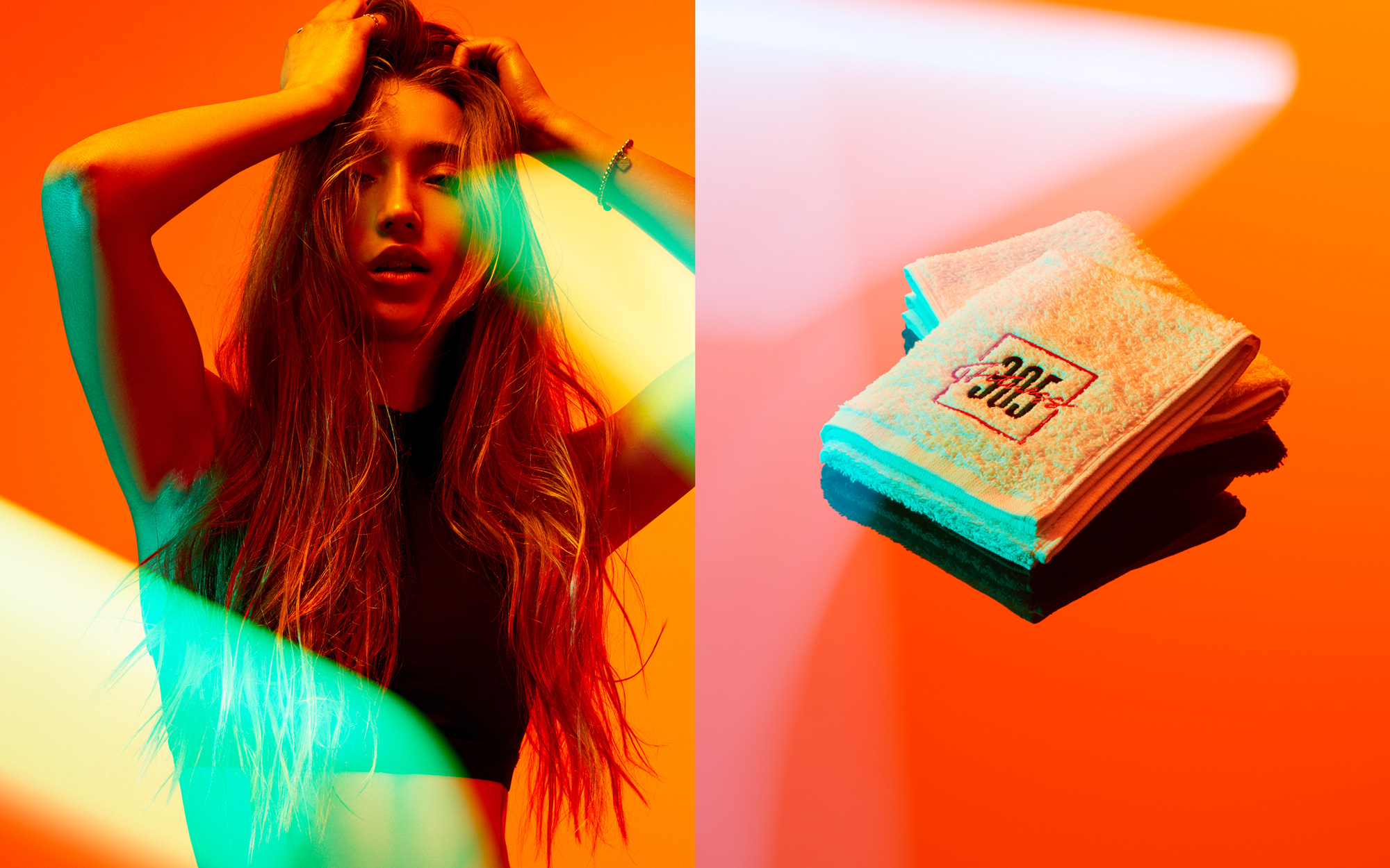
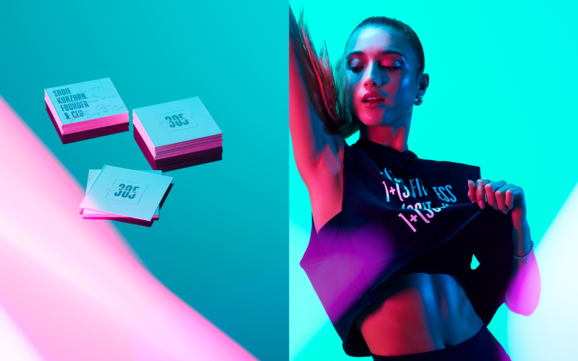
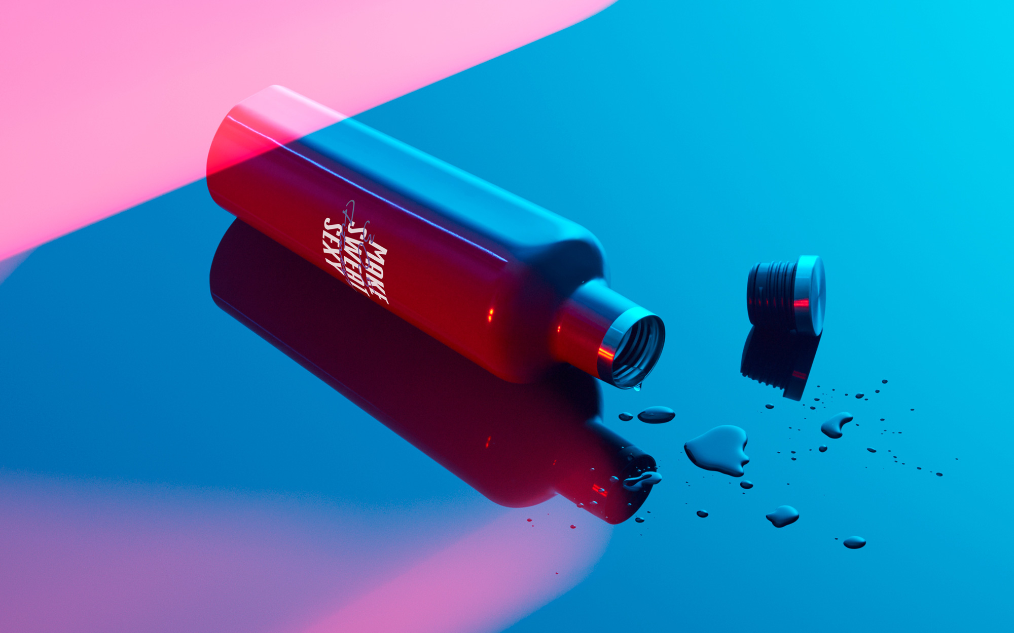
The applications are fairly straightforward given that the ingredients are few and their interaction very simple: Big condensed type underneath, less big script type on top. Done. And on point in every instance. I'm not saying it's the greatest identity ever, just that it's very efficient in getting the studio's vibe across.
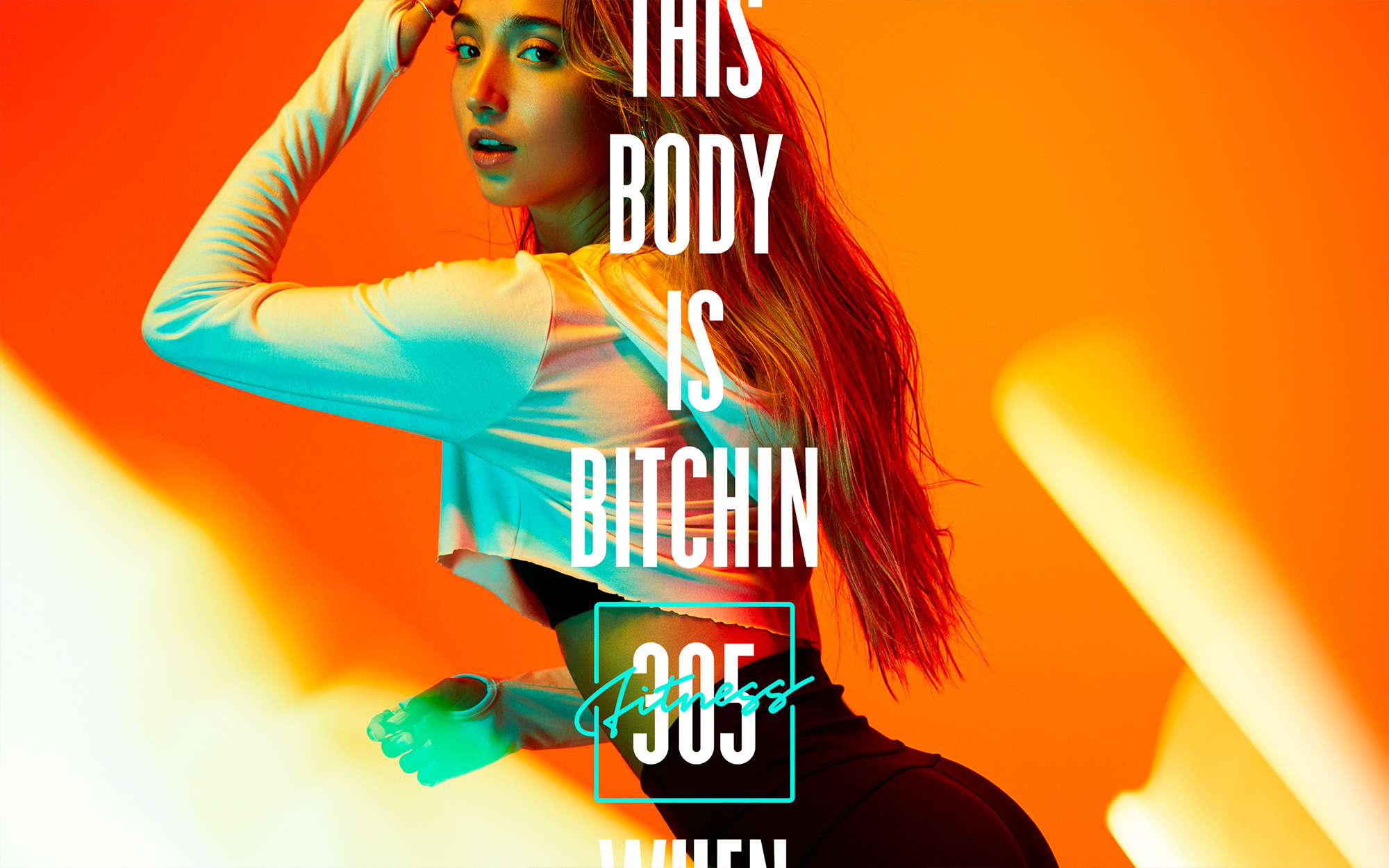
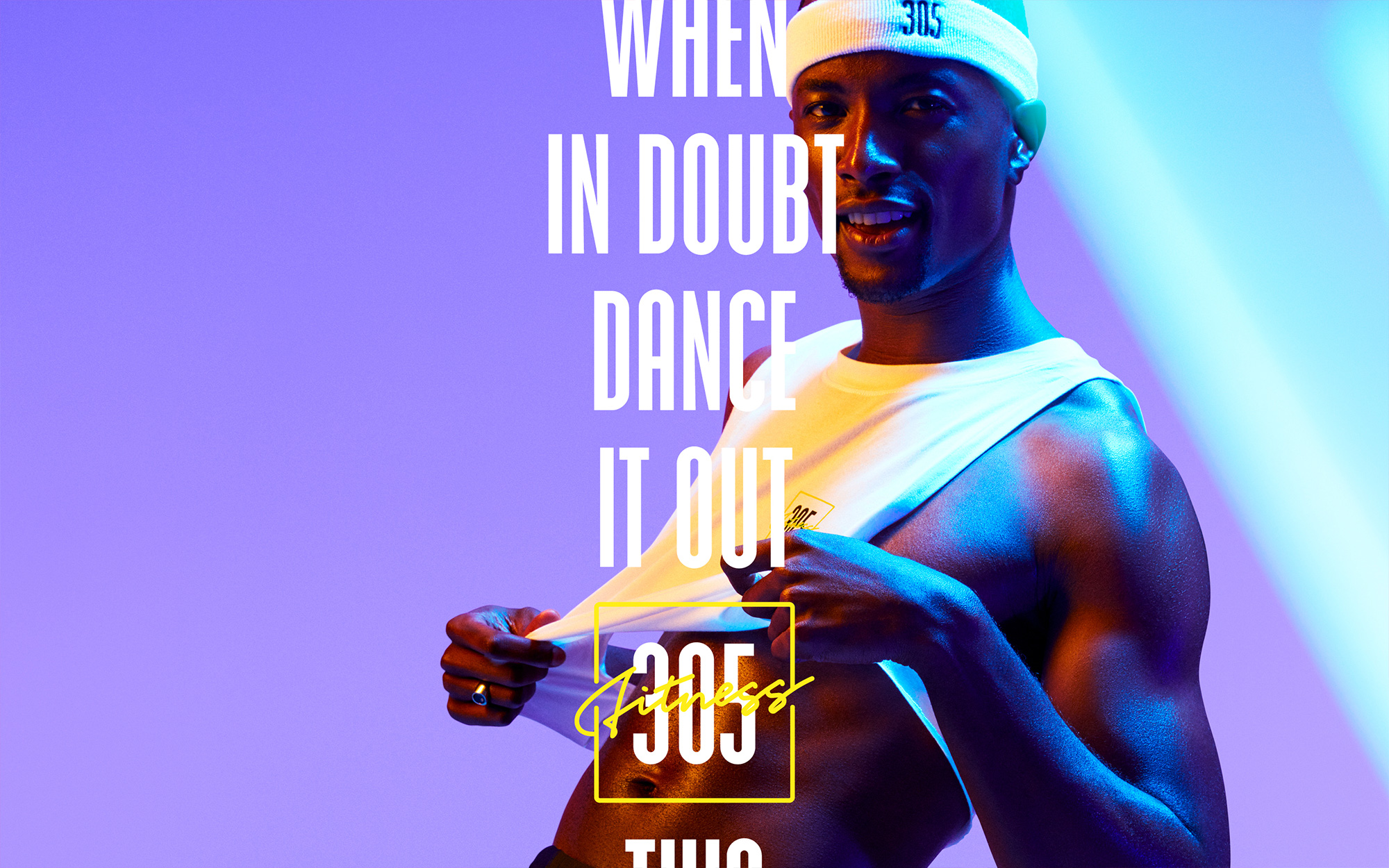
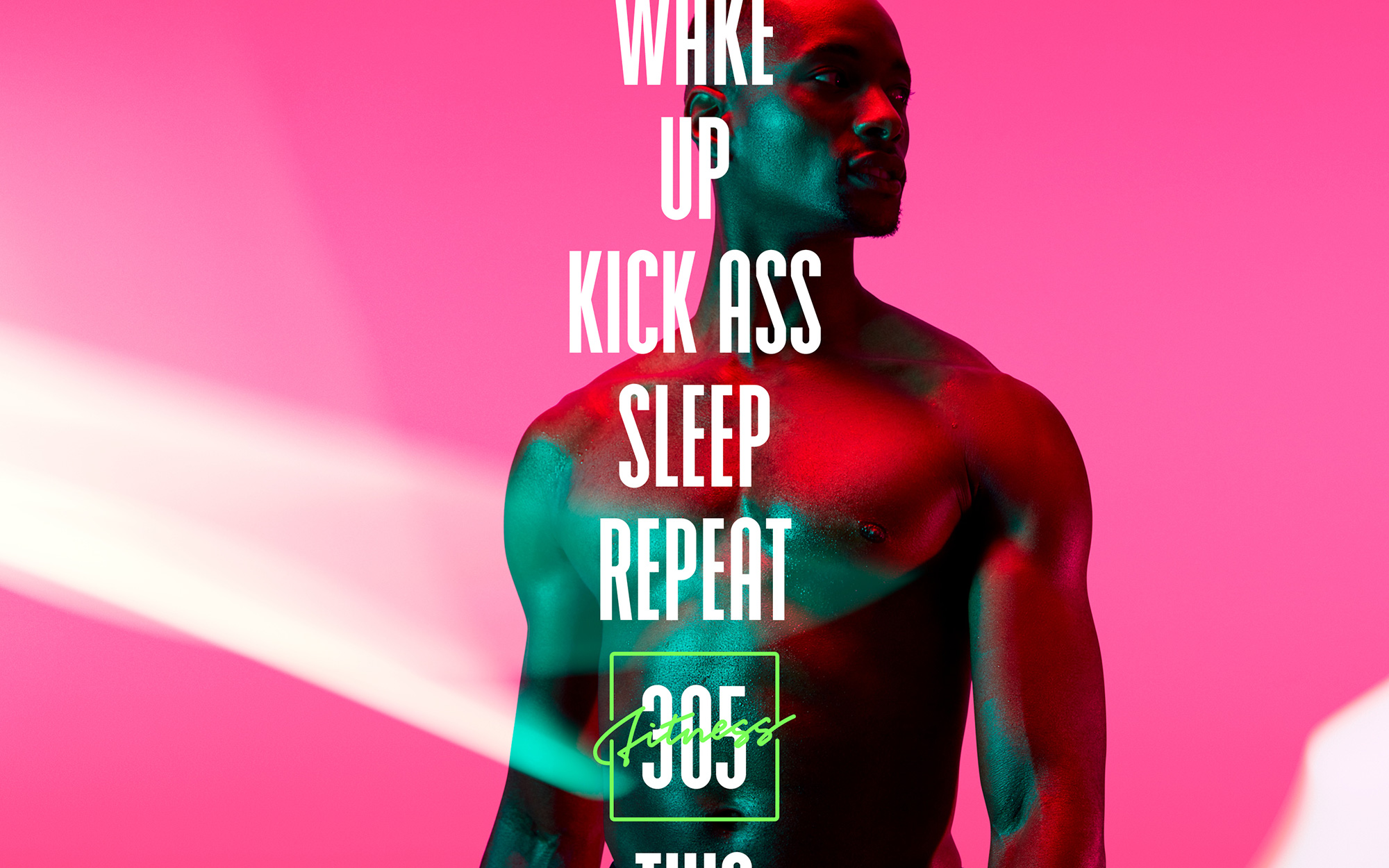
The one complaint I would file is that for all their focus on inclusivity and body-positivity, all of the images above with models in them don't really reflect. I mean, yes some inclusivity of people of color, but those are some toned bodies and meticulous hair. Their website and Instagram account do a better job in showing a wider range of people and bodies so hopefully they could do some equally sexy photo treatments with more relatable models. Having said that, the art direction on the photos is pretty great.
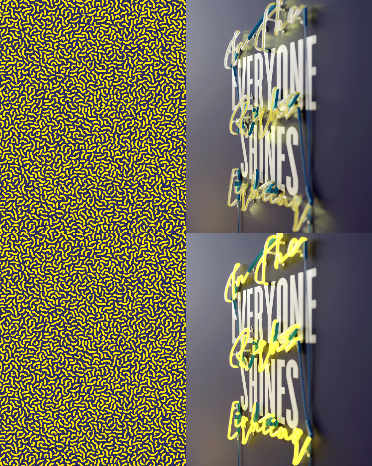
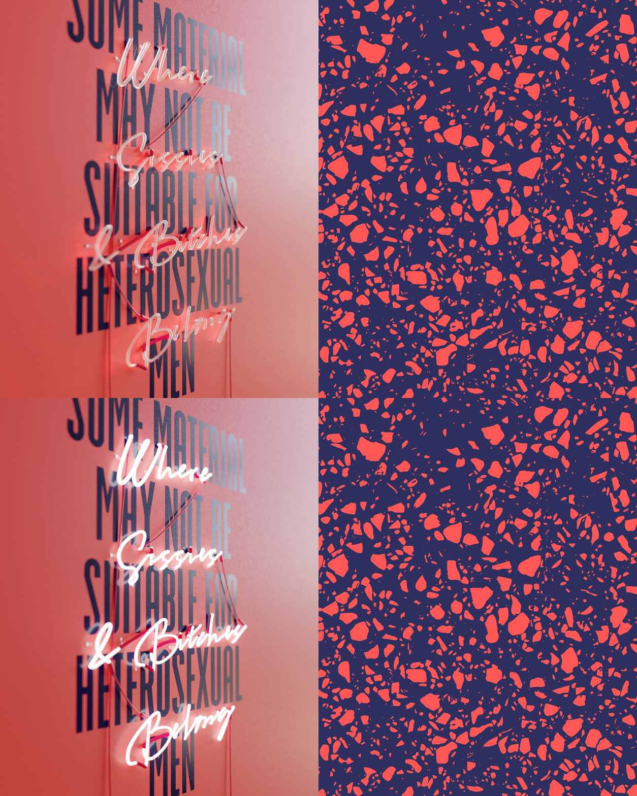

🤷
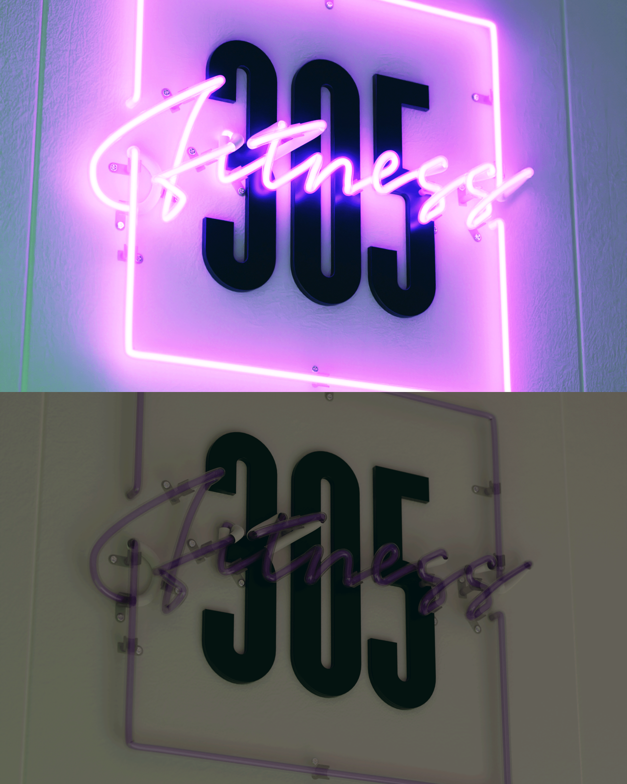
Overall, this really nails it, both in terms of building on the origin of the studio -- Miami 4eva -- and establishing a clearly different vibe from the many existing fitness options that are either too burly or too sexy... or too silly (in terms of identity).
In ấn Anpic In nhãn mác Anpic In brochure Anpic In card visit Anpic In catalogue Anpic In thiệp cưới Anpic In tờ rơi Anpic
In Ấn Anpic – Nổi Tiếng In Đẹp In Nhanh
Số 5 Ngõ 75 Nguyễn Xiển, Thanh Xuân, Hạ Đình, Hà Nội
0963223884
baogiainananh@gmail.com
https://anpic.vn
https://g.page/inananpic
In nhãn mác Anpic ✅ In brochure Anpic ✅ In card visit Anpic ✅ In catalogue Anpic ✅ In thiệp cưới Anpic ✅ In tờ rơi Anpic
https://anpic.vn/in-nhan-mac-dep
https://anpic.vn/in-brochure
https://anpic.vn/in-an
https://anpic.vn/in-voucher-in-phieu-giam-gia-khuyen-mai
#inananpic
Comments
Post a Comment