Reviewed: New Logo and Identity for CEV by Alphabet
“Uncanny Volley”
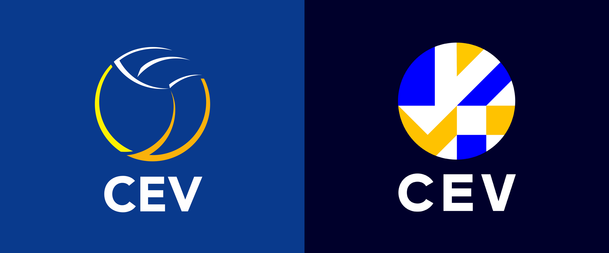
Established in 1963, Confédération Européenne de Volleyball (CEV for short, European Volleyball Confederation in English) is, as its name implies, the institution responsible for governing 56 countries throughout Europe in the sport in support of the Fédération Internationale de Volleyball (FIVB), the mothership of international volleyball. Headquartered in Luxembourg, CEV has the authority and responsibility for organizing all European competitions in volleyball, beach volleyball, and, yup, snow volleyball. The organization promotes the expansion and popularity of volleyball, coordinates the activities of the 56 member countries, fosters the development of friendly relationships among them, and ensures adherence to the FIVB rules. Last year, the CEV introduced a new identity designed by Manchester, UK-based Alphabet.
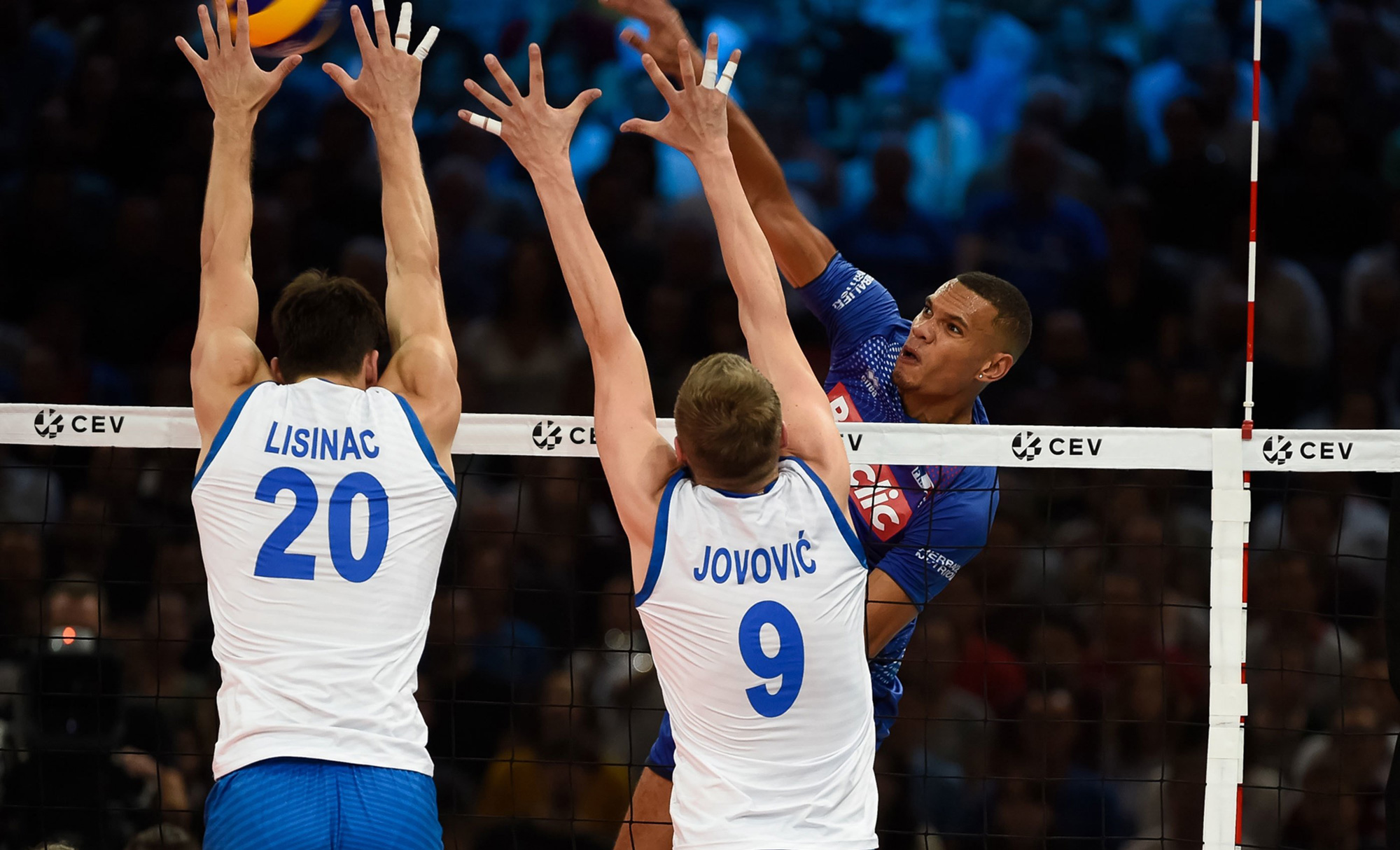
Born from inspiration of the flags of all 56 European Nations, the Volleymark is the centrepiece of the brand identity. The shapes and angles illuminate the spectacular moments that transcend the sport.
Once keylined, we used the flags as direct inspiration for the Volleymark. The angles in the design directly reference the angles used in the country flags. The final design is contained within the circular shape representing the volleyball.
Alphabet project page

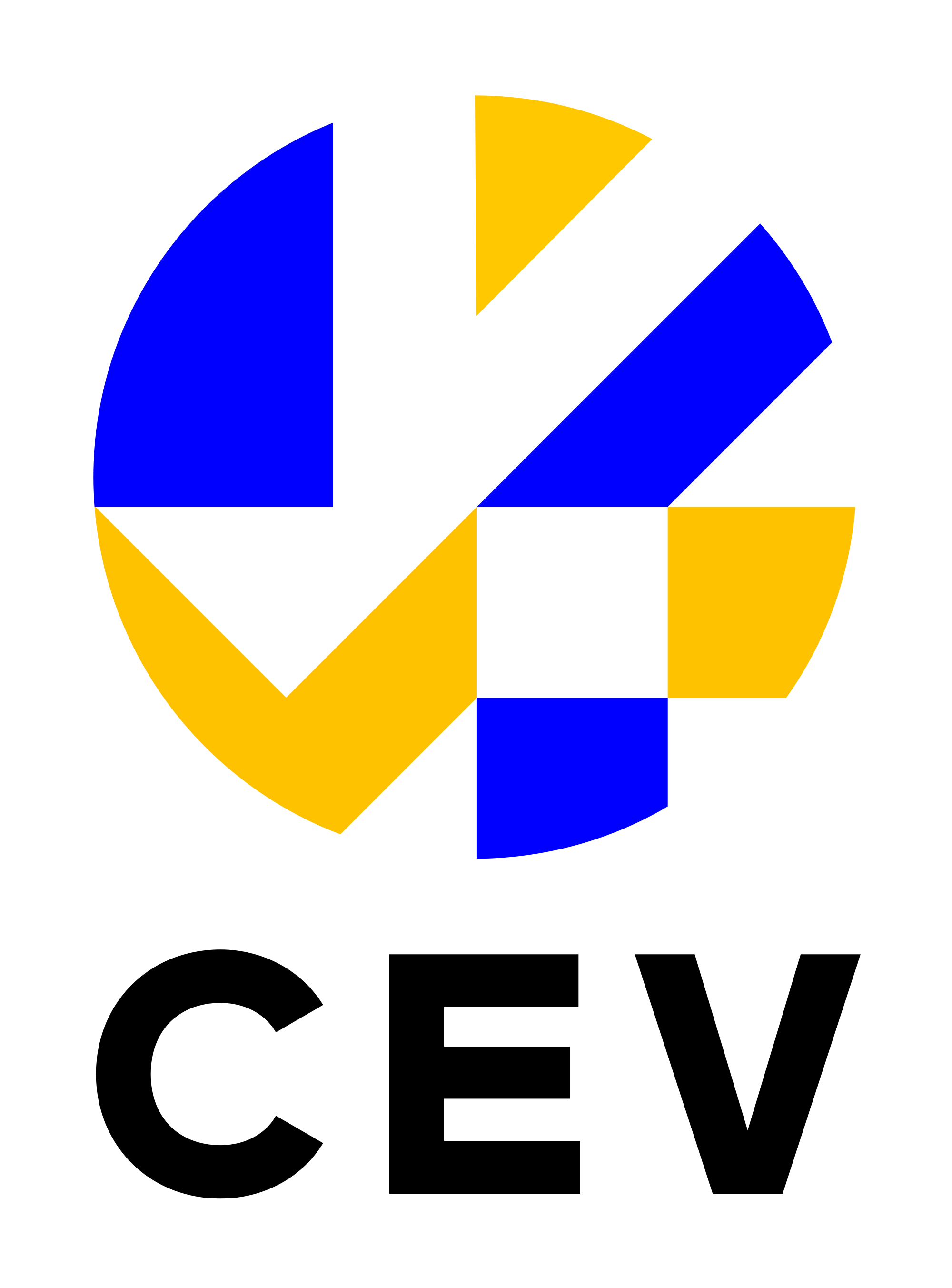

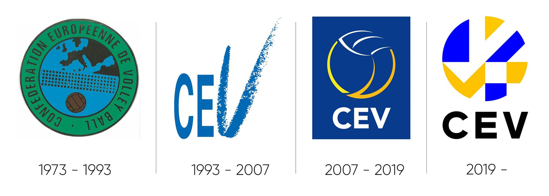
The old logo was pretty bad, with a wispy swoosh-based abstraction of a ball in an unnecessary and almost imperceptible range of yellows; the wordmark was, I guess, okay. The new logo has a much stronger presence and while I visually like its impact, I'm unsure exactly what the icon is. I think the main interpretation is of a player about to either serve or spike a ball (with the upper yellow triangle being the head and arms stretched diagonally) but then trying to interpret the rest of the blocks leads to confusion, at least for me. There is also the explanation that the icon comes from the flags but that connection isn't super evident in the result. Still, for whatever reason, I kind of dig it. Like the old logo, the new wordmark is, I guess, okay.
We devised a clear branding system where each of the main competitions (National, Club, Beach and Snow) had a unique colour palette and crest, with smaller horizontal badges for the sub-competitions that sit underneath each sector.
Alphabet project page
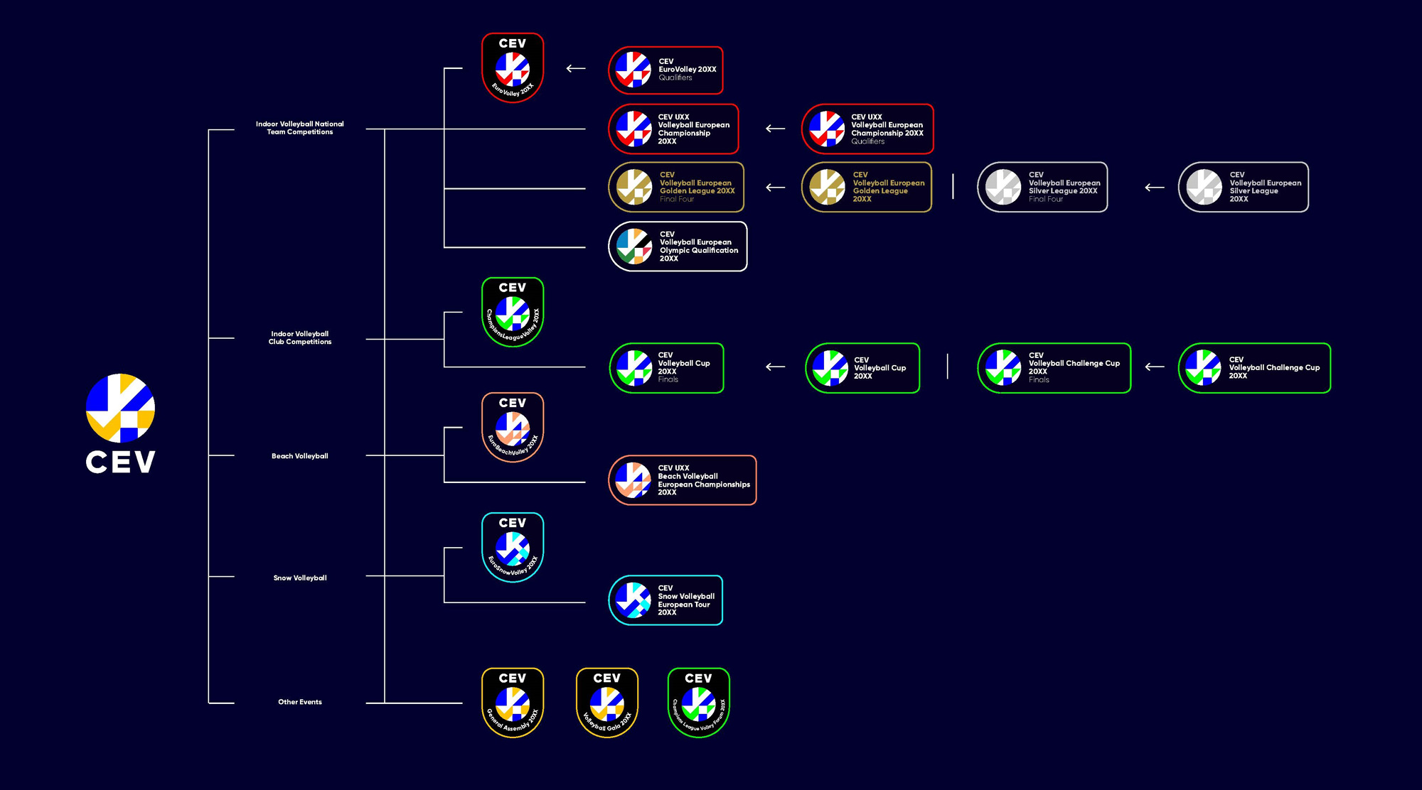
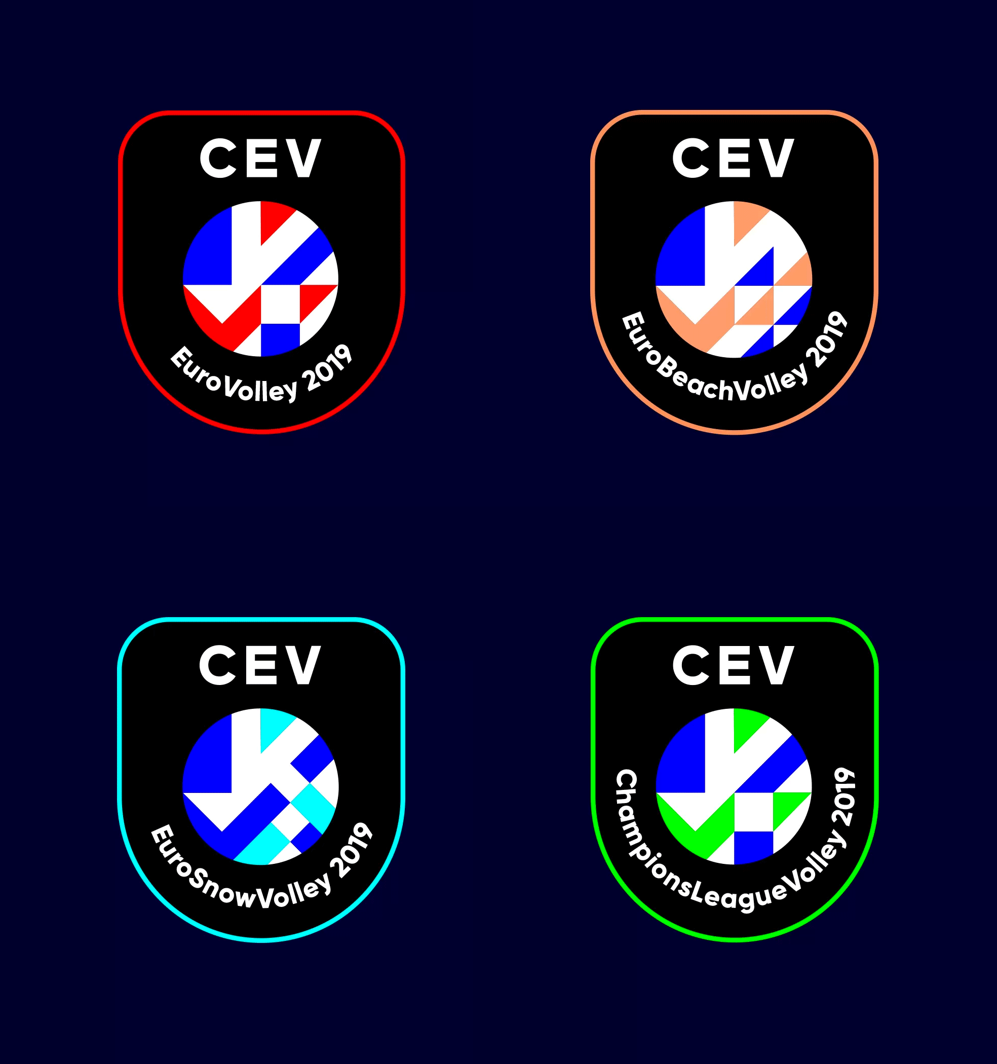
The sub-brands add to the confusion by adding elements to the beach and snow editions and the variations are so subtle I'm not sure they were needed beyond the change in color. The badge shapes and lock-ups are a little odd too... The thin stroke and the generously rounded corners are very different from the bold and crisp language of the icon and there is a lot of awkward white space within them. Their structure is a good start but the execution felt short.

The display typeface is a classic geometric sans serif with a modern and energetic twist. A number of interesting angled letterforms represent the movement and fast-paced nature of the sport and are inspired by the angles found in the Volleymark.
Alphabet project page
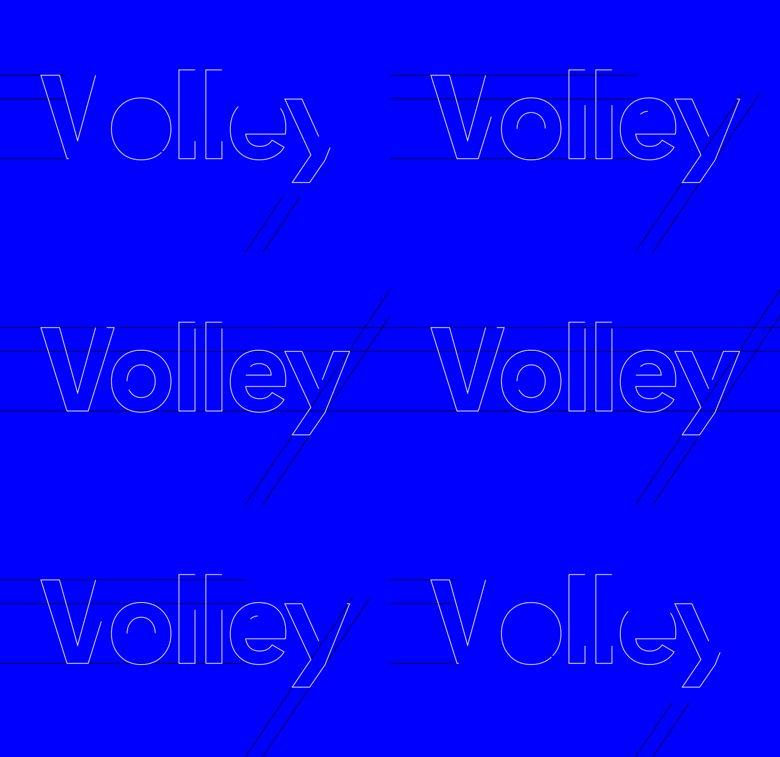
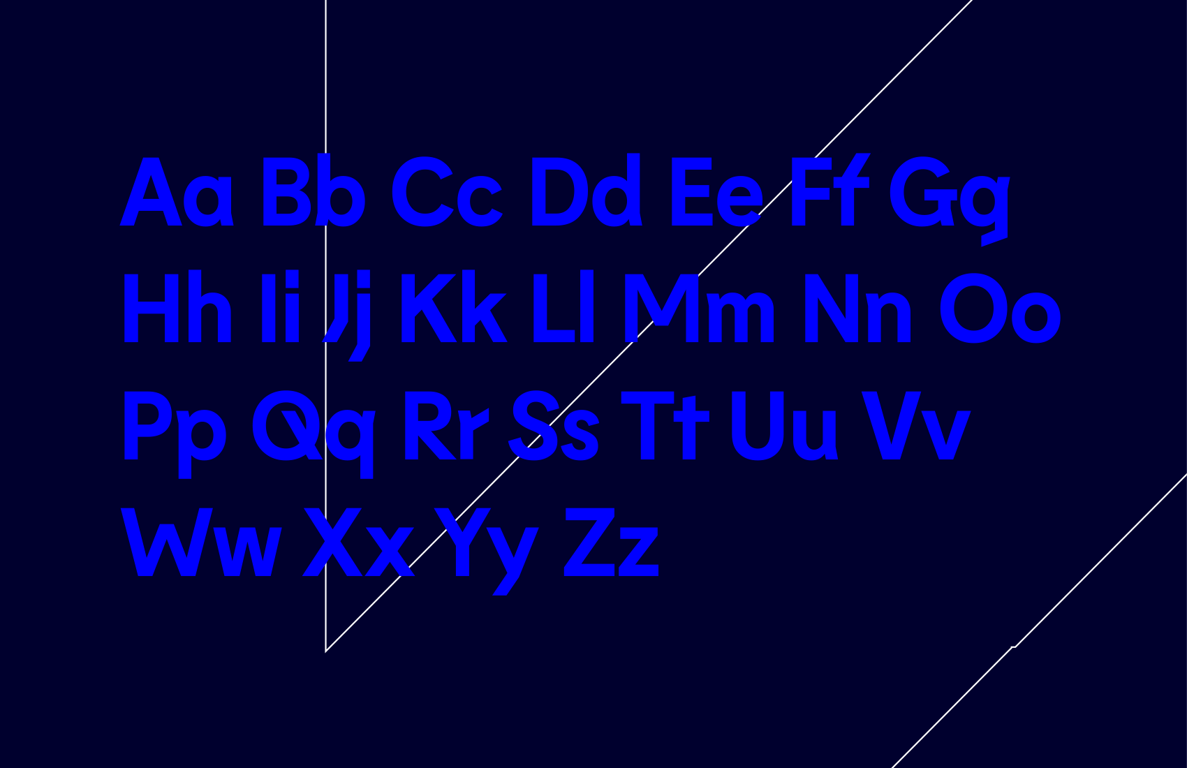

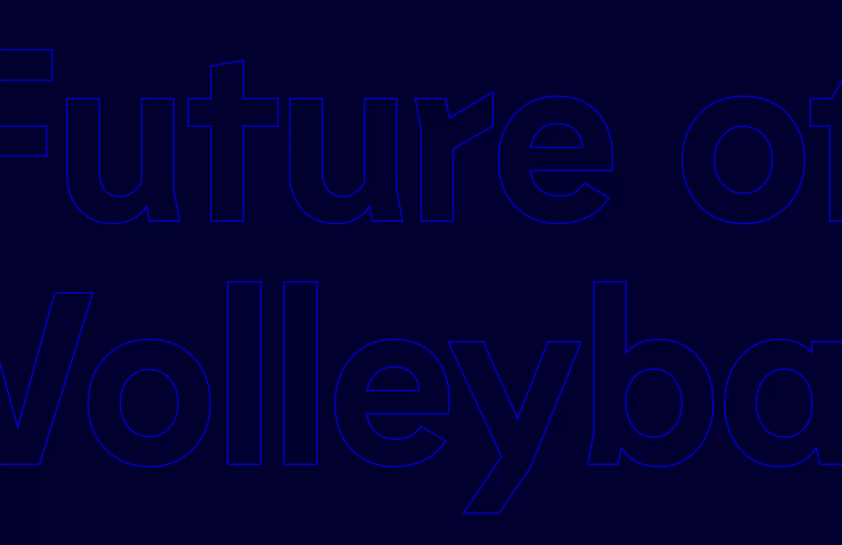
Maybe it's just me but I don't like the selected typeface, Lemur, at all. I can appreciate its selection for the hard angles -- that represent the odd angles at which balls sometimes bounce in volleyball -- but it's a rather unpleasant aesthetic, especially when served in large doses like in the website. Nonetheless, I can also appreciate that it's an unconventional choice that deviates from the norm.
The brand is able to flex from bold and vibrant to premium and elegant. A less liberal use of highlight colours, plus a toned-down graphic device enables corporate materials to work in their relevant settings without diluting the brand.
Alphabet project page
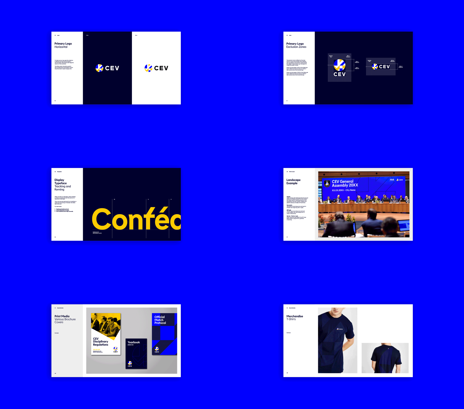
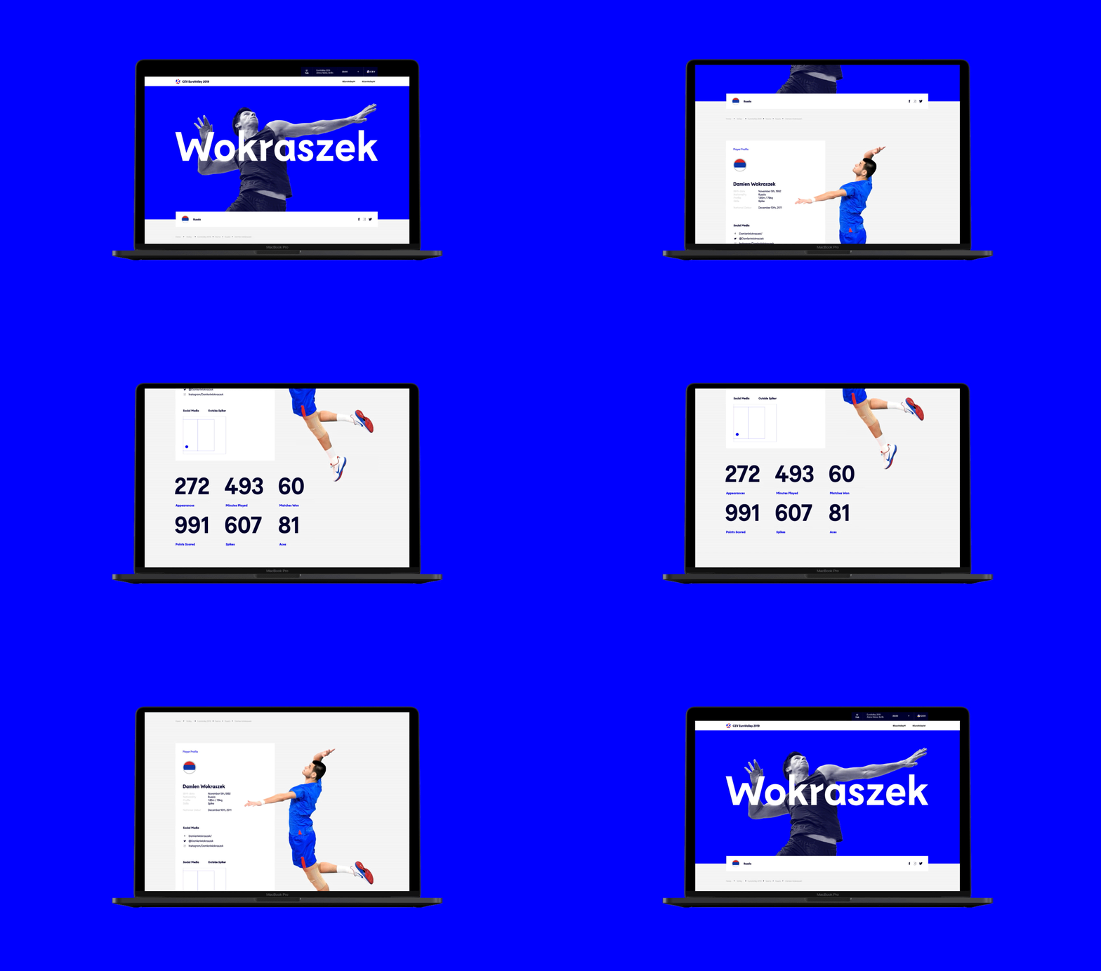
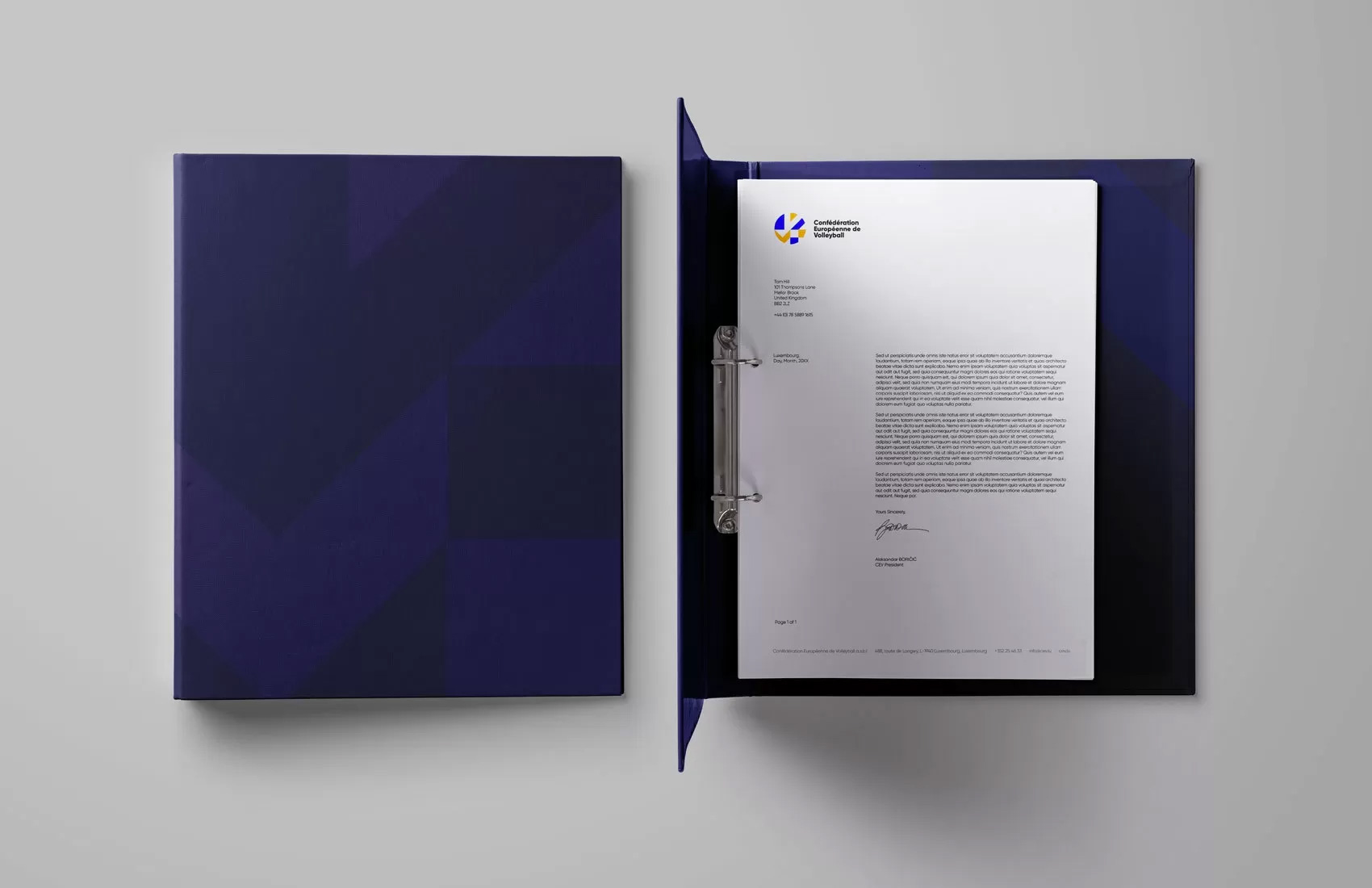
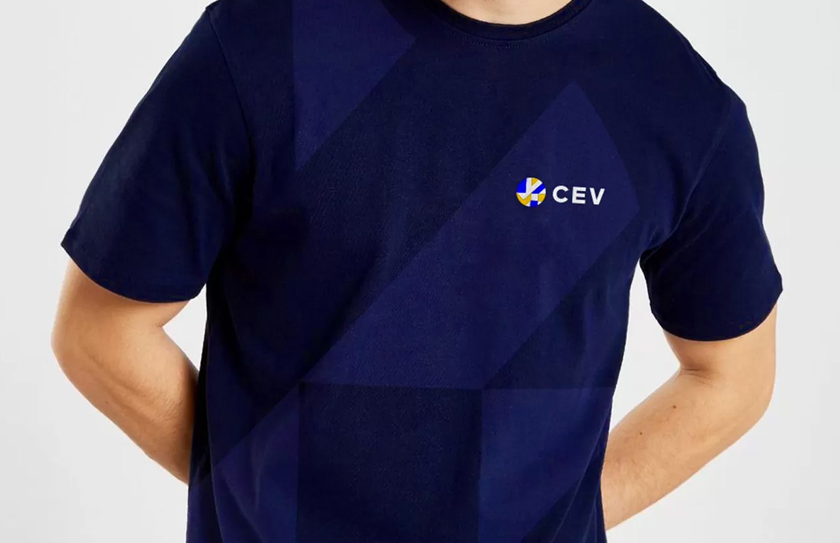
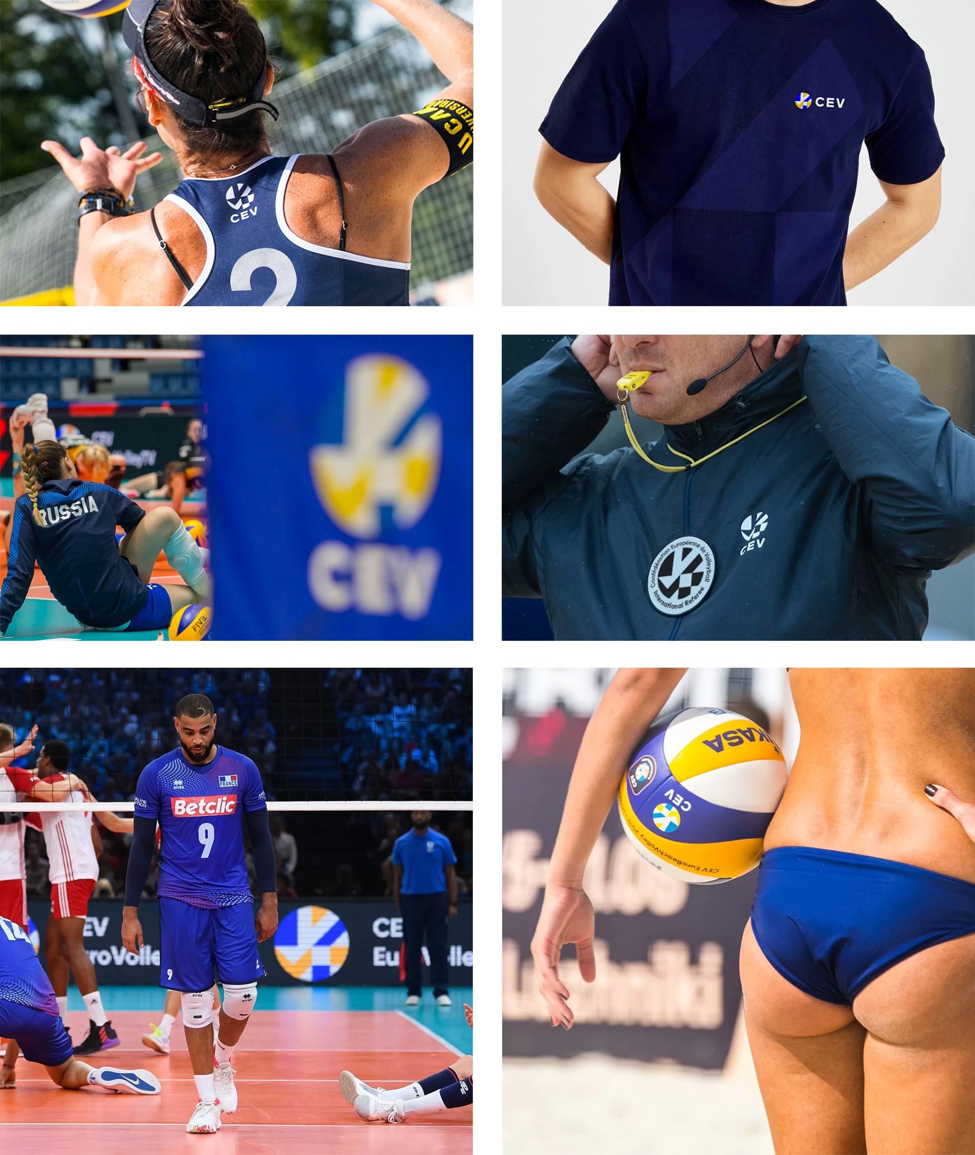
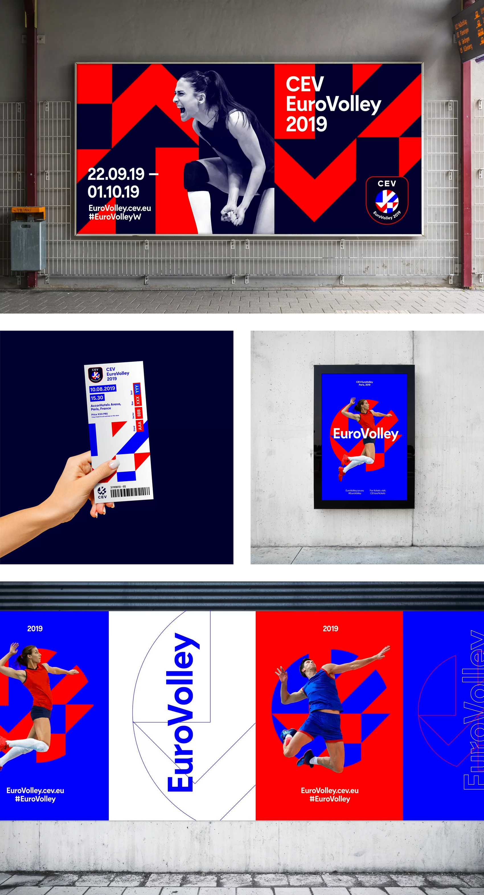
The applications are decent, using the icon huge in the background both as tone-on-tone or as high-contrast color combinations to turn the volume up or down as needed. The work for Eurovolley has the most development and it's a good barometer to see the potential of the visual language. There is a good amount of energy to it.
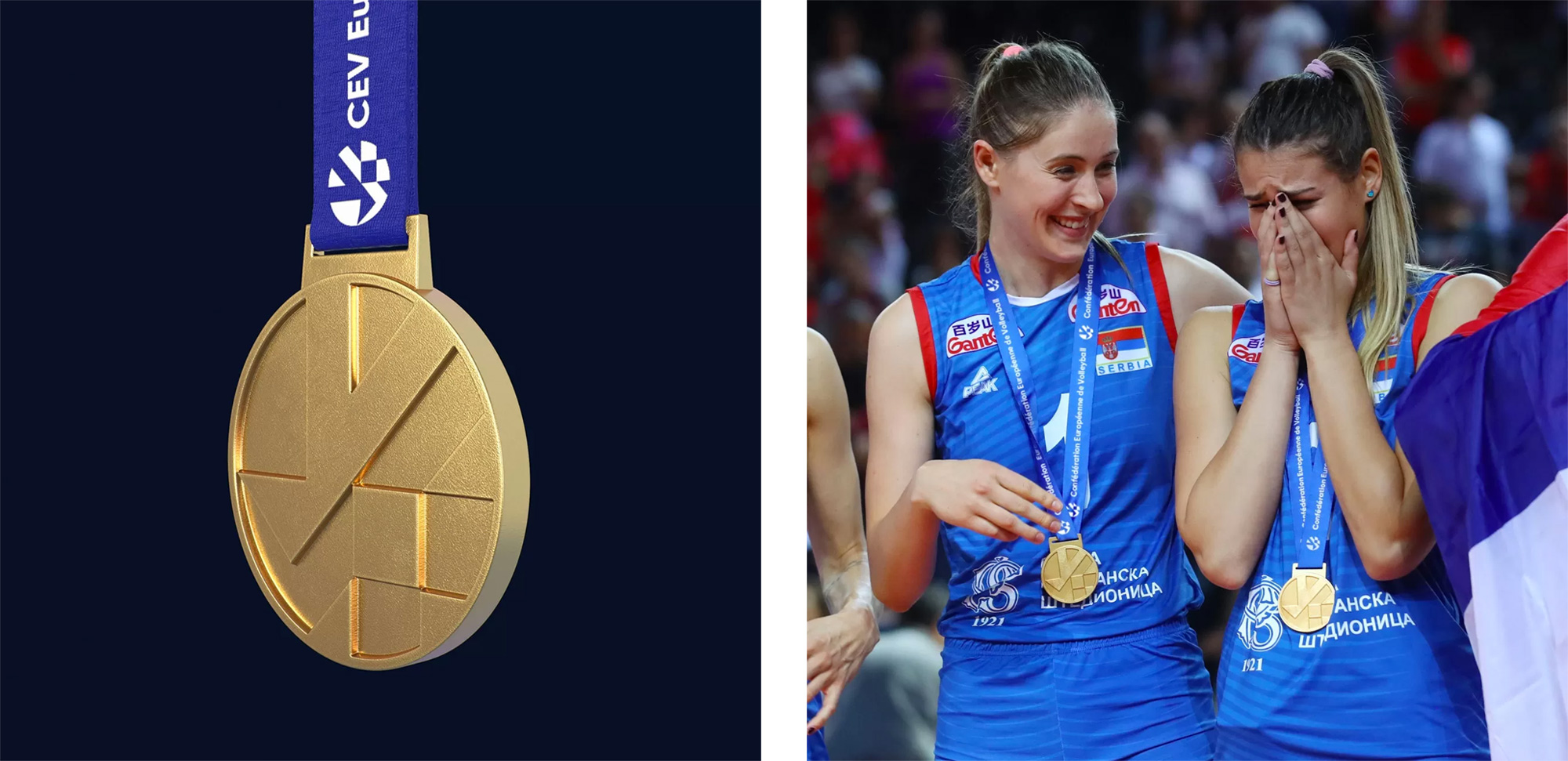
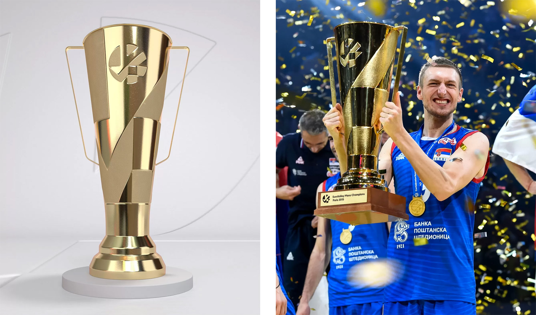
Overall, save for some ambiguity on the icon's meaning and my personal lack of enthusiasm for the brand typeface, this is pretty good for an organization that has to represent so many different countries and cultures while finding a balance of portraying the excitement of the sport as well as the seriousness of the organization.
In ấn Anpic In nhãn mác Anpic In brochure Anpic In card visit Anpic In catalogue Anpic In thiệp cưới Anpic In tờ rơi Anpic
In Ấn Anpic – Nổi Tiếng In Đẹp In Nhanh
Số 5 Ngõ 75 Nguyễn Xiển, Thanh Xuân, Hạ Đình, Hà Nội
0963223884
baogiainananh@gmail.com
https://anpic.vn
https://g.page/inananpic
In nhãn mác Anpic ✅ In brochure Anpic ✅ In card visit Anpic ✅ In catalogue Anpic ✅ In thiệp cưới Anpic ✅ In tờ rơi Anpic
https://anpic.vn/in-nhan-mac-dep
https://anpic.vn/in-brochure
https://anpic.vn/in-an
https://anpic.vn/in-voucher-in-phieu-giam-gia-khuyen-mai
#inananpic
Comments
Post a Comment