Reviewed: New Logo and Identity for Museum of Ice Cream by The Working Assembly
“The Cream of the Crop”
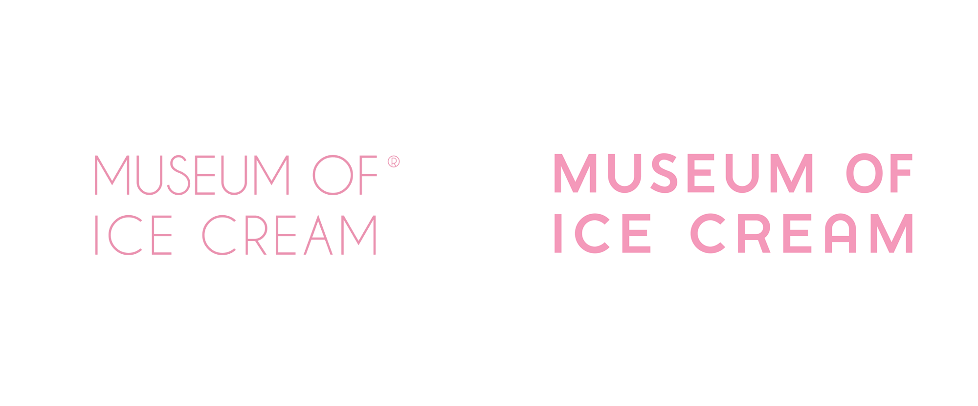
First launched in 2016 as a pop-up museum experience -- now technically an "experium" -- in New York, NY, the Museum of Ice Cream (MOIC) is made up of "beautiful and shareable environments that foster IRL interaction and URL connections, providing fun, multi-sensorial expressions of ice cream". Its success was instant, selling more than 300,000 tickets in its first five days, later traveling to Los Angeles, Miami, and San Francisco (where, after a 1-year engagement, became the first permanent location in 2018). To match and spearhead the growth of MOIC, its founders have even established a new company, Figure8, dedicated to it as well as to new "experiums", leading with a flagship permanent location opened in Soho in New York -- 25,000 square feet over 3 floors of ice cream-related Instagram goodness -- that opened this past Fall with a new identity designed by New York-based The Working Assembly.
(Before getting into the review: Happy new year to everyone and may all your logo wishes come true in 2020.)


The old logo was mostly fine, in an unassuming Art Deco-ish sans serif with its biggest issue being how thin it was and its highly distracting ® glyph. The new wordmark is an improvement by its weight gain alone, making it more visible and easier to reproduce but its letterforms are also a little more jovial, especially the round "A". However, it's not exactly exciting or even interesting as a logo. To complement the dry wordmark is a new icon in the form of an abstract scoop/swirl of ice cream that spells "MOIC" somewhat cleverly in it -- it's a good idea and the execution was close but would have benefitted from a letterer's touch to take it to the next level. The two elements together do get the point across, easily and convincingly, that this museum is indeed all about ice cream.
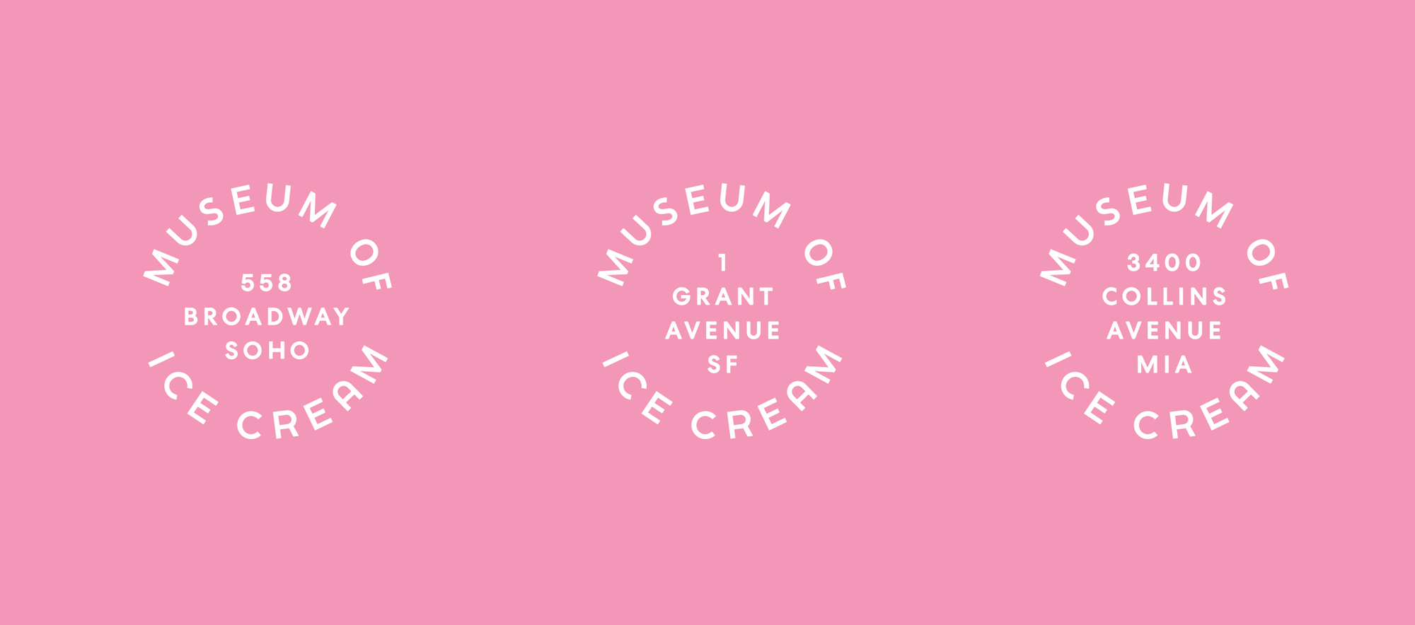
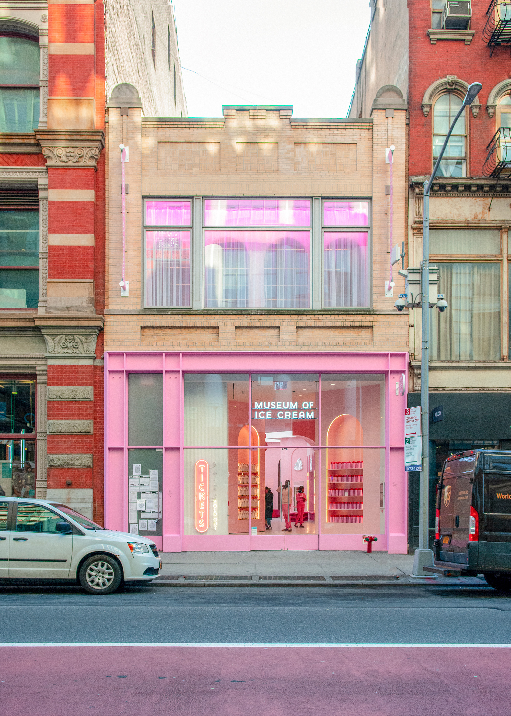
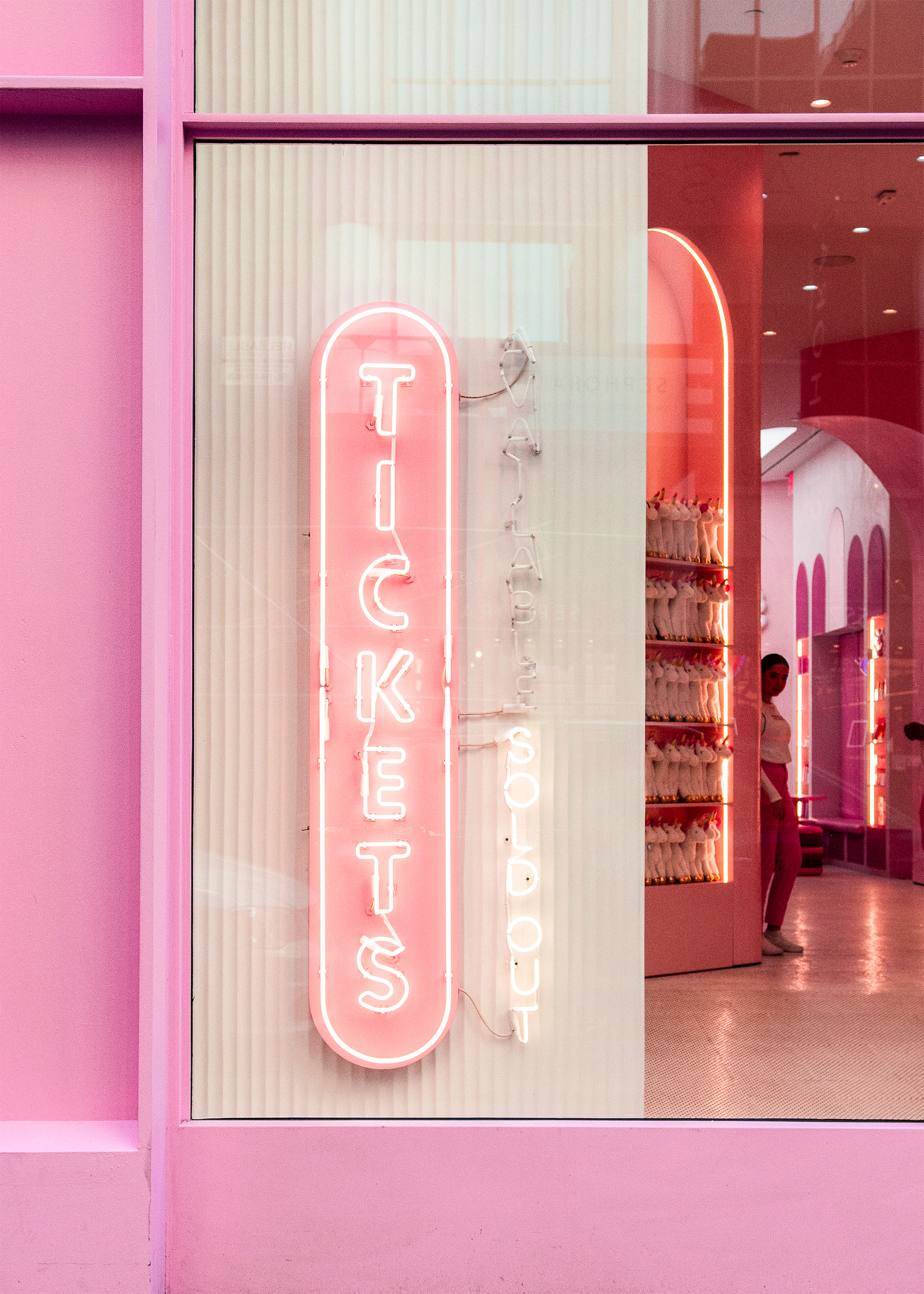
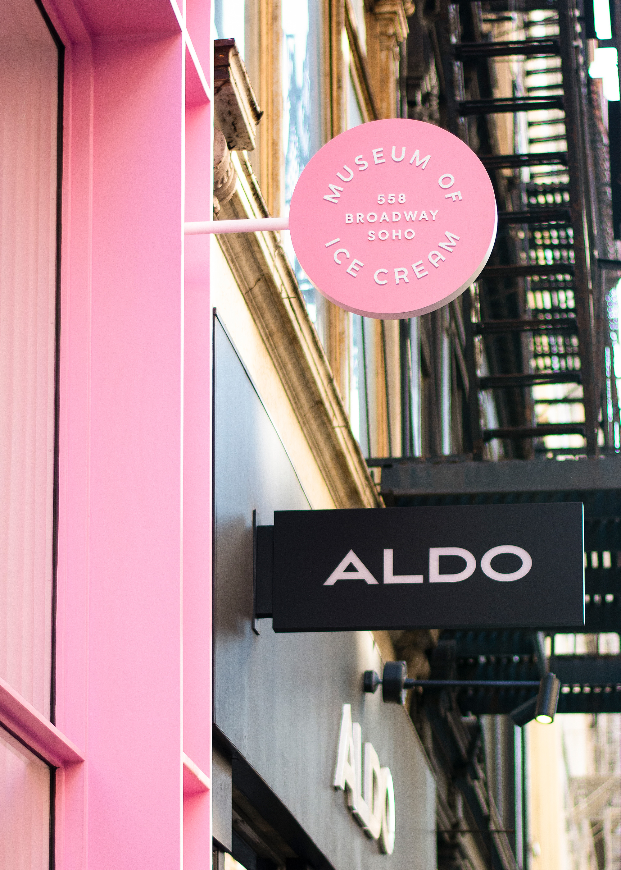
In a way, the logos don't really have to do much heavy lifting as the museums themselves are the brand with pretty much every room being a photogenic brand touchpoint and instant Instagram fodder that effectively promotes and identifies MOIC with every instance that @museumoficecream is tagged. With the museum as a backdrop, the identity elements -- the wordmark, the icon, the use of Bookmania, and a rainbow color palette -- all they have to do is quietly support the experiences and modestly enhance and unify them, which they do appropriately and engagingly.
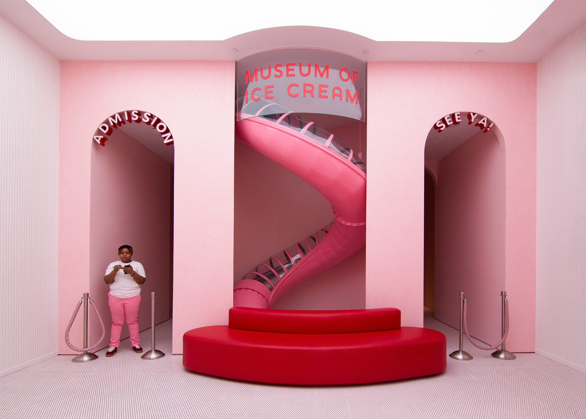
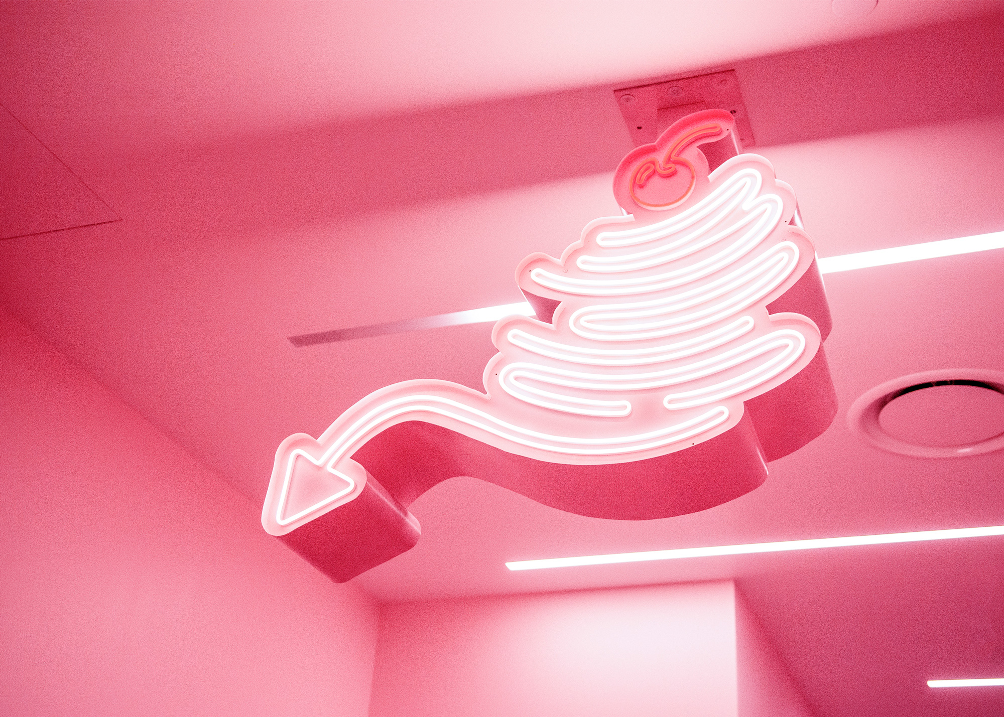
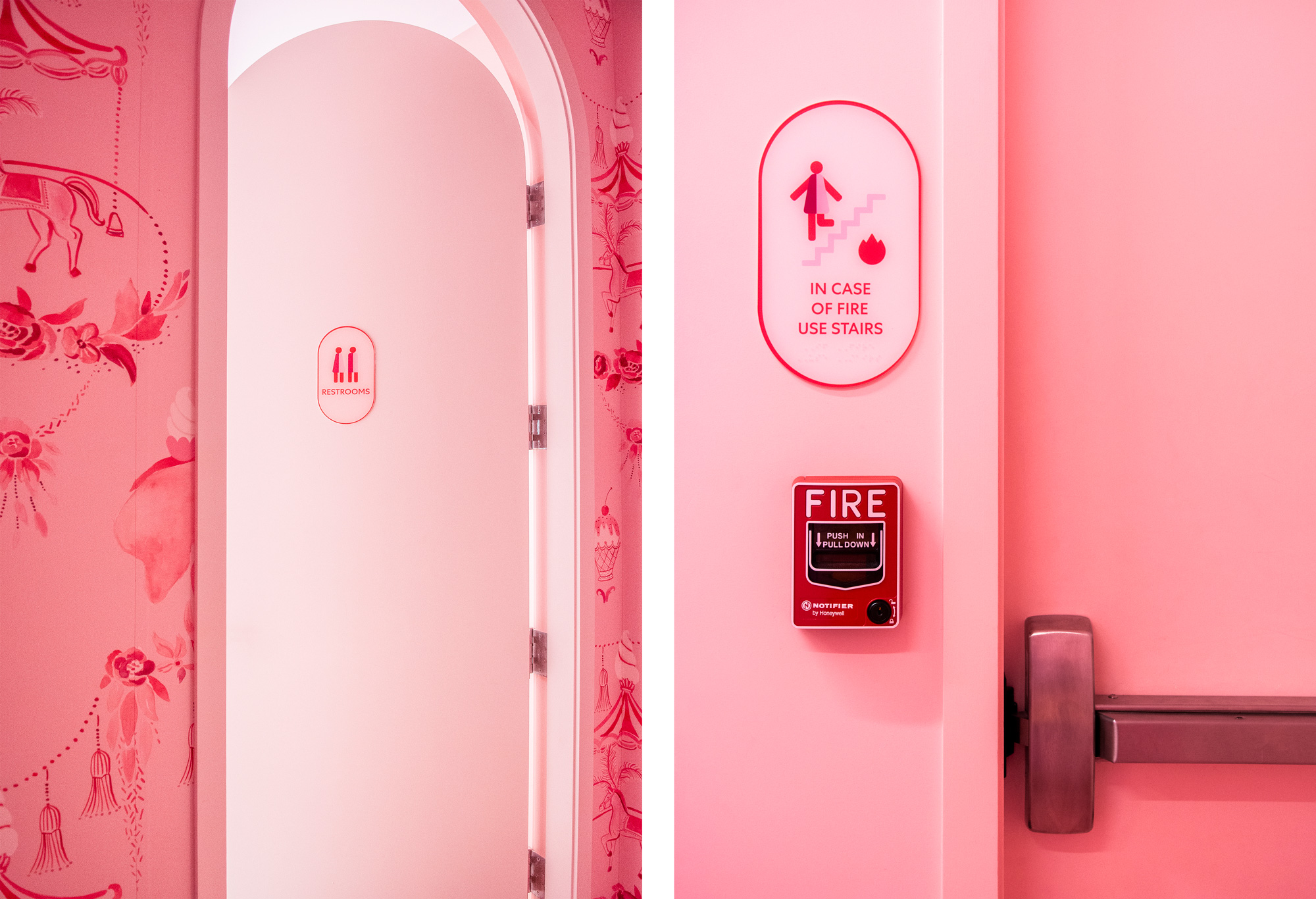
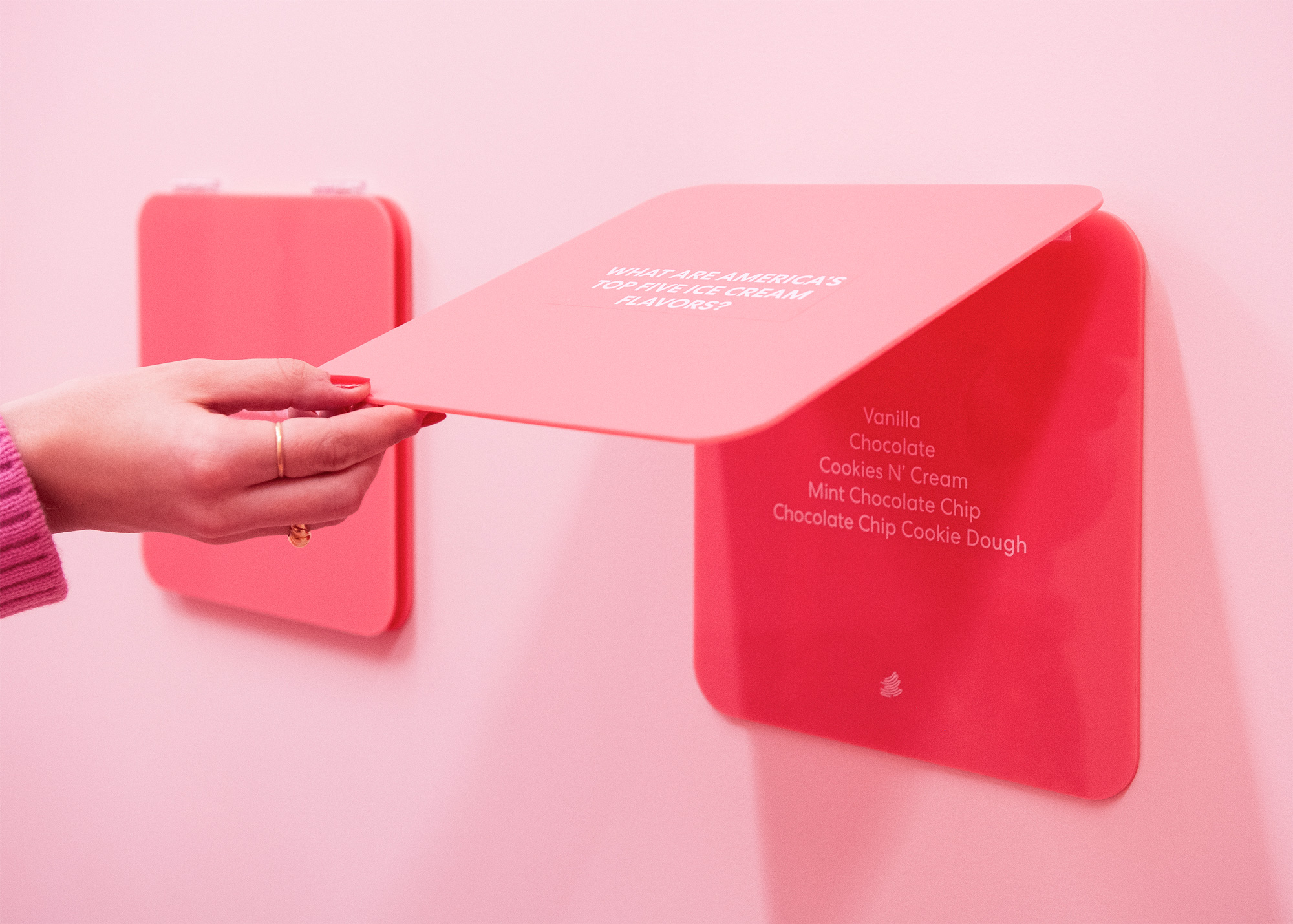
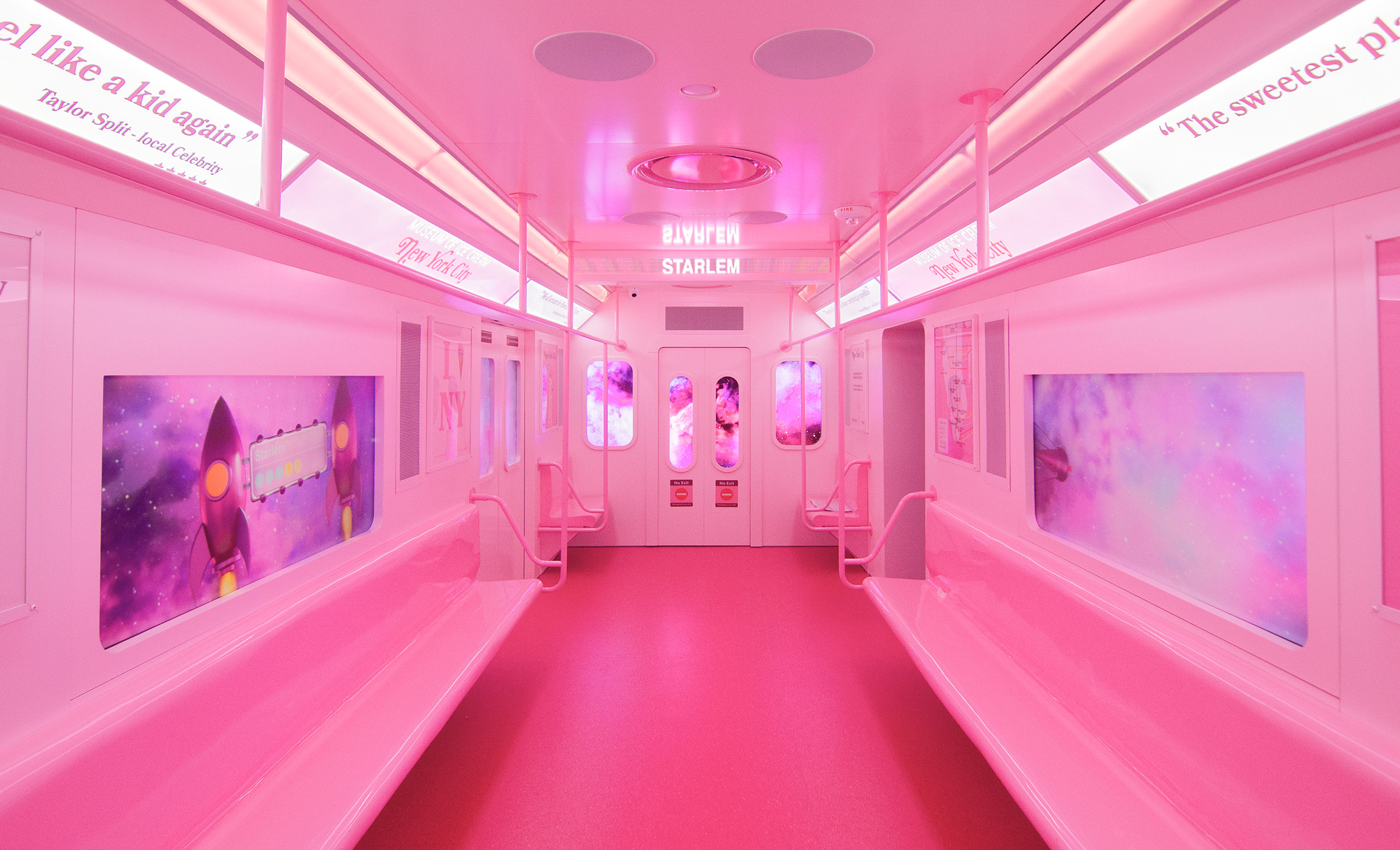
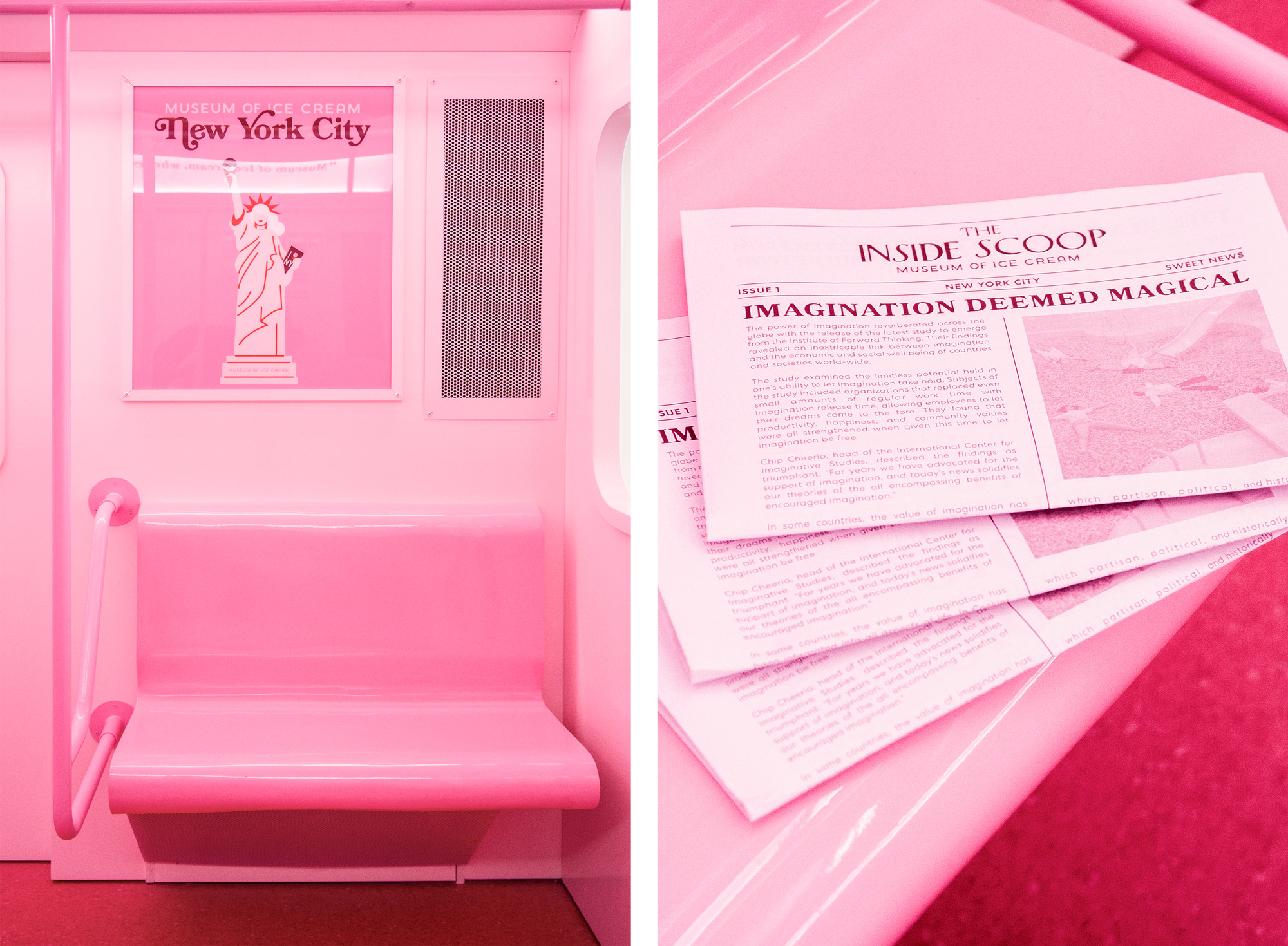
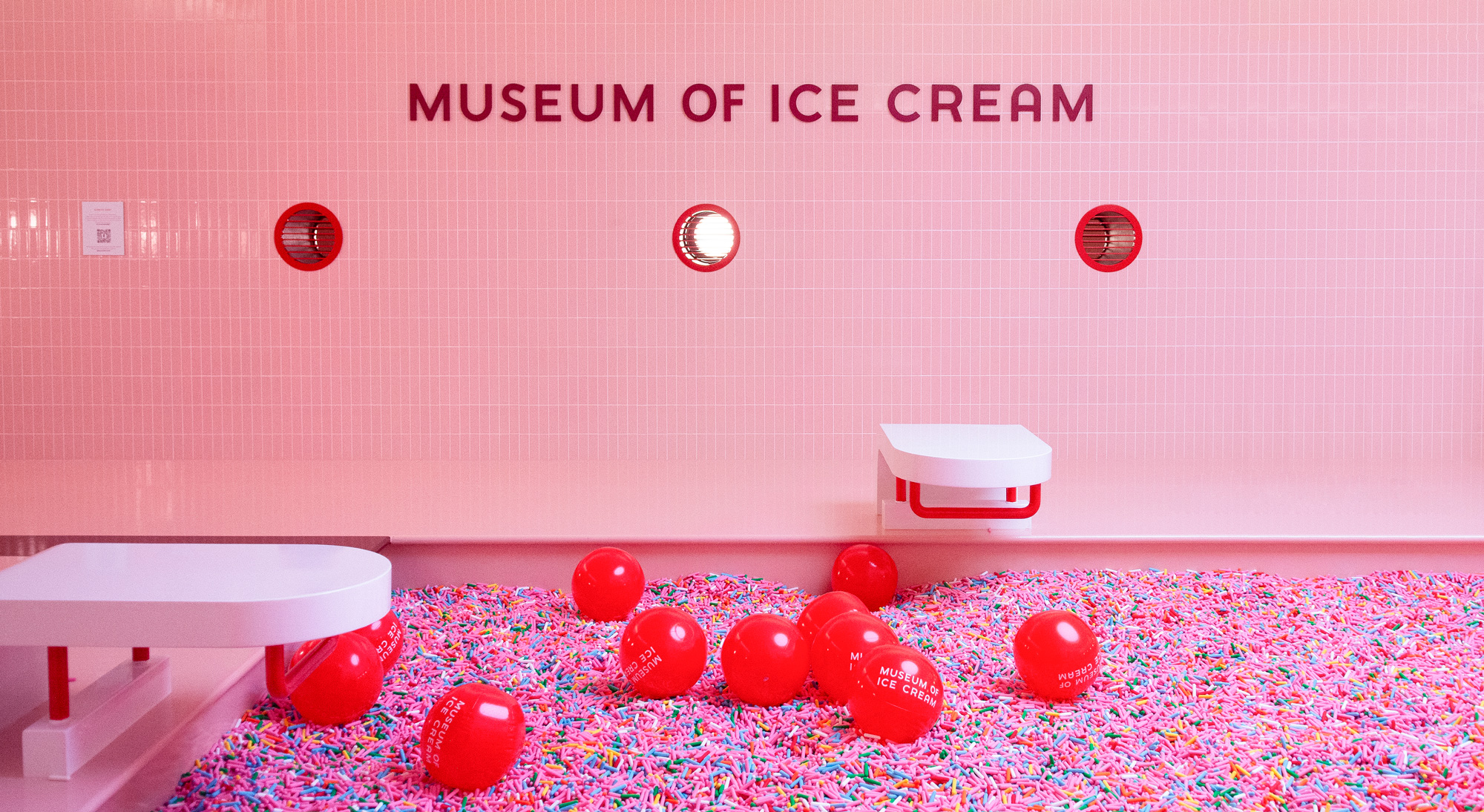
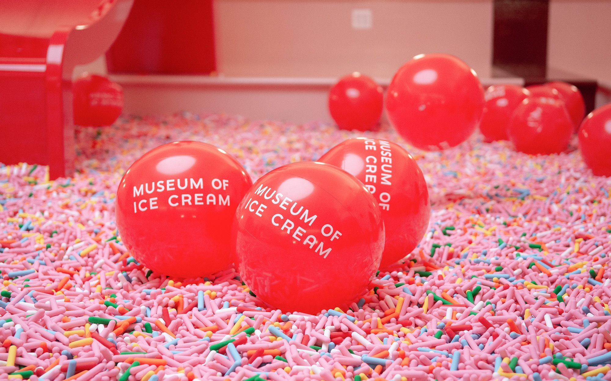
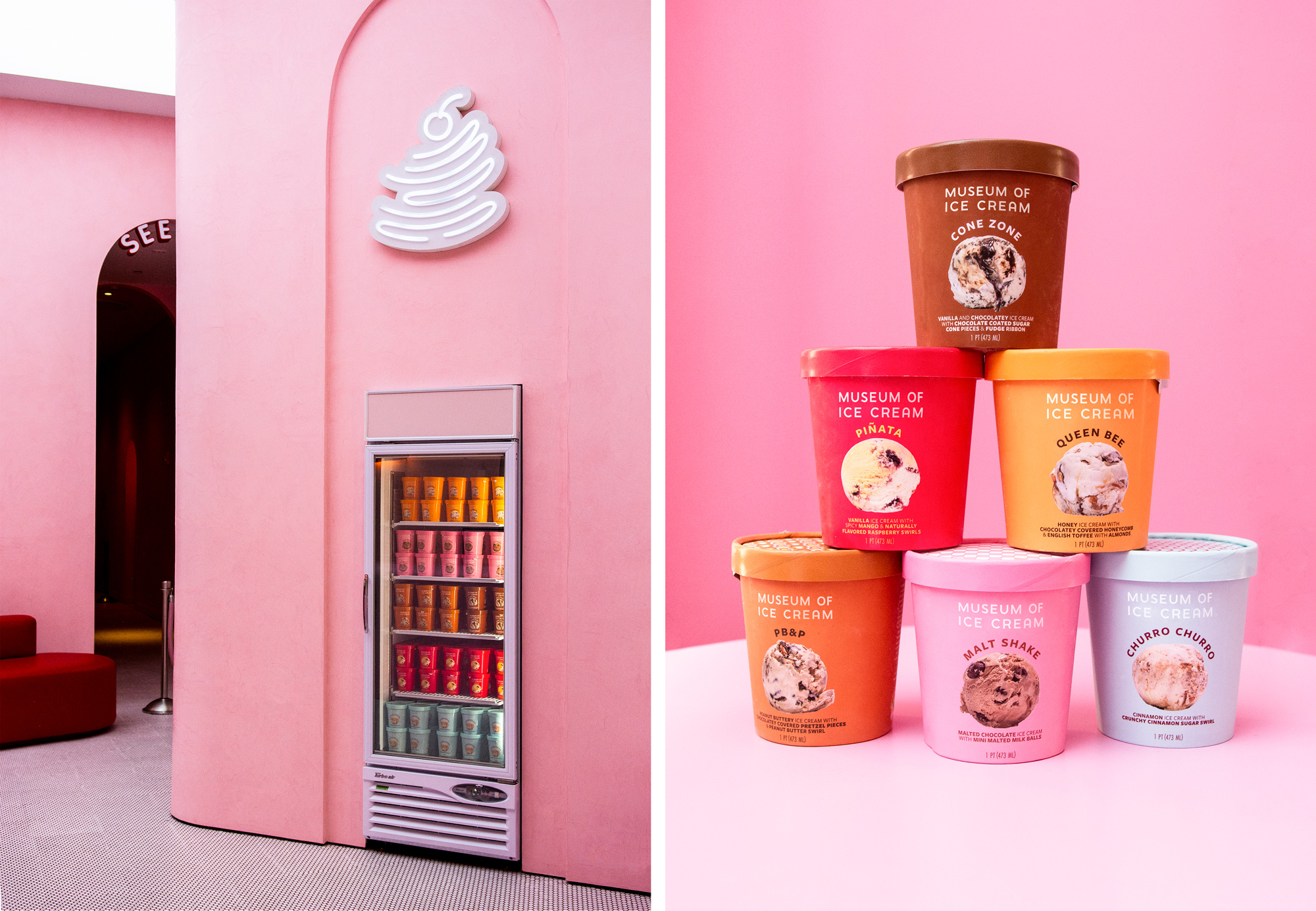
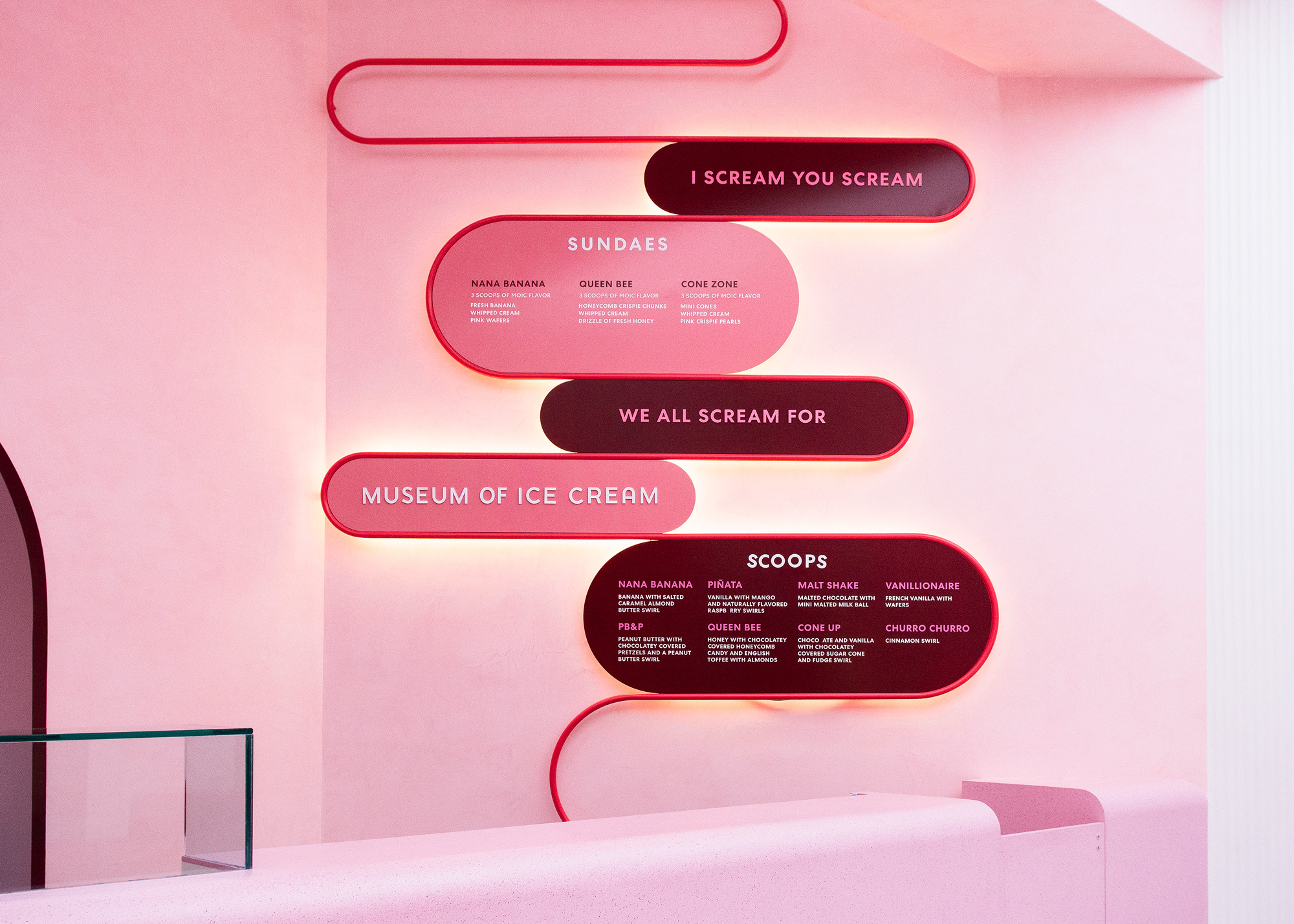
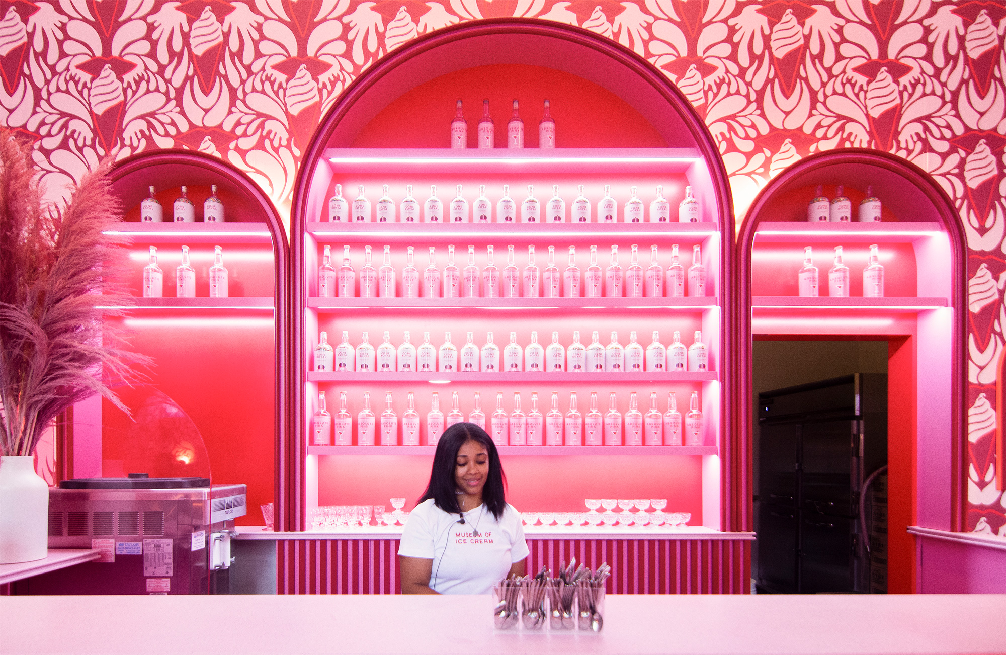
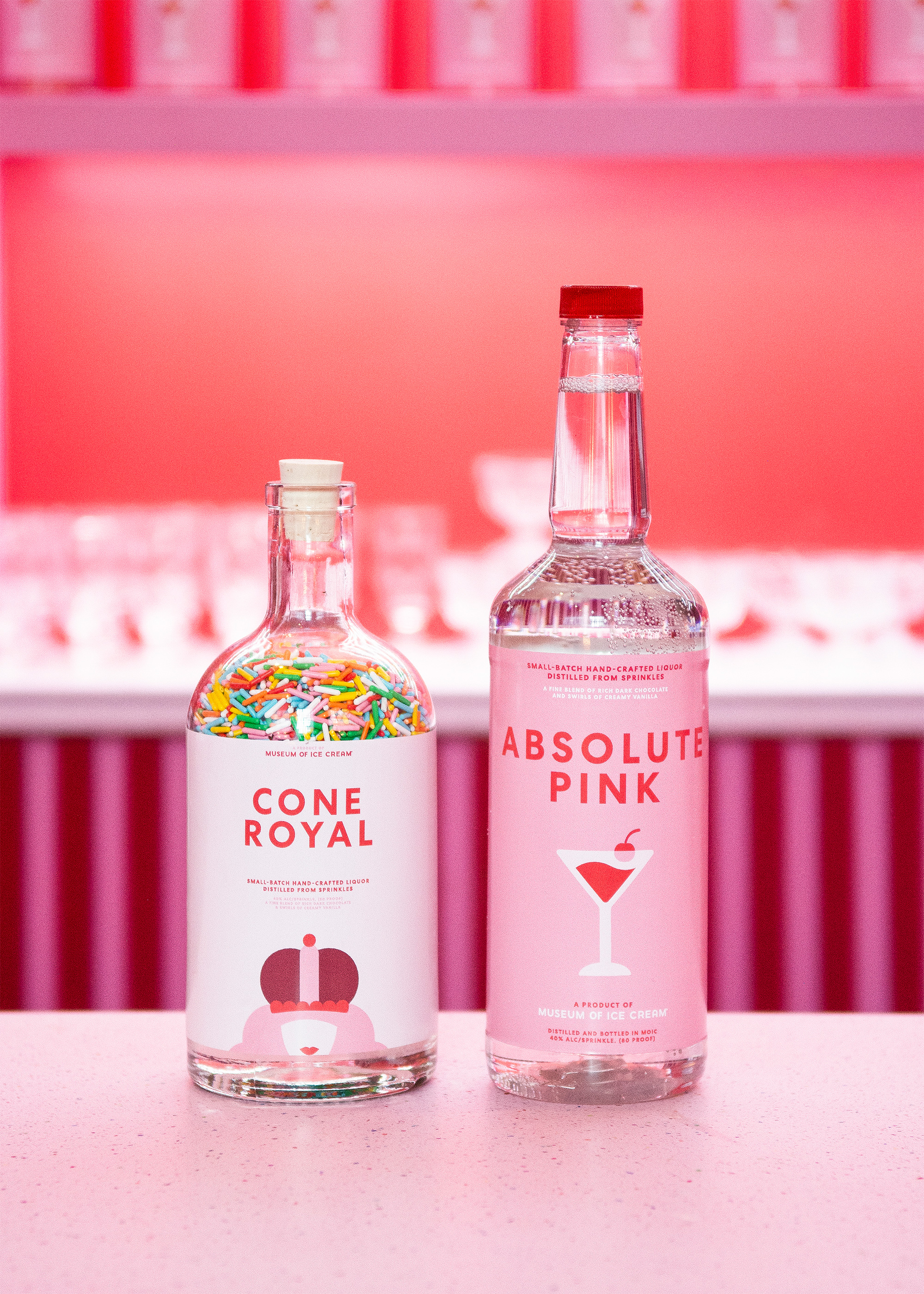
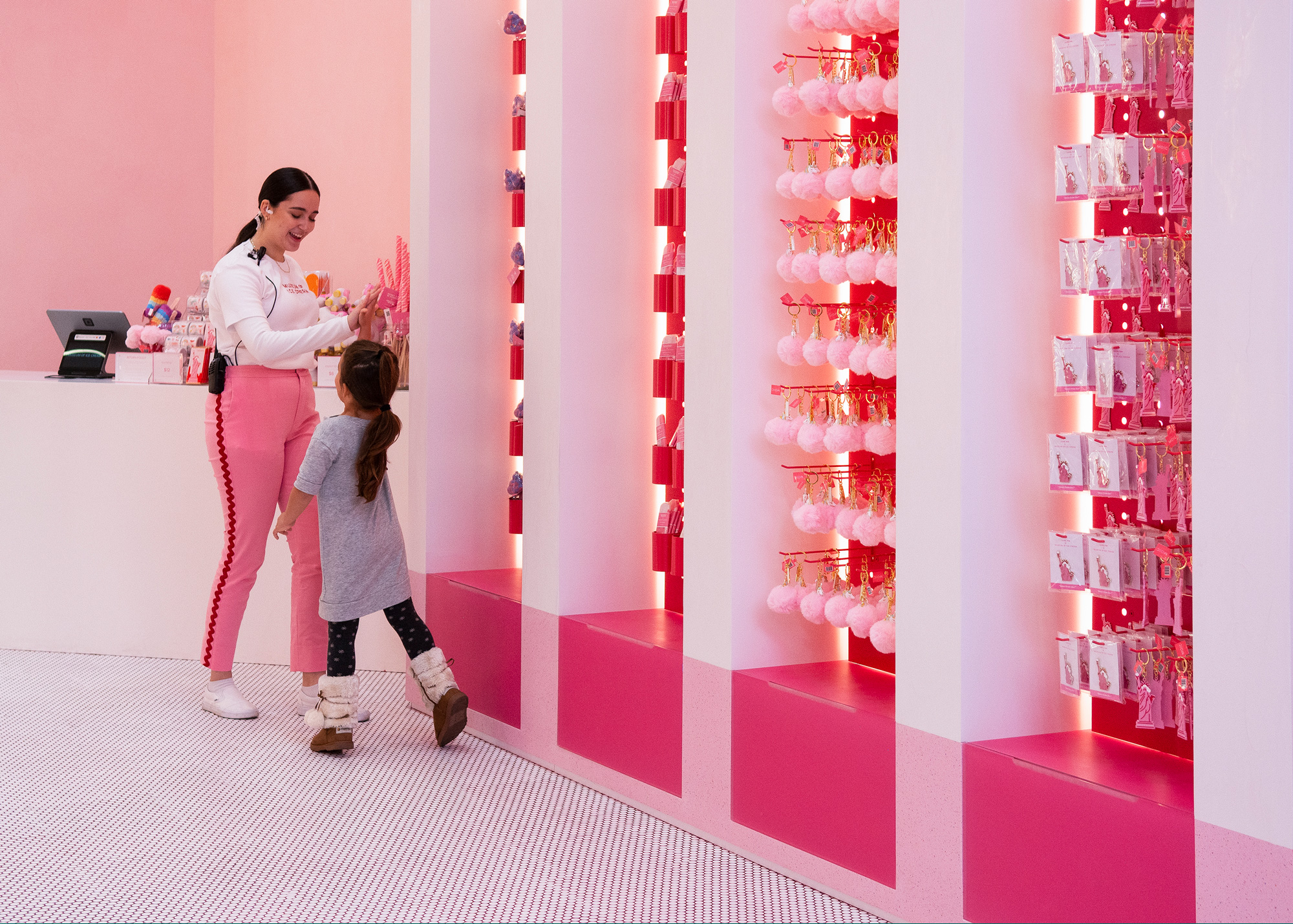


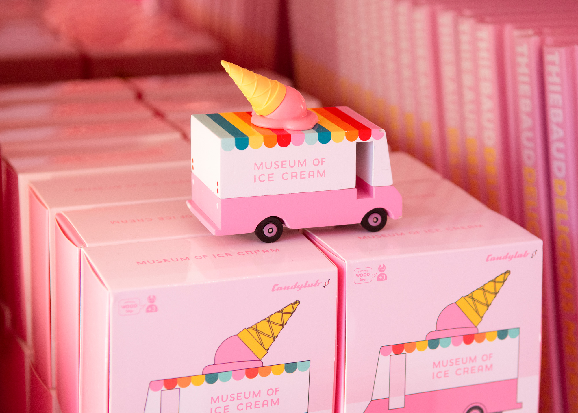
Overall, all the applications are good and mostly enjoyable but I feel like they fall a bit short of matching the excitement and execution of the museum itself. I mean, don't get me wrong, I do think this is good, like, chocolate-ice-cream-good but I think it could have been chocolate-ice-cream-with-chocolate-chips-and-fudge-swirls-good.
In ấn Anpic In nhãn mác Anpic In brochure Anpic In card visit Anpic In catalogue Anpic In thiệp cưới Anpic In tờ rơi Anpic
In Ấn Anpic – Nổi Tiếng In Đẹp In Nhanh
Số 5 Ngõ 75 Nguyễn Xiển, Thanh Xuân, Hạ Đình, Hà Nội
0963223884
baogiainananh@gmail.com
https://anpic.vn
https://g.page/inananpic
In nhãn mác Anpic ✅ In brochure Anpic ✅ In card visit Anpic ✅ In catalogue Anpic ✅ In thiệp cưới Anpic ✅ In tờ rơi Anpic
https://anpic.vn/in-nhan-mac-dep
https://anpic.vn/in-brochure
https://anpic.vn/in-an
https://anpic.vn/in-voucher-in-phieu-giam-gia-khuyen-mai
#inananpic
Comments
Post a Comment