Reviewed: New Logo and Packaging for Byte Bars by Cast Iron Design
“Byte your Tongue”
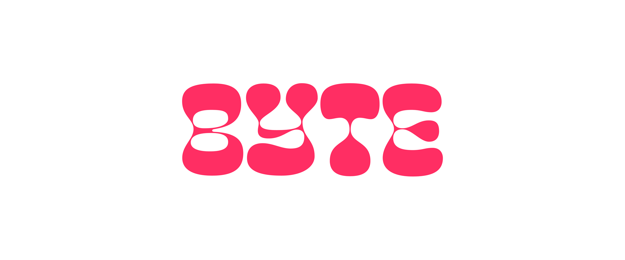
Launched in 2019, Byte Bars is a new brand of snack bars loaded with simple, whole, vegan ingredients and made with MCT oil, the healthy fat derived from coconuts, that helps burn fat for energy and boost your metabolism. Started by a duo of cousins in Boulder, CO, the identity and packaging for Byte Bars was designed by local firm Cast Iron Design.
Representing a cross-generational, free-spirited vibe, the shapes of the type and icons are influenced by the groovy 1960s and the vivid color palette is drawn from the electric poppiness of the 80s and early 90s.
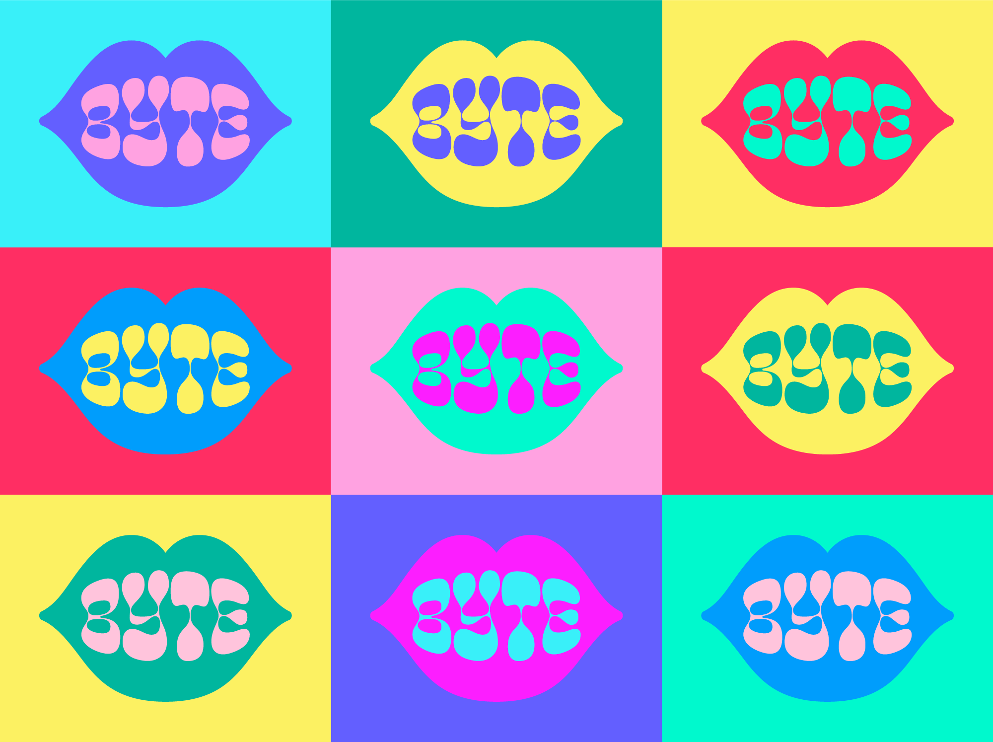
Playing off of the brand name, we developed a series of mouth icons of varying detail. Combined with an extensive color palette, the dozens of potential icons allow Byte to give each bar their own look and keep the brand fresh.
Cast Iron Design project page
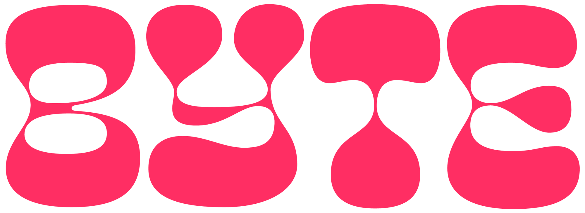
The wordmark, typeset in Oh No's Cheee, which is described as a "high contrast blobber, designed to be used large, and for a slightly stoney vibe", is exactly that: a slightly stoney vibe of a blobber that for some unknown reason fits perfectly a brand of healthy, feel-good snack bars made in Colorado. To some of youse's disappointment, no, this do not contain cannabis despite all the visual hints that it would. The wordmark puts the funky in, well, funky and it's really all kinds of loose fun. The addition of lips and mouths... I think I personally could have done without but they do add a nice touch and additional layer of quirkiness to the identity.
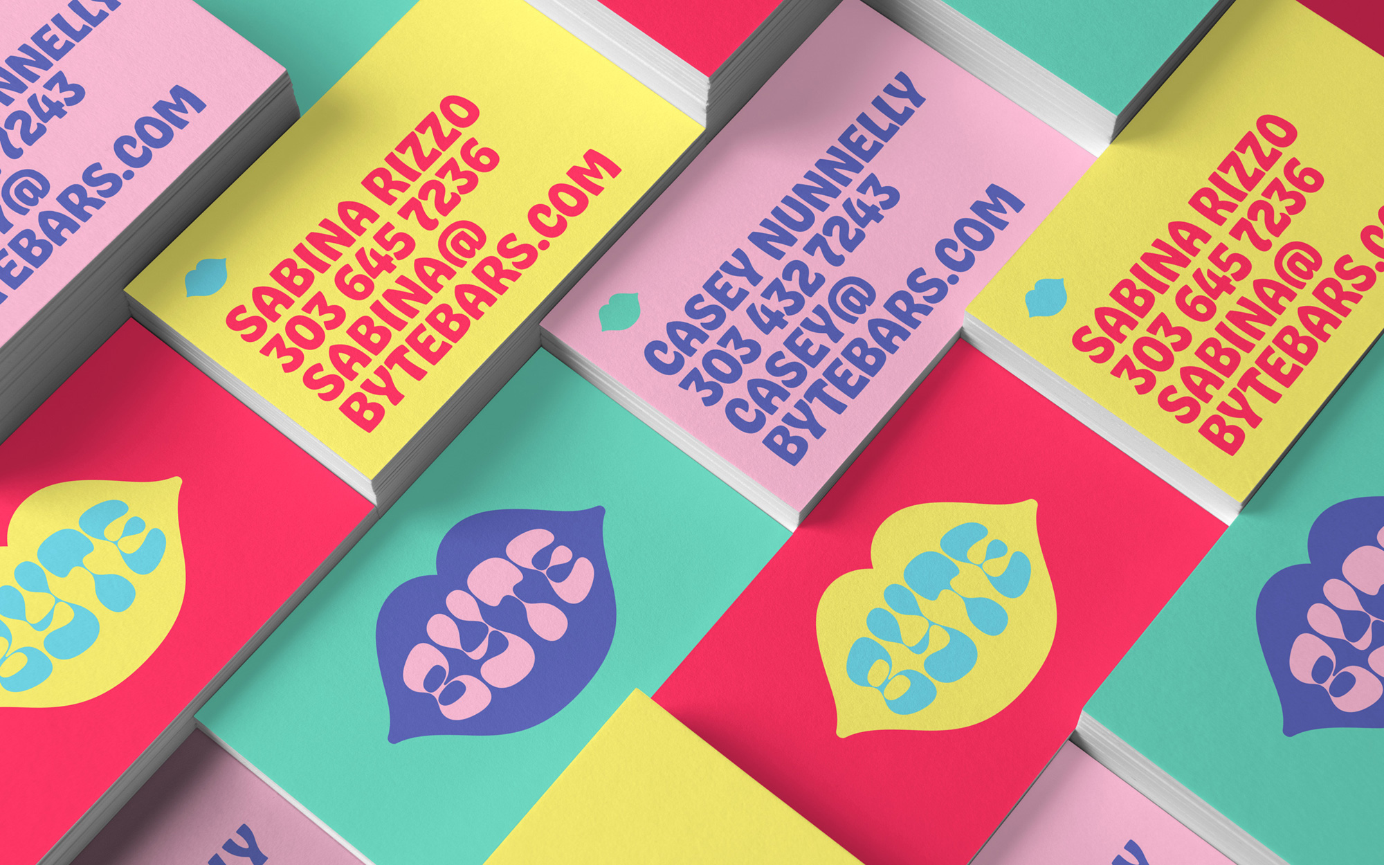
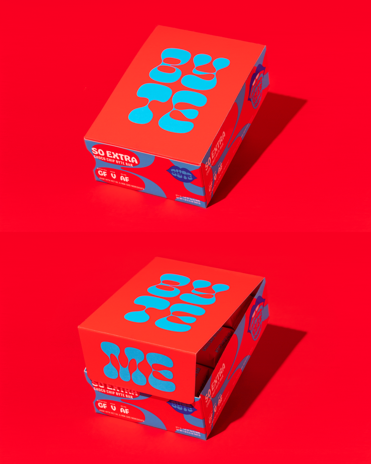
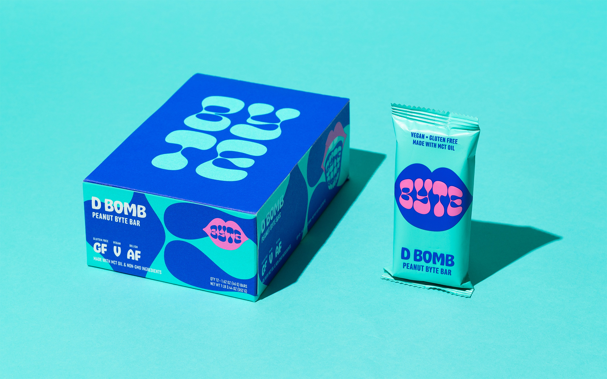
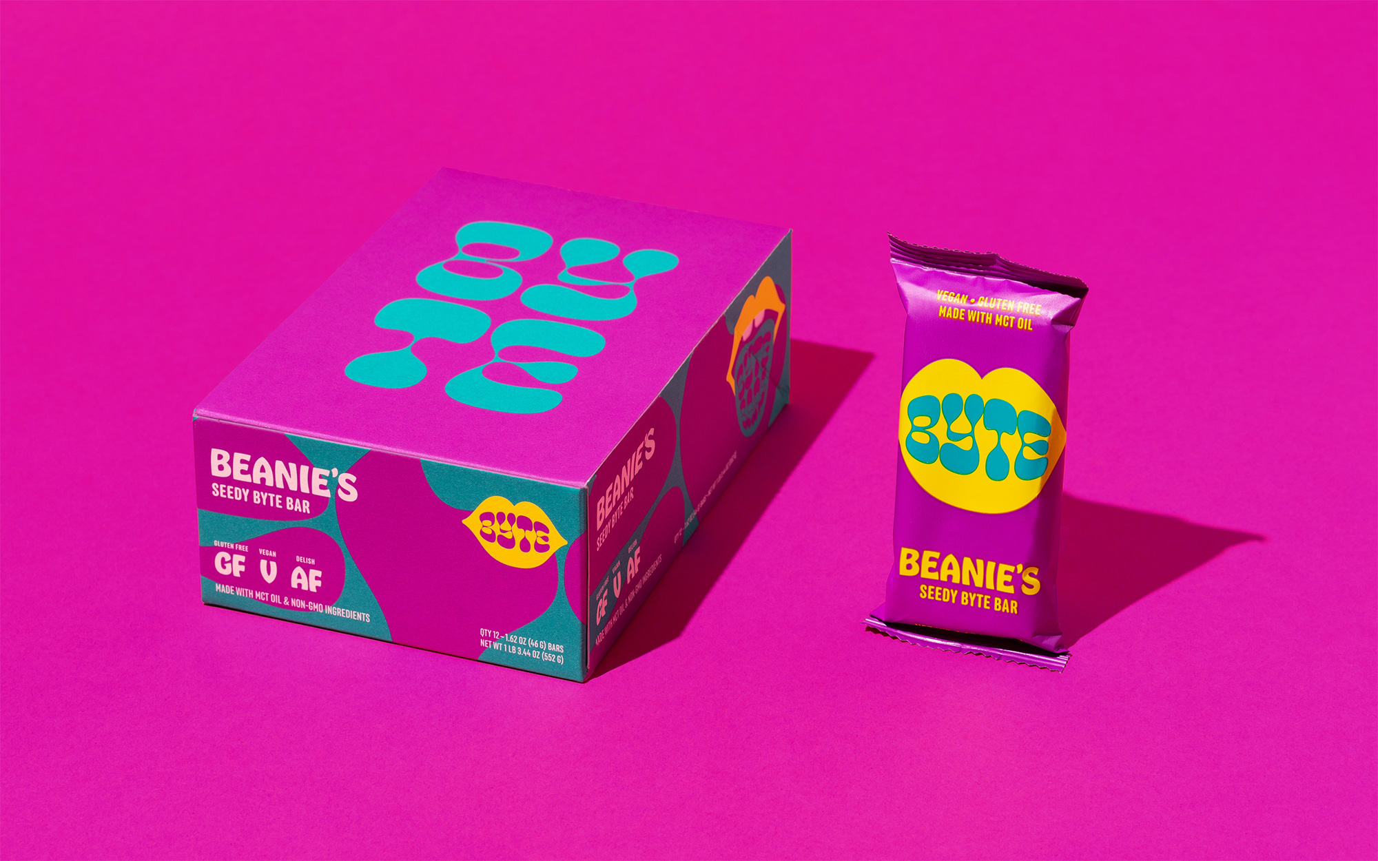
The packaging dips back into the Oh No well with the use of Hobeaux as the primary typeface for the flavors, supported by Process Type Foundry's Anchor (which literally helps anchor the layouts with its normalcy). The boxes and single packs are all kinds of loud and colorful yet deceivingly minimal in their design. I love the detail of the wordmark going across the three flavors in the boxes and the copywriting addition of "AF" next to "GF" -- to keep things PG-rated, though, "AF" stands for "And Fun" in the Byte Bar world.
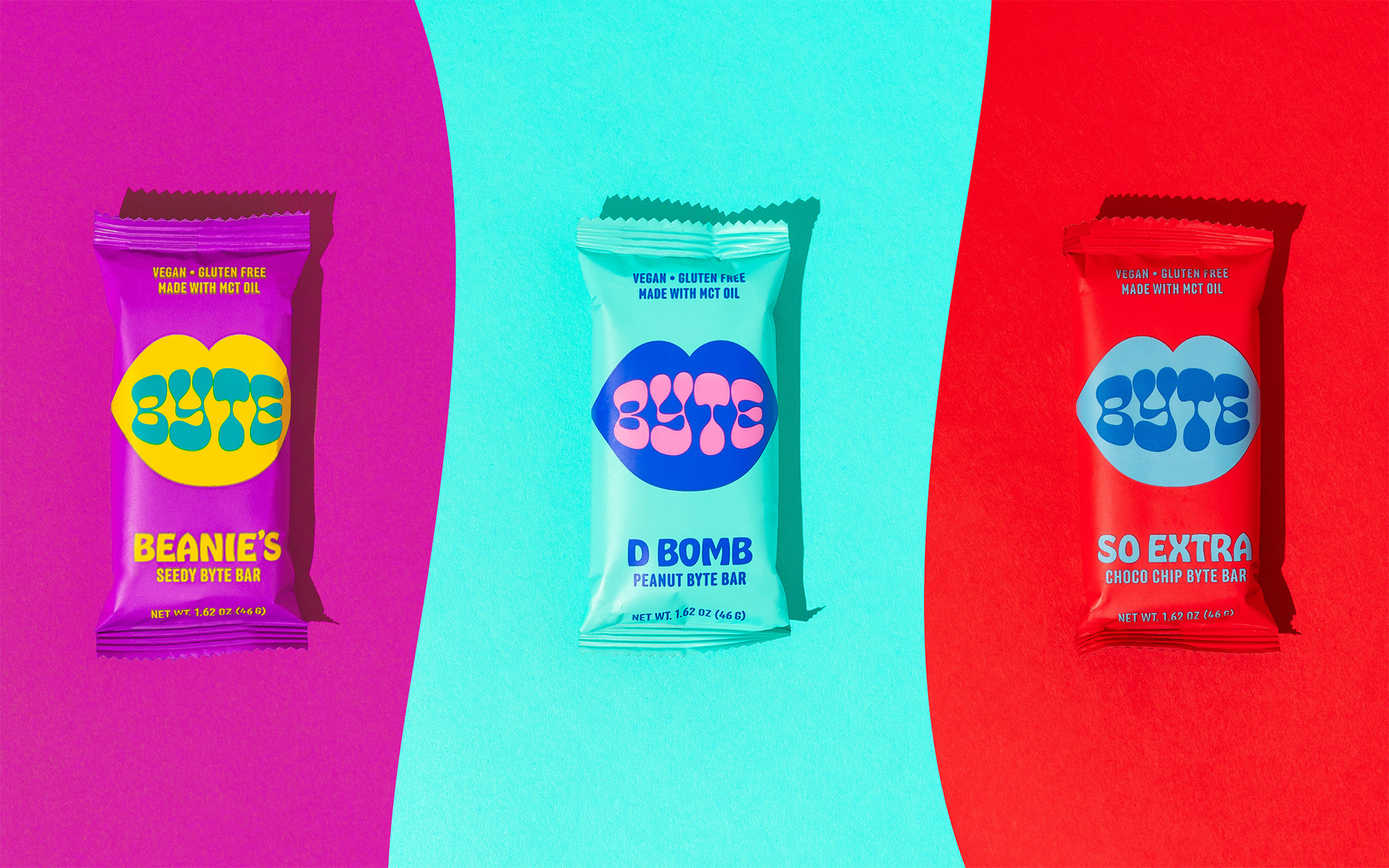
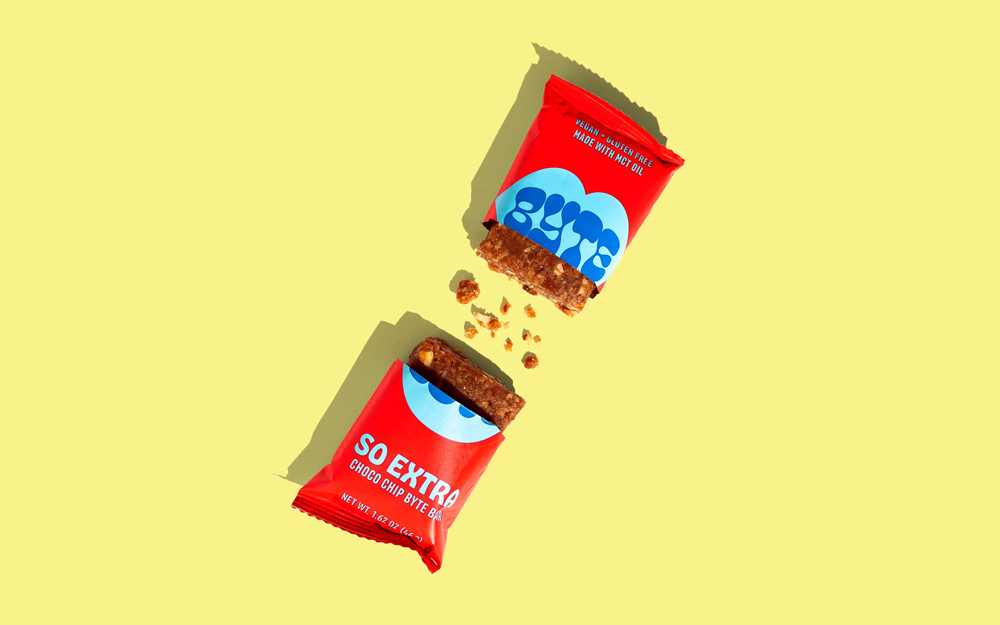
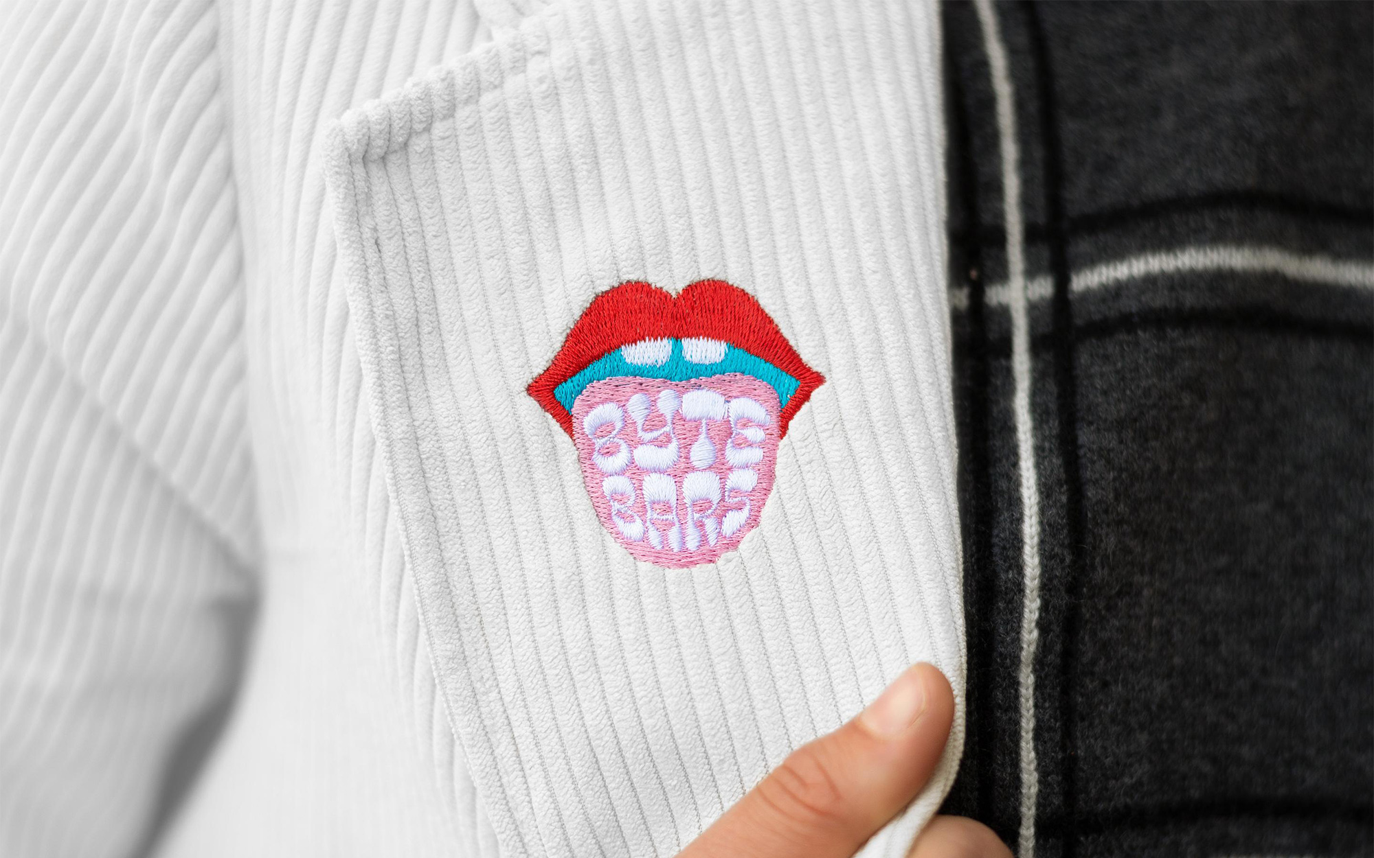
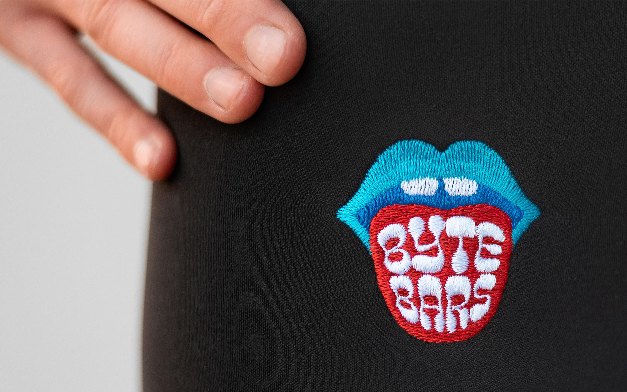
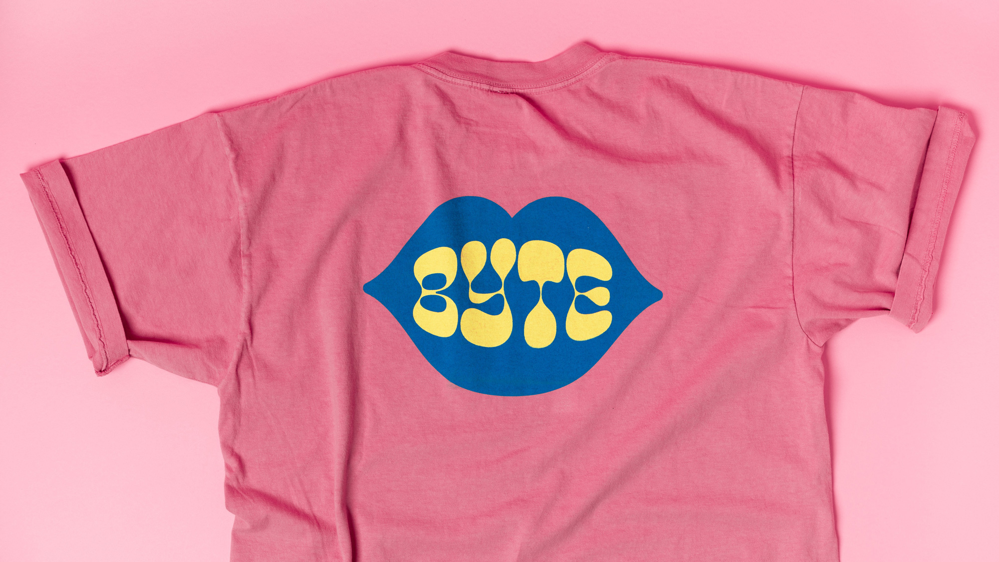
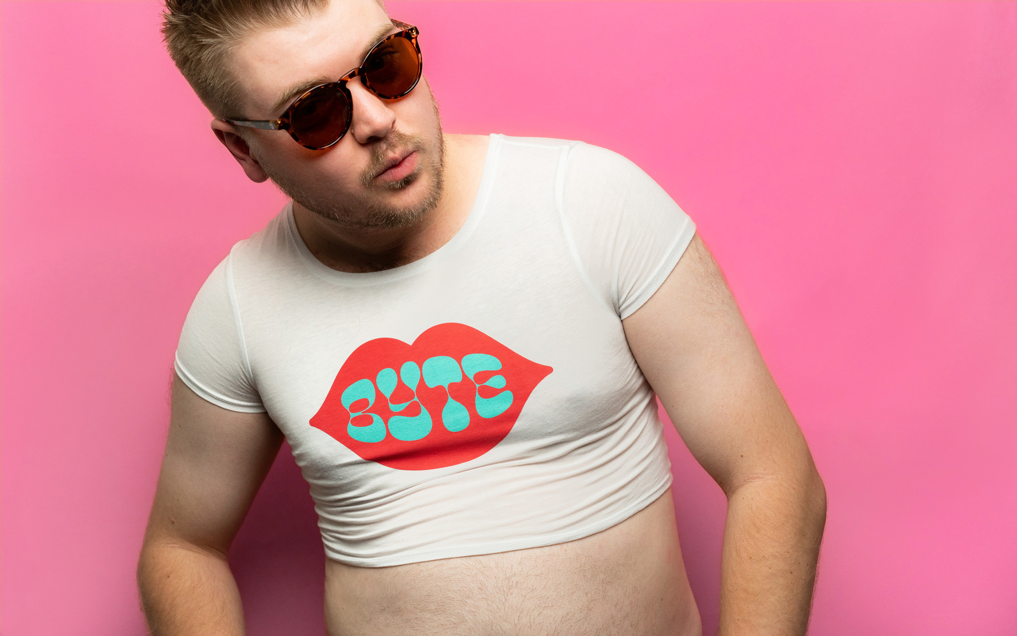
At a time when snack bars come in all kinds of novel ingredient combinations and health-boosting motivations, making one brand stand out from the others is no easy task and this one does that through its wild, bold design and free-spirit attitude. I don't know if it's enough to sustain it in the long run but definitely enough to enter the market and demand attention to be tried at least once.
In ấn Anpic In nhãn mác Anpic In brochure Anpic In card visit Anpic In catalogue Anpic In thiệp cưới Anpic In tờ rơi Anpic
In Ấn Anpic – Nổi Tiếng In Đẹp In Nhanh
Số 5 Ngõ 75 Nguyễn Xiển, Thanh Xuân, Hạ Đình, Hà Nội
0963223884
baogiainananh@gmail.com
https://anpic.vn
https://g.page/inananpic
In nhãn mác Anpic ✅ In brochure Anpic ✅ In card visit Anpic ✅ In catalogue Anpic ✅ In thiệp cưới Anpic ✅ In tờ rơi Anpic
https://anpic.vn/in-nhan-mac-dep
https://anpic.vn/in-brochure
https://anpic.vn/in-an
https://anpic.vn/in-voucher-in-phieu-giam-gia-khuyen-mai
#inananpic
Comments
Post a Comment