Reviewed: New Logo for Tripadvisor by Mother Design
“Power Trip”

Established in 2000, Tripadvisor is, probably without any hyperbole involved, the world's largest travel information platform, helping an average of nearly 460 million monthly unique visitors plan their trips and adventures with a whopping 830 million reviews and opinions of 8.6 million accommodations, restaurants, experiences, airlines, and cruises. I use it all the time and it's hard to imagine making travel plans without it as a reference. Yesterday, as part of phased rollout, Tripadvisor introduced a new logo designed by New York, NY-based Mother Design.
Appreciating the current love for and global recognition of the iconic logo, we retained its inherent personality but refined its geometry for better reproduction at all sizes. What was an exercise both in reduction of complexity and amplification of character resulted in a much simpler owl, and a complementary custom typeface by Colophon Foundry which could carry the weight of the real, global, human connection the brand believes in.
And because Rome wasn't revealed in a day, Tripadvisor's refresh won't be, either. The company intends to roll out their updated look and feel in full over the course of the coming year.
Mother Design project page

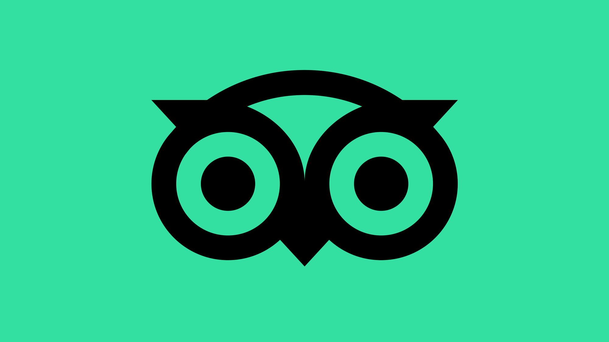
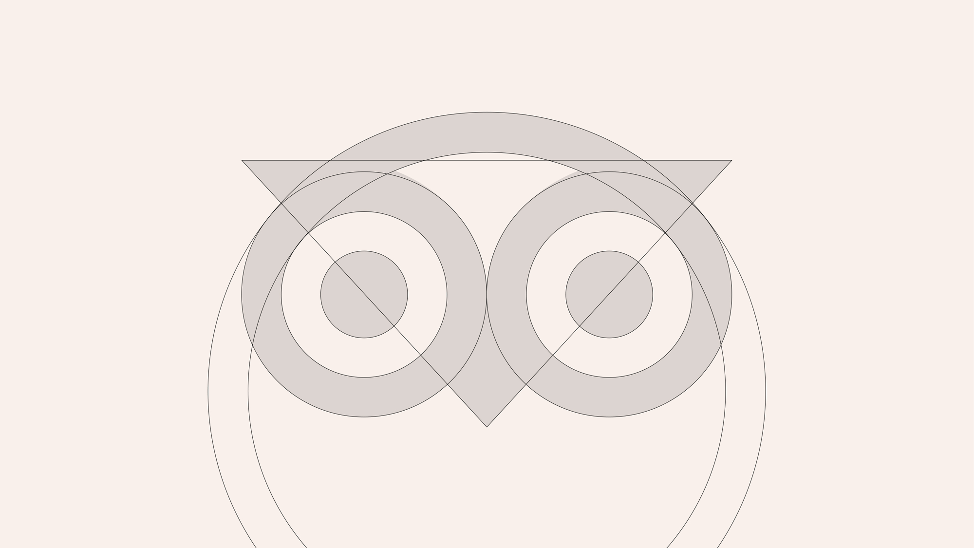
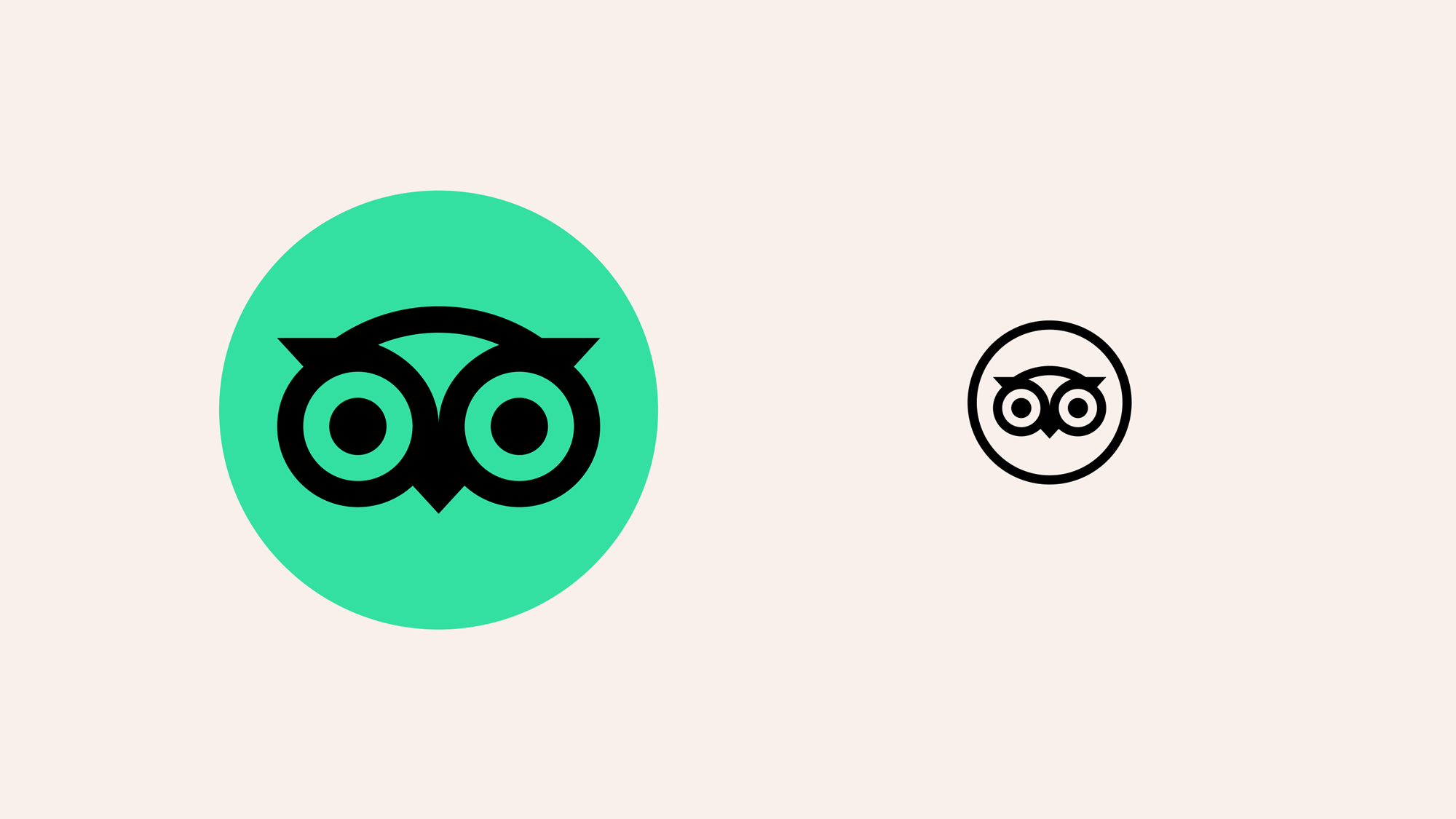
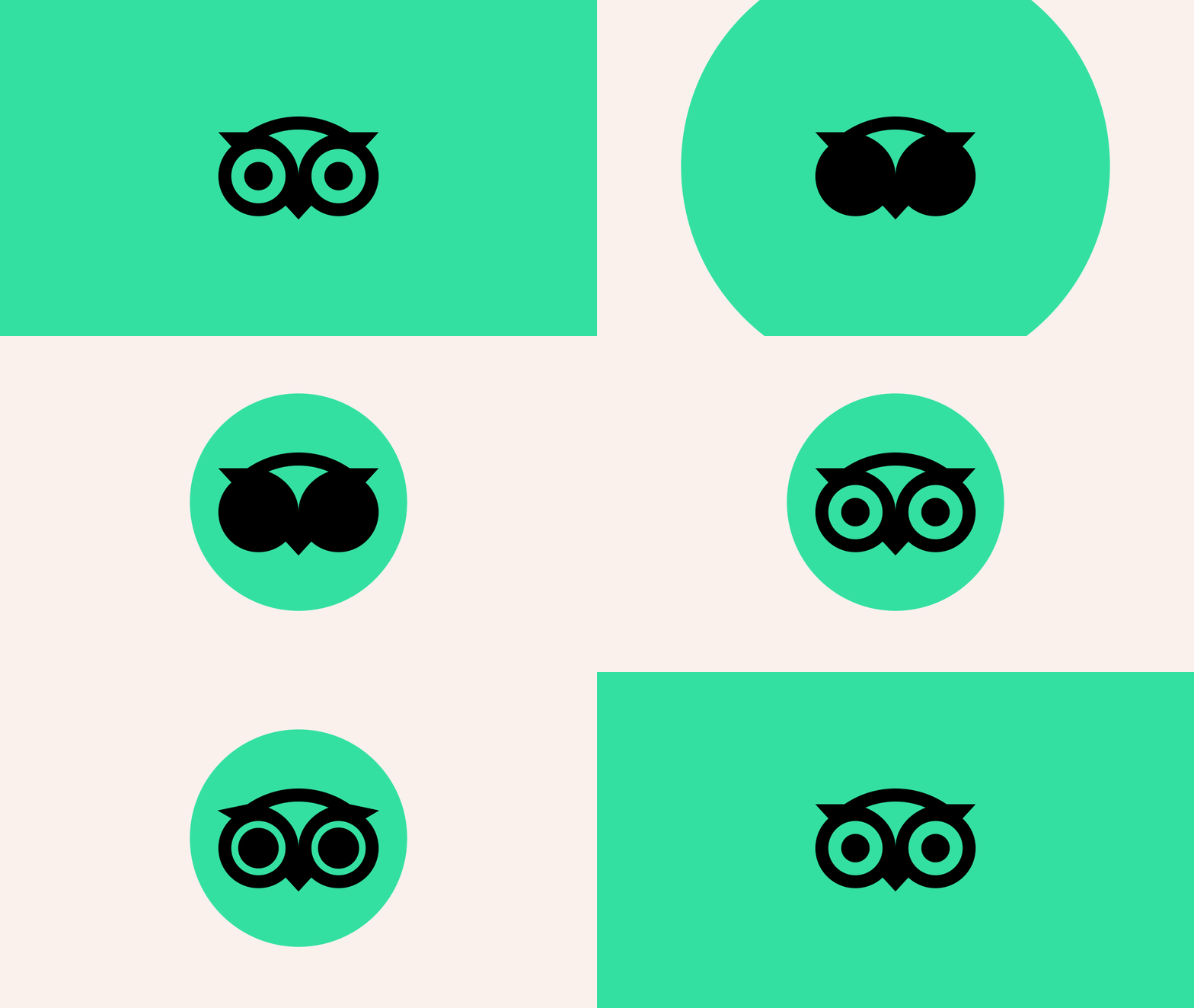
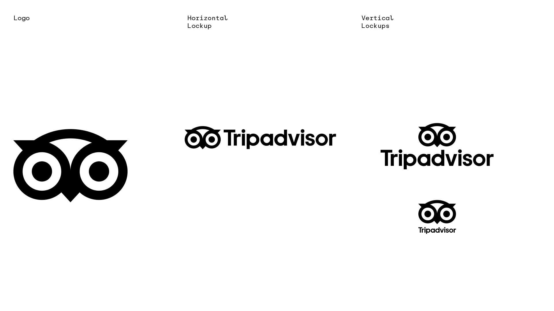
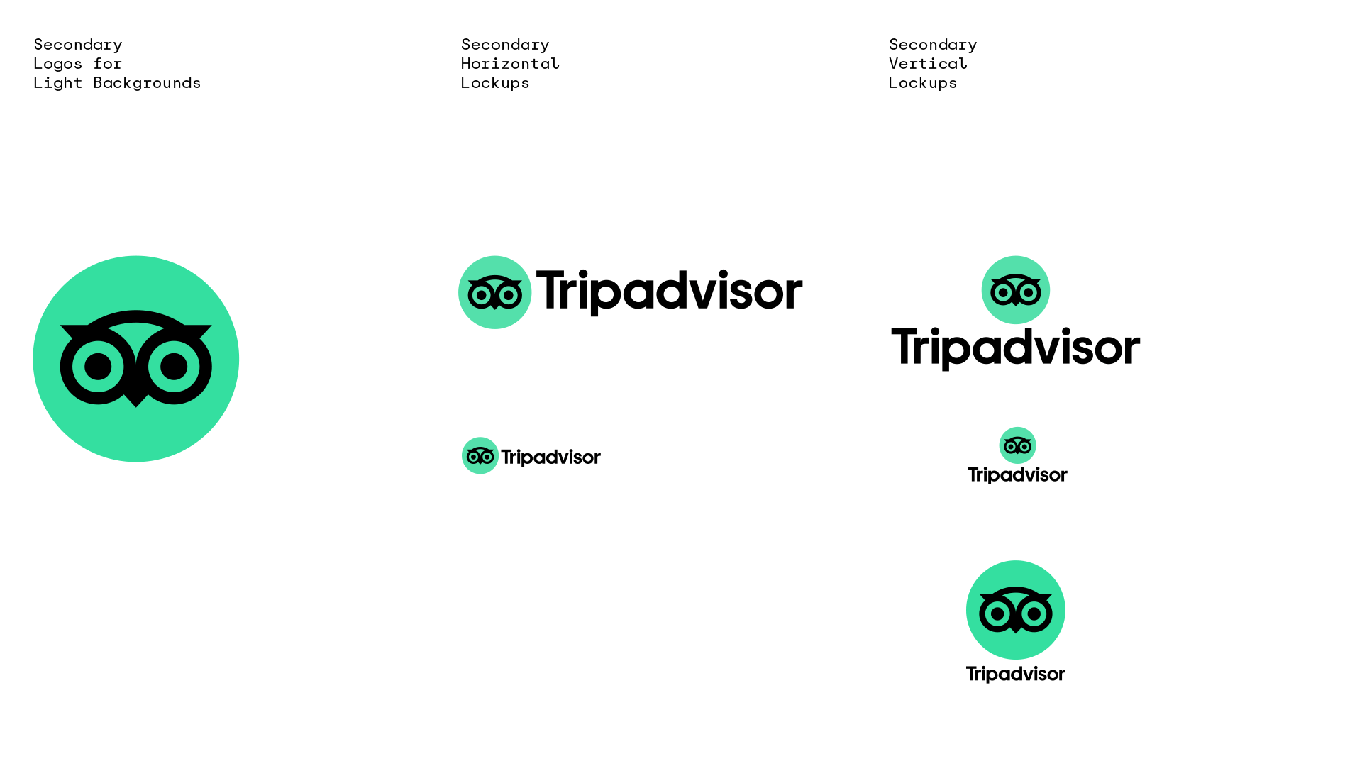
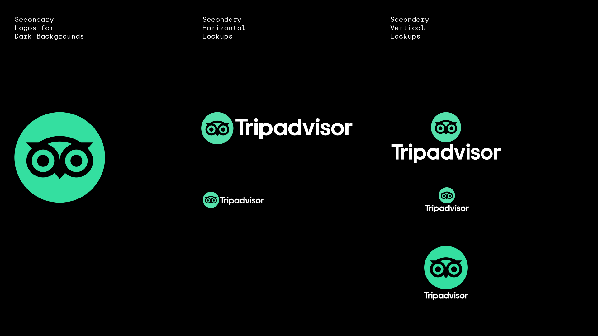
I have always found the Tripadvisor owl -- official nickname, Ollie -- to be a little disturbing, looking like it itself is on a trip but not the traveling kind of trip, with its dilated pupils and mismatched iris colors. Yet, in its weirdness and 4-color-reproduction-needed, it has become a highly recognizable icon, not just online but in the physical world as many establishments proudly display it on their windows or reception desks. The new icon now properly renders in a single color and a cleaner construction. It's a little bolder overall, which I personally like, but I could also see a case being made for it benefitting from being thinner. As I stare into the eyes of the new icon, I do wonder how much recognition rested in the multi-color approach? The new wordmark is a major improvement as the old one was truly bad, with a default font look that did not instill a lot of trust. While the improvement is undeniable, the new wordmark is still within the safe confines of the geometric sans approach -- those "r"s tho. The logo now moves into a single-color primary application, which may feel a little harsh, and a secondary two-color application that feels much more internet-y and friendly. Cue the Spotify green comparisons, which are valid -- Spotify really nailed that green early on, didn't they?

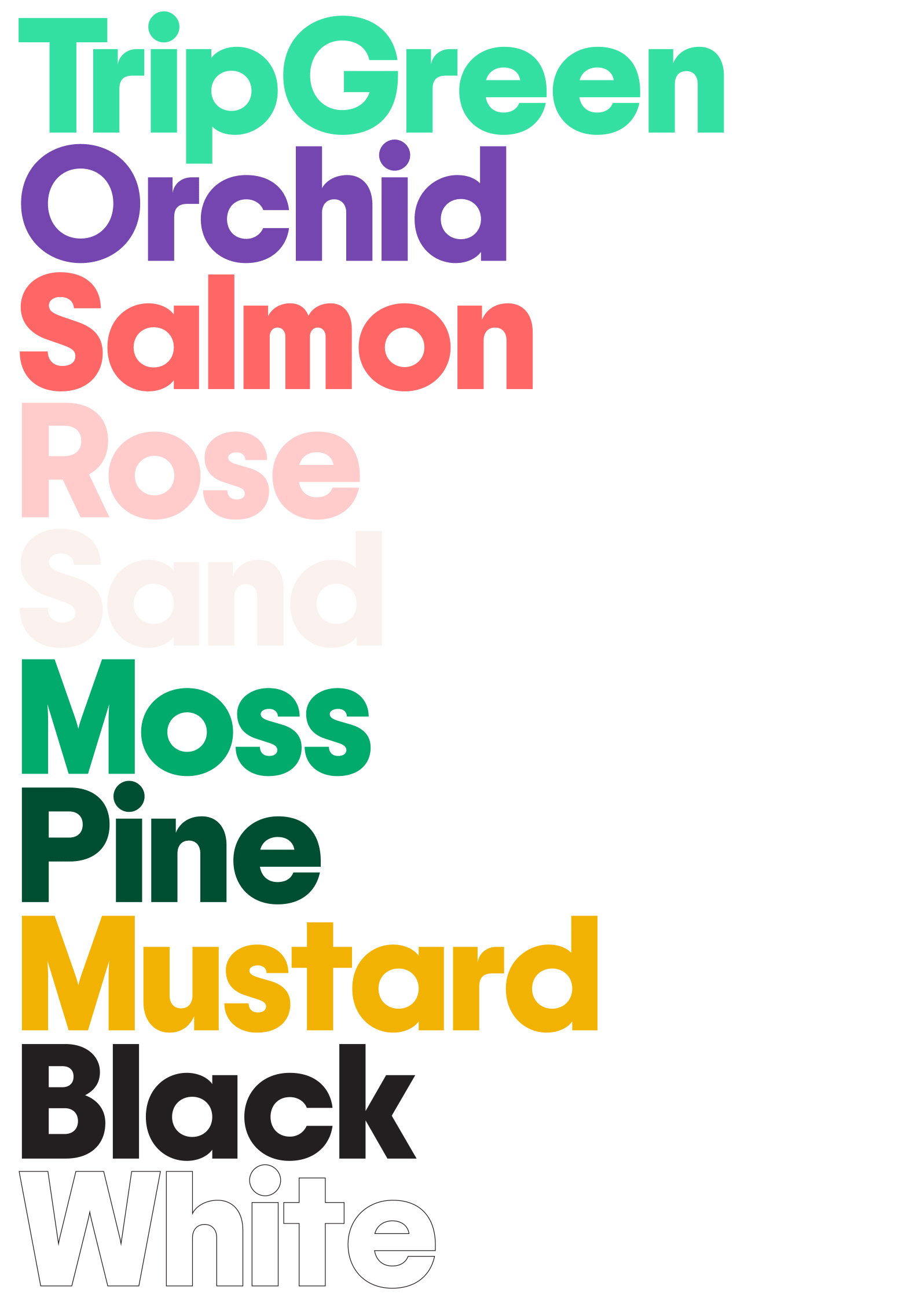
The color palette is pretty nice, with a couple of bright contrasting colors and a range of lights and darks that are good complements. I hope these colors seep into the website, as it could use some variety.
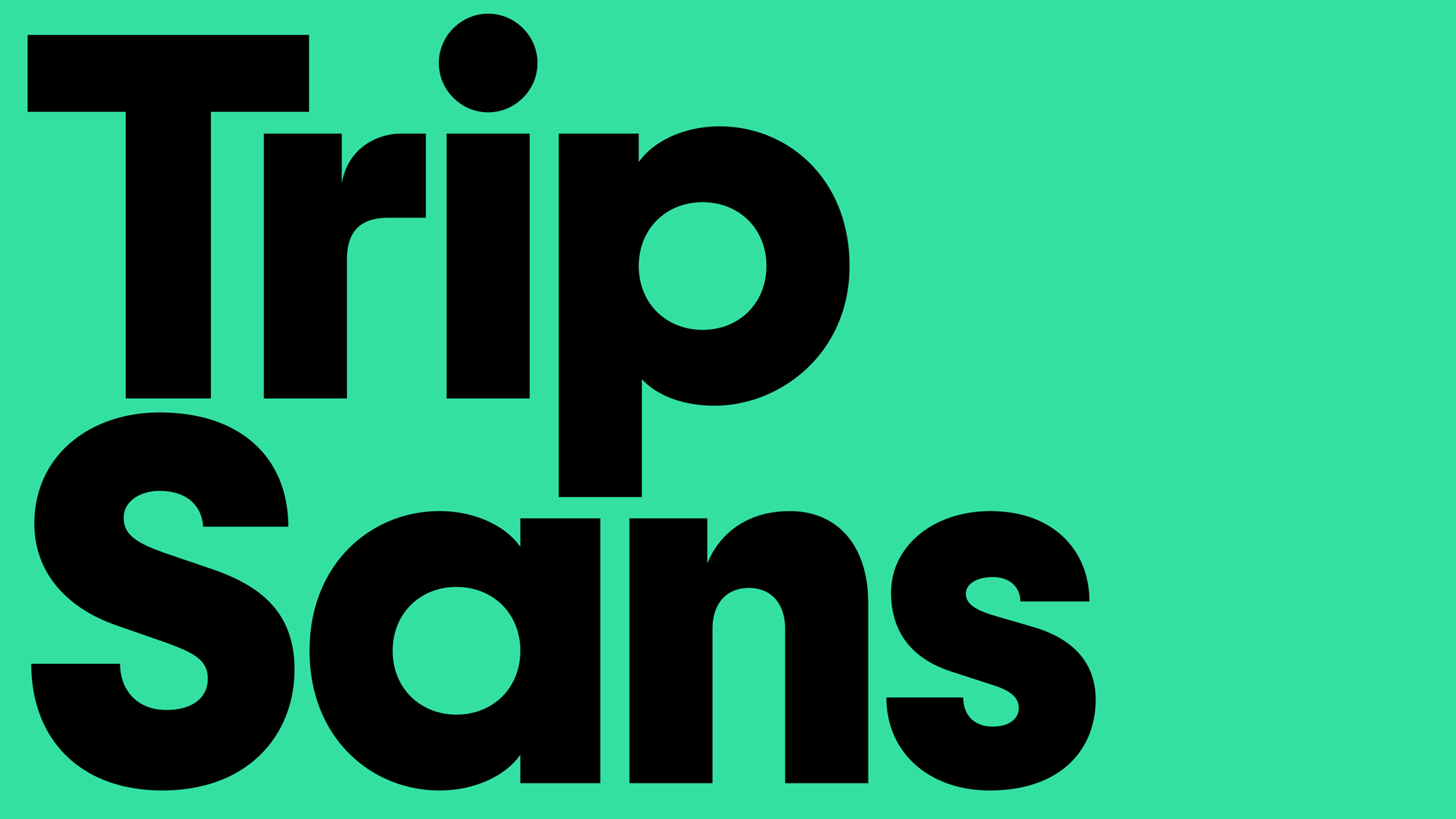
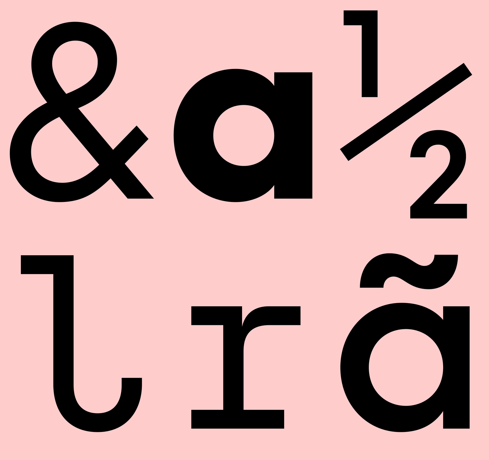
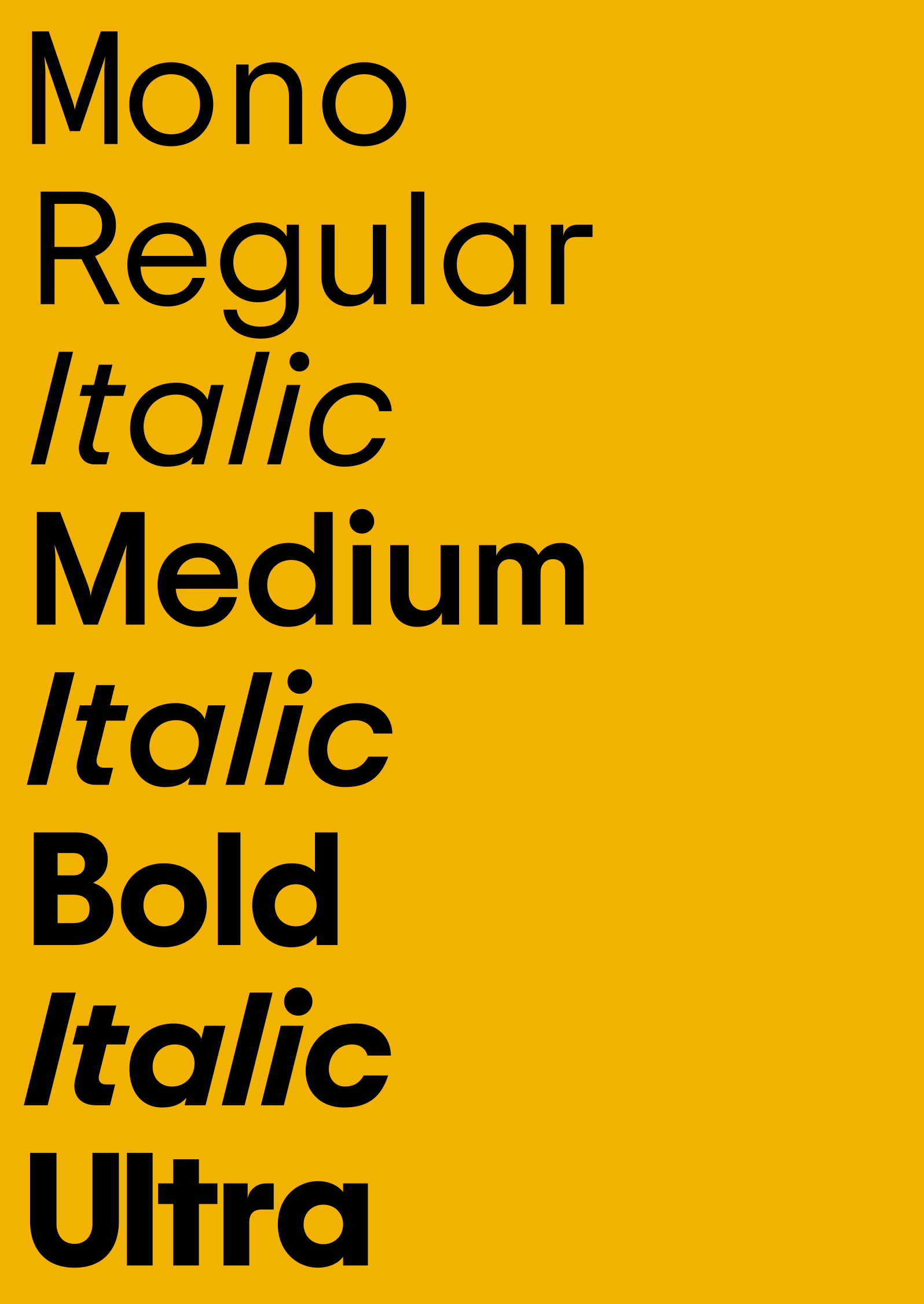
The custom type family looks good as is expected from Colophon Foundry but also joins the cadre of other proprietary families like it. The combination with icons below looks promising.
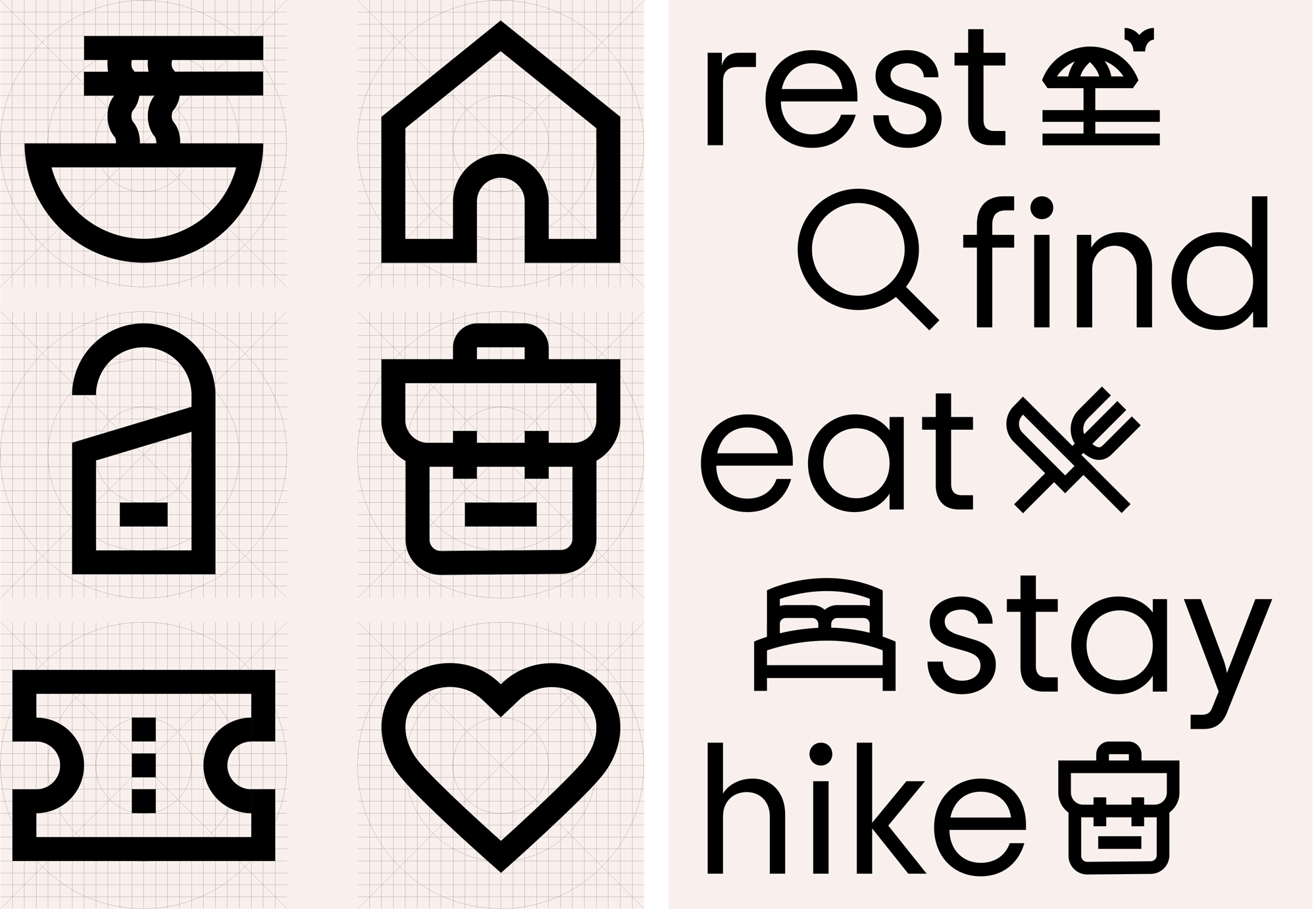
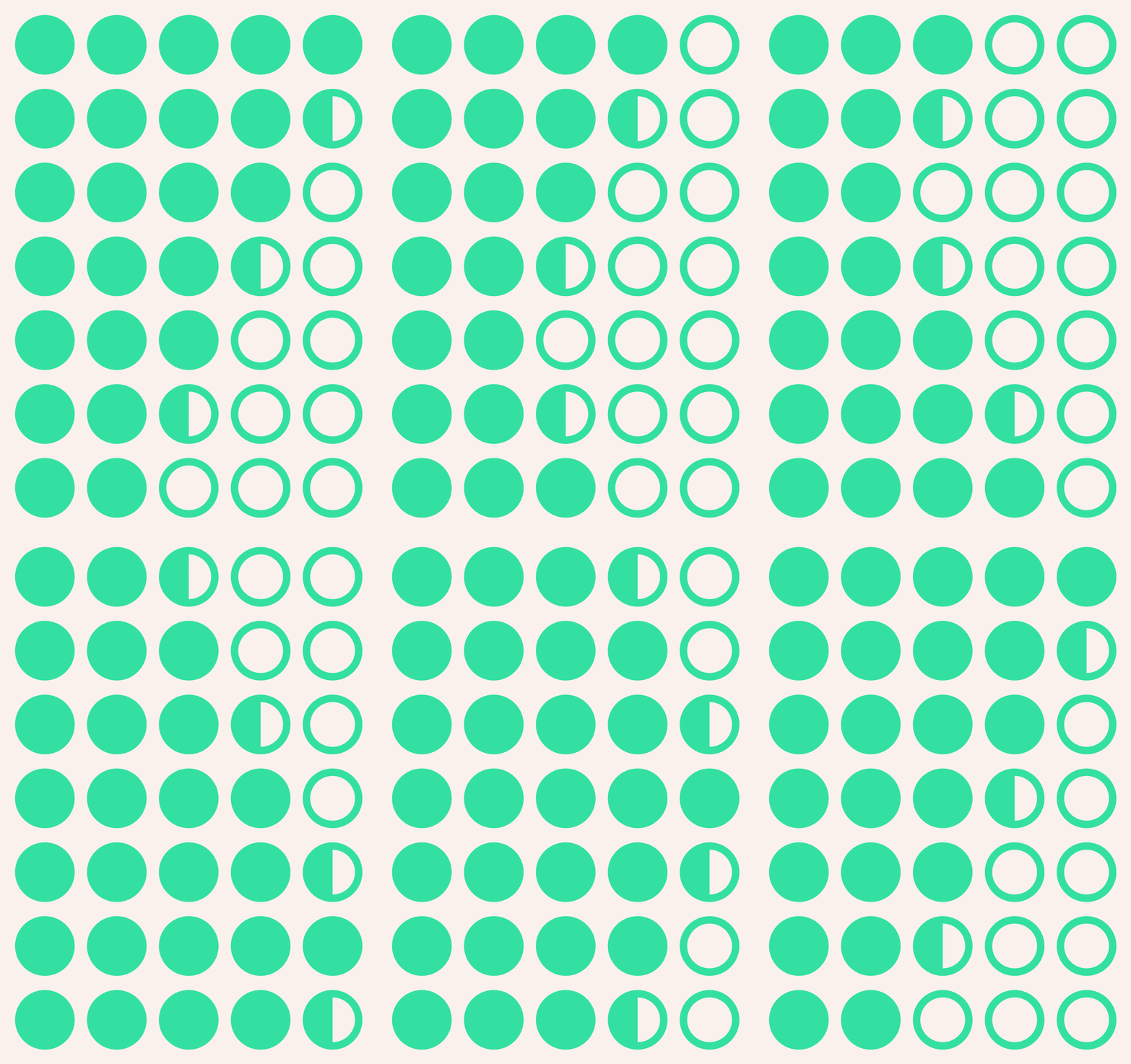
Overall, I think the evolution is technically good with all the right moves in all the right places but I do wonder if something got lost in the process? There was something charming and even effective about the less polished version that made the platform feel more open. Still, I do think Tripadvisor did indeed need an update to reflect its status as an integral part of the travel industry and this conveys that position in a confident, contemporary way.
In ấn Anpic In nhãn mác Anpic In brochure Anpic In card visit Anpic In catalogue Anpic In thiệp cưới Anpic In tờ rơi Anpic
In Ấn Anpic – Nổi Tiếng In Đẹp In Nhanh
Số 5 Ngõ 75 Nguyễn Xiển, Thanh Xuân, Hạ Đình, Hà Nội
0963223884
baogiainananh@gmail.com
https://anpic.vn
https://g.page/inananpic
In nhãn mác Anpic ✅ In brochure Anpic ✅ In card visit Anpic ✅ In catalogue Anpic ✅ In thiệp cưới Anpic ✅ In tờ rơi Anpic
https://anpic.vn/in-nhan-mac-dep
https://anpic.vn/in-brochure
https://anpic.vn/in-an
https://anpic.vn/in-voucher-in-phieu-giam-gia-khuyen-mai
#inananpic
Comments
Post a Comment