Guta Cafe

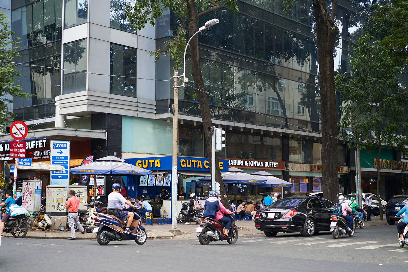
Taking inspiration from the unique Vietnamese street culture, Guta Cafe is growing into a familiar coffee brand where urban people can connect and enjoy the outdoor environment. Focusing on a responsive and affordable store setup, Guta have grown fast, dominated Saigon, and become one of the most popular coffee chains in the city.
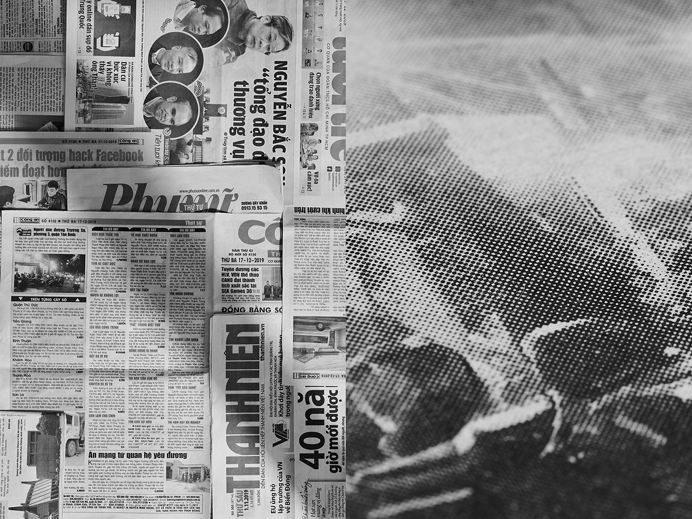
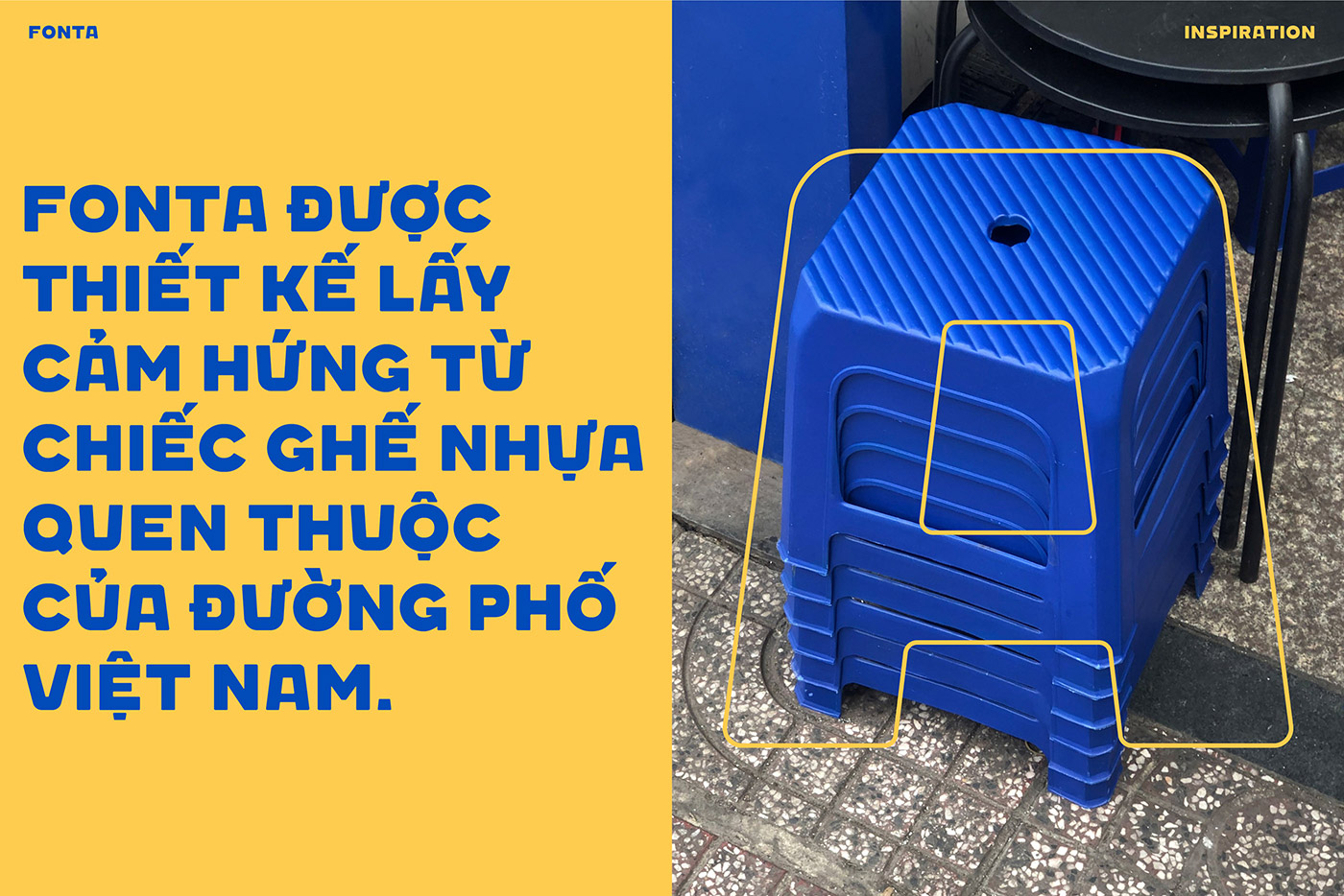
Guta is Vietnamese slang taken from “gout /gu/” in French and “ta” in Vietnamese, which together stand for the term “our style.” This represents Guta’s brand spirit, proud to serve a good, strong Vietnamese coffee. Street coffee has become a fundamental habit, not just in Saigon, but throughout Vietnam. Beneath the habitual culture there’s always a “plastic chair,” small and convenient for setting up small coffee shops anywhere.
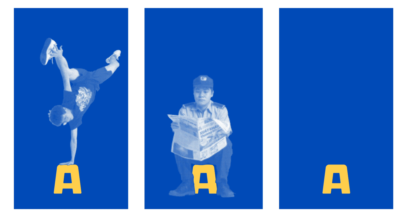
The graphic system is dominated by the iconic chair, combined with various surrounding environmental elements and people behaviours. Together they create a unique style for Guta that echos the brand’s origins.
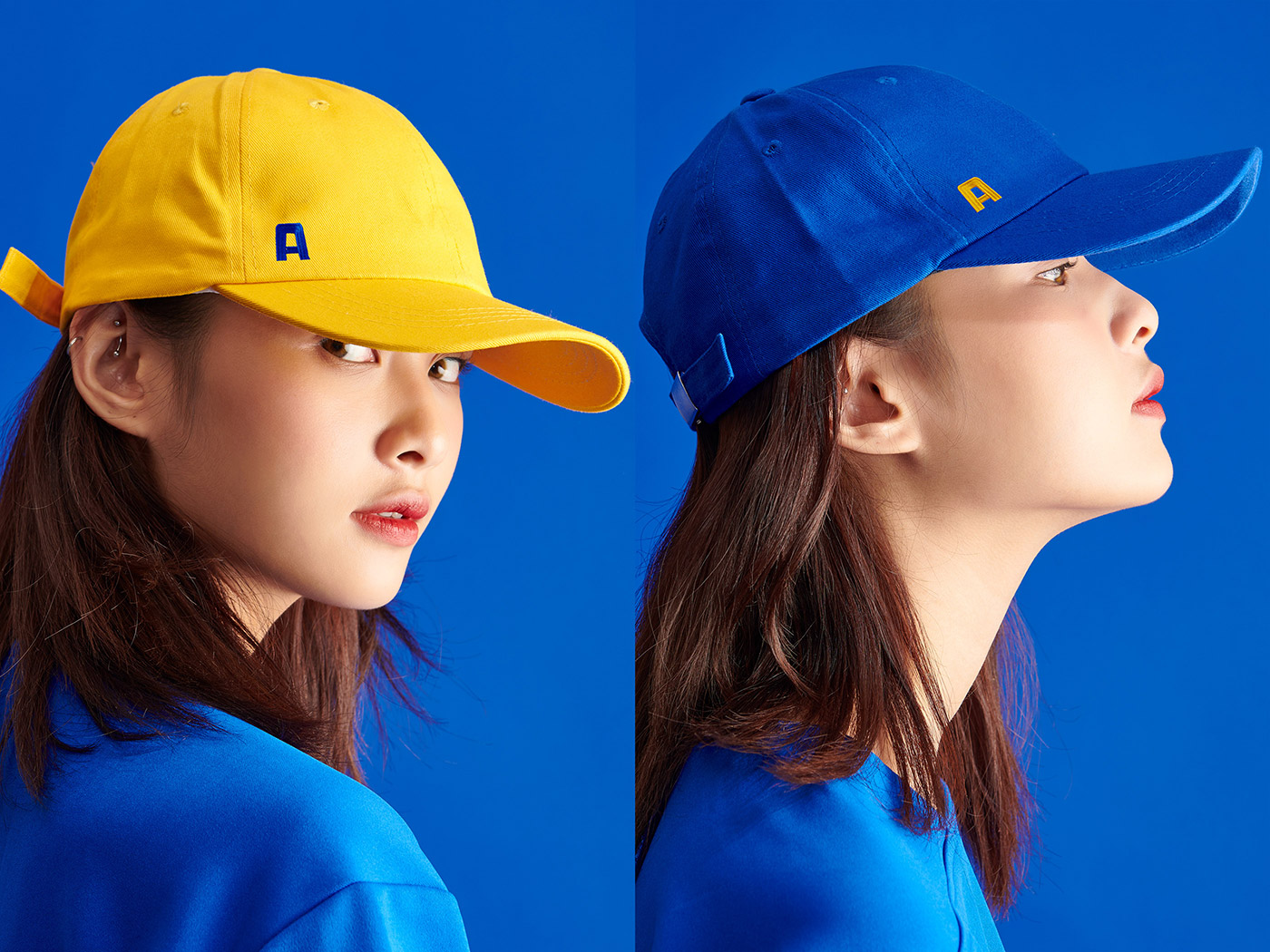
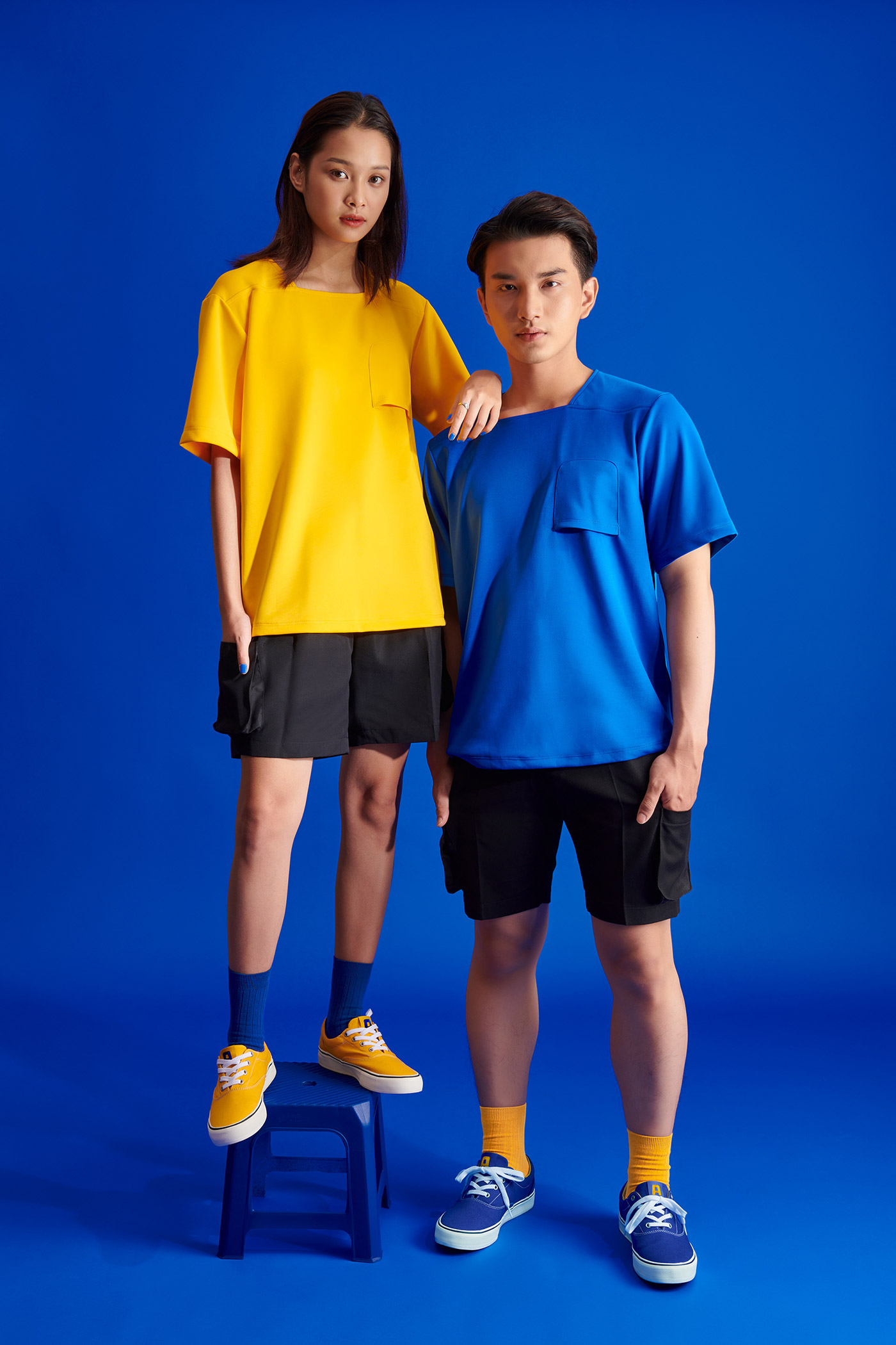
Inspired by the iconic Vietnam Social Security propaganda poster that hangs everywhere around the country, the blue and yellow palette was adapted for Guta. Just like the poster’s slogan, the colour choice represents the idea of “a friend of every worker.”

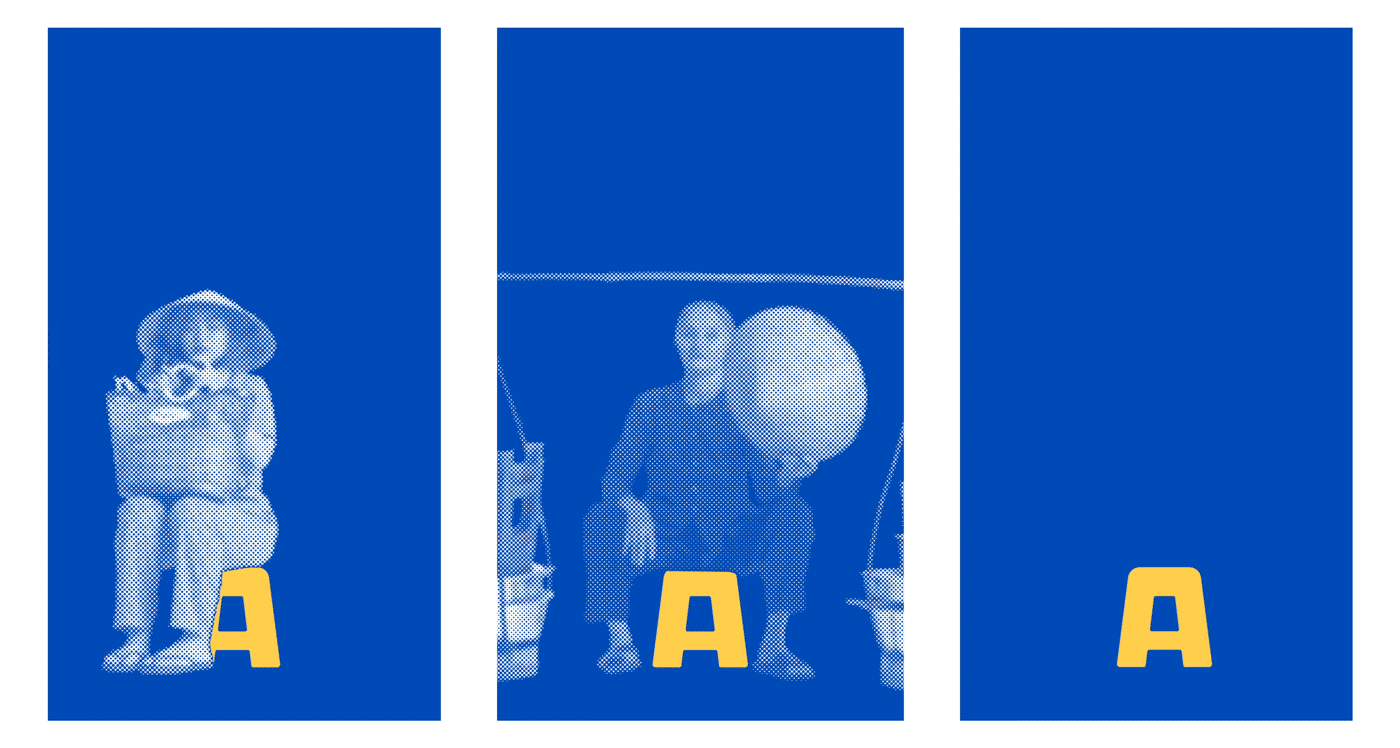
People who love street coffee usually kickstart their day by sitting on a plastic chair, somewhere shady, surrounded by greenery, with a cup of coffee and a newspaper. The halftone print effect of newspapers adds a distinctive look to the various characters we depicted sitting on chairs, from office workers to lady hawkers.
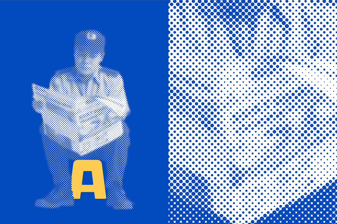
Every character was carefully selected to represent a wide range of customers — young, old, blue collar, white collar. Each character has a unique pose that expresses their personalities and broadens the identity elements. The visuals and colour palette creating a unique yet consistent brand expression that’s easily adapted for various marketing purposes.
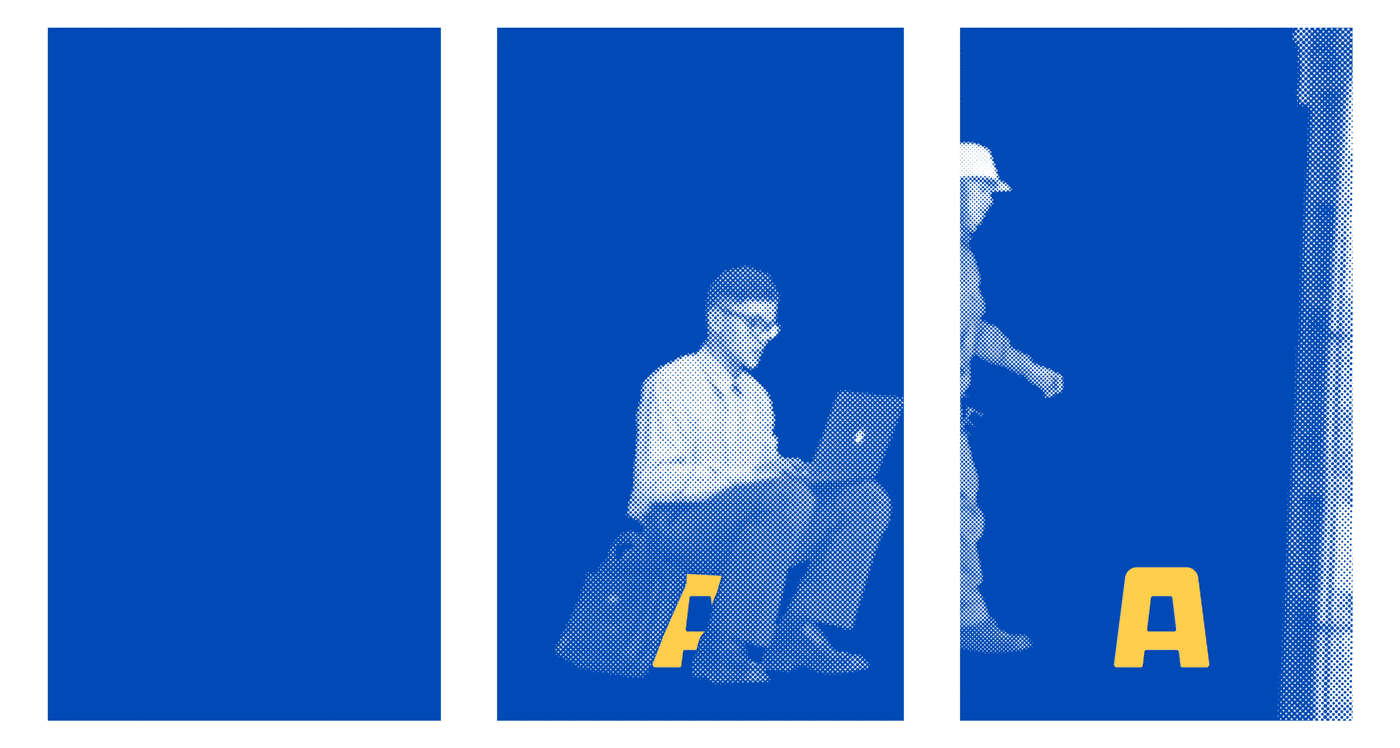
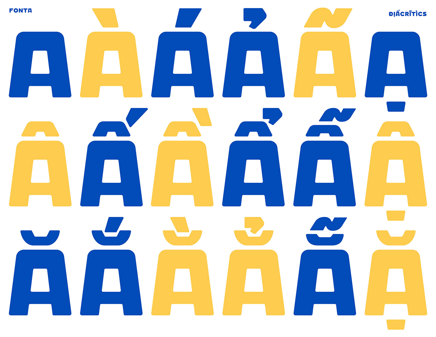
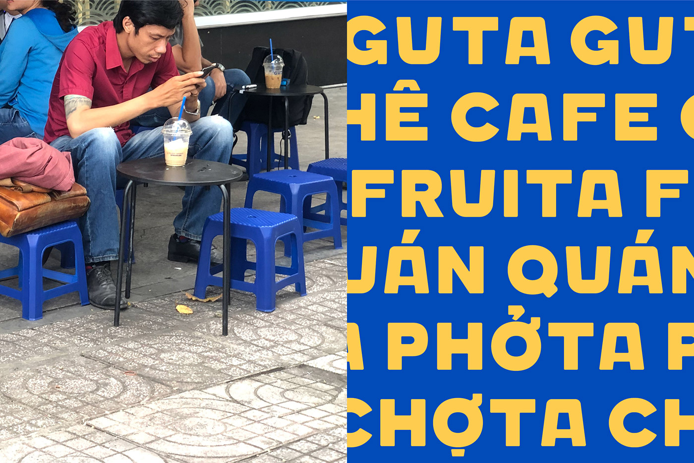
Featuring the chair and Vietnamese diacritical marks, we developed a custom font named after Guta — FONTA (our font). After this rebrand, Guta has grown from several stores to nearly 60 stores around Saigon, launching new sub-brands such as PHỞTA (Phở noodle) and CHỢTA (convenient local store).


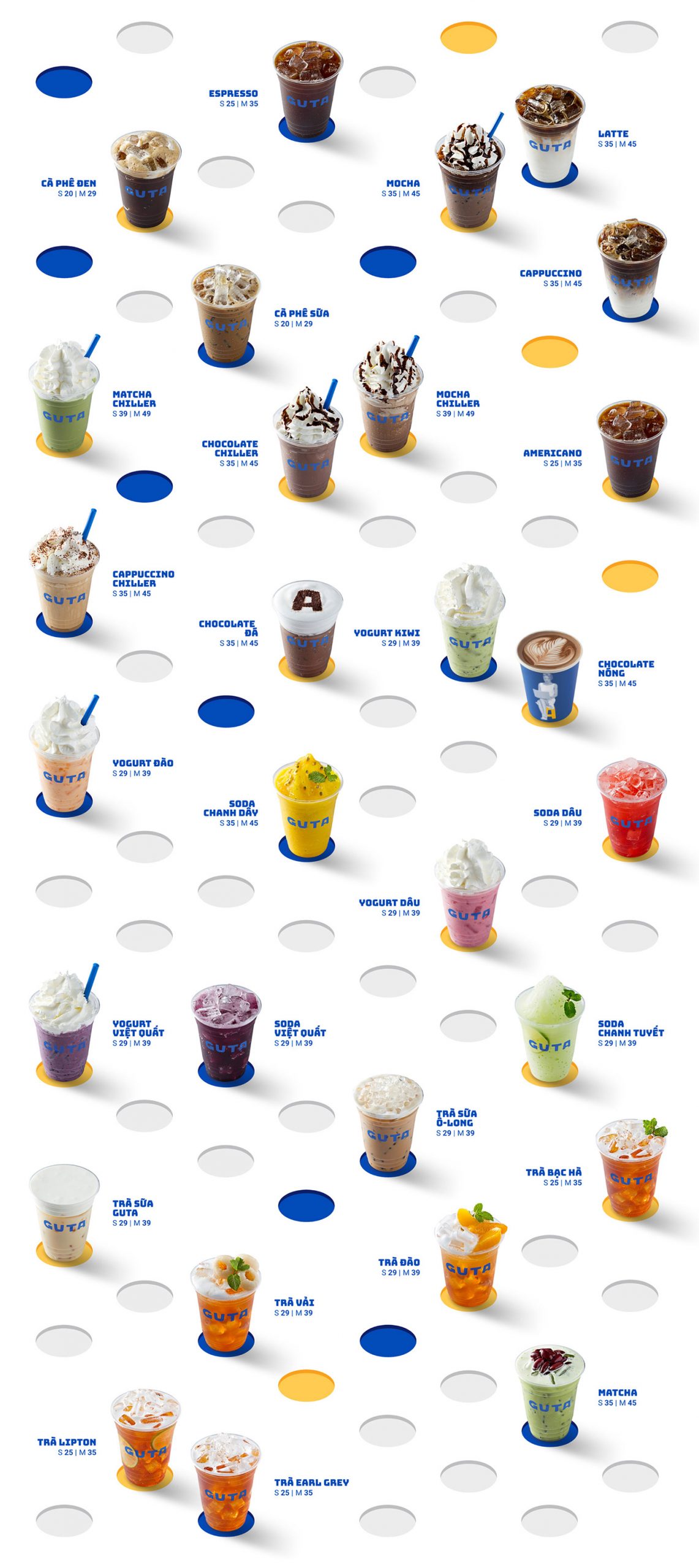
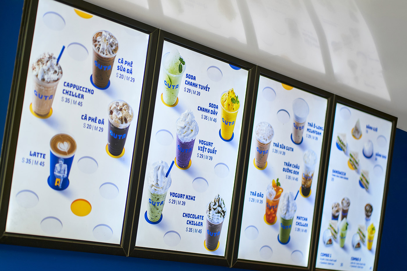
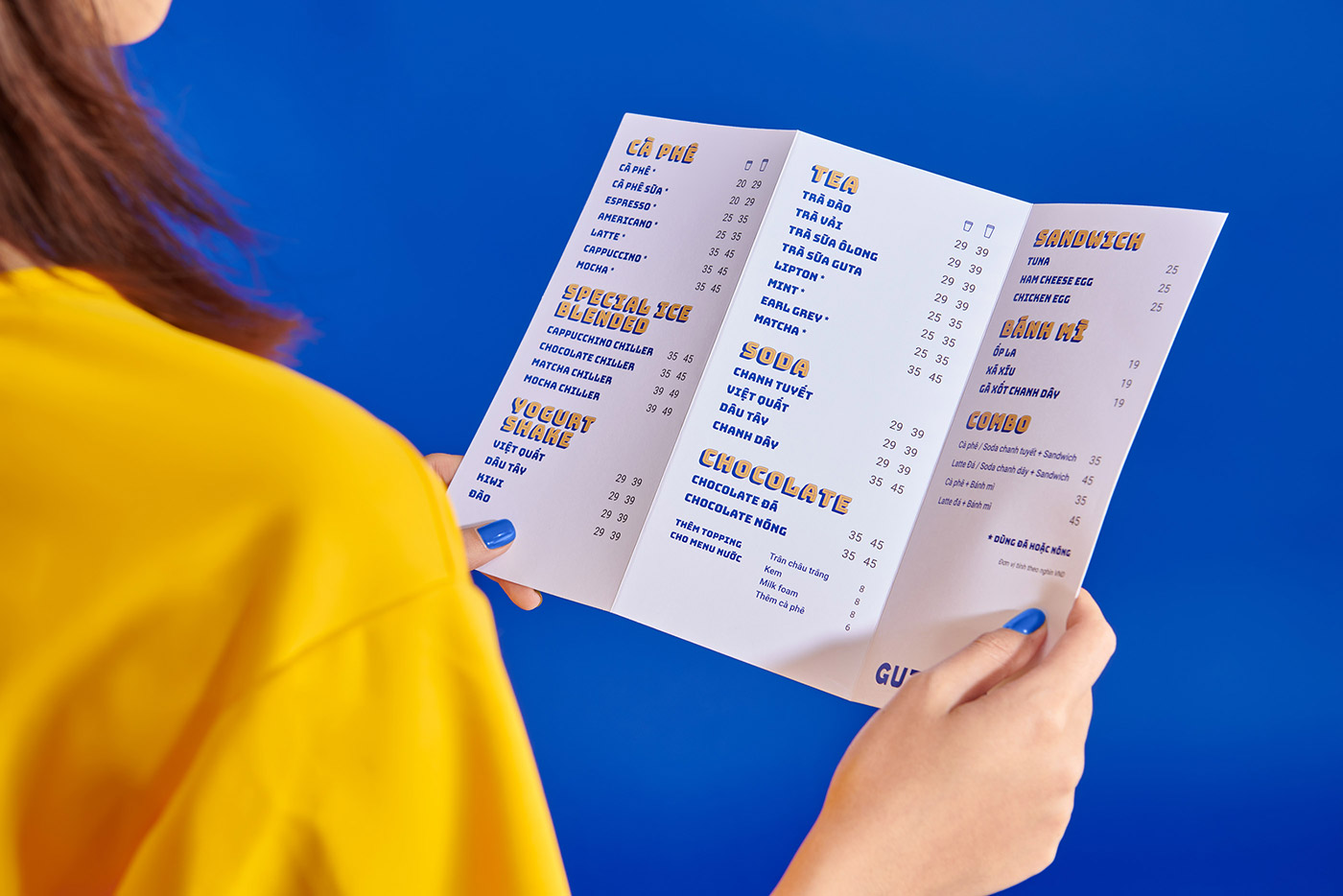
We also gave the menus a fresh appearance (both in-store and takeaway).


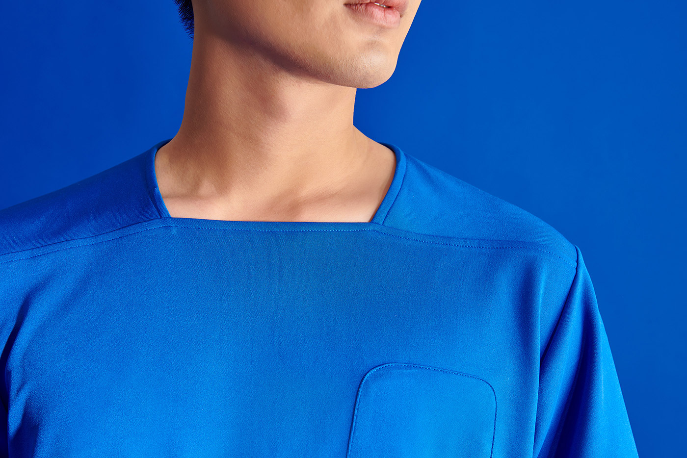
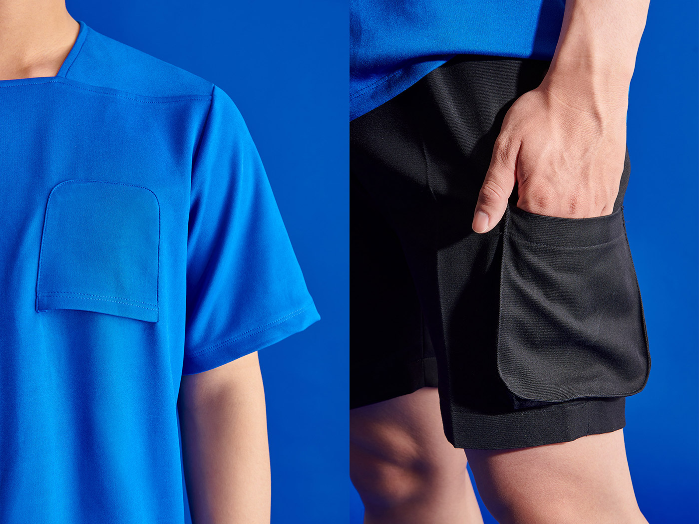
For comfort and functionality when serving outdoors in humid, sunny weather, the uniform was designed with a minimal, basic, light T-shirt and shorts. For subtle differentiation there’s an upside-down pocket detail that hints at the A-chair symbol.
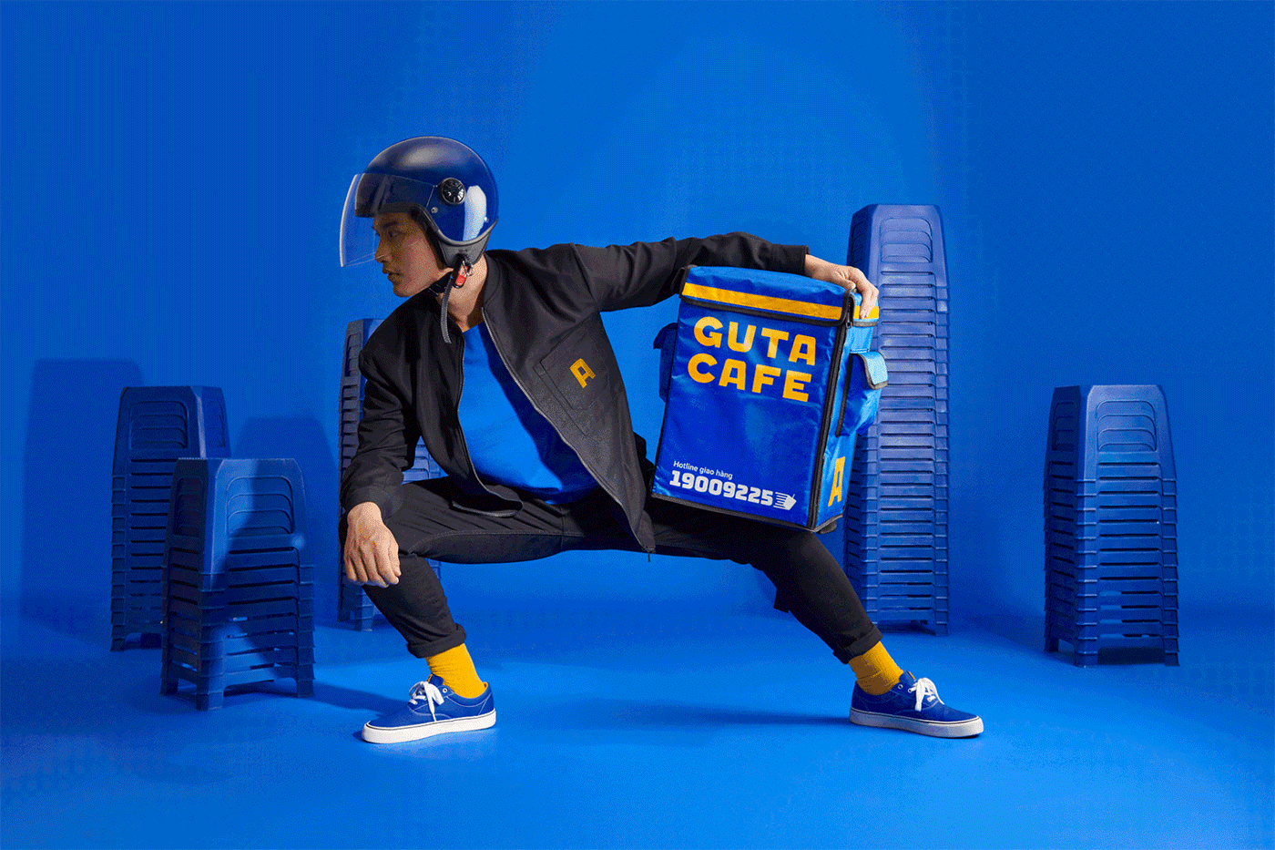
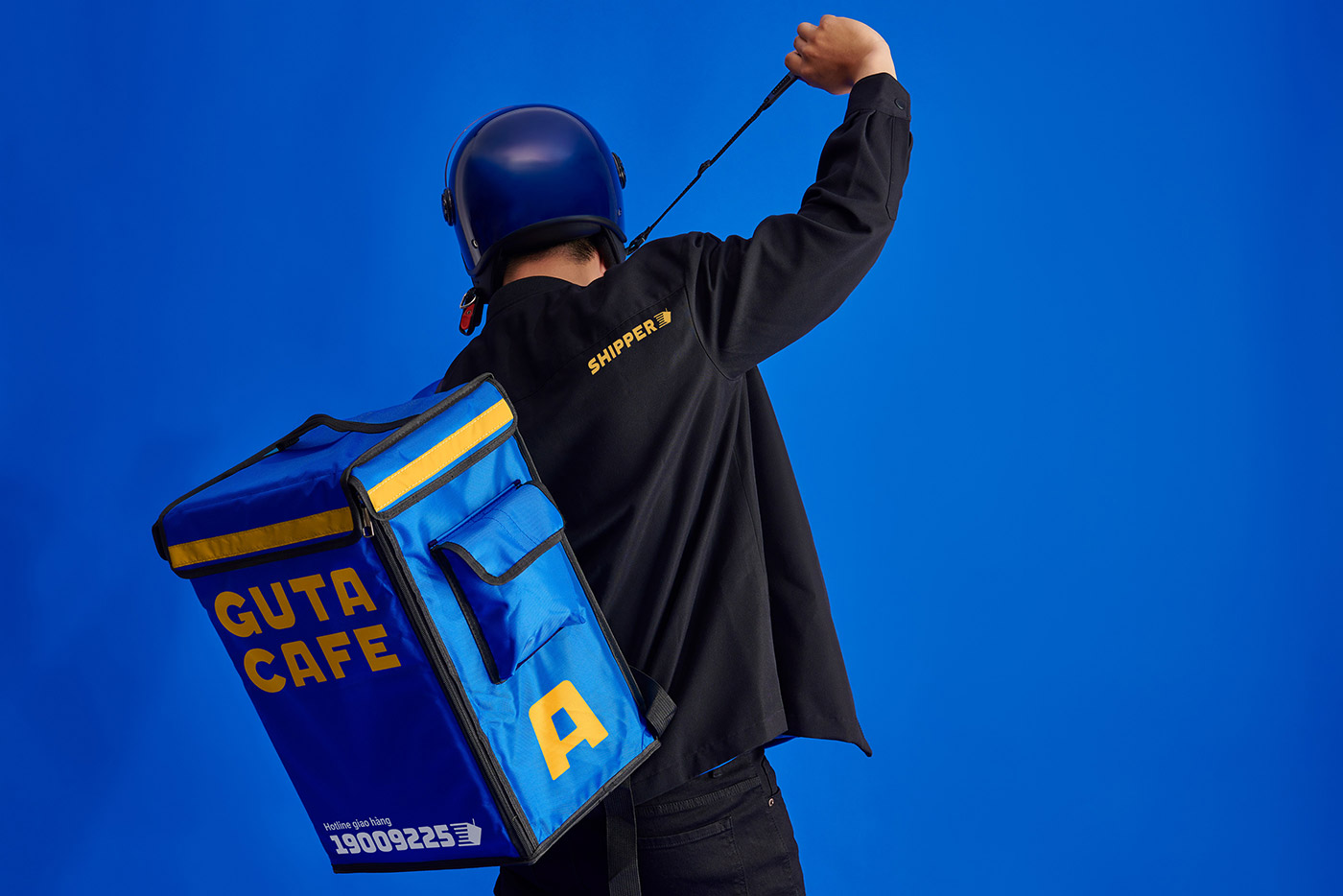
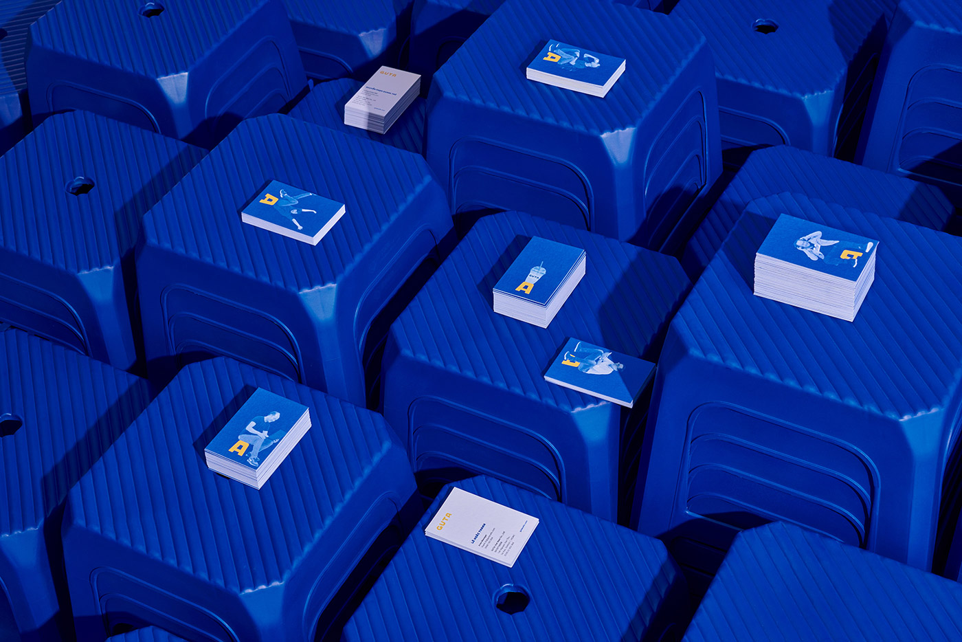
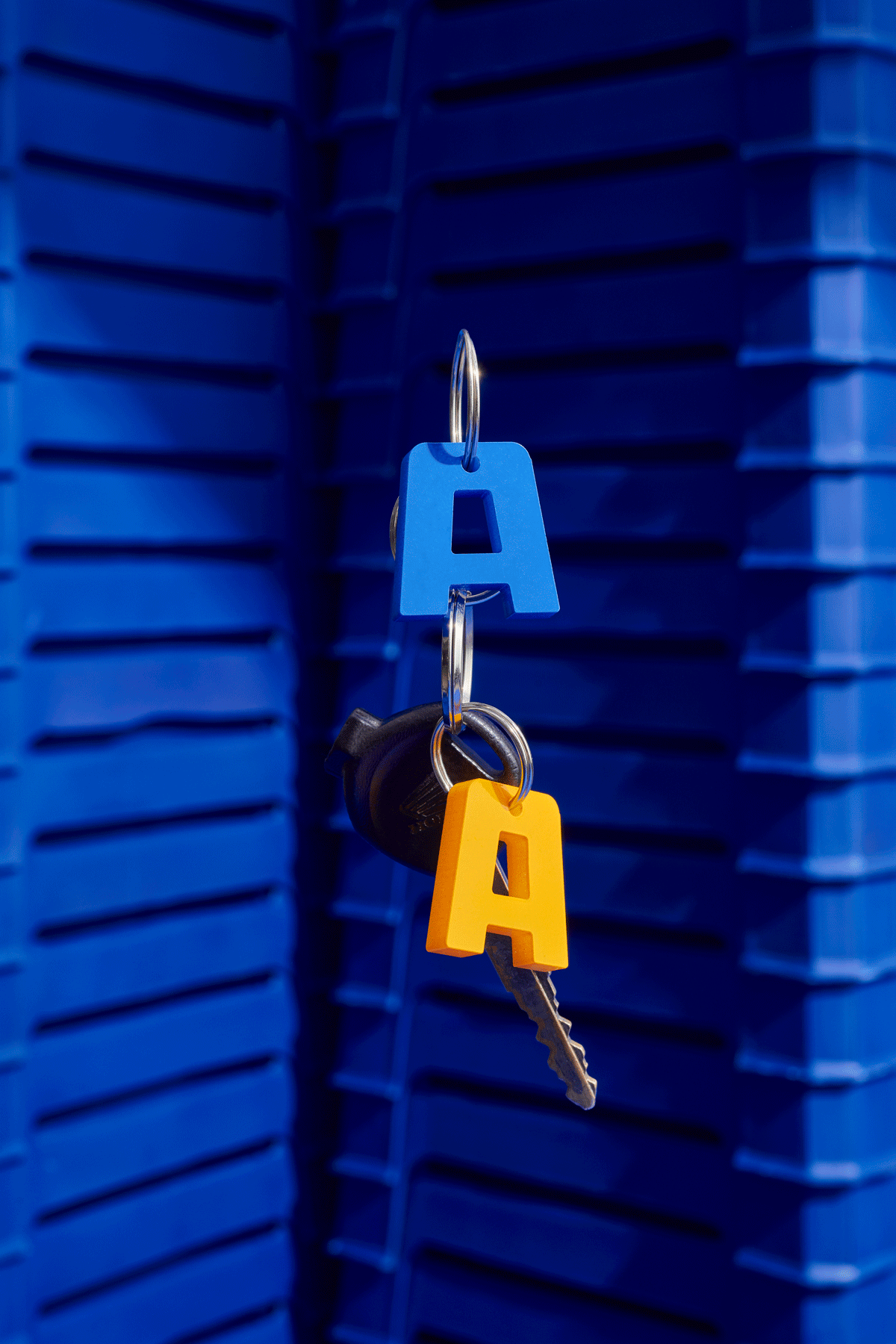
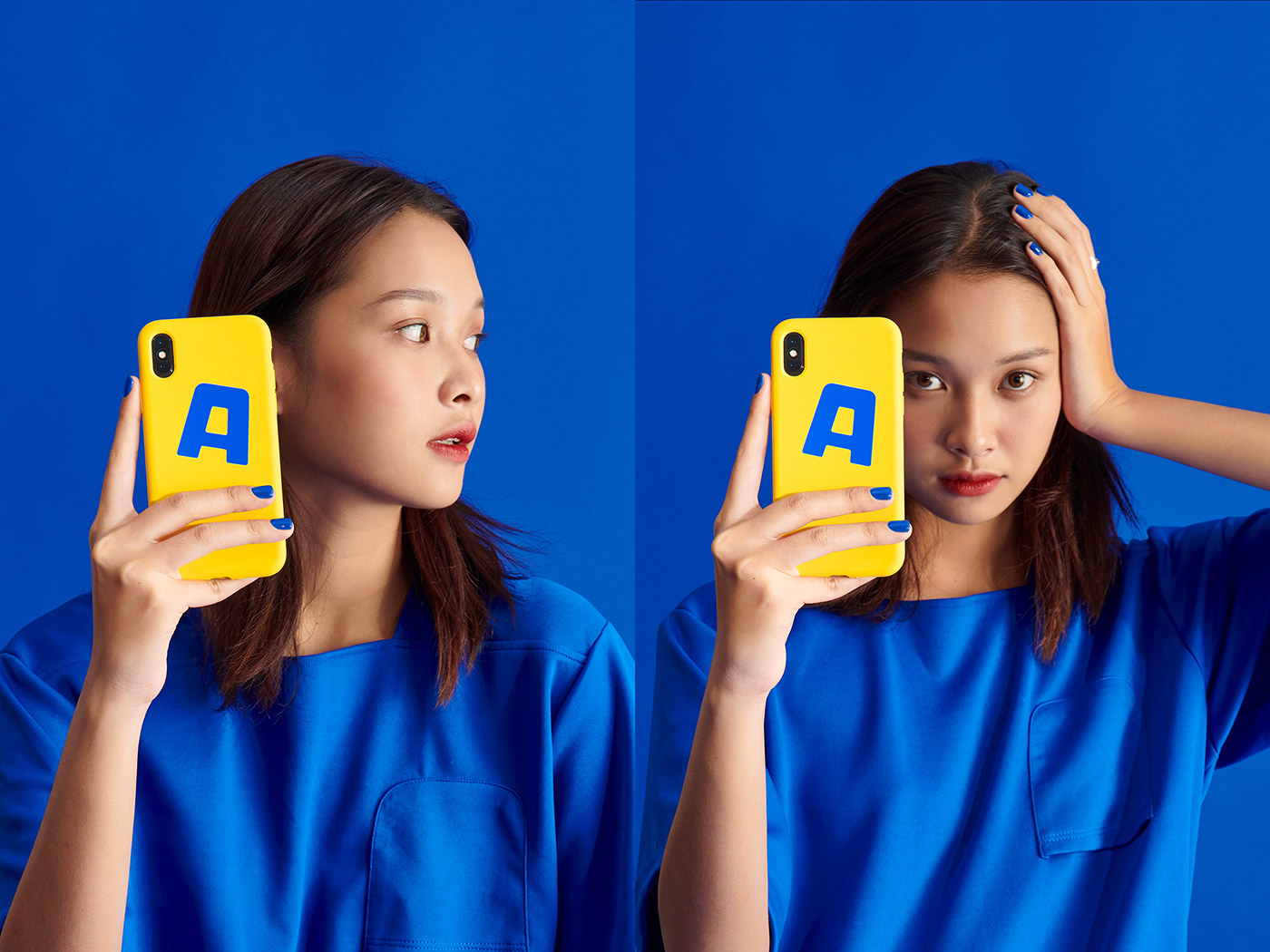
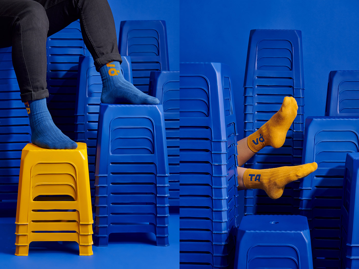
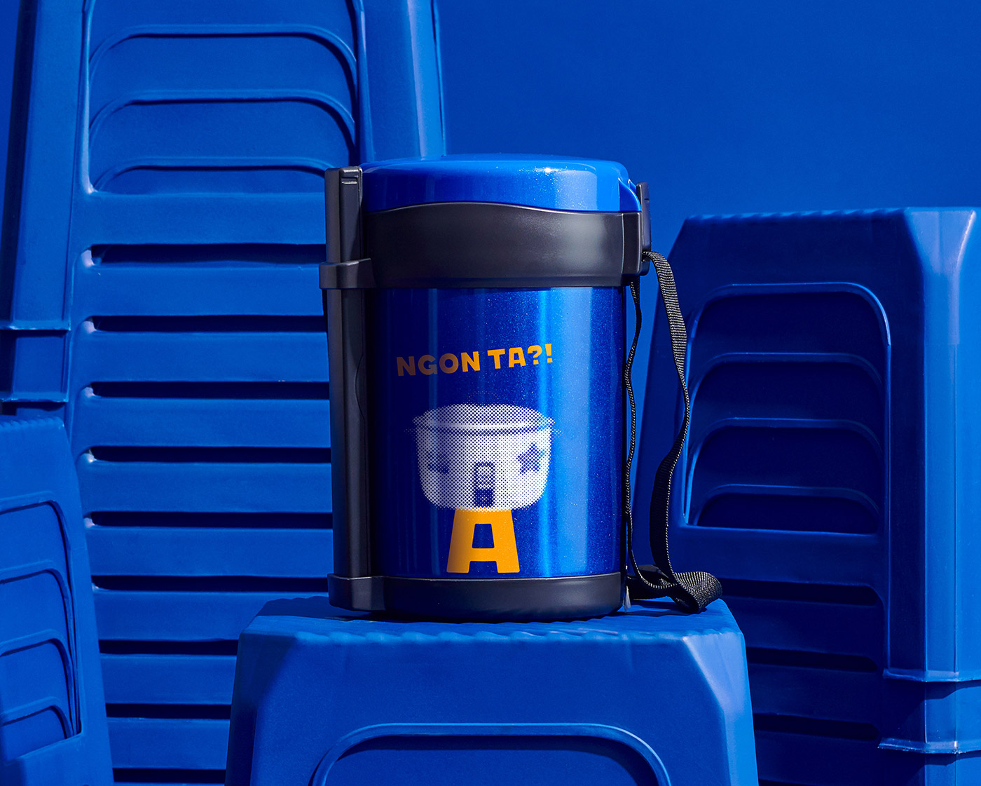
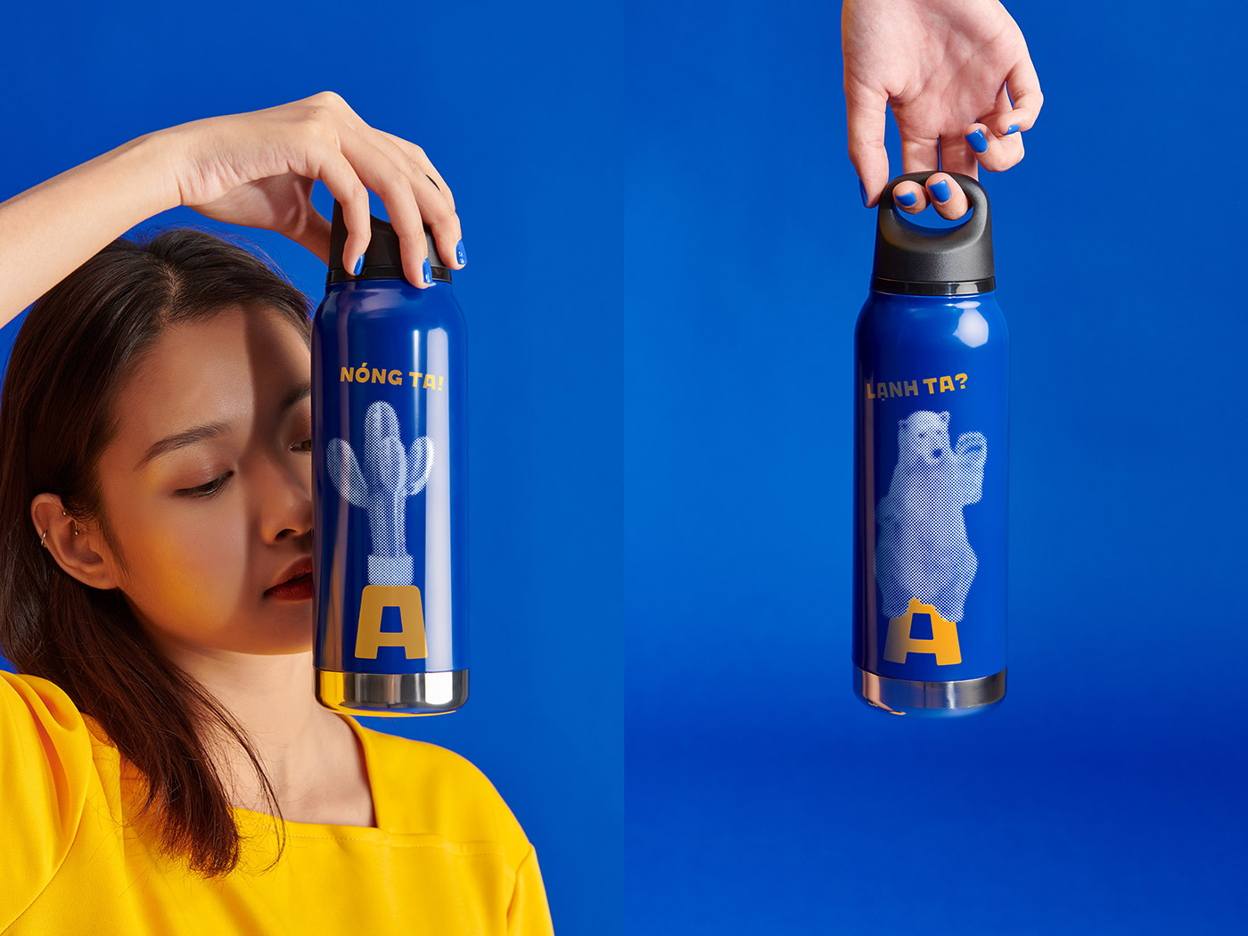
To help with marketing we created a wide range of branded goods such as a keychain tag, phone case, socks, helmet, tumbler, lunchbox, and even a lighter.


M — N Associates elsewhere on Identity Designed: JUS.
In ấn Anpic In nhãn mác Anpic In brochure Anpic In card visit Anpic In catalogue Anpic In thiệp cưới Anpic In tờ rơi Anpic
In Ấn Anpic – Nổi Tiếng In Đẹp In Nhanh
Số 5 Ngõ 75 Nguyễn Xiển, Thanh Xuân, Hạ Đình, Hà Nội
0963223884
baogiainananh@gmail.com
https://anpic.vn
https://g.page/inananpic
In nhãn mác Anpic ✅ In brochure Anpic ✅ In card visit Anpic ✅ In catalogue Anpic ✅ In thiệp cưới Anpic ✅ In tờ rơi Anpic
https://anpic.vn/in-nhan-mac-dep
https://anpic.vn/in-brochure
https://anpic.vn/in-an
https://anpic.vn/in-voucher-in-phieu-giam-gia-khuyen-mai
#inananpic


Comments
Post a Comment