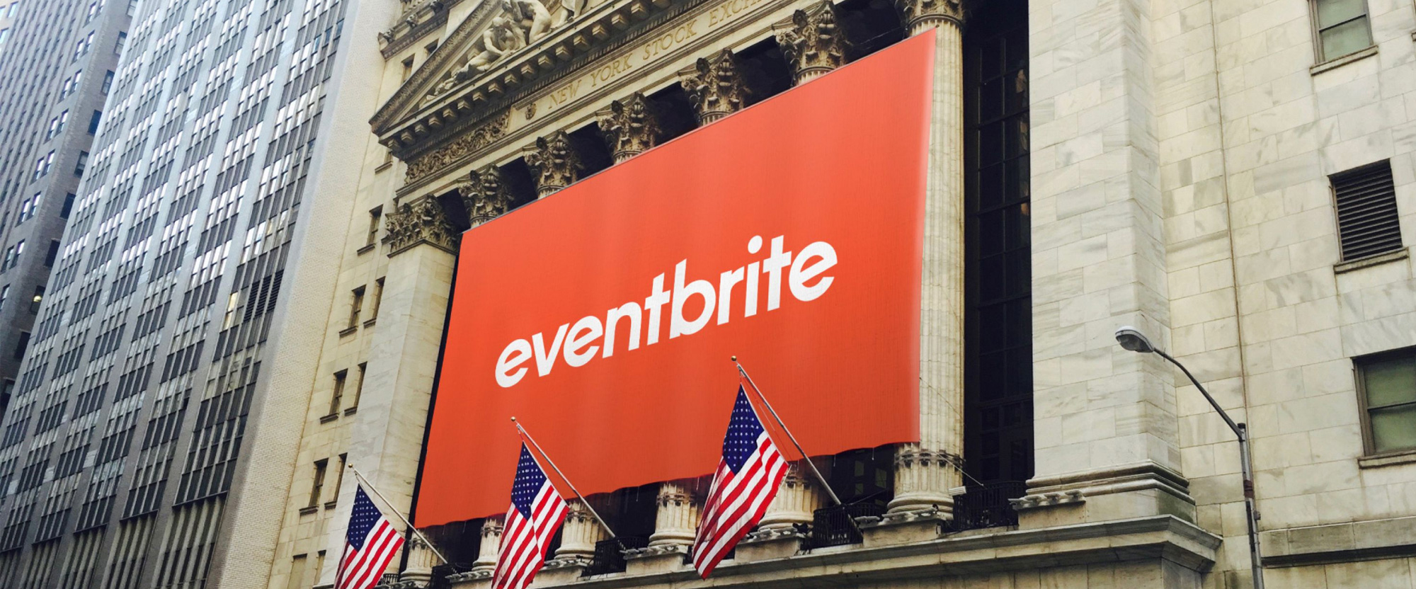
Noted: Follow-up: New Logo and Identity for Eventbrite by Moving Brands
“The Present Looks Tepidly Lit”

(Est. 2006) "Eventbrite is the world's largest ticketing and event technology platform, powering millions of events in 180 countries in 2017. We build technology that allows anyone to create, share, find and attend events of all kinds. Music festivals, marathons, conferences, hackathons, political rallies, fundraisers, gaming competitions-- you name it, we power it."
Design by
Moving Brands
Related links
Moving Brands project page
2016 Brand New Noted post
2018 Brand New Noted post
Relevant quote
The new visual identity builds on Eventbrite’s existing equity, adding ingredients where needed to create distinctive marketing executions and a rich digital experience.
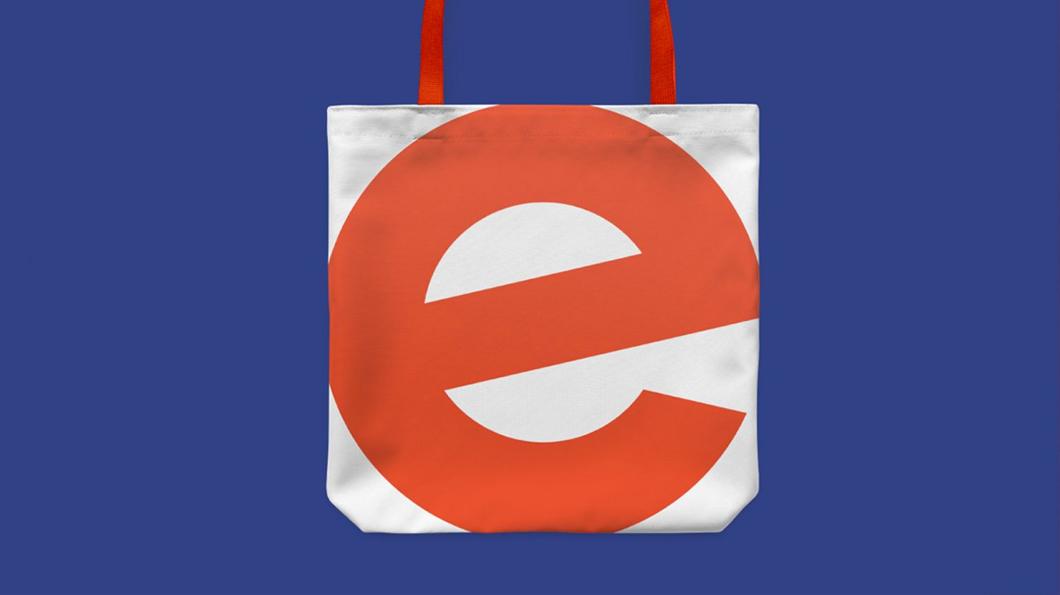
Moving Brands created an animated wordmark and a short-form ‘e’ to ensure the brand can be identified at any scale. A new system of core and complementary identity ingredients maintains consistency in key communications, but also gives Eventbrite the ability to flex, in a controlled way, to meet the mood of any event.
Images (opinion after)


Opinion
I’ll begin this opinion by quoting myself from the 2018 post: “Unlike the previous redesign that I couldn’t even, with this one I would actually like to see more of it.” Ask and ye shall receive… 18 months later as only now was the work approved for publishing. The title of the 2018 post was “The Future Looks Brite” since I liked the logo evolution and it seemed like there was a promise that the identity around it could be good and, well, as the title of this post suggests, the result (the present) is not super exciting but it’s not bad either. The identity elements are a little awkward and random, from the everything-goes color palette to the combination of a condensed sans serif and a relatively wide sans serif that don’t quite go together or complement the logo in a beneficial way. The use of illustration or photography or solid color backgrounds feels like the premise behind the identity is “Do whatever you want, but not too much of any one thing”. It’s almost like a non-identity as there isn’t a real hook that ties everything together but, at the same time, everything looks fine, which is very un-Moving Brands-like. The few instances where I have used Eventbrite to register for events I have to say that the overall experience is much improved and the website feels lighter and peppier but I think that’s just from better UI/UX than any overarching identity philosophy, which I guess is fine and, most importantly, it’s not whatever mess it was before 2018.
In ấn Anpic In nhãn mác Anpic In brochure Anpic In card visit Anpic In catalogue Anpic In thiệp cưới Anpic In tờ rơi Anpic
In Ấn Anpic – Nổi Tiếng In Đẹp In Nhanh
Số 5 Ngõ 75 Nguyễn Xiển, Thanh Xuân, Hạ Đình, Hà Nội
0963223884
baogiainananh@gmail.com
https://anpic.vn
https://g.page/inananpic
In nhãn mác Anpic ✅ In brochure Anpic ✅ In card visit Anpic ✅ In catalogue Anpic ✅ In thiệp cưới Anpic ✅ In tờ rơi Anpic
https://anpic.vn/in-nhan-mac-dep
https://anpic.vn/in-brochure
https://anpic.vn/in-an
https://anpic.vn/in-voucher-in-phieu-giam-gia-khuyen-mai
#inananpic
Comments
Post a Comment