Noted: New Logo and Identity for 26th UN Climate Change Conference by Johnson Banks
“A Marble to Behold”
(Est. 1995 in Berlin) "The United Nations Climate Change Conferences are yearly conferences held in the framework of the United Nations Framework Convention on Climate Change (UNFCCC). They serve as the formal meeting of the UNFCCC Parties (Conference of the Parties, COP) to assess progress in dealing with climate change, and beginning in the mid-1990s, to negotiate the Kyoto Protocol to establish legally binding obligations for developed countries to reduce their greenhouse gas emissions. From 2005 the Conferences have also served as the "Conference of the Parties Serving as the Meeting of Parties to the Kyoto Protocol" (CMP); also parties to the Convention that are not parties to the Protocol can participate in Protocol-related meetings as observers. From 2011 the meetings have also been used to negotiate the Paris Agreement as part of the Durban platform activities until its conclusion in 2015, which created a general path towards climate action." (Wikipedia)
Design by
Johnson Banks (London, UK)
Animation: The Mill (London, UK)
Related links
Johnson Banks project page
Relevant quote
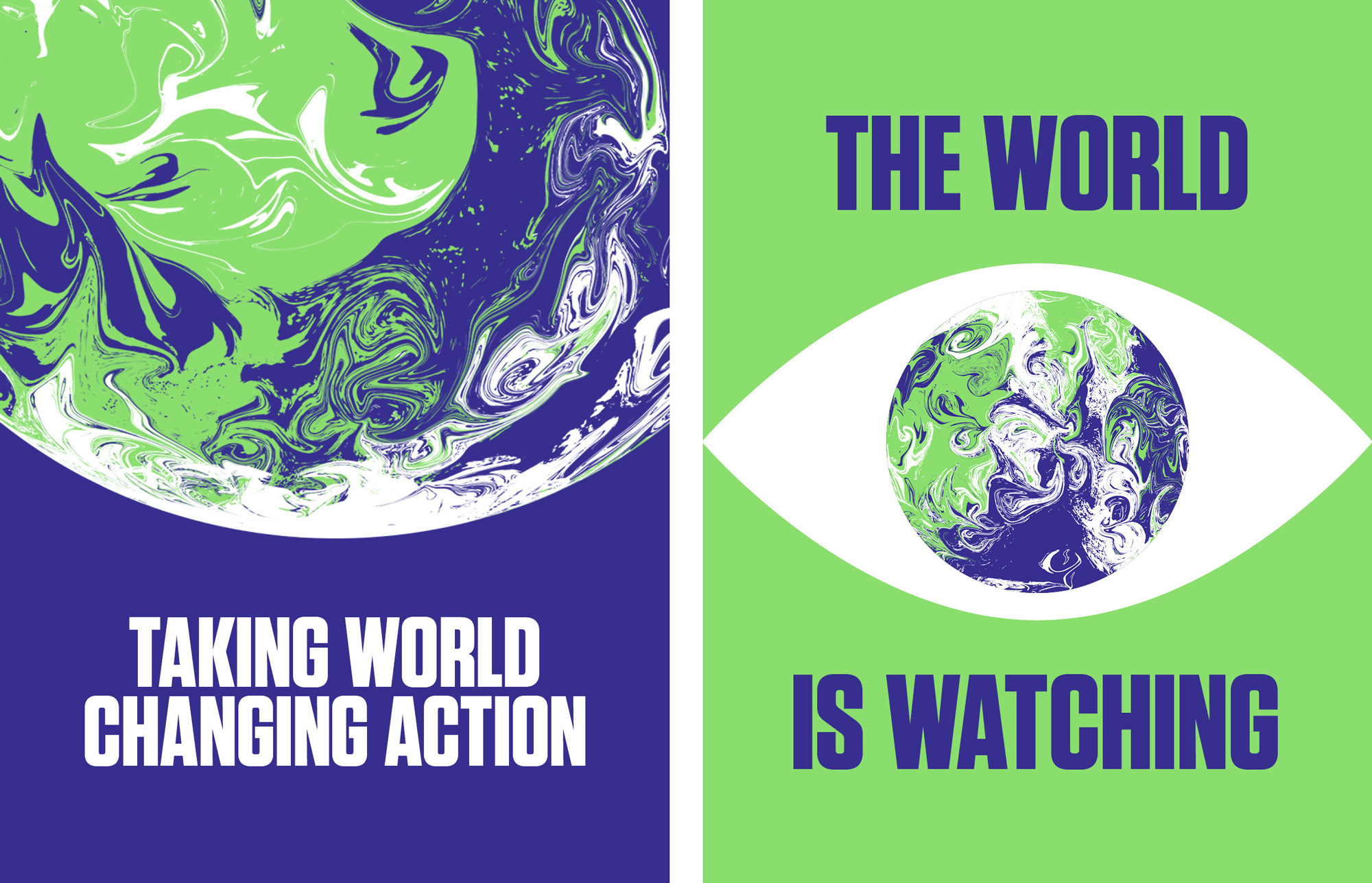
After an extensive design exploration, a route that began as a marbled green and blue sphere became the clear favourite. The swirling coloured globe illustrates that the climate has no borders, alludes to currents and weather systems – and is intentionally beautiful. It deliberately avoids directly using recognisable country shapes and is designed to fascinate people, wake them up and compel them to take urgent action to save our precious planet.
Images (opinion after)


Opinion
Looking at the history of logos for the conference, it’s pretty clear that it’s a free-for-all — and, hey, look, there is the COP15 I reviewed 11 years ago — which is not a bad thing, it just means that there can be some pretty awful things. Last year’s Chile/Madrid combo had an interesting concept with the shape of Chile acting as a dial on a ring of doom I suppose. Weird but interesting. Lame type though. The new logo continues the free-for-all-ness as the conference comes to Glasgow in 2020 with a marbled globe image that’s fairly striking… at its best looking like marbled paper — at its worst like someone just discovered the Photoshop Twirl filter. Despite the cheap Photoshop jab, I do like this, both in its concept and execution that convey that this is a problem across borders and that, well, the earth is fucking melting. In motion, and with The Mill involved, the logo is kind of underwhelming… I think this could be a whole lot more dramatic in its swirling effect. The wordmark is nice and condensed to accommodate the long name. I would have added a little more space between words because I keep reading “Un-climate Change…” instead of “U.N. Climate Change…”. I really like the applications where the globe is extra large and bleeding off the edges and the simple color palette is quite effective. I wasn’t too sold on the whole project until I saw the podium/backdrop application directly above — as the visuals have a very impressive impact. Overall, this is a great take on an identity that will live only for a year; it doesn’t have to be timeless so it can act almost more like a campaign, and it works great with that in mind.
In ấn Anpic In nhãn mác Anpic In brochure Anpic In card visit Anpic In catalogue Anpic In thiệp cưới Anpic In tờ rơi Anpic
In Ấn Anpic – Nổi Tiếng In Đẹp In Nhanh
Số 5 Ngõ 75 Nguyễn Xiển, Thanh Xuân, Hạ Đình, Hà Nội
0963223884
baogiainananh@gmail.com
https://anpic.vn
https://g.page/inananpic
In nhãn mác Anpic ✅ In brochure Anpic ✅ In card visit Anpic ✅ In catalogue Anpic ✅ In thiệp cưới Anpic ✅ In tờ rơi Anpic
https://anpic.vn/in-nhan-mac-dep
https://anpic.vn/in-brochure
https://anpic.vn/in-an
https://anpic.vn/in-voucher-in-phieu-giam-gia-khuyen-mai
#inananpic


Comments
Post a Comment