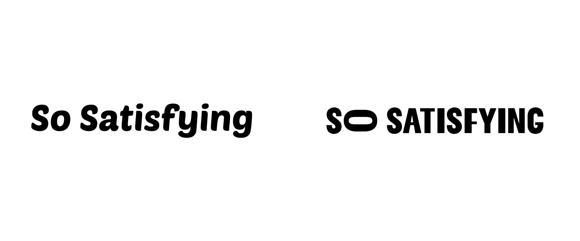
Noted: New Logo and Identity for So Satisfying by Vault49
“(I Can Get Some) Satisfaction”

So Satisfying is an ASMR (autonomous sensory meridian response) content provider that creates original content and curates videos from an exclusive group of content partners. Their channel content is viral, entertaining and brain tingling. So Satisfying is part of IMGN, a tech- media company specialized in producing and programming social content for Gen Z audiences that owns and operates a portfolio of 14 distinct media brands with an overall reach of +40 million followers.
Design by
Vault49 (New York, NY; London, UK)
Related links
N/A
Relevant quote
The core of the strategic and creative idea came from the sensorial effect the videos create. Chandler adds: “We used our in-house CGI artists and animators to create bespoke ASMR content to inspire and work in conjunction with our identity. Playfully animated statements describe the ASMR experience, and surreal, captivating 3D scenes mesmerize the viewer.”
“‘So’ is the unique part of the name – other brands in the ASMR space also use the word ‘satisfying’ within their name.
“‘So’ is also an emotional, descriptive word, therefore we wanted to give it more emphasis – it’s not just satisfying, it’s sooooooo satisfying.
“We explored various creative ways of capturing the emphasis on the word ‘o’ and landed on simply stretching it. It is represented fully in its animated form, and as the brand exists largely in the digital space it was essential for us to bear this in mind from the very beginning.
“The identity is expressed across printed comms and interior spaces, where we can use architecture or clever paper engineering to stretch the ‘o’ in different ways.”
Images (opinion after)


Opinion
If you are wondering who in the world watches ASMR stuff, that would be my 9-year-old daughter and… me. Whenever she’s watching clips like these on the TV I always stop to watch. It’s almost involuntary and, indeed, so satisfying. So… the old logo… I don’t think it counts much as a logo; more like someone chose a font for the website and it stuck. The new logo hints at the quirkiness of the content with the irregular sans serif and the rotated, elongated “O”, which is kind of charming and clever as a way of trying to translate visually when you say “Sooooo”. It’s satisfying enough and more so when it stretches in physical applications. In digital applications, though, where this could thrive, it feels like it’s halfway there — the “TINGLE” animation gets close to evoking that satisfying feeling but it’s not nearly enough, nor are the 3D clips. I think this could be pushed tenfold in terms of animations and behaviors. I would give this 6 “o”s out of 10, like soooooo.
In ấn Anpic In nhãn mác Anpic In brochure Anpic In card visit Anpic In catalogue Anpic In thiệp cưới Anpic In tờ rơi Anpic
In Ấn Anpic – Nổi Tiếng In Đẹp In Nhanh
Số 5 Ngõ 75 Nguyễn Xiển, Thanh Xuân, Hạ Đình, Hà Nội
0963223884
baogiainananh@gmail.com
https://anpic.vn
https://g.page/inananpic
In nhãn mác Anpic ✅ In brochure Anpic ✅ In card visit Anpic ✅ In catalogue Anpic ✅ In thiệp cưới Anpic ✅ In tờ rơi Anpic
https://anpic.vn/in-nhan-mac-dep
https://anpic.vn/in-brochure
https://anpic.vn/in-an
https://anpic.vn/in-voucher-in-phieu-giam-gia-khuyen-mai
#inananpic
Comments
Post a Comment