Noted: New Logo and Identity for Tilix by BR / BAUEN
“If I Could Turn Back Time”
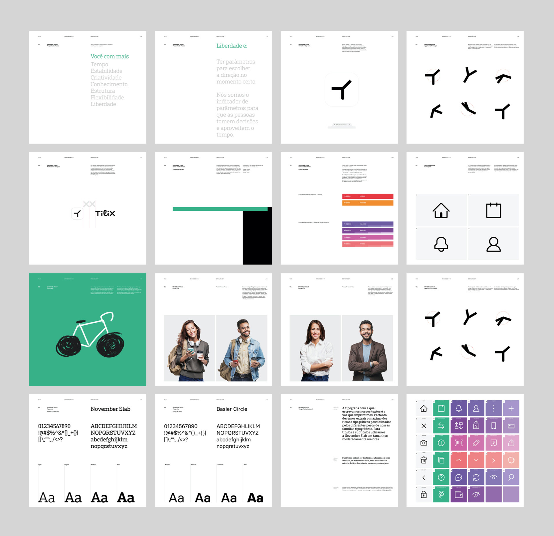
(Est. 2017) Owned by PagSeguro, Tilix is a fintech app that offers a simplified bill payment system in Brazil. A further explanation from the designers: "In Brazil there is a payment method called 'boleto' (ticket), which is an invoice with a barcode you can scan on your mobile device and pay for it. Tilix scans those 'boletos' in your e-mail and organizes them by due date, you can also save receipts etc."
Design by
BR / BAUEN (Goiânia, Brazil)
Related links
BR / BAUEN project page
Relevant quote
Through a deep understanding of the path forward, we understood that Tilix's contribution to the financial sector was not simply about organizing one's bills and payments - Tilix's way forward is to optimize people's time through thorough and simplified finance organization - that was the main insight to design Tilix's app icon: a watch that rotates backwards - the symbol animation speed was developed following the movement proportions of analog watches.
Images (opinion after)
Opinion
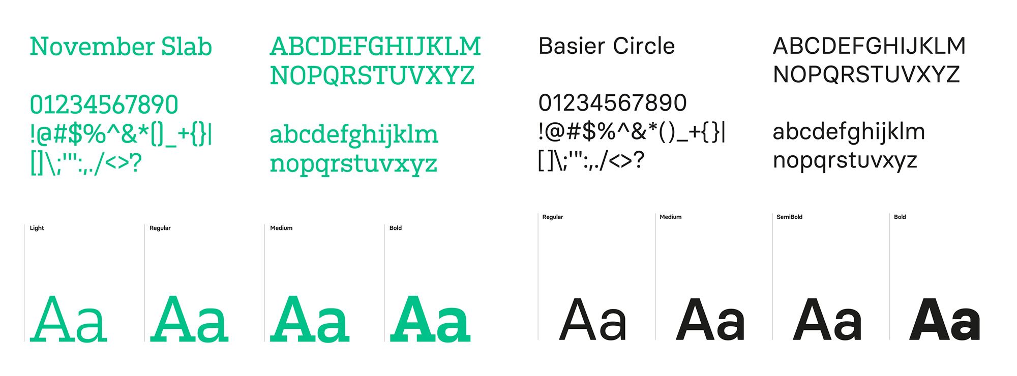
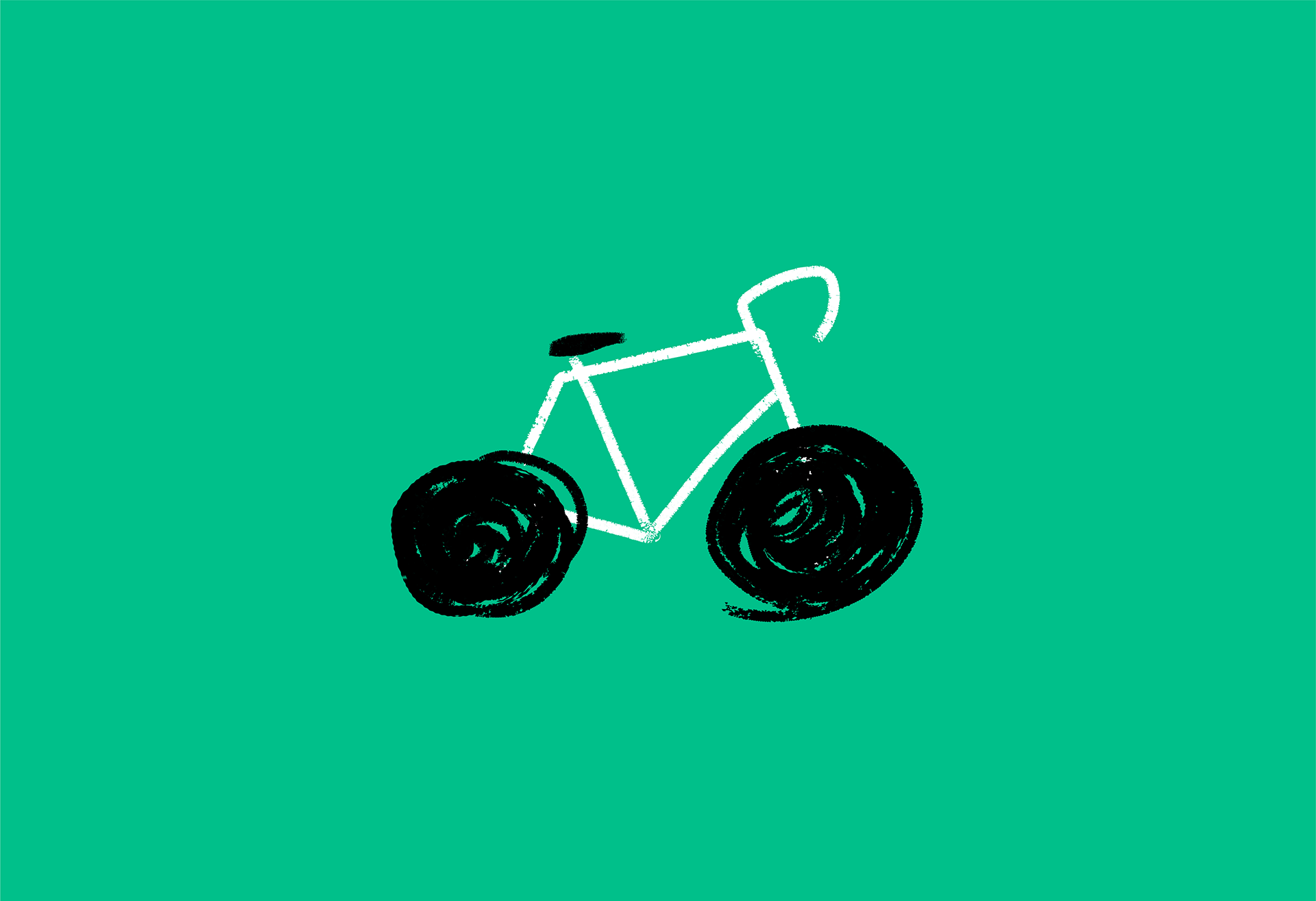
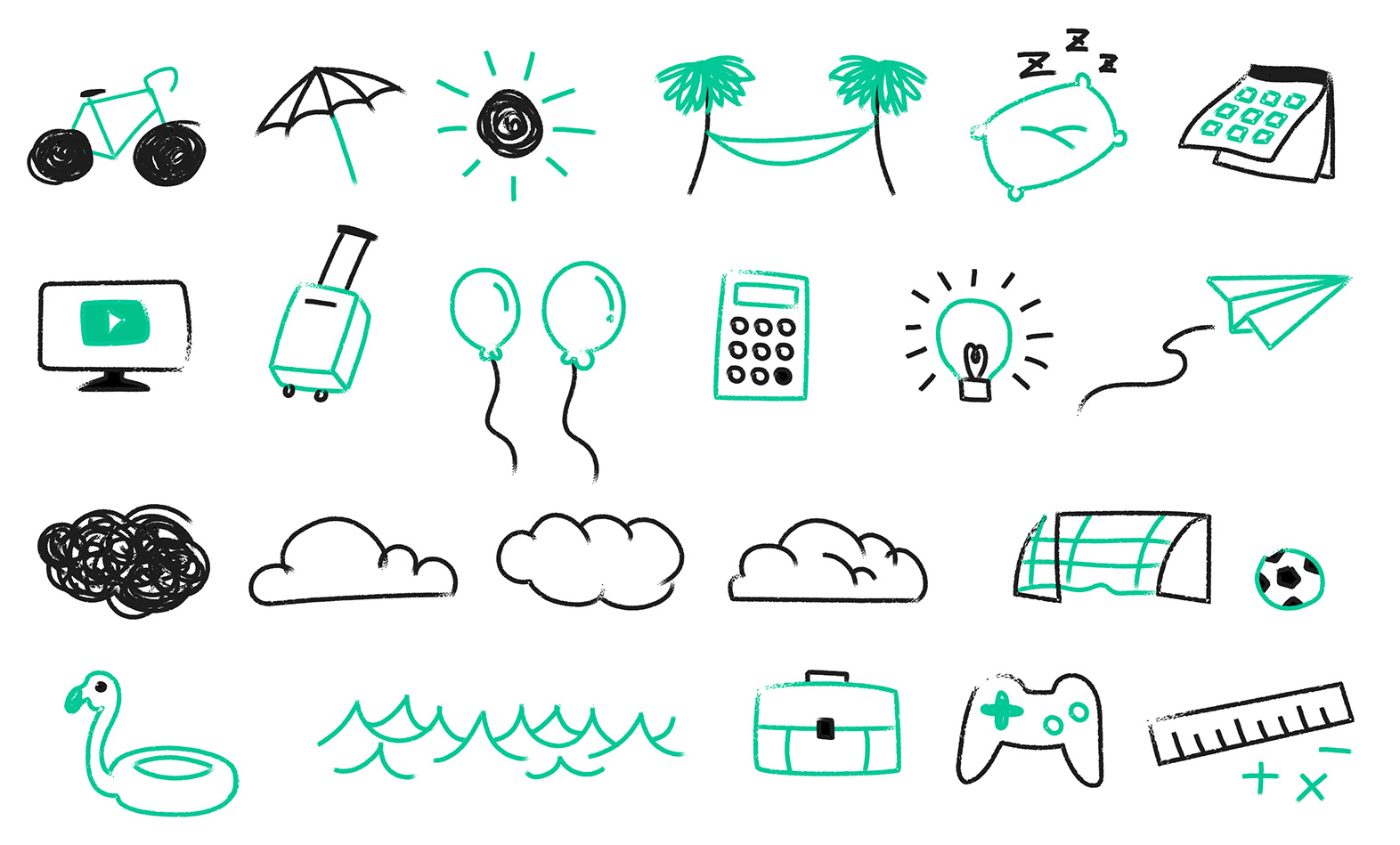
The old logo was almost inoffensive with its techie rounded sans serif wordmark but it was also pretty bad with its terrible kerning that read as “t ili x” and the “ili” companion in a circle was a weird standalone component. The new wordmark… it’s hard to tell what in the world is going on or why it is the way that it is — the project page explains that it came from the “t” being a plus sign and the “x” a multiply sign in earlier renditions, which no one would know from looking at the final design — but for some weird reason I really, really like it. There is a strange symmetry (not mirrored obviously) created by the two “i”s and the “T” and “X” being the same height and width, while the script “l” bridges the two sides but only connects on one. I dunno… I just viscerally like it. Even the weird curved bottoms and flat tops are interesting. The app icon, I like the idea that it’s the hours/minutes/seconds hands of a clock and that it animates backward to signify saving time but there is something flimsy about it… like it needs something to give it more body or presence. I do like how it animates into the full logo. Not much in application other than the website, which is fine, but the identity elements all seem enjoyable: typography choices are solid, color palette is simple and finance-y, and the illustrations are charming. It would have been cool to see some more of the weirdness from the logo bubble up to the identity somehow but maybe that would have been too much for an app that’s meant to handle all your bill payments, so the more conservative approach seems reasonable.
In ấn Anpic In nhãn mác Anpic In brochure Anpic In card visit Anpic In catalogue Anpic In thiệp cưới Anpic In tờ rơi Anpic
In Ấn Anpic – Nổi Tiếng In Đẹp In Nhanh
Số 5 Ngõ 75 Nguyễn Xiển, Thanh Xuân, Hạ Đình, Hà Nội
0963223884
baogiainananh@gmail.com
https://anpic.vn
https://g.page/inananpic
In nhãn mác Anpic ✅ In brochure Anpic ✅ In card visit Anpic ✅ In catalogue Anpic ✅ In thiệp cưới Anpic ✅ In tờ rơi Anpic
https://anpic.vn/in-nhan-mac-dep
https://anpic.vn/in-brochure
https://anpic.vn/in-an
https://anpic.vn/in-voucher-in-phieu-giam-gia-khuyen-mai
#inananpic


Comments
Post a Comment