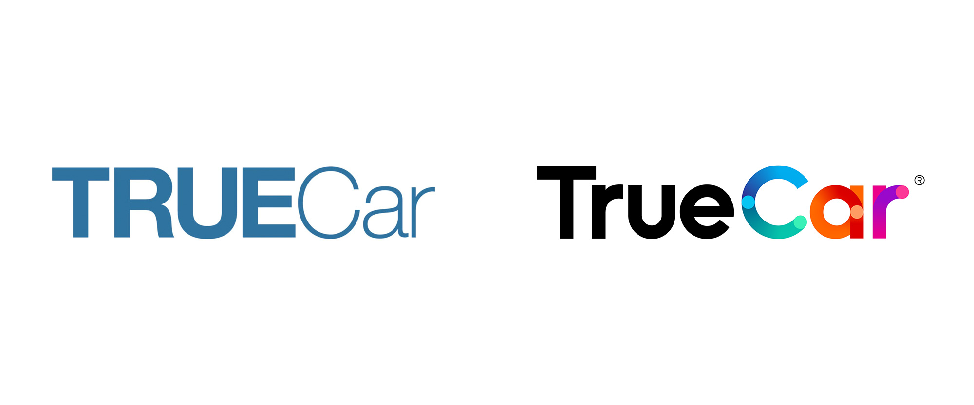
Noted: New Logo and Identity for TrueCar by Pentagram
“Show One’s True Colors”

(Est. 2005) "TrueCar, Inc. exists to create a world where shopping for a car is uplifting. Our digital automotive marketplace helps car shoppers consider choices from every angle--all with a clear view of what's a great deal. We show you price ratings for new and used cars. We provide this information so you can feel confident in the upfront, discounted price you'll pay at the dealership. If you need a fast and easy way to trade in your car, you can get a cash offer in minutes. Our national network of over 16,500 Certified Dealers shares our belief that truth, transparency and fairness are the foundation of a great car buying experience. As part of our marketplace, TrueCar powers car-buying programs for over 250 leading brands, including USAA, Sam's Club, and American Express. Nearly half of all new-car buyers engage with TrueCar powered sites, where they buy smarter and drive happier."
Design by
Pentagram (Michael Gericke, partner; New York, NY)
Illustration: NiceShit Studios (Barcelona)
Animation: Hornet/Moth (New York)
Related links
Pentagram project page
TrueCar blog post
Relevant quote
The redesign evolves TrueCar into a contemporary brand with a friendly, approachable personality that is straightforward, open and honest. The branding connects people to the experience of finding the car they love, helping them navigate the process.
This idea is captured in the vibrant new TrueCar logo, a custom wordmark that renders the word “car” in dynamic typography that captures a sense of movement, freedom and making a change. The colorful logo evokes TrueCar’s many choices and options, and sets the brand apart from the blue typically used by its competitors.
The new messaging focuses on making an emotional connection with consumers and recreating the feeling they have about their cars and the importance they play in their lives. Advertising campaigns emphasize this relationship using warm, playful photography and illustration. Rather than highlight individual automobiles, the branding shows the special role cars play in the important moments in our lives and how TrueCar helps make them happen.
Images (opinion after)


Opinion
The old logo was super dry, from the bold/light Helvetica choice to the drab blue selected, looking more like a regional healthcare provider than an enticing web shopping platform. The new logo is a lot happier, friendlier, and more inviting, with an expected but timely geometric sans serif wordmark that has been adorned with gradients and dots to convey the idea of movement — both literal and metaphorical — from A to B. I don’t find the solution very interesting or attractive but I think it suits the company well... there isn’t any passive-aggressiveness in that statement — it’s colorful and welcoming and, sure, I would buy a car from there. The logo animation is pretty slick. The logo reminded me of both Waymo and HiyaCar, which isn't a condemnation of any sort, just interesting that all three are in the “car” realm. In application, there is the introduction of a light sans serif, Radikal, that I’m not sure it works well but I’m also not convinced it doesn’t work. Then there are the obligatory faceless people illustrations that, yeah, I just can’t even anymore with these. Strangely enough, for the more advertising-y spots, there are some really nice, textured illustrations and people with, gasp, faces that, even though they don’t actually relate any better or worse to the logo, are at least far more interesting. Overall, this goes in one or two too many directions and while appropriately peppy on the surface it doesn’t really do much that’s newly interesting or memorable.
In ấn Anpic In nhãn mác Anpic In brochure Anpic In card visit Anpic In catalogue Anpic In thiệp cưới Anpic In tờ rơi Anpic
In Ấn Anpic – Nổi Tiếng In Đẹp In Nhanh
Số 5 Ngõ 75 Nguyễn Xiển, Thanh Xuân, Hạ Đình, Hà Nội
0963223884
baogiainananh@gmail.com
https://anpic.vn
https://g.page/inananpic
In nhãn mác Anpic ✅ In brochure Anpic ✅ In card visit Anpic ✅ In catalogue Anpic ✅ In thiệp cưới Anpic ✅ In tờ rơi Anpic
https://anpic.vn/in-nhan-mac-dep
https://anpic.vn/in-brochure
https://anpic.vn/in-an
https://anpic.vn/in-voucher-in-phieu-giam-gia-khuyen-mai
#inananpic
Comments
Post a Comment