Noted: New Logo and Packaging for Denver Distillery by O Street
“A Tear Drop in the Bucket”
(Est. 2018) "In the historic Baker neighborhood, Denver Distillery is the city's first distillery-pub in town. Denver Distillery's spirits evoke a feeling of historic Denver, the 'Queen City of the Plains'. Our hand-built stills and old world techniques pull out the unique subtleties from the finest regionally sourced, non-GMO ingredients giving our spirits flavors that haven't been experienced since the 1800s."
Design by
O Street
Related links
O Street project page
Relevant quote
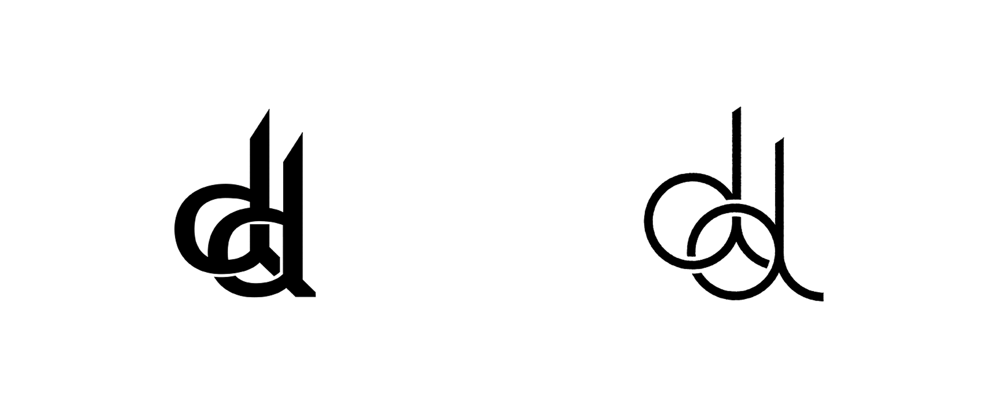
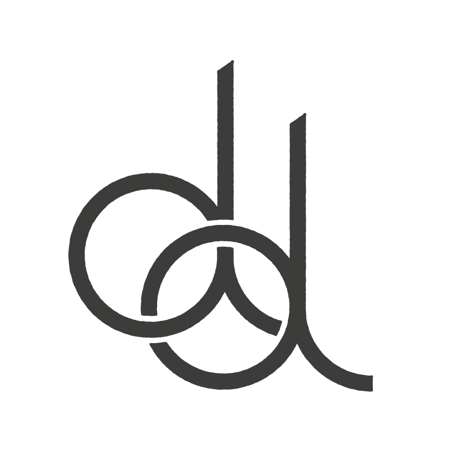
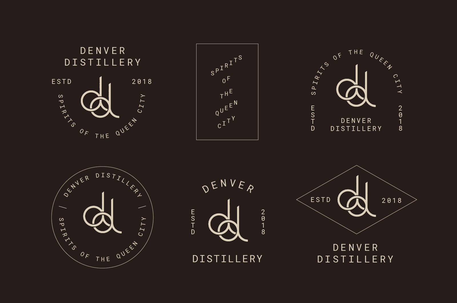
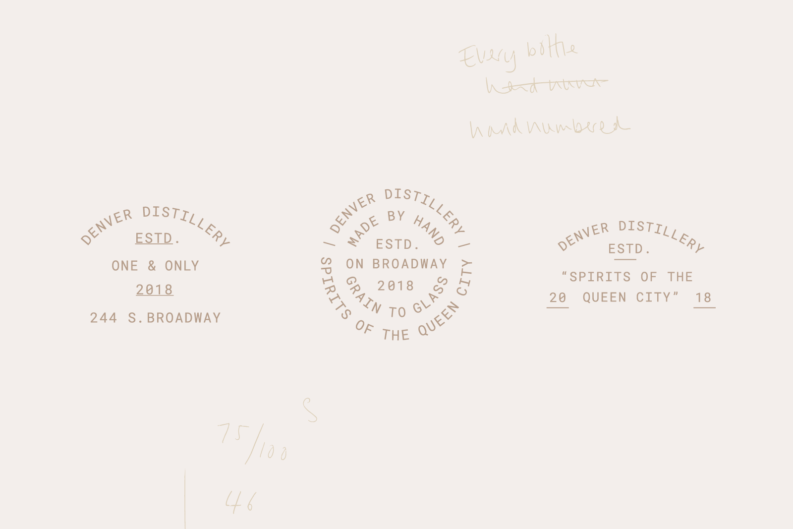
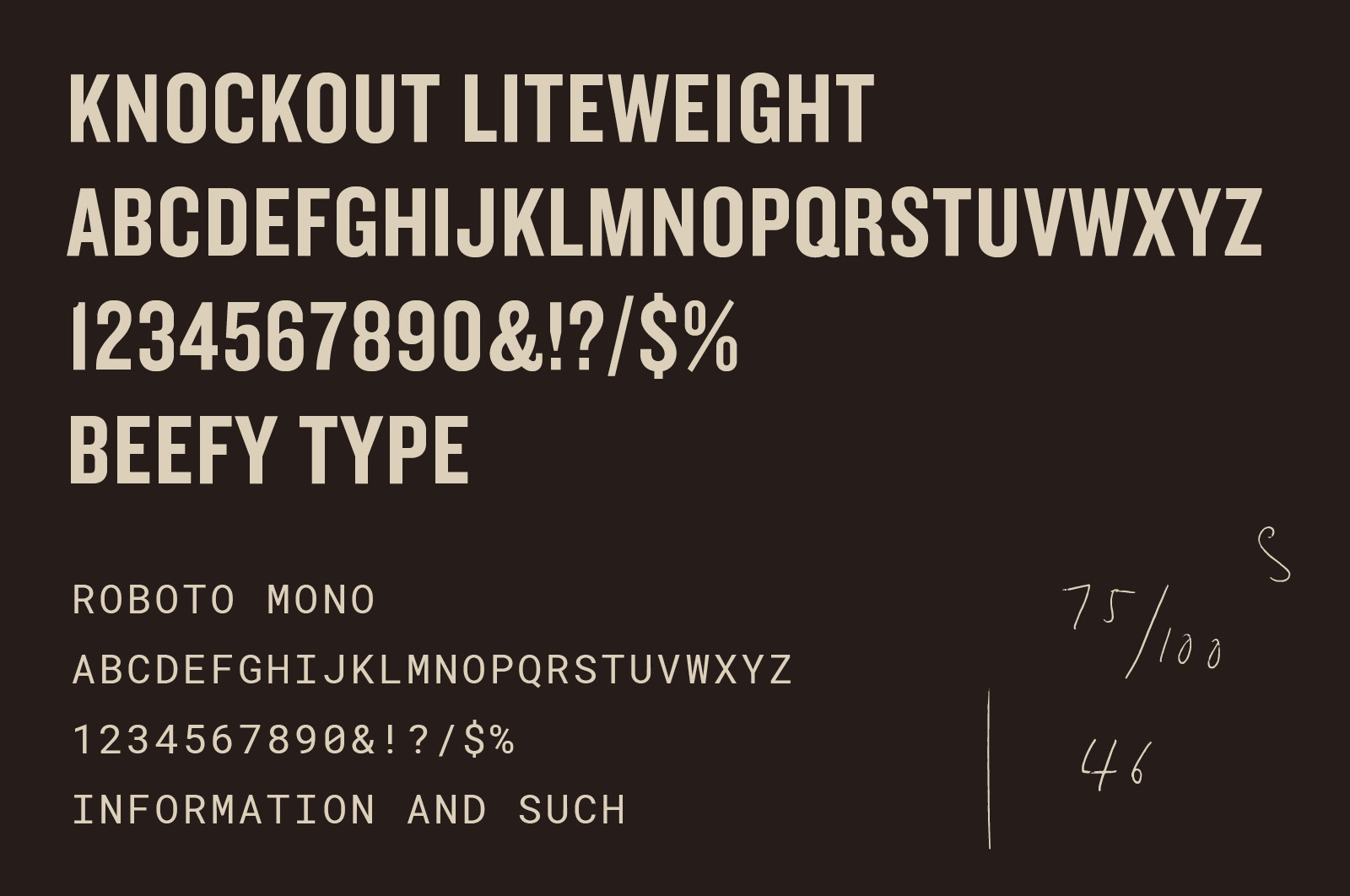
The first task was to reflect the value of handcrafting in their brand. O Street redrew their logo, drawing on the sculpted iron version that appears over the doorway to the distillery. Working with the distillery’s historic working-class neighborhood, O Street then specified typography and designed a suite of logo lockups with an appropriate feel.
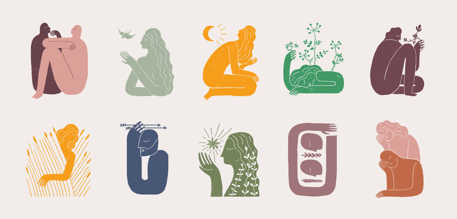
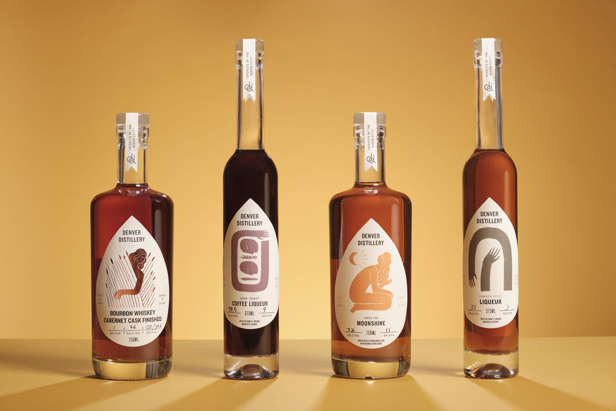
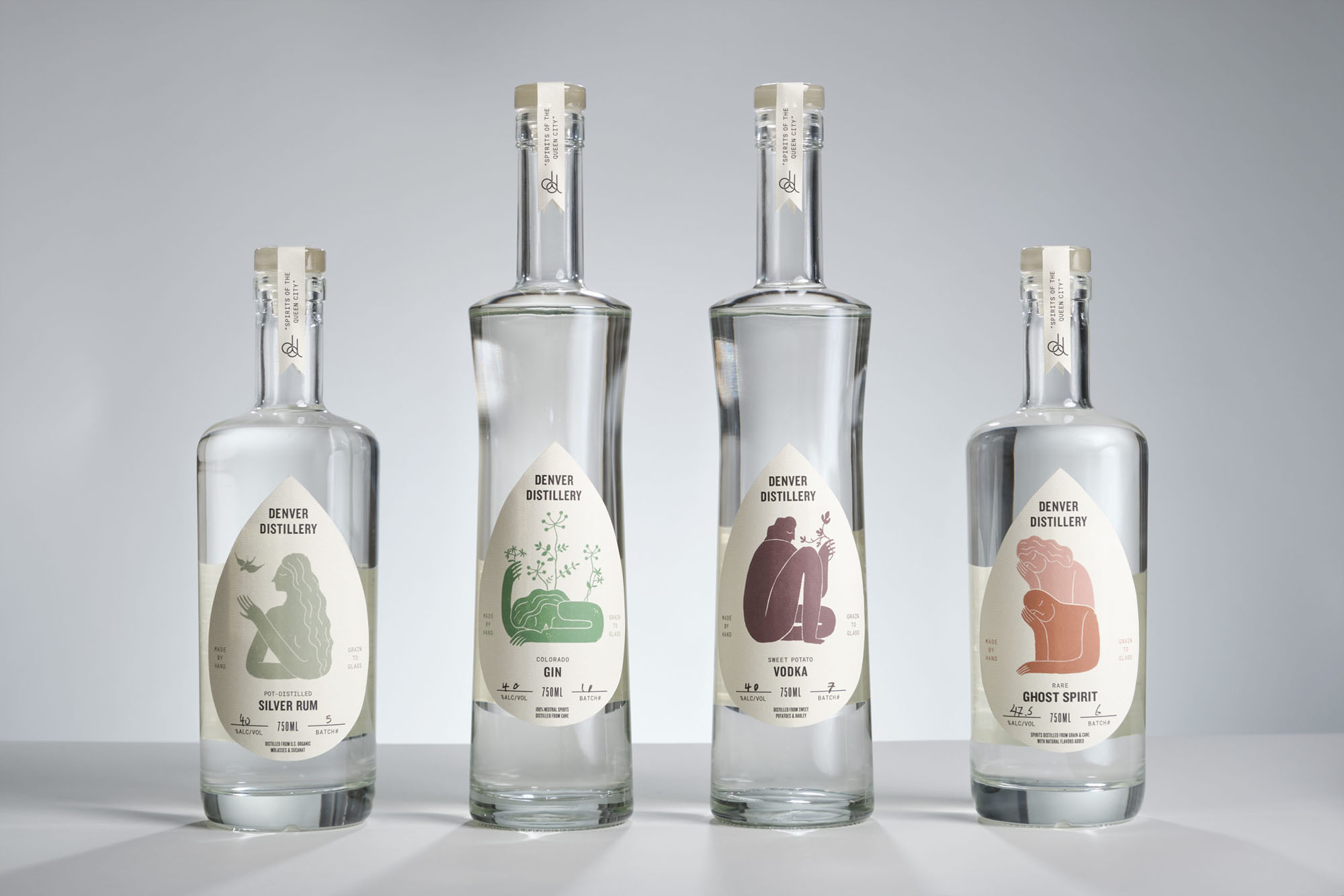
Denver Distillery’s charismatic owner Ron Tarver and his wider team, are deeply interested in the stories and art that “define the human condition and experience”. The studio, led by Design Director (and part-time illustrator) Josh Peter, used this as a concept behind the packaging, capturing the spirit of lore and legend through a multitude of hand painted illustrations. With help from the distillery’s marketing manager Jen Anderson-Tarver—who happens to be an art history aficionado—each piece of art was then paired with a spirit.
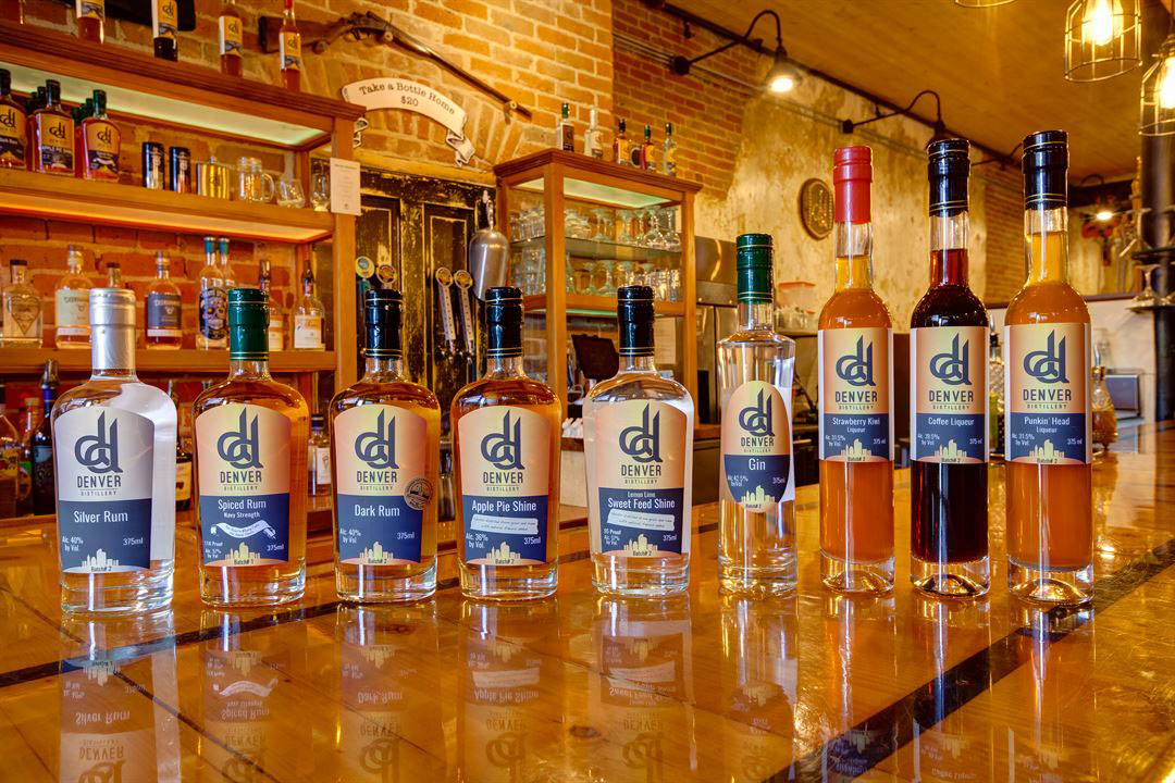
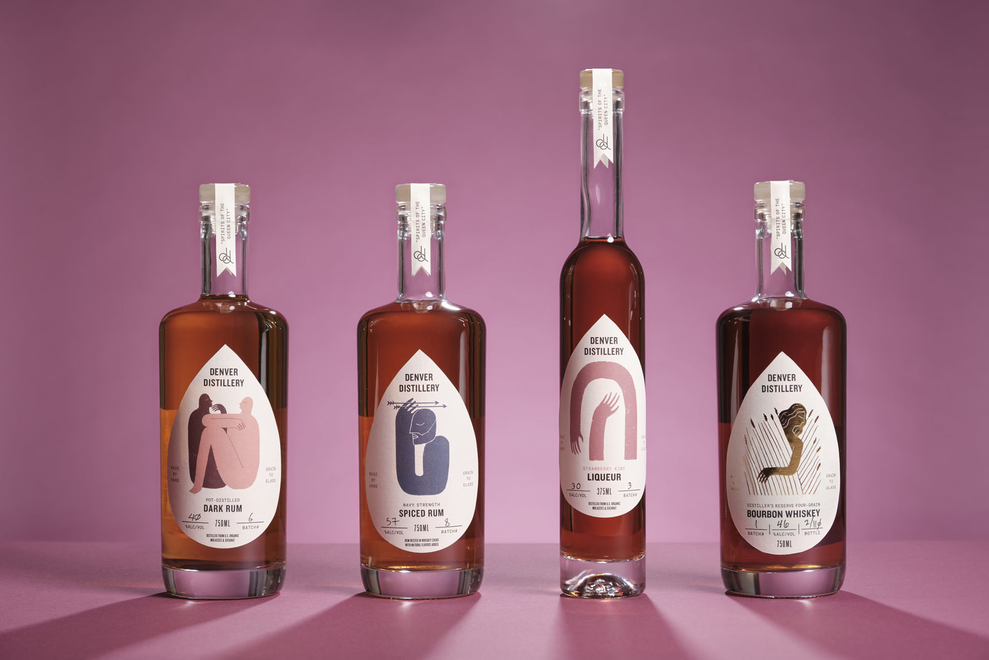
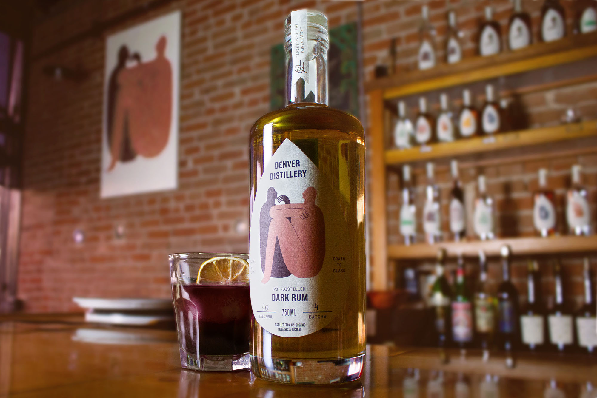
Then came the bottles. The distillery employs three different bottle shapes and produces over a dozen unique spirits, from sweet potato vodka to moonshine and small-batch bourbon. O Street helped the distillery organize their product hierarchy to pave the way for a unifying brand structure. As a way of visually unifying these products, they developed a unique layout and die-cut teardrop label shape. The teardrop adds a consistent and familiar shape across the entire range, while also sitting flatter on the concave bottle shapes.
Images (opinion after)

Opinion
I’m not a big fan of the old or new double-“d” monogram but the new one is definitely an improvement with cleaner lines and a better interaction between the two letters. The badges and lock-ups seem somewhat gratuitous… they are very heavy on the awkward-badge trend and it’s 3 or 4 years too late, not to mention that the lock-ups have no real relation to the monogram and much less to the packaging which is when this project gets good. Real good. The old packaging was kind of sad and had a heaviness to it that wasn’t too enticing. The new teardrop-shaped labels do wonders to make the bottles look almost bespoke and it’s a great way to unify the various spirits offered and the three different bottle shapes. A lovely range of illustrations take center stage on each label and the typography is neatly arranged around it while accentuating the label’s contour. Overall, the packaging redesign is so successful that it probably would have been good to rethink the logo based on where they landed on that instead of trying to hold on to the monogram.
In ấn Anpic In nhãn mác Anpic In brochure Anpic In card visit Anpic In catalogue Anpic In thiệp cưới Anpic In tờ rơi Anpic
In Ấn Anpic – Nổi Tiếng In Đẹp In Nhanh
Số 5 Ngõ 75 Nguyễn Xiển, Thanh Xuân, Hạ Đình, Hà Nội
0963223884
baogiainananh@gmail.com
https://anpic.vn
https://g.page/inananpic
In nhãn mác Anpic ✅ In brochure Anpic ✅ In card visit Anpic ✅ In catalogue Anpic ✅ In thiệp cưới Anpic ✅ In tờ rơi Anpic
https://anpic.vn/in-nhan-mac-dep
https://anpic.vn/in-brochure
https://anpic.vn/in-an
https://anpic.vn/in-voucher-in-phieu-giam-gia-khuyen-mai
#inananpic
Comments
Post a Comment