Noted: New Logo for the State of Oklahoma
“Aim for the Star”

"Oklahoma is a state in the South Central region of the United States. It is the 20th-most extensive and the 28th-most populous of the 50 United States. Its residents are known as Oklahomans (or colloquially, "Okies"), and its capital and largest city is Oklahoma City. The state's name is derived from the Choctaw words okla and humma, meaning "red people". It is also known informally by its nickname, "The Sooner State", in reference to the non-Native settlers who staked their claims on land before the official opening date of lands in the western Oklahoma Territory or before the Indian Appropriations Act of 1889, which increased European-American settlement in the eastern Indian Territory. Oklahoma Territory and Indian Territory were merged into the State of Oklahoma when it became the 46th state to enter the union on November 16, 1907. A major producer of natural gas, oil, and agricultural products, Oklahoma relies on an economic base of aviation, energy, telecommunications, and biotechnology. Both Oklahoma City and Tulsa serve as Oklahoma's primary economic anchors, with nearly two-thirds of Oklahomans living within their metropolitan statistical areas." (Wikipedia)
Design by
Undisclosed local creatives working pro-bono
Related links
Oklahoma brand microsite
The Oklahoman news story
Relevant quote
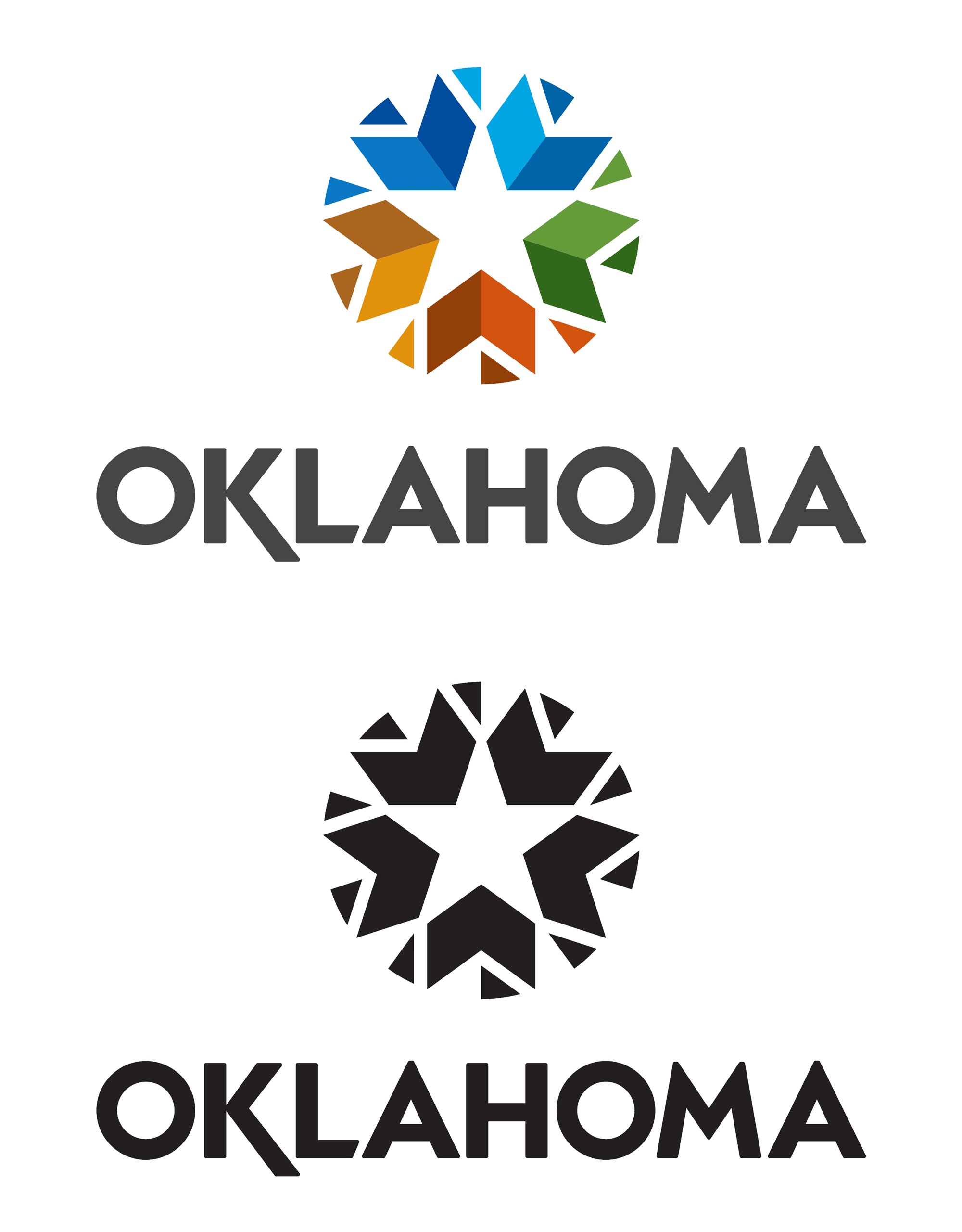
The design of our logo is based on shapes and colors embedded in our history. The form is inspired by our native heritage. It reflects earth, sky, water, agriculture and forest. These colors also speak to the seasons. A white star is a powerful symbol of America which is a part of our state seal and on the original flag of the state. Chevrons acknowledge our military. These elements form a circle and direct their energy inward, dramatizing Oklahoma as a hub at the center of America. This symbol invites everyone to join us here in an embracing community, to take in countless unexpected experiences and explore genuine opportunity.
Images (opinion after)


Opinion
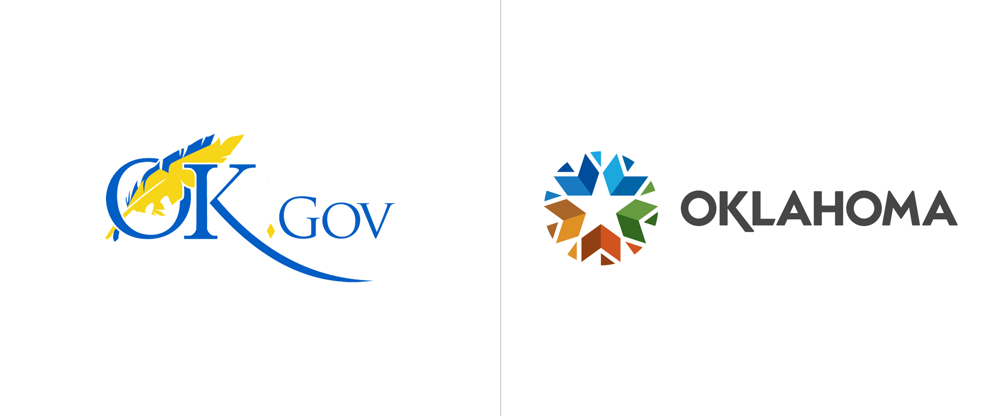
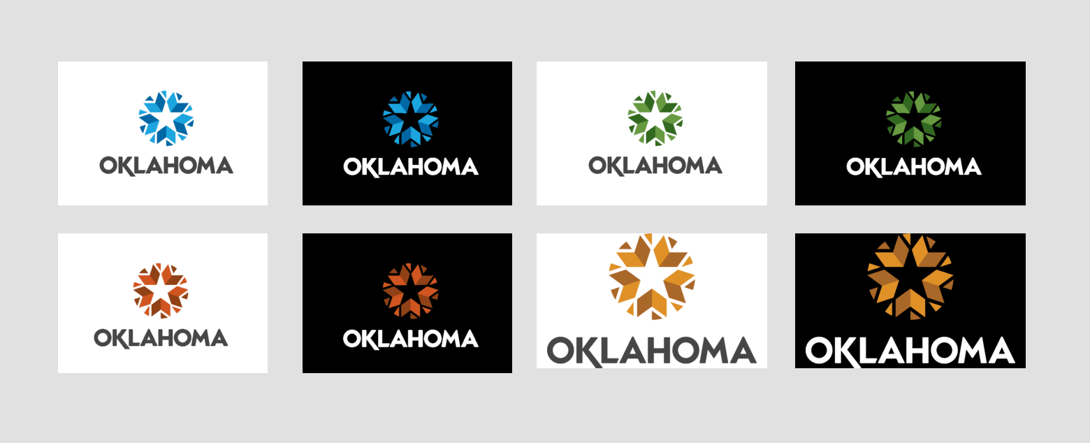
The old OK.gov logo was… not very OK, with the longest and most unnecessary swash ever recorded and some poor use of Trajan in “.Gov” to complement whatever serif “OK” used to be. The feathers were awkward and that’s not even counting the pushback against logos that include Native American imagery, although if there is a state where it’s relevant and appropriate, Oklahoma is one of them. Anyway, that was not the state’s official logo and was not used to promote tourism or business but it did serve as the logo for the state’s website, so worth including and acknowledging. On to the new logo… I’ll start with the positive, because there is not much of it: At a glance and small, it manages to convey, perhaps loosely and abstractly, a Native American graphic motif but at the same time manages to be somewhat corporate, bridging the need for representing the state AND bringing in business. The star in the center isn’t highly creative or unique but appropriate given that the state’s seal features a prominent white star. The main problem with the logo is that it feels so very generic, like it could be for a public library system, for a shopping mall, or for a history museum. Execution-wise, I get the chevrons but I really don’t understand what’s up with the pizza slices and door-stop wedges… why are they the way they are? Who knows. The colors on the icon are also somewhat depressing. I know we complain a lot about the preponderance of bright, happy colors but I guess this is why they are so used, because the opposite is such a downer. When the logo breaks down to a single color, it’s both better and worse: better because it’s not those colors and worse because it’s even harder to tell what’s going on. The wordmark is fine I guess. Don’t get me wrong, I do not like it, but it’s not bad per se. What’s clear, though, is that the state of Oklahoma really likes swashy “K”s. Overall, it’s a bit of a trainwreck in minor ways but I can see this surviving the initial negative reactions and becoming a serviceable mainstay for the state.
In ấn Anpic In nhãn mác Anpic In brochure Anpic In card visit Anpic In catalogue Anpic In thiệp cưới Anpic In tờ rơi Anpic
In Ấn Anpic – Nổi Tiếng In Đẹp In Nhanh
Số 5 Ngõ 75 Nguyễn Xiển, Thanh Xuân, Hạ Đình, Hà Nội
0963223884
baogiainananh@gmail.com
https://anpic.vn
https://g.page/inananpic
In nhãn mác Anpic ✅ In brochure Anpic ✅ In card visit Anpic ✅ In catalogue Anpic ✅ In thiệp cưới Anpic ✅ In tờ rơi Anpic
https://anpic.vn/in-nhan-mac-dep
https://anpic.vn/in-brochure
https://anpic.vn/in-an
https://anpic.vn/in-voucher-in-phieu-giam-gia-khuyen-mai
#inananpic
Comments
Post a Comment