Reviewed: New Logo and Identity for Sing King by Nomad
“The King is Dead, Long Sing the King!”
Established in 2012, Sing King is the world's largest online karaoke track depository with a huge presence on YouTube. With over 3.3 billion views and 7 million subscribers, Sing King re-records thousands of tracks with simpler instrumental compositions, adds the synched lyrics, and posts new videos almost every day -- 2,193 videos to date. Based in London, UK, the small company has managed to create, publish, and monetize this tricky content legally, working out agreements with Sony/ATV, Kobalt, and Universal Music Group. Looking to expand into mobile and smart TV apps as well as and a standalone web destination, Sing King has introduced a new identity designed by London-based Nomad.
As leaders in their field, Sing King are well placed to lead the charge with changing the perception of Karaoke. The intention was create a symbol that could become a kite mark of quality for the industry and reflect the global reach of their product.
We used the basis of musical notes to create the negative space of the crown, creating a simple yet striking symbol. We've supported this with a word mark and palette of accompanying weights of Sharp Grotesque by Sharp Type.
Nomad provided text
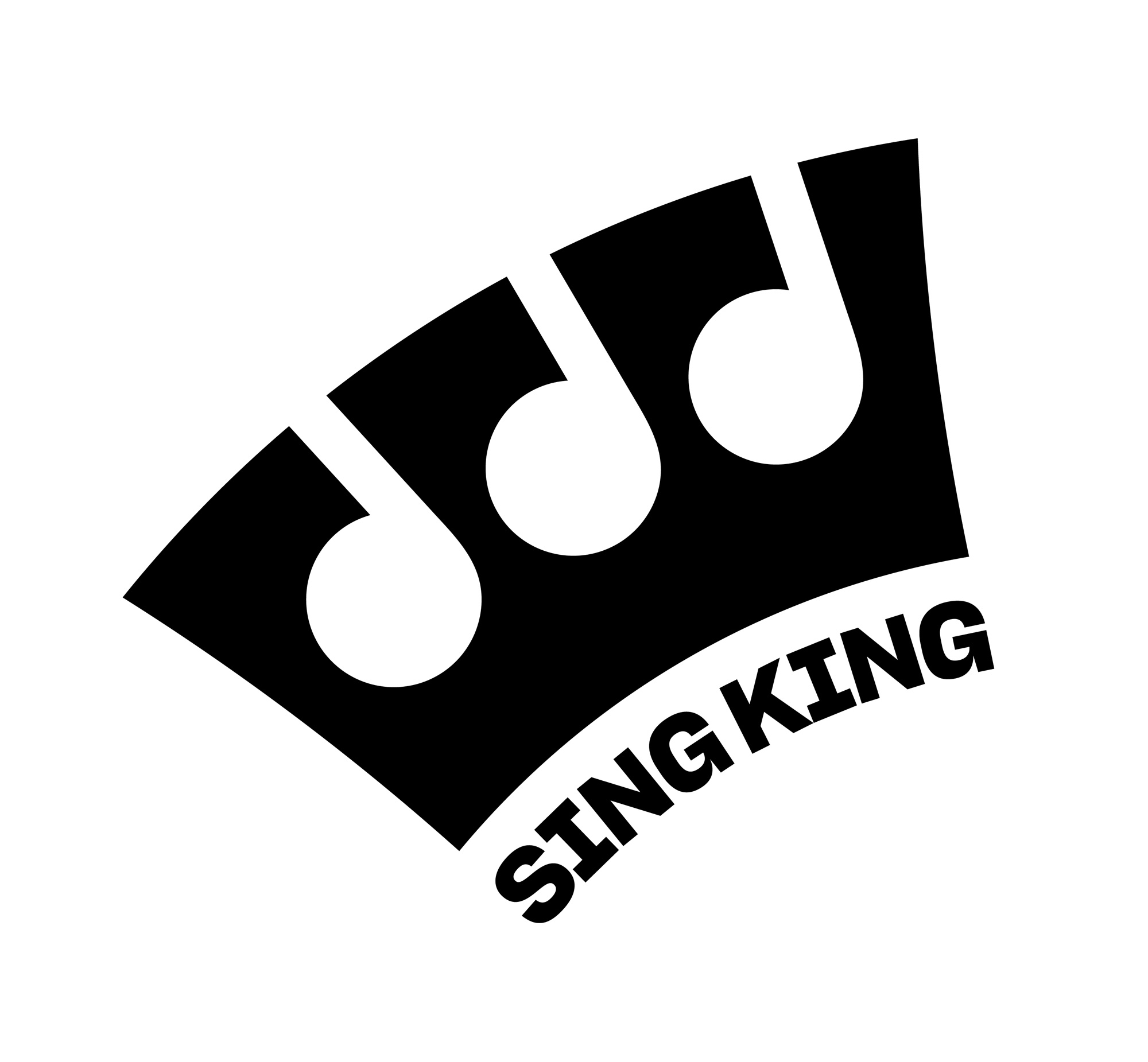
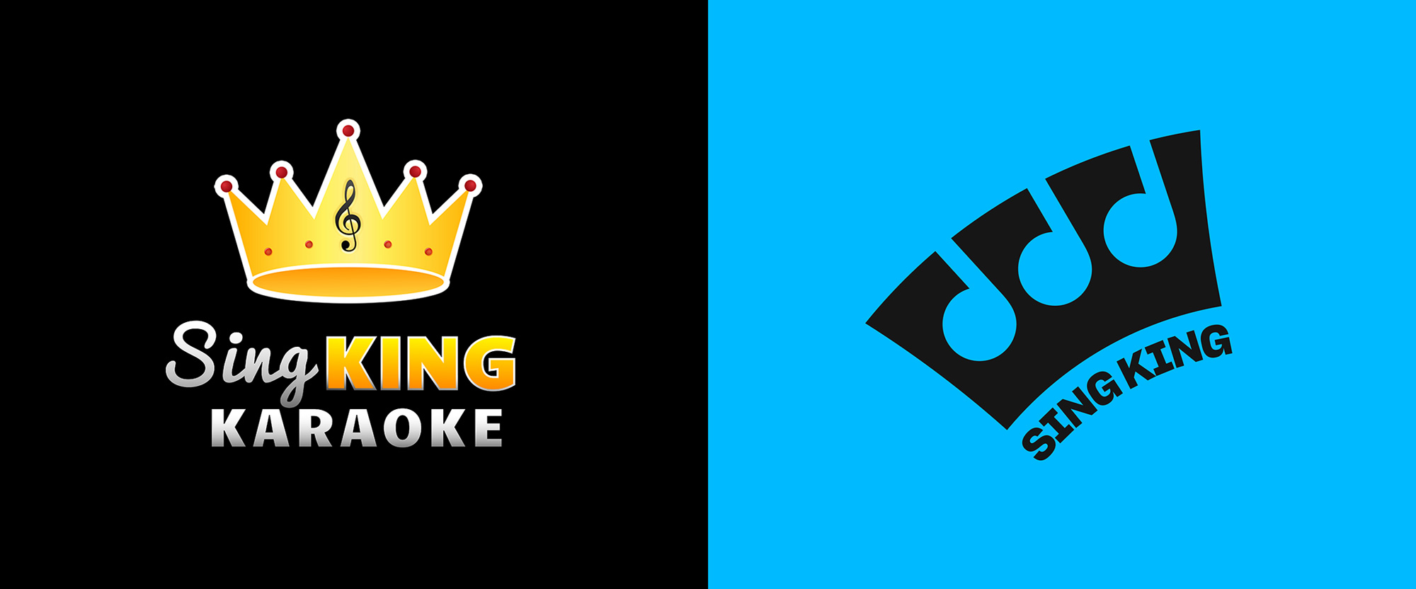
The old logo was almost charming in how amateur it was but the key word is almost as it was really not a good logo by most standards. To play my own devil's advocate though, it did match the essence of karaoke, where anyone can sing and have fun even if their singing is not good singing "by most standards". While the old logo was as literal as it gets with a clip-art crown and a clef spelled out, the new logo is a more interesting interpretation that builds an abstract crown with the help of three music notes in the negative space. Without the name attached to the icon, it would be a hard read but the name allows the icon to instantly pay off. (In my mind, I also see one of those cartoon scenes where a character screams and the "camera" zooms in into their tonsils as their uvula swings vigorously, much like when you are hitting those high notes in Let it Go.) The wordmark... I'm on the fence. I think it works but at the same time maybe it could have been something a lot more fun -- a condensed rounded sans serif, perhaps. The final choice is not wrong though as the type matches the flares of the icon. There is a secondary lock-up used in the website where the icon sits small in between the two words and that sort of kills the crown effect but, in general, it's a fun logo.
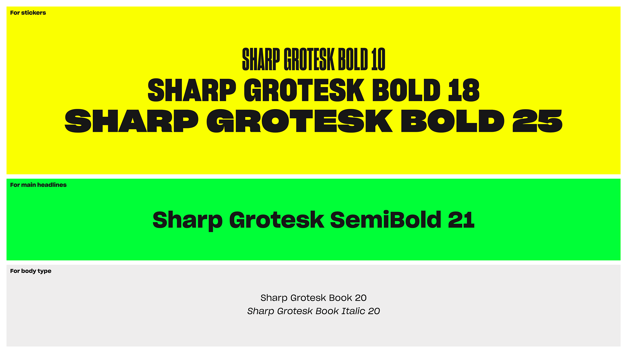
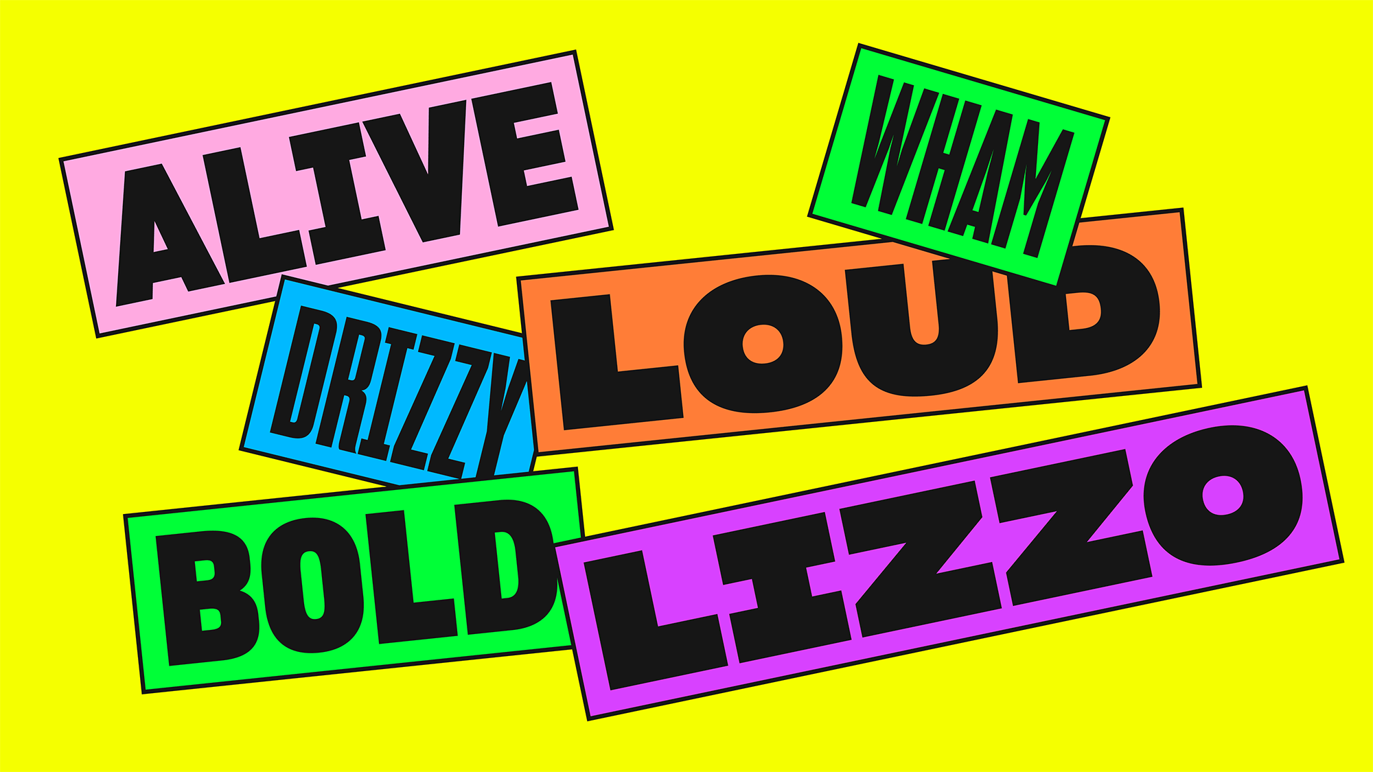
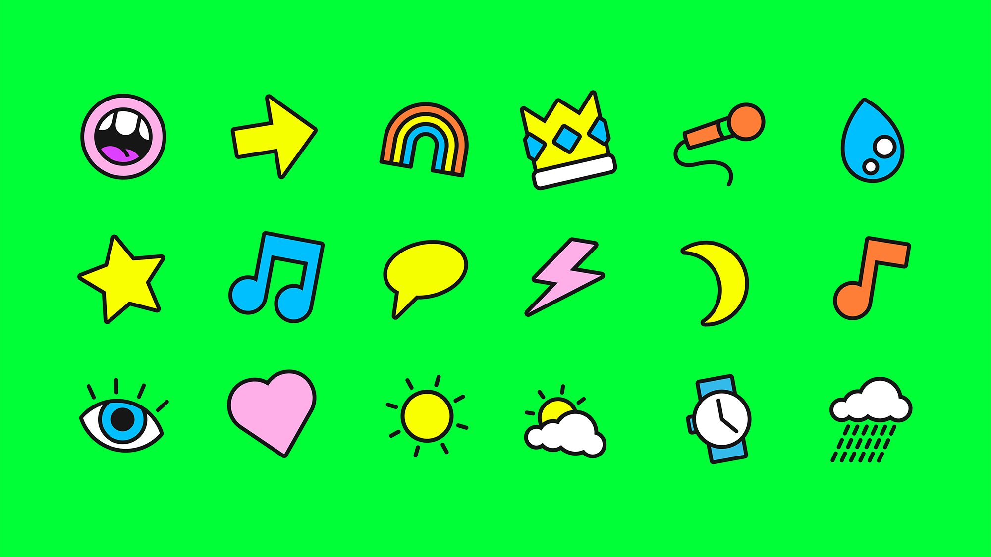
Sharp Grotesk is a great type family and its varied widths are put to good use in the sticker treatment that isn't the most novel but the addition of the black stroke around the boxes gives it a little extra visual interest. The icon set matches the boxes with their own black stroke and the different tilts make the mono-thickness-line-art approach feel a little different than usual. Even the burn-your-retina color palette feels slightly new as it's very appropriate for this identity.
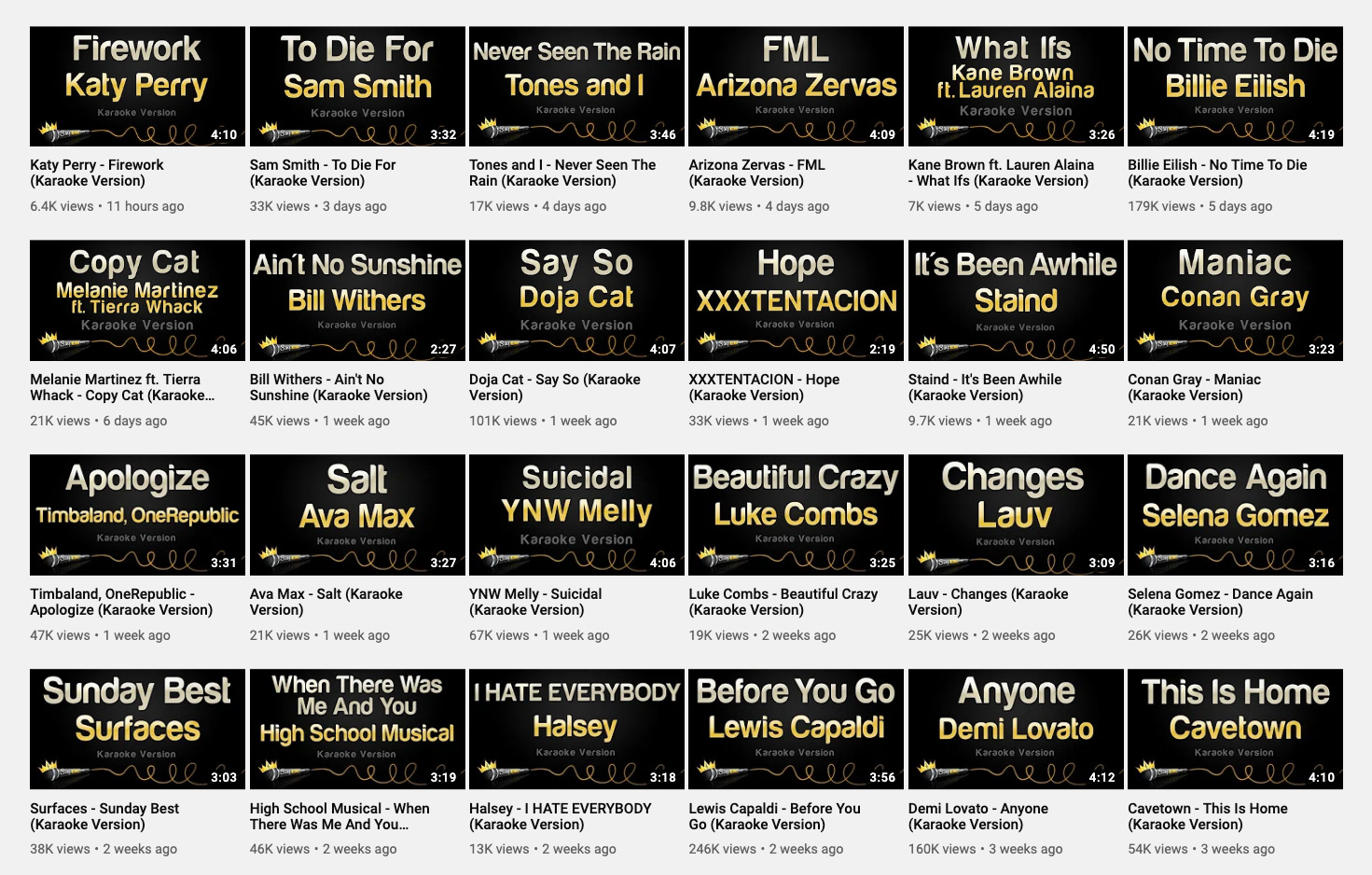
One of the most important applications for Sing King are the thumbnails that appear on YouTube and the existing thumbnails are 100% atrocious. Unlike the old logo, there is no redeeming quality about them. The new thumbnails are bright, happy, bold, and look like a good time waiting to happen. It's interesting that they have a big "KARAOKE" sticker on them, probably so that they play well in search results.
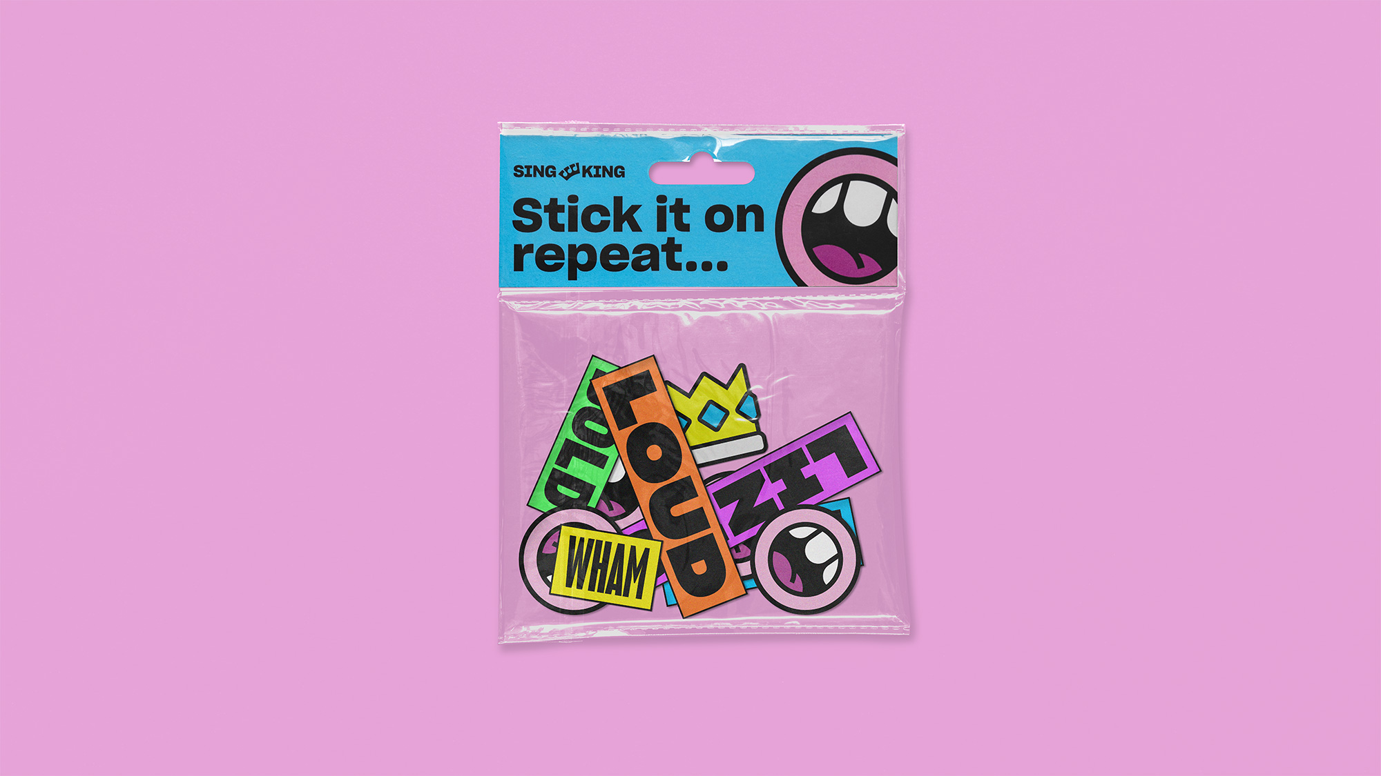
The few other, mostly digital, applications shown are solid, with a fun mix of typography, boxes at different angles, and lots of black strokes around things. The design elements yield a very flexible and consistent visual language that is able to make the artist-provided imagery feel almost custom to them. Overall, this is great. It's vibrant, it's fun, and it's cheesy in a sophisticated way that feels quite right for some solo or group karaoke-ing.
In ấn Anpic In nhãn mác Anpic In brochure Anpic In card visit Anpic In catalogue Anpic In thiệp cưới Anpic In tờ rơi Anpic
In Ấn Anpic – Nổi Tiếng In Đẹp In Nhanh
Số 5 Ngõ 75 Nguyễn Xiển, Thanh Xuân, Hạ Đình, Hà Nội
0963223884
baogiainananh@gmail.com
https://anpic.vn
https://g.page/inananpic
In nhãn mác Anpic ✅ In brochure Anpic ✅ In card visit Anpic ✅ In catalogue Anpic ✅ In thiệp cưới Anpic ✅ In tờ rơi Anpic
https://anpic.vn/in-nhan-mac-dep
https://anpic.vn/in-brochure
https://anpic.vn/in-an
https://anpic.vn/in-voucher-in-phieu-giam-gia-khuyen-mai
#inananpic
Comments
Post a Comment