Reviewed: New Logo and Identity for The Coronet Theatre by North
“System of a Crown”

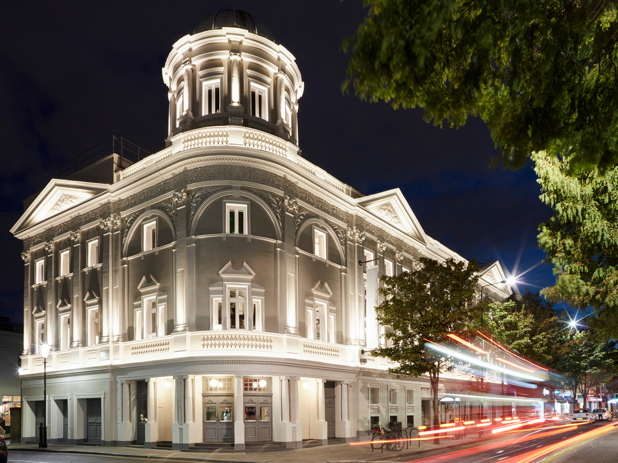
Established in 2010 as the Print Room, The Coronet Theatre presents a risk-taking, eclectic program of theatre, film, dance, music, poetry, and visual art in London, UK. Originally housed in a converted printing warehouse, the Print Room moved into The Coronet, a historic, listed building in Notting Hill that started life in 1898 as a theatre, became a cinema in 1924, and in 2014 Print Room took over and began a gradual process of restoring the neglected venue. Today, the building provides an intimate 195-seat main auditorium and a 90-seat studio. The arts organization changed its name to The Coronet Theatre in 2019 when they also introduced a new identity designed by London-based North.

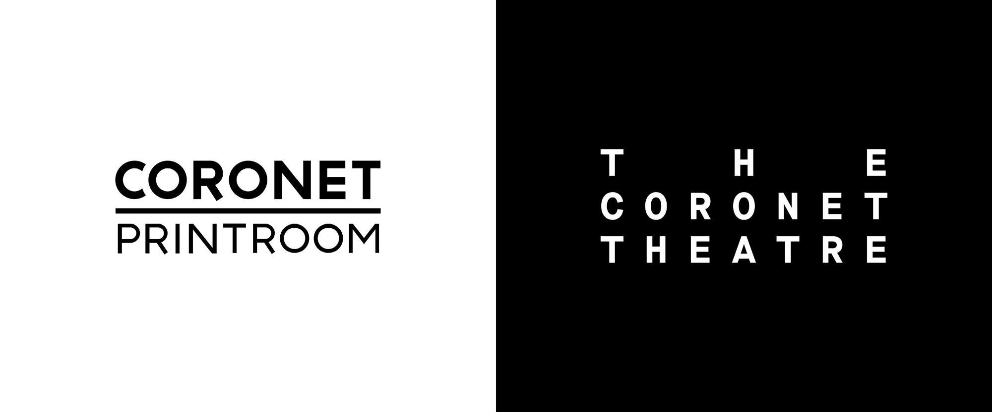
As part of this ongoing re-furbishment North helped the theatre return to it's original name with bold typographic identity. The logo itself was a gift - justifying the characters of the name gave us simple but recognisable coronet. From this we developed an extended typographic language with a monospaced typeface at it's core, alongside more expressive serif and script typefaces in order to create an offbeat visual language which reflected the idiosyncrasies of the building's interior.
North provided text


Not much to say about the old logo as it wasn't trying too hard (or any kind of hard) to be interesting perhaps other than its "R"s being weird. The new logo, as the quoted text mentions, was a gift from the character-count heavens where "CORONET" and "THEATRE" have the same number of characters and "THE" can be spaced out evenly with two characters in between, yielding an abstract coronet, which is the minor league of crowns. The logo is infinitely pleasing in how nicely the arrangement pays off the name and the monospace typeface works particularly well because the name has no "M"s or "I"s, which are the two characters that make monospace fonts be weird, so this just looks like a perfectly spaced regular sans serif. Aside from being a greatly executed logo, it also works very well for a small theater, having that slightly deadpan museum/gallery/symphony vibe that indicates "the arts".


While the season launch campaign used a treatment where the logo is placed tilted on the head of a person and is all kinds of delightful, the individual production posters have a much more strict design that is also pretty cool, especially if you are a control and alignment freak like me. The layout template video brings me so much joy and the resulting posters are pretty amazing with very strong branding by having the logo edge to edge running across the top and the typography -- monospace or otherwise -- falling neatly into place, all with the use of great imagery in the background.
The V&A's archive houses many of the original play-texts and printed collateral from The Coronet Theatre's past, and was a rich source of visual inspiration. Whilst we were cautious to not create a pastiche, we were enamoured by the found coronet symbols/illustrations and used them as the starting point for hand drawn pen and ink illustrations, which became the theatres secondary visual language - used on beer bottles, tote bags and staff badges.
North provided text


There is a bit of a curveball with the last two images where a series of hand-drawn crowns are used in secondary applications... would love to see more of this and how it integrates with the identity as it feels almost like a separate project but I'm not really complaining as it looks great. Overall, the redesign manages to be both elegant and edgy without being too much of either one while providing a great design system for posters and social media posts.
In ấn Anpic In nhãn mác Anpic In brochure Anpic In card visit Anpic In catalogue Anpic In thiệp cưới Anpic In tờ rơi Anpic
In Ấn Anpic – Nổi Tiếng In Đẹp In Nhanh
Số 5 Ngõ 75 Nguyễn Xiển, Thanh Xuân, Hạ Đình, Hà Nội
0963223884
baogiainananh@gmail.com
https://anpic.vn
https://g.page/inananpic
In nhãn mác Anpic ✅ In brochure Anpic ✅ In card visit Anpic ✅ In catalogue Anpic ✅ In thiệp cưới Anpic ✅ In tờ rơi Anpic
https://anpic.vn/in-nhan-mac-dep
https://anpic.vn/in-brochure
https://anpic.vn/in-an
https://anpic.vn/in-voucher-in-phieu-giam-gia-khuyen-mai
#inananpic
Comments
Post a Comment