Noted: New Logo and Identity for 2020 Democratic National Convention by Zero
“Dem Star, Tho”
"The Democratic National Convention (DNC) is a series of presidential nominating conventions held every four years since 1832 by the United States Democratic Party. They have been administered by the Democratic National Committee since the 1852 national convention. The primary goal of the Democratic National Convention is to nominate and confirm a candidate for president and vice president, adopt a comprehensive party platform and unify the party. Pledged delegates from all fifty U.S. states and from American dependencies and territories such as Puerto Rico and the Virgin Islands, and superdelegates which are unpledged delegates representing the Democratic establishment, attend the convention and cast their votes to choose the Party's presidential candidate. Like the Republican National Convention, the Democratic National Convention marks the formal end of the primary election period and the start of the general election season." (Wikipedia)
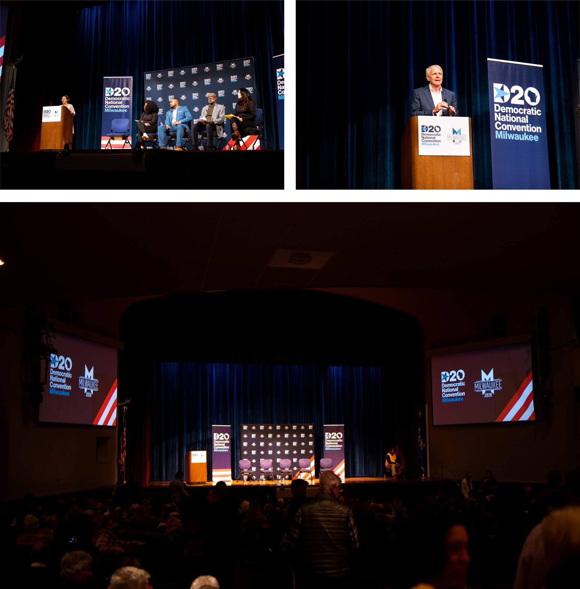
In July, the Democratic Party will come together to formally nominate the next president and vice president candidates of the United States at the 2020 Democratic National Convention in Milwaukee, Wisconsin.
Design by
Zero (New York, NY & Milwaukee, WI)
Related links
DNC design microsite
Relevant quote
Our visual identity reflects our party, and this year’s convention. We started by referencing past Democratic conventions, iconic Americana, and the values, landmarks, and culture that makes Milwaukee and Wisconsin beloved.
Our visual system is inspired by the Wisconsin state motto, “Forward,” and the Democratic party’s vision for positive progress in America.
Images (opinion after)
Opinion
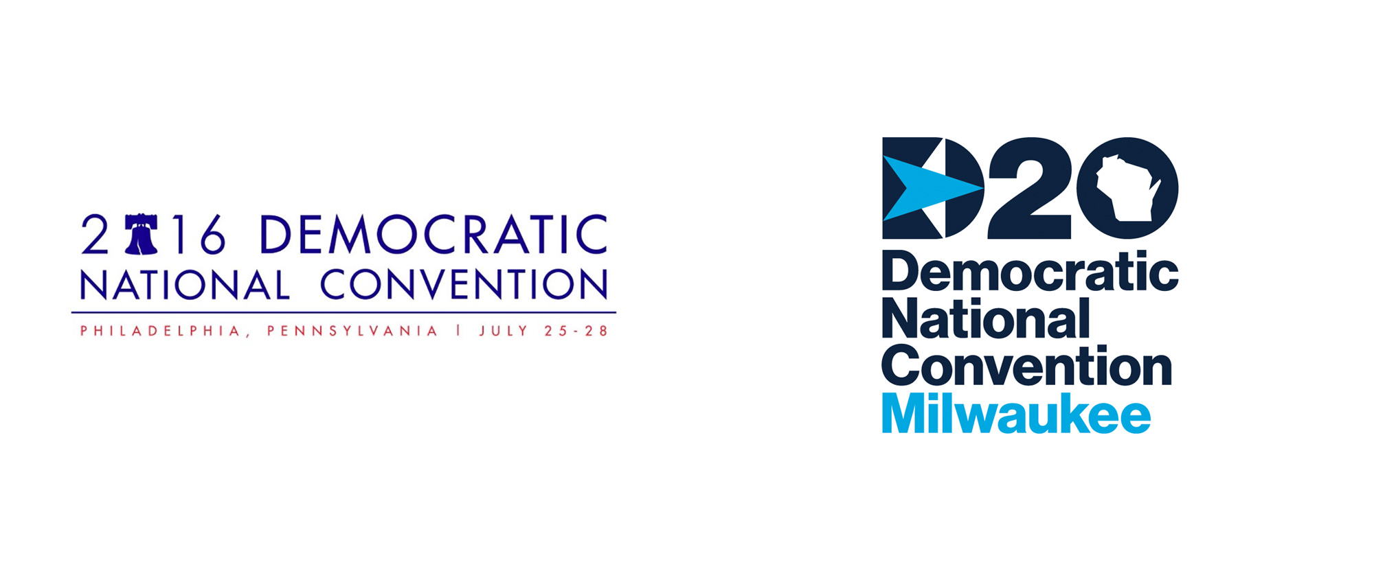
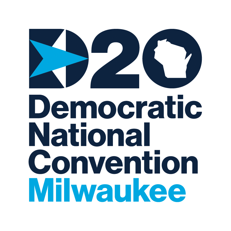
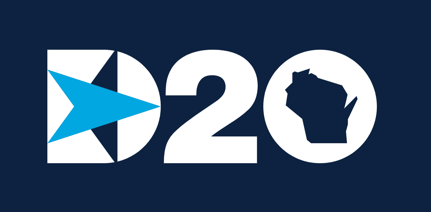
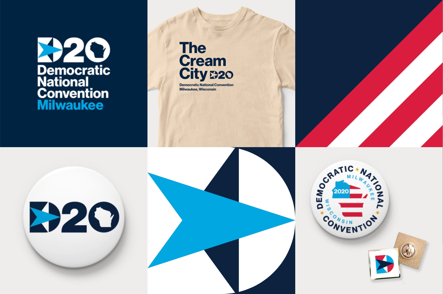
The old logo is an apt representation of the general and expected state of design when it comes to politics-related identity: bland, generic, done as if no one cared about design. With the growing trend of good design in politics, the new logo is a much more uplifting representation of how political identity has improved and where it’s headed. It’s not an amazing logo by any means but it’s good. Solidly good. The custom “D” with the star is quite nice, with the blue arrow hitting the edges of the letter while the complementary white shapes (that complete the star in the brain) establish a strong 90-degree vertical line that, in turn, presents the star at a dynamic angle. It’s easy to dismiss it as just a “D” with a star but there are enough detail-oriented subtleties to make it unique. The bold “20” looks good and while the shape of the state of Milwaukee in the counterspace is indeed questionable I think it’s okay. The full name is spelled out in Neue Haas Grotesk and while it’s not exciting, it gets the job done and the stacked configuration yields a nice “DNC” acronym, which is commonly used to refer to the event. Not much in the way of application and the little there is points to a fairly straightforward, utilitarian approach. There is one nice detail, which is the the stripes that go diagonally across the bottom-right corner of some applications (like such). Overall, it’s a modest, well-designed identity that will get the job done and has some personality to it but isn’t boisterous in a way that could be distracting or misinterpreted as some kind of over-confidence for the party’s desired outcome after this event.
In ấn Anpic In nhãn mác Anpic In brochure Anpic In card visit Anpic In catalogue Anpic In thiệp cưới Anpic In tờ rơi Anpic
In Ấn Anpic – Nổi Tiếng In Đẹp In Nhanh
Số 5 Ngõ 75 Nguyễn Xiển, Thanh Xuân, Hạ Đình, Hà Nội
0963223884
baogiainananh@gmail.com
https://anpic.vn
https://g.page/inananpic
In nhãn mác Anpic ✅ In brochure Anpic ✅ In card visit Anpic ✅ In catalogue Anpic ✅ In thiệp cưới Anpic ✅ In tờ rơi Anpic
https://anpic.vn/in-nhan-mac-dep
https://anpic.vn/in-brochure
https://anpic.vn/in-an
https://anpic.vn/in-voucher-in-phieu-giam-gia-khuyen-mai
#inananpic
Comments
Post a Comment