Noted: New Logo and Identity for Cruise by Moving Brands and In-house
“Cruise Control”

(Est. 2013) "We're Cruise, a self-driving car service designed for the cities we love. We are building the world's most advanced self-driving vehicles to safely connect people to the places, things, and experiences they care about. We believe self-driving cars will help save lives, reimagine cities, redefine time in transit, and restore freedom of movement for many. Backed by some of the world's most respected companies like General Motors, SoftBank, Honda, and T. Rowe Price, we operate as a fast-moving startup with deep financial resources. Their backing for our technology demonstrates their confidence in our progress, team, and vision and makes us one of the leading autonomous vehicle organizations in the industry. Our partnership with General Motors enables us to manufacture a fully-integrated self-driving car that is 100% electric, and we believe this approach is crucial to truly solving transportation challenges at global scale."
Design by
Moving Brands in collaboration with Cruise in-house design team
Related links
N/A
Relevant quote
Unlike many of our competitors, our new identity system doesn’t feature a logo per se. Rather, the system is anchored by a 3-dimensional symbol which reflects our hopes of shaping the future of transportation — and the cities in which we operate — for the better in the 21st century. We think of it as a living identity, one that is responsive, dynamic, and can adapt to change. For example, the interplay of light and shadows on the symbol enables us to reflect the different times of day, and moods, in a built urban environment. What’s more, we can crop into our symbol to create rich imagery for a variety of brand touchpoints, especially motion assets.
Our colors are born from the city in which we’re founded: San Francisco. Our core color, presidio, is inspired by our city’s iconic architecture. The other core colors in our identity are asphalt (of course) and the colors that represent what we hope to create in future cities: clean air, water, and light.
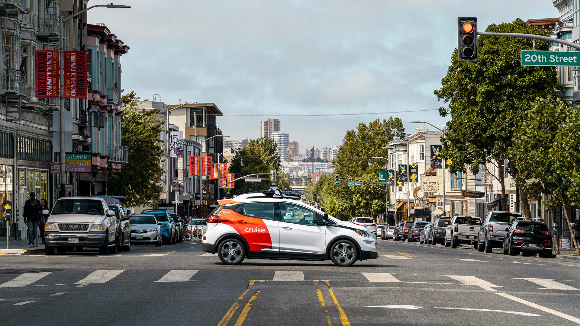
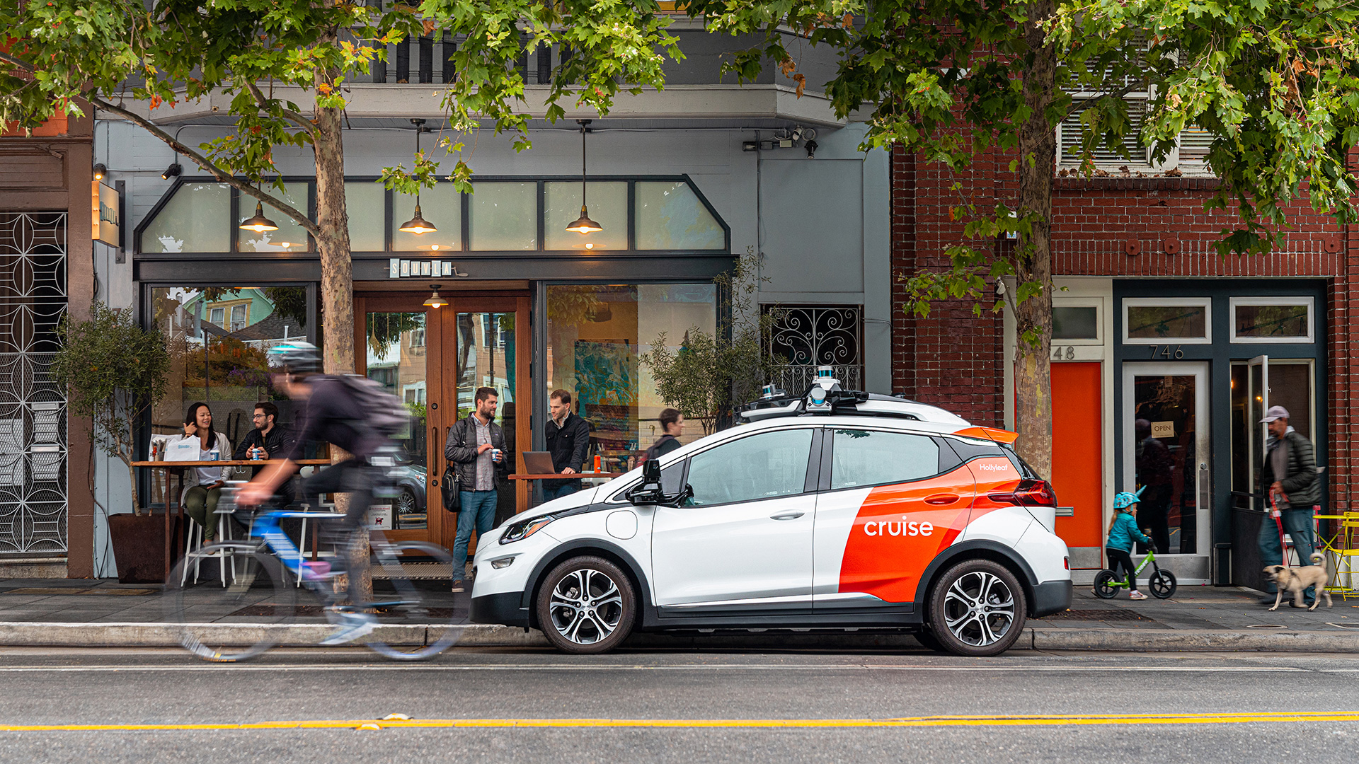
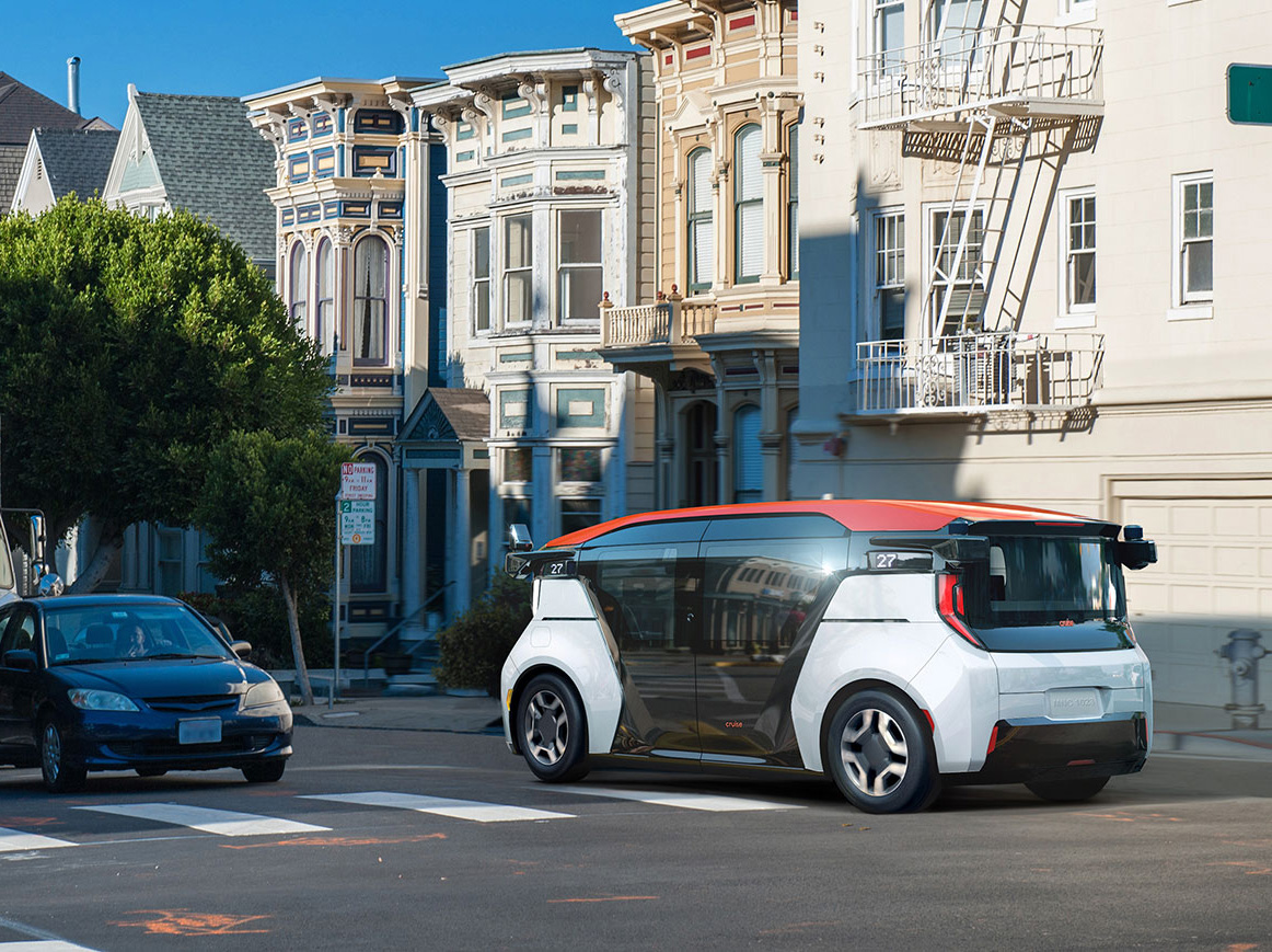
Currently, we’re busy expressing our new identity system across a variety of channels and mediums: from livery design and communications, to our app, in-car experience, physical spaces — and most notably to the world’s first production-ready, self-driving, all-electric vehicle: the new Cruise Origin.
Images (opinion after)



Opinion
While the wordmark isn’t meant to be the brand’s main identifier — the symbol is — it’s still the first thing you see on the website and while not exciting in the least, it’s so much better than the old logo with its clunky rounded sans serif and disproportionately large “u”. The biggest positive of the new wordmark is that it’s not distracting and it’s a serviceable complement to the cars and the symbol. Sculpted in slick 3D, the new “C” is super nice eye candy. The embossed, tone-on-tone execution is very well executed and I really love how the open ends of the “C” blend into the background as the height of the letter decreases. The tight crop yields cool textures and the animation is very satisfying. Not much in terms of application, the closest being the smaller car livery with the crop of the “C” and the white wordmark on top. It’s promising. Overall this feels very SFO-Silicon-Valley-ish with its slick finish, happy bright color, and crisp sans serif… which looks nice for sure but it’s all still in the same general vein as many of the tech industry brands.
In ấn Anpic In nhãn mác Anpic In brochure Anpic In card visit Anpic In catalogue Anpic In thiệp cưới Anpic In tờ rơi Anpic
In Ấn Anpic – Nổi Tiếng In Đẹp In Nhanh
Số 5 Ngõ 75 Nguyễn Xiển, Thanh Xuân, Hạ Đình, Hà Nội
0963223884
baogiainananh@gmail.com
https://anpic.vn
https://g.page/inananpic
In nhãn mác Anpic ✅ In brochure Anpic ✅ In card visit Anpic ✅ In catalogue Anpic ✅ In thiệp cưới Anpic ✅ In tờ rơi Anpic
https://anpic.vn/in-nhan-mac-dep
https://anpic.vn/in-brochure
https://anpic.vn/in-an
https://anpic.vn/in-voucher-in-phieu-giam-gia-khuyen-mai
#inananpic
Comments
Post a Comment