Noted: New Logo and Identity for DVDW by Studio Dumbar
“That W FTW”
(Est. 2004) "DVDW (Duijnstee Van Der Wilk) is a medium-sized commercial law firm with offices in The Hague and Rotterdam. We focus in particular on the larger business clients and we are keen on their interests every day. We are an office of committed and decisive lawyers: from entrepreneurs, for entrepreneurs. Quality, reliability and courage are at the core of our work and our identity. DVDW has quickly grown into a top 50 law firm in the Netherlands with offices in The Hague and Rotterdam."
Design by
Studio Dumbar (Rotterdam, Netherlands)
Related links
Studio Dumbar project page
Relevant quote
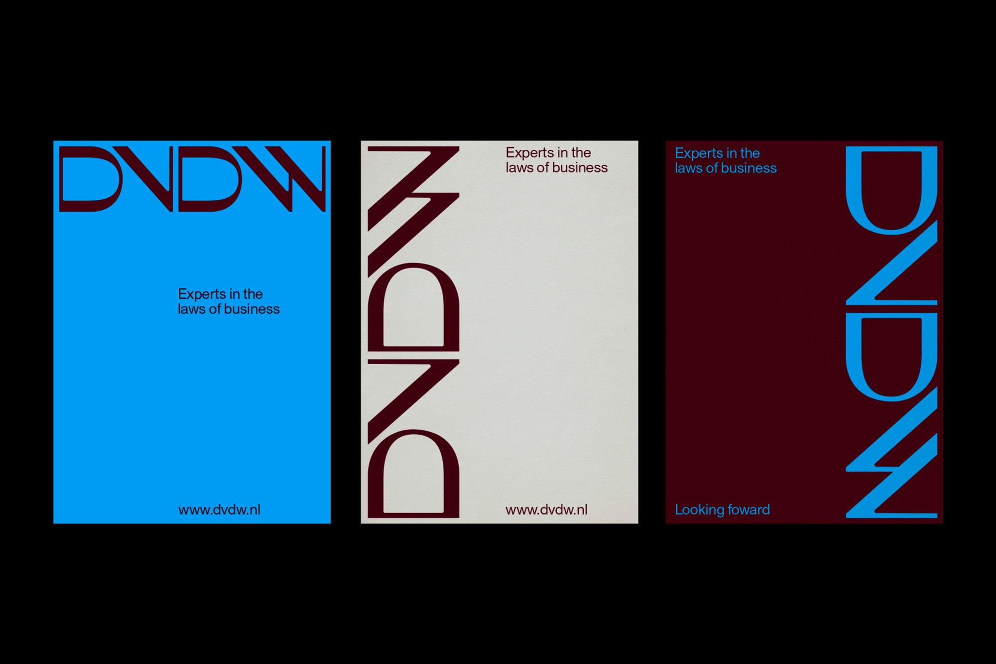
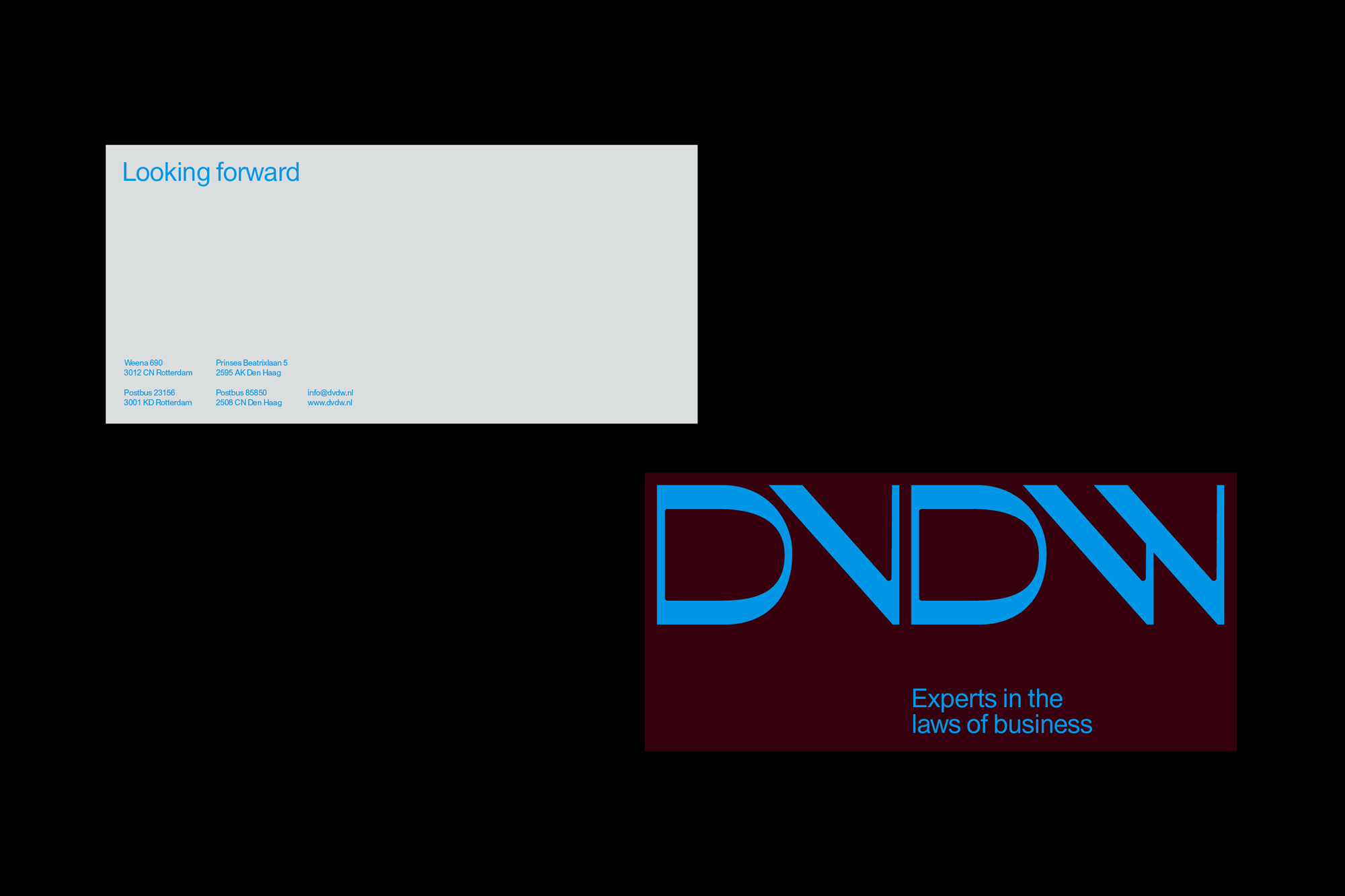
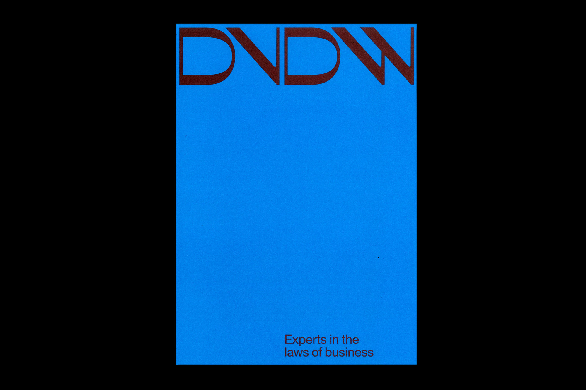
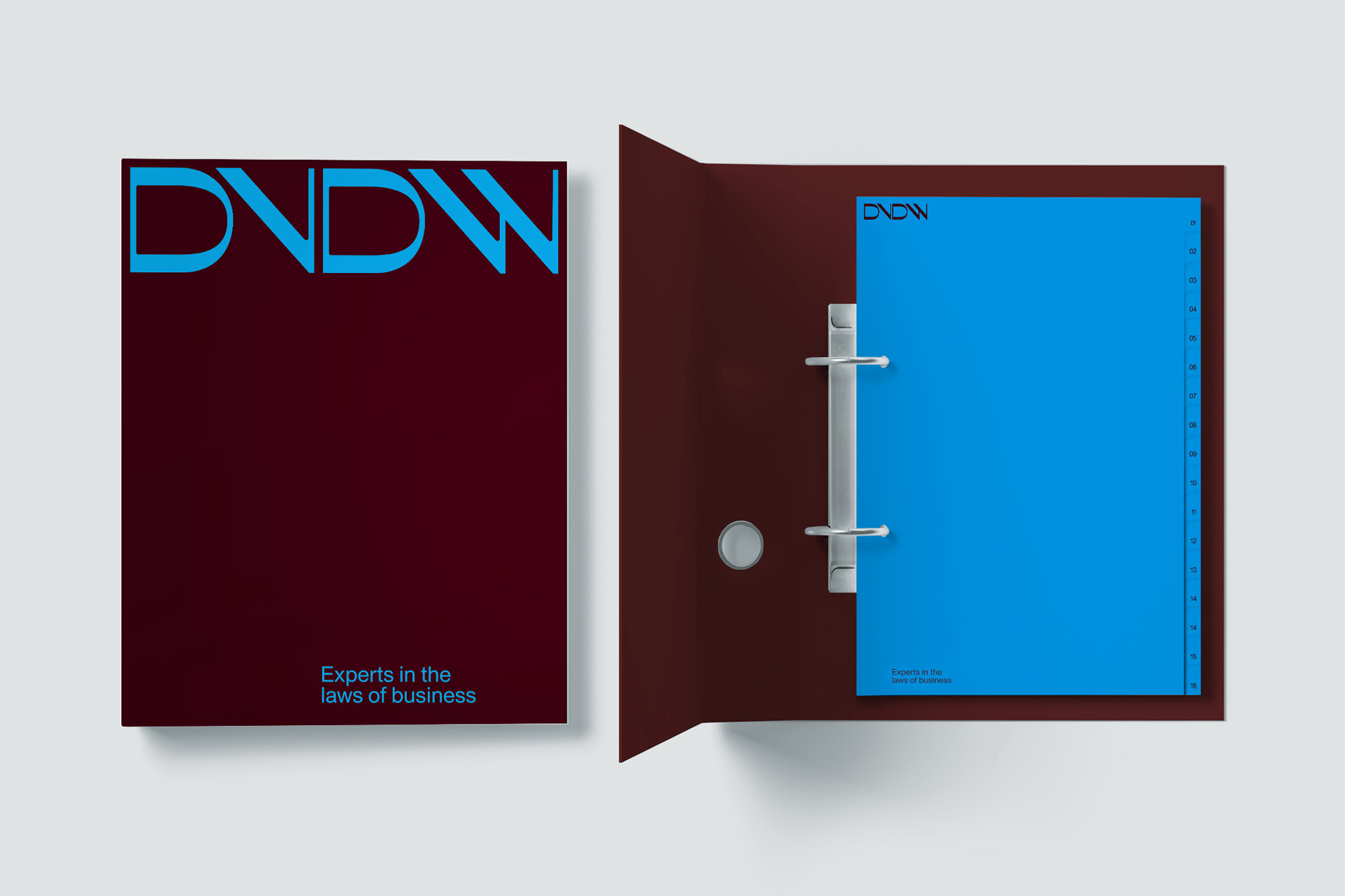
The house style and website are completely new in form, content, and user experience. The new logotype incorporates the dynamics of a modern law firm combined with the strength of a solid partner. These features are also reflected in the outstanding personalities of DVDW's lawyers, who are now prominently visible on the website – with large portraits of individual team members.
Images (opinion after)
Opinion
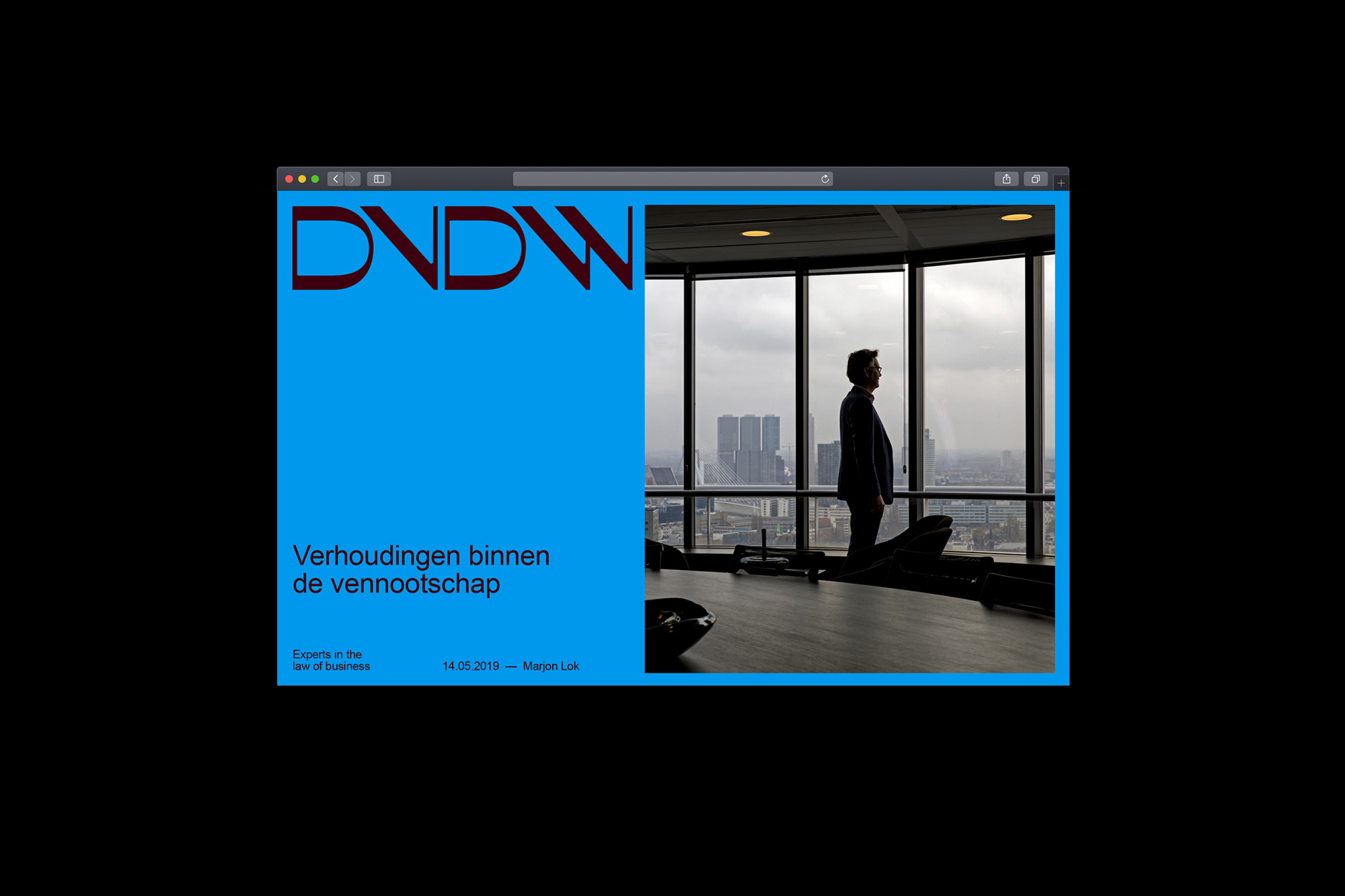
(Quick disclaimer: the redesign is from July 2019; I missed it at the time but it’s good so let’s get it.) The old logo, I’m not sure what was going on there… perhaps there is a law (or Dutch-specific) reference in there somewhere in regard to whatever was happening with the “D”s? I would love to learn something new today, so if you have an answer let me have it. Aside from that, it was a weird but not bad logo, looking scholarly. The new logo is very unexpected for a law firm in general but maybe less so for a law firm in the Netherlands where they are simply cooler than the rest of us. I love the contrasts within the logo, both in the thicks and thins as well as in the rounded-ness of the “D”s and angularity of the “V” and “W”. The latter being so counter-intuitive to how they should be drawn that they are undeniably unique — whether you like them or not, that’s a different story, but they sure are distinctive. In application I love how the logo is used super big in the layouts and how the reverse “W” that ends on a flat vertical line so neatly frames the logo. There is really not that much to the applications other than big logo and demure sans serif typography but given that this could have easily ALL been demure sans serif typography, the fetching logo adds a lot to it. The odd color palette of bright blue and reddish brown is pretty great too — a little jarring but, like the logo, it’s unique and interesting. Overall, a great funkification — which, yeah, I know it’s not a thing or a word but in these screwed up times I am writing whatever nonsense I please — of traditional law firm identities that tend to be appropriate but forgettable.
In ấn Anpic In nhãn mác Anpic In brochure Anpic In card visit Anpic In catalogue Anpic In thiệp cưới Anpic In tờ rơi Anpic
In Ấn Anpic – Nổi Tiếng In Đẹp In Nhanh
Số 5 Ngõ 75 Nguyễn Xiển, Thanh Xuân, Hạ Đình, Hà Nội
0963223884
baogiainananh@gmail.com
https://anpic.vn
https://g.page/inananpic
In nhãn mác Anpic ✅ In brochure Anpic ✅ In card visit Anpic ✅ In catalogue Anpic ✅ In thiệp cưới Anpic ✅ In tờ rơi Anpic
https://anpic.vn/in-nhan-mac-dep
https://anpic.vn/in-brochure
https://anpic.vn/in-an
https://anpic.vn/in-voucher-in-phieu-giam-gia-khuyen-mai
#inananpic


Comments
Post a Comment