Noted: New Logo and Identity for Thames & Hudson by Pentagram
“Like Two Dolphins in a Pod”
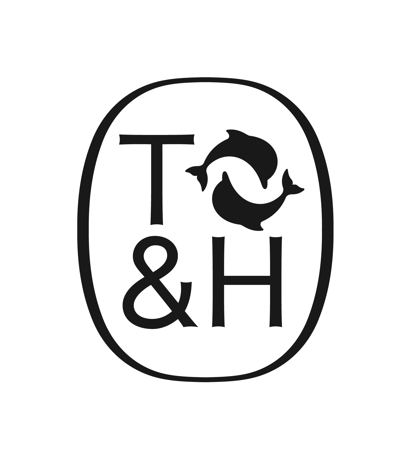
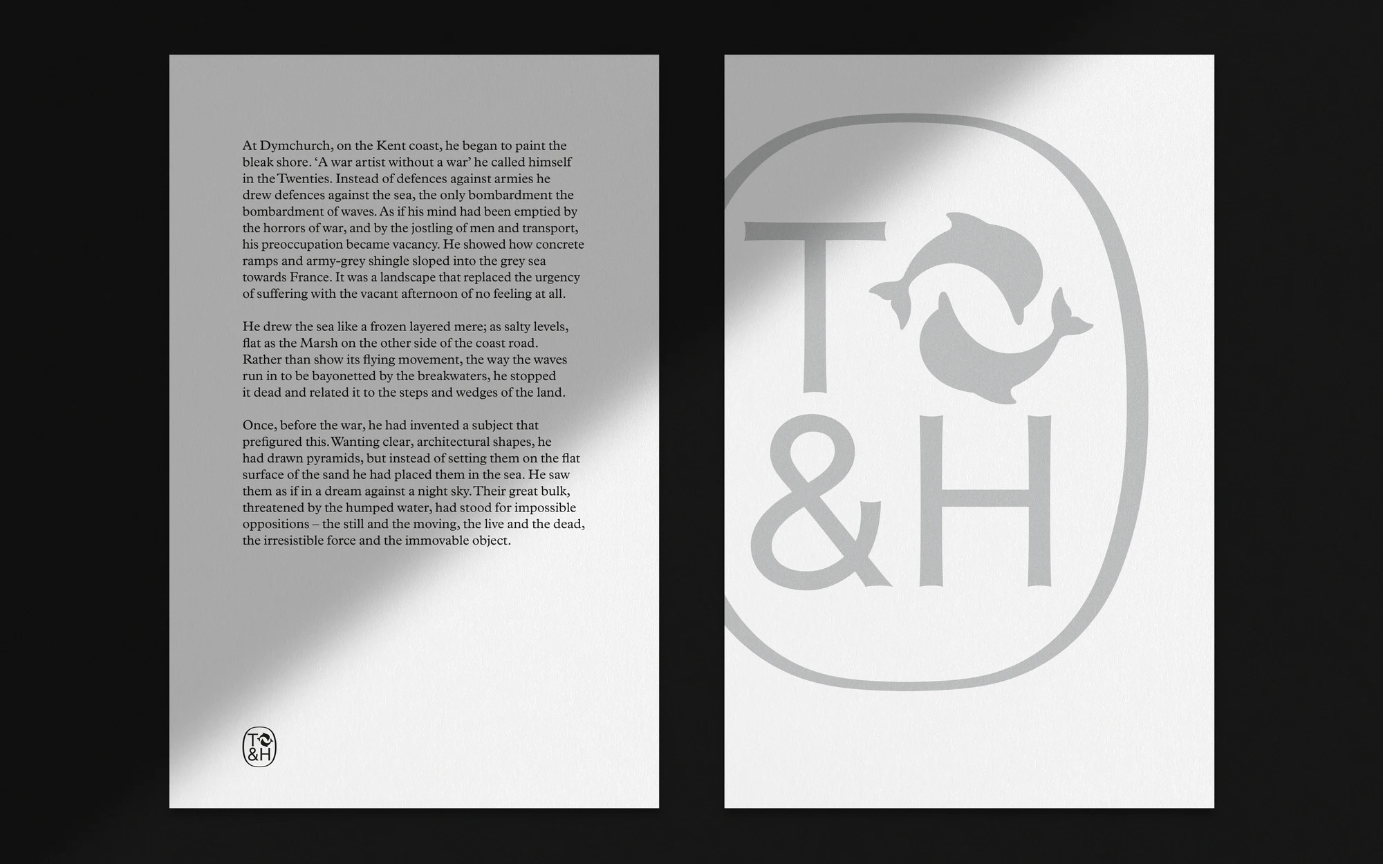
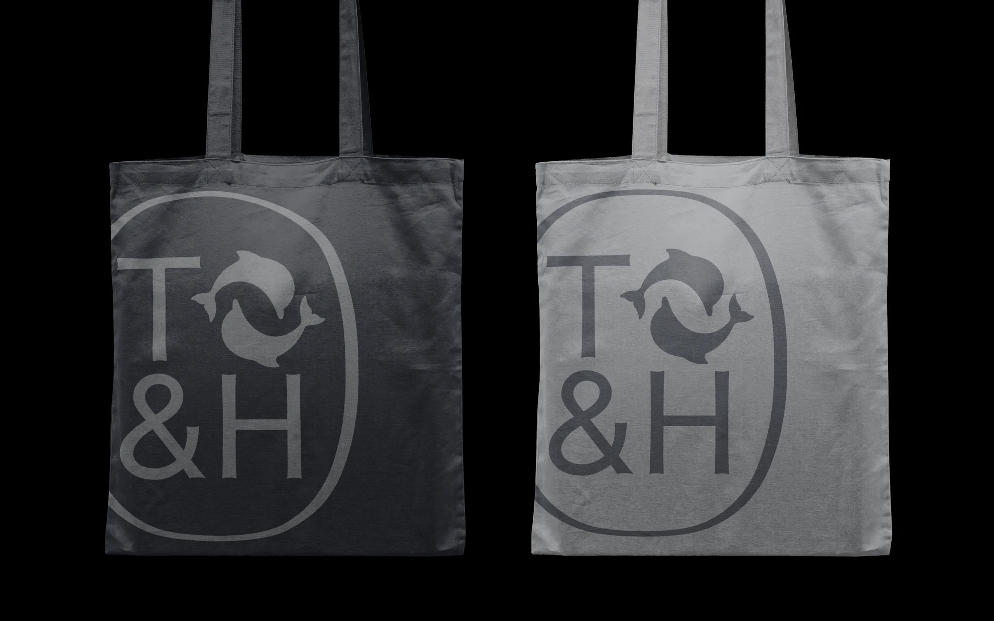
(Est. 1949) "Thames & Hudson was founded in 1949 by Walter and Eva Neurath. Their passion and mission was to create a 'museum without walls' and to make accessible to a large reading public the world of art and the research of top scholars. To reflect its international outlook the name for the company linked the rivers flowing through London and New York, represented in its logo by two dolphins symbolizing friendship and intelligence, one facing east, one west, suggesting a connection between the Old World and the New. Today, still an independent, family-owned company, Thames & Hudson is one of the world's leading publishers of illustrated books with over 2,000 titles in print. We publish high-quality books across all areas of visual creativity: the arts (fine, applied, decorative, performing), architecture, design, photography, fashion, film and music, and also archaeology, history and popular culture. Our children's books list is also expanding. Headquartered in London, we have a sister company in New York and subsidiary sales and distribution companies in Hong Kong and Paris. Today the group employs 150 staff in London and a further 65 around the world."
Design by
Pentagram (Partner, Harry Pearce; London, UK)
Related links
Pentagram project page
Relevant quote
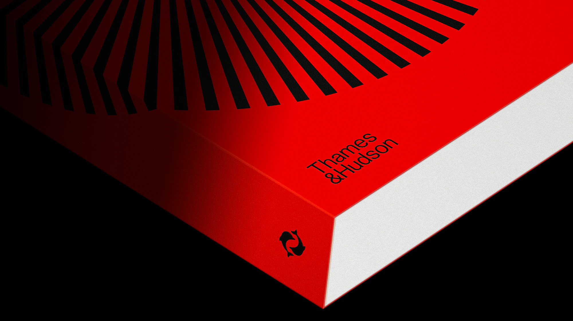
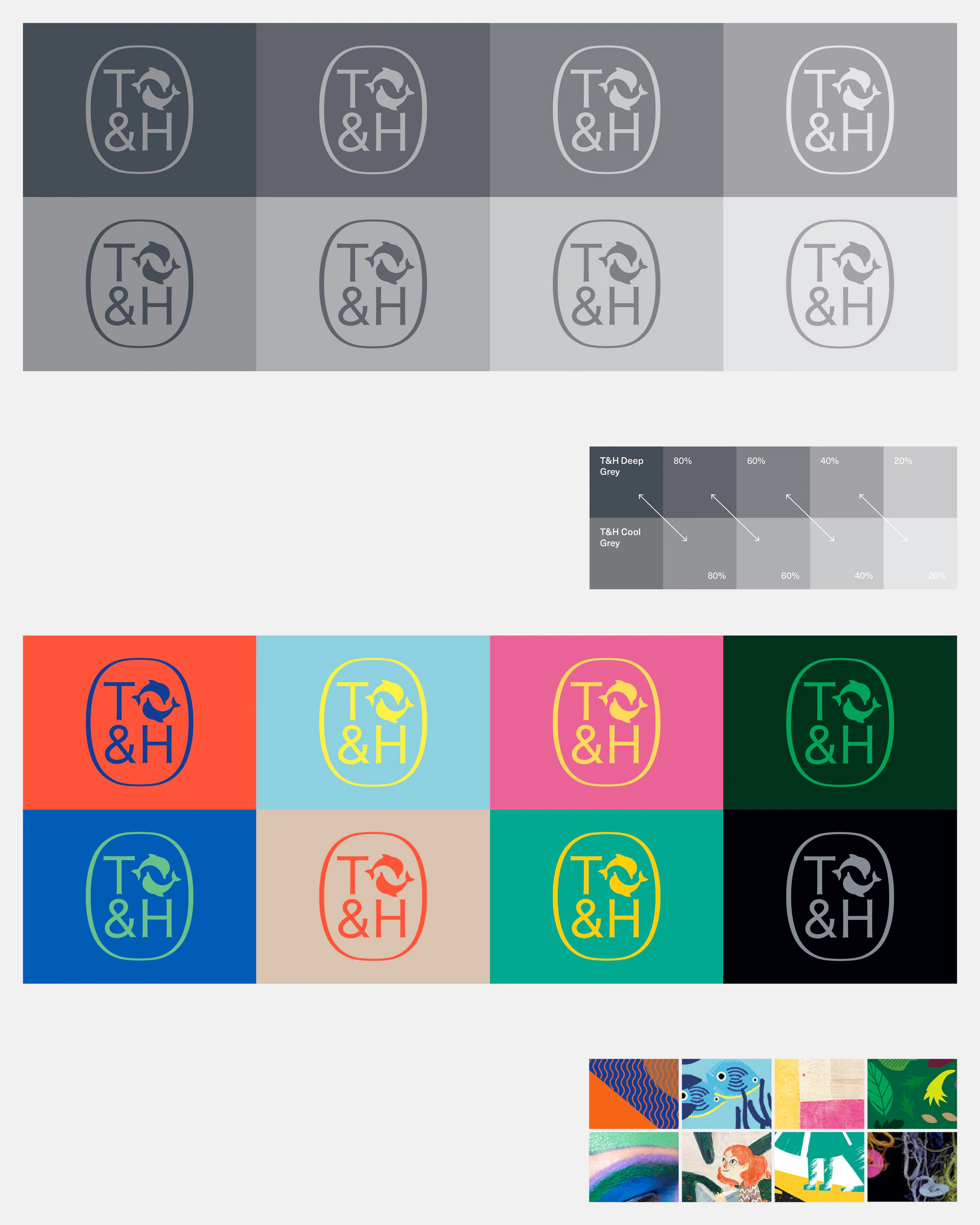
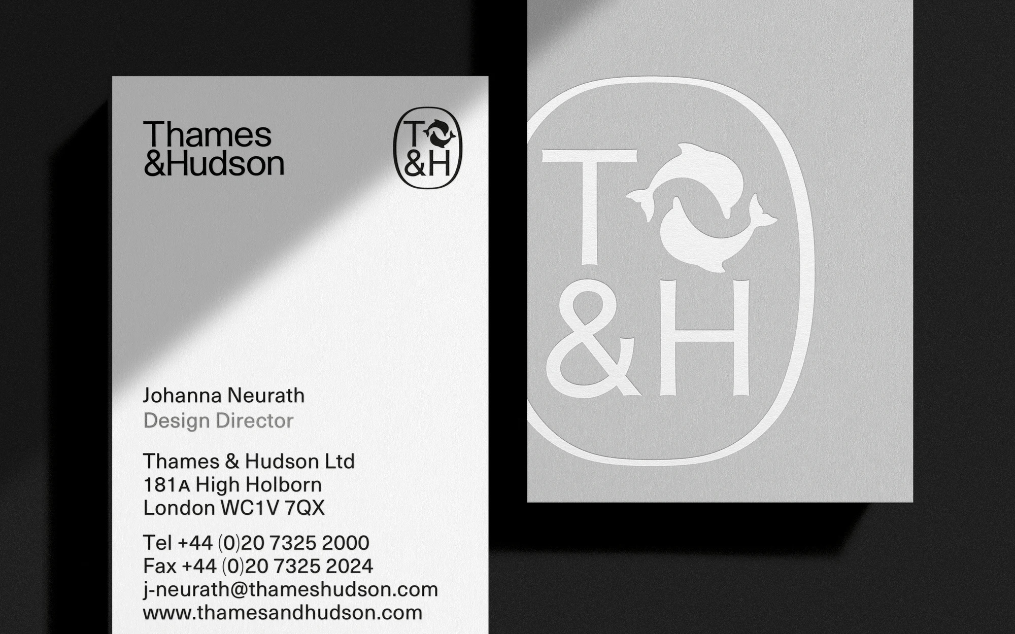
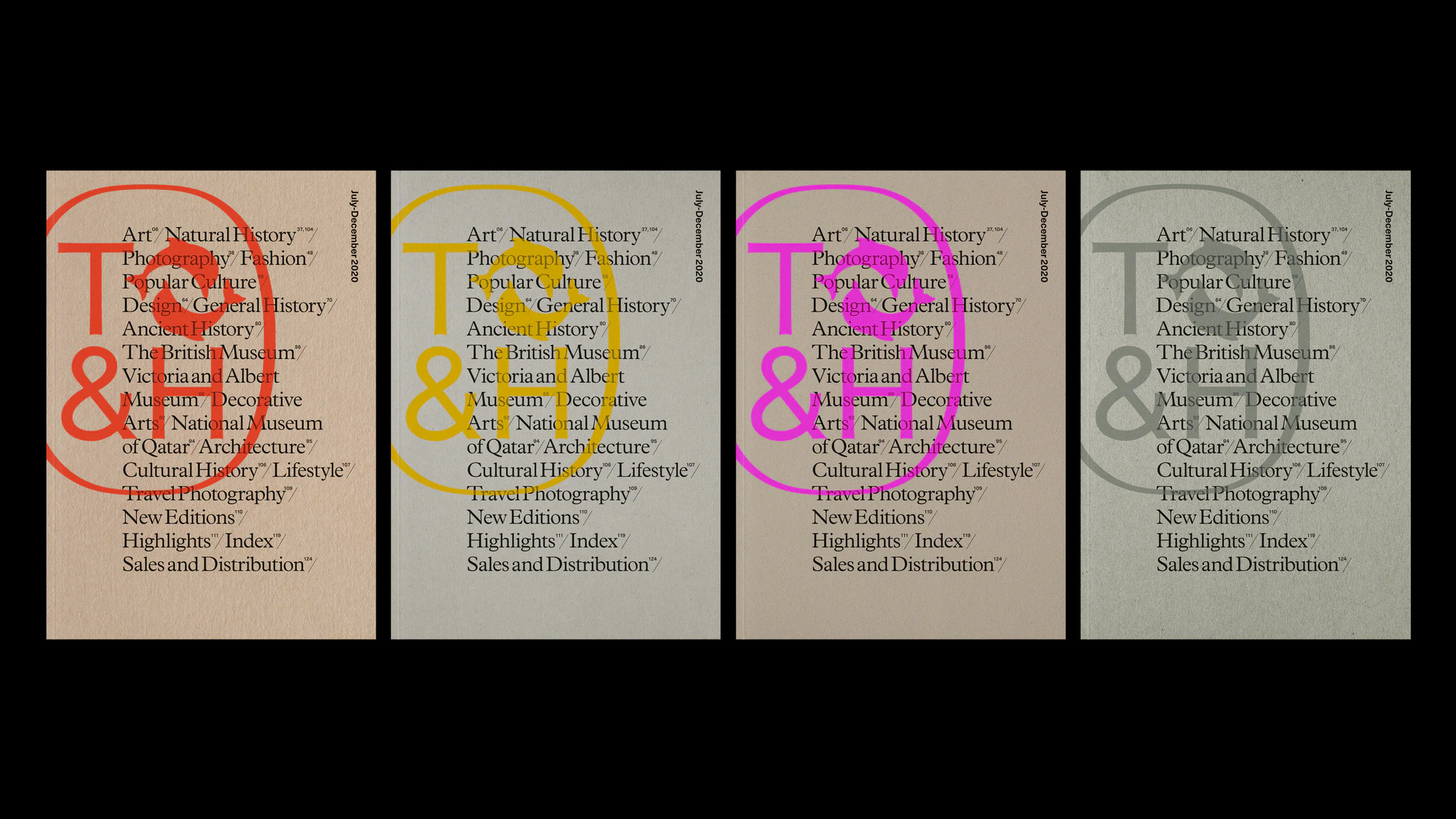
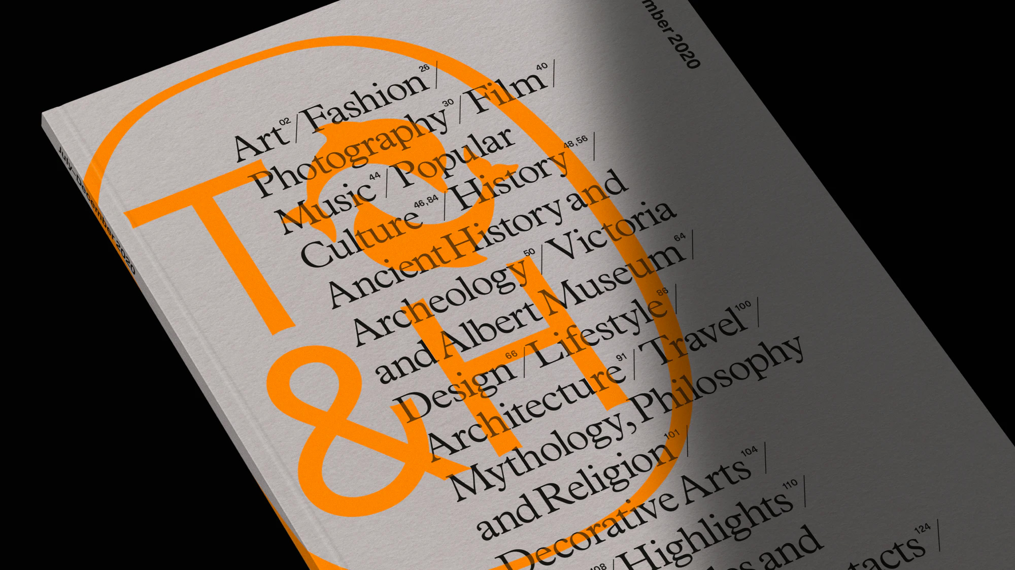
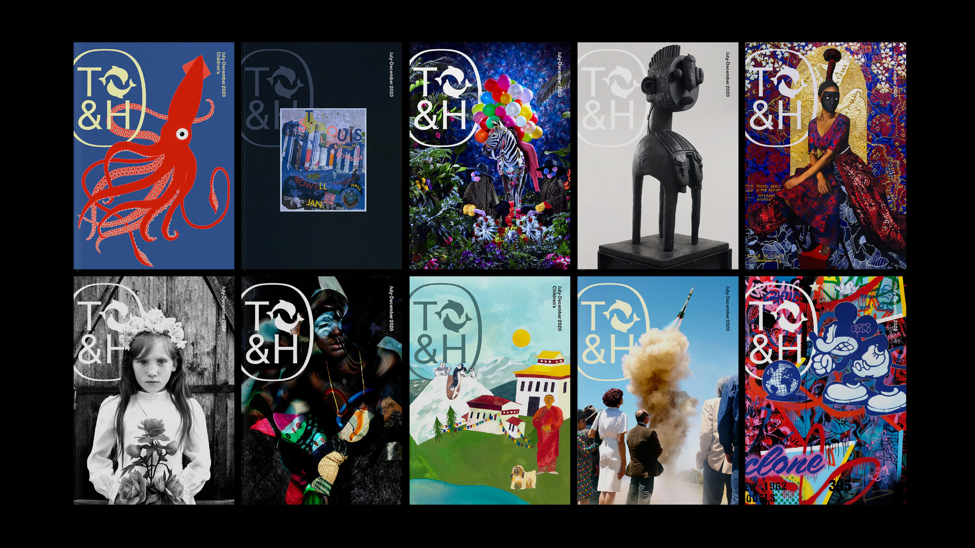
The team researched previous incarnations of the publisher’s logo and looked at how it was applied. A new wordmark was created, as well as a new cartouche, which is a modernised reworking of the original Thames & Hudson cartouche. The new cartouche contains a T&H monogram built from the team’s new bespoke logotype typography, locked up with the publisher’s existing dolphins symbol.
Images (opinion after)
Opinion
The old logo was fine. No major complaints or praises. The new full logo and shorthand cartouche, though, deserve all the praise. The wordmark, in a curiously flared sans serif is unexpected and oddly appealing, especially at smaller sizes — up close it can be a little off-putting. The stacking of the two lines is great, with the top of the ampersand nestling with the concave bottom of the “T” and the left verticals of the “h” and “H” neatly aligning. The cartouche looks great with the dolphins filling in the top-right quadrant to complement the initials inside a lovely holding shape that’s neither oval nor rectangular but both at the same time. The applications are great, especially when the cartouche goes big and bleeds off to the left of any given layout. Overall, everything looks both classy and contemporary, almost with a vintage book publisher feel that makes one pine for the good old days when book publishers were boss.
In ấn Anpic In nhãn mác Anpic In brochure Anpic In card visit Anpic In catalogue Anpic In thiệp cưới Anpic In tờ rơi Anpic
In Ấn Anpic – Nổi Tiếng In Đẹp In Nhanh
Số 5 Ngõ 75 Nguyễn Xiển, Thanh Xuân, Hạ Đình, Hà Nội
0963223884
baogiainananh@gmail.com
https://anpic.vn
https://g.page/inananpic
In nhãn mác Anpic ✅ In brochure Anpic ✅ In card visit Anpic ✅ In catalogue Anpic ✅ In thiệp cưới Anpic ✅ In tờ rơi Anpic
https://anpic.vn/in-nhan-mac-dep
https://anpic.vn/in-brochure
https://anpic.vn/in-an
https://anpic.vn/in-voucher-in-phieu-giam-gia-khuyen-mai
#inananpic


Comments
Post a Comment