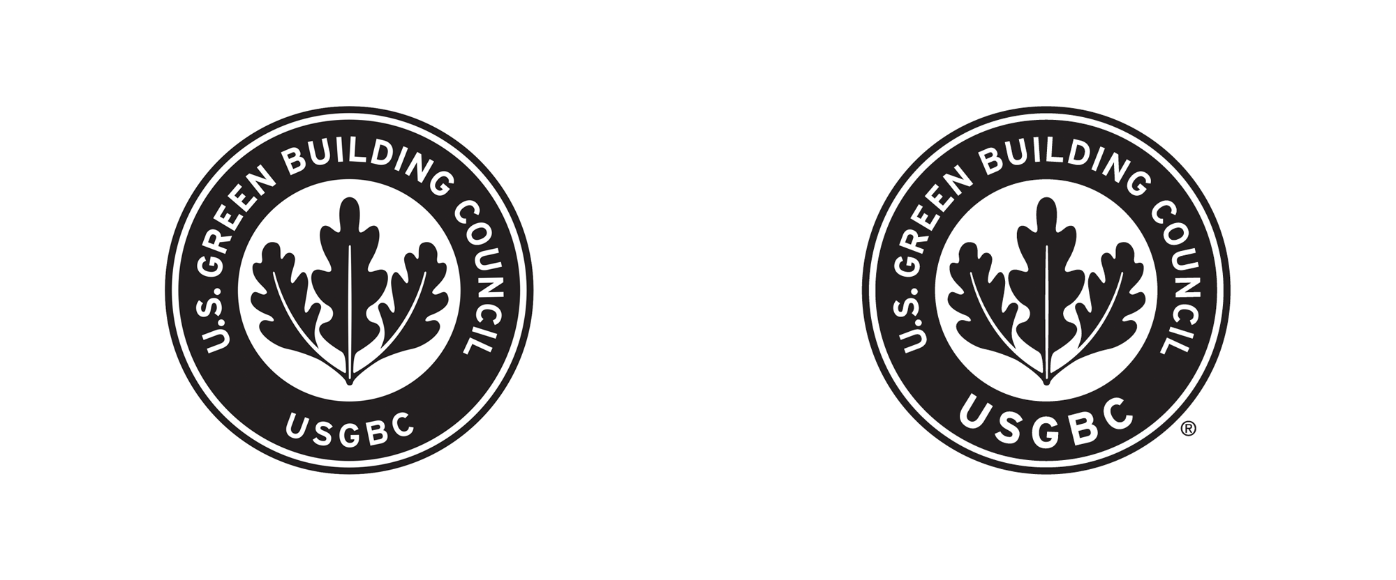
Noted: New Logo and Identity for U.S. Green Building Council
“It’s Not Easy Bein’ Green”

(Est. 2013) "The U.S. Green Building Council (USGBC) and its community are changing the way buildings and communities are designed, built and operated. We believe in better buildings; places that complement our environment and enhance our communities. Places that give people better, brighter, healthier spaces to live, work and play. Green building is a win-win, offering both environmental and economic opportunity. Greater building efficiency can meet 85 percent of future demand for energy in the United States and a commitment to green building has the potential to generate 2.5 million jobs. USGBC is made up of tens of thousands of member organizations, chapters and student and community volunteers that are moving the building industry forward in a way that has never been seen before. We are a diverse group of builders and environmentalists, corporations and nonprofits, teachers and students, lawmakers and citizens. Today we are 77 chapters, 13,000 member organizations and 188,000 LEED professionals strong that share the same vision of a sustainable built environment for all within the next generation."
Design by
N/A
Related links
USGBG post 1 of 2
USGBG post 2 of 2
Relevant quote
Our main logo is our USGBC seal in black. Because it’s our most recognizable mark, we reserve it for use on more formal printed materials, including letterhead, certificates and advertisements.
For less formal applications, our oak leaf can be pulled out and used on applications ranging from social media posts to merchandise, like cups or notebooks.
Our lowercase USGBC wordmark is reserved specifically for use by USGBC employees. You’ll find this mark on places like staff business cards or internal resources. This mark is not to be shared or used externally.
Images (opinion after)


Opinion
If like me, you are trying to spot the difference between the old and new logos, it’s minimal. I had to overlay them to figure it out: The “USGBC” type at the bottom is much bigger. A small change but makes a huge difference, bringing to the fore the well-known acronym. The nicest part about this exercise is the extraction of the oak leaf as a standalone icon, which looks quite nice — I wish they had redrawn it with the help of an expert hand as it could be a beautiful icon. Conversely, props for working with what they had, assuming that budget was a concern. The color combinations for it (and the wordmark as seen in the sole application image) can lean towards the uncomfortable so maybe some tighter control on that would be good. The lowercase wordmark is nice as well but I am huge Benton Sans fan, so I may be in the minority when it comes to appreciating the wordmark — it looks pretty good on the water bottle with the oak leaf icon centered above. Makes me wonder if that was the pitch for a completely new logo at some point. Not sure what happened with the illustrations and icons… to reference today’s Reviewed post, those sure came out of left field. Overall, this is a modest evolution with a kind of 1980s old-school identity approach using classic typefaces and minimal design expressions, which seems apropos to the organization.
In ấn Anpic In nhãn mác Anpic In brochure Anpic In card visit Anpic In catalogue Anpic In thiệp cưới Anpic In tờ rơi Anpic
In Ấn Anpic – Nổi Tiếng In Đẹp In Nhanh
Số 5 Ngõ 75 Nguyễn Xiển, Thanh Xuân, Hạ Đình, Hà Nội
0963223884
baogiainananh@gmail.com
https://anpic.vn
https://g.page/inananpic
In nhãn mác Anpic ✅ In brochure Anpic ✅ In card visit Anpic ✅ In catalogue Anpic ✅ In thiệp cưới Anpic ✅ In tờ rơi Anpic
https://anpic.vn/in-nhan-mac-dep
https://anpic.vn/in-brochure
https://anpic.vn/in-an
https://anpic.vn/in-voucher-in-phieu-giam-gia-khuyen-mai
#inananpic
Comments
Post a Comment