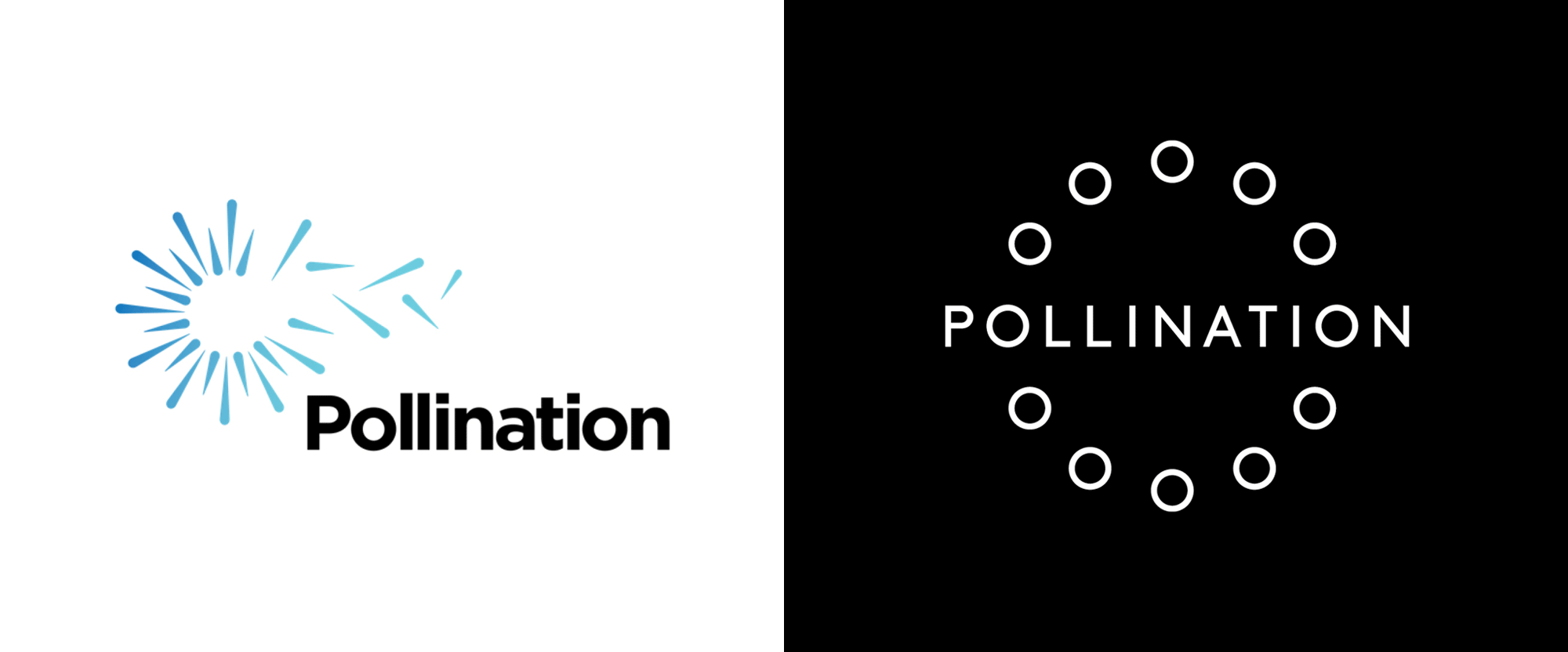
Noted: New Logo and Identity for Pollination by Frost*
“It’s Change O’Clock Somewhere”

(Est. 2019) "Pollination is a specialist climate change advisory and investment firm, accelerating the transition to a net zero, climate resilient future. Our people are the key to unlocking change. Brought together from across industries, we are global leaders in finance, investment, technology, business, law and policy. We combine our diverse expertise to connect dots and see around corners where others can't. With strong relationships at the highest levels of government and the private sector, we shift barriers and catalyse transformative partnerships. Our clients span governments, businesses and public and private capital. Using our broad experience, we help navigate the climate transition, and design and invest in breakthrough ideas that deliver financial returns."
Design by
Frost* (Sydney, Australia)
Related links
Frost* project page
Relevant quote
To communicate Pollination’s unique way of working, we developed an identity based on working collectively towards a net zero carbon emissions future. The graphic logo tells this story in a number of ways, alluding to time and the importance of continuous collaboration.
A black and white colour palette highlights that climate change is not a grey area, while an intelligent yet dynamic brand voice serves up intellectual rigour and creative thinking in equal measures.
A photography library champions the role Pollination plays at the centre of the climate change story, by taking an editorial, world-view approach to climate change topics. The duality of photography style – close-up details vs. ‘bigger picture’ images – captures Pollination’s ability to interrogate the problem in order to make informed decisions, as well as using its imagination to solve tomorrow’s problems with more than today’s solutions.
Images (opinion after)


Opinion
The old logo was fine, a little on the literal side but it got the point across. The new logo is a more abstract interpretation and it’s sublime, linking the two “O”s at the start and end of the long word with a circle of more identical “O”s conveying the notion of one idea flowing into another and creating, in this case, a positive cycle. It’s, in hindsight, such a simple idea and it’s executed perfectly. The ability to use the circle of “O”s on its own is also great and how it animates like a dial in tune with imagery changing is a powerful message. The applications introduce a lovely serif, Displaay’s Reckless, that, along with the strong photography, provides an editorial look for some added gravitas. Overall, this is great from start to finish, which I realize is not the most substantial argument but that’s what it boils down to for me.
In ấn Anpic In nhãn mác Anpic In brochure Anpic In card visit Anpic In catalogue Anpic In thiệp cưới Anpic In tờ rơi Anpic
In Ấn Anpic – Nổi Tiếng In Đẹp In Nhanh
Số 5 Ngõ 75 Nguyễn Xiển, Thanh Xuân, Hạ Đình, Hà Nội
0963223884
baogiainananh@gmail.com
https://anpic.vn
https://g.page/inananpic
In nhãn mác Anpic ✅ In brochure Anpic ✅ In card visit Anpic ✅ In catalogue Anpic ✅ In thiệp cưới Anpic ✅ In tờ rơi Anpic
https://anpic.vn/in-nhan-mac-dep
https://anpic.vn/in-brochure
https://anpic.vn/in-an
https://anpic.vn/in-voucher-in-phieu-giam-gia-khuyen-mai
#inananpic
Comments
Post a Comment